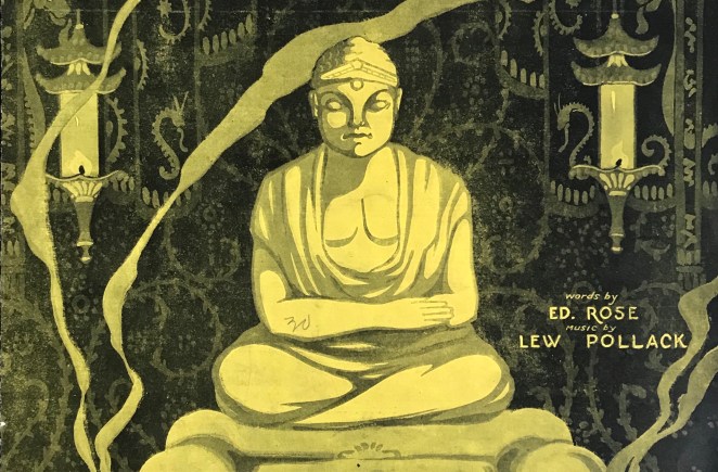
For all the new Buddhas in the West posts follow us on Bluesky & Instagram
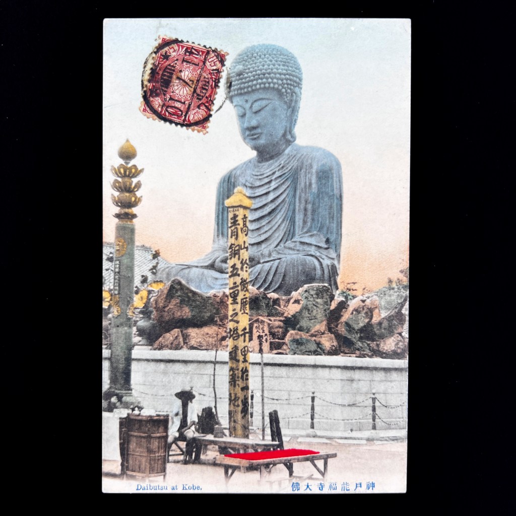
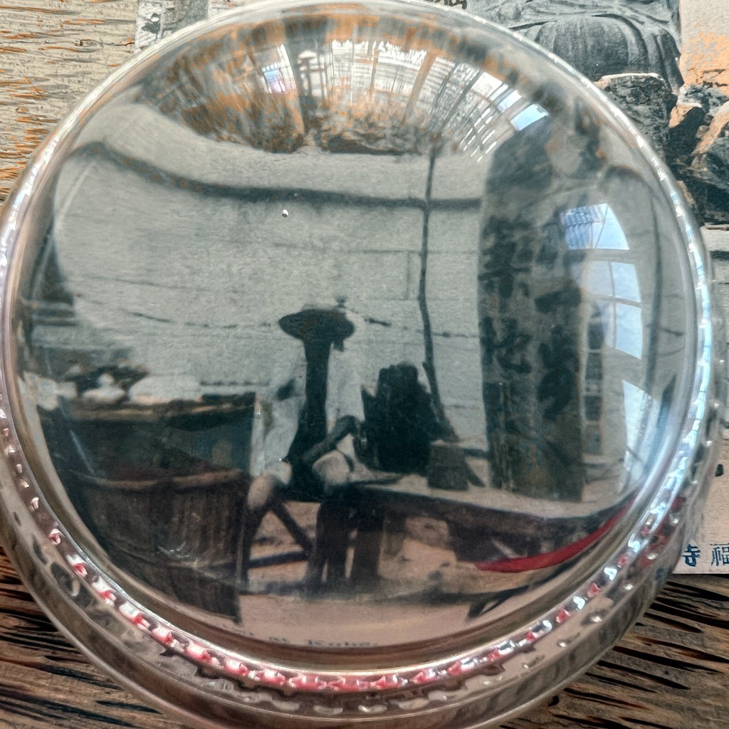
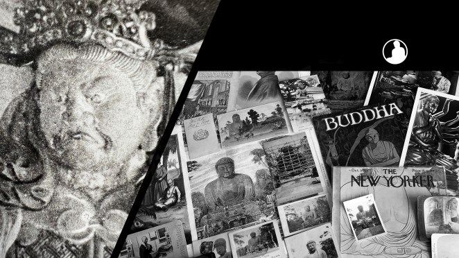
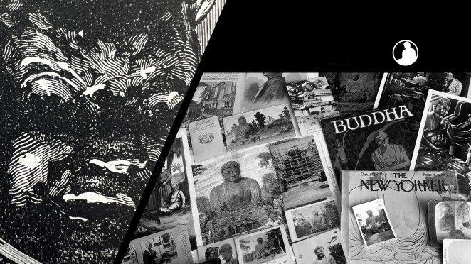
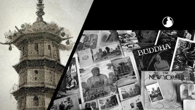
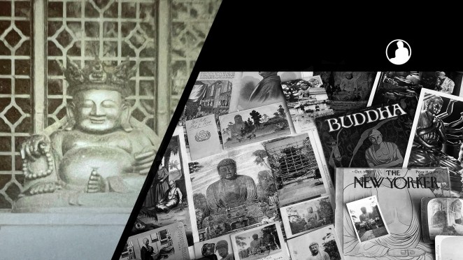
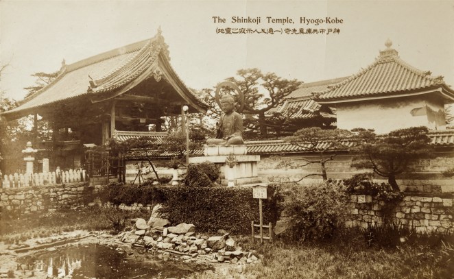
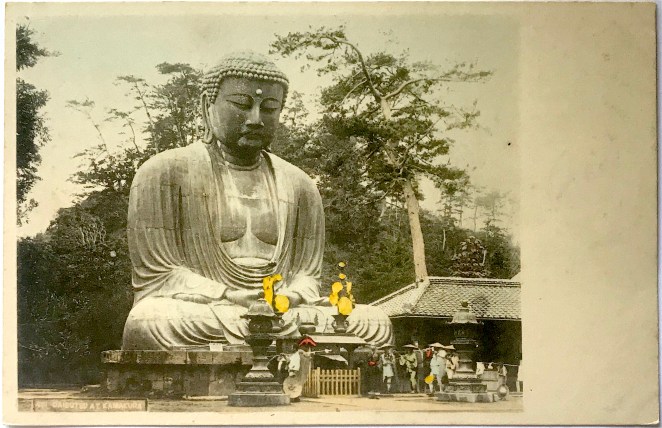
Nōfuku-ji, a Buddhist temple in the port city of Kobe, Japan, was reportedly founded by the monk Saichō in 805. A thousand years later, the colossal Hyōgo Daibutsu was built on temple grounds in 1891, but the statue did not survive beyond World War II.
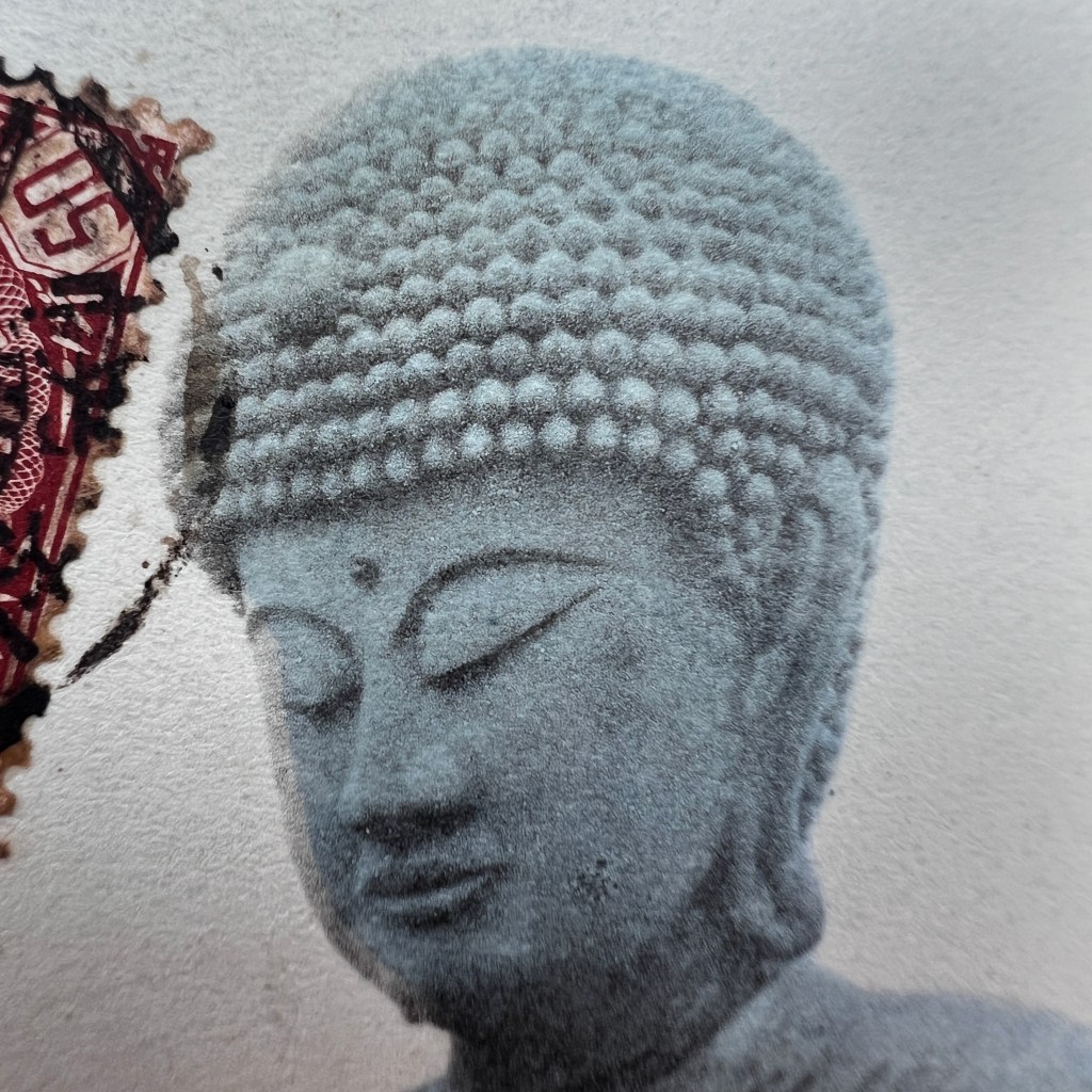
Commissioned by a local paper merchant, the bronze icon stood just under 15 meters (48 ft.) in height, but remained exposed and uncovered by a shrine hall. The Hyōgo Daibutsu represented Vairocana Buddha, the same figure enshrined at Tōdai-ji, in the ancient capital of Nara.
Guidebooks in the early 20th century refer to Nōfuku-ji as a worthy tourist destination when traveling through Kobe. Equally, Japanese postcard companies often used imagery of the Hyōgo Daibutsu; here we see a card made by Ueda Photo, one of the largest publishers during the late Meiji era.
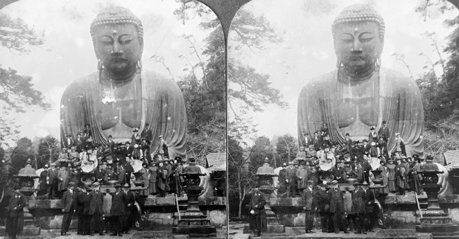
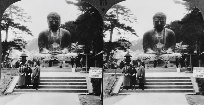
Like the Kamakura Daibutsu, the outdoor setting allowed visitors an easy opportunity to have photographs taken in front of the colossal statue.
The statue was dismantled under the Ordinance on the Collection of Metals issued as part of Japanese war efforts during WWII. In 1991, one hundred years after the original was complete, a new Hyōgo Daibutsu was consecrated and remains today at Nōfuku-ji.
The Buddhas in the West Material Archive is a digital scholarship project that catalogues artifacts depicting Buddhist material culture for Western audiences. It’s comprised of prints, photos, and an assortment of ephemera and other objects. For a brief introduction to this archive, visit the main Buddhas in the West project page.
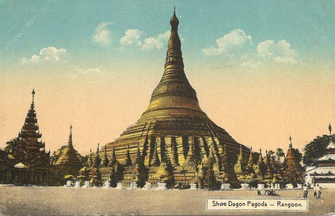
For Related Buddhas in the West Posts Featuring the Hyōgo Daibutsu:
Collecting postcards became a national craze in Japan in the first decade of the twentieth century – and caused at least one riot. Yokohama, home to many of the oldest and most important Japanese tourist photography studios, became a major center of postcard production and the Ueda Photographic Prints Corporation 上田写真版合資会社, founded by Ueda Yoshizō上田義三 in the famed city port, was one of a handful of premier Japanese picture postcard publishers. Ueda’s early sets of cards included photographs of the Kamakura Daibutsu, but they and their business rivals continued to produce new views of this ancient colossus.
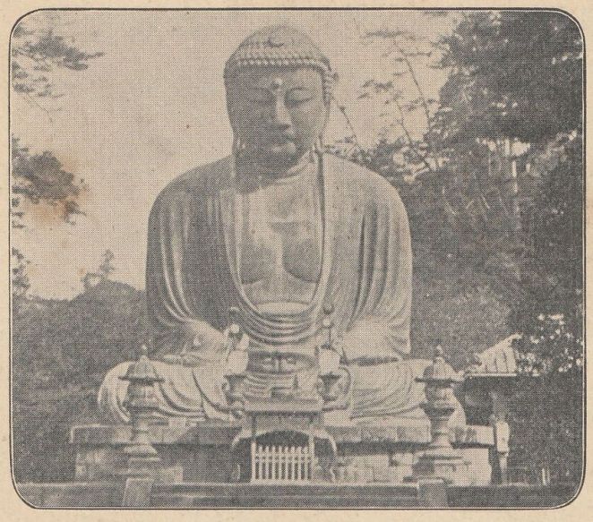
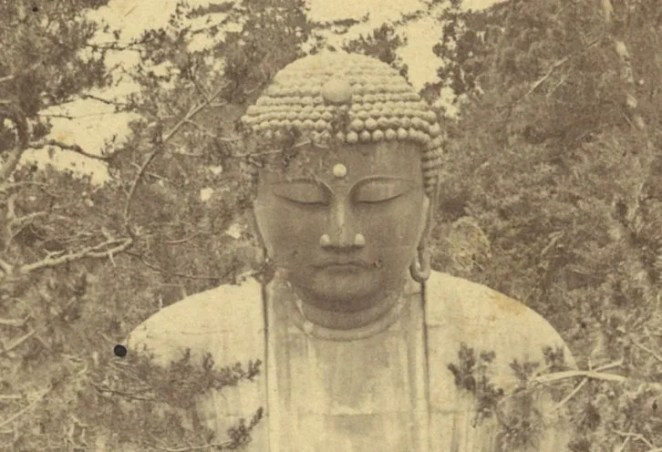
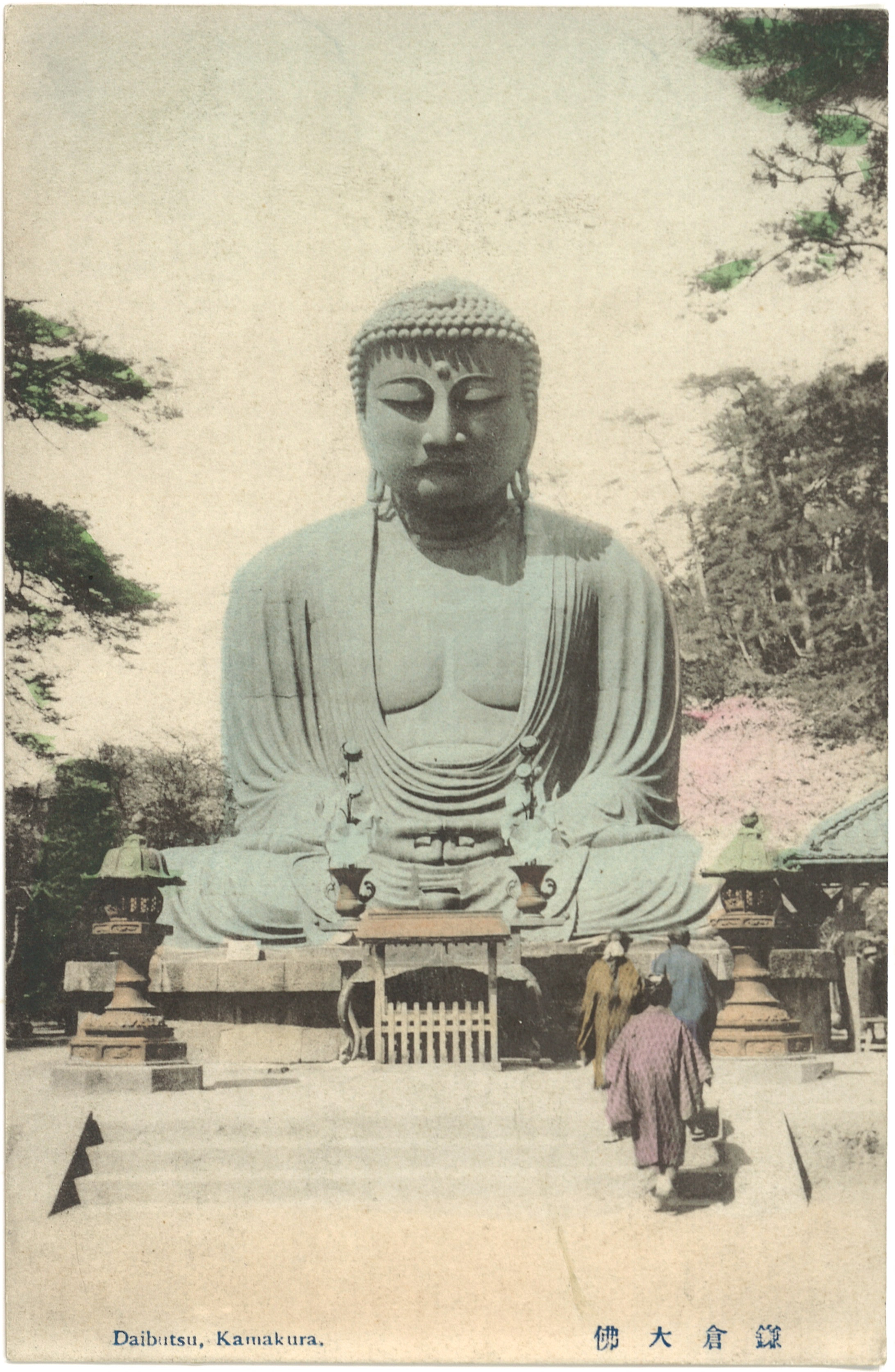
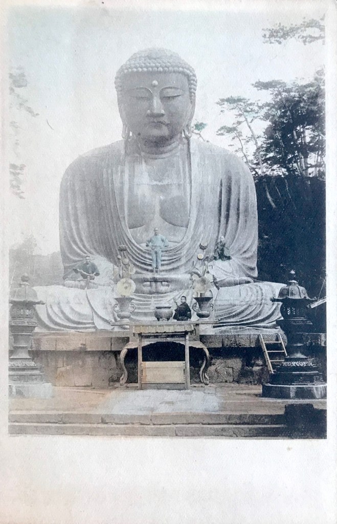
Professional and amateur photographs had long shot the Daibutsu frontally from long and medium distances. A few took photographs from the southwest corner, or even from behind, but images of the Daibutsu from the southeast were uncommon (although not unknown) likely because the temple landscaping did not easily allow for a person to position himself. The grounds of Kōtoku-in 高徳院, the temple where the Daibutsu resides, had continuously undergone renovations since Western tourists discovered it in the 1860’s, slowly opening up the areas around the statue and providing better “picturesque” viewing. One unknown photographer from Ueda was able to take a position in the southeast corner and take a photograph [Figure 1] – one of the very few from this angle.
Figure 1
Title/Caption: Daibutsu, Kamakura. 佛大倉鎌
Year: c. 1912 [postally unused]
Publisher: Ueda Photographic Prints Corp. 上田写真版合資会社
Medium: collotype print on cardstock
Dimensions: 5.5 in X 3.5 in
Reverse Imprint: Carte postale – Postkarte – Post Card [Type 5], Made in Japan, 郵便はかき
This postcard image is also one of the few photographs that does not incorporate any people in its composition, a technique which typically assisted the viewer in gauging and appreciating the sheer size of the statue. Only the most astute observer would note that the photograph is not devoid of all beings – there is a dog resting at the stone base of the statue [Figure 2]. The dog’s distinctive head patterning and white body suggests this may be the same dog photographed in two olderstereoview cards, who is seen mingling with temple visitors and tourists. Serene and relaxed, both the Daibutsu and dog appear to be enjoying the relative quiet of the scene.
Figure 2
The Ueda crest on the reverse along with the distinctive multilingual printing clearly reveals this card to be part of the Ueda Corp. stock published after 1907, possibly around 1912. It is difficult to determine when the photograph was taken, but the presence of the dog suggests it was taken sometime after the first few years of the turn of the century, when the stereoviews were taken. While this is one among a dozen or more Japanese picture postcards produced of the Daibutsu before 1923 (when the Kantō earthquake destabilized the Japanese postcard industry), it remains one of the most unique.
*This is part of a series of posts devoted to exploring the development of a visual literacy for Buddhist imagery in America. All items (except otherwise noted) are part of my personal collection of Buddhist-themed ephemera.
Additional Posts in Visual Literacy of Buddhism Series
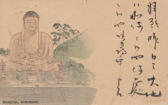
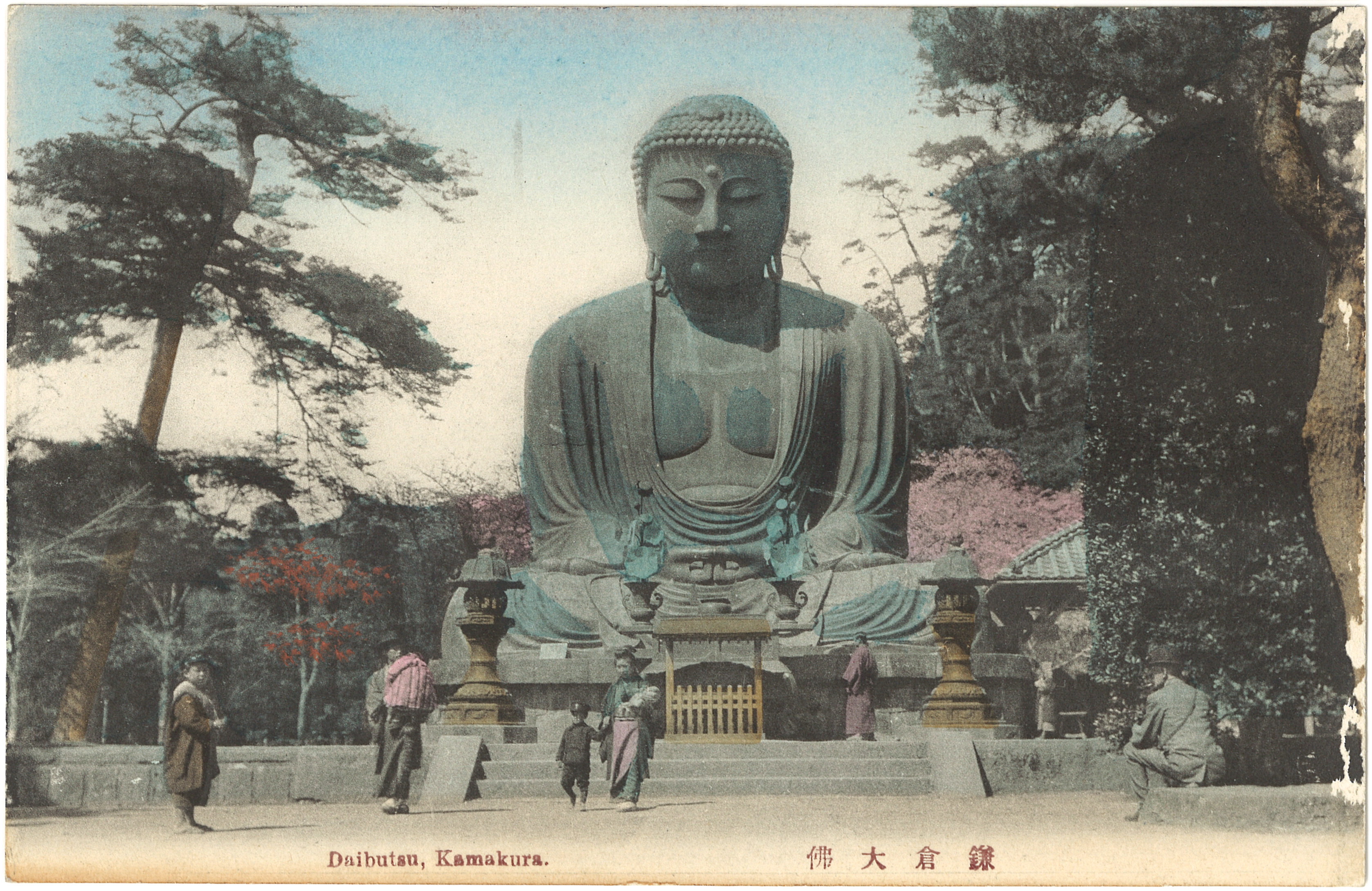
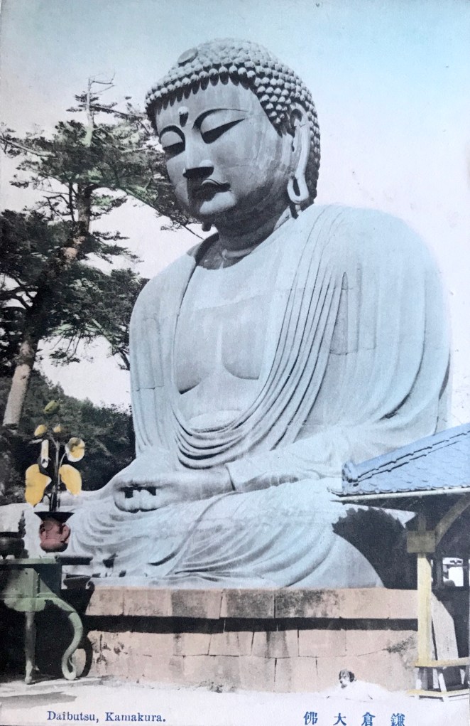
In early 1904, Japan formally declared war on Russia after nearly a decade of rising tensions. Military attachés and journalists from around the world traveled to the front with photographers to chronicle the gruesome affair. This use of wartime photography propelled a surge in popularity of Japanese picture postcards (ehagaki絵はかき), resulting in a spike of mass-produced, inexpensive postcards depicting Japan’s military might. The swell in Japanese nationalism and interest in seeing images of a modernized state helped create a Japanese postcard boom in the middle of the first decade of the twentieth century.[1] New private postcard publishing houses, such as Ueda Photographic Prints Corporation 上田写真版合資会社, Hoshinoya 星野屋, and Tonboya トンボヤ, grew in number as did their inventory of photographic postcards. Consequently, during this period numerous new images of the Kamakura Daibutsu were taken and sold to a ready market of Japanese and foreign travelers [Figure 1].
Figure 1
Title/Caption: Daibutsu, Kamakura. 佛大倉鎌
Year: c. 1907 [postally used 1910]
Publisher: Ueda Photographic Prints Corp. 上田写真版合資会社
The unknown photographer of this postcard image set the camera on the second landing of the paved walkway and framed the Daibutsu frontally and symmetrically, similar to numerous Yokohama port studios and foreign stereo-photographers of earlier years. The standard size ratio of the postcard allowed for a slightly larger panoramic sweep than that of older albumen prints, thus more of the foliage surrounding the site is visible. The mise-en-scène is natural and casual, unlike the highly choreographed images of piety taken by HerbertPonting around the same period. The viewers eyes are eventually drawn to the group of people on the lower left, perhaps a family, that walks away from the Daibutsu. Except for the adolescent boy on the far left dressed in an oversized coat, no one makes eye contact with the photographer. This leaves the viewer with a sense of casual observation, as if seeing the normal daily activities of the temple grounds. The outfits of the family suggest a bricolage of cultures, as traditional flowing (and brightly colored) Japanese garments are mixed with Western attire, including a narrow brimmed hat worn by the older man and military school outfits (gakuran 学ラン) worn by the young boys (officially adopted in Japan in the 1880’s[2]). Another man sits on the far right, also wearing a brimmed hat, trousers, and vented jacket. To a Japanese viewer, these sartorial elements would be clear indications of a modern, militaristic, and “Westernized” Japan. Reading deeper, the lone kimono-wearing figure in the rear, closest to the Daibutsu, might symbolize the traditional and religious past being left behind by the more progressive present.
This collotype print on card stock was hand tinted with water color, but unlike the more conservative hues of older albumen prints sold at established port photography studios, postcards more frequently have a splash of bright color, especially the warm vibrant hues of orange, scarlet, and pink. The early colorists of Daibutsu postcards often included a patch of pink behind the statue, suggesting spring cherry blossoms, even though this was not the tradition of older Yokohama studios and – as far as I can discern – not botanically accurate [although this image may suggest otherwise].
In addition to this card, a vertical format of a similarly dated Daibutsu picture postcard [Figure 2] shows the same patch of tree foliage to the right of the Daibutsu also painted in cherry blossom pink.[3] Images such as these may function as the origins of the painting tradition for Daibutsu postcards which continued for several decades, effectively ending when color photography was introduced. More curiously, in the horizontal image above, the colorist also included a red-leaved maple tree (just above the man in the short-brimmed hat), inaccurately suggesting that spring cherry blossoms and red autumn foliage appear in the same season! Of course, these decisions were not motivated by a fidelity to reality, but by a consumer market with idealized visions of a bright and polychromatic Japanese landscape.
Figure 2
Title/Caption: Daibutsu, Kamakura. 佛大倉鎌
Year: c. 1907 [postally unused]
Publisher: Ueda Photographic Prints Corp. 上田写真版合資会社
These two postcards were not only sold by the same publisher (the printing on the reverse is identical on both), but clues in these photographs suggest they were taken at the same time. Most tellingly, the shadows are sharp, indicating a clear afternoon, and fall across the face and shoulders of the Daibutsu in precisely the same way, indicating they was taken on the same exact time of day.[4]
For both the horizontally and vertically formatted postcards, the photographic image bleeds to the edges, except on the bottom where an unprinted border leaves space for a caption, here both in English and Japanese. Identifying the location of the site, the cerulean colored letterpress is simple and succinct: “Daibutsu, Kamakura,” (or “Kamakura Daibutsu” 鎌倉大佛 in Japanese).[5] Unlike older postcards, no blank space needed to be reserved on the front of the card because new postal regulations allowed correspondence to be written on the back in addition to the recipient’s name and address. The evidence for this change is the narrow umber (or orange-cinnamon) colored dividing line separating the message from the address space on the reverse.[6] The new regulations for “divided back” postcards were passed in March 1907, but took effect in October of the same year, thus providing a terminus post quem of 1907 for both cards above.
The reverse of these cards also clearly indicates the intended international audience for this expanding postal medium. “Postkarte” (postcard) is written in German along the long edge, followed by French, Italian, and Russian translations, as well as Japanese (yūbin hakaki 郵便はかき [sic]) along the short edge. Unfortunately, as is common for older cards, the reverse sides do not provide information pertaining to the publisher. I feel there is solid evidence, however, to believe these were published by the Ueda Photographic Prints Corporation, founded by Ueda Yoshizō上田義三 in the bustling port of Yokohama. This company was known for its prolific production of early Japanese postcards.[7] If we examine other similar hand colored collotype postcards with cerulean captions and umber printing on the reverse – hereafter I refer to this scheme as the Ueda “cerulean-umber” design – we find a clear relationship between our cards and later cards imprinted with the Udea Corp. trademark. If we examine another horizontal postcard [Figure 3] with the same image (even with the same coloring, down to the red spot on the child’s pink jacket), we can observe the printing on the reverse is different, suggesting it comes from a different print run.
Figure 3
Title/Caption: Daibutsu, Kamakura. 佛大倉鎌
Year: c. 1910 [postally unused]
Publisher: Ueda Photographic Prints Corp. 上田写真版合資会社
Medium: collotype print on cardstock, hand tinted
Dimensions: 5.5 in X 3.5 in
Reverse Imprint: Carte postale – Postkarte – Post Card [Type 3], MADE IN JAPAN, 郵便はかき
Within a short period between 1907 and 1912, the design on the reverse of Ueda postcards changes several times [Figure 4], following a discernable progression, until the dividing line was capped by a heavily stylized Ueda crest in the last phase [Figure 5].[8] Please consult my working notes for an outline of these chronological changes.
Figure 4:
Title/Caption: Daibutsu, Kamakura. 佛大倉鎌
Year: c. 1912 [postally unused]
Publisher: Ueda Photographic Prints Corp. 上田写真版合資会社
Medium: collotype print on cardstock, hand tinted
Dimensions: 5.5 in X 3.5 in
Reverse Imprint: Carte postale – Postkarte – Post Card [Type 5], MADE IN JAPAN, 郵便はかき
Figure 5: The Ueda Photographic Prints Corp. trademark/crest.
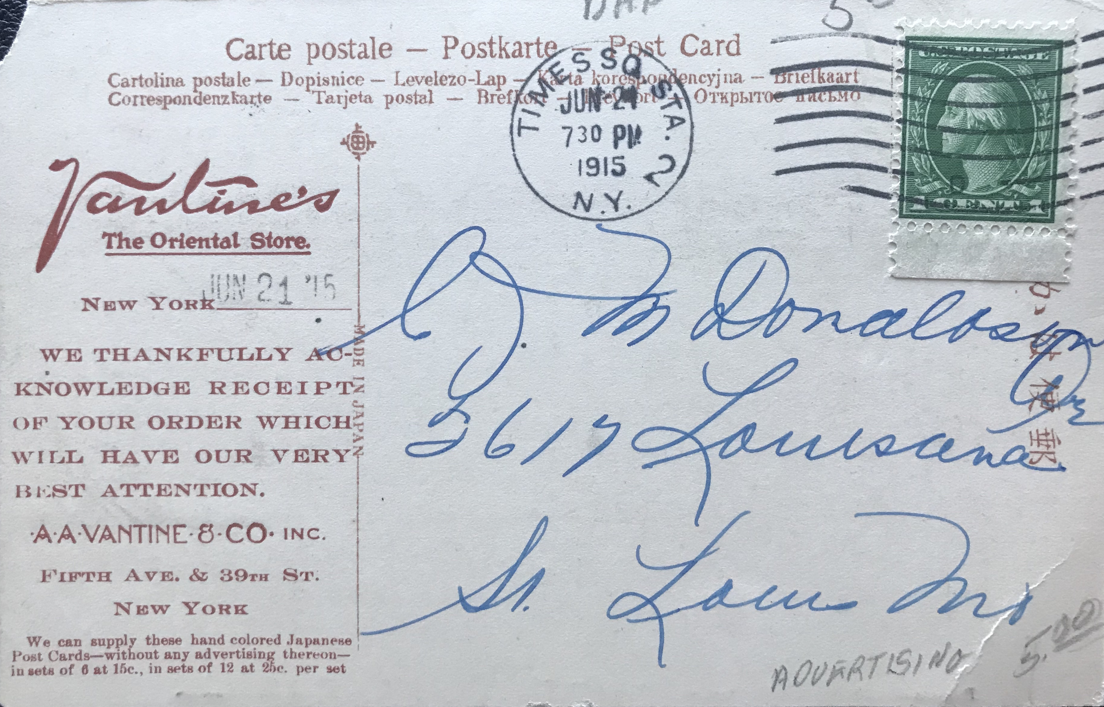
These Ueda Corp. postcards were domestically produced (later editions cearly say “Made in Japan”), but had a worldwide circulation. The cards were not only purchased as inexpensive souvenirs or mailed to lucky recipients around the world, the premier commercial importer of Asian goods into America, A.A. Vantine & Co., also sold Ueda postcards at its flagship store in New York City and through it’s widely distributed mail order catalogue. Coincidentally, Vantine’s heavily illustrated 1914 catalogue [Figure 5] highlights the horizontal Daibutsu postcard along with pictures of geisha and pagoda, all well-worn visual motifs of the exotic Orient. Affordably priced, Vantine’s sold a dozen of these Ueda published postcards for 25 cents. The copy of Vantine’s catalogue three years later [Figure 6] informs its prospective buyers about the value of these inexpensive items: “To one interested in ‘things Japanese,” or as a gift to a friend making a collection, nothing is more appropriate than a set of Japanese souvenir postcards.” [10]
Figures 5 (left) & Figure 6 (right) [not part of Archive]
Figure 7
In addition, Vantine’s used Ueda postcards to confirm orders placed by customers [Figure 7], thus diffusing the idealized imagery of Japan, and notably that of the Kamakura colossus, to people who never left the confines of their living rooms. From this vantage point, a postcard of the Daibutsu was no longer a momento of a trip, but one verification among many of the cultural difference and strange Otherness of the Orient.
Notes:
*This is part of a series of posts devoted to exploring the development of a visual literacy for Buddhist imagery in America. All items (except otherwise noted) are part of my personal collection of Buddhist-themed ephemera.**This post is in honor of Josh Harris, thanks for all the postcards!
[3] Uncolored versions of this vertical format postcard also exist [in Archive].
[4] This is in addition to the era clues supplied by the fenced and gable-roofed coin donation box and small placard by the right leg of the statue. These environmental elements can be confidently dated, minimally, to between 1896 and 1905, but may extend a few years beyond this range. While the printed postcard must postdate October 1907 (see below) the photograph may have been taken several years earlier, although I would assign it to a time between 1904 and 1907.
[5] It is difficult to tell if a caption is printed or letterpress, but on some samples there is slight embossing of the letters on the back – a telltale sign of letterpress printing. Visually, some postcards will have slight soiling where the caption pushes through on the reverse.
[8] The Ueda Co. crest/trademark is comprised of the two characters of the Ueda family name: ue 上 repeated rotationally four times around da 田. Is should be remembered that earlier printed cards could remain unsold for several years before being purchased or mailed. It is worth noting that both the horizontal and vertical format card [in the Archive] depicted above were also produced in black and white.
[9] The U.S. Stamp Act of 1894 required the country of origin to be printed on all foreign imports to the US, but this stipulation was not fastidiously practiced. In addition, this act was amended in 1919 so the words, “Made in,” be included on all imports, but clearly this practices was already established before 1919.
Itō Izumi 伊藤泉美. 2001. “Tsuioku no Yokohama e hagaki ni miru 100-nen mae hitobito to fūkei 追憶の横浜繪葉書にみる100年前人びとと風景,” Kaikō no hiroba 開港のひろば, No. 71, p. 1.
Saitō Takio 斎藤多喜夫. 1985. “Yomigaeru shinsaizen no Yokohama fūkei よみがえる震災前の横浜風景,” Kaikō no hiroba 開港のひろば, No. 12, pp. 1, 4.
Yokohama Archives of History 横浜開港資料館, ed. 1999. Nen mae no Yokohama Kanagawa ― ehagaki de miru fūkei 年前の横浜・神奈川―絵葉書でみる風景. Tokyo: Yurindo 有隣堂.
Additional Posts in Visual Literacy of Buddhism Series