The Eight Postcard Views of Kamakura

Collage.png

The September 1, 1923 Great Kantō Earthquake changed Japan. Striking at just before noon, the 7.9 magnitude earthquake razed the capital of Tokyo and the port of Yokohama and caused severe destruction around the entire Kantō region. The resulting fire and tsunami triggered by the earthquake claimed many more casualties. The resulting reconstruction efforts, involving the rebuilding of homes, government buildings, factories, shops, roads, canals, and bridges was a monumental effort. After seven years of toil, the rebirth of the capital and the symbolic renewal of Japan was marked by a week-long series of celebratory events held in March 1930.

Among the many structures decimated by the disaster also included historic temples and shrines, several of which were in Kamakura, part of what is now considered the Greater Tokyo Area. The ancient capital of Kamakura, after which the Kamakura Period (1185-1333) is named, was the home to the shogunate (bakufu 幕府, “tent government”), a hereditary military dictatorship that ruled over Japan and which granted only nominal authority to the imperial court. While the institution of the shogunate persisted until 1867, the capital was moved at the end of the Kamakura period back to the cultural center of Kyoto. After centuries of gradual decline, significant domestic and international interest was thrust back on to Kamakura in the Meiji period (1868-1912), when its proximity to the newly created international port of Yokohama increased its exposure to travelers and businesses.

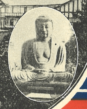
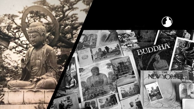
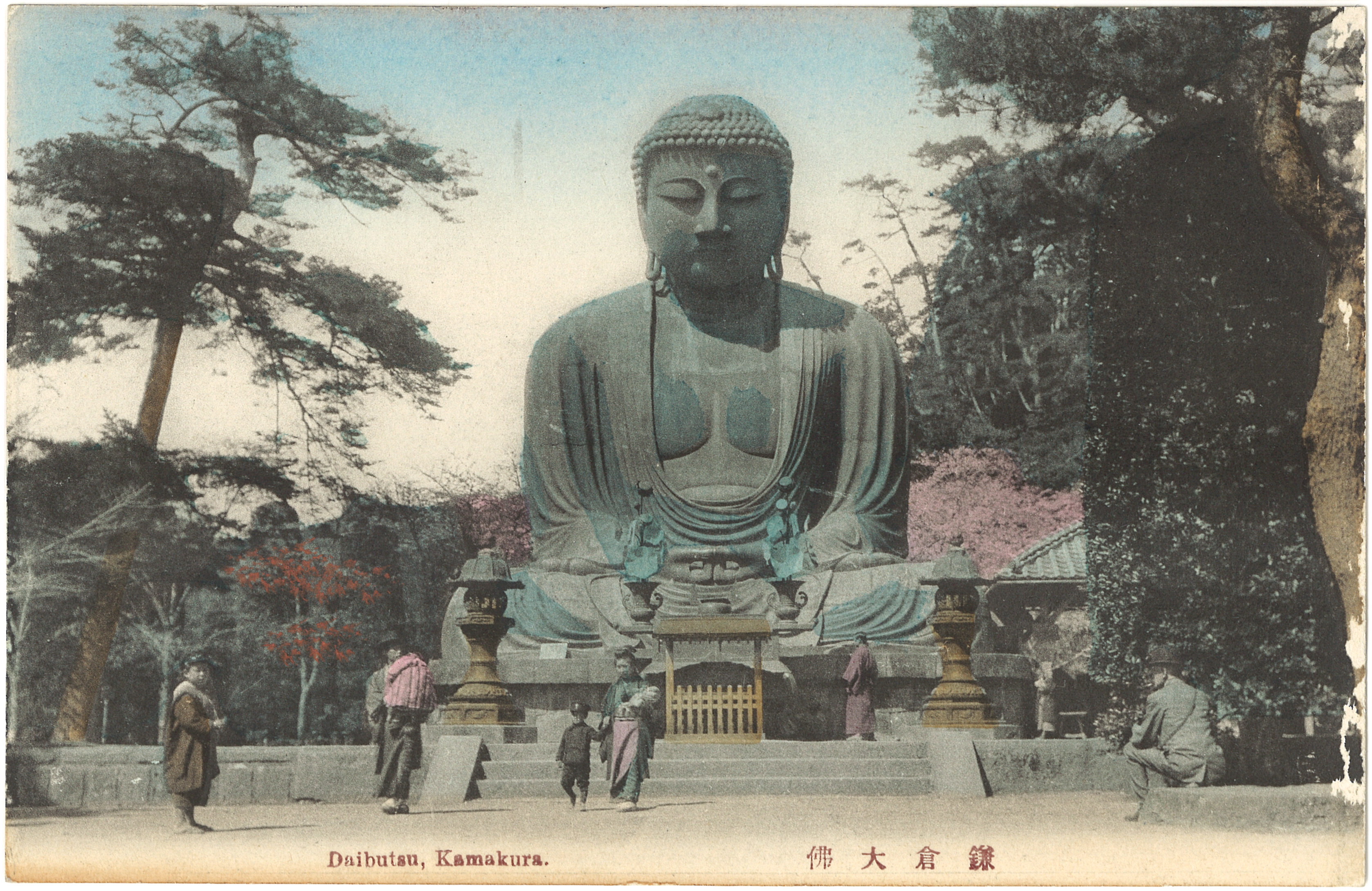
When the 1923 earthquake hit the region, one of the early storylines that spread through American newspapers concerned the survival of the Kamakura Daibutsu, a destination known worldwide among globetrotting tourists. While the 93 metric tonne bronze statue had shifted 30 centimeters forward, warping its back and neck, it survived relatively unharmed. Because of the shift in weight, a portion of the stone pedestal was pushed into the ground. The pedestal itself, however, received extensive structural damage requiring significant repair, which occurred early in 1925.

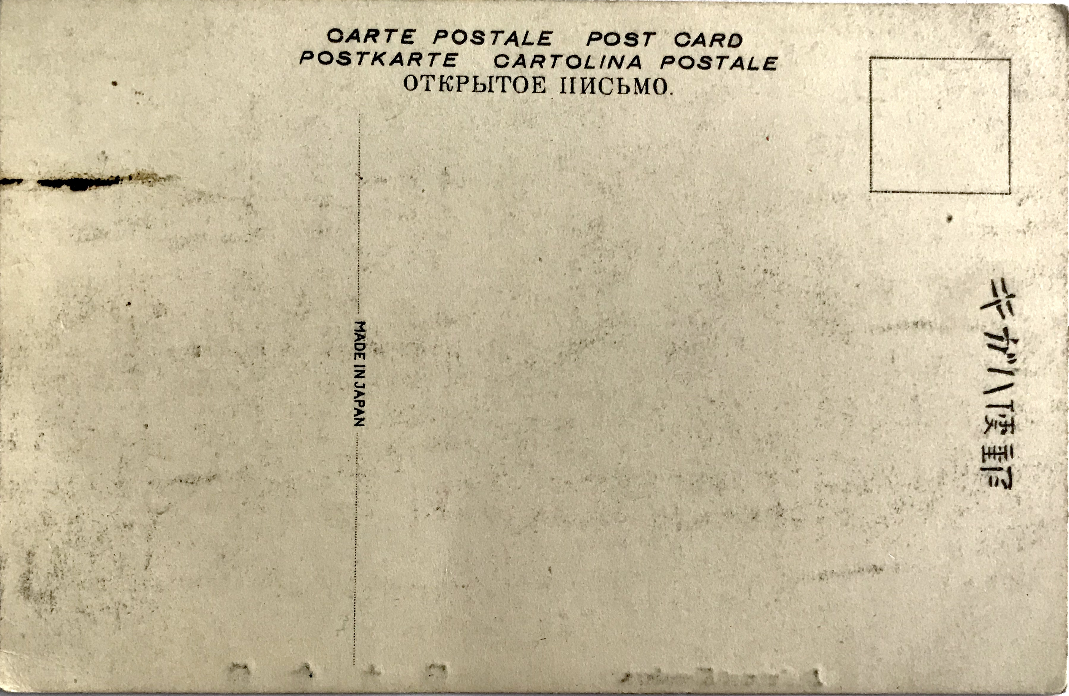
Sometime after the 1923 earthquake, an unknown publisher issued a set of eight postcards memorializing the scenic views of Kamakura. Thematic sets of postcards had long been manufactured by Japanese publishers, both by private printers and the government. When the government first printed its own picture postcards (ehagaki 絵葉書) in 1902 (private companies were allowed two years earlier), it issued a set of six cards commemorating the Japanese–Korea Treaty of Amity (Nitchō-shūkōjōki 日朝修好条規). Regardless of this precedent for publishing a set of six cards, issuing a set of eight cards soon became standard for postcard publishers.

Why issue a set of eight cards? On theory traces the origin to the artistic preferences of Song Dynasty China. A set of eight scenic vistas has its historical origins in the brush paintings of Chinese artist and government bureaucrat Song Di 宋迪 (c. 1067 – c. 1080) who is attributed with created the visual genre of the Eight Views of the Xiao and Xiang Rivers (Xiāoxiāng Bājǐng瀟湘八景)[Song Di’s paintings are now lost]. The notion that a set of “eight scenic vistas” or “eight views” (hakkei 八景) constituted a complete and integrated set made its way into Japan by the fourteenth-century. This motivated Japanese artisans and poets to find their own groupings of “famous sites” (meisho 名所) and by the Edo period (1615-1868) each province claimed to have its own set of eight special vistas.[1] For example, Kanazawa 金沢 in Sagami Province, in which Kamakura also resides, became among the most famous sets of eight views in Japan, which was visually represented by woodblock artists such as Utagawa Hiroshige 歌川広重 (1797-1858). Perhaps surprisingly, given Kamakura’s historical importance as a national capital, a specific set of eight views was never expressed among pre-Meiji poets, artists, and woodblock printers.[2]

Given the precedence of the literary and artistic value of the eight scenic vistas genre, one could conclude postcard publishers were naturally filling in the gaps of history when they issued sets of eight postcards depicting famous locations around Kamakura. Kanji Satō suggests this would be premature, as it overlooks the particular means of postcard manufacturing. The photomechanical process of printing late Meiji postcards was dominated by the collotype press, which used relatively large sheets of paper that were later cut into individual cards. Each of these sheets accommodated eight individual postcards, thus sets were most efficiently designed in groupings of eight cards, totaling 8, 16, 24, or 32 cards per set. Thus the relationship to the historical groupings of eight scenic vistas portrayed as a “complete” set is most likely coincidental, although it dovetails nicely into traditional Japanese arts.

Figure 1 [Set 1] & Figure 2 [Set 2]Figure 1.JPG

Figure 2.JPGSometime in the 1920s sets of picture postcards were more frequently issued in a paper sleeve or cover. These sleeves were initially imprinted with text or simple designs, but due to the highly competitive commercial market these utilitarian items became subject to the same visual expectations as the postcards themselves. The examples before us bear a hand-colored photographic image, which is given the same artistic care as the cards they hold [Fig. 1 & Fig. 2]. In addition to the minor and idiosyncratic coloring differences, each set uses a slightly different letterpress design. Set 2 also appears to be influenced by an Art Deco font style.

Figure 3 & Figure 4

Figure 3
Figure 4

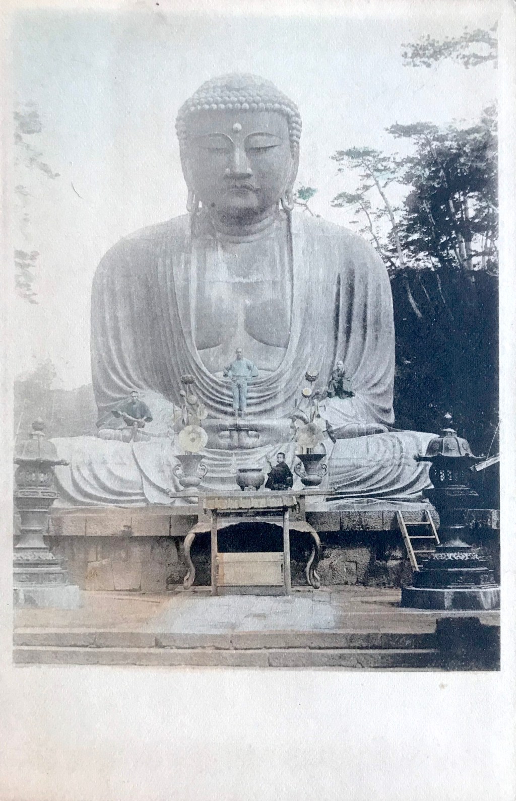
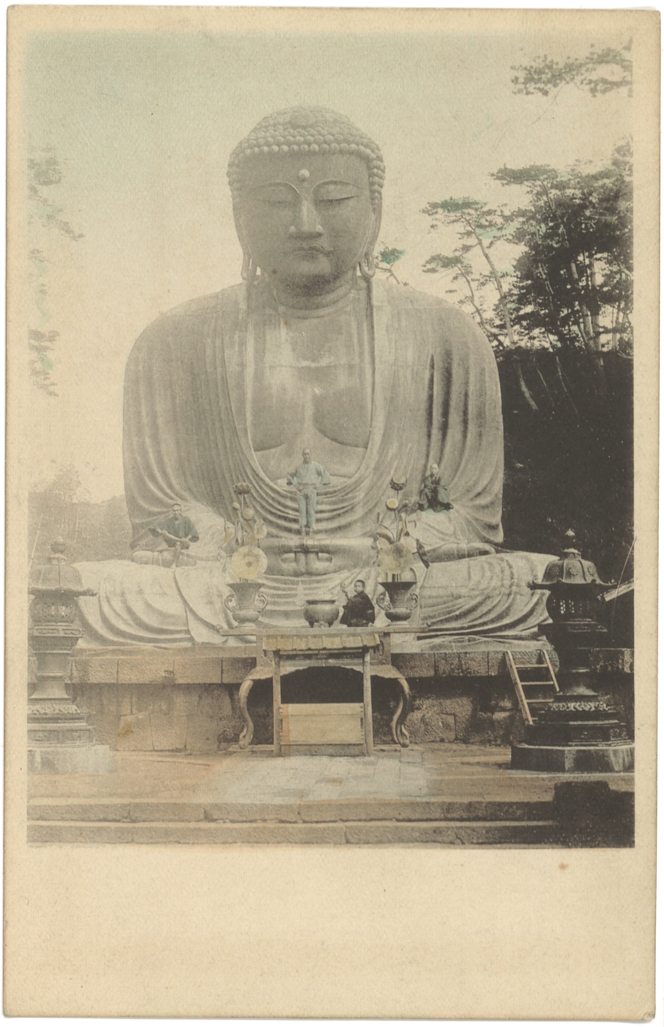
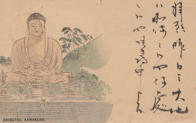
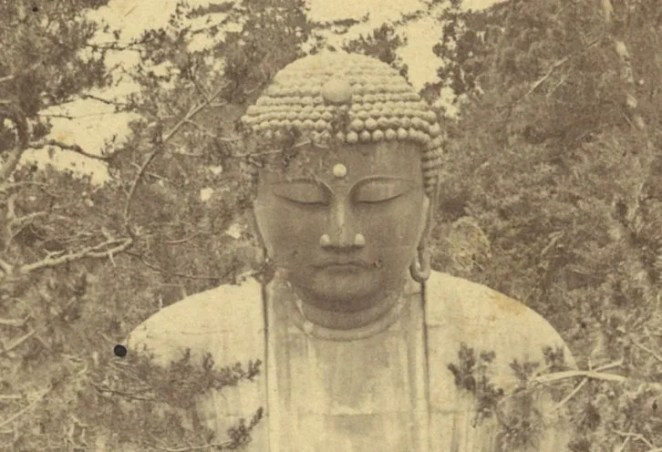
The sleeve image of the Daibutsu matches the photograph of the Daibutsu on the interior postcard, save for the bokashi-style color wash of the sky. Both sleeves show a pink-hued twilight coloring of the sky while the cards are tinted with a daylight blue [Fig. 3 & Fig. 4]. The fact that these selves and cards are hand-colored is partly surprising. In the early part of the twentieth century many monochromatic photographic postcards were hand-tinted. In the early part of the Taishō period (1912-1926), however, a multi-color collotype printing process was developed, presenting a new option for publishers to speed up their production process. Some publishers took advantage of this technology and multi-color printed cards existed side-by-side with hand-tinted cards into the early 1920s. After the 1923 earthquake, however, almost all publishers adopted this new printing technology when they re-opened their businesses. Since these two sets of cards were issued post-1923 (see below), the fact that our unknown publisher was employing hand-coloring was an added selling point – justifiably noted on the sleeve.

Figure 5

Figure 5

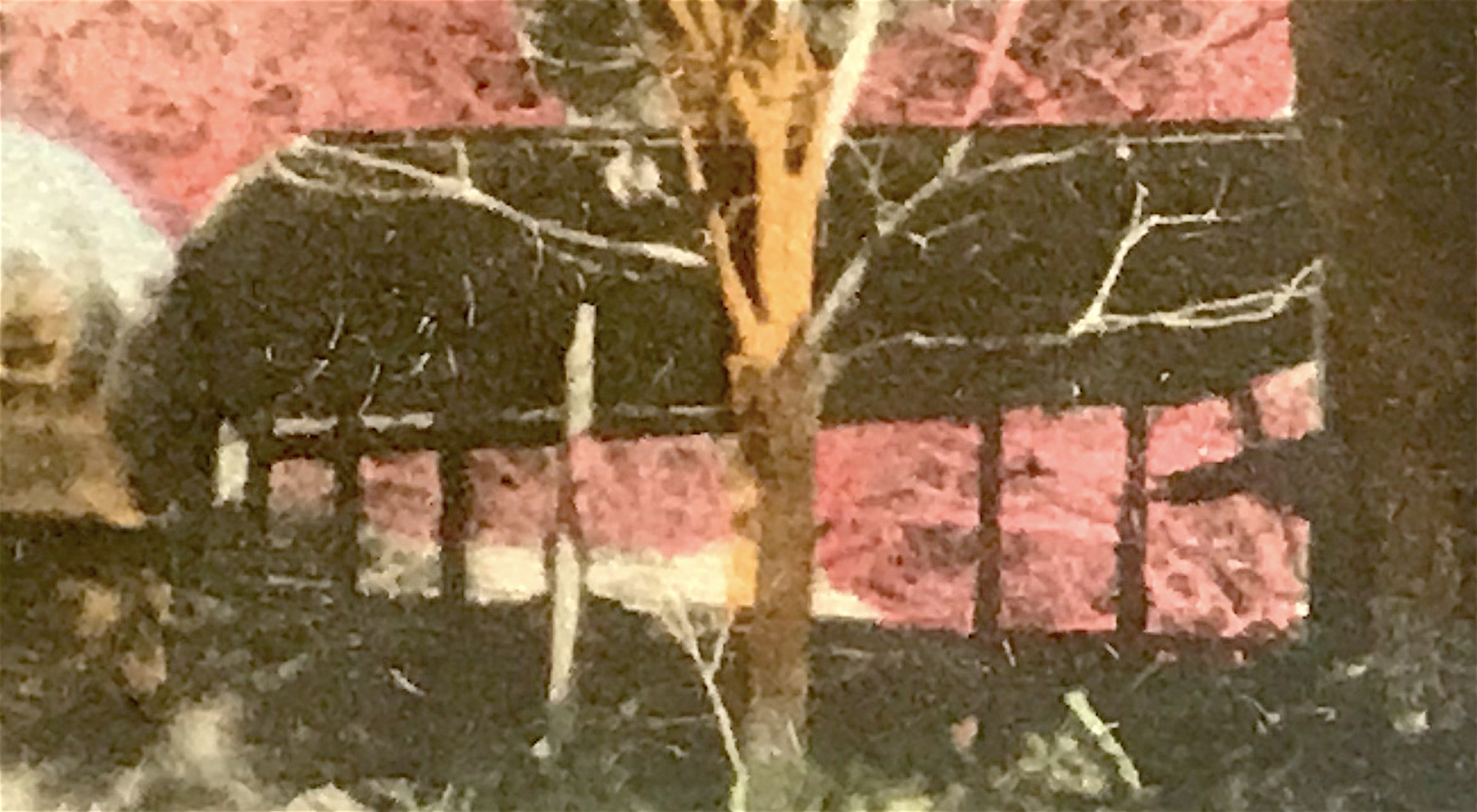
Figure 6 [sleeve] & Figure 7 [postcard]

Figure 6
Figure 7.JPG

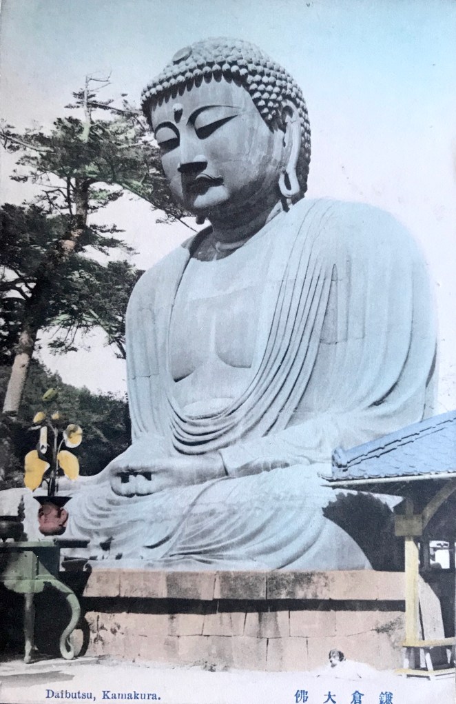
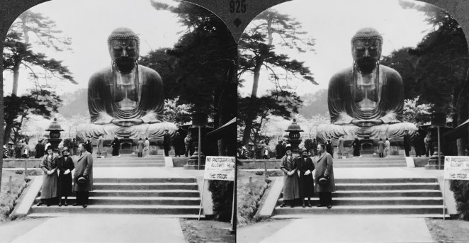
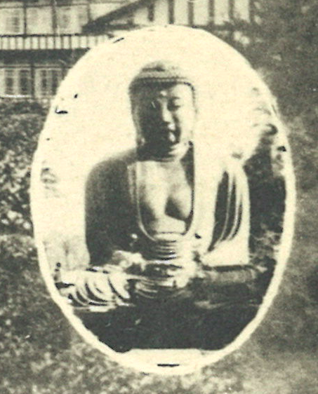
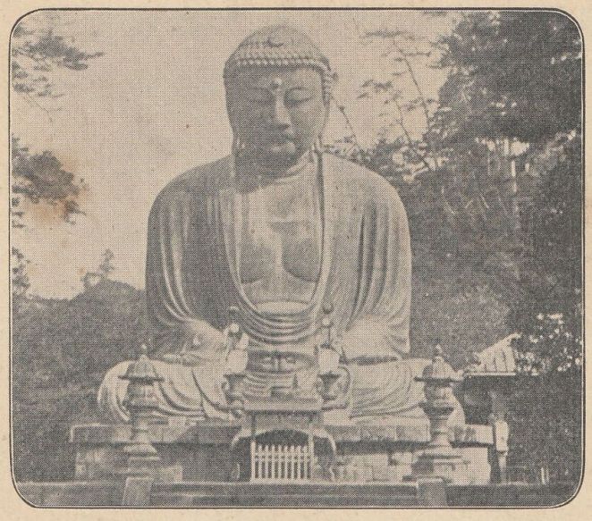
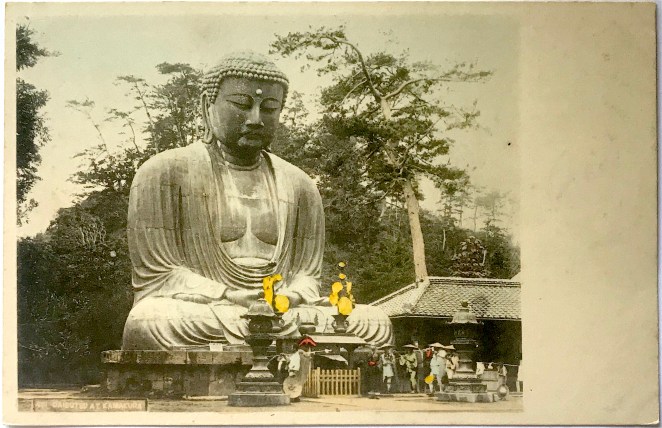
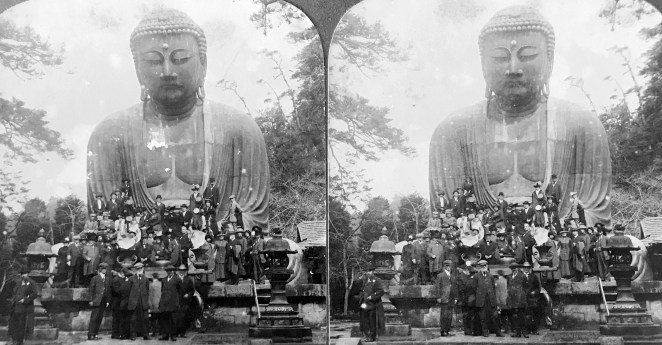
The photograph of the Daibutsu appears staged, as all of the onlookers face squarely towards the colossal statue with legs drawn together and arms at their sides. Upon close inspection, we also see very subtle signs of the 1923 earthquake that ravaged the Kantō region. The lanterns, for example, are shortened from their usual height, signs they needed to be pieced back together and re-erected. Additionally, the items normally arranged atop the offering table are now missing [Figs. 3 &4]. More significantly, the structure to the right of the Daibutsu appears slipshod, a significant difference from the ornate hipped roof building that stood in that same location for three decades [Fig. 5]. Moreover, in a detail that is only visible on the cover sleeves, wooden supports hold up the base of the pedestal, a clear indication of the damages rendered in 1923 [Fig. 6]. An artist carefully painted over the wooden supports for the postcard image, creating a new brick façade to complete the deception [Fig. 7]. The most evident sign of damage is the toppled tree that breaks into the foreground view from the left side [Figs. 3 &4].

Most likely, this photograph represents a period after the terrible destruction caused by the earthquake and after the initial clean-up of the temple grounds. Indeed, enough time has passed so the structure on the right could have been constructed. Yet, the ample work reported in refinishing the pedestal appears to have not yet been executed. Furthermore, in other photographs from April 1925 after the repairs, not only are the wooden supports removed, but the lanterns have been reconstructed fully and moved to the second landing. These details all suggest this photograph of the Daibutsu was taken after the Great Kantō earthquake on September 1, 1923, but before the repairs were finished in early 1925.

Figure 8 [Set 1] & Figure 9 [Set 2]

Figure 8
Figure 9

I suspect that Set 1 was printed in the mid-to-late 1920s. Regrettably, I have not yet been able to match the trademark of a drum (in the stamp box, see Fig. 8) to any known publisher. While Set 2 contains photographs of the same locations, only four of the eight photographs have been copied directly from Set 1. The other four cards offer different vantage points of those locations. Most importantly, the caption (in Japanese only) of the image of the bell tower at Kenchō-ji Temple in Set 2 distinguishes the bell as a National Treasure (kokuhō 國寶)[Fig. 23], a designation it received only on November 14, 1933, thus establishing a firm terminus post quem for this set. I would estimate that Set 2, also issued under an unknown publisher (although I’ve suspected Hoshinoya in the past), was printed in the mid-1930s. I remain uncertain if the same publisher issued both sets.

Below I offer brief historical commentary on the remaining seven views from both sets. The older set, i.e. Set 1, bears simpler captions that are set in blank spaces around the card. The newer set, i.e. Set 2, places the captions along the bottom edge of the cards, as is more traditional. The English in the bilingual caption is sometimes a loose translation of the Japanese, thus I provide a more literal rendering in square brackets.

Figure 10 & Figure 11

Figure 10
Figure 11
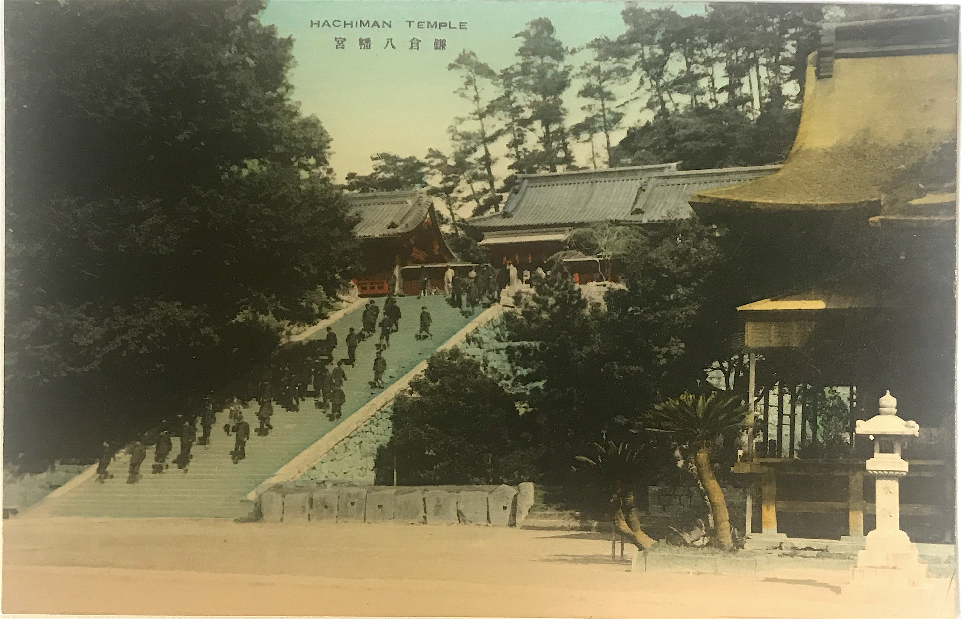
  • Set 1 caption: Hachiman Temple 鎌倉八幡宮 [Hachiman Shrine, Kamakura]
  • Set 2 caption: Hachiman Shrine Kamakura 鎌倉八幡宮 [Hachiman Shrine, Kamakura]

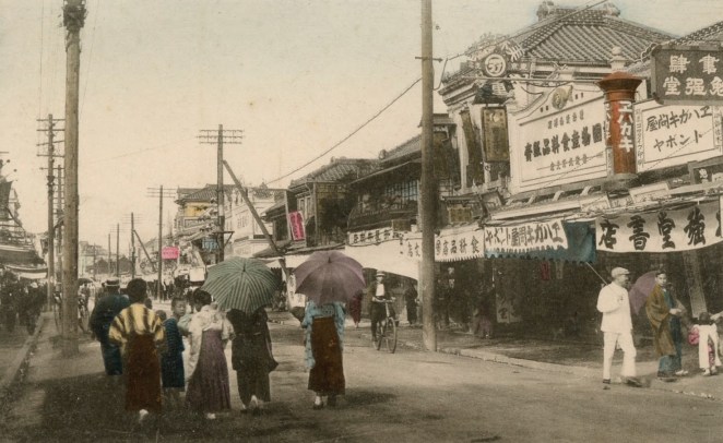
Residing at the geographical center of the city, the unusually long, nearly 2-kilometer long road leading to the Hachiman Shrine entrance traditionally doubled as the main thoroughfare of the city. Originally constructed in 1063, the founder of the Kamakura shogunate, Minamoto no Yoritomo 源頼朝 (1147-99), invited the tutelary kami of warriors, Hachiman 八幡, to reside in a new reconstruction of the shine in order to protect his fledgling government. Due to its relationship with the shogun and important political role, the Hachiman Shrine remains the most historically and culturally important site in Kamakura. Previous to 1868, this site was a shrine-temple complex (jingū-ji 神宮寺), meaning it was used as a place for Buddhist practice and the worship of kami.

Figure 12 & Figure 13

Figure 12
Figure 13
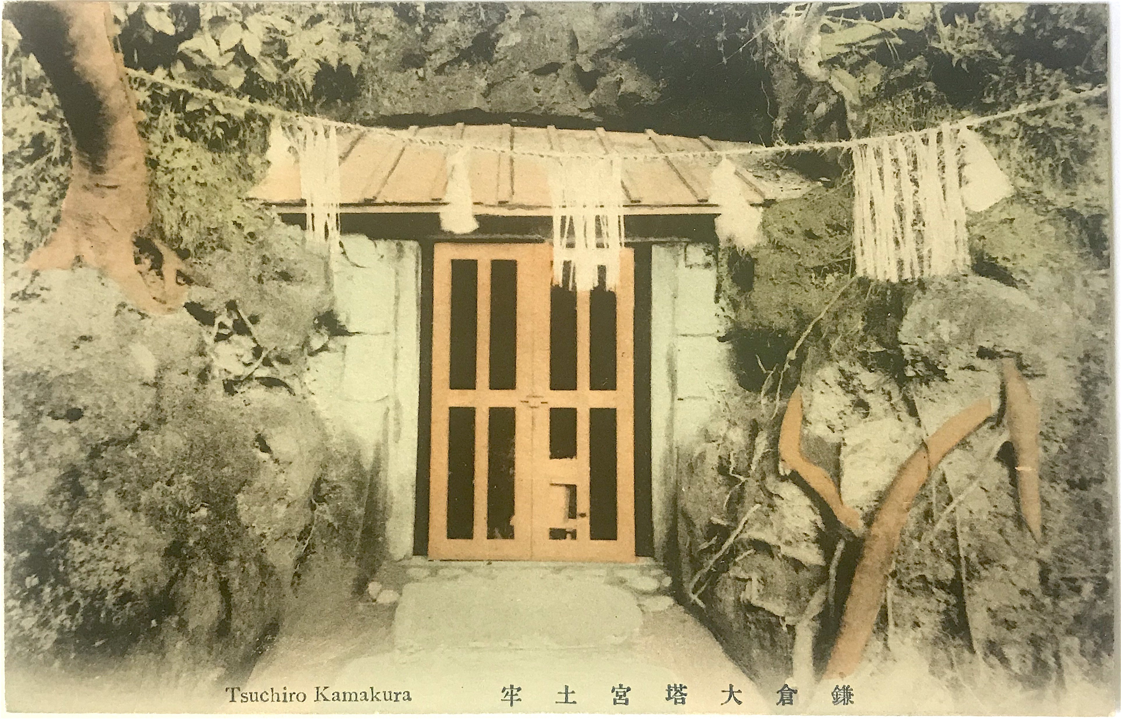
  • Set 1 caption: Tsuchiro Kamakura 鎌倉大塔宮土牢 [“The prison at Ōtōnomiya Shrine, Kamakura”]
  • Set 2 caption: Tsuchiro Kamakura 鎌倉大塔宮土牢 [“The prison at Ōtōnomiya Shrine, Kamakura”]

The Kamakura Shrine was erected by Emperor Meiji in 1869 to honor Prince Moriyoshi 護良親王 (also read Morinaga) (1308-1335) who was imprisoned and killed as an act of political retribution in 1335. Before he actively helped his father lead forces against the shogun, Moriyoshi was a Buddhist monk and previously held the position of head abbot of Enryaku-ji Temple 延暦寺, the prestigious seat of the Tendai school.[3] Moriyoshi’s life and unfortunate death captured the imagination of the Japanese and he was well known even before the creation of the shrine memorializing him. The postcard photograph depicts the cave behind the main shrine hall (haiden 拝殿), which according to tradition is where the prince was held captive for nine months. The alternate name of this site is Ōtōnomiya Shrine 大塔宮, for a pseudonym used by Moriyoshi.

Figure 14 & Figure 15

Figure 14
Figure 15

 Set 1 caption: View of Yenoshima 七里ヶ濱ヨリ江ノ島ヲ望 [Distant View of Enoshima from Shichirigahama]

Set 2 caption: View of Enoshima (Island) near Kamakura 七里ヶ濱ヨリ江ノ島ヲ望ム [Distant View of Enoshima from Shichirigahama]

 Figure 16 & Figure 17

Figure 16
Figure 17
  •  Set 1: View of Yenoshima 江ノ島入口 [The Entrance to Enoshina]
  • Set 2: Entrance of Enoshima (Island) near Kamakura 江ノ島入口棧橋 [The Entrance Bridge to Enoshina]

The famed island of Enoshima is a center of worship to the goddess Benzaiten 弁財天, a figure with origins in India and who entered Japan in the 6th through 8th centuries. As one of her roles, Benzaiten was considered the protector of the nation and thus was favored by military leaders. The founder of the Kamakura shogunate, Minamoto no Yoritomo 源頼朝 (1147-99), took advantage of the proximity of Enoshima to his new capital and mandated the construction of a torii on the island to memorialize his devotion to the goddess. Taking advantage of visitors to the islands, entrepreneurs soon set up a variety of shops, consequently making the excursion even more attractive to travelers. For early Western tourists, the sandy beaches made the island a favorite resort area. Older woodblock prints show that the island was connected to the Shichirigahama beach by a shallow sandbar before the bridge was constructed.

Figure 18 & Figure 19

Figure 18
Figure 19
  • Set 1 caption: Hase Temple 鎌倉長谷寺 [Hasa-dera Temple, Kamakura]
  • Set 2 caption: Hase Temple Kamakura 鎌倉長谷寺 [Hasa-dera Temple, Kamakura]

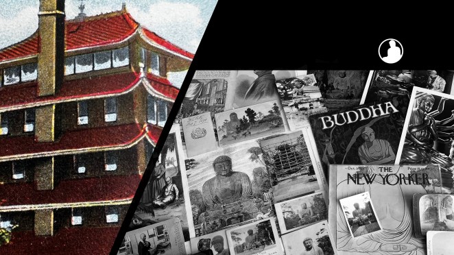
With origins in the 8th century, this temple is best known for housing one of the largest wooden statues in Japan. It is a 9 meter (approx. 30 foot) tall statue of the Buddhist goddess Kannon 觀音. Its purported origins are rather interesting. It is believed an artist named Tokudo 徳道 made two large Kannon statues from a single fragrant camphor tree in 721. One was enshrined in Hase-dera Temple in Nara, while the second was set adrift into the sea. Fifteen years later the wooden statue washed ashore near Kamakura and a temple, also named Hase-dera, was constructed to honor it. Like many religious sites in Kamakura during the Kamakura period, this temple was restored and expanded. Several later postcard sets of Kamakura include a view of the Kannon statue.

Figure 20 & Figure 21

Figure 20
Figure 21
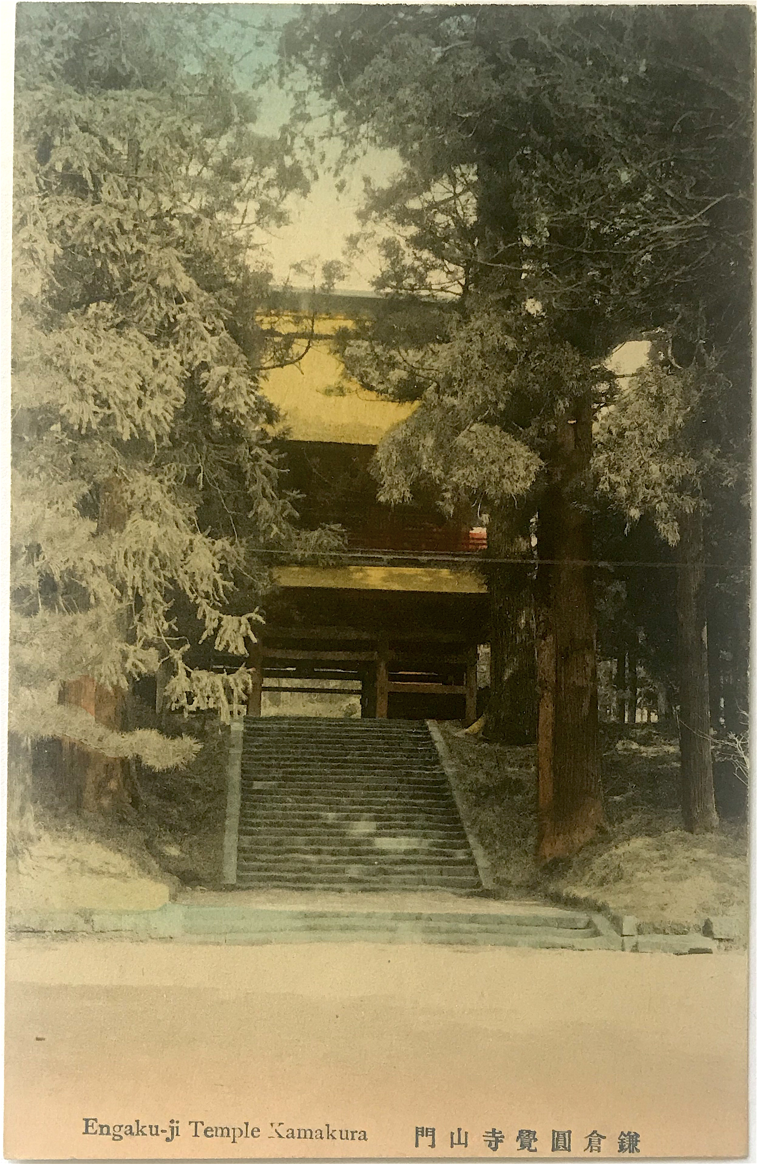
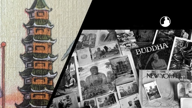
  • Set 1: Yengakuji Temple Kamakura 鎌倉円覚寺舍利殿 [Reliquary Hall of Engaku-ji Temple, Kamakura]
  • Set 2: Engaku-ji Temple Kamakura 鎌倉圓覺寺山門 [Front Entrance of Engaku-ji Temple, Kamakura]

Founded in 1282 during the Kamakura period, Engaku-ji Temple was included as one of the Kamakura’s “Five Mountains” (gozan 五山), a network of Zen Buddhist temples supervised by a state bureaucracy but that also received the state’s protection. In the Meiji period (1868-1912) it became the center for Zen study in the eastern part of Japan. Not coincidentally, the famed popularizer of Zen in America, D.T. Suzuki (1870-1966), trained there (though he remained a layperson until his death). Set 1 depicts the temple Reliquary Hall (noted in the Japanese caption) which houses a tooth of the Buddha. This building is registered as a National Treasure. Set 2 depicts the temple front gate (sanmon 山門, “mountain gate”), itself a prominent piece of architecture on the temple grounds.

Figure 22 & Figure 23

Figure 22
Figure 23
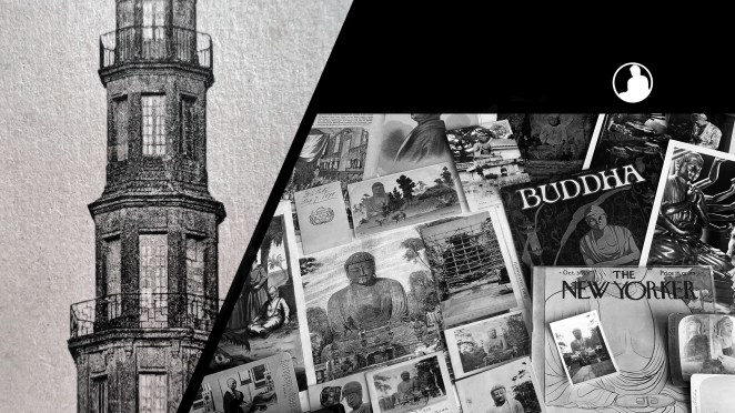
  • Set 1 caption: Kenchoji Temple Kamakura 鎌倉建長寺山門 [Front Entrance of Kenchō-ji Temple, Kamakura]
  • Set 2 caption: Tsurigane (Bell-Tower) Kencho-ji Temple Kamakura 鎌倉建長寺鐘樓(國寶) [Bell Tower at Kenchō-ji Temple, Kamakura (National Treasure)]

Founded in 1253 during the Kamakura period, Kenchō-ji is the oldest Zen training temple in Japan. Like Engaku-ji, it was also included among the “Five Mountains” network. Set 1 depicts the temple front gate. And while Set 2 depicts the bell tower, the significant historical entity is the temple bell (bonshō 梵鐘), itself designated as a National Treasure (kokuhō 國寶), the most precious of Japan’s historic and cultural properties. Cast in 1255 by Mononobe Shigemitsu 物部重光 it is the second largest in the Kantō region, only to one housed in Engaku-ji. It is believed that the goddess Benzaiten, who was thought to reside on the nearby island of Enoshima (see above), offered her divine protection to have it made. Some modern scholars have suggested Mononobe as the caster of the Kamakura Daibutsu since this bell was made around the same period, although this remains unlikely.

Notes:

*This is part of a series of posts devoted to exploring the development of a visual literacy for Buddhist imagery in America. All items (except otherwise noted) are part of my personal collection of Buddhist-themed ephemera. I have also published my working notes on identifying publishers of Meiji and early Taishō postcards and establishing a sequential chronology for Kamakura Daibutsu photographs.

[1] Shirane 2010.

[2] Nenzi (2004) outlines the development of Kamakura and Sagami generally into a destination spot through the identification of “tourist packages.”

[3] Moriyoshi (his Buddhist name was Son’un 尊雲) had a complex relationship to his monastic vocation, since his vital role as abbot was to enlist the help of important temples and warrior monks to help his father, Emperor Go-Daigo 後醍醐天皇 (1288-1339), in his fight against the Kamakura shogunate.

Esaki’s Pilgrims at the Daibutsu

For nearly three decades after the first Japanese postal cards were issued in 1873, printing and distribution were strictly controlled by the government. Only with changes in postal codes in 1900 could private publishers start printing and selling their own postcards. Importantly, and for the first time, these privately issued cards could bear images on the obverse, thus being termed “picture postcards” (ehagaki 絵葉書). Previous government-issued specimens were printed blank to accommodate a sender’s written message. Moreover, the growing use among Japanese print shops of inexpensive collotype printing equipment meant photographs could be easily reproduced for this new medium. Many early photographic postcards are reproductions of images originally created and sold in Japanese photography studios, as is the case with the examples here.

Figure 1Esaki 01a.JPG

  • Title/Caption: DAIBUTSU AT KAMAKURA
  • Year: 1900-1907 (postally unused)
  • Photographer: Esaki Reiji 江崎礼二 (1845-1910)[?]
  • Medium: collotype print on cardstock, hand-tinted
  • Dimensions: 5.5 in X 3.5 in
  • Reverse Imprint: Union Postale Universelle. CARTE POSTALE, 萬國郵便聯合端書

This postcard depicts the Kamakura Daibutsu, scaled to fit in the upper-left corner of the card [Fig. 1]. The blank space on the right side was reserved for a written message; Japanese postal code required the reverse side to be reserved solely for the name and address of the recipient. Once messages could be included on the reverse in 1907, postcard images were regularly scaled to fit the entirety of the obverse side.

For artistic flourish, the publisher of our card employed a subtle trompe-l’œil, making it appear as if the corner of the photographic image is curling off the paper. Visual illusions such as this would make the postcard stand out among a sea of similar imagery. Printed in large block lettering, the caption clearly denotes the subject of the photograph, the “Daibutsu at Kamakura.”

Figure 2

Esaki 02a

  • Title/Caption: 451 [or 461] DAIBUTSU AT KAMAKURA
  • Year: 1900-1907 (postally unused)
  • Photographer: Esaki Reiji 江崎礼二 (1845-1910)[?]
  • Medium: collotype print on cardstock, hand-tinted
  • Dimensions: 5.5 in X 3.5 in
  • Reverse Imprint: Union Postale Universelle. CARTE POSTALE, 萬國郵便聯合端書

Another postcard employs the same photograph. Here, the image covers a larger portion of the card, but lacks the trompe-l’œil effect [Fig. 2]. Additionally, the caption is much smaller and incorporates an identifying stock number, 451 (or possibly 461). It is of note that a caption which incorporates a stock number with a title is characteristic of prints made by Japanese photography studios of the 1880’s and 1890’s. By comparing this stock number to known lists gleaned from published Japanese studio albums, it appears likely the original photograph was taken by Esaki Reiji 江崎礼二 (1845-1910), a famed Tokyo-based photographer.[1]

Esaki apprenticed under the pioneering photographer Shimooka Renjō 下岡蓮杖 (1823-1914) in 1870 before opening his own studio in 1871 in Asakusa Park.[2] He soon established himself as a technical master, among the first of Japanese photographers to adopt the new gelatin dry-plate (zerachin kanpan ゼラチン乾板) technique in 1883 and executing technically difficult pictures of a naval mine detonating in the Sumida River (1883) and night-time exposures of a lunar eclipse (1884) and exploding fireworks (1885). The shorter exposure times of the dry-plate process also allowed Esaki to more easily photograph fidgeting children, an expertise he proudly displayed in a famous collage of more than 1700 young children and infants (1893).[3]

Figure 3

Esaki 01 pilgrims
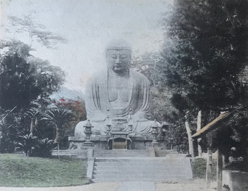
The photograph of the Daibutsu by Esaki (or one of his studio assistants) depicts the bronze statue from the southwest corner, an uncommon, but not unprecedented angle. More relevant to the site’s religious heritage, the photograph shows a line of Japanese pilgrims (jinreisha 巡礼者) in front of the Daibutsu, easily identified by their broad circular sedge hats and walking staffs carried over their shoulders [Fig. 3]. The mise-en-scène is more relaxed than reverent. The lead pilgrim, who holds his hat in his hand, appears to read the small rectangular sign perched on the pedestal (which, coincidentally, forbids climbing on the statue), while his fellow travelers casually stand conversing with one another. Only the temple priest by the offering table glances directly towards the camera.[4] This mundane expression of religious piety stands in contrast to the highly orchestrated images of devotion sometimes staged by Western photographers. Significantly, the distinction between Japanese pilgrim and tourist is often blurred, as both can engage in similar activities at a pilgrimage site, including visits to the temple souvenir shop.

Although faded, the hand-tinting is still visible in both cards, with the slate blue colossus overlooking his faithful visitors. The elements in the scene suggest this photograph was taken in the late 1890’s.[5]

Figure 4

Esaki 01b

Esaki 02b

The reverse of both cards is bordered by an ornamental filigree-like design in burgundy ink [Fig. 4]. These are examples of “undivided back” cards, since no line yet separates the areas on the back where the correspondence and address would later come to be written. This functions now as an easy identifier for dating old postcards, with these dating between 1900 and 1907. Since it was not yet common for publishers to imprint their names or trademarks on the back, it is difficult to tell who printed these beautifully rendered cards.

Notes:

*This is part of a series of posts devoted to exploring the development of a visual literacy for Buddhist imagery in America. All items (except otherwise noted) are part of my personal collection of Buddhist-themed ephemera. I have also published my working notes on identifying publishers of Meiji and early Taishō postcards and establishing a sequential chronology for Kamakura Daibutsu photographs.

[1] Stock lists for Esaki’s studio do not include numbers 451 or 461, but numbers 452 to 460 are all images of Kamakura, specifically Hachiman Temple, the Daibutsu, and the lotus ponds in Kōtokuin (the temple that houses the Daibutsu). See Bennett 2006a: 129. Unfortunately, almost all attributions to Esaki and his studio remain tentative and more work desperately needs to be done on his photographic oeuvre.

[2] For Esaki’s biographical information, see Bennett 2006b: 165 and here and here. Several Japanese resources note his name as “Ezaki,” but I follow the standard English “Esaki,” which is also how he promoted his studio on photographic mounts and in other published materials (the older “Yesaki” can also be found).

[3] This image was also sold in the United States through Sears & Roebuck catalogues.

[4] Closer inspection reveals a young boy towards the far right of the photograph, holding his hat in his hand, also possibly peering towards the camera

.Esaki 01 boy

[5] I have seen postcards of this image cancelled in January 1902, setting a firm terminus ante quem for the photograph. I have also seen a third postcard, oriented vertically, bearing this same photograph.

Panoramic Postcard of the Kamakura Kaihin Hotel

In the summer of 1887, Nagayo Sensai 長与専斎 (1838-1902), a physician and director of the recently incorporated Bureau of Health 衛生局, founded Japan’s first sanatorium, the Kaihin-in 海濱院, on the beaches of Kamakura. Since many Japanese physicians during the early Meiji (1868-1912) were trained under German doctors they soon adopted the contemporary belief in Western medicine that regular exposure to seawater would ameliorate people stricken with tuberculosis. German doctor Erwin Bälz (1849-1913) first recommended the mild climate of Kamakura as an optimal location for sea bathing therapy. This motivated Nagayo to work with wealthy Yokohama silk merchants to construct a vast Western-style resort on Yuigahama Beach 由比ヶ浜海岸 in Kamakura, replete with several acres of pine groves and spacious lawns. Called Kaihin-in (“Seaside Facility”), patients would participate in regular sea bathing sessions and enjoy the open-aired, scenic vistas. Within a year, however, mismanagement would cause the facility to be repurposed into a hotel and resort that catered to foreign visitors.[1]

 The hotel was renamed the Kamakura Kaihin Hotel 鎌倉海濱ホテル and quickly became a tourist destination in its own right. In 1891, an American sailor, M. B. Cook, described his pleasurable visit as such:

“From the streets of Kamakura we drove to the Kaihinin, a large hotel or marine sanitarium facing the sea, and surrounded by beautiful walks and drives. In the summer season it is full of guests, and being in one of the most healthy places in Japan, and the visitors are given so much attention, that it is becoming a center of attraction to all American tourists.[2]

The hotel was also featured in Murray’s A Handbook for Travellers in Japan, the premier English language guidebook for foreign tourists in Japan. It remained a wildly popular destination into the twentieth century, located a mile from the main Kamakura train station (the Yokosuka Line 横須賀線 opened in 1889) and was famed for its European-style cuisine, affordable rates, and English language guest services. It was also located less than a mile directly south from the most important foreign tourist attraction in the region, the Kamakura Daibutsu.

Figure 1

Kaihin obverse.jpg

Kaihin reverse.jpg

  • Title/Caption: Kamakura Kaihin Hotel Kamakura, Japan. // Telephone No. 4 & 331 The Best Bathing Beach in Japan // Telegram “Kaihin” Home of Daibutsu
  • Year: 1903-1907 [postally unused]
  • Publisher: unknown
  • Medium: collotype print on cardstock
  • Dimensions: 5.5 in X 3.5 in
  • Reverse Imprint: Post Card, 郵便はかき

The image on the postcard obverse [Fig. 1] shows the lawns and landscaping of the hotel grounds that led out towards the ocean (seen on the far left). The sprawling multi-storied complex is topped by a flag emblazoned with “KKH,” for the Kamakura Kaihin Hotel. The sweeping, panoramic photograph provides a potent combination of modern (Western) luxury and natural beauty, sure to lure even the most cagey tourist. The text under the photograph proclaims that the site offers “the best bathing beach in Japan,” a callback to its origins as a bathing sanatorium. Importantly, the photograph is overlaid with an oval image of the Kamakura Daibutsu, with the caption proclaiming that the hotel is the “home of Daibutsu.”[3] These elements show that the postcard was also used as an  advertisement, tying together the exotic Buddhist icon of the “Orient” with the scenic luxury of the resort grounds. Roaming, half-day long horseback rides to and from the port of Yokohama were no longer necessary to enjoy the Kamakura colossus. Daytime visitors could enjoy a short trek to the temple, expose or purchase a few photographs, and return to picnic by the beach.

Figure 2

Kaihin Daibutsu.png

This photograph of the Daibutsu [Fig. 2] likely dates from after 1903 (due to the outward facing metal lotus flowers atop the offering table). The reverse of the card shows that it is an “undivided back,” definitively dating it previous to 1907 (a “dividing line” was introduced the following year). This also proves the design on the front of the card was purposeful, with the bottom blank half of the card reserved for correspondence; only the address and name of the recipient was allowed on the back. The photographer(s) and publisher remain unknown.

Figure 3

TMKD Kaihin Obverse.jpg

  • Title/Caption: Kamakura Kaihin Hotel Kamakura // Telephone No. 4 & 331, Kamakura // Japan
  • Year: 1930s
  • Printer: unknown
  • Medium: halftone print and ink on paper
  • Dimensions: 5 in X 3.5

The same photograph of the hotel compound was later used on paper luggage tags [Fig. 3] for the Kamakura resort. Affixed to suitcases and steamer trunks, luggage tags were very popular in the interwar period. In addition to helping sort luggage in transit, these tags signaled the cosmopolitan sophistication of the tourist and thus were often designed with bold images and bright colors. The oval inset of the Daibutsu closely mirrors the postcard design, yet this photograph of the Kamakura colossus is of a much later vintage, quite possibly dating from the 1930’s [Fig. 4].

Figure 4

TMKD Kaihin CU.png

The Kamakura Kaihin Hotel suffered significant damage during the 1923 Great Kantō earthquake, but was rebuilt to its previous grandeur. The hotel would remain in operation up through World War II, until a series of fires resulted in its closing in the mid-1940s.

Notes:

*This is part of a series of posts devoted to exploring the development of a visual literacy for Buddhist imagery in America. All items (except otherwise noted) are part of my personal collection of Buddhist-themed ephemera.

[1] An overview of the cultural encounters between Germany and Japan in the field of medicine are discussed in Kim 2014. For more information on Nagayo, see Rogaski 2004, esp. pp. 136ff. The best available information on Nagayo’s role in the founding of the Kaihin-in appears to have been discussed in the Exhibition Reminiscing the Kamakura Kaihin Hotel 鎌倉海浜ホテル追憶展, organized by Hirata Emi 平田恵美 of the Kamakura Central Library, Modern Historical Materials Division 鎌倉市中央図書館近代史資料室 in 2011. I am indebted to the review of this event by Noriyuki Takagi 高木規矩郎 found here, here, and here. Other scattered information can be found here. Certainly, far more archival research needs to be done for a full account of this story. I have not been able to consult this work: Kamakura kaihin hoteru: Nipponhatsu no kaihin rizōtohoteru 鎌倉海濱ホテル 日本初の海浜リゾートホテル [The Kamakura Kaihin Hotel: Japan’s First Seaside Resort Hotel], by Shimamoto Chiya 島本千也 and Hirata Emi 平田恵美.

[2] Cook 1891: 29. A handful of other late nineteenth and early twentieth-century tourist remarks can be found here.

[3] There are versions of this postcard without the small overlay of the Daibutsu. The caption instead reads “The only resort in the Far East.” The best online collection of Kamakura Kaihin Hotel memorabilia remains here.

References:

  • Cook, M. B. 1891. A Sailor’s Visit to the Island Empire. New York: John R. Alden.
  • Kim, Hoi-eun. 2014. Doctors of Empire: Medical and Cultural Encounters between Imperial Germany and Meiji Japan. Toronto, University of Toronto Press.
  • Rogaski, Ruth. 2004. Hygienic Modernity: Meanings of Health and Disease in Treaty-Port China. Berkeley: University of California Press.

Tonboya’s Failed Voyeurism of the Daibutsu (Visual Literacy of Buddhism)

After the Meiji Restoration, the popularity of photography began to overshadow traditional Japanese woodblock printing. Increasingly, woodblock artisans came to find employment with photography studios, adapting their technical painting skills to add vivid color to monochromatic photographs. In the beginning of the twentieth century, due to the craze surrounding Japanese picture postcards (ehagaki 絵はがき), artisans continued to ply their trade by adding translucent water-soluble pigments to these small format calotypes. One of the most famous postcard distributers was Tonboya トンボヤ, or the “Dragonfly Studio,” first opened by Yoshimura Kiyoshi 吉村清 around 1905.[1] The Tonboya storefronts in Yokohama, first located in the Isezakichō 伊勢佐木町 district before moving to the more heavily trafficked Motomachi 元町 district, were easily identifiable because of large signboards made to look like red cylindrical postal boxes (yūbin posuto 郵便ポスト) widely adopted in Japan. One side of the signboard had the word “POSTALCARDS” painted on it, while the other said ehakaki エハカキ [sic](“picture postcards”), suggesting Yoshimura catered to both foreign and domestic travelers.[2] One image that would represent the photographic interests of both groups would be the Kamakura Daibutsu, located close to the port of Yokohama [Figure 1].

Figure 1PCKD009t(o)

PCKD009t(r).JPG

  • Title/Caption: Daibutsu at Kamakura. 佛大倉鎌
  • Year: 1907-1918
  • Publisher: Tonboya トンボヤ
  • Medium: collotype print on cardstock, hand tinted
  • Dimensions: 5 in X 3.5 in
  • Reverse Imprint: Union Postale Universelle.[+], 郵便はかき

By setting the camera on the second landing of the paved walkway, this unknown photographer filled the frame with the image of the Daibutsu; positioning the statue frontally and symmetrically, this framing is similar to many of the images produced by Yokohama photography studios. The image depicts three figures, two women and a young child, facing the Buddhist icon in the center of the photograph. This setting might elicit other images of religious piety at this site, but the mise-en-scène is complicated by the presence of two more children, standing at each of the sides, who stare directly at the viewer. Their presence might have been obscured had it not been for the colorist who painted them in light hues of blue and pink. Notably, their casual posturing is stark contrast to staged “photo ops” of foreign travelers who try to visually suggest their domination of the Orient. Because of these elements, on the whole, we are made to feel as if the scene is staged and that we have been caught in an act of  voyeurism. The women and child, positioned center-stage, engage in a orchestrated religious performance while the children at the edges observe us watching them. A rather apt visual metaphor for the Orientalist gaze, where the artist attempts to create a certain controlled vision of the East, but with “unruly” actors foiling the illusion.[3]

This postcard is not imprinted with a trademark to identify the publisher. The black ink and serif font used for the reverse, however, in addition to the guide lines provided for writing the address, all suggest this card was made by Tonboya.[4] In addition, the position of the diving line for correspondence indicates this card was printed between 1907 and 1918. If the image on the obverse was not self-evident enough, bilingual cerulean letterpress (note the impression the reverse) identifies the scene clearly: “Daibutsu at Kamakura.”

Notes:

*This is part of a series of posts devoted to exploring the development of a visual literacy for Buddhist imagery in America. All items (except otherwise noted) are part of my personal collection of Buddhist-themed ephemera.

[1] Several online English sources claim Tokutaro Maeda was the founder of Tonboya, but I have found no Japanese sources that confirm this. I prefer here to follow the print Japanese sources (e.g. Saitō 1985: 1), but leave the question unsettled.

[2] Several early-century postcards depicting the streets of Yokohama show this red cylindrical signboard, as seen here: Red postal sign.pngThe full postcard can be found here (not part of the Archive).

[3] By shooting one woman mid-stride ascending the small flight of steps, this photographer is (accidentally?) paying homage to Enami Nobukuni 江南信國 (1859—1929), but without the overal effects of sterling visual narrative.

[4] The best site for identifying Tonboya cards remains here: http://tamayochankankousya.seesaa.net/article/421306802.html. Another common reverse printing of Tonboya during this period is discussed here.

References:

  • Handy, Ellen. 1998. “Japonisme and American Postcard Visions of Japan,” in Delivering Views: Distant Cultures in Early Postcards,  Christraud M. Geary and Virginia-Lee Webb, eds. Washington: Smithsonian Institution Press.
  • Saitō Takio 斎藤多喜夫. 1985. “Yomigaeru shinsaizen no Yokohama fūkei よみがえる震災前の横浜風景,” Kaikō no hiroba 開港のひろば, No. 12, pp. 1, 4.
  • Satō, Kenji. 2002. “Postcards in Japan: A Historical Sociology of a Forgotten Culture,” International Journal of Japanese Sociology, No. 11, pp. 35-55.
  • Yokohama Open Port Museum 横浜開港資料館, ed. 1999. Nen mae no Yokohama Kanagawa ehagaki de miru fūkei 年前の横浜・神奈川―絵葉書でみる風景. Tokyō: Yurindo 有隣堂.

Tonboya’s Onlooker of the Daibutsu (Visual Literacy of Buddhism)

By the end of the nineteenth century the port city of Yokohama had developed into a thriving tourist destination. Consequently, numerous Japanese shops opened to cater to the needs of both domestic and foreign travelers. Perhaps surprising to a modern reader, among the prized goods offered for sale were picture postcards (ehagaki 絵はがき), the first truly commodified form of the photograph which unexpectedly became a collectors craze in the first decade of the twentieth century.[1] Around 1905, Yoshimura Kiyoshi 吉村清, the proprietor of the well-known Tokyō-based publisher Kamigataya 上方屋, started a new venture in Yokohama, called Tonboya トンボヤ, or the “Dragonfly Studio.”[2] The dragonfly was long seen as symbol of courage and strength in Japanese culture, and thus it was cherished by the samurai and bestowed the romantic name of the “Victorious Insect” (kachimushi 勝ち虫). This lore notwithstanding, Tonboya postcards – emblazoned with its distinctive dragonfly trademark – soon became some of the most famous and widely circulated postcards of the period.

Figure 1

PCKD008t(o).JPG

PCKD008t(r).JPG

  • Title/Caption: Daibutsu at Kamakura. 佛大倉鎌
  • Year: c. 1909
  • Publisher: Tonboya トンボヤ
  • Medium: collotype print on cardstock, hand tinted
  • Dimensions: 5 in X 3.5 in
  • Reverse Imprint: Carte Postale Post Card [+],  郵便ハガ[キ]

This image of the Kamakura Daibutsu [Figure 1] highlights the rustic setting of the colossal statue, framing the statue between sprawling tree branches and the silhouette of a sago palm. With the camera placed in the southwest corner, our unknown photographer creates a voyeuristic scene as a man in knee-high mud boots and western attire peers towards group of Japanese visitors from behind a tree. Seeing this observer from behind, we take his perspective and also gaze upon the group of Japanese visitors dwarfed by the overlooking bronze statue. The brightly colored garments of the women on the right stand in contrast to the uncolored gray shades of the men and boy on the left [Figure 2]. The boy wears a school uniform (gakuran 学ラン), a style adopted decades earlier based on French and Prussian military outfits.[3] Among this group, only a single man looks up towards the Buddhist statue. The others stand and stare at each other from several paces apart. The gives an unnatural effect to the scene, as the stationary bodies and odd spacing fails to build up a clear visual narrative. What is the relationship of these temple visitors to each other? What is their purpose for being there? As was typical of cards from this period, bilingual cerulean letterpress informs us as to the identity of the Buddhist figure, the “Daibutsu at Kamakura” (note the imression left on the reverse along the bottom edge).

Figure 2

PCKD008t(men).JPG   PCKD008t(women0.JPG

Often, Tonboya would impress its dragonfly logo at the lower right on the front of the card, but our variant lacks this identifying element.[4] Turning to the reverse of our card [Figure 1], we still fail to easily locate the characteristic mark of the dragonfly. So, just how can this card be distinguished? The designers at Tonboya devised a creative and playful way to identify their publishing studio; they replaced the ki (キ) in hagaki (ハガキ, “postcard”) with a highly stylized dragonfly illustration [Figure 3]. Only the most attentive observer would notice this subtle alteration, but once noticed it becomes an easily identifiable marker of this studio. This creative design can be dated back to around 1909 and remained throughout Tonboya’s existence into the late 1920’s.

Figure 3

PCKD008t(logo).JPG

Notes:

*This is part of a series of posts devoted to exploring the development of a visual literacy for Buddhist imagery in America. All items (except otherwise noted) are part of my personal collection of Buddhist-themed ephemera.

[1] Satō 2002: 41.

[2] Several online English sources claim Tokutaro Maeda was the founder of Tonboya, but I have found no Japanese sources that confirm this. I prefer here to follow the print Japanese sources (e.g. Saitō 1985: 1), but leave the question unsettled. Another unresolved question remains the relaitonship between Kamigataya and Tonboya. It appears that Tonboya may have been a distribution name of postcards printed by Kamigataya (which continued to also publish postcards under its own name). Some sources claim Tomboya opened as early as 1904, other as late as 1907.

[3] The development of Japanese school uniforms are detailed here: http://journal.media-culture.org.au/index.php/mcjournal/article/view/1041.

[4] Tonboya would also often include an identifying letter and stock number in the lower left, but this is also missing in our specimen. It is also possible to find cards with the letter and numbering system, but still lack the dragonfly icon, see here: https://www.maryevans.com [then search for the reference number 10989247]

References:

  • Handy, Ellen. 1998. “Japonisme and American Postcard Visions of Japan,” in Delivering Views: Distant Cultures in Early Postcards,  Christraud M. Geary and Virginia-Lee Webb, eds. Washington: Smithsonian Institution Press.
  • Saitō Takio 斎藤多喜夫. 1985. “Yomigaeru shinsaizen no Yokohama fūkei よみがえる震災前の横浜風景,” Kaikō no hiroba 開港のひろば, No. 12, pp. 1, 4.
  • Satō, Kenji. 2002. “Postcards in Japan: A Historical Sociology of a Forgotten Culture,” International Journal of Japanese Sociology, No. 11, pp. 35-55.
  • Yokohama Open Port Museum横浜開港資料館, ed. 1999. Nen mae no Yokohama Kanagawa ehagaki de miru fūkei 年前の横浜・神奈川―絵葉書でみる風景. Tokyō: Yurindo 有隣堂.

Kōzaburō’s Undivided Back Postcard (Visual Literacy of Buddhism)

Many early Japanese turn-of-the century postcards were colorful illustrations, cartoons, or woodblock prints, some of which were made by famed Japanese artists, but these traditional arts forms would soon lose favor to the photograph. One of the shifts that ushered in the visual dominance of photographic postcards was the introduction of private company postcards 私製はがき, which had been illegal to print until new postal regulations were introduced in 1900. In addition, the adoption of a new photomechanical printing technique, called the collotype, allowed for the wide availability of inexpensive photographic images of Japan.

Many early photographic postcards first circulated as albumen or silver gelatin prints sold by commercial photography studios. Early postcard publishers experimented with the orientation of the old images on the new format. By placing the image on the top half of a vertically oriented card, the bottom half could be reserved for the message [Figure 1]. Strategically designed areas or blank spots were necessary on the front of the card, because the reverse of the card was reserved solely for the name and address of the recipient until 1907. The regulations were determined by the Union postale universelle, the body which oversaw the postal system worldwide. These postcards, known today as “undivided back” cards, were replaced by “divided back” cards in 1907 in Japan, where the message could be included on the reverse of the card.

Figure 1

pckd002tk(o)pckd002tk(r)

  • Title/Caption: NA
  • Year: 1900-1907
  • Photographer: Tamamura Kōzaburō 玉村康三郎 (1856-1923?)[?]
  • Medium: collotype print on cardstock, hand tinted
  • Dimensions: 5.5 in X 3.5 in
  • Inscription: Union Postale Universelle. CARTE POSTALE, 萬國郵便聯合端書

The image depicts a wide angle view of the Daibutsu taken from the third landing. The positioning of the camera shows the rustic, yet landscaped grounds surrounding the Daibutsu statue. Lacking the presence of people, this bucolic setting exhibits a more quiet moment of the famous tourist destination.  On the right, the supports and roof of the ablution pavilion stick out from under an evergreen tree. The water basin (chōzubachi 手水鉢) for washing hands is found underneath (dating from 1749).

The photographer of this image is debated. Older studio albumen prints of this image are imprinted with “661 Daibuthu [sic] at Kamakura.” This numbering is consistent with the studio catalogue of Tamamura Kōzaburō 玉村康三郎 (1856-1923?)(See Bennett 2006: 152), but other sources attribute this image to Ogawa Kazumasa 小川 一眞 (1860-1929). (A similar, but not exact, photo has been identified in an Ogawa studio album). This exemplifies the difficulty in determining the correct attribution and age of old Daibutsu photographs, and more research still needs to be done.

Moreover, because the publishers of the postcard did not imprint their name on the back, it is difficult to tell who printed this tourist souvenir. The reverse of this card is bordered by an ornamental filigree-like design in umber brown ink. This card is an example of an “undivided back,” since no line appears separating the sections on the back where the correspondence and address would later come to be written. This functions now as an easy identifier for dating old postcards, with this exemplar dating between 1900 and 1907. (The photograph was probably taken in the mid-to-late 1890s). In addition, a small scalloped square appears in the top right corner, indicating the location to affix the necessary postage.

*This is part of a series of posts devoted to exploring the development of a visual literacy for Buddhist imagery in America. All items (except otherwise noted) are part of my personal collection of Buddhist-themed ephemera.

Ueda’s Daibutsu and Dog Postcard (Visual Literacy of Buddhism)

Collecting postcards became a national craze in Japan in the first decade of the twentieth century – and caused at least one riot. Yokohama, home to many of the oldest and most important Japanese tourist photography studios, became a major center of postcard production and the Ueda Photographic Prints Corporation 上田写真版合資会社, founded by Ueda Yoshizō上田義三 in the famed city port, was one of a handful of premier Japanese picture postcard publishers. Ueda’s early sets of cards included photographs of the Kamakura Daibutsu, but they and their business rivals continued to produce new views of this ancient colossus.

Professional and amateur photographs had long shot the Daibutsu frontally from long and medium distances. A few took photographs from the southwest corner, or even from behind, but images of the Daibutsu from the southeast were uncommon (although not unknown) likely because the temple landscaping did not easily allow for a person to position himself. The grounds of Kōtoku-in 高徳院, the temple where the Daibutsu resides, had continuously undergone  renovations since Western tourists discovered it in the 1860’s, slowly opening up the areas around the statue and providing better “picturesque” viewing. One unknown photographer from Ueda was able to take a position in the southeast corner and take a photograph [Figure 1] – one of the very few from this angle.

Figure 1

pckd007u(o)pckd007u(r)

  • Title/Caption: Daibutsu, Kamakura. 佛大倉鎌
  • Year: c. 1912 [postally unused]
  • Publisher: Ueda Photographic Prints Corp. 上田写真版合資会社
  • Medium: collotype print on cardstock
  • Dimensions: 5.5 in X 3.5 in
  • Reverse Imprint: Carte postale – Postkarte – Post Card [Type 5], Made in Japan, 郵便はかき

This postcard image is also one of the few photographs that does not incorporate any people in its composition, a technique which typically assisted the viewer in gauging and appreciating the sheer size of the statue. Only the most astute observer would note that the photograph is not devoid of all beings – there is a dog resting at the stone base of the statue [Figure 2]. The dog’s distinctive head patterning and white body suggests this may be the same dog photographed in two older stereoview cards, who is seen mingling with temple visitors and tourists. Serene and relaxed, both the Daibutsu and dog appear to be enjoying the relative quiet of the scene.

Figure 2

PCKD007u(o) dog.jpg

The Ueda crest on the reverse along with the distinctive multilingual printing clearly reveals this card to be part of the Ueda Corp. stock published after 1907, possibly around 1912. It is difficult to determine when the photograph was taken, but the presence of the dog suggests it was taken sometime after the first few years of the turn of the century, when the stereoviews were taken. While this is one among a dozen or more Japanese picture postcards produced of the Daibutsu before 1923 (when the Kantō earthquake destabilized the Japanese postcard industry), it remains one of the most unique.

*This is part of a series of posts devoted to exploring the development of a visual literacy for Buddhist imagery in America. All items (except otherwise noted) are part of my personal collection of Buddhist-themed ephemera.


Kimbei’s Undivided Back Postcard (Visual Literacy of Buddhism)

The Japanese postal delivery service was initiated in 1871 and soon joined the Universal Postal Union (soon to be known formally as Union Postale Universelle) in 1877, thus permitting the sending and receiving of international mail. Until the start of the twentieth century, however, all postcards were issued by the Japanese government as private companies were prohibited from publishing their own cards. After legal permission was granted in 1900, private companies soon embarked on mass-scale printings of picture postcards (ehagaki 絵はがき). The postcard soon rivaled the traditional woodblock print as the favored medium to present contemporary Japanese images.[1] Furthermore, while many early postcards were illustrated with drawings, photographic images soon dominated the medium and are considered the earliest commodified forms of the photograph.[2] This was spurred by the development of a new printing process, known as the collotype, which allowed for photomechanical printing on a massive scale.  Several themes emerged as popular favorites, including ones that may sound odd to modern purchasers of postcards, such as “natural disasters” and “current events.” Not surprisingly, with the advent of the thriving tourism industry, “scenic views” (fukei 風景) emerged as a favorite visual genre for many domestic Japanese tourists and foreign travelers.

Since a driving force behind the early interest in postcards was the acquisition of inexpensive photographs, it seems only natural that several picture postcards would be reprints of old photographic stock. The premier Japanese photographer of his time, Tamamura Kōzaburō 玉村康三郎 (b. 1856), was commissioned in the 1890’s to produce a then-reported one-million hand-colored albumen prints (though more recent estimates place the number of prints at approximately 350,000) for the multi-volume work Japan: Described and Illustrated by the Japanese. He enlisted the help of his competitor, Kusakabe Kimbei 日下部金兵衛 (1841-1934), to finish the massive order.  Scholars have only recently begun to identify Kimbei’s photographs found within the publication. The postcard image of the Great Buddha of Kamakura [Figure 1] is now considered a Kimbei photograph. The original image was scaled down and slightly cropped to fit on a standard size postcard.

Figure 1

PCKD001kk(o).jpgPCKD001kk(r).jpg

  • Title/Caption: NA
  • Year: 1900-1907
  • Photographer: Kusakabe Kimbei 日下部金兵衛 (1841-1934)
  • Medium: collotype print on cardstock, hand tinted
  • Dimensions: 5.5 in X 3.5 in
  • Inscription: Union Postale Universelle. CARTE POSTALE, 萬國郵便聯合端書

There is no caption identifying the statue or location on the postcard, but the Kamakura Daibutsu was certainly well known in the early twentieth century. In the coming years, however, it would become standard practice to include letterpress captions, often both in English and Japanese, to describe the scene. The fine reticulation pattern and matte cardstock identifies this image as a photomechanical reproduction, known as a collotype (korotaipu コロタイプ). As with standard albumen and silver gelatin photography, early postcards were hand-tinted with water-color washes.

The small margin at the bottom of the card was left for correspondence. Before 1907, the Union Postale Universelle required the entire reverse of the postcard be used for the address and name of the recipient, thus early publishers would leave blank space for a brief messages on the front of the card. Because of this limitation, the correspondence was typically very short, with foreign travelers often briefly commenting on their sightseeing excursions.

The reverse of this card is bordered by an ornamental filigree-like design in umber brown ink. This card is an example of an “undivided back,” since no line appears separating the spaces on the back where the correspondence and address would later come to be written. This functions now as an easy identifier for dating old postcards, with this exemplar dating between 1900 and 1907.  In addition, a small scalloped square appears in the top right corner, indicating the location to affix the necessary postage.

Notes:

*This is part of a series of posts devoted to exploring the development of a visual literacy for Buddhist imagery in America. All items (except otherwise noted) are part of my personal collection of Buddhist-themed ephemera.

[1] https://www.mfa.org/collections/asia/art-japanese-postcard

[2] Satō 2002: 41.

References:

  • Saitō Takio 斎藤多喜夫. 1985. “Yomigaeru shinsaizen no Yokohama fūkeiよみがえる震災前の横浜風景,” Kaikō no hiroba 開港のひろば, No. 12, pp. 1, 4.
  • Satō, Kenji. 2002. “Postcards in Japan: A Historical Sociology of a Forgotten Culture,” International Journal of Japanese Sociology, No. 11, pp. 35-55.
  • Yokohama Open Port Museum 横浜開港資料館, ed. 1999. Nen mae no Yokohama Kanagawa ehagaki de miru fūkei 年前の横浜・神奈川―絵葉書でみる風景. Tokyō: Yurindo 有隣堂.

Ueda’s Hand-Colored Cerulean Letterpress Postcards (Visual Literacy of Buddhism)

In early 1904, Japan formally declared war on Russia after nearly a decade of rising tensions. Military attachés and journalists from around the world traveled to the front with photographers to chronicle the gruesome affair. This use of wartime photography propelled a surge in popularity of Japanese picture postcards (ehagaki 絵はかき), resulting in a spike of mass-produced, inexpensive postcards depicting Japan’s military might. The swell in Japanese nationalism and interest in seeing images of a modernized state helped create a Japanese postcard boom in the middle of the first decade of the twentieth century.[1] New private postcard publishing houses, such as Ueda Photographic Prints Corporation 上田写真版合資会社, Hoshinoya 星野屋, and Tonboya トンボヤ, grew in number as did their inventory of photographic postcards. Consequently, during this period numerous new images of the Kamakura Daibutsu were taken and sold to a ready market of Japanese and foreign travelers [Figure 1].

 Figure 1

pckd004u(o)

PCKD004u(r).jpg

  • Title/Caption: Daibutsu, Kamakura. 佛大倉鎌
  • Year: c. 1907 [postally used 1910]
  • Publisher: Ueda Photographic Prints Corp. 上田写真版合資会社
  • Medium: collotype print on cardstock, hand tinted
  • Dimensions: 5.5 in X 3.5 in
  • Reverse Imprint: Postkarte [Type 1], 郵便はかき

The unknown photographer of this postcard image set the camera on the second landing of the paved walkway and framed the Daibutsu frontally and symmetrically, similar to  numerous Yokohama port studios and foreign stereo-photographers of earlier years. The standard size ratio of the postcard allowed for a slightly larger panoramic sweep than that of older albumen prints, thus more of the foliage surrounding the site is visible. The mise-en-scène is natural and casual, unlike the highly choreographed images of piety taken by Herbert Ponting around the same period. The viewers eyes are eventually drawn to the group of people on the lower left, perhaps a family, that walks away from the Daibutsu. Except for the adolescent boy on the far left dressed in an oversized coat, no one makes eye contact with the photographer. This leaves the viewer with a sense of casual observation, as if seeing the normal daily activities of the temple grounds. The outfits of the family suggest a bricolage of cultures, as traditional flowing (and brightly colored) Japanese garments are mixed with Western attire, including a narrow brimmed hat worn by the older man and military school outfits (gakuran 学ラン) worn by the young boys (officially adopted in Japan in the 1880’s[2]). Another man sits on the far right, also wearing a brimmed hat, trousers, and vented jacket. To a Japanese viewer, these sartorial elements would be clear indications of a modern, militaristic, and “Westernized” Japan. Reading deeper, the lone kimono-wearing figure in the rear, closest to the Daibutsu, might symbolize the traditional and religious past being left behind by the more progressive present.

This collotype print on card stock was hand tinted with water color, but unlike the more conservative hues of older albumen prints sold at established port photography studios, postcards more frequently have a splash of bright color, especially the warm vibrant hues of orange, scarlet, and pink. The early colorists of Daibutsu postcards often included a patch of pink behind the statue, suggesting spring cherry blossoms, even though this was not the tradition of older Yokohama studios and – as far as I can discern – not botanically accurate [although this image may suggest otherwise].

In addition to this card, a vertical format of a similarly dated Daibutsu picture postcard [Figure 2] shows the same patch of tree foliage to the right of the Daibutsu also painted in cherry blossom pink.[3] Images such as these may function as the origins of the painting tradition for Daibutsu postcards which continued for several decades, effectively ending when color photography was introduced. More curiously, in the horizontal image above, the colorist also included a red-leaved maple tree (just above the man in the short-brimmed hat), inaccurately suggesting that spring cherry blossoms and red autumn foliage appear in the same season! Of course, these decisions were not motivated by a fidelity to reality, but by a consumer market with idealized visions of a bright and polychromatic Japanese landscape.

Figure 2

pckd005u1(o)pckd005u1(r)

  • Title/Caption: Daibutsu, Kamakura. 佛大倉鎌
  • Year: c. 1907 [postally unused]
  • Publisher: Ueda Photographic Prints Corp. 上田写真版合資会社
  • Medium: collotype print on cardstock, hand tinted
  • Dimensions: 5.5 in X 3.5 in
  • Reverse Imprint: Postkarte [Type 1], 郵便はかき

These two postcards were not only sold by the same publisher (the printing on the reverse is identical on both), but clues in these photographs suggest they were taken at the same time. Most tellingly, the shadows are sharp, indicating a clear afternoon, and fall across the face and shoulders of the Daibutsu in precisely the same way, indicating they was taken on the same exact time of day.[4]

For both the horizontally and vertically formatted postcards, the photographic image bleeds to the edges, except on the bottom where an unprinted border leaves space for a caption, here both in English and Japanese. Identifying the location of the site, the cerulean colored letterpress is simple and succinct: “Daibutsu, Kamakura,” (or “Kamakura Daibutsu” 鎌倉大佛 in Japanese).[5] Unlike older postcards, no blank space needed to be reserved on the front of the card because new postal regulations allowed correspondence to be written on the back in addition to the recipient’s name and address. The evidence for this change is the narrow umber (or orange-cinnamon) colored dividing line separating the message from the address space on the reverse.[6] The new regulations for “divided back” postcards were passed in March 1907, but took effect in October of the same year, thus providing a terminus post quem of 1907 for both cards above.

The reverse of these cards also clearly indicates the intended international audience for this expanding postal medium. “Postkarte” (postcard) is written in German along the long edge, followed by French, Italian, and Russian translations, as well as Japanese (yūbin hakaki 郵便はかき [sic]) along the short edge. Unfortunately, as is common for older cards, the reverse sides do not provide information pertaining to the publisher. I feel there is solid evidence, however, to believe these were published by the Ueda Photographic Prints Corporation, founded by Ueda Yoshizō上田義三 in the bustling port of Yokohama. This company was known for its prolific production of early Japanese postcards.[7] If we examine other similar hand colored collotype postcards with cerulean captions and umber printing on the reverse – hereafter I refer to this scheme as the Ueda “cerulean-umber” design – we find a clear relationship between our cards and later cards imprinted with the Udea Corp. trademark. If we examine another horizontal postcard [Figure 3] with the same image (even with the same coloring, down to the red spot on the child’s pink jacket), we can observe the printing on the reverse is different, suggesting it comes from a different print run.

Figure 3

PCKD005u(o).jpgpckd005u(r)

  • Title/Caption: Daibutsu, Kamakura. 佛大倉鎌
  • Year: c. 1910 [postally unused]
  • Publisher: Ueda Photographic Prints Corp. 上田写真版合資会社
  • Medium: collotype print on cardstock, hand tinted
  • Dimensions: 5.5 in X 3.5 in
  • Reverse Imprint: Carte postale – Postkarte – Post Card [Type 3], MADE IN JAPAN, 郵便はかき

Within a short period between 1907 and 1912, the design on the reverse of Ueda postcards changes several times [Figure 4], following a discernable progression, until the dividing line was capped by a heavily stylized Ueda crest in the last phase [Figure 5].[8] Please consult my working notes for an outline of these chronological changes.

Figure 4:

pckd004u5(o)pckd004u5(r)

  • Title/Caption: Daibutsu, Kamakura. 佛大倉鎌
  • Year: c. 1912 [postally unused]
  • Publisher: Ueda Photographic Prints Corp. 上田写真版合資会社
  • Medium: collotype print on cardstock, hand tinted
  • Dimensions: 5.5 in X 3.5 in
  • Reverse Imprint: Carte postale – Postkarte – Post Card [Type 5], MADE IN JAPAN, 郵便はかき

Figure 5: The Ueda Photographic Prints Corp. trademark/crest.

PCKD004u5(r) crest.jpg

These Ueda Corp. postcards were domestically produced (later editions cearly say “Made in Japan”), but had a worldwide circulation. The cards were not only purchased as inexpensive souvenirs or mailed to lucky recipients around the world, the premier commercial importer of Asian goods into America, A.A. Vantine & Co., also sold Ueda postcards at its flagship store in New York City and through it’s widely distributed mail order catalogue. Coincidentally, Vantine’s heavily illustrated 1914 catalogue [Figure 5] highlights the horizontal Daibutsu postcard along with pictures of geisha and pagoda, all well-worn visual motifs of the exotic Orient. Affordably priced, Vantine’s sold a dozen of these Ueda published postcards for 25 cents.  The copy of Vantine’s catalogue three years later [Figure 6] informs its prospective buyers about the value of these inexpensive items: “To one interested in ‘things Japanese,” or as a gift to a friend making a collection, nothing is more appropriate than a set of Japanese souvenir postcards.” [10]

Figures 5 (left) & Figure 6 (right) [not part of Archive]


Figure 7

IMG_9312


In addition, Vantine’s used Ueda postcards to confirm orders placed by customers [Figure 7], thus diffusing the idealized imagery of Japan, and notably that of the Kamakura colossus, to people who never left the confines of their living rooms. From this vantage point, a postcard of the Daibutsu was no longer a momento of a trip, but one verification among many of the cultural difference and strange Otherness of the Orient.

Notes:

*This is part of a series of posts devoted to exploring the development of a visual literacy for Buddhist imagery in America. All items (except otherwise noted) are part of my personal collection of Buddhist-themed ephemera.**This post is in honor of Josh Harris, thanks for all the postcards!

[1] See for example:  https://visualizingcultures.mit.edu/asia_rising/ar_essay01.html and https://visualizingcultures.mit.edu/yellow_promise_yellow_peril/yp_essay01.html

[2] The development of Japanese school uniforms are detailed here: http://journal.media-culture.org.au/index.php/mcjournal/article/view/1041

[3] Uncolored versions of this vertical format postcard also exist [in Archive].

[4] This is in addition to the era clues supplied by the fenced and gable-roofed coin donation box and small placard by the right leg of the statue. These environmental elements can be confidently dated, minimally, to between 1896 and 1905, but may extend a few years beyond this range. While the printed postcard must postdate October 1907 (see below) the photograph may have been taken several years earlier, although I would assign it to a time between 1904 and 1907.

[5] It is difficult to tell if a caption is printed or letterpress, but on some samples there is slight embossing of the letters on the back – a telltale sign of letterpress printing. Visually, some postcards will have slight soiling where the caption pushes through on the reverse.

[6] It should be noted that an older undivided back version of this postcard exists which is not in the Archive, it is rather astutely analyzed here: http://celio-barreto.strikingly.com/blog/about-a-photo-postcard-version-2-0.

[7] Preliminary information of Yokohama postcard publishers can be found here: http://www.kaikou.city.yokohama.jp/journal/images/kaikouno-hiroba_12.pdf. And here: http://tamayochankankousya.seesaa.net/article/420534147.html. For more scattered informaiton on Japanese publishers, see here: http://www.ikjeld.com/japannews/00000551.php. Of the three most important publishers in Yokohama, Ueda started his business in 1897, Hoshinoya was started in 1904 (Meiji 37), and Tonboya in 1905/7 (Meiji 38, some sources claim Meiji 40).

[8] The Ueda Co. crest/trademark is comprised of the two characters of the Ueda family name: ue 上 repeated rotationally four times around da 田. Is should be remembered that earlier printed cards could remain unsold for several years before being purchased or mailed. It is worth noting that both the horizontal and vertical format card [in the Archive] depicted above were also produced in black and white.

[9] The U.S. Stamp Act of 1894 required the country of origin to be printed on all foreign imports to the US, but this stipulation was not fastidiously practiced. In addition, this act was amended in 1919 so the words, “Made in,” be included on all imports, but clearly this practices was already established before 1919.

[10] Scanned versions of several of the Vantine’s catalogues can be found here: https://archive.org/search.php?query=creator%3A%22A.A.+Vantine+and+Company+%28New+York%2C+N.Y.%29%22

Bibliography:

  • Morita Tadayoshi 森田忠吉, ed. 1910. Yokohama seikō meiyo kan: Kaikō go jū-nen kinen 横浜成功名誉鑑: 開港五十年紀念. Yokohama: Yokohama shō kyōshin byōsha 横浜商况新報社. [Digital version here: https://www.lib.city.yokohama.lg.jp/Archive/DTRP0320?SHIRYO_ID=2235%5D
  • Itō Izumi 伊藤泉美. 2001. “Tsuioku no Yokohama e hagaki ni miru 100-nen mae hitobito to fūkei 追憶の横浜繪葉書にみる100年前人びとと風景,” Kaikō no hiroba 開港のひろば, No. 71, p. 1.
  • Saitō Takio 斎藤多喜夫. 1985. “Yomigaeru shinsaizen no Yokohama fūkei よみがえる震災前の横浜風景,” Kaikō no hiroba 開港のひろば, No. 12, pp. 1, 4.
  • Yokohama Archives of History 横浜開港資料館, ed. 1999. Nen mae no Yokohama Kanagawa ehagaki de miru fūkei 年前の横浜・神奈川―絵葉書でみる風景. Tokyo: Yurindo 有隣堂.