By the end of the nineteenth century the port city of Yokohama had developed into a thriving tourist destination. Consequently, numerous Japanese shops opened to cater to the needs of both domestic and foreign travelers. Perhaps surprising to a modern reader, among the prized goods offered for sale were picture postcards (ehagaki 絵はがき), the first truly commodified form of the photograph which unexpectedly became a collectors craze in the first decade of the twentieth century.[1] Around 1905, Yoshimura Kiyoshi 吉村清, the proprietor of the well-known Tokyō-based publisher Kamigataya 上方屋, started a new venture in Yokohama, called Tonboya トンボヤ, or the “Dragonfly Studio.”[2] The dragonfly was long seen as symbol of courage and strength in Japanese culture, and thus it was cherished by the samurai and bestowed the romantic name of the “Victorious Insect” (kachimushi 勝ち虫). This lore notwithstanding, Tonboya postcards – emblazoned with its distinctive dragonfly trademark – soon became some of the most famous and widely circulated postcards of the period.
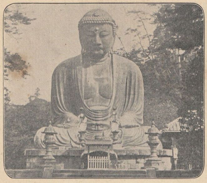
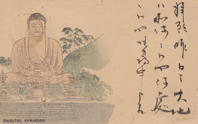
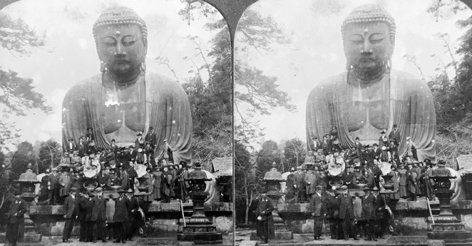
Figure 1

- Title/Caption: Daibutsu at Kamakura. 佛大倉鎌
- Year: c. 1909
- Publisher: Tonboya トンボヤ
- Medium: collotype print on cardstock, hand tinted
- Dimensions: 5 in X 3.5 in
- Reverse Imprint: Carte Postale Post Card [+], 郵便ハガ[キ]
This image of the Kamakura Daibutsu [Figure 1] highlights the rustic setting of the colossal statue, framing the statue between sprawling tree branches and the silhouette of a sago palm. With the camera placed in the southwest corner, our unknown photographer creates a voyeuristic scene as a man in knee-high mud boots and western attire peers towards group of Japanese visitors from behind a tree. Seeing this observer from behind, we take his perspective and also gaze upon the group of Japanese visitors dwarfed by the overlooking bronze statue. The brightly colored garments of the women on the right stand in contrast to the uncolored gray shades of the men and boy on the left [Figure 2]. The boy wears a school uniform (gakuran 学ラン), a style adopted decades earlier based on French and Prussian military outfits.[3] Among this group, only a single man looks up towards the Buddhist statue. The others stand and stare at each other from several paces apart. The gives an unnatural effect to the scene, as the stationary bodies and odd spacing fails to build up a clear visual narrative. What is the relationship of these temple visitors to each other? What is their purpose for being there? As was typical of cards from this period, bilingual cerulean letterpress informs us as to the identity of the Buddhist figure, the “Daibutsu at Kamakura” (note the imression left on the reverse along the bottom edge).
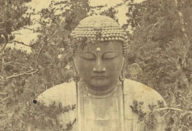
Figure 2


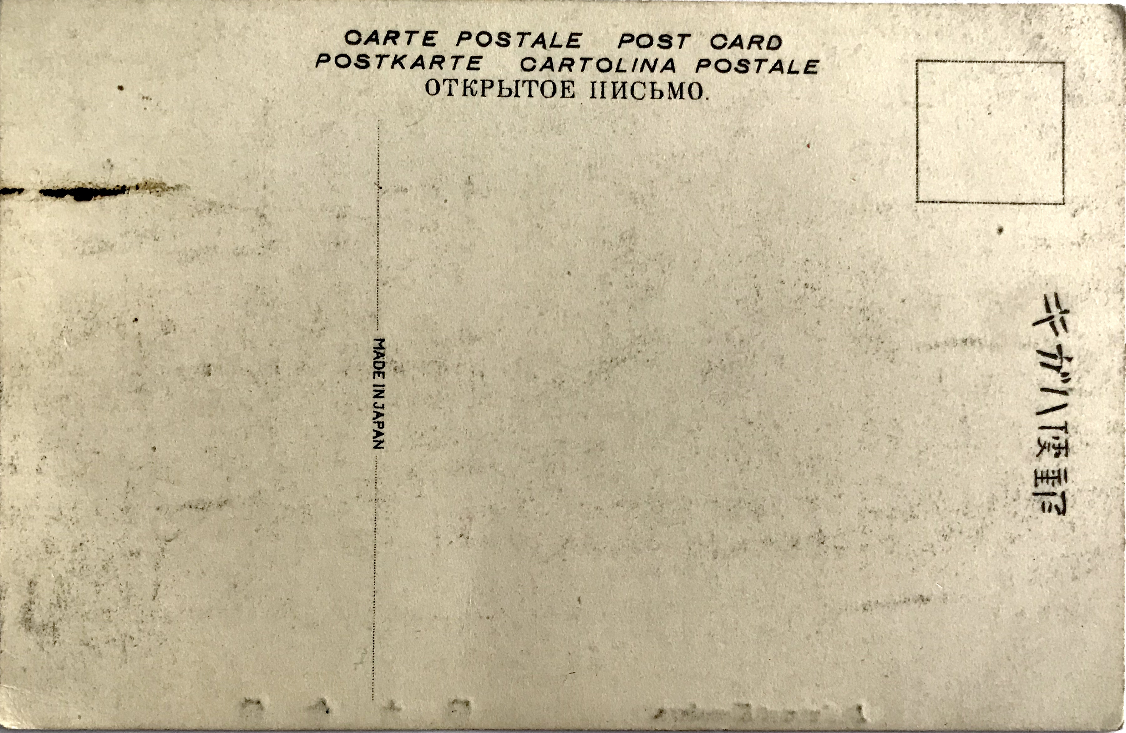
Often, Tonboya would impress its dragonfly logo at the lower right on the front of the card, but our variant lacks this identifying element.[4] Turning to the reverse of our card [Figure 1], we still fail to easily locate the characteristic mark of the dragonfly. So, just how can this card be distinguished? The designers at Tonboya devised a creative and playful way to identify their publishing studio; they replaced the ki (キ) in hagaki (ハガキ, “postcard”) with a highly stylized dragonfly illustration [Figure 3]. Only the most attentive observer would notice this subtle alteration, but once noticed it becomes an easily identifiable marker of this studio. This creative design can be dated back to around 1909 and remained throughout Tonboya’s existence into the late 1920’s.
Figure 3

Notes:
*This is part of a series of posts devoted to exploring the development of a visual literacy for Buddhist imagery in America. All items (except otherwise noted) are part of my personal collection of Buddhist-themed ephemera.
[1] Satō 2002: 41.
[2] Several online English sources claim Tokutaro Maeda was the founder of Tonboya, but I have found no Japanese sources that confirm this. I prefer here to follow the print Japanese sources (e.g. Saitō 1985: 1), but leave the question unsettled. Another unresolved question remains the relaitonship between Kamigataya and Tonboya. It appears that Tonboya may have been a distribution name of postcards printed by Kamigataya (which continued to also publish postcards under its own name). Some sources claim Tomboya opened as early as 1904, other as late as 1907.
[3] The development of Japanese school uniforms are detailed here: http://journal.media-culture.org.au/index.php/mcjournal/article/view/1041.
[4] Tonboya would also often include an identifying letter and stock number in the lower left, but this is also missing in our specimen. It is also possible to find cards with the letter and numbering system, but still lack the dragonfly icon, see here: https://www.maryevans.com [then search for the reference number 10989247]
References:
- Handy, Ellen. 1998. “Japonisme and American Postcard Visions of Japan,” in Delivering Views: Distant Cultures in Early Postcards, Christraud M. Geary and Virginia-Lee Webb, eds. Washington: Smithsonian Institution Press.
- Saitō Takio 斎藤多喜夫. 1985. “Yomigaeru shinsaizen no Yokohama fūkei よみがえる震災前の横浜風景,” Kaikō no hiroba 開港のひろば, No. 12, pp. 1, 4.
- Satō, Kenji. 2002. “Postcards in Japan: A Historical Sociology of a Forgotten Culture,” International Journal of Japanese Sociology, No. 11, pp. 35-55.
- Yokohama Open Port Museum横浜開港資料館, ed. 1999. Nen mae no Yokohama Kanagawa ― ehagaki de miru fūkei 年前の横浜・神奈川―絵葉書でみる風景. Tokyō: Yurindo 有隣堂.
Additional Posts in Visual Literacy of Buddhism Series