Peter Romaskiewicz [Last Update: June 2024]
Introduction: Identifying publishers for early twentieth-century Japanese postcards can be daunting. Publishers oftentimes omit their name or trademark – or in the case of some postally used cards, the trademark is printed in the stamp box, under the stamp.
I have stumbled upon two methods for tentatively identifying publishers of unknown cards. One method is to trace the image on the obverse (tsūshin-men 通信面, “communication side”) of the unknown card to a different printed postcard with shared image where the publisher is clearly indicated. This process is not fool-proof, however. Some images seem to have become the common property of several publishing houses, especially when considering older photographic stock commonly seen on the “undivided period” of cards (early Japanese laws only provided five to ten years of copyright protection, see Bennett 2006a: 123, Bennett 2006b: 308). Moreover, it is possible that the rights to certain photographs were sold between publishing house – or outright pirated – thus making definitive identification difficult.
The second method is to identify the distinctive printing designs on the reverse (atena-men 宛名面, “address side”) of an unknown postcard and determining any plausible relationships between variant cards where the publisher is identified (e.g. matching general design, fonts, printing colors, etc.).
Using a combination of these two methods I propose the following identification for Ueda Photographic Prints Corporation 上田写真版合資会社 (historically Romanized as “Uyeda”) postcards printed between 1907 and 1918 (corresponding to Period II of Urakawa Kazuya’s 浦川和也 chronology). For a brief history of the company see here.
I identify five variant “types” that appear to follow a general chronological sequence, arranged into two “phases.” Much more work needs to be done to determine if an earlier type or phase ends with the introduction of a new type or phase, or if they were printed concurrently. The basic principle follows that the final type in the second phase (see below), Ueda incorporated its crest/trademark [a stylized “Ueda” 上田, see Figure 1] atop the dividing line on the reverse of the card. Thus, if any connection can be established to older variants without the publisher’s mark, they too would possibly (or even likely) be Ueda products.
Figure 1: The Ueda Photographic Prints Corp. trademark/crest.

Again, I have accomplished this by matching cards with the same obverse image but different reverse designs (as seen here) and complemented this procedure by looking for overarching similarities among different exemplars in the printing and design on the reverse. The design of the reverse is the most distinctive aspect of mass-produced postcards, and identifying the font, ink color, or overall design may help in determining publishers (see a Hoshinoya exemplar here). For Udea, the multilingual printing on the reverse in umber brown (or burgundy) ink appears as one of its most easily identifiable hallmarks. An outline of the progressive changes (Type 1 to Type 5) for Udea’s reverse printing is found below.
Relative Chronology of Ueda Cerulean-Umber Design from 1907–1918 (Urakawa Period II)

Urakawa Period II – Phase I (German or French header)
- Type 1 (top card above): divided back; topped with German “Postkarte” header [TPQ 1907]
- Type 2 (second card from top): divided back; topped with French “Carte Postale” header and imprinted with “Made in Japan” in dividing line (or sometimes in the bottom left corner)[TPQ 1907] (Update: I have found images that have also matched to later Tonboya backs, this identification needs more consideration.)
- Notes: As of June 2024, I possess a Type 1 “German” header on an undivided back card (Urakawa Period I, pre-1907) with the old Udea company name printed along the side edge in Japanes. The header is printed in burgundy. I have yet to locate a Period II/Type 1 card with Ueda’s name, but believe there are grounds to make the association between the Period I and Period II/Type 1 cards. Type 2 cards switched from German to French headers. I have yet to find a Period II/Type 2 specimen on an undivided back, but the same sans-serif “Carte Postale” type (omitting the other languages) is found on undivided cards. Some sources claim that foreign language designations (i.e. non-Japanese) only appeared in 1905, but I have found that to be inaccurate. [There are two more types of Urakawa Period II cards not published here, I am still gathering more information.]
Urakawa Period II – Phase 2 (French-German-English header)
- Type 3 (middle card): divided back; topped with French-German-English header and imprinted with “Made in Japan” in dividing ling, capped by single bar [appears c.1910]
- Type 4 (second card from bottom): same as Type 3, but with a double bar capping the dividing line; possibly coincidental, this resembles the trademark for the Japanese Post Office (〒) [appears c.1910]
- Type 5 (bottom card): same as Type 3, but with Udea crest capping the dividing line [appears c.1912]
- Notes: These types all also contain the following ten languages in order: Italian, Estonian, Czech, Polish, Dutch, Austrian, Spanish, Sweedish, Norwegian, and Russian. Type 4 variants exist with “Made in Japan” imprinted on the short edge of the card.
- As of June 2024, I now posses a Period II/Type 4 card with “Printed by Uyeda, Yokohama” on the side edge (Caption on the obverse: “Ogosho, Kyoto”). When considering the fact that I have not yet found Period II/Type 3 or Period II/Type 4 cards with a different publisher’s name strongly suggests there is firm grounding to assume Period II/Type 3 and Period II/Type 4 cards are the products of the Udea publishing house.
Color Variations on the Reverse of Ueda Postcards from 1907-1918 (Urakawa Period II)
The color of the ink on the Ueda reverse can vary between a burgundy red, light or dark orange, and cinnamon or umber brown (see below). It is difficult to determine if these distinctive hue variations were intended or are due to printing irregularities, light fading, or general aging. Regardless, these ink colors stand out in comparison to the blues and black used by several other contemporary publishers (Tonboya and Hishinoya specifically). Because a large portion of Ueda cards are brown or dark brown, I use the term “umber” as an umbrella term to include the variant warm color inks.

Color Variations on the Obverse of Ueda Postcards from 1907-1918 (Urakawa Period II)
Turning to the front of the card, captioning was a fairly common practice among many postcards publishers and is not a viable way, in isolation, to identify Ueda prints. In addition, not all Udea postcards are captioned, especially more generic images, such as those of geisha. Nevertheless, an immense amount of Ueda cards are captioned bilingually in English and Japanese in a cerulean or cobalt blue ink. Sometimes a caption is printed in another color, such as brown, but this is rare and most are printed in a light to dark cerulean blue (see below). After 1917, however, Ueda revamps its design and more captions are printed in scarlet red. This is just another factor to consider when assessing the origins of a postcard. Irregularly, some captions are printed with an index number on the lower left, but this was far more common among the Tonboya publishing house.

After 1918…
When shifting to Period III of Urakawa‘s chronology, the postal regulations move the dividing line to the middle of the postcard in 1918, and Ueda follow suit by shifting the crest-capped line to the center of the card. In this new period, I have seen this dividing line position with the Type 5 and Type 2 design, and have also seen a new design absent the multilingual translations.
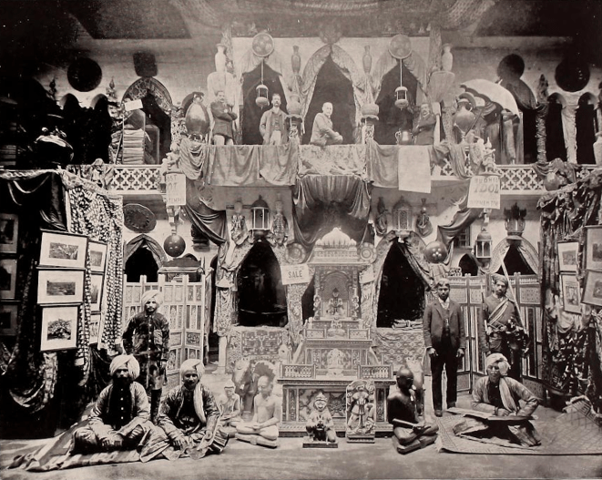
Overall, I only offer this typology and chronology as a possible starting point for historical research, as more work remains to be done to develop a more robust history of Ueda postcard printing. Unsurprisingly, there is a lot more research on the Yokohama shashin 横浜写真 (“Yokohama photography”) industry which produced many of the oldest and most significant tourist photographs of Meiji Japan. Much more research will be necessary to identify the photographers of these inexpensive and mass-produced postcards.
Notes:
I have found at least two different Urakawa Period I Udea backs. One is Type 1 (as noted above). Another has a “Union Postale Universelle” header in serif font, with “Carte Postale” in serif font underneath.
Additional “Working Notes” Posts