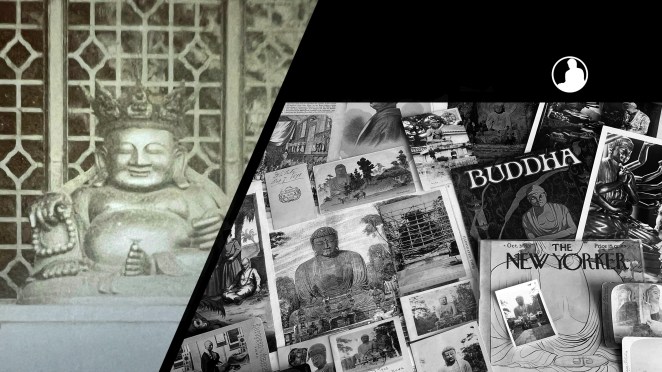
For all the new Buddhas in the West posts follow us on Bluesky & Instagram
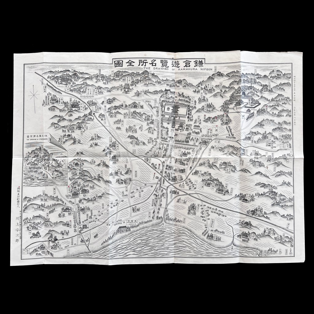
After the opening Japan in 1859, the old backwater capital of Kamakura was transformed into an international tourist destination. This bilingual tourist map from 1912 (Meiji 45) provides a glimpse into which Kamakura sites were seen as most significant, including the Kamakura Daibutsu.
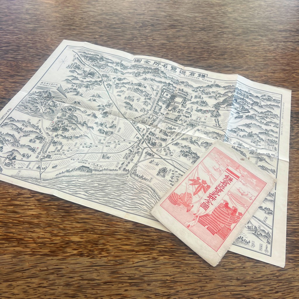
The Complete Map of Kamakura Famous Places for Sightseeing (Kamakura yūran meisho zenzu 鎌倉遊覧名所全圖), loosely rendered into English as The Drawing of Kamakura Nipoon [sic], came inside a paper folder printed with symbols of the Japanese empire. The map was prepared by Kawakami Yasujirō 川上安次郎.
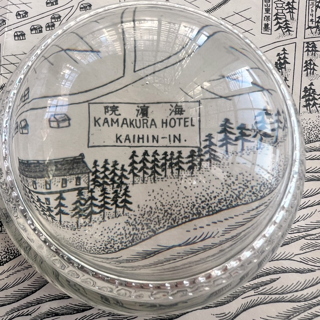
By the early 1890s, the Kamakura Kaihin Hotel, a converted medical therapy facility for seawater bathing, emerged as the premier resort for Kamakura travelers. In March 1893, the Japanese Welcome Society was established to help promote foreign travel in Japan.
For many Japanese travelers, the main attraction was the Hachiman Shrine, a large complex in the heart of the city found at the end of a long central promenade leading to the ocean. The red dot seen here suggests this site was highlighted by the original owners of the map.
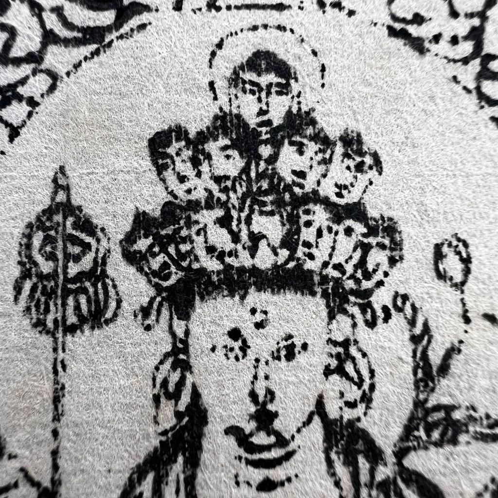
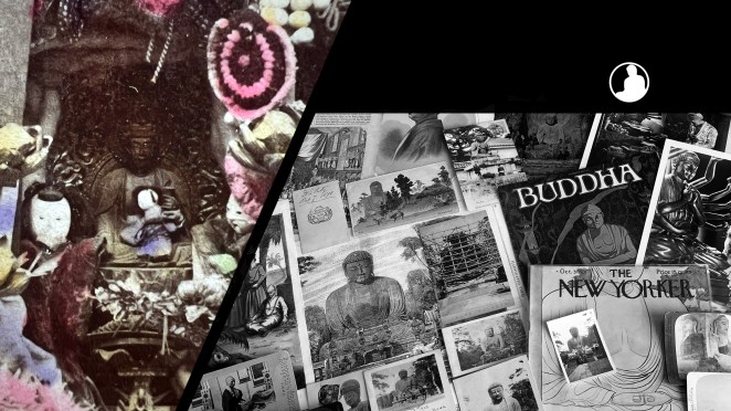
Among the many dozens of sites named on the map, only a handful are marked by a red dot. Of those highlighted is Hase-dera, temple home to a famous 31-foot tall Eleven-Headed Kannon statue.
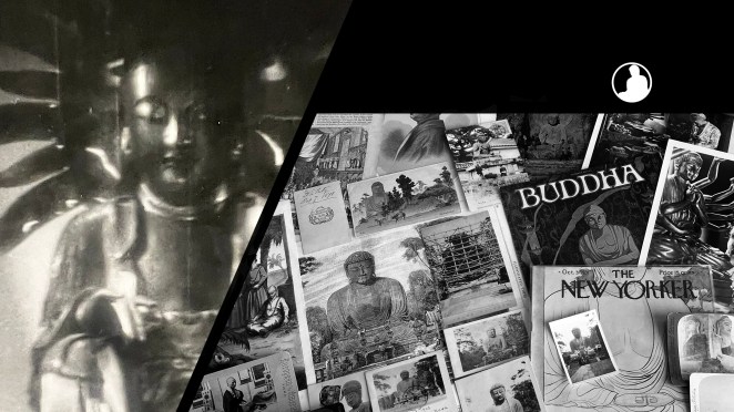
Another highlighted tourist attraction is the Kamakura Daibutsu at Kōtoku-in, here depicted by a small, yet easily identifiable, icon. For a digitized collection of Japanese maps held by the C. V. Starr East Asian Library at UC Berkeley, see tinyurl.com/yutj576z.
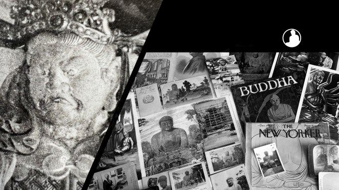
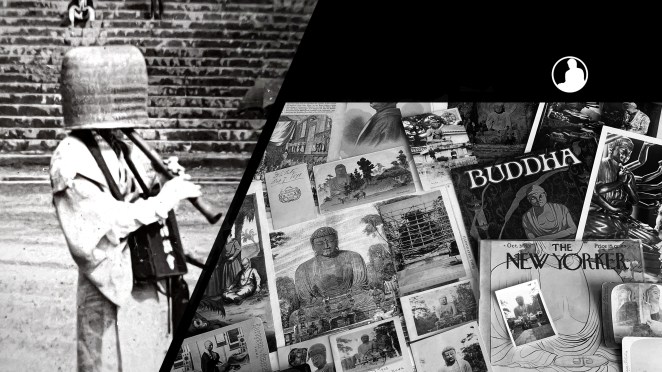
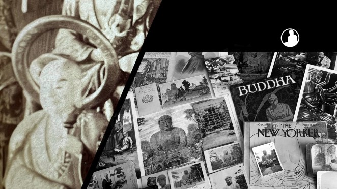
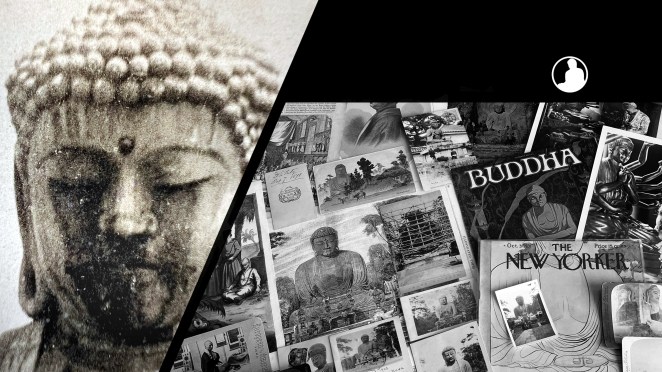
The Buddhas in the West Material Archive is a digital scholarship project that catalogues artifacts depicting Buddhist material culture for Western audiences. It’s comprised of prints, photos, and an assortment of ephemera and other objects. For a brief introduction to this archive, visit the main Buddhas in the West project page.
For Related Buddhas in the West Posts Featuring Japan:
For all the new Buddhas in the West posts follow us on Bluesky & Instagram
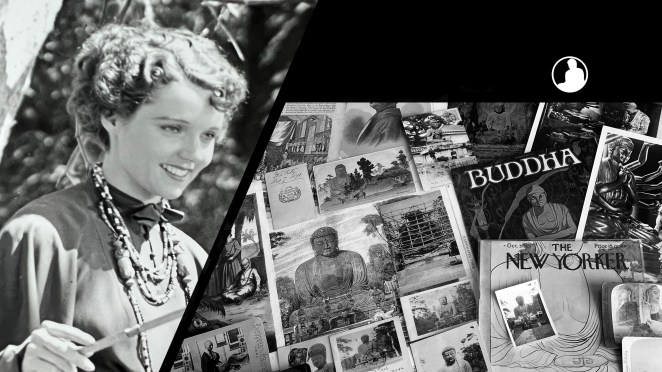
Isabella Stewart Gardner, founder of Gardner Museum, was an early American collector of Asian art with an affinity towards Buddhist artifacts.
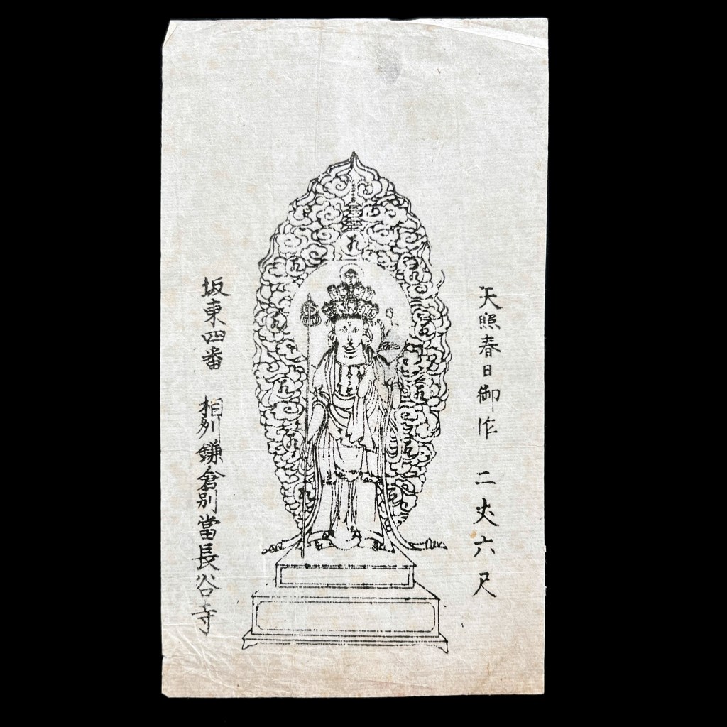
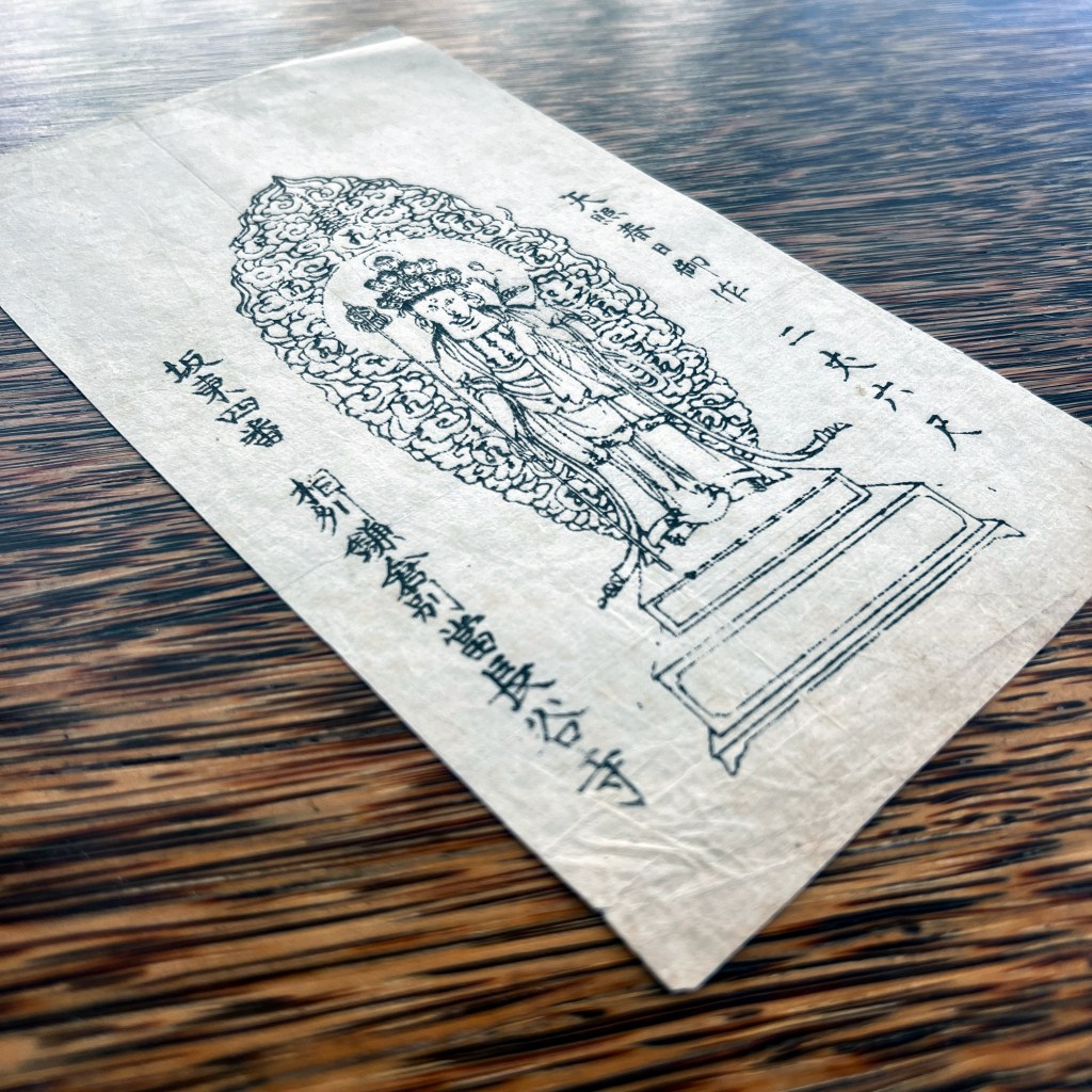
Gardner returned from Asia in 1884 with a Japanese talisman very similar to the one shown here. Both talismans came from Kamakura Hasa-dera 長谷寺 and depict the temple’s main Kannon icon. Talismans (ofuda お札) are woodblock prints sold by various shrines and temples typically for their protective or salutary effects. They were also popular among Japanese pilgrims.
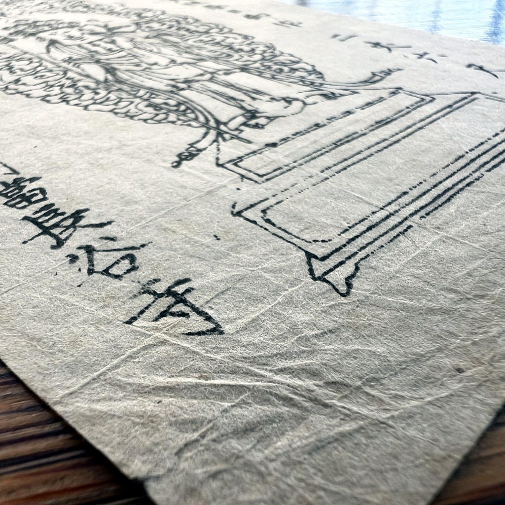
Printed on thin paper, pilgrims would often carry these talismans in a special bag called a fudabasami.
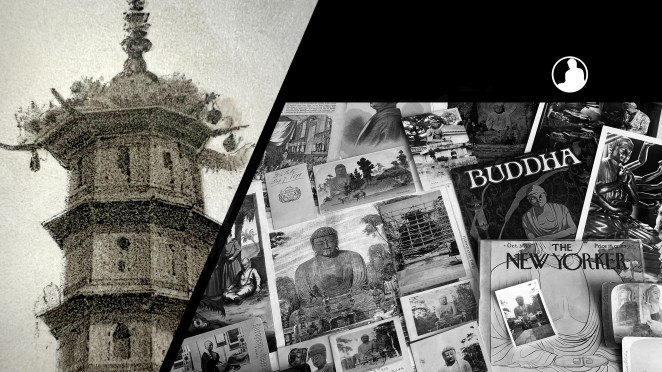
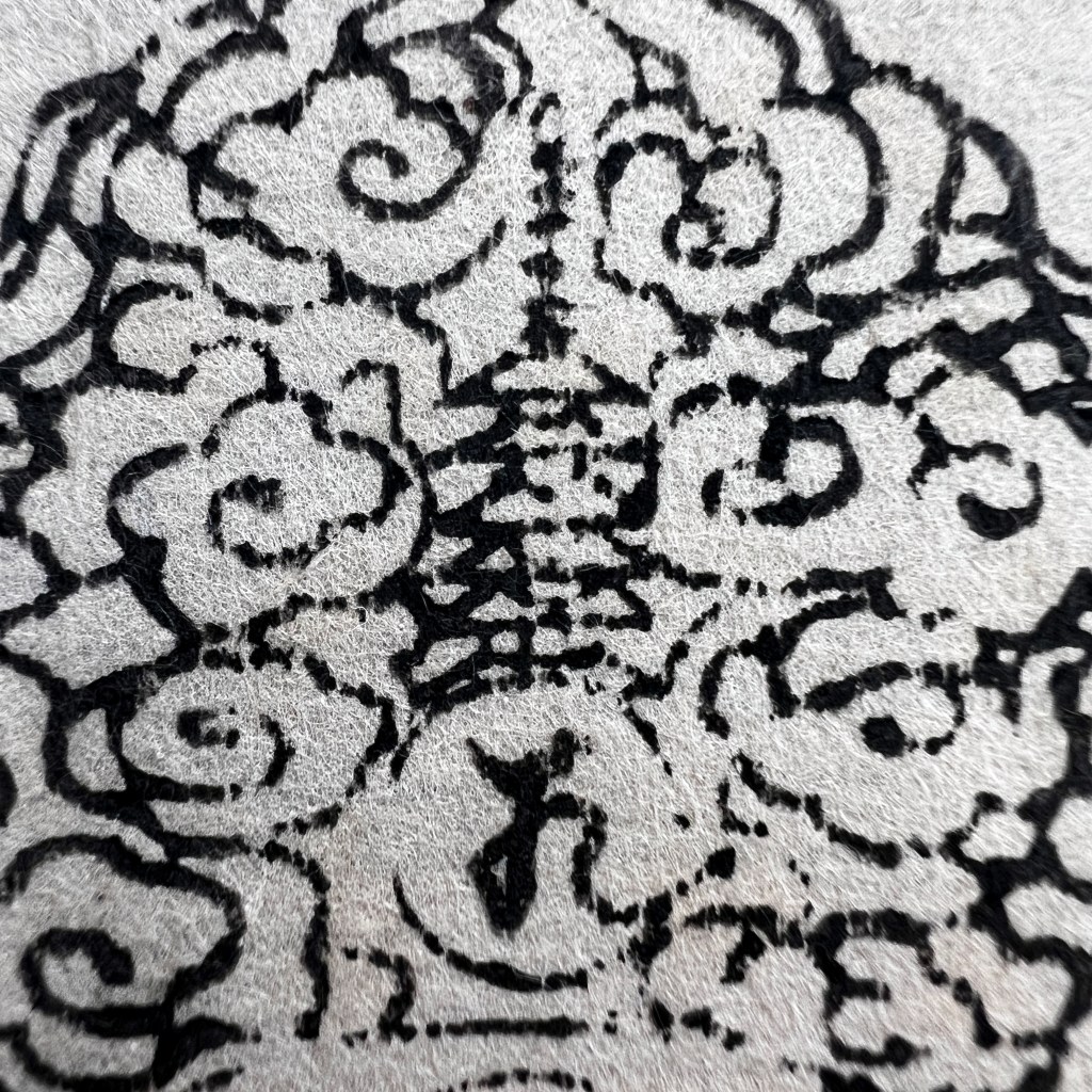
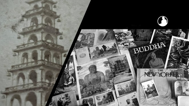
A close examination of the print shows small details, including this pagoda.
Buddhist imagery proved inspirational for Garder as she commissioned John Stewart Sargent to paint her portrait in 1888 which bears a strong likeness to the standing Kannon icon. A discussion of the portrait and its Buddhist influence can be read here: https://tinyurl.com/359r522m.
The Buddhas in the West Material Archive is a digital scholarship project that catalogues artifacts depicting Buddhist material culture for Western audiences. It’s comprised of prints, photos, and an assortment of ephemera and other objects. For a brief introduction to this archive, visit the main Buddhas in the West project page.
For Related Buddhas in the West Posts Featuring Kannon / Avalokiteśvara:
The modern Japanese word for postcard, hagaki はがき, is derived from hashigaki はしがき (or 端書き), a reference to writing placed at the beginning or end of a document. During the early Meiji period (1868–1912), hagaki came to denote a brief letter or a note that was sent through the mail as a postcard.[1] The first postal card in Japan was issued in December 1873, just four years after this novel postal stationary was introduced in Austro-Hungarian Empire. Until the beginning of the twentieth century all Japanese postal cards were government issued (kansei 官製). Moreover, the vast majority were printed without images on the obverse since the non-address side was reserved for the written message. These plain cards are further identifiable through pre-paid franking printed on the address side (reverse) of the card. Changes in Japanese postal codes on October 1, 1900 afforded private companies the opportunity to publish picture postcards (ehagaki 絵葉書) where an illustration or design could be printed on the obverse. These changes altered the landscape of the postcard market and soon started a new cultural phenomenon known as the Japanese “postcard boom.”[2]
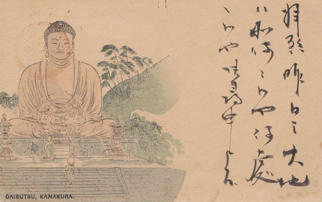
Figure 1
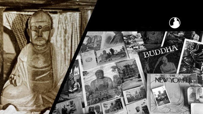
The state issued postal card shown here, postally canceled in 1897 (Meiji 30),[3] unconventionally bears a multi-color woodblock print on the obverse. It depicts the Kamakura Daibutsu colored with washes of ink [Fig. 1]. Notably, the image is offset to allow space for the written message; it would not be until 1907 that a message could be written on the reverse. Domestic illustrated postal cards from this period – that is, before the ban on privately printed cards was lifted in 1900 – are relatively uncommon and their origins are poorly understood.[4] Exemplars such as this suggest the state Printing Bureau (insatsu-kyoku 印刷局), the agency responsible for printing banknotes, stamps, and postal cards, may have been playing with designs before the postal code changes in 1900 or, alternatively, were ambivalent towards private companies who added illustrations to government cards and resold them to the public.[5]
For example, in addition to the circulation of illustrated New Year’s cards (nengajō 年賀状) in the 1890s, some government issued cards (as identified through the imprinted franking on the reverse) depict photographs of landscapes and a variety of scenes from daily Japanese life.[6] It is clear that some of these images draw heavily upon photographic genres, compositions, and conventions that developed under the Japanese foreign tourism and souvenir industry of the 1870s and 1880s.[7] More specifically, some state-issued postal card images can be traced to known Japanese photography studios that catered to both domestic and foreign clientele through the last decade of the nineteenth century.[8]
It remains unknown whether early picture postal cards were printed under the formal auspices of the Printing Bureau (to my knowledge, there is no documentation supporting such a view), or if Japanese photography studios privately issued or commissioned photomechanically printed cards on the “base” of state-issued cards, or if printing houses purchased copyrights of photographs and issued cards themselves (again, on a state-issued card “base”).[9] Current evidence gives most weight to the latter possibility. We know, for example, Ueda Yoshizō 上田義三 (1865–?), opened a collotype printing house in Yokohama in 1897 and is reported to have printed landscapes and images of people on state-issued cards.[10] The role of the Printing Bureau and other state agencies remains undetermined in such a business, but we may surmise these entrepreneurial activities helped encourage the postal regulation changes in 1900. Ueda would directly benefit from this change and became the one of the largest private postcard publishers in Yokohama through the early 1910s.
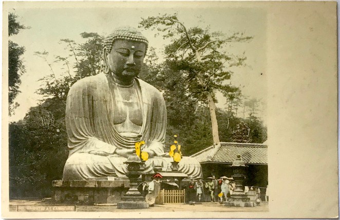
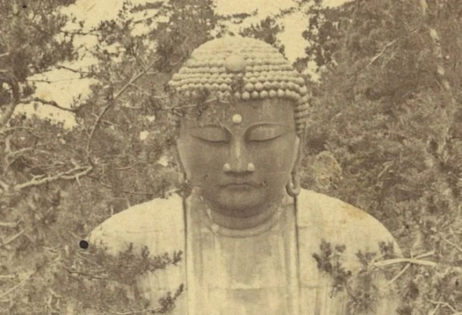
The postal card under consideration here is reminiscent of similar period photographs taken of the Daibutsu statue head-on. The unknown artist depicted a realistic scene with two Japanese travelers gazing upwards at the colossal image. It casts a gentle sign of reverence towards the Buddhist image without culturally reductionistic signs of deep religious piety as was sometimes choreographed by Western photographers. The overall scene is calm and peaceful, reflecting the beneficent gaze of the Daibutsu.
With the exception of the steeply banking hillside and tall flight of steps leading to the top landing, the illustration depicts the location faithfully as it was known in the 1880s, inclusive of the step ladder to help visitors climb atop the statue. Similar photographs were sold by the studios of Kusakabe Kimbei 日下部金兵衛 (1841–1934) and Tamamura Kōzaburō 玉村康三郎 (1856–1923?), both highly accomplished commercial photographers whose stock may have been the models upon which the unknown artist based this design.[11] The Daibutsu grounds were modified by the winter of 1890, thus while this postcard was probably printed in the latter half of the 1890s, it is likely based on a photograph taken a decade earlier.
The only curious element in the depiction of the statue is the inclusion of earrings, a detail often reserved for other Buddhist deities, but not for buddhas. In contrast, the original bronze work has long, pierced ear-lobes which one might easily confuse for earrings, especially from frontal photographs.[12]
Figures 2 & 3
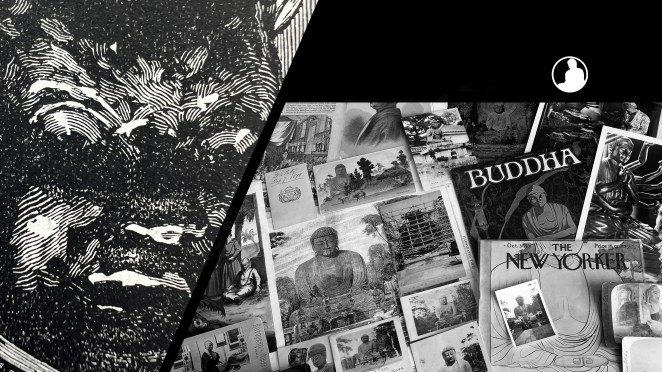
In further examining the card we can infer it is a woodblock print. First, this is discernible through the telltale signs of “ink squash” along the margins of the color washes. This occurs when the pressure of printing forces ink to spill over the cut edge of the woodblock, creating a darker ink line [Fig. 2]. Moreover, we can observe partial embossing of the obverse image on the reverse of the print. The pressure of the print, most noticeable here with the trees on hillside, causes the paper to deform around the woodblock cuts [Fig. 3]. (Both figures show an unused version of the same postcard where these details are easier to see.)
Figure 4
The reverse bears a rectangular filigree border and 1 sen oval-shaped frank printed in light blue [Fig. 4]. We may presume this card was intended for domestic use since international mail required higher 2 sen or 3 sen rates.[13] Additional postage could be affixed, however, to make up for the difference. There are other indications this card was produced with an international or cosmopolitan audience in mind. If we look back at the caption under the obverse illustration we see “Daibutsu, Kamakura.” While this uses Japanese terminology (Daibutsu means “Great Buddha”), it nevertheless employs the foreign Roman alphabet, not native kanji characters or the kana syllabary, such as we see on the reverse.
The franking design here incorporates the three-leafed paulownia seal (kirimon 桐紋), the official insignia of the Japanese government, in its center. Examining the border design we can also find the government agency responsible for printing the card, namely the Printing Bureau in the Ministry of Finance.[14] Instructions in Japanese explain this side is reserved for the name and address of the recipient only. The paper is thinner than the sturdier stock customarily used by private publishers a few years later. Not only was the paper more durable, it was also a better surface for the increasingly fashionable fountain pen, a Western implement that started to replace the traditional writing brush, especially for composing postcard messages.[15]
*This is part of a series of posts devoted to exploring the development of a visual literacy for Buddhist imagery in America. All items (except otherwise noted) are part of my personal collection of Buddhist-themed ephemera.
Notes:
[1] Scholars of postal history often distinguish between “postal cards” which are imprinted with prepaid franking (an imprinted stamp) and “postcards” which are privately issued and require the addition of an adhesive stamp. The Japanese term hagaki came to signify both state issued postal cards and privately issued postcards.
[2] For an English language introduction to the early history of Japanese picture postcards, see Satō 2002 and Morse 2004.
[3] The cancellation stamp is heavily degraded, but Meiji 30 seems appropriate. The bisected cancellation date stamp (maruichi gata hitsukein 丸一型日付印) was nationally adopted in 1888 and the date reads year-month-day from right to left below the dividing line. Sanjū nen 卅十年 (Year 30) is barely legible and is equivalent to 1897. This dating also aligns with other evidence placing the cancellation between 1878 (signaled by the inclusion of the Printing Bureau instead of the Bureau of Banknotes on the reverse border inscription) and April 1899, when the postage rate for postal cards increased from 1 sen to 1½ sen (additional postage would have been affixed to the card if mailed after the rate increase). In addition, the Printing Bureau changed the design of the oval frank postal card to a chrysanthemum frank in December 1898, thus the printing of this postal card – not necessarily its mailing – must predate this period.
[4] Traditional Japanese deltiological lore holds that the first privately issued picture postcard was designed by Ishii Kendō 石井研堂 and appended to the October 5th issue of the boy’s magazine Kinsei Shonen 今世少年, just four days after the new postal regulations. This story was first reported in Ishii’s own 1908 work, Origin ofMeiji Things明治事物起源, where he proclaims himself to be the inaugural producer of private picture postcards. Most postal historians will point out that Ishii’s claims do not preclude the earlier existence of state issued cards bearing pictures, see for example Saitō 1999: 336. Nevertheless, Ishii’s own claims deserve further scrutiny. For example, in 2020, a privately issued picture postcard cancelled on October 1, 1900 came into the hands of collector Takao Hitoshi 高尾均, hinting the printing history of picture postcards is not as straightforward as traditional lore suggests.
[5] Postal cards had long been adorned with hand drawn illustrations prepared by the sender, now typically categorized as etegami 絵手紙, “hand drawn missives.” These were clear predecessors to the mass scale printing of picture postcards. In addition, many Japanese were previously familiar with picture postcards through European or American cards collected overseas or sent through international mail, see comments in Mōri 2013: 32.
[6] As noted in Kim 2011: 173. Such postal cards are can be categorized as landscapes (fūkei 風景) and customs (fūzoku 風俗). These are continuations of the two most important genres of Meiji-era export tourist photography, see Tucker 2003: 7–8.
[7] For discussion of early commercial photography in Japan, see Dobson 2004 and Wakita 2013.
[8] This personal observation is based on seeing several illustrated state-issue cards for sale on the secondary market. For example, I have seen postal cards depicting a photograph of geisha playing the shamisen and koto as well as a lakefront vista of the old Grand Hotel in Yokohama (destroyed during the 1923 earthquake). Both of these images were reproductions of photographs found in albums sold by Yokohama photographer Kusakabe Kimbei, catalogued as “371. Girls Playing on Samisen and Koto,” and “505. Grand Hotel, Yokohama”; for these catalogue number attributions, see Bennett 2006: 137. I saw the former photograph, with identifying caption, in a private collection while the latter, also with identifying caption, is held by the Syracuse University Art Museum (Object number 1986.510). Notably, the postal cards were printed with 4 sen franking, revealing they were intended for international mail.
[9] It should be noted that Meiji-era Japan had weak copyright regulations for photographs and pirating was fairly common, see Bennett 1996: 85–87.
[10] Saitō 1999: 336. Mid-to-late Meiji business documents from the many postcard sellers of the time have yet to be uncovered. As noted by Saitō Takio, a very large Yokohama postcard exhibit was held in 1985 in the hopes that descendants of these sellers would come forward with old business documentation or family anecdotes, but nothing of the sort occurred, see Saitō 1986.
[11] Relevant photographs would be Kusakabe Kimbei’s print sometimes labeled as “1020,” with an exemplar held by the Nagasaki University Library (Catalogue No. 4673), and Tamamura Kōzaburō’s print captioned “No. 535 Daibutsu at Kamakura,” with an exemplar held by Museé Guimet (AP15903).
[12] According to Buddhist lore, as a sign of his renunciation of princely life, the Buddha removed his earrings, thus leaving his pierced earlobes empty.
[13] International postal cards, issued between June 1879 and December 1898, were printed with 2 sen or 3 sen franking depending on destination, see EGASHIRA 2018: 2. The 1 sen rate covered domestic postage until April 1899 when the rate was increased.
[14] The full inscription reads, “issued by the Printing Bureau in the Ministry of Finance of the Empire of Japan” (Dainippon teikoku seifu Ōkurashō insatsu-kyoku seizō 大日本帝国政府大蔵省印刷局製造). The Printing Bureau in the Ministry of Finance was also responsible for printing paper currency.
[15] For comments on the relationship between postcards and fountain pens, see Satō 2002: 49.
Sources:
Bennett, Terry. 2006. Old Japanese Photographs Collectors’ Data Guide. London: Bernard Quaritch Ltd.
Dobson, Sebastian. 2004. “Yokohama Shashin.” In Art & Artifice: Japanese Photographs of the Meiji Era, by Sebastian Dobson, Anne Nishimura Morse, and Frederic A. Sharf, 15–40. Boston: MFA Publications.
KIM Kyounghwa 金暻和. 2011. “‘Bungaku to shite no hagaki’: Nichirosensō-ki no “hagaki bungaku” o jirei ni shita media-ron no kokoromi”「文学としての葉書」: 日露戦争期の『ハガキ文學』を事例にした メディア論の試み. Masu komyunikēshon kenkyū マス・コミュニケーション研究 78: 169–88.