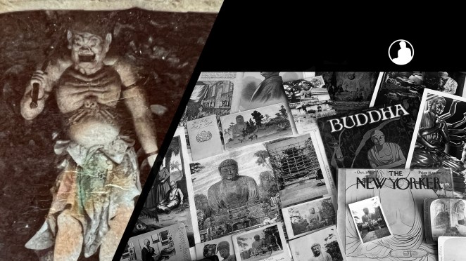
For all the new Buddhas in the West posts
follow us on Bluesky & Instagram
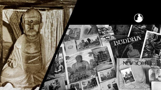
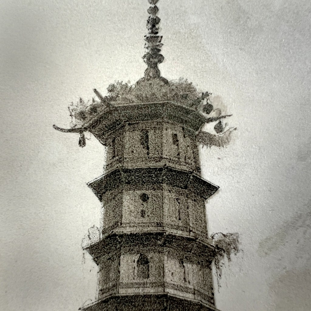
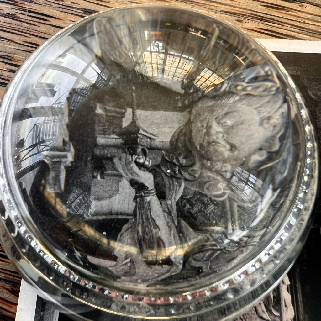
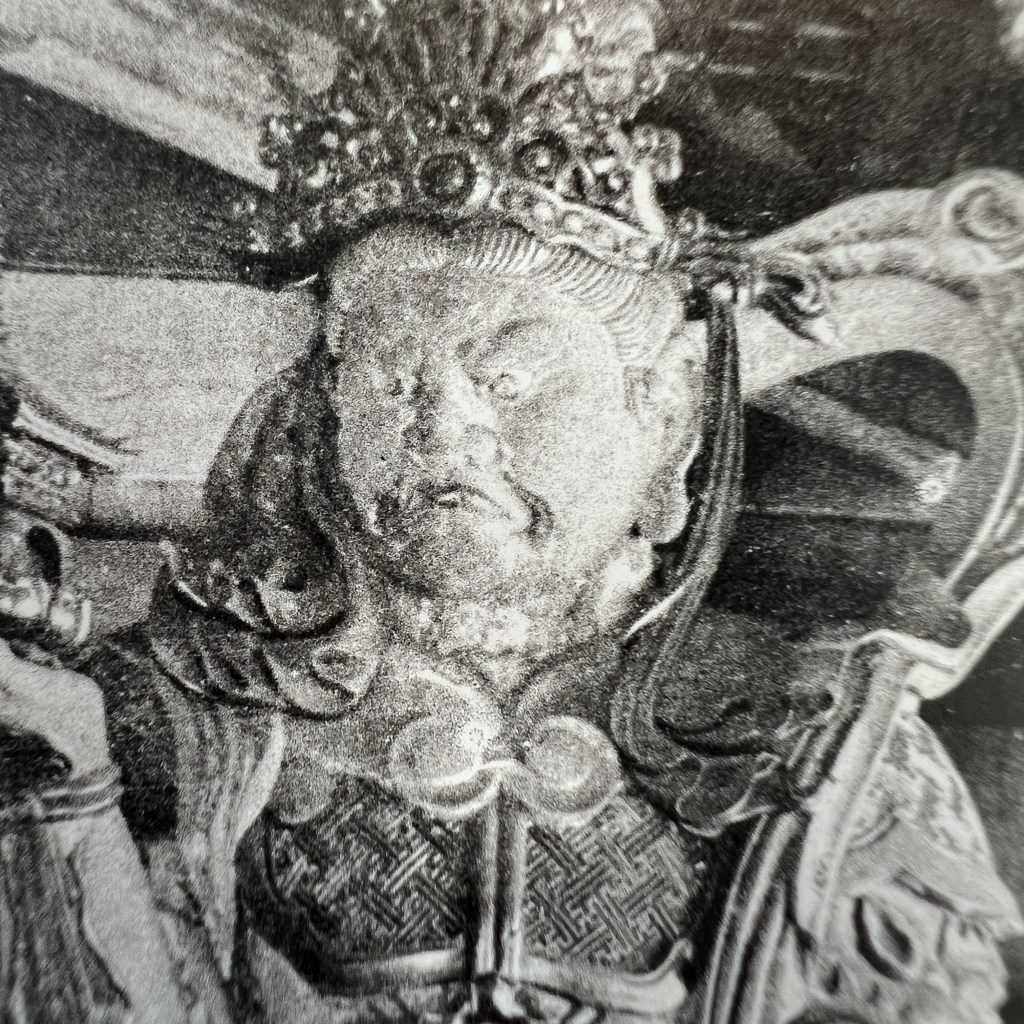
Hidden among the treasures of Nara’s Tōdai-ji stands a fierce guardian: Bishamonten, the Heavenly King of the North. Clad in armor with eyes blazing, this towering 4.2-meter cypress statue exemplifies the remarkable craftsmanship of thirteenth-century Japanese Buddhist sculpture.
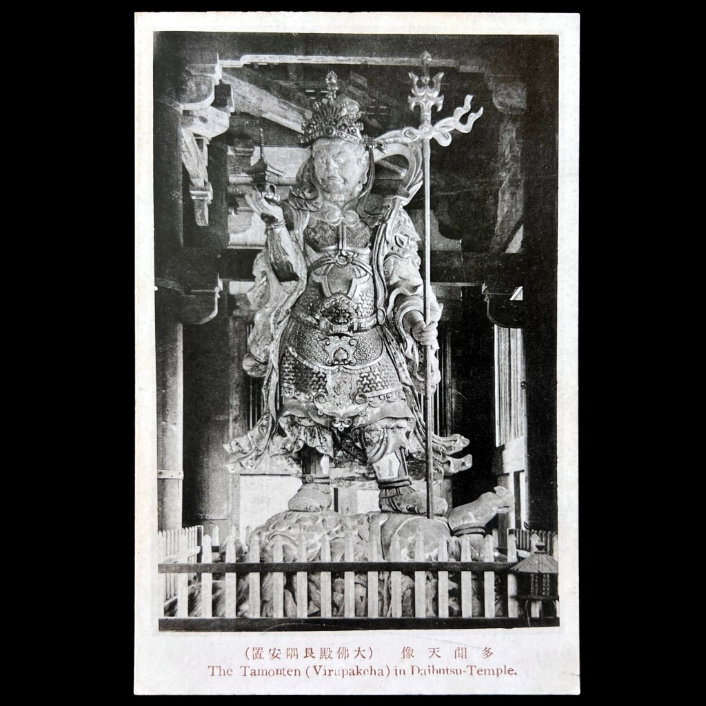
Bishamonten, adapted from the Indian deity Vaiśravaṇa, is foremost a “demon subduer who subjugates maleficent entities,” and by extension serves as a protector of the Buddhist teachings and of the rulers who uphold them. In Japan, he also came to be revered as a patron deity of warriors.
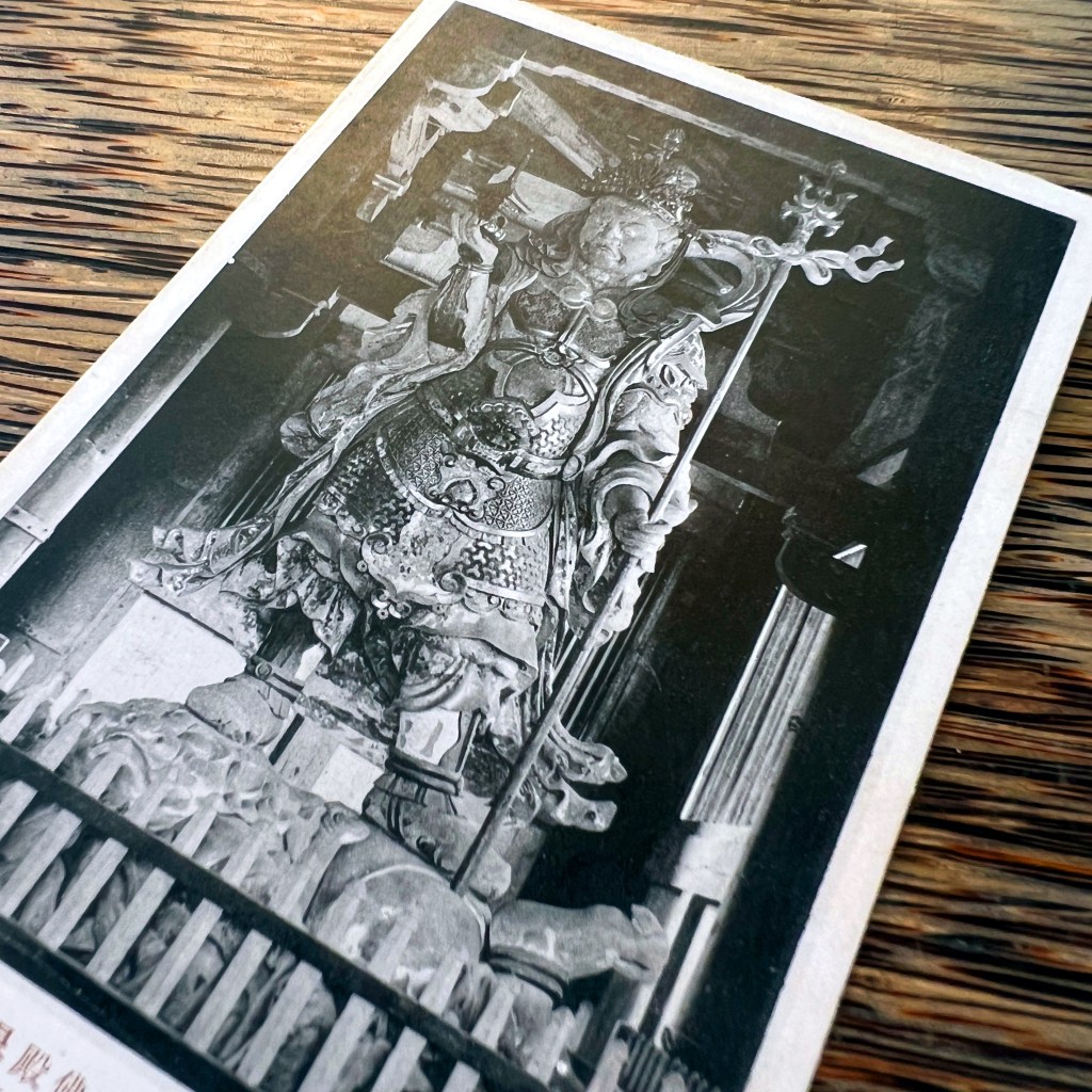
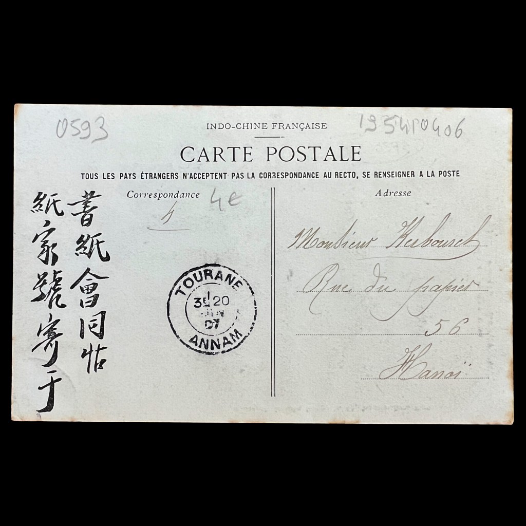
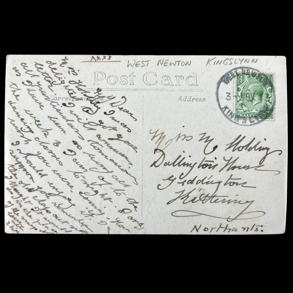
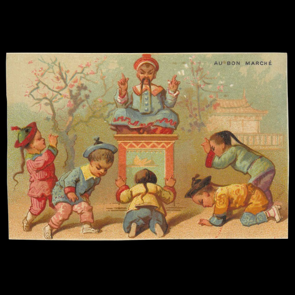
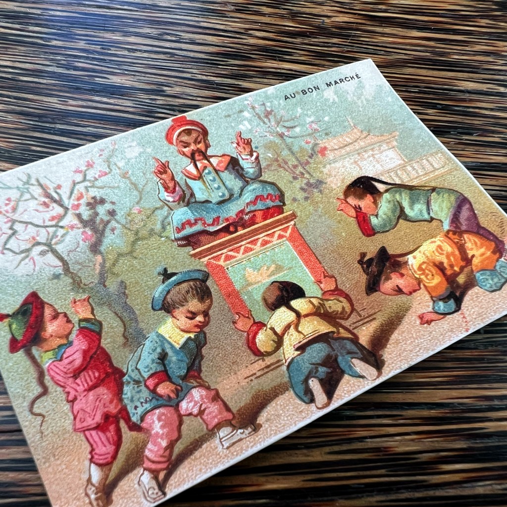
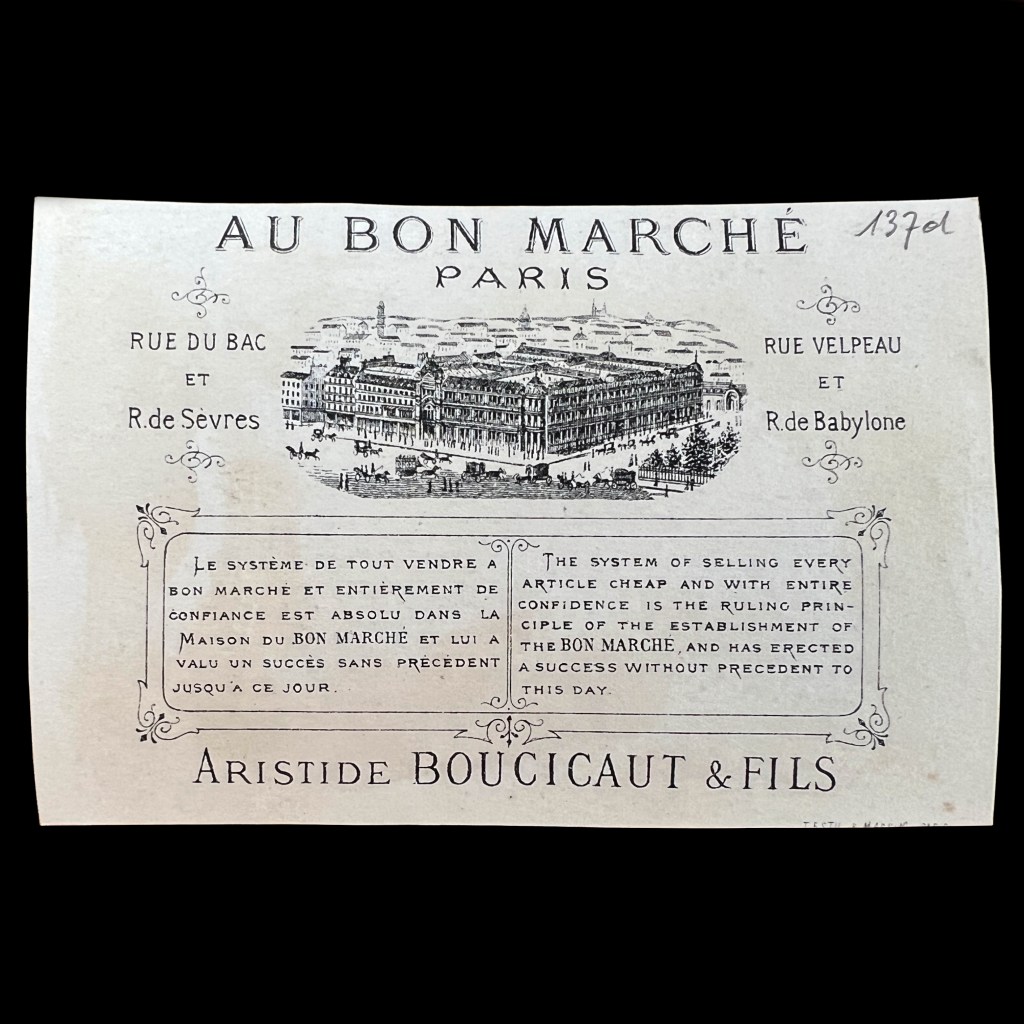
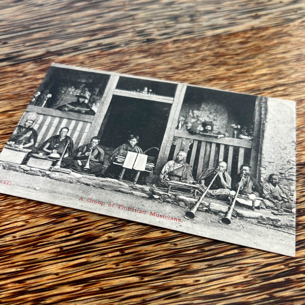
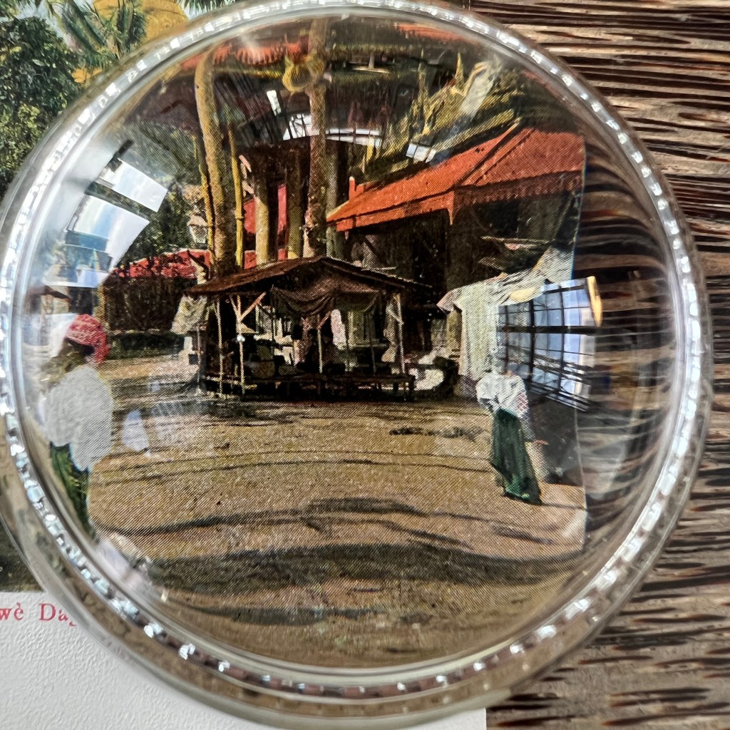
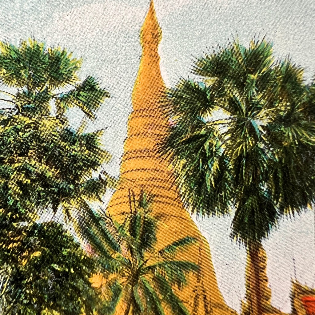
This postcard was published by Tōdai-ji, the historically powerful temple complex in the ancient capital of Nara. It was likely issued as part of a souvenir set in the late 1930s. The small emblem in the stamp box depicts the great fish-shaped roof ornament crowning the temple’s main hall.
In his hand Bishamonten holds a miniature pagoda, a reliquary associated with the relics of the Buddha. The object underscores his role as a guardian of the Buddhist teachings, while also reflecting his parallel identity as a protector of treasure and bestower of prosperity.
For this reason, Bishamonten is also venerated as one of Japan’s Seven Gods of Good Fortune. For more on the many roles of Bishamonten, see Bernard Faure, Gods of Medieval Japan: Protectors and Predators (2015).

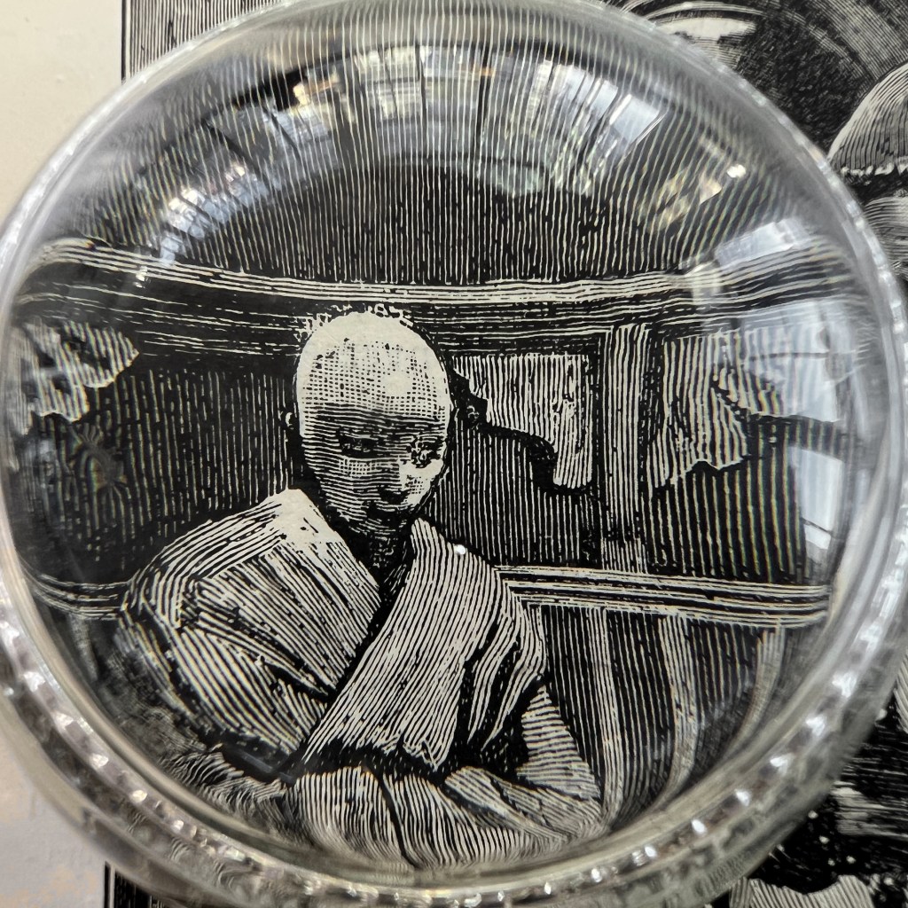
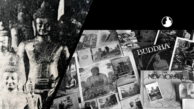
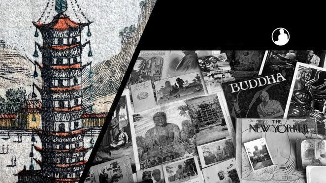
The Buddhas in the West Material Archive is a digital scholarship project that catalogues artifacts depicting Buddhist material culture for Western audiences. It’s comprised of prints, photos, and an assortment of ephemera and other objects. For a brief introduction to this archive, visit the main Buddhas in the West project page.
For Related Buddhas in the West Posts Featuring Nara:


For the Most Recent Buddhas in the West Posts: