My first-year composition class requires students to engage in rhetorical and textual analysis through developing a “heightened awareness” of writing genres. Genre-based analysis works on a wide range of texts (really, all texts) and given the important role of media in the several last US elections and the prominent and recurring spotlight thrown on Fake News, I thought an examination into news genres would be timely and interesting.
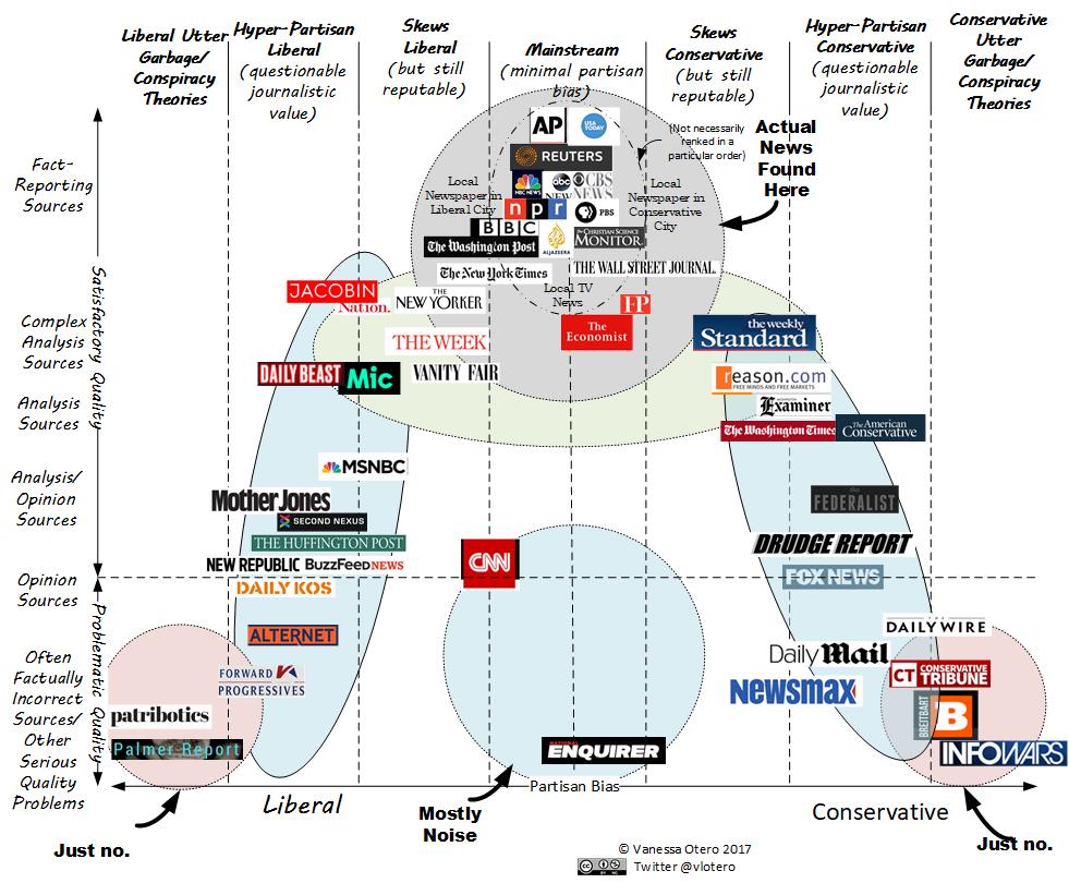
While researching and analyzing the distinctions between news genres, one online resource stood above the rest because it offered a convenient visual representation of news sources along two axes of partisan bias and journalistic integrity. The chart (below) was created by Vanessa Otero, a blogger whose keen eye helped me make several important distinctions between news writing styles. [Updated Interactive Media Bias Chart 5.0]

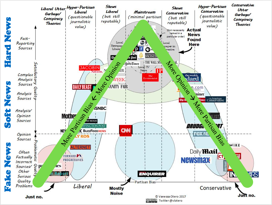
There are several online resources which chart the political polarization of news media, including a well-researched report by the Pew Research Center and the curiously amusing “Blue Feed, Red Feed” maintained by the Wall Street Journal [now archived](also helpful are the AllSides and Media Bias/Fact Check websites). These resources, however, only measure partisan bias (horizontal axis above). I was looking for other measurements that may align with elements of genre analysis. Otero’s chart was helpful because it added a vertical axis that charted journalistic quality, highlighting important stylistic differences that I could easily map on to the traditional divisions of news genres: Hard News/investigative journalism (just the facts!), Soft News/Feature News/Editorials (analysis and opinion), and Fake News (plain fiction).
This was the perfect entry point for starting discussion, a convenient and astutely crafted visual chart showing the complexity of news writing. It also allowed me to handily visualize the close relationship between bias and interpretation without confounding them. Analysis and description of news articles beyond partisan bias became a core assignment for my students.

Many sources cite the standard distinction between Hard News and Soft News as a difference in topic coverage, with the former focusing on events (political, economic, disruptive), while the latter focuses on people (lifestyles, celebrities, and human-interest). The gendered implications of this division have been noted in Women, Men, and News by Paula Poindexter, Sharon Meraz, and Amy Schmitz Weiss. Otero’s chart, on the other hand, begins to suggest how writing choices also frame the categorization of news genres, suggesting attention also is paid to tonality, organization, length, and evidence, along with several other smart observations made by my students.
In order to discuss CNN’s position as an outlier, being both highly analytical and opinionated and yet only mildly left-leaning, I turned to the Vox series Strikethrough which publishes excellent videos on modern American media. In a short 6-minute video (perfect for class), CNN’s approach to telling news is compared to the ESPN’s “hot take” model, which favors heavy-handed opinion and argumentative debate over cool-headed fact-reporting. This serves to underscore how Hard News can be “softened.” Furthermore, I ended up pairing Otero’s chart with the insights of Colleen Patrick into the value of Soft News as providing much-needed perspective on simple fact-reporting.
Overall, these resources proved invaluable in helping me to conceive of the distinctive writing conventions found among Hard, Soft, and Fake News, and provided a good springboard into discussion on other important contextualizing rhetorical features, such as intended audience and purpose.
Writing Skills Posts


