Introduction
I have never been tempted to use those PowerPoint templates or slide themes, they were always too tacky to me. I’ve developed my own lecture slide style over the years, and while it has matured over that time, there are still several principles I have come to consider non-negotiable.
Given the universal usage of presentation software (PowerPoint, Keynote, Prezi, etc.) in the classroom, it is quite shocking to me how few internet resources discuss the creation of effective lecture slides. The best I’ve found is Vanderbilt’s Center for Teaching. Many online resources are directed towards perfecting business presentations, and while useful ideas can be gleaned from these I find the rhetorical situation (purpose, audience, topic, etc.) of the boardroom to be different from that of the classroom. It should follow that design conventions would be different as well.
Basic Slide Design
In my earliest days of lecturing (starting around 2005) I designed my slides with just images. I considered the slides (I used, and still regularly use, PowerPoint) to be the same as “old-fashioned” projection slides used in art history classes. I choose images that complemented what I was saying, either in depicting particular people, places, or events, or in providing a visual metaphor that helped give shape to an abstract idea. I wrote a lot on the white/black board back then. I thought that if the students had to write it, I should also take the time to write it.
My slides today have significantly more writing on them, but I still consider images to be the main focal point. Here is a breakdown of how I create lecture slides, focusing on basic design elements. In writing this post I realized that I’ve naturally developed three basic design templates: text-heavy slides, image-heavy slides, and image-text slides.
To start, I first choose one aesthetically pleasing, high-resolution image as the “cover image” for the first slide. I incorporate the lecture title and date. (Because of an old job as a book cover designer when I have the time I treat each cover image slide as a design problem, playing around with how I incorporate the title and other information, as if a book cover.)
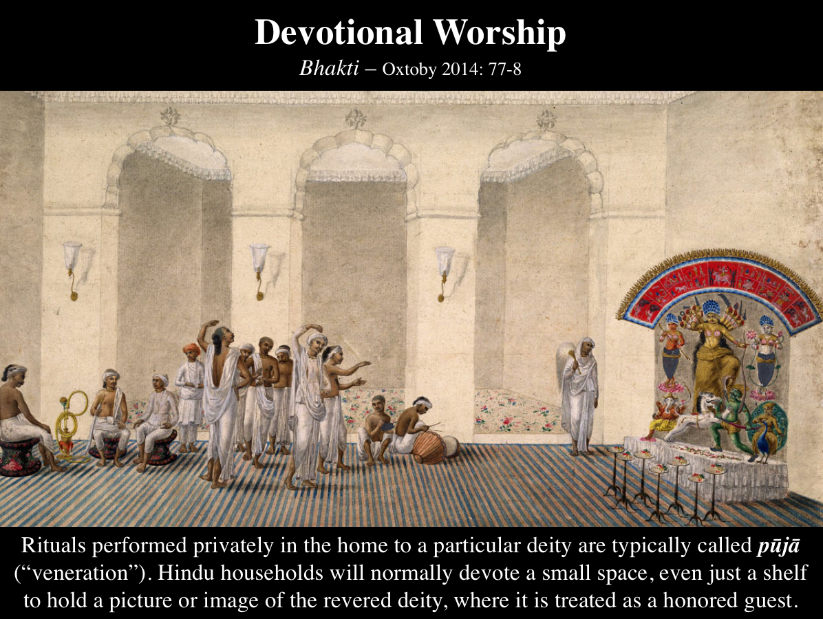
For example, this image depicts a figure (Bālakṛṣṇa) that is central to my topic (Hindu devotional literature). Sometimes it is difficult to locate imagery that matches closely with the topic or to find an image with the necessary resolution. In these cases I will select an image that is more loosely related to the theme (say, an image of the Ganges River). This cover image then serves as my background for my text-heavy slide template.
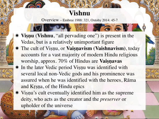
By using the same image I hope to create a subtle visual clue that unifies the day’s lecture material. Sometimes, if I switch to a significantly different topic during the lecture I will change the background image to also visually suggest the change in theme.
Let me break down the design of this text-heavy slide. I typically type text on top of a partially transparent white box, usually around 30 percent transparency (here, because the background image is so busy, the box is closer to opaque than normal). The title box identifies the theme (here: “Vishnu”) and subtopic (“Overview”). This theme/subtopic layout is the only element that is carried over to (almost) every slide of the lecture. It is important for students to easily identify these components, and thus the theme is the largest font (32 pt) on the slide, while the subtopic is smaller (20 pt).
I’ve become accustomed to including the pages of that day’s readings in this box as well (at 16 pt). I used to regularly add the page numbers to the notes sections on the PowerPoint slides for my personal reference, but I’ve recently began to share these with the students by placing them direclty on the slide itself. It allows direct reference to the readings if necessary and helps the students study.
The main content text is organized by bullet points. I typically use 24 pt. font here for this text. (And yes, I use different types of bullet points to create visual correspondences. For this class, I’m using Dharma Wheels for all the lectures on Buddhism, yinyangs for all the lectures on Daoism, etc.)
I’ve been slowly shifting to using more complete sentences, but I’m aware that this may be problematic – students spend a lot of time writing everything on a slide before they start listening to you speak. I should be clear here – I never advance a text-heavy slide with all of the content showing at the outset. Using the “Animation” function in PowerPoint I fade in each bullet point as I come to it. This eliminates the “text shock” that can come from seeing a slide filled with text and paces when the students write/type.

I also use this slide format to cite longer quotations I want the class to read together. In this case I cite the primary (or secondary) source as the subtopic in the title box.
I take a different approach to designing image-heavy slides. In these cases I typically switch to a black background (to accentuate the image) and white text. I keep the same layout and font sizes for the title box (it is slightly higher on the slide in comparison to the text-heavy slide) and move all of the content text to the bottom of the slide in order to highlight the image. Again, as always, I only use high-resolution images.

The font size of the text depends on how much information I want to include. In these examples the font is at 20 pt., but I try to keep it at 24 pt. I’ve also begun to incorporate labels or captions noting the origin, age, or current location of the image. I’ll put this in small 10 pt. font somewhere on the edge of the image where it is almost invisible. I’ll return to this at the end, but since I distribute my slides to my students this information is really only for those who are looking at these images on their computer after class. One reason I’ve started doing this is because I’m developing exercises where students are expected to find their own images depicting religious studies themes.
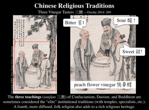
Design issues regularly arise, sometimes forcing me to tinker with the template slightly, but overall the image-heavy slide remains fairly versatile. For example, I may use the central space to zoom in on a certain part of a larger image and highlight particular elements. In the example below I use the “Animation” function to add in the word balloons as I tell a story.
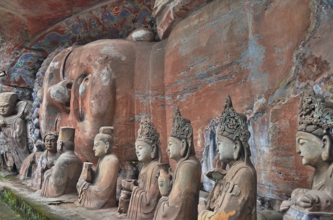
I also often use the “Remove Background” function to highlight the most significant parts of the image. Here I’ve removed the background of the terracotta figurines, bringing them into greater focus and allowing me to place three different examples on a single slide. With fairly uniform design elements I hope to present a sense of coherency for the lecture.

Image-text slides are roughly half image and half text. I use this layout when there is too much text for the image-heavy slide or especially if I want to use bullet points. In practice, I often use this layout when discussing the biography of an important figure, balancing the text with a illustration/photograph (or relevant image) of the person. I also use this template when citing a passage that I want to compliment with an image.

These three design templates, text-heavy, image heavy, and image-text, form a majority of my current lecture slide collection. Yet, there are always situations that arise which cause me to design new slides for a particular rhetorical context. Some of my favorite challenges are when I have to think of (and then locate!) visual complements or visual metaphors that help exemplify or elucidate the idea. (I am partly motivated in the endeavor by research done on “picture superiority effect.”) In general, these types of slide tend to be far more interactive, meaning that I use the “Animation” function frequently to reveal colors, text, or new images.


Transitions and Animations
In terms of Transitions between slides I almost always use “fade.” Every once and a while, if I think a transition visually reflects a narrative element in my lecture – a discovery (uncover transition), or a debunking (fall over transition) – I will consider incorporating it. Since I use a lot of maps in my lecture slides, I have become quite enamored with the “drape transition” recently which replicates a piece of fabric being unfurled from above, similar to pull-down maps one finds in classrooms.
As I noted above, I use Animations quite frequently in my slides. Every bullet point on my slides are set to fade in when I want to advance to that topic. This avoids text-shock and rapid typing by students. This creates a steady pace for my lecture and controls what I share and when.
There are some advanced Animation settings which I use frequently as well. It is possible to trigger a series of animations right after the transition with only one click of the advance button. This means I can transition to a new slide and then slowly populate it with images and text while I talk without needing to continuously hit the advance button. You can set the animations to start at different time intervals in 1/2 second increments. Much of the time I use these to add just a little flair to the slide, meaning that most of the animation is over within a second.


When I advance to one of my Focus-Quote Slides (I did not cover these above, but they are pretty straightforward design wise), the transition is a simple fade, here revealing the blue background and white title banner. Immediately after the transition is complete the figure on the left (Zhuangzi) flies in (“fly in” animation) from the left side of the screen and the quote flies in from the right after a half second delay. Thus I treat this animation sequence as an extension of the transition which is complete in one second. For this particular slide I have the butterflies slowly float in after a five-second delay, adding a little dynamism to the slide.
Distribution
I make my slides available to my students after lecture. Since I have many slides with long quotations (sometimes not found in the readings), I don’t want students wasting time copying them down. I will print the PowerPoint as a PDF and upload the slides to our class website. I usually add a small “watermark” on the bottom of each slide with my name, date, and email address.
Relevant Pedagogy Posts