For all the new Buddhas in the West posts
follow us on Bluesky & Instagram
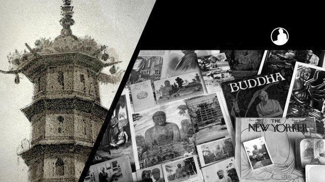
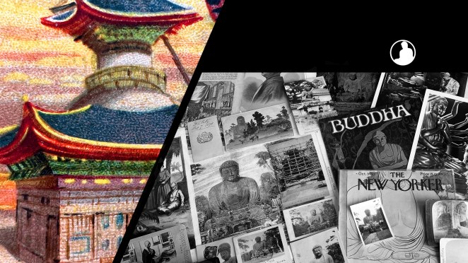
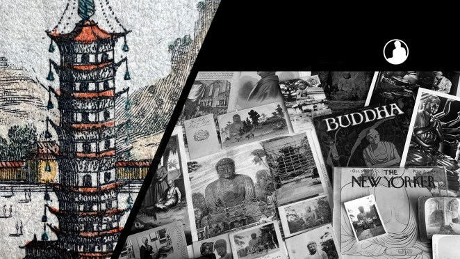
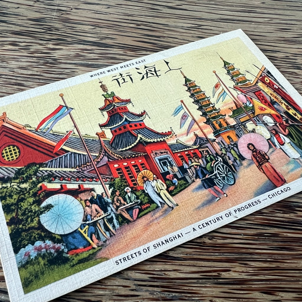
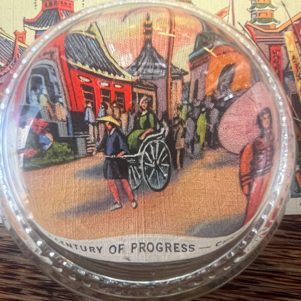
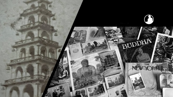
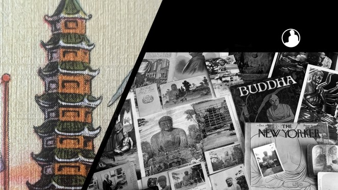
In the midst of a growing Pacific War, the young Republic of China withdrew from the World’s Fair in Chicago in 1933. Private individual ensured China’s symbolic presence, however, with local Chinatown businessmen erecting two giant pagodas for the “Streets of Shanghai” concession.
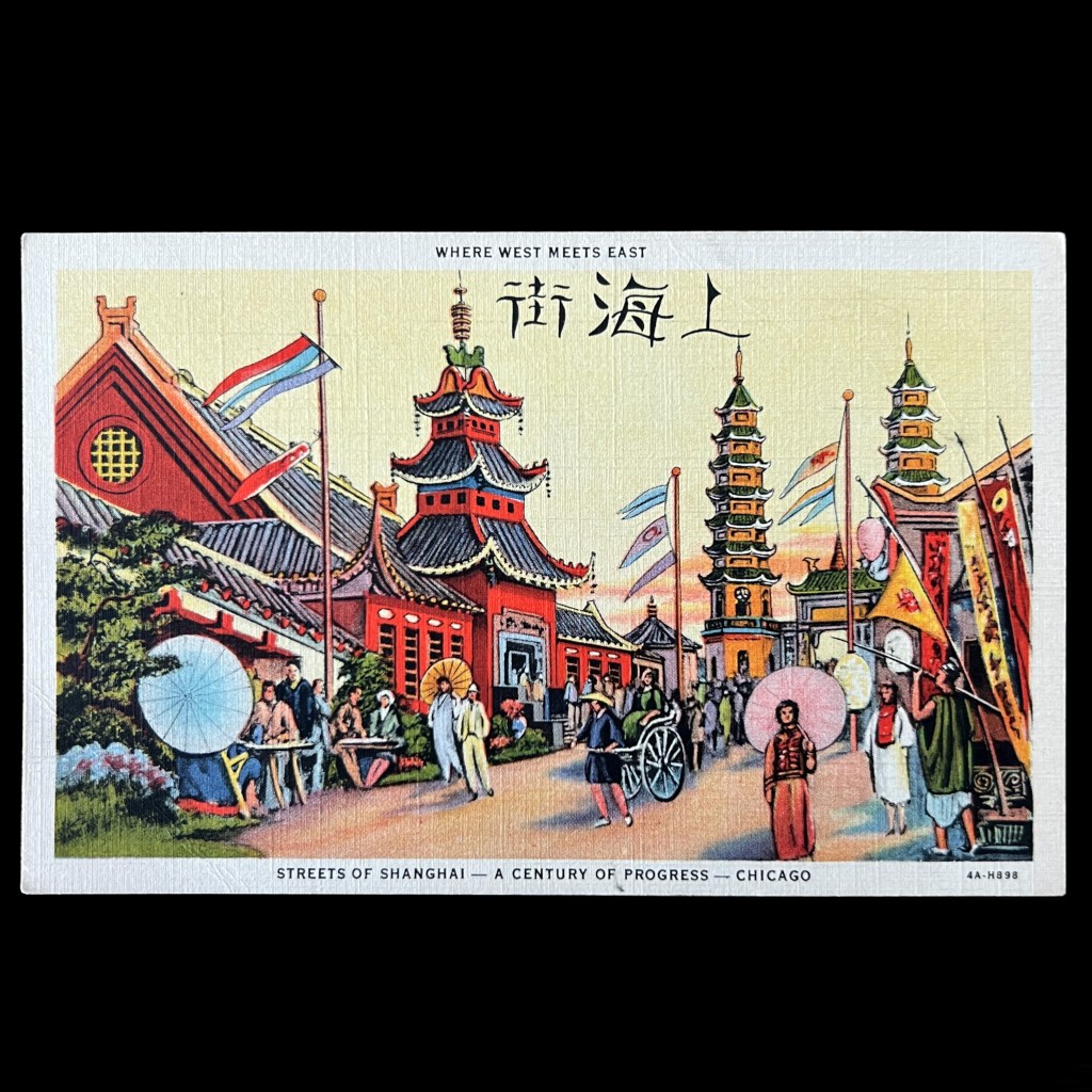
Arguably the lesser of two other China exhibits, including a Chinese pavilion and reconstruction of a Tibetan Buddhist shrine hall from Chengde, the Streets of Shanghai was one of many foreign “villages” erected on the fairgrounds. It overlooked Lake Michigan alongside the Dutch Village.
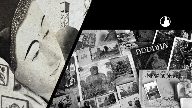
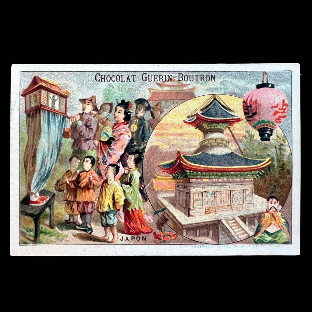
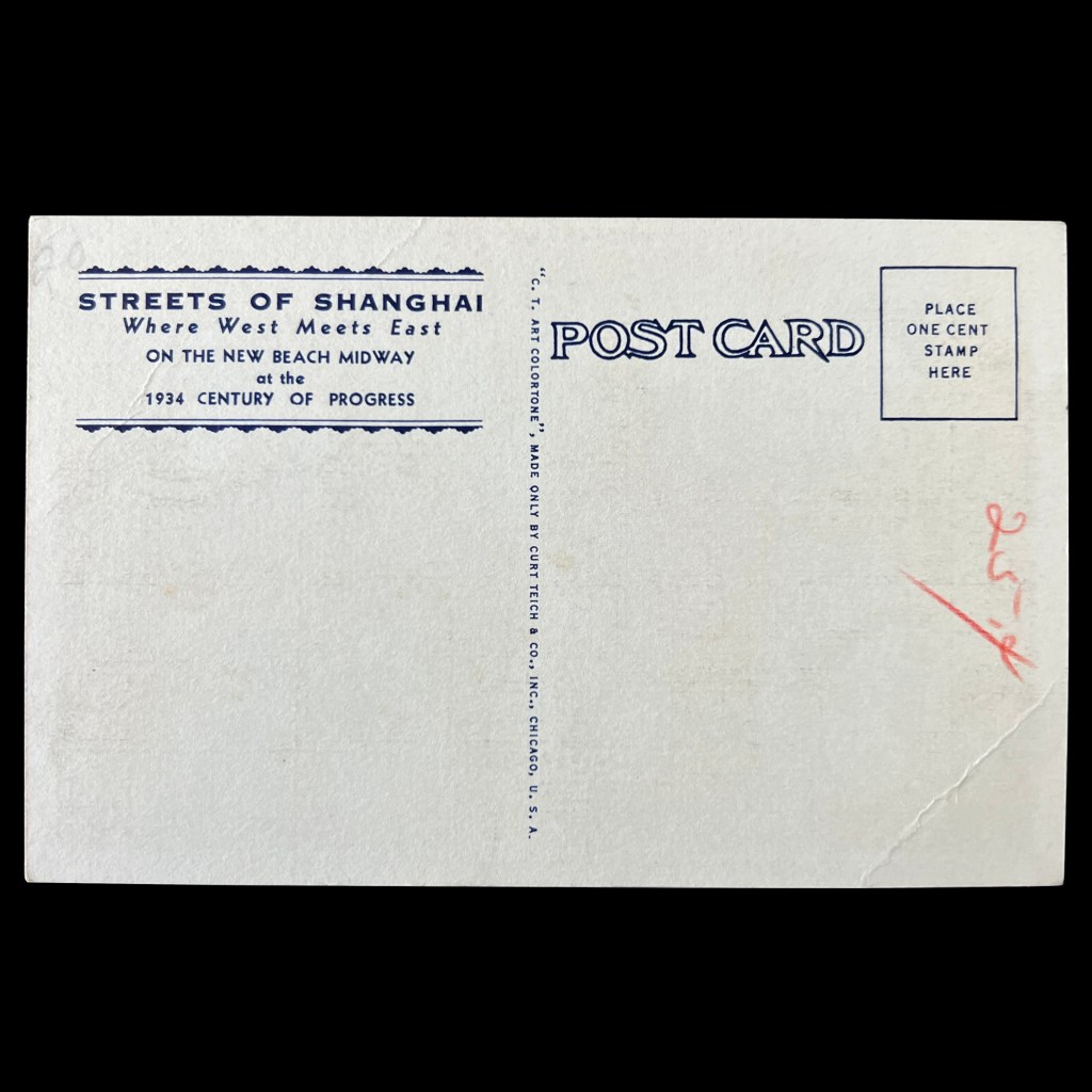
Picture postcards were issued fifty years earlier for the famous 1893 fair in Chicago and, although past their prime, remained favorite, cheap souvenirs through the Depression. Chicago-based Curt Teich was critical for the development of the vibrantly colored “linen” postcards of the 1930s.
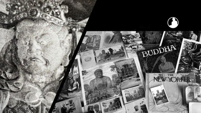
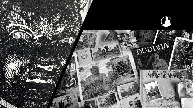
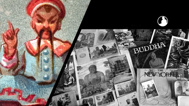
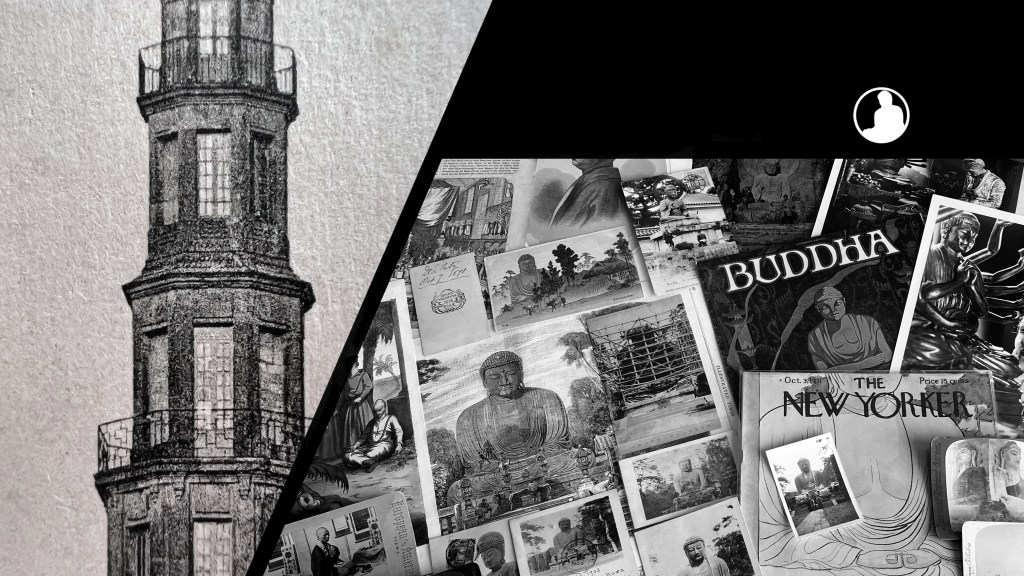
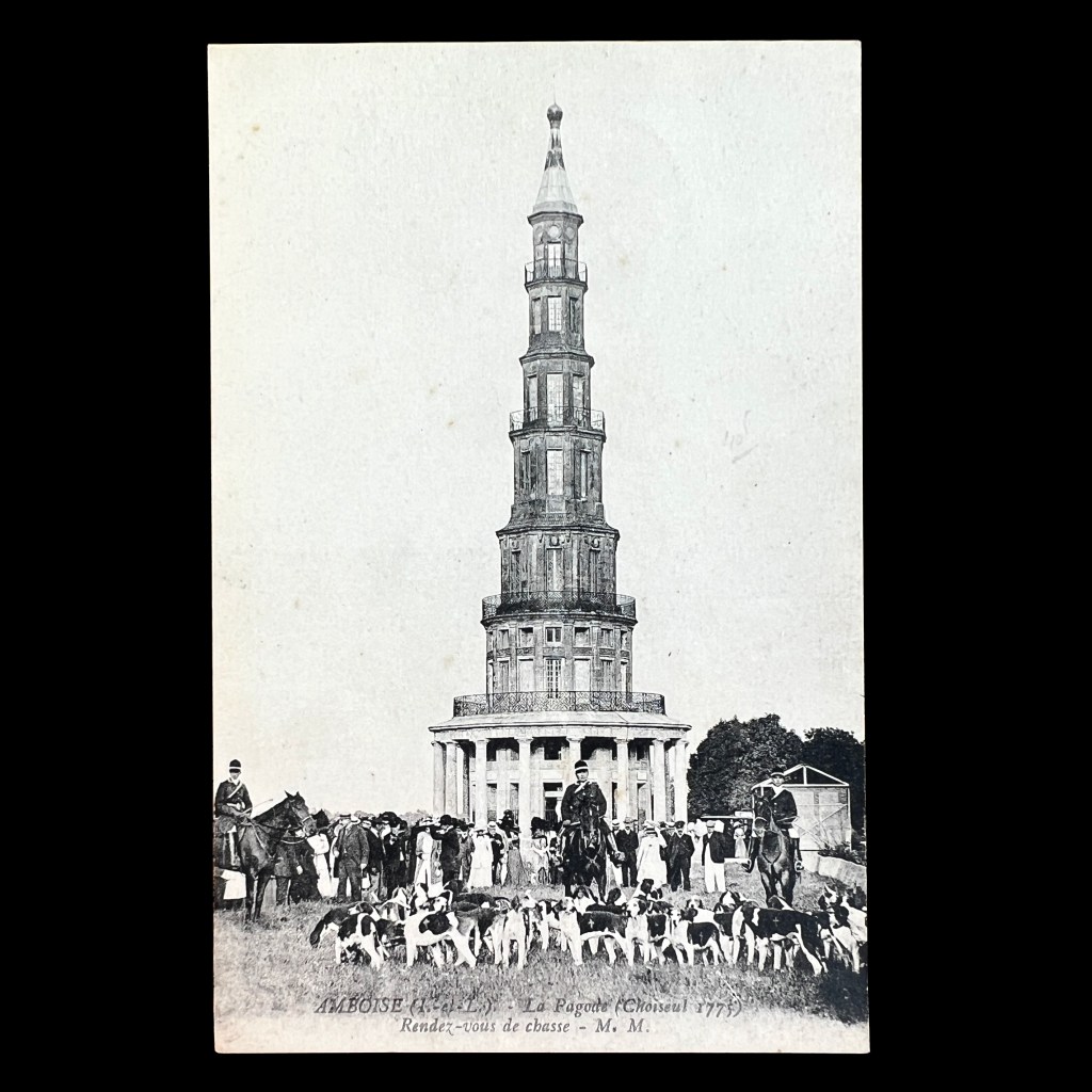
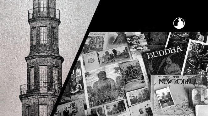
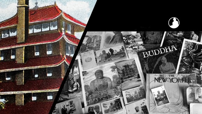
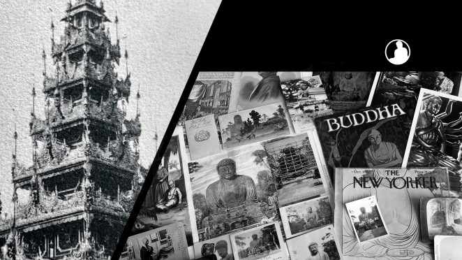
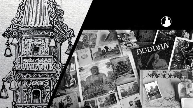
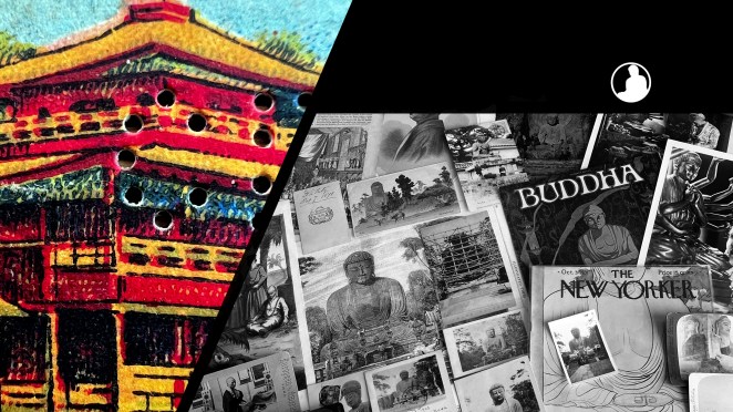
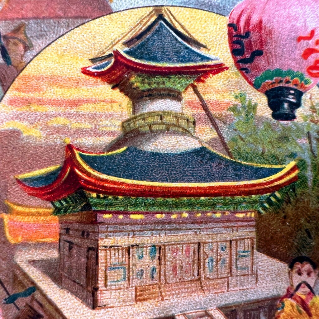
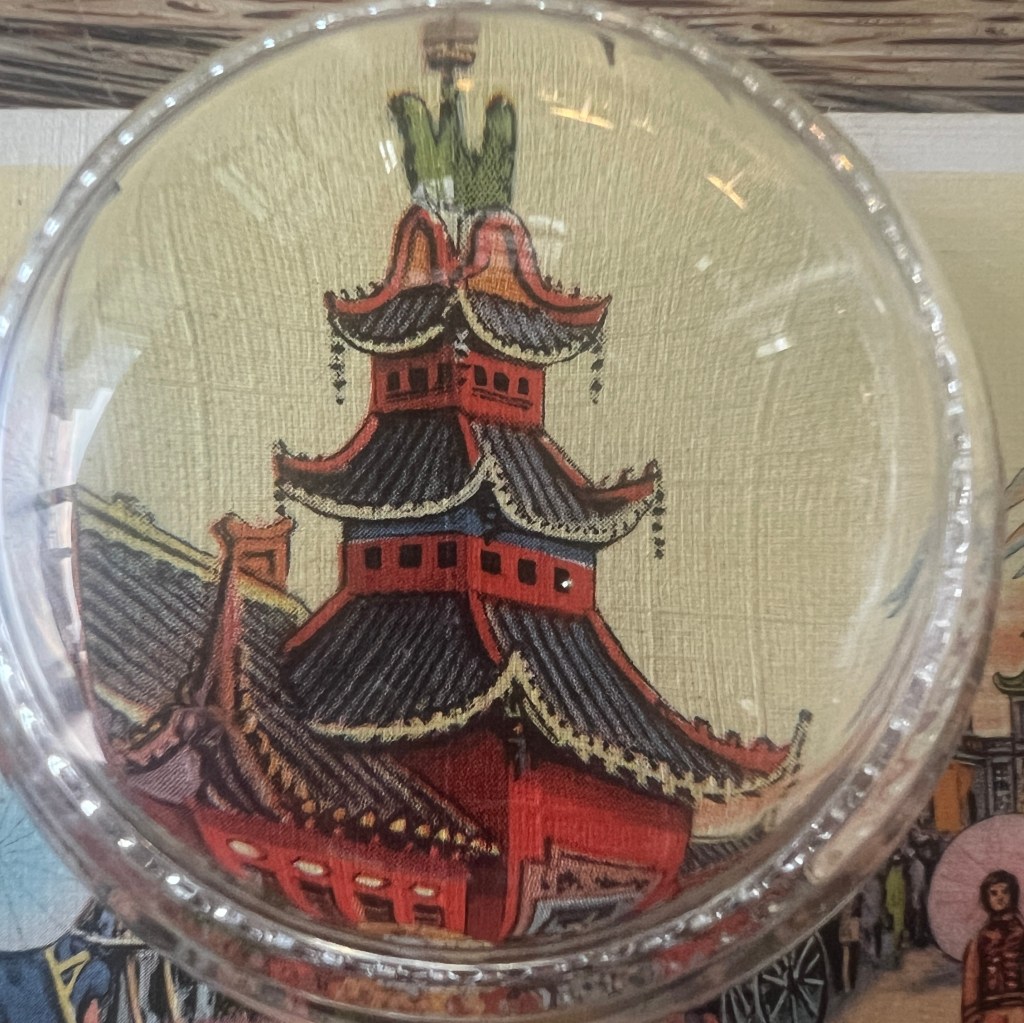
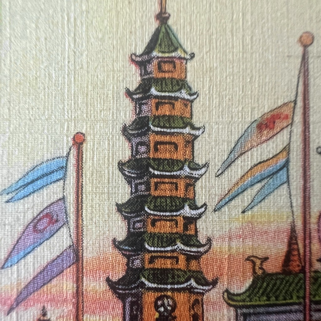
As an amusement concession with an extra admission cost, the Streets of Shanghai embraced stereotypes to drum up interest and recreate the “mysteries of a Chinese port.” The twin eight-story pagodas at the main gate were well-developed visual icons of the Orientalist Far East.
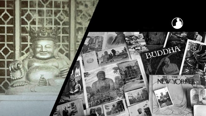
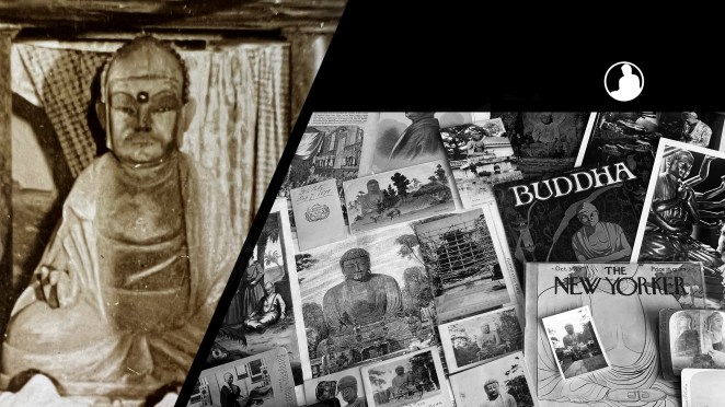
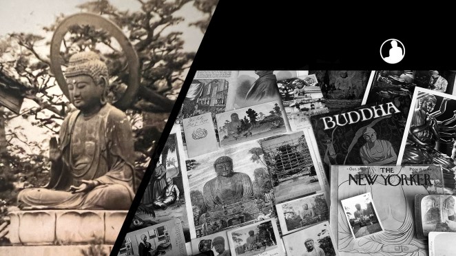
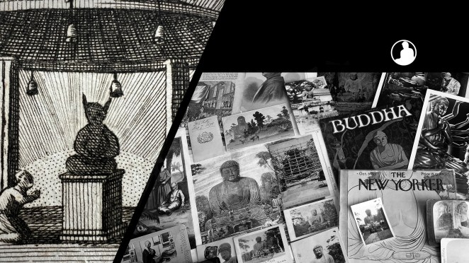
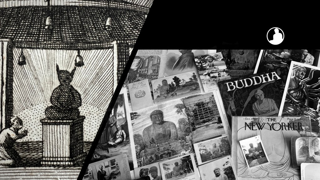
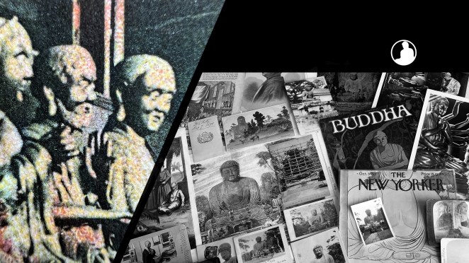
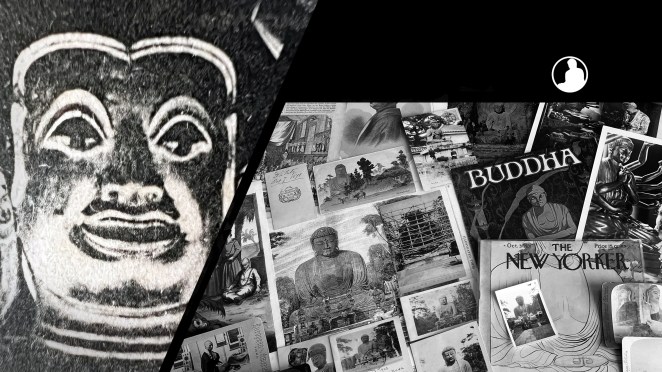
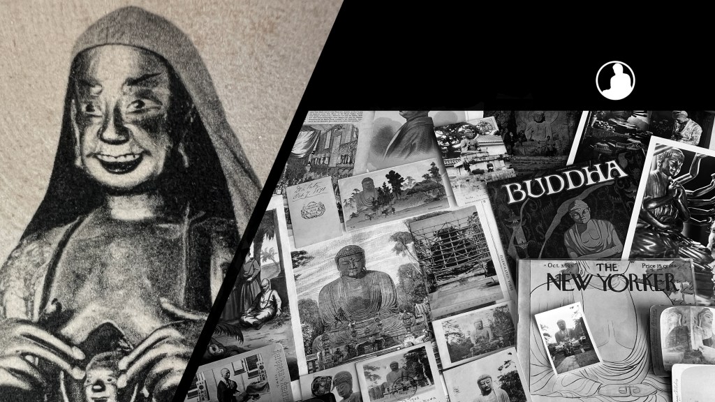
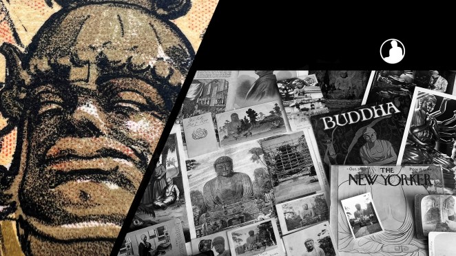
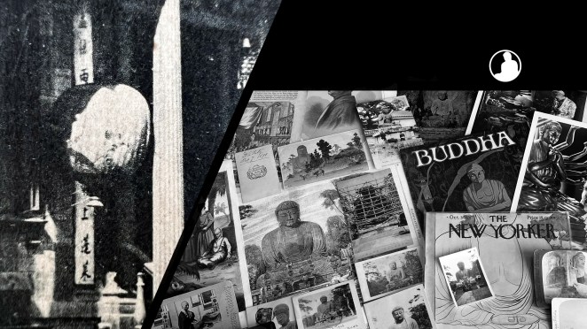
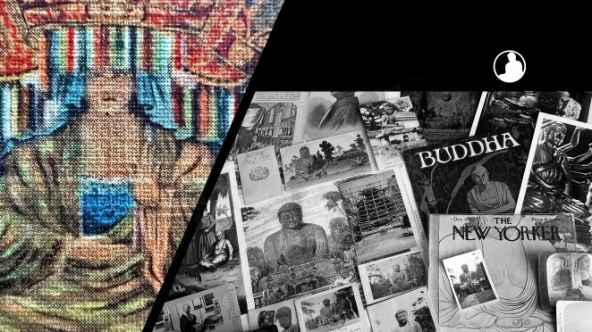
Some sources claim an interior building was a Buddhist Arhat Temple, while others claim it was a temple to Confucius. Notably, a new private museum opened in Chicago’s Chinatown to draw fair visitors to the area, also displaying elements of China’s Buddhist heritage (see postcard here: https://tinyurl.com/3wb7jfvu).
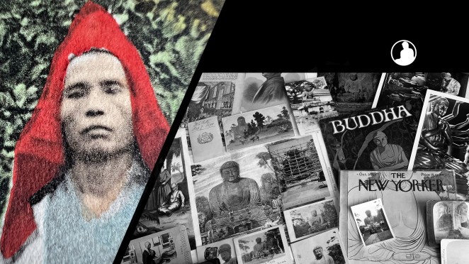
The Streets of Shangahi housed a large Chinese restaurant, an operating noodle factory, and many shops selling silks, bronzes, and porcelains. Advertised as “Where West Meets East,” the concession created a commercial fantasy land for the Century of Progress.
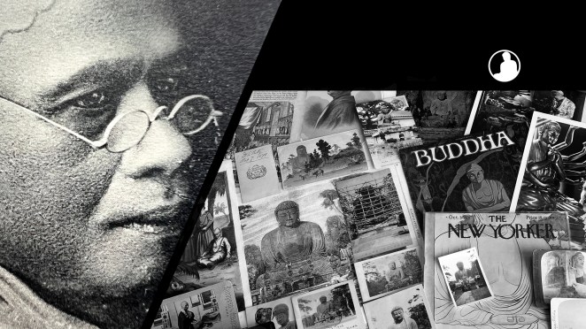
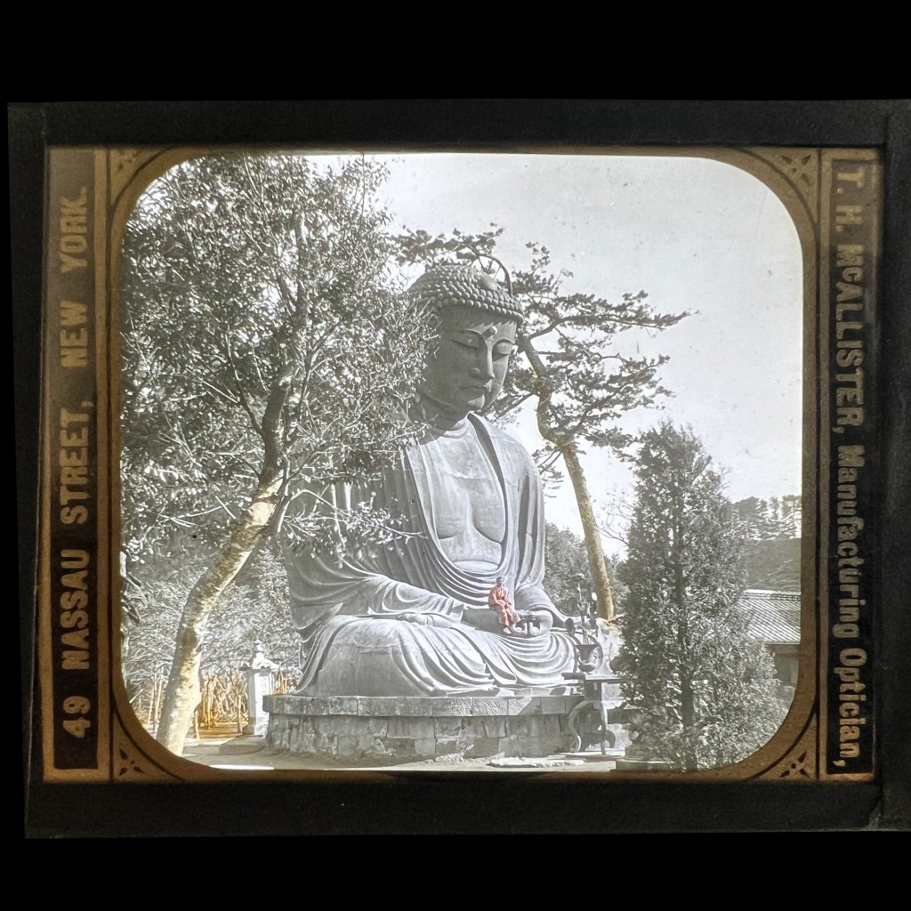
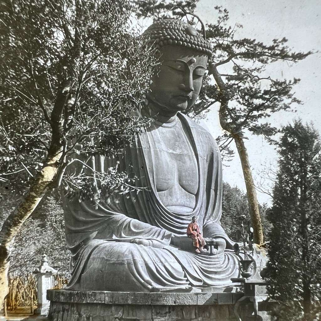
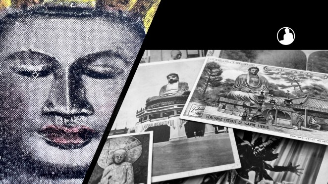
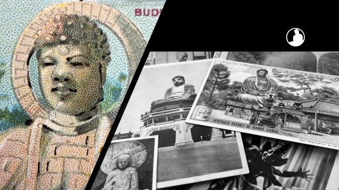
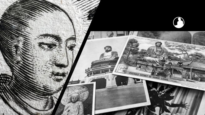
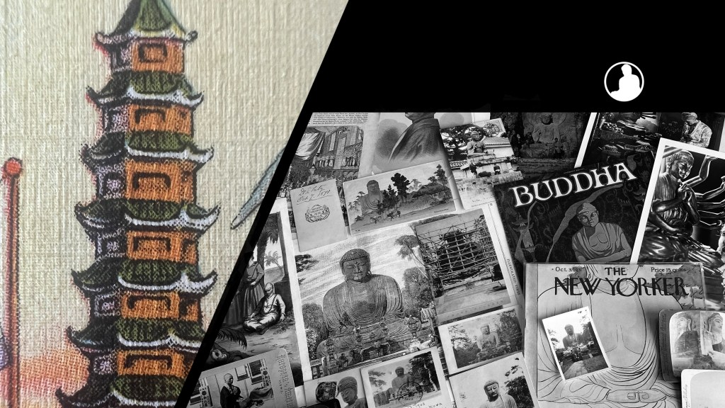
The Buddhas in the West Material Archive is a digital scholarship project that catalogues artifacts depicting Buddhist material culture for Western audiences. It’s comprised of prints, photos, and an assortment of ephemera and other objects. For a brief introduction to this archive, visit the main Buddhas in the West project page.
For Related Buddhas in the West Posts Featuring Chicago:

For the Most Recent Buddhas in the West Posts: