Peter Romaskiewicz [Last updated: June 2024]
Introduction
In the ongoing effort to identify Japanese picture postcards (ehagaki 絵葉書) in my collection, I have decided to publish my working notes on early twentieth-century Japanese postcard publishers.
Using Urakawa Kazuya’s four-period chronology as a foundation, I attempt to catalog variant designs printed on the reverse (atena-men 宛名面, “address side”) by each publisher, as well as differing letterpress caption styles on the obverse (egara [or shashin]-men 絵柄[写真]面, “design [or photograph] side,” also called tsūshin-men 通信面, “communication side”)[1].
The aim is to assist in identifying cards that lack a publisher’s name or trademark (shōhyō 商標; rogumāku ロゴマーク)—an inherently fallible undertaking.
The information presented here is drawn primarily from Japanese-language sources, both print and digital, supplemented by my own observations. These notes remain provisional and will be updated as time permits.
Japan was among the world’s largest producers of postcards in the early twentieth century; accordingly, the research below is far from exhaustive and reflects my particular interests. I focus mainly on hand-tinted, photomechanically reproduced cards from the late Meiji and early Taishō periods. I do not address, for example, the substantial collectors’ market for artist-designed picture postcards, bijutsu ehagaki 美術絵葉書.
Topically, my interest centers on landscape views (fūkei 風景), especially those depicting Japanese religious sites, and the scope of this research is shaped accordingly. A list of useful references appears at the end of this post.
Please contact me if you can provide any other information or resources about Japanese postcard publishers, or any other oversights and errors: peter.romaskiewicz[at]gmail[dot]com.
A Brief History of Publishing Postcards in Meiji and Early Taishō Japan
The commercial market for photography in Japan expanded significantly in the 1860s and 1870s with the arrival of globetrotting tourists in search of souvenirs from their “exotic” travels in Asia. During the Meiji period, the principal port of entry for foreign visitors was Yokohama, which quickly emerged as the center of a competitive commercial photography industry. Yokohama shashin 横浜写真 (“Yokohama photography”) came to denote a distinctive fusion of Western technology and Japanese craftsmanship: monochromatic albumen prints were meticulously hand-colored by artists to produce vivid, eye-catching scenes.
Throughout the 1880s and 1890s, Japanese-owned studios grew steadily in number and prominence, gradually displacing their Western counterparts, who had dominated the market in earlier decades. As travel restrictions on foreigners were eased and domestic interest in photography increased, Japanese studios expanded into a wider range of urban centers across the country. The aesthetic cultivated by these early studios would exert a significant influence on Japan’s first domestic postcard publishers.
Japan’s modern postal service began operations in March 1871 and joined the Union Postale Universelle (bankoku yūbin rengō 萬国郵便聯合) in June 1877, enabling the regular exchange of international mail (although several foreign powers had previously maintained post offices in select treaty ports). The first postal card (hagaki 端書) was issued in December 1873; until the end of the nineteenth century, however, all cards were government-issued (kansei 官製). These are identifiable by prepaid franking printed on the address side (i.e., the reverse). The obverse was left blank to accommodate a written message.
Revisions to postal regulations on October 1, 1900 permitted private companies to produce picture postcards (ehagaki 絵葉書), allowing illustrations or photographs to appear on the obverse. (Until the adoption of the “divided back” format in April 1907, the sender’s message still had to be written on the image side.) Two years later, the government began issuing its own commemorative picture postcards. Together, these changes transformed the landscape of the postcard market and sparked a new cultural phenomenon.
For privately issued (shisei 私製) cards, photographic imagery quickly became the preferred visual medium, and many images originally produced by commercial Japanese photography studios were repurposed for postcard publication. These were typically reproduced using the inexpensive planographic process known as collotype (korotaipu コロタイプ), introduced commercially in Japan by Ogawa Kazumasa 小川 一眞 (1860–1929) in 1889. Because multi-color collotype printing was technically challenging, many early twentieth-century publishers employed artists to apply watercolor washes by hand (certain hues, such as red, often used more heavily pigmented paints). In this way, the aesthetic of Yokohama shashin developed in the early Meiji period persisted into the early Taishō era through the new medium of the postcard.
The Russo-Japanese War (1904–1905) triggered what is now termed the “picture postcard boom” (ehagaki būmu 絵葉書ブーム or ehagaki ryōkō 絵葉書流行). Postcards were sold nationwide, particularly in major urban centers. Specialty postcard shops operated in cities such as Tokyo, Kyoto, Kobe, and Yokohama. Numerous other enterprises entered the lucrative trade, including photography studios, printing houses, booksellers, souvenir shops, and even Buddhist temples. Large publishers distributed stock wholesale to retailers across the country, saturating the market with inexpensive photographic images—landscapes, city views, geisha and actors, members of the imperial family, scenes of daily life, war reportage, natural disasters, and more. At least one firm, Ueda Photographic Prints Corp., marketed its products directly to retailers in New York City.
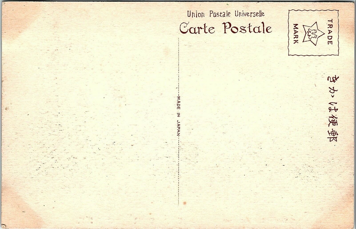
Publishers did not always identify themselves clearly on their cards. In some cases, their name and address were printed discreetly on the card; more commonly—though still not uniformly—larger firms adopted a trademark or logo, often placed within the stamp box (kitte ichi 切手位置) on the reverse. While this location visually framed the mark, the affixing of a postage stamp could easily obscure it, effectively rendering the publisher anonymous. At times, a name or insignia appears elsewhere: incorporated into the dividing line, embedded in a letterpress caption, or concealed within the image itself. Some publishers, such as Ueda or Tonboya, even disguised their marks intentionally.
In many instances, however, surviving cards offer little reliable evidence for firm attribution. In an industry defined by mass production, identifying the original photographer—or the individual colorist—is, regrettably, impossible. Elsewhere I have outlined a method for approaching otherwise anonymous publishers; the present entry continues that ongoing, if necessarily provisional, investigation. The attributions proposed here should therefore be understood not as definitive conclusions, but as informed and carefully considered hypotheses.
Ueda Photographic Prints Corp.
上田写真版合資会社
Born in Tokyo, Ueda Yoshizō 上田義三 (1865–?) found employment after college in the oldest German export trading company in the capital, Aherns & Co. (Ārensu shōkai アーレンス商会), founded by Heinrich Aherns in 1869. In the mid-1890’s, after Ueda toured Europe and America, he returned to Japan to open his first business venture in 1897 (Meiji 30), the Yokohama Photographic Printing Co. 横浜写真版印刷所 first located on Yatozaka Slope 谷戶坂. In 1905 (Meiji 38) the business moved to Okina-chō 3-chōme (No. 131) 翁町3丁目(131番) and around 1913 (Taishō 2) the business was renamed Ueda Photographic Prints Corp. 上田写真版合資会社 (the name “Uyeda” can be found printed on some postcards).
Ueda was highly successful in selling photographs and producing government-issued postcards on his own collotype printing equipment. Importantly, Ueda’s success in printing early landscape and figural picture postcards presaged the Japanese postcard boom after the Russo-Japanese War, thus he became recognized as the “Japanese Pioneer of Picture Postcard Manufacturing” 日本元祖絵葉書製造元. Īkura Tōmei 飯倉東明 (1884-?) worked as Udea’s director of photography in the first decade of the twentieth century. My analysis of Ueda postcards from 1907–1918 can be found below.

Tonboya
トンボヤ

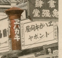
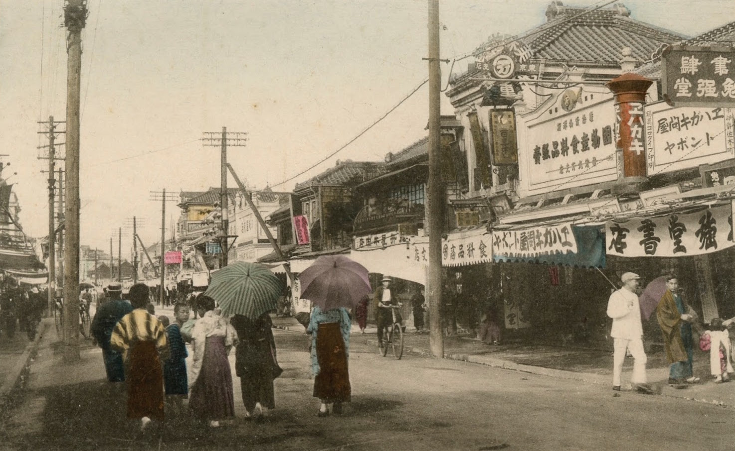
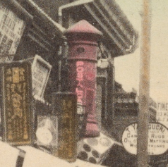
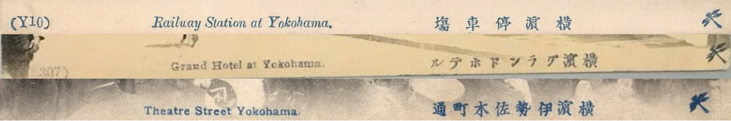
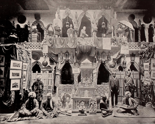
Around 1905 (Meiji 38), Yoshimura Kiyoshi 吉村清, the proprietor of the well-known Tokyo-based publisher Kamigataya 上方屋 (in Ginza), started a new venture in Yokohama, called Tonboya トンボヤ, or “Dragonfly Studio.” [2] Along with Ueda, Tonboya was the most prolific hand-painted postcard publisher in late Meiji/early Taishō Japan, also opening offices in Tokyo, Kawasaki, and Yokosuka. The original shop was located on Isezaki-chō 2-chōme (No. 16) 伊勢佐木町2丁目(16番), a famous area known among foreigners as Theatre Street (see post frontispiece above). The storefront can easily be located in period photographs due to its distinctive Japanese-style red cylindrical postal box (yūbin posuto 郵便ポスト) sign painted with ehakaki エハカキ [sic], or “Picture Postcards.” The left-hand column of words on the white storefront sign says “photographic collotype printing.”
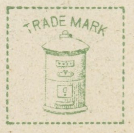
The postal box was also the trademark printed in the stamp box for Kamigataya issued cards. The precise business relationship between Kamigataya and Tonboya remains obscure.
Kamigataya appears to have had an office in the Motomachi district (Motomachi-dori 2-chōme [No. 85]) which also appears in period photographs, here saying “postal cards” (in some photographs, Kamigataya is visible on the front of the sign). In the early Showa Period after the Great Kantō earthquake, Tonboya moved to Izezaki-chō 1-chōme (No. 36) 1丁目(36番). Cards were initially hand-colored, but Tonboya used a multicolored collotype process starting in the early Taisho. Tonboya remained in operation after the Great Kantō Earthquake of 1923.
Tonboya Reverse Designs and Obverse Captions


Hoshinoya
星野屋

Yoshioka Chōjirō 吉岡長次郎 arrived in Yokohama in 1904 (Meiji 37) with postcards purchased in Tokyo, hoping to turn a profit by reselling them to foreigners. After receiving numerous orders and making several trips back to Tokyo to restock, Yoshioka opened a shop in Yokohama at Onoe-chō 4-chōme, No. 61 尾上町4丁目(61番).
By the end of the Russo-Japanese War in the fall of 1905, he had collected many collotype plates of native landscapes and was very successful marketing to both foreigners and Japanese. Hoshinoya emerged as one of the most well-known postcard shops in the port of Yokohama.
Hoshinoya Reverse Designs and Obverse Captions
I have not yet confidently identified undivided back Hoshinoya cards.


 A variant style for “Carte Postale” can also be found. Note the stamp box is vertical.


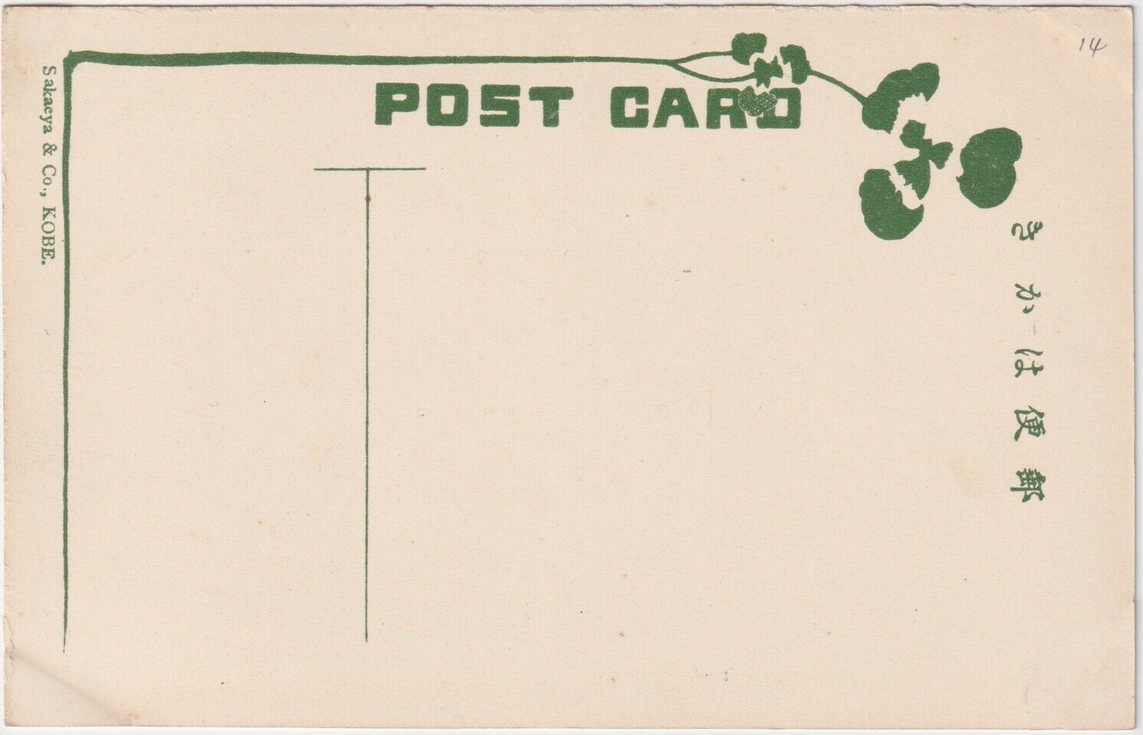
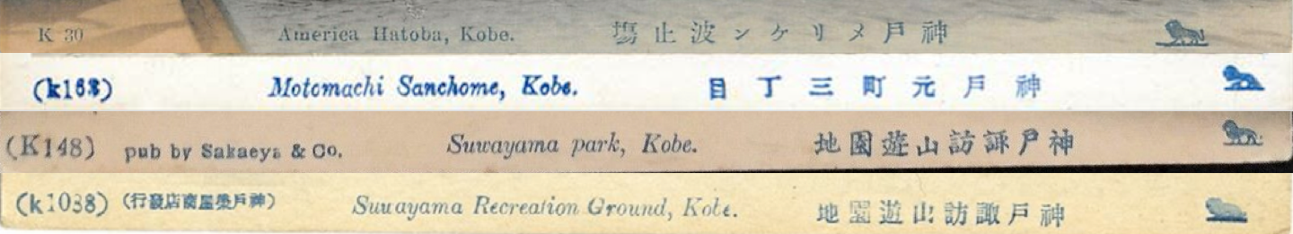
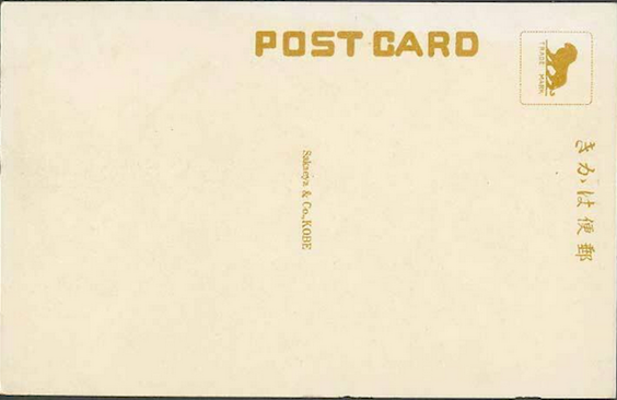
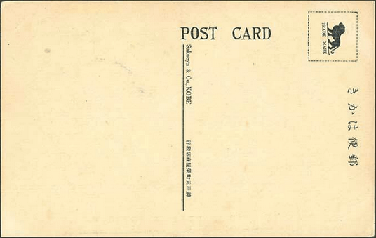
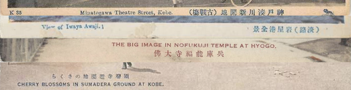
Sakaeya & Co.
栄屋商店

A Kobe based company with a shop in Motomachi, Kobe. A majority of this publisher’s cards are of Kobe and its environs, but there are other images among its portfolio. Curiously, I have seen Sakaeya’s lion insignia in the caption of images that were printed on cards bearing both Ueda’s and Tonboya’s seals on the reverse. I’d speculate that Sakaeya purchased Ueda and Tonboya cardstock and used it to print their own cards. It seems likely they mainly sold them in Kobe with the lion insignia imprinted on the front. Period III cards also bare the insignia of Taisho Hato (see below), a dove with is wings spread open.
Sakaeya Reverse Designs and Obverse Captions
I have not yet confidently identified undivided back Sakaeya cards.


Other Publishers
 Akanishi (Kobe 神戸)
 Asahidō (Kyoto 京都)
 Benrido 便利堂 (Kyoto 京都)[no trademark, but uses distinctive font – one of the last collotype studios still in operation; some cards bearing this font seem to have been printed by (or for?) Buddhist temples)
 Hōeidō 保永堂 (Kamakura 鎌倉?)
 Naniwaya Co. 浪華屋 (Kanda, Tokyo 東京神田) – [later became Tokyo Design Printing Co. 東京図按(vl. 案)印刷社; Kuroda Hisayoshi 黒田久吉]
- Nassen & Co. (Yoshioka-chō, Yokohama) – interlaced N and S atop floral design
 Nisshinsha (Tokyo 東京)
 S.N. Banshiudo 長島萬集堂 [Nagashima banshūdō](Shiba, Tokyo 東京芝)
  Taisho Hato Brand 大正鳩ブランド (Wakayama 和歌山)
 Tōdai-ji 東大寺 (Nara 奈良)
Notes
[1] The nomenclature for the sides of the postcard derived from their original design where one side was reserved solely for the address, while the other was reserved for the written message, and eventually, a printed image. These are also known as the reverse (rimen 裏面) and obverse (hyōmen 表面).

[2] Some sources name the proprietor as Maeda Tokutarō 前田徳太郎, but I have not seen this name in printed Japanese sources. Some sources note 1907 (Meiji 40) as the date for the founding of Tonboya. A Kamigataya sign and display of postcards can also be found in the Motomachi district of Yokohama.
Resources
- Print Resources [selected]
- Barclay, Paul D. 2010. “Peddling Postcards and Selling Empire: Image-Making in Taiwan under Japanese Colonial Rule.” Japanese Studies, Vol. 30, No. 1, pp. 81-110.
- Geary, Christraud & Webb, Virginia-Lee, eds. 1998. Delivering Views: Distant Cultures in Early Postcards. Washington DC: Smithsonian Institution.
- Handy, Ellen. 1998. “Japonisme and American Postcard Visions of Japan: Beauties and Workers, Cherry Blossoms and SIlkworms.” In Delivering Views: Distant Cultures in Early Postcards, edited by Christraud Geary and Virginia-Lee Webb, 91–114. Washington D.C.: Smithsonian Institution Press.
- Hibata Sekko 樋畑雪湖. 1936. Nihon ehagaki shichō 日本絵葉書史潮 [The History of Japanese Picture Postcards]. Tokyo: Nihon Yûken Kurabu.
- Itō Izumi 伊藤泉美. 2001. “Tsuioku No Yokohama: Ehagaki Ni Miru 100-Nen Mae No Hitobito to Fūkei 追憶の横浜: 絵葉書にみる100年前の人びとと風景 [Memories of Yokohama: Postcards of People and Scenery from 100 Years Ago].” Kaikō No Hiroba 開港のひろば / Yokohama Kaikō Shiryōkan 横浜開港資料館 [Yokohama Archives of History], Vol. 71. [http://www.kaikou.city.yokohama.jp/journal/images/kaikouno-hiroba_71.pdf]
- Kamakura Board of Education 鎌倉市教育委員会. 2011. Ehagaki de miru Kamakura hyakkei 絵葉書で見る鎌倉百景 [One Hundred Views of Kamakura through Postcards].[photos]
- Maclachlan, Patricia L. 2011. The People’s Post Office: The History and Politics of the Japanese Postal System, 1871-2010. Harvard University Asia Center.
- Matsumoto Hiroyuki 松本洋幸. 2012. “Yokohama No Shashin-Kan No Ayumi – 1860’s~1960’s 横浜の写真館の歩み -1860’s~1960’s [History of Photo Studios in Yokohama – 1860’s – 1960’s].” Kaikō No Hiroba 開港のひろば / Yokohama Kaikō Shiryōkan 横浜開港資料館 [Yokohama Archives of History], Vol. 115.
- Morita Tadayoshi 森田忠吉. 1910. Kaikō Gojū-Nen Kinen Yokohama Seikō Meiyo Kan 開港五十年紀念横浜成功名誉鑑. Yokohama: 横浜商况新報社. [https://archive.lib.city.yokohama.lg.jp/museweb/detail?cls=collect_01&pkey=00002235.]
- Morse, Anne Nishimura; Rimer, J. Thoma & Brown, Kendall H. 2004. Art of the Japanese Postcard. Boston: MFA Publications a Division of the Museum of Fine Arts.
- O’Connor, Peter & Cohen, Aaron M. 2001. “Thoughts on the Precipice: Japanese Postcards, c.1903–39,” Japan Forum, Vol. 13, No. 1, pp. 55-62.
- Pai, Hyung Il. 2013. “Staging ‘Koreana’ for the Tourist Gaze: Imperialist Nostalgia and the Circulation of Picture Postcards,” History of Photography, Vol. 37, No. 3, pp. 301-311.
- Pedlar Alfred Neil, ed. 1980. Yokohama ehagaki: Pedorā korekushon 横浜絵葉書: ペドラー・コレクション [Yokohama Picture Postcard: Peddler Collection]. Kyoto: 有隣堂.
Prochaska, David. 2001. “Thinking Postcards,” Visual Resources, Vol. 17, No. 4, pp. 383-399. - Saitō Takio 斎藤多喜夫. 1985. “Yomigaeru Shinsaizen No Yokohama Fūkei よみがえる震災前の横浜風景 [Reviving the Scenery of Yokohama Before the Earthquake].” Kaikō No Hiroba 開港のひろば / Yokohama Kaikō Shiryōkan 横浜開港資料館 [Yokohama Archives of History], Vol. 12. [http://www.kaikou.city.yokohama.jp/journal/images/kaikouno-hiroba_12.pdf]
- Saitō Takio 斎藤多喜夫. 1986. “‘Pedorā Korekushon Ehagaki Ni Miru Shinsaizen No Yokohama Fūkei’-Ten Yow『ペドラー・コレクション絵葉書にみる震災前の横浜風景』展余話 [A Side Note from the Exhibition ‘Scenery of Yokohama before the Earthquake as Seen on Postcards from the Peddler Collection’].” Kaikō No Hiroba 開港のひろば / Yokohama Kaikō Shiryōkan 横浜開港資料館 [Yokohama Archives of History], Vol. 13.
- Satō Kenji. 2002. “Postcards in Japan: A Historical Sociology of a Forgotten Culture.” International Journal of Japanese Sociology, Vol. 11, No. 1, pp. 35-55.
- Schor, Naomi. 1992. “Cartes Postales”: Representing Paris 1900,” Critical Inquiry, Vol. 18, No. 2, pp. 188-244
- Urakawa Kazuya 浦川和也. 2006. “Ehagaki de Chōsen sōtokufu o miru: ‘Chōsen hantō ehagaki’ no shiryōteki kachi to naihōsareta ‘mezashi.'” Shuka 朱夏, Vol. 21., pp. 39-52.
- Yokohama Open Port Museum 横浜開港資料館, ed. 1999. Hyaku-nen mae no Yokohama Kanagawa: Ehagaki de miru fūkei 100 年前の横浜・神奈川: 絵葉書でみる風景. Kyoto: 有隣堂.
- Digitzed Collections:
- Museum of Fine Arts Boston: Art of the Japanese Postcard
- Lafayette College
- [Japanese Postcards] http://digital.lafayette.edu/islandora/search/:?f%5B0%5D=cdm.Relation.IsPartOf%3A%22East+Asia+Image+Collection%22&f%5B1%5D=eastasia.Format.Medium%3A%22Picture+postcard%22&f%5B2%5D=eastasia.Coverage.Location.Country%3A%22Japan%22
- [Resources] https://dss.lafayette.edu/collections/east-asia-image-collection/supporting-material/
- Elizabeth Ridout Collection [Freer Gallery of Art and Arthur M. Sackler Gallery Archives]
- Japanese Missionary Postcards [Freer Gallery of Art and Arthur M. Sackler Gallery Archives]
- Joanne Bernardi’s Re-Envisioning Japan – Postcards [University of Rochester]
- Other Resources [As of June 2024, much disarray below]
- Casertano, Adriana. 2020. “Postcards from the Far East 1899-1927” [Italian][here]
- Japan Picture Postcard Society [Nihon ehagaki kai 日本絵葉書会] http://www.nihon-ehagakikai.com/Journal/journal2019html.html
- Kinoya Postcard Collection [Kinōya きのう屋] http://www.kinouya.com/
- Japan Archives [ジャパンアーカイブズ] https://jaa2100.org/
- The Society for Taisho Imagery Studies [Taishō imajuryi gakkai 大正イマジュリィ学会] http://taisho-imagery.org/g.shtml#t13 (search 絵葉書)
- Yokohama Postcard Club [Yokohama tesaishoku shashin ehagaki zukan 横浜手彩色写真絵葉書図鑑] https://yokohamapostcardclub.blogspot.com/
- Yokohama Archives of History [Yokohama kaikō shiryōkan 横浜開港資料館] [Index] http://www.kaikou.city.yokohama.jp/journal/index.html
- Postal Museum Japan [Yūsei hakubutsukan 郵政博物館] https://www.postalmuseum.jp/publication/ [Yūsei hakubutsukan kenkyū kiyō 郵政博物館研究紀要]
- Postal Card history (Government Issued) http://mai-collection.com/shimizu/search/?item_category=8&item_subcategory=2
https://www.postalmuseum.jp/column/collection/post_2.html - Japanese Auctions https://aucfan.com/
https://www.korezo.jp/ - List of Historical Publications on Japanese Picture Postcards http://www.riichi.com/ehagaki.web/booklist.htm
https://kanazawa-bumpo-kaku.jimdo.com [postcard classics reprinted] - 横浜近代史辞典: 改題横浜社会辞彙 1918/1986 [https://opac.lib.city.yokohama.lg.jp/opac/OPP1500?SELDATA=TOSHO&SSNO=3-0190264475]
- Sites for Japanese Postal History [Paul D. Barclay/dating Japanese cards] https://sites.lafayette.edu/eastasia/2014/09/04/how-to-ascertain-the-date-or-time-period-of-a-japanese-postcard/
- [Dating Japanese cards] https://tanken.com/ehagaki.html
- [Dating/postmarks] https://photoguide.jp/pix/thumbnails.php?album=89
- [Dating/postmarks/stamps] https://www.ehagaki.org/history/ [click on third tab “推定方法”]
- Old Tokyo Website [illustrated with postcards] http://www.oldtokyo.com/
Additional “Working Notes” Posts


So I think I have an earlier than 1900 cepia tone Japanese postcard of two Geisha ladies. It says Postcard in Japanese on the back and the rest is blank. Its real photo cepia toned as mentioned and no hand colouring. All the ones I have seen seince 1900 are not like the one I have. I would be interested to show you an image of it for your opinion. I wonder if its possible to date it?
LikeLike
Hi Duncan, according to the best of my current understanding, the *government did issue photograph/picture postcards before 1900 – *private companies were not allowed to do so until the end of 1900. You can tell by the pre-paid franking (pre-paid postage) that is printed on the back of the card. I give some analysis here on a card in my collection: https://peterromaskiewicz.com/2020/01/04/government-halftone-postcard-of-the-daibutsu/
Happy to think through more questions if you have them. Cheers!
LikeLike
Hi Peter I have it up on eBay if you could take a look it does feel pre 1800 to me but I maybe wrong. if you could have a quick look you can tell me if I am wrong. Here is the link https://www.ebay.com.au/itm/373097412472?ViewItem=&item=373097412472
LikeLike
Hi Duncan, thanks for the link. I, too, have not seen a card like this before. There are a few things that make me suspicious of a 19th century date, however. For starters, the “郵便はがき” mark was made by a hand stamp and the photo is bleed to the edge – printers would leave space for the message on front. Its most likly a collotype print (as most Japanese photo cards are), a technique that wasn’t introduced until 1889 and not widely used for postcards until the 20th c. Lastly, the photo has a very modern feel that used a good lens. There is a field of depth (i.e. the background is blurred) that I just haven’t seen in 19th Japanese photography – though I am no expert on this. I would guess the cards is from the 1930s. Regardless it is a wonderful photograph, best of luck on furter research. Cheers!
LikeLike
Hi! Sorry if bothersome, I have stumbled upon a postcard with symbol clearly resembling the Naniwaya logo in your post, but at the corner there is printed 淡美會出版部 (something like Tamami Society Publishing Department?) and a symbol resembling a small bell. Could you please tell me what’s up with this postcard? The front depicts ocean waves, there is no additional writing in case it’s important.
LikeLike
I wish I could be of more help, but I don’t have any insight here. One of the Naniwaya cards I own has an art nouveau design style on the back in dark blue ink. The Naniwaya logo is along the top edge and the stamp box has a design of two birds in a lake (not a bell). It is cancelled Meiji 42/1909. It is possible it merged with another company, but I can’t say for certain. As far as I can tell, there is no easily accessible source which describes in detail the history of these printing/postcard companies. I would love to know if you find out any more information. Best of luck and happy sleuthing!
LikeLike
Started a review of my grandfathers pc collection with bout 120 japanese cards from 1908 n 1909. Some unique, many rppcs. I believe a number would be of interest to you. Would u b interested in a discussion of trading your knowledge for cards?
LikeLike
Thank you for your diligent research. I volunteer with Oxfam Canada’s Stamp Program, and we raise money for Oxfam projects through the sale of stamps, postcards, covers, etc. Our material all comes from donations. We have received 16 postcards which have obverse details like what you have shown (mostly the early ones). Someone has written numbers on the obverse side. Do they have any significance? And do you have any idea of their value as we will be selling them.
LikeLike
Hi what a wonderful site , so much research which is brilliant. I wonder if you can help me ? My great grandfather was a Christian Missionary to Japan in the late 1800s around 1880 and on his travels he picked up books of postcards from Horiuji Temple . They are books containing 36 cards of what would have been in the temple at that time. I would love to know more about them . Kind regards Simon . Very happy to share images .
LikeLike