In 1868 Wilhelm Burger (1844–1920) was appointed as the official photographer to the Austria-Hungary ligation to Siam, China, and Japan. In preparation for this inaugural diplomatic and commercial enterprise, Burger prepared numerous photographic glass negatives that could be later exposed to capture images of the mission. By employing the dry collodion process for capturing photographs, Burger no longer needed to use a portable darkroom as was necessary with the older wet collodion process. Burger was among the first to use the dry collodion method in Japan.[1]
Recently, Luke Gartlan has shown that Burger did not arrive in Japan with the lead Austrian naval vessel, the Donau, in early September 1869, but was delayed in Shanghai taking photographic records of Chinese artworks. He arrived a few weeks later, skipping the customary port-of-call at Nagasaki and rejoining the ligation at Yokohama.[2] After falling ill and subsequently requiring hospitalization, Burger was allowed to remain in Japan to continue his photographic documentary work as the rest of the mission continued on to South America that November. Burger remained in Japan until March 1870, disembarking out of Nagasaki on his way back to the Austrian Empire.
During his sixth month stay Burger was able to amass a large portfolio of Japanese images, both larger format landscapes and smaller format studio portraits.[3] Based on studio furnishings and props, it has long been known that Burger’s portraits were taken in the pioneering Japanese photographic studios of Ueno Hikoma 上野彦馬 (1838–1904), established in Nagasaki, and Shimooka Renjō 下岡蓮杖 (1823–1914), established in Yokohama. More critically, it has recently been shown that some of Burger’s purported photographs were more than likely taken by Ueno Hikoma and Shimooka Renjō themselves. For example, as Tani Akiyoshi and Peter Pantzer have demonstrated, the studio portrait negatives that remain in the Austrian National Library were prepared with the wet collodion process used extensively across Japan.[4] We may assume that Burger purchased these smaller format negatives and their copyrights to print and sell back in Europe.[5]
Figure 1
When we turn to Burger’s published portfolio of fifty-seven Japanese views held at the British Museum, catalogued as A Series of 56 [sic] Views of Towns, Villages in Japan, we find Buddhist figural imagery prominent in eight photographs, including three individual plates of the Kamakura Daibutsu.[6] One of these latter photographs (plate 59), with another example shown above [Fig. 1], depicts three men in Western attire, with two looking towards the camera and one towards the colossal bronze.
This photograph has sometimes been attributed to the famous photographer and Yokohama resident Felice Beato (1832–1909), but I feel this is unwarranted.[7] In spite of the fact that a photograph published under Burger’s name does not necessarily prove he made the original exposure, Burger did arrive in Japan prepared to take larger format landscape photographs, just as we see with this image of the Daibutsu. Moreover, as noted by Akiyoshi and Pantzer, the average size of Burger’s surviving dry collodion plates was 150 x 200 mm.[8] These would be contact printed on photosynthesized paper, thus a resulting print would have the same dimensions. The print illustrated here measures 135 x 200 mm, approximating the average size of Burger’s negative plates.
Moreover, given the popularity of the Daibutsu among foreigners in Yokohama (it was one of the few places within the established treaty boundaries), it seems natural that Burger would make the excursion during his stay in Japan from late fall to early spring and attempt to preserve it as part of his photographic record.[9] Other commercial photographers, such as William Saunders (1832–1892), William Andrew (fl. 1865), and Felice Beato, all previously included the bronze Kamakura icon as part of their studio portfolios.[10] The statue was arguably one of the most photographed objects in the region at the time.
The men in Western clothing in Burger’s photo remain unidentified. Another print showing some the same men in different positions is held by the Yokohama Museum of Fine Art; this is also currently attributed to Beato.[11]
After Burger’s return to the Austrian Empire he was granted the title of imperial and royal photographer (k.k. Hofphotograph) in November 1871. That same year he published Bilder aus Japan, a portfolio of his Japanese prints. A copy is held by the British Museum under the aforementioned English name A Series of 56Views of Towns, Villages in Japan.
[1] Gartlan 2009: 73, Akiyoshi & Pantzer 2011: 44, 49. There are notices of the French photographer Paul Champion (1838–?) (albeit with very limited success) and English amateur photographer Angus C. Fairweather using dry collodion plates in Japan before Burger’s arrival, see Bennett 2006b: 124 and 307.
[3] Upon his return to Austria, Burger also sold stereoviews of his travels, but these were not taken with a stereo camera and thus do not produce stereoscopic 3-D images, see Bennett 2006a: 169.
[4] According to the estimates of Akiyoshi and Pantzer, out of the 188 surviving negatives of Japan, 27 plates should be ascribed to Ueno Hikoma and 44 plates to Shimooka Renjō, see Akiyoshi & Pantzer 2011: 41. The authors raise other concerns as well, such as the limited time Burger had to organize and set up all of the studio models as well as his apparent misunderstanding, as exemplified in his later captions, of the locals portrayed.
[5] Such a practice was not uncommon at the time, see Akiyoshi & Pantzer 2011: 49–50.
[6] This includes object numbers: c13562-26 (plate 19), c13562-30 (plate 23), c13562-33 (plate 26), c13562-37 (plate 30), c13562-54 (plate 47), c13562-66 (plate 59), c13562-67 (plate 60), and c13562-68 (plate 61). The final three objects listed here depict the Kamakura Daibutsu.
[7] See, for example, the identification of this photograph held by the Santa Barbara Museum of Art (Ac. 2003.42.3) and the National Library of New Zealand (Ref. PA1-f-021-057-2). The latter photograph is part of the album compiled by Alexander Fisher (fl. 1861–1879) and entitled Album of Photographs Compiled on Cruises aboard HMS Endymion with the Flying Squadron and in the Mediterranean. The HMS Endymion sojourned in Yokohama for a few days in April 1870, only a month after Burger departed Japan. I speculate the Burger left a few prints of his work in local Yokohama shops before returning to Austria. Another print showing some the same men in different positions is held by the Yokohama Museum of Fine Art (Ref. 91-PHF-008); it is also attributed to Beato.
[9] Judging from the three photographs, it appears Burger made at least two trips, a possibly three, to the Kamakura Daibutsu: once in winter when the foliage was absent from some trees (see British Library items c13562-66 [plate 59] and c13562-67 [plate 60]) and once in early spring when the foliage had returned (c13562-68 [plate 61]). This latter photograph also shows additional damage to the railing on the left side of the image, suggesting it was taken at a different time. Another photograph of the Daibutsu reputedly taken by Burger can be found in his published stereoview set. One copy of the stereograph is preserved in the Nagasaki University Library (No. 3436). This image shows the entire railing intact and thus was either taken during Burger’s winter excursion or he procured it from another photographer in Japan. In any regard, the non-stereo photograph is found in Burger’s K. K. Mission nach Ostasien 1868-1871 preserved by the Museum für angewandte Kunst (Ref. KI 13660-15-2). It measures 86 x 71 mm, an approximate size that is appropriate for a stereoview.
Burger may have also taken another photograph that was used for the inaugural publication of the The Far East: A Monthly Illustrated Journal on May 30, 1870. It shows the left side railing completely removed. This would suggest Burger took at least a third trip to the Kamakura Daibutsu (or it is possibly the work of another photographer). Nevertheless, a copy of the photo is found in Burger’s K. K. Mission nach Ostasien 1868-1871 preserved by the Museum für angewandte Kunst (Ref. KI 14291-395). It measures 195 x 141 mm, although it appears part of the glass negative extends beyond the print.
[10] An article in the October 25th, 1862 issue of the Japan Herald describes Saunders selling a photograph of the Daibutsu, see Bennett 2006a: 59. An advertisement in the October 14th, 1865 issue of the Japan Herald notes Andrew selling a Daibutsu print, see Bennett 2006b: 120. The Daibutsu was a staple of Beato’s albums in the 1860s, see, for example, Lacoste 2010: 15.
Akiyoshi, Tani, and Peter Pantzer. 2011. “Wilhelm Burger’s Photographs of Japan: New Attributions of His Glass Negative Collection in the Austrian National Library.” PhotoResearcher 15:40–50.
Bennett, Terry. 2006a. Old Japanese Photographs Collectors’ Data Guide. London: Bernard Quaritch Ltd.
Bennett, Terry. 2006b. Photography in Japan 1853-1912. Rutland, VT: Tuttle Publishing.
Gartlan, Luke. 2009. “Photography and the Imperial Austrian Expedition in Nagasaki (1869-70).” Koshashin Kenkyu 古写真研究 3:72–77.
Lacoste, Anne. 2010. Felice Beato: A Photographer on the Eastern Road. Los Angeles: J. Paul Getty Museum.
The World Parliament of Religions, held as one of the many international congresses at the 1893 Columbian Exposition in Chicago, is often regarded as a significant factor in the birth of religious pluralism in the United States. Equally, it is treated as one of the earliest formal encounters between leading Asian missionaries and American audiences, leading to a wider acceptance of Eastern Religions. Here, I want to briefly look beyond the speeches and presentations given at the World Parliament of Religions and examine the broader presence of a Buddhist material culture at the fair which lasted from May through the end of October. Outside of the Buddhist representatives at the Parliament, an event that lasted only two weeks, what other ways were Americans interacting with expressions of Buddhism at the fair?
Figure 1
Hōōden (Phoenix Pavilion) on Wooden Isle at the 1893 Columbian Exposition
Japan Building (Phoenix Pavilion): The centerpiece of Japan’s exhibits at the Columbian Exposition was the Hōōden 鳳凰殿, or Phoenix Pavilion, a large wooden building that was built in Japan, disassembled, and then reconstructed by Japanese craftsmen in Chicago [Fig. 1]. The Japanese concession building was a slightly smaller replica of the Phoenix Hall (Hōōdō 鳳凰堂) at Uji in Kyoto Prefecture. The original building in Japan, also known as the Amida Hall, was part of the eleventh century Buddhist temple complex known as Byōdōin. The exposition replica, however, was not fitted with Buddhist imagery and ritual paraphernalia, but in the words of Okakura Kakuzō, was “modified to adapt it for secular use.” The building was gifted to the city of Chicago after the fair. After decades of decline, the site was refurbished and re-opened as a tea house in 1935 until 1941. Vandals set fire to the building in 1946, reducing it to ashes. A set of three transom panels from the original building still exist in the collection of the Art Institute of Chicago.
Figure 2
Front entrance to the Japanese exhibit in the West Court of the Palace of Fine Arts
Figure 3
Japanese exhibit on the second floor gallery of the East Court (note the entwined flags of Japan)
Figure 4
Japanese exhibit on the second floor gallery of the East Court
Figure5
Kannon (Ishikawa Kōmei)
Figure 6
Gigeiten (Takenouchi Kyuichi)
Japanese Exhibit, Palace of Fine Arts: For the first time in the history of World Fairs, Japan was allowed to present works under the category of Fine Arts at the Columbian Exposition. Of the hundreds of works submitted and put on display, about a dozen pieces directly represented Buddhist figures, Buddhist architecture, or Buddhist themes more generally. Japanese artworks occupied two areas in the Palace of Fine Arts, one on the main gallery in the west wing [Fig. 2] and the other on the second floor gallery surrounding three of the four sides of the central rotunda [Fig. 3]. Some of the most stunning sculptural pieces were Buddhist inspired and placed at the front and center of these exhibition spaces. Guarding one side of the entrance to the Japan exhibit on the main concourse was a giant bronze image of a fierce Buddhist figure who often protects the entrance of Japanese Buddhist temples, named Shukongōjin 執金剛神 (S. Vajradhāra)[Fig. 2]. This image was cast by Okazaki Sessei 岡崎雪聲 (1854–1921) and is currently owned by the Waseda University Aizu Yaichi Memorial Museum. A carefully carved miniature replica of the Yasaka Pagoda 八坂の塔 , executed by Niwa Keisuke 丹羽圭介 (1856–1941), was also placed in the alcove in front of the entrance [Fig. 2]. Lastly, a smaller image of Kannon Bodhisattva in ivory, carved by Ishikawa Kōmei 石川光明 (1852-1913), was also positioned at the entrance [Fig. 5]. One the second floor gallery overlooking the east court we find an expressive rendition of Gigeiten 技芸天 (S. Sarasvatī), a minor Buddhist deity who is considered a patron of the arts [Figs. 4 & 6]. This piece was carved in wood by Takenouchi Kyuichi 竹内久一 (1857–1916) and is currently owned by the University Art Museum at Tokyo University of the Arts.
Figure 7
Stereoscopic view of the Japanese exhibit in the Manufacturers and Liberal Arts Building
Japanese Exhibit, Manufacturers and Liberal Arts Building: At least one “handsome pagoda” was on display in at this exhibit [Fig. 7]. I have been unable to identify the maker of this object.
Japanese Exhibit, Horticulture Building: Japan’s horticulture and floriculture exhibit incorporated traditional stone lanterns (dōrō) into its garden displays.
Figure 8
Ceylon Building (Ceylon Court)
Ceylon Building (Ceylon Court): The official governmental building of Ceylon, now Sri Lanka, occupied over 18,000 square feet and was comprised of a central octagonal hall with two wings spreading to the north and south [Fig. 8]. The architectural form borrowed from Sinhalese Buddhist temple design in the Dravidian style. Photographs of temples in Sri Lanka were hung throughout the court. Most notably, the main central hall was flanked on both sides by large statues, one of the seated Buddha in meditation and one of a four-armed Viṣṇu painted in his characteristic dark blue hue. Figures such as nāgas, garudas, and yakṣas were also worked into various balustrades, pillars, and other architectural elements. A model of the Ruwanweli stūpa in Anuradhapura was constructed just outside of the main building, and was apparently “set apart for the use of the Ceylon court staff” [Handy 1893: 112]. After the fair, the main building was purchased by real estate mogul Frank R. Chandler and moved to Lake Geneva, Wisconsin, where it stood until it was demolished in 1958. While the front exterior of the building was commonly photographed, I have seen no imagery of the interior or the stūpa constructed in the back.
Sinhalese Exhibit, Manufacturers and Liberal Arts Building: The Sinhalese pavilion in the Manufacturers Building was positioned between the Korean and Indian pavilions. It was reputedly created “in the form of a small Cingalese [sic] temple” [Bancroft 1893: 1.186, also Handy 1893: 112, White & Igleheart 1893: 135]. The interior displayed frescoes representing the life of the Buddha, which were made as copies from tenth and thirteenth century originals. Additionally, figures of the Buddha were found in the ornamental screen panels placed around the exhibit [White & Igleheart 1893: 135]. I have not located any photographs or illustrations of this exhibit.
Sinhalese Exhibit, Anthropological Building: The Ceylon Commission displayed a figure of a Buddhist monk and the Colombo Museum, now the National Museum of Colombo, provided a model of the Buddha’s tooth relic, presumably that which is preserved in Kandy, and a reliquary. Notably, a bronze statue of the Buddha was displayed by Don Carlos Appuhamy (1833–1906), a pioneer of the Buddhist revival movement in Sri Lanka and father of Anagārika Dharmapāla (1864–1933)[Handy 1893: 1102]. All of these objects fell under Group 164, which was described as “models and representations of ancient buildings, cities, or monuments of the historic period anterior to the discovery of America” [Anon 1891: 54]. I have not located any photographs or illustrations of this exhibit.
Figure 9
Interior of the East India Building
East India Building: Located close to the Sweden Building, the East India Building was a private venture funded by the Indian Tea Association of Calcutta. It occupied a 4,800 square foot footprint and was ornamented in an elaborate arabesque design [Handy 1893: 128]. The interior of the rectangular hall displayed goods for sale and was decorated with statues of the Buddha [Fig. 9]. Hanging signage advertised “Buddhist Idol [sic].” Additionally, “Burmese pagodas” were listed as on display in the official directory [Handy 1893: 274].
Figure 10
Siamese exhibit at the Manufacturers and Liberal Arts Building
Siamese Exhibit, Manufacters and Liberal Arts Building: Siam, now known as Thailand, did not construct a separate governmental building, but its pavilion located in the Manufacters and Liberal Arts Building was partly created in a traditional temple style with elaborate sloped roofs and inlaid glass mosaic [Mayer 1893: 10]. Images of the Buddha, framed by floral designs, were carved in ivory and hung at the entrance of the pavilion [Bancroft 1893: 2.220][Fig. 10].
Figure 11
Gandharan Buddhist relief on display in the Anthropology Building
Figure 12
Stone carving of the Buddha’s hand in the Anthropology Building
Private British Collection, Anthropological Building: A unnamed British collector of curios also displayed at least two Indian Buddhist pieces of artwork [White & Igleheart 1893: 424]. One was a Gandharan relief depicting a narrative scene in the life of the Buddha [Fig. 11]. This item was reportedly originally recovered by an officer in the British army. The other item was the remnant of the webbed hand of the Buddha [Bancroft 1893: 643, 661-662][Fig. 12]. I am unsure of the whereabouts of these two items today. The exposition’s Department of Ethnology was under the supervision of Frederick Ward Putnan, the director of the Peabody Museum at Harvard, who was also in charge of arranging the displays in the Anthropological Building. Due to various delays, the Anthropological Building was not ready for visitors until one month after the fair opened [Hinsley 1991: 349]. This might account for the difficulty in finding a detailed directory of the building’s contents or schematic map of its displays (as we find, for example, with both the Palace of Fine Art and the Manufacturers and Liberal Arts Building)[for diagrams of the fair’s buildings, minus the Anthropological Building, see Handy 1893]. Notably, while the outdoor ethnographic exhibits on the Midway Plaisance fell under the oversight of Putnam, in reality, Sol Bloom, a San Francisco businessman, was in charge of their installation [Hinsely 1991: 349].
Foreign Missionary Society, Women’s Building: A collection of “curios” from foreign missionary work was placed on display, of which “converted heathendom has also contributed to the collection a Turkish prayer roll, and a Buddhist rosary.” [Bancroft 1893: 2.285]. I have not located any photographs or illustrations of this exhibit.
Chinese Exhibit, Manufacturers and Liberal Arts Building: Since China declined to participate in the fair due to the recently enacted American laws against Chinese immigrants, especially the 1892 Geary Act, the Chinese presence was entirely comprised by private ventures. Merchants from Canton exhibited Chinese goods at the Manufacturers Building, which reputedly included tiny carvings of joss houses and pagodas [Bancroft 1893: 2.221]. I have not located any photographs or illustrations of this exhibit.
Figure 13
Exterior of the Chinese Village on the Midway Plaisance
Figure 14
Interior of the Joss House
Figure 15
Interior of the Joss House
Chinese Village, Theatre, and Joss House, Midway Plaisance: The Columbian Exposition was divided into two sections. The first was comprised mainly of large neoclassical buildings which housed the displays of international exhibitors. Known as the White City (or Dream City), this section was interpreted as by contemporary visitors and modern scholars as the utopian vision of a good, modern life. In contrast to the educational function of the exhibits in the White City, the carnivalesque amusement concession, known as the Midway Plaisance, was in the words of Robert Rydell, the “honky-tonk sector” of the fair. [Rydell 1978: 255]. Under the supervision of Sol Bloom, the Midway was principally a commercial endeavor, populated by displays installed by private entrepreneurs. The Wah Mee Exposition Company, operated and financed by three Chinese immigrants, opened a building complex that housed a Chinese theater, tea house (in some maps erected separately on the southern side of the Midway walkway), restaurant, shopping bazaar, shrine hall, and living diorama of daily life in a Chinese village. The shrine hall, adopting the common American nomenclature of “joss house,” was located on the second floor of the large building in the rear of the concession space. While some fair-goers describe the entirety of the hall as “Buddhist,” photographs reveal a relatively typical Chinese American shine populated with folk deities, semi-historical figures, and tutelary gods. It is very likely an image of Bodhisattva Guanyin was included on the altar, although I cannot clearly locate one in the surviving souvenir photographs. Textual accounts also note an additional display of Yama’s Ten Courts of Hell where different figures are represented in various modes of karmically determined tortures. Although the concession was created for tourists, the joss house appears to have been a fully functional shrine hall. At the closing of the fair, the contents of the joss house were auctioned off, but a few items were sold to the Field Museum, including a set of fortune sticks.
Other exhibits that could have displayed Buddhist objects: Japanese Bazaar, Midway Plaisance; Korean Exhibit, Manufactures and Liberal Arts Building; East Indian Exhibit, Manufactures and Liberal Arts Building; East Indian Exhibit, Anthropological Building; Gunning Collection, Anthropological Building; Cullin Collection, Anthropological Building.
The Kamakura period (1185-1333) was a time of intense religious activity in Japan. In particular, Buddhist priests who promoted faith in Amitābha Buddha, a figure who resided in the Western Pure Land and taught those fortunate to be reborn there, were influential in shaping the future of Japanese Buddhism. The founder of the Ji School (Jishū 時宗) of Pure Land Buddhism, Ippen 一遍 (1239-1289), was among the more obscure of these figures, but traditionally he is given the honorific title, Shōnin 上人, a name reserved for the most eminent of Buddhist priests. He is perhaps most celebrated for his sixteen year period of homeless wandering as a holy mendicant during which he distributed small talismans bearing the name of Amitābha Buddha. A central practice of the Pure Land schools was reciting this buddha’s name, thus the practice was called nembutsu 念仏, “recalling [Amitābha] Buddha.” Ippen sought to encourage this salvific practice among as many people as he could reach. In 1289, he passed away in a hall dedicated to the Buddhist bodhisattva of compassion, Avalokiteśvara, in a small temple that would soon come to be known as Shinkōji 真光寺. Located in Hyōgo, far from the Japanese capital, Shinkōji never became a powerful center of Japanese Buddhism, but it’s connection to Ippen – as it would come to house his remains – would garner it a small bit of local fame.
When foreign tourists first started traveling in large numbers to Japan in the last decades of the nineteenth century, Yokohama was the main port of entry for people traveling across the Pacific Ocean. The port of Hyōgo, which came to be subsumed by its neighbor Kōbe in 1892, was the next harbor that ships used when taking passengers further south along the Japanese coast. The ships would then eventually continue on to China, if not further west or even around the globe. This influx of travelers gave sites around the port of Kōbe more attention, of which Shinko-ji received a small share. For example, the temple was noted as being “worth a visit” by the widely circulated third edition of Murray’s Handbook for Travellers in Japan, published in 1891.[1] It was also noted in Keeling’s Guide to Japan, a popular illustrated guidebook sold in Yokohama at Adolfo Farsari’s shop. The centerpiece for most foreign tourists was a large bronze statue of a buddha, situated outside the main temple gate. At a height of just under sixteen feet, the statue was not as colossal as the Great Buddha in Kamakura, but its placement in the middle of a lush lotus pond made it a picturesque and desirable location for visitors to enjoy. While some sources claim the Shinkōji statue depicts Amitābha Buddha, the iconography suggests Vairocana Buddha, an identification substantiated by Shinkōji today.
Figure 1
Title/Caption: The Shinkoji Temple, Hyogo-Kobe
Year: 1920’s
Publisher: Sakaeya & Co.
Medium: silver gelatin print on cardstock
Dimensions: 5.5 in X 3.3 in
Reverse Imprint: Postcard/郵便はかき
The postcard here depicts the Shinkōji statue atop its pedestal in the middle of the lotus pond [Fig. 1]. To the left of the statue is a large gable roof structure which acted as the main gate giving access to the inner monastic compound. Behind the plastered wall we see the tiled roofs of the bell tower and main hall. The small pond in front was used to rescue and release turtles.
The English caption clearly denotes the location of the image, but the Japanese caption provides more commentary on the religious relevance of the site. It notes that this temple as sacred location where Ippen passed away, a story that would resonate more with Japanese pilgrims than Western tourists. This also tacitly acknowledges the diverse reasons for visiting temples, as more foreign visitors were interested in seeing – and capturing – the picturesque sites of Japan. Like curio collectors they could return home with their souvenir spoils.
Figure 2 (detail of Figure 1)
The large halo fixed to the statue’s upper back, suggesting a radiant glow emanating from the icon, helps draw attention to the calm features of the buddha’s face [Fig. 2]. Without a person in the picture for scale it is difficult to assess that the statue is much larger than life-size; a person standing atop the ivy covered base would barely surpass the height of the square white stone pedestal.[2] The pole to the left of the pedestal appears to support a small round light that is level with the statue’s head. Viewed from the harbor, the city of Kobe and surrounding hillsides were known to cast a delightful glow at night, suggesting electric lights were installed throughout the region. When turned on, this light likely would have cast a gentle glow on the buddha’s face at night.[3]
Figure 3
Figure 4
Unlike many Japanese produced postcards of the time, this is not a photomechanical print made with ink, but a silver gelatin photograph. Thus, this “real photo” postcard was chemically processed as a photograph on cardstock bearing a postcard design. By the early 1920’s several Japanese publishers were issuing real photo postcards as part of their commercial catalogues. Sakaeya & Co., the publisher of this postcard, was based in Kobe and many of its cards depict the environs of the bustling port city. The lion insignia in the stamp box was the trademark of Sakaeya, which was one of the largest distributors of postcards in Japan [Figs. 3 & 4]. Based on similar cards issued by other publishers, this card likely dates to the early 1920’s.
During World War II, the entire Hyōgo ward of Kōbe was destroyed by the allied firebomb attacks in March 1945. Most of “Old” Shinkōji was destroyed and the statue at the front gate appears to have been lost.[4]Temple records reveal the statue was installed on temple grounds in 1760. Nineteenth century Japanese photography studio prints and twentieth century picture postcards remain some of the best artifacts cataloguing this wonderful piece of Japanese Buddhist art.
[2] The height of the Shinkō-ji statue is noted as being 4.8 meters tall. This height is equivalent to the traditional measurement of “one jō and six shaku” (一丈六尺 ichijō rokushaku, often shortened to jōroku 丈六), which was considered to be the true height of the historical Buddha while standing. Many “Great Buddha” images in Japan were made to match this height. Since the Shinkōji image was made sitting, it would be close to twice the traditional height of the Buddha.
[3] The pole does not appear in studio photographs from the nineteenth century, nor in postcards issued before 1918. Another postcard in the Archive clearly shows wires leading from the pole to behind the statue towards the wall (it is missing a light bulb, however). It also shows towering wooden power lines in the background, proving the temple had electricity by at least the early 1920’s. See a cropped image of this postcards here:
Power lines run from the temple to the pole in front of the pedestal; also note the power lines supported by the wood tower in the background (on the right).
[4] The temple website does not currently count the statue as among its current holdings. It is worth noting that a statue of the Buddhist figure Jizō was enshrined in 1936 and still remains on the temple grounds, thus some objects did survive the bombing. I have not found any resource to confirm the statue was destroyed, but it does not appear to be on display at this point. As for now, I must leave the question regarding the statue’s current existence as unknown.
Kaufman, Laura. 1992. “Nature, Courtly Imagery, and Sacred Meaning in the Ippen Hijiri-e,” in Flowing Traces: Buddhism in the Literary and Visual Arts of Japan, eds. James H. Sanford, William R. LaFleur and Masatoshi Nagatomi, Princeton: Princeton University Press, pp. 47-75.
Yanagi Sōetsu, and Waddell, Norman. 1973. “Ippen Shōnin,” The Eastern Buddhist, Vol. 6, No. 2, pp. 33-57.
Additional Posts in Visual Literacy of Buddhism Series
During the long period of British rule in Burma (modern Myanmar), the Imperial Post Office of India oversaw all mail delivery across British India, which included a circuit in eastern-most Burma. Postcards were introduced through the British postal department in 1879 and were first marketed at the inexpensive rate of a quarter-anna. That same year, a popular Indian newspaper proclaimed, “Postal cards are now a rage all over India.” [1]
The immediate popularity of the mail system, and postcards in particular, was not the case in Burma, however. Few Burmese elected to use the colonial mail system (unlike in India, Burma had no native mail system previous to British occupation) and postal employees conversant in Burmese were difficult to recruit. By the 1890s, postcards were still a rarity in both Lower and Upper Burma. And while more than fourteen million letters and postcards were sent across the Burmese province in 1900, more than three quarters were written by non-Burmese.[2] Nevertheless, a viable commercial postcard market grew in the first decade of the twentieth century, centered in the provincial capital of Rangoon (modern Yangon). Many of the early Burmese postcard publishers operated professional photography studios and thus many postcard images can also be found in commercial tourist albums now in personal and private collections around the world. This included the work of Felice Beato, Philip Klier, D.A. Ahuja, and Frederick Albert Edward Skeen and Harry Walker Watts. A sizable collection of Burmese postcards can be found in the Pitt Rivers Museum archive at the University of Oxford, donated in 1986 by the Burma-born artist Noel F. Singer, and the wonderfully digitized collection of Sharman Minus.
D. A. Ahuja
Reverse of Ahuja studio carte-de-viste mounting card. Ahuja was at this address from approx. 1906-1920.
The firm D.A. Ahuja & Co. was the largest publisher of postcards in colonial Burma and continued operation through the late 1950s. Very little is known about the personal life of the proprietor, D.A. Ahuja (c.1865–c.1939), but he claims to have established his business in Rangoon in 1885. It is likely he immigrated from India, along with thousands of other Indians during the colonial period, but his family’s precise origins remain debated, with both Punjab and Shikarpur (in modern Pakistan) as suggestions. The earliest firm documentation comes in 1900, when he announced the change of his company name from Kundandass & Co. to his own personal name, located at 87 Dalhousie Street in Rangoon. The following year Ahuja published a photography manual in Burmese and in English translation, with the latter entitled Photography in Burmese for Amateurs. In a 1917 advertisement pictorial postcards remained “a specialty” for Ahuja, but his business had expanded beyond photography and involved exporting a wide variety of Burmese goods.[3]
Ahuja produced some of the most distinctive and vibrant color postcards in South Asia. As is noted on the reverse of his cards, they were printed in Germany, then the commercial center of postcard printing. German printers used a lithographic-halftone hybrid process, first applying layers of color using a lithographic substrate and then applying a black halftone screen. Only the final key plate (i.e. black ink plate) carried the fine detail of the photograph. Several of Ahuja’s images were taken from his competitors, including Philip Klier and Watts & Skeen. While Ahuja apparently bought out the photographic stock of Watts & Skeen, Klier filed a lawsuit against Ahuja for copyright infringement in 1907. Klier won the claim, but it appears Ahuja paid for the rights to reproduce Klier’s photographs since he continued to print them years after the lawsuit.
I still remain uncertain when the colonial British post office allowed divided back postcards. This began in England in 1902, but thus far I have not confirmed if this was the case for the Post Office of India. Postcards were first introduced nine years later in British India, thus I assume there might be a lag in changes in Indian postal code.
Undivided Back
Type 1: This is the only undivided back design I have seen from Ahuja, printed in a distinctive evergreen color. It cannot predate his business name change in 1900. I have not seen any examples with a printed stamp box. Note that the design is similar to the undivide Klier card. The obverse always leaves a small portion of the card on the bottom (for both vertical and horizontally oriented photographs) blank for correspondence. The photograph is otherwise bled to the edges of the card. The caption uses red ink with an italicized front.
Divided Back
Type 2: I presume this to be the earliest divided back design of Ahuja cards since it follows the undivided back design so closely. Again, I have not seen any examples with a printed stamp box. Significantly, there also appears to be a renumbering of the photographic stock numbers when compared to the same images on the undivided back cards. In many cases a blank space with caption is retained on the obverse, just as we saw with the undivided back specimens. In a handful of cases, the photograph is bled to all edges of the card and the caption is printed directly atop the image. Type 3: The black ink design signals an overhaul of the entire card design by Ahuja. The stock number is brought to the front of the publisher line. Ahuja’s use of the word “copyright” is very inconsistent. I have noticed, however, that he uses the term when his is copying a photograph of Klier, a rather unintuitive practice given a lawsuit was brought against him by Klier in 1907. The upper limit of stock numbers for the black-back design I have seen thus far is 155. The earliest cancellation date I have seen for this design is November 1907. We now encounter Ahuja’s distinctive captioning style, a white label placed at the bottom of the image. There are slight variations in font, but I have not been able to trance out any rationale for the changes. Type 4: A green ink is now used for the reverse design. “Printed in Germany” is marked in the stamp box. All notices of “copyright” are removed, even if the photograph was originally taken by Klier (I presume Ahuja obtained the rights after the lawsuit). The upper limit of stock numbers for the green-back design I have seen thus far is 614. The earliest date I have seen for this design is August 1912.Type 5: This card design remains curious to me. It retains the older method of placing the stock number at the end of the publisher line, but still has the stamp box marking printing in Germany. The obverse design also has a white border around the photograph with the stock number as part of the caption.
Philip Klier
Reverse of Klier studio carte-de-viste mounting card.
Philip Adolphe Klier (1845–1911) first arrived in Moulmein, Lower Burma, in 1870 and established business that offered a range of services, one of them being a photography studio. By the late 1870s he created a large portfolio of photographs and moved to a new location in Rangoon, the bustling capital of British Burma. Klier’s business continued after his death for about another decade.
Klier produced large format albumen prints of various locations around Burma, focusing on the major cities of Moulmein, Rangoon, and Mandalay. His studio photographs would be inscribed with the name of the location and a stock number while later photos from the late 1880s or early 1890s would also include his name. A large digitized collection of Klier’s work is housed at the National Gallery of Australia. It is difficult to ascertain when Klier started publishing postcards from his photography stock, but it was certainly sometime during the 1890s. Noel Singer has suggested the well known German printer, Verlag v. Albert Aust, in Hamburg partnered with Klier to produce a series, Birma Series Asien.[4] The earliest issues (at least, imprinted with Klier’s name) were collages, typically of two or three monochromatic photographs with significant blank incorporated around the images for correspondence. Eventually, this style gave way to single photo cards and then tinted cards.
The analysis below is preliminary – there appear to be a wide variety of variants in both the obverse and reverse design.
Undivided Back
Type 1: The reverse for the Birma Series Asien cards issued by Verlag v. Albert Aust. In addition to the caption providing the location of the photograph, a series stock number was included.Type 2: The reverse deign for the early monochromatic collage cards (see above). Except for the inclusion of the stamp box, this design is similar to the back of the undivided Ahuja cards. The collage cards backs are typically in red ink. The obverse of the collage cards, in addition to the caption, would incorporate Klier’s name and address, and the word “copyright” – presumably in accordance with new trademark laws enacted in 1894 (see Berchiolly 2018: 98n.16). Type 3: The reverse design for an unknown publisher that used Klier’s photographs, only identified by Klier’s inscription on the original photograph, not imprinted on the card. Not all cards with this reverse design have a photograph with Klier’s inscription in view, thus more research needs to be done on these issues. Type 4: Similar to the reverse design above, the obverse bears a single image bled to three edges (the bottom or right side is left blank for correspondence). The image could be monochromatic or polychromatic. Some monochromatic images are printed in dark blue ink for both the obverse caption and reverse design. Colored images typically have black ink reverse designs, like above. I presume these to be later than the collage cards with red ink reverse designs. The obverse bears Klier’s name and a stock number.
Divided Back
Type 5: A reverse design for monochromatic images bled to all four edges.Type 6: A reverse design for monochromatic images bled to all four edges. I am unsure of the number in the bottom right.Type 7: A reverse design for colored images. I am unsure of the number in the bottom right.
Notes
[1] Clarke 1921: 8.
[2] Frost 2016: 1059.
[3] Berchiolly 2018: 113. I am indebted to Berchiolly’s work for the life of Ahuja and Klier.
[4] Noted in Berchiolly 2018: 98.
References
Berchiolly, Carmin. 2018. “Capturing Burma: Reactivating Colonial Photographic Images through the British Raj’s Gaze,” MA Thesis, Northern Illinois University.
Birk, Lukas and Berchiolly, Carmín. Reproduced: Rethinking P.A. Klier and D.A. Ahuja. Vienna: Fraglich Publishing.
Clarke, Geoffrey. 1921. The Post Office of India and its Story. London.
Davis, G., and Martin, D. 1971. Burma Postal History. London.
Falconer, John. 2014. “Cameras at the Golden Foot: Nineteenth-century Photography in Burma,” in 7 Days in Myanmar: A Portrait of Burma by 30 Great Photographers, by John Falconer, Denis Gray, Thaw Kaung, Patrick Winn, Nicholas Grossman, and Myint-U Thant. Singapore: Didier Millet, pp. 27-29.
Frost, Mark. R. 2016. “Pandora’s Post Box: Empire and Information in India, 1854–1914,” English Historical Review, Vol. 131, No. 552, pp 1043-73.
Imamura, Jackie. “Early Burma Photographs at the American Baptist Historical Society,” Archives, Vol. 4, No. 1. [here]
Khan, Omar. 2018. Paper Jewels: Postcards form the Raj. Mapin Publishing Pvt. Limited. [also see website below]
Sadan, Mandy . 2014. “The Historical Visual Economy of Photography in Burma,” Bijdragen Tot De Taal-, Land- En Volkenkunde / Journal of the Humanities and Social Sciences of Southeast Asia, Vol. 170, pp. 281-312.
Singer, Noel F. 1993. Burmah: A Photographic Journey, 1855-1925. Gartmore, Stirling: Paul Strachan Kiscadale.
Singer, Noel F. 1999. “Philipp Klier: A German Photographer in Burma,” Arts of Asia, Vol. 29, No. 1, pp. 106-13.
1. About this Map and Urban Chinese American Temples [TOC]
Dedicated to Philip Choy (1926–2017)
This map and commentary identifies many of the Chinese temples constructed in San Francisco prior to the 1906 earthquake and fire. Known generically as miao 廟 (or miu in Cantonese), meaning temple or shrine hall, these structures were commonly referred to as “joss houses” by the non-Chinese American public. A principal function of these temples was to enshrine Chinese religious icons, known commonly as “joss,” and house other ritual equipment relevant to religious practice and worship.
Urban Chinese American temples rarely occupied a whole building. More typically, they took the form of shrine halls on the top floor of a multi-story structure. Moreover, these early temples were not operated by religious institutions, but were owned and operated by various community organizations. A handful seem to have been privately owned and managed. The largest, most opulent temples were often maintained by district associations (huiguan 會館), while many others were operated by secret fraternal organizations (tang 堂) or by associations organized around clan lineages or particular trades.
Many temples, especially those in private hands, enshrined numerous icons that could be worshiped for an array of reasons. In other cases, a temple was dedicated to a single figure who functioned as the patron deity of the association or guild. This icon was placed in the central altar of the main shrine hall. In larger district association buildings, the lower floors were typically devoted for non-religious functions, such as meeting rooms, hostels, or other work and business spaces essential for the organization’s operation.
The base map used here is the 1887 Sanborn Fire Insurance Map. It is accompanied by brief commentary and related imagery from the late nineteenth and early twentieth centuries depicting the exterior and interior of selected temples.
2. Map of Temples in San Francisco’s Chinatown: 1850s-1906 [TOC]
Click to open enlarged map in new tab
Notes to the Map and Key
Temples and shrines are arranged by type following Chuimei Ho and Bennet Bronson (2022). Importantly, this map is syncretic; not all temples and shrines existed simultaneously. Many temples relocated within Chinatown over time (indicated by Roman numerals I, II, etc.), sometimes taking up residence in older temple buildings. The identification of multiple temples at a single address might indicate shared use of a building, such as occupancy on different floors, or successive occupation in different periods; these issues are addressed in the brief commentary below. Please note the map is oriented with north pointing to the right.
3. Historical Overview of Chinatown’s Temples [TOC]
Oldest Temples
The oldest temples in San Francisco’s Chinatown are often thought to be the Tin How Temple on Waverly Place [#12] and the Kong Chow temple originally on Pine Street [#X2]. Both are claimed to have been built in the early 1850s, but this is not without some dispute and qualification.
As shown by Chuimei Ho and Bennet Bronson, the earliest report of a Chinese temple in San Francisco – variously characterized as a heathen, pagan, and idol temple in contemporary newspapers – appears in the fall of 1851. Unfortunately, the brief account repeated by newspaper editors across the US provides scarce detail regarding location or affiliation [Figs. 1–3]. The earliest identifiable temple structure is connected with the Yeong Wo Association, built on the southwestern slope of Telegraph Hill and dedicated in the fall of 1852 [see #35]. It is now possible to confirm, however, that this Yeong Wo temple was the same as the unnamed Chinese “idol temple” described in 1851 and was located on Varennes Street [see #X1].
Figs. 1-3: Newspapers discussing the first Chinese “idol temple” in San Francisco; Portsmouth Inquirer, 1851 December 5. | South Western Baptist, 1851 November 26. | Beloit Wisconsin Free Press, 1851 Nov 13.
The Yeong Wo temple predates the Sze Yup Association temple, which is sometimes mistakenly identified as the first Buddhist temple in the United States. The Sze Yup Association was formally organized in 1851 and constructed its headquarters and temple near Pine Street and Kearny Street two years later, in 1853. In the mid-1860s, this building became the legal property of the Kong Chow Association, an organization composed of members from Xinhui in Guangdong Province, one of the four constituent groups that originally formed the Sze Yup Association. This relationship helps correct the common misconception that the Kong Chow temple was built in 1851, clarifying instead that it was constructed in 1853 by its parent organization, the Sze Yup Association.
Despite the widespread claim that the Tin How Temple on Waverly Place dates to the early 1850s, no contemporary historical documentation supports this assertion. The earliest evidence for a Tin How Temple on Waverly appears in June 1877, while the name “Tin How” first appears in a property sale record from 1876. Notably, however, by June 1877 Waverly Place—the two-block street connecting Sacramento and Washington Streets—was already known among the Chinese community as Tin How Temple Street (Tianhou miao jie 天后廟街). This area would later contain the highest concentration of Chinese temples prior to the 1906 earthquake.
Significant Temples and Icons
The Tin How and Kong Chow temples are today regarded as the most prominent in San Francisco’s Chinatown, both among the rare organizations to rebuild temples after the earthquake and fire. An examination of historical media coverage, travel accounts, and visual representations of San Francisco’s Chinese religious landscape, however, reveals a far more complex historical picture. As Chinatown grew and developed through the nineteenth century, different temples garnered attention at different times, with some falling into obscurity after periods of relative prominence.
One of the first temples to receive media attention was the Sze Yup Association temple upon its opening in 1853 [#X2]. Substantial attention next fell on the Ning Yung Association temple in 1864 [#45], in part because its opening was described by the young Samuel Clemens, later known as Mark Twain. During the 1860s, this temple was widely regarded as the primary “joss house” for tourists, owing in part to its proximity to the newly built Globe Hotel at Dupont and Jackson Streets. In the following decade, significant media and guidebook attention shifted first to the privately owned Eastern Glory Temple in 1871 [#22], located on St. Louis Alley, and then towards the new and lavishly decorated Hop Wo Association temple on Clay Street after 1874 [#38]. When the Yeong Wo moved from their old building on Brooklyn Place [#2] to their new site on Stockton Street in 1887 [#35], they also began attracting more outside visitors and curious onlookers, in part due to the festive parades held in honor of their main icon. Lastly, when the Ning Yung moved to their new temple on Waverly [#6] in 1891, in the religious heart of Chinatown, they were considered the most opulent and worthy of tourist visitation. After the turn of the twentieth century, self-guided walking tours through Chinatown also noted the beauty of the newly constructed Wong family temple, also on Waverly [#17]. After rebuilding and reopening in 1911, the Tin How Temple was seen as a reminder of old Chinatown, especially as many of the older temples and shrines halls were never rebuilt.
Restricting ourselves to the temples listed here where a main icon can be identified, the semi-historical figure Guandi 關帝 emerges as the most commonly enshrined deity [#6/#45, #38, #25, #X2, and nearly all secret societies). Two, or possibly three, temples focused devotion to the Empress of Heaven (i.e. Tianhou 天后), also known as the goddess Mazu 媽祖 [#12, #28, #X3], and two temples were dedicated to the popular Buddhist bodhisattva Guanyin 觀音 [#18, #40]. Icons of Guanyin and Tianhou also appeared in several temples as secondary figures, placed in flanking positions on the main altar or housed in adjacent altars, rooms, or floors [#2, #22, #X3]. Another important figure was the Supreme Emperor of the Dark Heavens (Xuantian shangdi 玄天上帝), also known as the Northern Emperor (Beidi 北帝), whose icon traveled with the movement of the Eastern Glory Temple [#22, #14]. Among the numerous fraternal societies that operated temples, the Chee Kong Society [#16] was by considerable margin the most influential.
Buddhist Icons in Chinatown
It is worth noting that I have not encountered a reliable written report, illustration, or photograph of Śākyamuni or Amitābha Buddha statues in any pre-1906 Chinese temple in San Francisco. Despite frequent tourist accounts describing encounters with “the Buddha” in Chinatown temples, such references can be attributed to misunderstanding or mis-identification. In most cases, the figure described was likely Guandi or the Northern Emperor. In other instances, the term “buddha” appears to have been used interchangeably with “joss” with no more precise meaning than “Chinese idol.” Visual depictions of buddhas sitting on San Francisco’s Chinatown altars appear only in political cartoons, crude newspaper sketches, and other poorly informed visual caricatures of Chinese immigrant life in the late nineteenth century (see, for example, #6).
In contrast to the limited ritual nature of community organization temples and shrine halls, many of which prominently displayed Guandi, privately owned temples seemed to hold more latitude for enshrining a wider variety of icons, including Buddhist ones. In this regard, the figure of Guanyin played a central role in the religious life of many early Chinese immigrants, being found in five locations on this map and likely remaining unreported at many others. At least one observer in 1883 claimed Guanyin occupied a “prominent corner of every private home as well as temple.” Images of the Buddha, by contrast, found no comparable level of popular support among early Chinese immigrants in San Francisco. This conclusion is further supported by the absence of any Chinatown-wide celebration for the Buddha’s birthday in either 1873 or 1880, when we have year-long records for important Chinatown festivals, or documentation for this event in San Francisco newspapers any other year before 1906. Consequently, images of buddhas in other temples across California, such at the Oroville temple complex built by the powerful Wong clan [see #40], should be considered meaningful exceptions to the typical landscape of early Buddhist material culture in the United States.
Note on Temple Commentary
A brief note on dating used below is warranted. Secondary scholarship covering the history of Chinatown’s temples often presents differing founding dates for the same institution. Sometimes this is due to historical complexities, such as when organizations split or descended from older institutional bodies. Furthermore, these discrepancies might be due to a conflation between the formal organization of a district association and the physical construction of its district association building, two distinct events that may be separated by many years. For example, while the Ning Yung Association organized in 1853, after splitting from the older Sze Yup Association, the earliest mention of an Ning Yung building with shrine hall is 1864, an eleven-year gap. My focus here is on the construction of temple buildings themselves, events that were often reported with fanfare in the contemporary press and that allow us to examine the reception and influence of Chinese religious material culture in the United States. On another hand, not only did the 1906 earthquake and fire destroy Chinatown’s religious buildings, but also almost all district association and fraternal society records. As a result, some temples or associations that claim early origins in the United States rely primarily on oral histories or much later historical documentation. While such accounts are valuable, they must be evaluated in conjunction with the earliest surviving documentary evidence which sometimes reveals a different story.
As of this writing, the most comprehensive study of the history of Chinese temples in San Francisco is Chuimei Ho and Bennet Bronson’s Chinese Traditional Religion and Temples in North America, 1849–1920: California (2022). I have benefited greatly from their expansive and nuanced historical research and archival work, which has helped resolve many longstanding questions and uncertainties; several of the observations presented here extend or supplement their critical analysis.
4. Selected Chinese American Temples with Commentary and Imagery [TOC]
1. Lung Kong Association (Longgang gongsuo 龍岡公所) 9 Brooklyn Place | 1887 Sanborn
The two-story Lung Kong building, located near the mid-point of Brooklyn Place between Sacramento and California streets, opened in the mid-1880s. The Long Kong Association was, and remains, an important clan association. Though similar in function to district associations, Lung Kong membership was not based on native districts, but from clan lineage, specifically serving members of the Lau/Lew 劉 (Liu), Kwan/Quan 關 (Guan), Cheong/Jeong 張 (Zhang), and Chin/Chew 趙 (Zhao) families. This set of four family lineages was not accidental, as each name can be traced to figures who played a prominent role in Chinese history during the period of the Three Kingdoms (220-280), namely Liu Bei, Guan Yu, Zhang Fei, and Zhao Yun. According to association history, members of these four families founded a temple in the seventeenth century in the Kaiping district of Guangdong province before organizing in the United States in 1875. No records survive, however, supporting this date of 1875 and the first appearance of this association in US media is through the announcement of a celebration at its temple on Brooklyn Place in the summer of 1886.
San Francisco-based photographer Isaiah West Taber (1830–1912) was able to capture the Long Kong Association shrine hall and altar in 1887 (see below), a rare interior image of a early Chinese American temple. The central icons were five glorified cultural heroes, Liu Bei (center), Guan Yu (center right), Zhang Fei (center left), and Zhao Yun (far right), with the addition of Zhuge Liang 諸葛亮 (far left).[For more on Taber’s photograph and it’s continued biography as a postcard, see here]. One visitor in 1887 describes the shrine hall as a “beautiful room with a large window opening on to a balcony,” with five figures displayed at the furthest end of the room. These icons are identified as “wood painted a bronze red, with fierce black mustaches and almond shaped eyes.”
Taber’s photograph showing a closely cropped image of the altar was repurposed for the cover to William Bode’s Lights and shadows of Chinatown in 1896. A second Taber photo shows the placement of the incense offering table before the main altar, obscuring most of the view of the icons. This furniture arrangement was standard among early Chinese American temples.
As for the building exterior, a simplistic sketch from Edward Wilson Currier (1857–1918) possible shows the temple’s two-story brick edifice. This was published in a San Francisco guidebook in 1898. It appears Arnold Genthe (1869–1942) may have also taken a photograph looking the opposite way down Brooklyn, just capturing the temple’s lanterns (see both below). All temple records and artifacts were lost in the 1906 earthquake.
The Long Kong Association rebuilt after 1906 at a different location and is still in operation today under the name Lung Kong Tin Yee Association.
I.W. Taber, “B 2699 Chinatown, S. F. Cal. The Five Idols in the Holy of Holies in the Joss Temple of Lung Gong,” 1887. [source]
[Interior of a Chinese Joss House, San Francisco] From Frank Leslie’s Sunday Magazine, April 1888, photograph by Iasiah Taber.
I.W. Taber, “B 2698 Chinatown, S. F. Cal. The incense table in the Joss Temple of Lung Gong,” 1887. [source]
William Bode, Lights and shadows of Chinatown, 1896 [source]
Arnold Genthe, “Old Longgang Temple lanterns, Chinatown, 4 Brooklyn Place, San Francisco,” 1896–1906 [source]
2. Yeong Wo Association I (Yanghe huiguan 陽和會館) / Temple of Golden Flower (Jinhua 金花) 4 Brooklyn Place | 1905 Sanborn
This small two-story building on Brooklyn Place served as the headquarters of the Yeong Wo Association from at least 1883, when it hosted the inaugural Chinatown parade for the association’s principal icon. The association relocated to its more permanent quarters on Sacramento Street in 1887 [#35].
At some point thereafter, the building was taken over by a privately owned temple that Frederic Masters described as being “crowded with images of goddesses, mothers, nurses, and children.” The central icon was Lady Golden Flower (Jinhua niangniang 金花娘娘), a deity revered for protecting the health and well-being of women and children. This figure was flanked by Guanyin and Tianhou on the altar. Additionally, eighteen attendant wet nurses (nainiang 奶娘) of Lady Golden Flower were arranged along the walls of the temple.
A description of Chinatown from 1883, prior to the opening of the temple to Lady Golden Flower, notes that images of the goddess, depicted holding a child in each arm, were placed beneath the beds of infants throughout Chinatown. Altars dedicated to Lady Golden Flower were also established within other independent temples, including Ah Ching’s Tin How Temple [#X3] and Eastern Glory Temple on St. Louis [#22]. Moreover, the birthday of Golden Flower (17th day of 4th lunar month) was widely celebrated across the Chinese quarter. The figure of Lady Golden Flower was clearly among one of the most important deities in Chinatown, but remains one of its most poorly understood.
The 1885 Board of Supervisors’ Map identifies a joss house at this location, most likely referring to the Yeong Wo temple. By contrast, the 1887 Sanborn Map shows no temple at this address, suggesting that it was prepared after the Yeong Wo Association, had moved but before the Golden Flower Temple was established.
Golden Flower Temple was not apparently rebuilt following the 1906 earthquake.
[Interior of the Temple of Golden Flower] From Masters’ “Our Pagan Temples” (1892).
3. Lord Tam Temple (Tamgong miao 譚公廟) Oneida Place | 1887 Sanborn
This three-story clan association temple served the Tam (Tom) families and was in existence by the late 1880s, though Frederic Masters reputed it to be among the oldest temples in Chinatown. Located on Oneida Place, the temple’s central icon was Lord Tam (Tamgong 譚公), a deity often regarded as a patron of seafarers and – at least in the context of Chinatown – also of theatrical troupes. Lord Tam is closely associated with the Hakka, a minority ethnic group within the broader Chinese diaspora. The entrance to the temple was painted by Charles Albert Rodgers in 1901 [viewable here].
Several washermen’s guilds operated in Chinatown, but one early organization, simply known as the “Washermen’s Association,” was known to meet regularly on Oneida Place. A newspaper account from 1870 reports that the guild’s meeting room and joss house was located at the rear of a two-story building at 825 Sacramento Street, accessible via a narrow stairway off Oneida Place. This is one of the earliest institutionally-managed shrines reported in Chinatown, with the others being only large district association temples.
In May 1870, a dispute among members of the association quickly escalated into an armed melee, drawing in at least fifty Chinese combatants and spilling into the alleyway before police broke up the fighting. As a consequence, the meeting room was “torn to pieces,” while the guild’s icon, altar, and offering vessels, all “suffered considerably.” According to Richard Dillon, this was the “first bloody internal riot” in Chinatown’s history.
As Ho and Bronson note, since laundry services were not a common occupation among men in China, there would have been no traditional patron deity for a washerman’s guild. The missionary Augustus W. Loomis, who took leadership of the Presbyterian Church in Chinatown in 1859, offers insight into this quandary. He revelas that the washermen’s guild established altars to Guandi in order to secure prosperity for their businesses. Ethnographer Stewart Culin notes a similar appearance of Guandi in Chinese laundries on the East Coast.
Ho and Bronson suggest that by 1887 a guild shrine may have been located at 810 Clay Street [#10].
5. Hang Far Low (Xinghua lou 杏花樓) 713 Dupont Street
6. Ning Yung Association II (Ningyang huiguan 寧陽會館) 35 Waverly Place | 1905 Sanborn
The Ning Yung Association moved from its original location [#45] to Waverly Place in 1891. Two rather crude newspaper sketches offer a glimpse of the official procession and parade as well as the new altar for the main Ning Yung Association icon, Guandi. The dangling hair queue added to the icon’s head was an attempt to highlight Guandi’s foreign origin rather than offer a faithful representation of its appearance. Moreover, rendering Guandi cross-legged, like a typical sitting buddha image, reflected more of the American popular perception of Chinese icons – what readers expected to see in Chinatown’s temples – than depict the icons that were actually enshrined.
In 1892, Frederic Masters described Ning Yung’s building, located “on the west side of Waverly street between Clay and Sacramento streets,” as the finest temple in Chinatown and visitors reported marveling at its marble stairs and gas lighting. Construction costs reportedly reached $160,000 while the opening festivities, which lasted ten days, cost an additional $15,000 (newspaper reports, however, vary wildly on the final cost of construction and temple furnishings). Isaiah West Taber took a photo of the three-story building around 1891 (see below).
By the turn of the twentieth century, the company shrine hall emerged as one of the more popular attractions on the Chinatown walking tour circuit. One 1902 San Francisco Chronicle article provides a map, directions, and commentary for the most important sites to visit while in San Francisco’s Chinese district. The map suggests a prospective visitor start at Portsmouth Plaza and walk westward up Washington Street, making stops in Washington Place and Dupont Street before heading to Waverly Place. While walking south on Waverly tourists are instructed to visit the new Wong family temple [see #40] and the “Temple of the Great Joss,” describing it as the “most magnificent house of worship in the quarter” (the map mistakenly places the Ning Yung building north of Clay). According to the reporter, temple managers catered more to tourists than Chinese worshipers, “for the sake of American gold.”
After the 1906 earthquake, the association building was rebuilt, but the shrine hall was not replaced.
[Carrying the Joss to New Quarters] From “Housing a Joss,” San Francisco Chronicle, 26 September 1891.
[In the New Joss House] From “A New Josshouse,” San Francisco Chronicle, 25 September 1891.
I.W. Taber, “3546 The New Chinese Joss House, Waverly Place, San Francisco,” c.1891. [source]
William Bode, Lights and shadows of Chinatown, 1896 [source][also here]
[Newspaper sketch of Ning Yung altar] “Chinese Burn Punk for Quon Kong, the Allwise,” San Francisco Chronicle, 7 October 1897.
[Street View of Ning Yung Building] Keystone View Company, “11659 – Reading War News-In Chinatown, San Francisco, Cal. U.S.A.” c.1901. [source]
7. City God Temple I (Chenghua miao 城隍廟) 22 Waverly Place
8. Hong Sing Society 805 Clay Street [?]
In 1892, a fire damaged the roof of the St. Francis Hotel, located on the southwest corner of Dupont and Clay (previously, I mis-identified this as the northwest corner), which consequently damaged a joss house belonging to the Hong Sing Society, reputed “on Waverly” (see below). There is no joss house located on the lower 800 Block of Clay Street on either the 1885 Supervisors’ map nor the 1887 Sanborn map, but the 1905 Sanborn map does indicate a joss house on the top floor of 805–807 Clay Street. Might this reflect the reestablishment of a society shrine hall after the fire? There were dozens of Chinese secret societies formed in the 1880s and 1890s and I can find no further information on the Hong Sing Society. If the newspaper sketch is accurate, it shows that even obscure societies maintained fairly elaborate shrine halls.
[Damaged temple on Waverly] From “Pagan Gods Scorched,” San Francisco Call, 27 October 1892.
9. Sze Yup Association II (Siba huiguan 四邑會館) 820 Clay Street
The 1887 Sanborn map notes this location at 810 Clay as “Chinese Laundry 2d Joss Ho 3d,” meaning it identified a joss house on the top floor. (The 1885 Supervisors’ Map identified the building as a restaurant.) Several contemporary photographs looking east down Clay towards Dupont (see proper map orientation here) suggest a shrine hall occupied the top floor (see below, also here, here, here & here). Hanging lanterns were a fixture on both restaurant and temple balconies, but one would expect to see inscribed boards above and on both sides of the main door of a temple. Existing photographs do not clearly show such details. Newspaper reports, however, provide some clues. In January 1895, continuing police raids in Chinatown claim to have captured a “war joss” (i.e. Guandi) from Dock Tin Society at 810 Clay [source]. If we turn to the 1905 Sanborn map we find the third floor was still being used for society rooms [here].
Regardless of these activities, 810 Clay was perhaps most known for its successful restaurant that operated on the first and second floors into the early twentieth century. It appears the restaurant or building owner rented space to various Chinese societies from time to time. Overall, the eye-catching balconies of 810 Clay would become a favorite of Chinatown photographers and postcard manufacturers (see detailed write-up by Doug Chan here)[additional photos of Clay and Waverly here].
11. Suey On Society (Ruiduan tang 瑞端堂) 34 Waverly Place
12. Tin How Temple (Tianhou miao 天后廟) & Hip Yee Society (Xieyi tang 協義堂) & Sam Yup Association II (Sanyi huiguan 三邑會館)[?] 33 / 121 / 125 Waverly Place | 1887 Sanborn
In 1892, Frederic Masters published a survey of Chinatown temples where he made two claims about Tin How Temple on Waverly Place that significantly shaped modern perceptions of the temple’s history. Masters, the head of the Methodist Chinese Mission in San Francisco, appeared to have deep personal familiarity with many of the temples he described, giving his assertions a sense of credibility that have been difficult to dismiss. When discussing Tin How Temple, Masters described it as “the oldest Joss-house in San Francisco,” claiming it had been “erected over forty years ago,” and explicitly identified it as “the property of the Sam Yap Company.”
As Ho and Bronson have recently argued, however, neither the claims regarding Tin How Temple’s age nor its affiliation with the Sam Yup Association are supported by historical documentation. Instead, they argue that the temple functioned independently, like several other contemporaneous Chinese American temples in San Francisco, and was most likely only occasionally used by Sam Yup members. Moreover, Ho and Bronson find no evidence supporting a founding date earlier than the late 1870s.
Additional evidence supports Ho and Bronson’s conclusions. In 1868, nearly twenty years after the reputed founding date implied by Masters, the Sam Yup Association is documented as owning buildings on Clay and Sacramento Streets and leasing office space on Commercial Street, yet there is no mention of property ownership or tenancy on Waverly Place. Further, an 1880 city tax assessment locates a Sam Yup joss house at 825 Dupont Street [#15], suggesting no clear institutional connection to Tin How Temple, which is already documented as operating on Waverly Place by this time. Taken together, this evidence undermines the recurring claim, first proposed by Masters, that Tin How Temple was founded in the early 1850s, contemporaneous with the formation of the Sam Yup Association and, moreover, that it was used as the company’s original and primary joss house.
Notably, we can also add that between July 1872 and March 1873, the building at 33 Waverly – the same address associated with Tin How Temple prior to the 1906 earthquake – appeared repeatedly in city newspapers as a residential property available for lease [Fig 4]. Nothing suggests the building was being used as a temple at this time. In April 1874, public notice was given that the property had been leased for three years at $100 per month to an unnamed Chinese man [Fig. 5]. It remains unknown what role, if any, this individual played in transforming 33 Waverly into Tin How Temple, but the property was apparently sold before the lease agreement expired. As documented by Ho and Bronson, the building at 33 Waverly was sold in July 1876 by J. L. Eoff to a legal entity listed simply as “Tin How” for $15,000 [Fig. 6]. This transaction constitutes the earliest known documentary reference to what would become Tin How Temple. The property was sold again in 1879 to an otherwise unknown individual named Ly Haung, for the same price of $15,000.
Fig. 4: Waverly for lease; San Francisco Chronicle, 1872 Jul 4. | Fig. 5: Waverly leased; San Francisco Chronicle, 1874 Apr 2. | Fig. 6: Waverly property sold] San Francisco Chronicle, “Real Estate Notes,” 1876 Jul 19.
New evidence suggests a critical role of the Hip Yee Society. As reported in the San Francisco Call, but not in the San Francisco Examiner referenced by Ho and Bronson, Ly Haung simultaneously purchased a second property in 1879 on Washington Place from the Hip Yee Society for $5,000. The timing of Ly Huang’s two transactions for buildings on Waverly and Washington is unlikely to be coincidental. To me, it suggests the Hip Yee Society was likely conducting business under the name “Tin How,” purchasing the Waverly property in 1876 and then selling it three years later bundled with the Washington Place property. The motivations behind these sales, as well as Ly Haung’s relationship to the Hip Yee Society, remain unknown.
Notably, the Waverly and Washington Place properties remained in Ly Haung’s possession until December 1890, when he sold them both back to the Hip Yee Society, which had earlier that year formally registered under the name Hip Yee Pioneer Association of California. Regardless of the formal ownership of 33 Waverly between 1879 and 1890, the Hip Yee Society was still described in 1883 as “owning” a joss house. Because this claim appears in a discussion of Chinatown’s largest and most prominent Chinese temples, it certainly refers to Tin How Temple, which otherwise goes unmentioned. This suggests, as already proposed by Ho and Bronson, that Ly Huang could have been a member of a temple committee designated to hold the deed, rather than an wholly independent investor.
Additional evidence underscores the role of the Hip Yee Society in Tin How Temple’s early history. The strongest evidence appears in the 1878 city directory which places the Hip Yee Society temple at 33 Waverly, two years after the property’s purchase by “Tin How” in 1876. The city directory from 1877, however, locates the Hip Yee Society temple at 730 Jackson Street. What may account for this discrepancy? Critically, the 730 Jackson Street address is claimed to have housed a temple dedicated to the goddess Tianhou around this period [#28], the same deity enshrined by Tin How Temple. Then in June 1877, we encounter newspaper reports of a new temple on Waverly, “constructed from a house,” dedicated to the “Daughter of Heaven,” an inexact rendering of the name Tin How (Tianhou) [Fig. 7].
Fig. 7: “A New Joss-House,” San Francisco Chronicle, 1877 June 11.
On the basis of the above documentation, it is possible to reconstruct a tentative timeline of events. In the summer of 1876, a “Tin How” organization, likely functioning as the legal arm of the Hip Yee Society, purchased 33 Waverly Place. During the renovations required to convert the former residential building into meeting rooms and a shrine hall, Hip Yee members appear to have used 730 Jackson Street, a property owned by the prominent Chinese physician Li Po Tai, either as a temporary site for the Tianhou shrine or as the location of an already-operational temple established several years earlier. Once renovations at Waverly Place were completed, the icon was transferred to its new location in June 1877, at which point the Tin How Temple was formally dedicated and opened to the public. The involvement of the Hip Yee Society is confirmed by its listing at 33 Waverly Place in the 1878 city directory. For reasons that remain unclear, the Hip Yee Society, operating under the name “Tin How,” sold the property to Ly Haung in 1879. Ly Haung retained ownership of 33 Waverly Place for the following decade before selling it back to the reorganized Hip Yee Pioneer Association.
While further research is warranted, these records suggest that the Hip Yee Society played a consequential role in founding Tin How Temple in the late 1870s on Waverly and had a substantially closer relationship with the temple than the Sam Yup Association through at least 1890.
The reasoning for Master’s claim in 1892 regarding the affiliation between the Tin How Temple and the Sam Yup Association is uncertain. Perhaps the two entities had an informal, yet very close, relationship at this time. But even this claim is diminished when looking at contemporary newspaper reports. In 1892, the same year as Master’s survey of Chinatown’s temples, the San Francisco Examiner covered the birthday celebration of Tianhou. The reporter carefully notes that, “here in San Francisco, Tin How was remembered by but one society, the California Chinese Pioneer Association,” indicating the Hip Yee Pioneer Association – and never mentioning the Sam Yup Association. Master’s assertion that the Tin How Temple was “the oldest Joss-house in San Francisco,” being “erected over forty years ago” when the Sam Yup Association first formed cannot be taken as credible without new evidence. The identity of Ly Haung may prove important in partly explaining Master’s claim, especially if he was not connected to the Hip Yee Society, but a member of the Sam Yup Association, an organization comprised mainly of merchants who would been well suited to finance an expensive property purchase. Further research may resolve these questions.
As indicated by the temple’s name, the central icon enshrined was the goddess Tianhou 天后, the Empress of Heaven, also popularly known as Mazu 媽祖. The establishment of this figure on Waverly in 1877 must have been an important event for the Chinese in the city, as a San Francisco Call article in June of that year notes the Chinese were already calling Waverly Place, “Tin How Temple Street.” The importance of this goddess was already seen through the festivities held at An Ching’s Tin How Temple on Mason Street [#X3]. Before its destruction by fire in December 1874, this Mason Street temple appears to have been Chinatown’s most significant site associated with the goddess and its loss must have left a vacuum in the religious landscape of Chinatown. In time, this void was filled by the new Tin How Temple.
Isaiah West Taber took several photos of the original, pre-earthquake two-story building (with additional basement level) housing the Tin How Temple, including one in approximately the mid-1880s, as did Treu Ergeben Hecht (see below). This building’s facade was commonly used for early twentieth century Chinatown postcards (see here), helping to establish it as a visual icon of pre-1906 Chinatown. No objects belonging to the original shrine hall appear to have survived the 1906 earthquake and fire; I also know of no surviving illustrations or photos of the original altar (although one candidate shows an incense burner inscribed with Temple of Many Saints [liesheng gong 列聖宮] as seen on the signboard above the Tin How Temple doorway, see here [also here]; see an erroneous identification here).
Given the secondary name of the Tin How Temple as the Temple of Many Saints, we may surmise multiple icons were enshrined here, likely including Guanyin, but documentation is sparse as to the content of the shrine halls previous to 1906.
After the earthquake, the Hip Yee Pioneer Association sold the lot to the Sue Hing Benevolent Society who rebuilt building Tin How Temple. It was reconstructed on roughly the same footprint of the old building, renumbered now as 125 Waverly. San Francisco guidebooks highlighting walking tours of Chinatown after reconstruction would often highlight Tin How Temple as a main attraction, along with the newly rebuilt Kong Chow Association Temple. For example, the 1914 Chamber of Commerce Handbook for San Francisco cites both as “the leading Joss Houses in San Francisco,” adding that “owing to changing faiths and ideas, no more are likely to be built” [source].
I.W. Taber, “B 529 Chinese Josh-House, S.F. Cal.” mid-1880s. [source][Note the two-story wood-frame building next door; according to the 1885 Supervisor’s map, this was under construction as a new brick building which we see in later photographs, e.g see #14 below]
Arnold Genthe, “In Front of the Joss House,” 1896–1906. [source][also here & here]
Arnold Genthe, “In Front of the Joss House” from Old Chinatown (1912).
13. Hip Sing Society (Xiesheng tang 協勝堂) 10½ Spofford Alley
14. Eastern Glory Temple II (Donghua miao 東華廟) & Gee Tuck Society (Zhide tang 至德堂)& Yee Fung Toy Society (Yufengcai tang 余風采堂) 35 Waverly Place | 1887 Sanborn
Adjacent to Tin How Temple, 35 Waverly was rebuilt as a three-story brick structure around 1885. Perhaps just prior, Li Po Tai appears to have moved his Eastern Glory Temple from St. Louis Alley [#22] to this address. An 1882 guidebook describing a temple “on Waverly Place” identifies the central icon as the Supreme Emperor of the Dark Heavens (Xuantian shangdi) and names other figures that were known to be enshrined at Li Po Tai’s St. Louis Alley location. (Ho and Bronson mistake the first edition of this guide as being published in 1885.) A newspaper reporting on a murder in front of 35 Waverly in July 1886 definitively locates Eastern Glory Temple at this address.
There are at least two issues that deserve our attention regarding this timeline. For one, the 1883 San Francisco city directory still lists an unnamed joss house on St. Louis. I believe this refers to the Yan Wo Association’s shrine hall [#25], not the temple of Li Po Tai. The Yan Wo address on St. Louis is corroborated by a guidebook also published in 1883.
One another hand, a single newspaper account from 1885 reports the Eastern Glory Temple as occupying 730 Jackson Street, a building owned by Li Po Tai. Outside of being a mistake by the reporter, the 1885 Supervisors’ map identifies a structure at approximately 35–37 Waverly Place as a “new brick building, not finished.” If Li Po Tai was forced to temporarily relocate the Eastern Glory Temple during the reconstruction of the Waverly building, this may explain why the temple was described as being located on Jackson Street.
As detailed by Ho and Bronson, following the completion of the new building on Waverly Place, the second floor was occupied by the Gee Tuck Society shrine, which was destroyed by an explosion caused by rival saboteurs in 1888. Firemen responding to the resulting fire reportedly chopped Gee Tuck’s main icon into “toothpicks.” In 1904, the Gee Tuck Society acquired the building across the street at 134–140 Waverly.
We hear little of Li Po Tai’s top floor shrine hall through the late 1880s, but sanitation inspection sweeps in 1889 and 1890 target Eastern Glory Temple for its filth and disorder. Frederic Masters still names the Eastern Glory Temple at 35 Waverly in 1892 as does a Chinese language business directory from the same year. This was one year away from Li Po Tai’s passing in 1893 and thus it appears the regular upkeep of his temple had fallen by the wayside. At some point after Li’s death, the third floor was used by the Yee Fung Toy Society, who purchased the entire building in 1896.
Isaiah West Taber photographed 33 and 35 Waverly in the late 1880s (see below), offering a unique cityscape portrait for sale by 1889. It is possible to see hanging lanterns and signboards on both the second and third floors of 35 Waverly. Taber entitled the photo “The Joss Temple,” likely unaware he captured three different temples at the same time. Ho and Bronson date Taber’s photograph to the 1890s and assert the top floor is occupied by the Yee Fung Toy Society. Perhaps a closer inspection of the physical photograph (or higher resolution scan) can reveal identifying information on the temple’s signboards, but if this is the same photograph for sale as in Taber’s 1889 catalogue, the top floor of 35 Waverly could only be Li Po Tai’s Eastern Glory Temple.
A postcard published by Fritz Müller shows roughly the same perspective. Given there is no temple occupant on the second floor, we may infer this photograph was taken after the Gee Tuck Society relocated, but before the 1906 earthquake.
I. W. Taber, “B 2694 Chinatown, S. F. Cal. The Joss Temple” c.1889. [source]
Fritz Müller, publisher, “Chinese Joss House, San Francisco, Cal.” c.1905.
15. Sam Yup Association I (Sanyi huiguan 三邑會館) 825 Dupont | 1887 Sanborn
The Sam Yup Association is among the oldest district associations in San Francisco, founded in 1851 as the Canton Company, then operating as Sam Yup starting in 1853. Its close association with the Tin How Temple on Waverly at the turn of the twentieth century may explain why the latter is often cited as being founded in 1851, 1852, or 1853 (or sometimes, 1848). As noted above [#12], however, the affiliation between these two entities is obscure, but it is clear the Sam Yup Association did not found the Tin How Temple in the 1850s. In fact, there is no clear evidence of them operating a company shrine hall in San Francisco until the 1880s.
In 1868, Augustus Loomis described the Sam Yup Association as maintaining a “company house” on Clay Street above Powell Street. This is likely the same frame house on Clay used by Sam Yup as reported in 1855. Loomis did not indicate whether this structure contained a dedicated shrine hall. While it is reasonable to presume a small private altar was established, a large public temple similar to other association temples does not appear to have been built. According to Ho and Bronson, the first Sam Yup temple in California was not in San Francisco, but in Sacramento in 1868.
In 1876 the Sam Yup Association was linked to an unknown address on Dupont Street and in 1878 is connected to 825 Dupont. The 1880 San Francisco city tax assessment listed a Sam Yup Company with a joss house at 825 Dupont (Ho and Bronson misread the address as 730 Jackson). The 825 Dupont address is corroborated by the city directory the following year in 1881, but unexpectedly also lists a “Sum Yup Co., Joss House” at 730 Jackson Street. This is the address of the poorly understood Jackson Street temple described as being devoted to Tianhou in the late 1870s [#28]. This is also the same address the Hip Yee Society occupied in 1877 before moving to 33 Waverly, the location of Tin How Temple, in 1878. The relationship between the Sam Yup Association, Hip Yee Society, and Tin How Temple through the 1880s is poorly understood.
The city directory of 1882 again locates the Sam Yup Association at 825 Dupont, but assigns no ownership to the joss house it lists at 730 Jackson; it is not clear if this building was still leased Sam Yup members, but the association is not again connected to this building in future directories. To add further complexity, the 1882 directory also lists an unnamed joss house on the west side of Waverly between Washington and Clay. This Waverly site was unlisted the previous year and could refer to the Tin How Temple, at 33 Waverly, or possibly Li Po Tai’s Eastern Glory Temple, at the top floor of 35 Waverly, which moved from St. Louis Alley around this time.
The city directory of 1883 again indicates the Sam Yup Association occupying 825 Dupont and an unnamed joss house at 730 Jackson. Moreover, the directory lists, for the first time by name, a Tin How Temple on Waverly, in addition to an unnamed joss house on the west side of Waverly, possibly the Eastern Glory Temple. There remains no evidence connecting the Sam Yup Association with the Tin How Temple up through 1883, as they appear as distinct organizational entities at this time.
The 1887 Sanborn map lists “Club Rooms & Joss Ho.” at 825 Dupont, suggesting Sam Yup members kept at least a private company shrine at this address through the 1880s. As suggested by Ho and Bronson, the Gee Tuck Society was identified in 1888 as an “offshoot” of the Sam Yup Association, thus they may have shared the shrine hall on the second floor of 35 Waverly.
Fundraising efforts in 1899 finally allowed the Sam Yup Association to open their own dedicated public temple the following year at 929 Dupont Street [#24], as is reflected in the 1905 Sanborn map [here]. The main icon enshrined was Guandi.
16. Chee Kong Society (Zhigong tang 致公堂) 69 / 32 Spofford Alley | 1887 Sanborn
Often cited as the most wealthy and influential of all Chinese secret societies, the Chee Kong Society occupied a three-story building on Spofford since 1881, moving from 827 Washington Street. Later to be known as the Chinese Freemasons, the Chee Kong Society was politically oriented and devoted, at the time, to the overthrow of the Qing emperor. In other many regards, they were similar to other Chinese communal organizations looking to help its members prosper in the United States. According to Ho and Bronson, the Chee Kong Society continued observing similar rituals as their parent organization in China, the Heaven and Earth Society (Taindi hui 天地會). As tensions grew in San Francisco’s Chinatown due to legal, social, and economic deprivations in the 1880s and 1890s, the American public developed a lurid fascination for information about Chinatown’s “hatchet men” and their “tong wars.” The Chee Kong emerged in public consciousness as one of groups who most profited from violence and vice and in 1886 Harper’s Weekly covered the the society’s elaborate initiation rituals which took place before a religious altar. The shrine hall is not described in the text and the accompanying sketch may be fictional (see below).
After the Geary Act of 1892 extended the federal laws regarding Chinese exclusion and started requiring Chinese registration, the flames of violence were fanned, triggering a series of police raids on prominent “highbinder” headquarters and joss houses through the 1890s. This coincided with the popularization of newspaper sketch artists who often had great latitude in depicting events covered in their newspapers. In 1893, one artist dramatically amplified the violence and terror associated with Chee Kong and other secret society initiation rituals, transforming them into caricatured spectacles (see below).
If we turn away from the depiction of initiation rituals, there is very little remaining visual documentation of the Chee Kong shrine hall on Spofford before the earthquake. While two images we do possess are hasty newspaper sketches, they capture an interesting issue of legal jurisprudence concerning Chinese American religious material artifacts. After a series of police raids around Chinese New Year in 1891, newspaper reports claim Chee Kong’s main icon, Guandi, and smaller images of his two attendants Guan Ping 關平 and Zhou Cang 周倉, including other ritual artifacts, were targeted and damaged by the police. The Chee Kong organization sought legal restitution from the city and police chief in the form of $1,227. A sketch artist for the Examiner submitted two drawings of the Chee Kong altar, which was estimated to have cost $10,000, presumably before the police took axes to the shrine hall (see below).
After 1906, the Chee Kong Society rebuilt on the footprint of their old building, complete with new shrine hall.
From Harper’s Weekly, “Chinese Highbinders,” 13 February 1886. [source]
From “Chinese Mafia,” The New London Day, 24 July 1893.
From San Francisco Examiner, “Great Idol Deposed,” 3 February 1891.
From “The Great Idol Deposed,” Examiner, 3 February 1891.
17. Wong Kong Ha Shrine II (Huang jiangxia 黃江夏) 137 Waverly Street
Opened by the early 1880s, the Guanyin Temple was located on the top floor of a three-story brick building on the southwest corner of Spofford Alley and Washington Street. The temple is curiously missing form both the 1885 Supervisors’ map and the 1887 Sanborn map. Nevertheless, in 1883, a Guanyin shrine is cited as located on the “contracted upper floor of a small building on Washington.” Frederic Masters, writing in 1892, notes the shrine hall was atop a “dingy staircase” that held a “rudely carved image and grimy vestments.” According to Masters, the space held an assortment of other figures, including the God of Medicine (Huatuo 華佗), the Grand Duke of Peace (Suijing Bo 绥靖伯), and Tsai Tin Tai Shing (Qitian dasheng 齊天大聖, otherwise known as the Monkey King, Sun Wukong 孙悟空).
Despite the popularity of Guanyin among Chinatown’s residents, we know very little about the rituals and ceremonies that took place at this small temple. Among what we do know is that sometime in the early 1880s, during the three-day birthday celebrations of Guanyin, a feast was held in her honor, inclusive of meat which seemed to surprise some onlooking Chinese, and her icon was paraded around Chinatown, leading to its installation in a Chinese theater where a performance was held in her honor. When the performance was finished in the early morning, her icon was returned to its altar on Spofford among a clamor of cymbals and cheers.
In a rare discovery, a brochure seeking funds to restore the temple has survived, dated to 1886 (guangxu 12). As discussed by Ho and Bronson, the brochure claims the temple had existed for more than thirty years at that point. It also notes the space was managed by Li Xiyi 李希意. The success of this fundraising endeavor is unknown, but the building at 60 Spofford seems to have remained in poor condition, being recommended for condemnation by the city health inspector in 1890 (city property records in 1886 cite an otherwise unknown Liebermann as the building’s owner). Regardless, the temple seems to have remained untouched as Masters attests to its divinely crowded quarters two years later. The temple also seems to have issued a weekly eight-page newsletter or newspaper in 1893, called Bun Ding, which was printed on “bright red paper and partly colored ink.” Ho and Bronson attest to the poetic writing of the fundraising brochure, speculating it could have been penned by Li Xiyi himself. Is it possible he also wrote or edited a regular weekly publication? The 1905 telephone directly still records a “Quon Yum Temple” at 60 Spofford, next to a printer.
There is very little visual record of Chinatown’s “Quon Yum Temple.” Isaiah West Taber took a photo looking north down Spofford and the temple’s round lanterns can barely be seen at the far end. Additionally, Arnold Genthe took at least one photo showing the exterior signage of this temple between 1896 and 1906 (see both below). The temple was apparently not rebuilt after 1906.
22. Eastern Glory Temple I (Donghua miao 東華廟)Update August 2025: Confirm St. Louis location St. Louis Alley | 1887 Sanborn
Famed Chinatown physician Li Po Tai (Li Putai 黎普泰) started this privately owned temple in 1871 after narrowly surviving a gas explosion the previous year that left him severely scarred and reputedly claimed the life of a friend. The multi-room temple, known as Eastern Glory Temple (Donghua miao 東華廟), was on the third floor of a large building on St. Louis Alley, allowing entrance from both Dupont and Jackson streets. A city directory from 1877 lists the address as 921 1/2 Dupont, which refers to a narrow alley running west off Dupont. The precise location along St. Louis, a tight alleyway named by the local Chinese as “Conflagration Alley” (Huoshao xiang 火燒巷) as early as 1877, has been difficult to determine. A map of Chinatown compiled by Henry Josiah West in 1873 placed a joss house at the 90-degree bend in St. Louis Alley [here]. Until recently, I considered this in error and Ho and Bronson’s published work also considers this inaccurate, instead placing Li Po Tai’s temple at the far rear of a building fronting Dupont Street and labelled a joss house on the 1887 Sanborn map.
The recent discovery of an oil painting by Karl Wilhelm Hahn (1829–1887) corroborates West’s placement, however. Hahn depicts St. Louis Alley looking south and shows a temple doorway on the third story of a building (see below). Rather uncharacteristically, the horizontal Chinese signboard is clearly legible, saying “Eastern Glory Temple.” Even the vertical pillar boards (yinglian 楹聯) appear to match mostly match with known textual records (and a partly obscured photograph). According to the numbering on the 1887 Sanborn map, this doorway is approximately equivalent to 4 or 5 St. Louis Alley. The Bancroft Library currently dates the painting to 1885, but we can now see Hahn’s work formed the basis for an engraving published in The Pacific Tourist, a guidebook first released in 1876 and reprinted in 1881 (see below).
Moreover, a rarely consulted report from 1873 describing the conditions of Chinatown clarifies Eastern Glory Temple occupied the entirety of the third flood of the building, spanning six rooms (an earlier Daily Alta account in 1871 noted eight rooms in total). If we consult the 1887 Sanborn map, the temple occupied a building abutting the rear of the Grand Chinese Theater, covering multiple ground-floor addresses, from 1 to 7 St. Louis Alley. The first room, furthest east, was fitted with a small door and led to a reception area while the second room sold ritual supplies such as candles and paper money. The other rooms enshrined icons. A larger second doorway toward the western end of the building, seen in Hahn’s painting, led directly to the main altar and was considered the main temple entrance.
A series of stereo-photographs taken by Eadweard Muybridge offer clear, rare depictions of the temple interior, including the main altar (see below). The Supreme Ruler of the Somber Heavens (Xuantian shangdi 玄天上帝; also Northern Emperor [Beidi 北帝]) sits in the center. Some contemporary reports given by visitors seem to conflate this central icon with Buddhist figures. It also appears Li may have moved icons around as one visitor claims in 1876, and another in 1880, that Guandi was the central icon, but this may just be a mis-identification (also see next entry for Yan Wo). In the Muybridge photo of the main altar, the Northern Emperor is flanked by Guandi to his left and righteous official Hong Sheng 洪聖 to his right.
The main hall originally enshrined a total of six icons, while other deities were found in adjoining rooms. Notably, Tianhou and Lady Golden Flower were reported enshrined in a room to the left of the main hall while Guanyin was enshrined in a room to the right. One visitor writing in 1890, but describing experiences more than a decade earlier, noted a Chinese liturgy to Guanyin imprinted with her image was available for sale. This was likely similar to the printed Guanyin liturgy dispensed at Ah Ching’s Tin How Temple [#X3], which was still in operation through late 1874. All of the original icons were reportedly made of local clay, a necessity after an intermediary who went to China with $3000 to purchase ritual supplies had disappeared, stealing the money. The temple’s icons were molded, painted, and decorated by Chinese immigrants in San Francisco. The craftsmen may have also made extra copies. One tourist recounting her visit to Eastern Glory Temple in 1877 noted the presence of miniature versions of the icons, claiming they were “possibly for sale.”
During a period when district association temples comprised a single room with a singular central icon, such as reflected at Kong Chow temple [#X2] and Ning Yung temple [#45], the multi-room temple complex of Li Po Tai displaying approximately a dozen icons must have stood out as an exceptional departure from prevailing norms. Only Ah Ching’s privately owned temple at the time held such a wide assortment of figures, but his temple was located further from the heart of Chinese life and tourist attention. Unsurprisingly, after its opening in the early 1870s, Eastern Glory Temple was known as the “boss temple” and “Grand Temple” of Chinatown. Some early reports, likely floated by those unhappy with the growing Chinese religious presence, inflated the grandeur of Li’s temple, claiming it possessed “over a hundred gods,” with “more expected on the next China steamer.”
By 1880, at least three major Chinatown celebrations centered upon Eastern Glory Temple, including the birthdays of the Northern Emperor (3rd day of 3rd lunar month) and the God of Wealth (16th day of 7th lunar month), as well as the summertime Ghost Festival, suggesting this privately-run temple was a major center of local religious life through the 1870s.
At least two detailed engravings were published in the 1870s showing the interior of the main shrine hall with three total altars (see below). The importance of this temple for the religious landscape of Chinatown was only further heightened by the prominence of Li Po Tai, a successful doctor who ran his business near Portsmouth Square and who was considered the wealthiest among all Chinese residents. Yet, the importance of Eastern Glory Temple was often diminished by tourists due to its location in a small, dark alleyway with “rickety stairs.” The claustrophobia of the alley, as well as the clamor of local gambling halls and brothels, caused many tourists to recount their visit to one of Chinatown’s main joss houses with a mixture of fascination and unease.
Sometime around 1882, Li Po Tai seems to have moved the contents of his Eastern Glory Temple to 35 Waverly [#14], next door to Tin How Temple [#12]. Frederick Masters still notes an Eastern Glory at 35 Waverly in 1892, but does not afford it a description, suggesting it had fallen from previous heights as a major Chinatown attraction.
Li passed on March 20, 1893 soon after turning 76. In July of that same year, one of his properties in Chinatown succumb to fire, but this was not his old temple site on St. Louis Alley as suggested by Ho and Bronson; Li never owned this building. Municipal property records from 1886 and 1894 show Li, or his estate, owning buildings at 730 Jackson and 1010/1012 Dupont. This is confirmed by contemporary newspapers covering his estate which variously estimated the value of his properties between $50,000 and $300,000 dollars. The building lost to fire in July 1893 was at 730 Jackson, which Li leased to at least two other groups that operated joss houses from that address in the mid-to-late 1870s and early 1880s.
Karl Wilhelm Hahn, [originally, “Chinatown Alley, Sing Yuen Washing & Ironing”; now renamed as] “Sing Yuen Washing & Ironing, Eastern Glory Temple in background, St. Louis Alley, Chinatown, San Francisco,” oil painting, 1885 [1876]. [source]
From Henry T. Williams and F.E. Shearer, The Pacific Tourist (1876), engraved by Meeder & Chubb.
Eadweard Muybridge, “Chinese Joss House, Guardian of the Temple,” stereoview, c. 1871.
Eadweard Muybridge, “Chinese Joss House. God of the Earth,” stereoview, c. 1871.
Eadweard Muybridge, “Chinese Joss House, Guardian of the Temple,” stereoview, c. 1871.
Eadweard Muybridge, “Chinese Joss House. Tauist [Daoist] Priest in Full Costume,” stereoview, c. 1871.
[Likely illustration of Eastern Glory Temple] From Harper’s Weekly, 25 March 1871. [also here]
[Likely illustration of Eastern Glory Temple] From Henry T. Williams and F.E. Shearer, The Pacific Tourist (1876), engraved by Meeder & Chubb. [Note the Chinese banners are more legible than the 1871 Harper’s engraving, suggesting this was not a copy, but an independent illustration.]
23. City God Temple II (Chenghua miao 城隍廟) 1018 Stockton Street
24. Sam Yup Association III (Sanyi huiguan 三邑會館) 929 Dupont Street
25. Yan Wo Association (Renhe huiguan 和會館) 5 St. Louis Alley & 933 Dupont Street | 1887 Sanborn
In 1877, the Yan Wo organization was reported to be the only district association among the major six that had not yet established a company temple. By 1880, however, a San Francisco city tax assessment records the Yan Wo Association as operating a joss house at 5 St. Louis Alley. This claim is corroborated by an 1883 Chinatown guidebook, which also locates a Yan Wo temple on St. Louis Alley. Consequently, it may be the case that an unnamed joss house listed on St. Louis Alley in the 1883 city directory refers to this same district association temple. To date, however, I have found no descriptive accounts of Yan Wo’s shrine hall off this alleyway.
There are still questions that remain outstanding. We now know that Eastern Glory Temple occupied the top floor of 5 St. Louis Alley until approximately 1882. If we take the 1880 city tax assessment at face value, the Yan Wo joss house may have shared the space or occupied a different floor of the same building. Moreover, if the 1876 and 1880 visitors’ reports claiming Guandi was the the central icon in Eastern Glory Temple are correct (they may not be, however, see previous entry) – thus, displacing the icon of the Northern Emperor – this may indicate an critical change of stewardship to Yan Wo as early as 1876, but this remains uncorroborated and speculative. The extant evidence does not allow us to create a clear timeline of events.
By 1892, the address of the Yan Wo Association had moved around the block to 933 Dupont Street, where its shrine was outfitted with an icon of Guandi and “fitted up in elegant style. The 1887 Sanborn map locates a joss house at the rear of the 933 Dupont building, possibly pointing to a move at least five years earlier.
26. St. George Temple 731 Jackson Street
The 1875 Bishop San Francisco City Directory contains a curious entry: St. George Joss House, 731 Jackson [source]. It is listed again in the 1876 edition [source], but is missing the following year. Nothing is known about this temple. It is not clear why the Christian martyr, St. George, famed for his defeat of a villainous dragon, is adopted as the name of a Chinese temple, but Frederick Masters provides a clue. In his survey of Chinatown temples in 1892, Masters describes Guandi as the “Saint George of Far Cathy,” drawing attention to the militaristic aspects of both figures. The St. George Joss House may have been one of many Chinese temples devoted to the semi-historical figure Guandi.
27. Bing Kong Society II (binggong tang 秉公堂) 740 Jackson | 1887 Sanborn
After a series of violent altercations with the Chee Kong Society, the organization from which the Bing Kong Society had originally split, and amid rising tensions in Chinatown more broadly, city police undertook a coordinated raid of Chinese secret society headquarters just prior to Chinese New Year in 1891. The Bing Kong Society was targeted first. When officers entered its headquarters at 817 Washington Street, at the corner of Waverly Place [#20], the interior was ransacked as “joss and idols fell with a crash” [source].
In the autumn of the following year, the society converted a former storefront at 740 Jackson Street into a shrine hall for the veneration of its ancestors. Local newspapers covered the dedication ceremony and included a small sketch illustration of the event (see below). Major ritual occasions from this period—categorized by Ho and Bronson as dajiao 打醮—featured large, wood-framed paper effigies of deities positioned at the temple entrance. These temporary figures were ritually burned at the conclusion of the festivities.
For comparison, I have also included a painting by Theodore Wores depicting similar figures at an unidentified Chinatown temple. The original painting was likely destroyed in the 1906 earthquake and fire (for additional depictions, seen here, here, & here). Because large festivals attracted many non-Chinese visitors, contemporary observers sometimes mistakenly assumed that these monumental images were permanent fixtures of Chinese temples. By the late 1890s, the Bing Kong Society had established new headquarters and a shrine hall at 34 Waverly Place [#12].
From “Treating the Ghosts,” Los Angeles Herald, 23 October 1892. [source] [NB: Although the caption labels this illustration as the “shrine,” this is the front entrance off the street.]
From H.B. McDowell, “New Light on the Chinese,” Harper’s Monthly Magazine, December 1892.
28. Jackson Street Temple 730 Jackson Street | 1887 Sanborn
One temple on Jackson Street, often described as located between Dupont and Stockton Streets, remains obscure. It’s important to note that Jackson Street, especially the stretch between Stockton and Dupont streets, was perceived as the heart of old Chinatown, thus a passing tourist reference to a “joss house on Jackson” might have been intended to be more evocative of Chinatown’s religious difference than descriptive of a real location. This notwithstanding, there have been an handful of specific claims about this site as a temple that deserve our attention.
Most importantly, an 1876 guidebook identifies a site on Jackson as a temple dedicated to the goddess Tianhou (Mazu), a claim repeated in 1880 and again in 1882 (the latter account deriving from a visit to Chinatown in the summer of 1878). The 1876 description places the Tianhou temple “on the north side of Jackson, near Stockton,” a location consistent with 730 Jackson Street.
In 1883, however, another guidebook identifies a temple “on Jackson Street near Stockton” as the Eastern Glory Temple. This may reflect confusion with Li Po Tai’s earlier location on St. Louis Alley [#22], which was sometimes also described as being off Jackson Street. It is also possible Li temporarily relocated to Jackson Street sometime around 1883 or 1885. Evidence suggests that Li moved his Eastern Glory Temple from St. Louis Alley to 35 Waverly as early as 1882 [#14], but construction at this Waverly address may have forced his temporary relocation in the mid-1880s.
Complicating matters further, Li owned the building at 730 Jackson, as property records in 1886 and 1894 attest (a record of a fire further confirms he owned the building as early as 1874). The 1886 assessment records that Li owned – or, leased to tenants who operated – two joss houses, five opium dens, and two stores along Duncomb Alley. This description aligns closely with the 1885 Supervisors’ map, which depicts the two-story structure at 730 Jackson as subdivided into ten apartments with two joss houses and five “opium resorts” among them. I have found no evidence that two distinct joss houses operated simultaneously at this address. These spaces may have functioned as separate shrine halls or chapels for the same joss house, similar to the arrangement documented at the Eastern Glory Temple on St. Louis Alley.
At least two different groups used the Jackson Street site as a shrine hall at separate times. The 1881 city directory lists a “Sum Yup” joss house at 730 Jackson Street, referring to the Sam Yup Association later loosely affiliated with the Tin How Temple on Waverly [#12]. If city records are accurate, it is reasonable to infer that the Sam Yup Association leased this space from Li Po Tai. In 1882, the city directory simply lists the address as an unnamed joss house.
Several years earlier, in 1877, a different group known as the Hip Yee Society was also reported as maintaining a temple at 730 Jackson. Notably, in the following year, the Hip Yee Society is listed at 33 Waverly, the site of the famed Tin How Temple and a building the society ultimately (re)acquired in 1890. It could be the case that the 1876 city guidebook citing a Jackson Street Tianhou temple was referring to the same Hip Yee Society temple. The precise relationship between the Tianhou temples on Jackson and Waverly remains unclear, though the Hip Yee Society may have been a key link between the two.
There was at least one moment when the Jackson Street temple appears to have commanded citywide attention. In a work published in 1880, Chinatown’s birthday celebrations for Tianhou (the twenty-third day of the third lunar month) are described as taking place at the Jackson Street temple, suggesting that it was regarded at the time as a particularly important shrine to the goddess. Earlier celebrations in 1873 and 1874 had been held at Ah Ching’s Tianhou temple on Mason [#X3]. It is uncler if the Jackson temple in 1880 was managed by Hip Yee, Sam Yap, or another organization or individual. It does appear, however, the subsequent rise in prominence of the Waverly temple through the 1880s may be closely linked to the disappearance of the Tianhou temples on Mason and Jackson.
In 1885, Li Po Tai’s Eastern Glory Temple is described at occupying 730 Jackson (a variant account claims it was the How Wong Temple of the Yeong Wo Association [see #35]). If accurate, this would corroborate the hypothesis of Li’s temporary relocation during the mid-1880s. It may also explain why the 1885 Supervisors’ map marks a joss house at this location, while the 1887 Sanborn map does not. John Hittel’s San Francisco guidebook map, published in 1888, also shows a joss house at approximately 730 Jackson, but this map seems to uncritically copy most of the joss house locations identified by the 1885 Supervisors’ map. Frederick Masters does not mention a Tianhou temple, or any other religious site, on Jackson in his comprehensive survey of Chinatown temples in 1892.
In July 1893, only months after Li Po Tai’s death, a fire broke out at 730 Jackson Street (misreported in newspapers as 830 Jackson), displacing a tinsmith, a cigar maker, and numerous tenants living in the rear of the long structure (see below). One newspaper account remarked that “the building was one time a joss-house of a powerful society,” a vague characterization that obscures the site’s complex – and rather significant – religious history.
[730 Jackson succumbs to fire] “Blazing Cigars,” San Francisco Call Bulletin, 13 July 1893
32. Hop Sing Society (Hesheng tang 合勝堂) 1025 Dupont Street
33. On Yick Society (Anyi tang 安益堂) 726½ Pacific Street
34. Chinese Merchant’s ExchangeShrine 739 Sacremento Street
By as early as 1854, the Chinese had started building a merchants’ exchange [source]. By 1882, the Chinese Merchants’ Exchange had moved to 739 Sacremento Street and operated independently of the district associations, yet wielded considerable influence within Chinatown. Contemporary accounts note that the Exchange building contained a joss shrine, before which business transactions were formally concluded. This small shrine, centered on a spirit tablet, was reproduced as an inset illustration in Harper’s Weekly in 1882 (see below).
Paul Frenzeny, “Chinese Merchant’s Exchange, San Francisco,” Harper’s Weekly, 18 March 1882. [source][alternate]
35. Yeong Wo Association II (Yanghe huiguan 陽和會館) 730 Sacramento Street | 1887 Sanborn
The Yeong Wo Association was formed in 1852 by a small group of early Chinese immigrants, among whom Norman Assing (b. 1808, born Yuan Sheng 袁生) emerged as the most prominent. An English-speaking naturalized citizen, Assing first arrived in the United States in 1820 and, after returning to China, came to California in July 1849, where he opened a successful restaurant. In 1851, Assing played a central role in organizing San Francisco’s first Chinese New Year celebration, hosting a large feast at his home and inviting members of the city’s police force. In subsequent years, this event developed into one of the most visible expressions of Chinese identity and communal celebration in the city.
The Yeong Wo Association is known to have maintained a temple on the southwestern slope of Telegraph Hill by at least late 1852. We can now connect this site to an earlier unnamed “idol temple” noted in newspapers across the US in 1851 as being erected at an undocumented location in San Francisco [#X1]. The temple was built in the summer of 1851, reputedly based on a “modified Chinese plan” with imported Chinese spruce timber. The formal dedication of the shrine hall in 1852 was captured with unusual detail by a local newspaper reporter. As analyzed by Ho and Bronson, the dedication of the shrine hall included Chinese opera performances as part of the festivities. The reporter mistakenly interpreted these theatrical performances as ritual actions conducted by Chinese priests. The temple’s icon was described only as resembling “a little doll,” with no further detail provided.
By 1868, the Yeong Wo organization headquarters was still in the “old house” on Telegraph Hill, but was developing property on Sacramento Street – addresses at 727 and 730 Sacramento Street appear in city directories of the 1870s and early 1880s. At an unknown time, religious activities seem to have shifted to a temporary location on Brooklyn Place [#2]. By September 1879, newspapers reported on Yeong Wo’s birthday festivities on Brooklyn Place honoring Houwang 侯王, a semi-historical figure who had become the association’s “patron deity.” Matters are complicated by the presence of a Houwang Temple on Brooklyn Place dating back to at least 1866, which appears to have been loosely affiliated with the Yeong Wo Association. Ho and Bronson speculate this earlier temple belonged to a benevolent society connected to Yeong Wo. Regardless, Houwang became so closely associated with this area of Chinatown that by the summer of 1877 residents referred to Brooklyn Place as “How Wong Temple Street.”
The Yeong Wo Association’s devotion to Houwang stems from the fact that all of its members hailed from Xiangshan 香山 district (modern Zhongshan), a region that contained an important Houwang temple. The physical icon of Houwang in San Francisco was reputed to have an especially distinctive provenance. According to one tradition retold by the San Francisco Examiner, it was discovered in Xiangshan “centuries ago” after a devastating flood receded, revealing the small figure atop a mountain; the deity thereafter ensured peace and stability in the region. When the icon was brought to California, it was said to have first resided in apartments on Mason Street near Post Street. Notably, this intersection is precisely where Ah Ching would establish his Tin How Temple [#X3], possibly as early as 1856, suggesting this area may have served as an important hub of Chinese religious activity shortly after large-scale immigration began.
The placement and potential movement of Yeong Wo / How Wong Temples until the late 1880s remains difficult to reconstruct. An 1880 city tax assessment claims that Yeong Wo maintained a company house and joss house at 730 Sacramento Street, but this most likely refers to a small altar, not a full shrine hall. In 1883, for example, the festive parade for Houwang’s birthday still originated at Brooklyn Place. Parade members traversed down Sacramento, up Commercial, and along Dupont until arriving at the Chinese theater on Jackson Street where performances were held for the occasion. There is also no mention of returning to Sacramento street at the end of the celebration. Of equal note, however, one newspaper account asserts the 1883 parade marked Yeong Wo’s first celebration of Houwang’s birthday, claiming that earlier festivities had been held at a temple on Cum Cook Alley, an area known as Chinatown’s redlight district. These conflicting accounts cannot be fully reconciled at present.
Moreover, it has been suggested, by myself and others, that in 1885 the Yeong Wo Association or Houwang Temple might have occupied 730 Jackson [#28] during Houwang’s birthday festivities that year. The singular evidence for this, however, appears to derive from an error in the San Francisco Chronicle. By contrast, the San Francisco Examiner reports the Yeong Wo parade of that year passed by 730 Jackson which was occupied by Eastern Glory Temple, an occupant that makes more sense given the time frame of the mid-1880s [see #14].
The Yeong Wo Association finally relocated to Sacramento Street in September 1887, nearly twenty years after such a move was first reported. This transition was marked by an especially elaborate birthday parade for Houwang, who was ceremonially transported to his newly sanctified abode. A rudimentary newspaper sketch depicts the diminutive icon, echoing the early observer who likened it to a child’s doll (see below). The procession featured a massive serpentine dragon constructed from brown packing paper covered in silk, measuring 170 feet in length – more than three times longer than the fifty-foot dragon used the previous year (see sketch of mask below). The dragon alone reportedly cost $2,000, while the entire celebration was said to have cost $50,000. Houwang’s annual birthday festivities, characterized by raucous parades and spectacle, continued to attract public attention and press coverage through 1906.
Amédée Joulin (1862–1917), a French-American painter born in San Francisco, is reputed to have painted the interior of the Yeong Wo temple in 1890. Two newspaper illustrations also depict the temple elaborately decorated for festival occasions (see all below). After the 1906 earthquake the Yeong Wo shrine hall was not replaced.
Both sketches from San Francisco Examiner, “Celestial Glory,” 22 September 1887.
Amédéé Joulin, “An Interior of a Joss House – At Prayer,” 1890. [also here]
From “How Wong’s Birthday,” San Francisco Call, 24 September 1895.
From “Cymbals Crash…,” San Francisco Call, 22 September 1903.
36. Hop Wo Association I (Hehe huiguan 合和會館) & Six Companies I (Zhonghua huiguan 中華會館) 736 Commercial Street | 1887 Sanborn
The Hop Wo Association splintered from the Sze Yup Association in 1862 and rented space at 736 Commercial Street through the late 1860s. City directories from this time also list the headquarters of the Chinese Benevolent Association at the same address, noting they were “sustained by the Hop Wo Company.” The Chinese Benevolent Association would come to be known as the Chinese Six Companies. Both organizations moved in the mid-1870s when the Hop Wo Association purchased a building a few doors down on Clay Street [see #37 & #38].
37. Six Companies II (Zhonghua huiguan 中華會館) 728 Commercial Street
As early as 1853 district associations in Chinatown banded together to help collectively aid in the concerns of the Chinese community, especially in caring for the Chinese sick and poor and repatriating bones of the deceased back to China. In time, according to Him Mark Lai, “a gongsuo (“public hall”) consisting of huiguan [district associaiton] officers and committeemen was established around 1862. This, however, appeared to be a loosely organized federation of the huiguan, which by consensus made decisions on matters affecting the general interest of the Chinese on the Pacific Coast.” The services in which this loose fraternity provided were wide ranging, including, “settling disputes between the people of different companies, consulting on the best means to contest or seek relief from anti-Chinese laws, devising means to bar the import of Chinese prostitutes, and entertaining public figures.”
Because there were six major district associations in operation at the time – Ning Yung, Hop Wo, Kong Chow, Yeoung Wo, Sam Yup, and Yan Wo – this organization became known as the Chinese Six Companies, a name that held in later years despite the addition of more district assoications. By 1882, the loose organization was formalized and its powers more clearly defined, in part, to combat actions engendered by growing anti-Chinese sentiment. The new organization was formally known in English as the Chinese Consolidated Benevolent Association (CCBA) and had divisions in other cities across North America.
The San Francisco offices were initially at 732 Commercial Street through the late 1860s [#36], but the organization settled at 728 Commercial in the mid-1870s. According to Ho and Bronson, the San Francisco CCBA never managed a public temple, but only kept a “small non-public shrine hall in its meeting room.” The 1887 Sanborn map shows a unnamed Chinese Association occupying a three-story brick building at 728 Commercial that directly abuts the Hop Wo Joss House [#38].
38. Hop Wo Association II (Hehe huiguan 合和會館) 751 Clay Street | 1887 Sanborn
After seperating from the Sze Yup Association in 1862, the Hop Wo Association headquarters occupied 736 Commercial Street through the late 1860s [#36]. Hop Wo members opened their first headquarters with dedicated shrine hall in 1874 after purchasing a three-story brick building directly across from the southwest corner of Portsmouth Square the previous year for $24,000. The building spanned a lot that reached back to Commercial Street and soon after the building was purchsed the Chinese Benevolent Association moved to the other entrance fronting 728 Commercial [#37].
The shrine hall, dedicated to Guandi, was on the top floor and outfitted with a reported $30,000 worth of icons, furnishings, and ritual equipment shipped from China. Soon after opening, a touring New York clergyman marveled at the temple’s opulence, claiming he was “entranced in a blaze of glory!” A hospital for company members was located in the basement which also apparently offered hospice care.
Through the early 1880s tourist guide books continued to recommend seeing the Hop Wo shrine hall, but by 1892 the building had lost its former luster, with Frederic Masters proclaiming it a “dingy-looking place.”
Isaiah West Taber took two rare photographs of the shrine hall in the mid-1880s (see one below). These were sold by Taber’s studio by 1889. In addition, one anonymous photo from around 1900 shows the building exterior (below; see also Arnold Genthe photo here). The shrine hall, as with many district association buildings, was not replaced after the 1906 earthquake.
I. W. Taber, “4769 God in Joss Temple, Chinatown, S.F., Cal.” mid-1880s. [source]
From Frederic Master’s “Our Pagan Temples” (1892).
39. Chan Master Temple (Chanshi miao 禪師廟) & Suey Ying Society (Ruiying tang 萃英堂) & City God Temple III (Chenghua miao 城隍廟) 1 / 2 Brenham Place
See commentary for the Wong family temple below [#40].
40. Wong Kong Ha Shrine I (Huang jiangxia 黃江夏) 2 / 3 Brenham Place | 1887 Sanborn
Both the 1885 Surveyors’ Map and the 1887 Sanborn Map mark 3 Brenham Place as a joss house, right next door to the Chinese Mission under the supervision of Rev. William Pond. A joss house at 3 Brenham is first listed in the 1883 city directory. As Ho and Bronson have shown, the multi-story wood building was occupied by the wealthy Wong Kong Ha 黃江夏 clan. Records from 1886 and 1894 record the property was owned by the L. & J. Joseph brothers, thus the Wong family most likely leased the space for their shrine hall. The Wong clan building faced Portsmouth Square, then simply known as the Plaza, the heart of old San Francisco.
One photo dated circa 1880 shows 3 Brenham Place with a shrine hall on the top floor (see below). (An older stereoview of Portsmouth Square taken by Isaiah West Taber shows 3 Brenham Place before the second floor was turned into a shrine hall, see here; also here). This dating is corroborated by a small hand-painted signboard indicating the Hop Yick & Co. at 1 Brenham Place, a restaurant also listed in city directories from the early 1880s. The Hop Yick restaurant was at the southern end of a building known as the Porthsmouth House that formed the corner of the block and ran westwards along Clay. While the photo shows a two-story building at 3 Brenham, the 1887 Sanborn map indicates a three story brick building with basement level, suggesting the construction of a new building sometime in the interim.
The identification of a joss house on Brenham Place is complicated by the record of a Shin Shee Nue [sic] joss house at 2 Brenham Place, first seen in the city directory of 1881. The existence of a “Sin See Mu Society” on Brenham is also reported in the summer of 1882 when a festival and parade was held for its “wooden” icon, described as a “violent-looking old gentleman” with his “right hand stretched far above his head.” This icon was not the one ensrined in the temple, but was burned at the end of the celebrations, as was common practice. In the summer of 1884 a newspaper recounts the celebrations of the “Shim Shee Mue” on Brenham and during the following summer of 1885 we again find a report covering the birthday celebrations of a “Wong Tung Shim Shee Mue.”
The use of the name “Wong” in the 1885 report suggests the Wong clan had a formal relationship with Shim Shee Temple (shim shee mue 禪師廟), transcribed several different ways above, which presumably occupied the neighboring Porthsmouth House. Unfortunately, the relationship between Shim Shee Temple and the Wong family remains poorly understood, but Ho and Bronson have shown a Wong family member was the head of a committee raising funds for the Shim Shee organization in 1903.
By the summer of 1887, the “Shinn See Mue” had moved from Portsmouth Square, holding their celebrations “in the josshouse on Stockton” near Washington Street. Notably, the 1887 Sanborn Map marks the Porthsmouth House, presumably where the Shim Shee Temple resided, as “built 1850,” and “to be removed.” This planned demolition may have caused the society to relocate elsewhere. In 1888, the “Shin Si Gear Society” enshrined a new ivory icon imported directly from Beijing, presumably at their new location on Stockton. The Chinese business directory of San Francisco in 1895 lists the Shim Shee Temple at 1111 Stockton, most likely the address they moved to in 1887. The identity of the central icon, Shim Shee, or Chan Master, remains unknown, but Ho and Bronson speculate he might be connected to a curious spirit table inscribed with “Great Virtue Chan Master” (dade chanshi 大德禪師) currently held in Kong Chow temple.
To complicate matters further, by 1892, the Wong family is described as occupying 2 Brenham Place, a address repeated in 1893 when they held a birthday celebration for their patron goddess, Guanyin. The history of this “move” is not straightforward. According to Ho and Bronson, this represented a new four-story building built in “early 1890” with a top-floor shrine hall dedicated to Water Moon Guanyin. If a newspaper sketch from 1893 is accurate (see below), this appears to be a new construction over the old footprint of 3 Brenham, meaning the building was renumbered to 2 Brenham. The street renumbering may have occurred after the Porthsmouth House on Clay was demolished in the latter half of the 1880s and rebuilt as a four-story brick building. (This would place the Wong clan building at 7–9 Brenham Place on the 1905 Sanborn map [here].)
A September 1894 article in the San Francisco Call, however, places a “new” Wong family temple on the “corner” of Brenham and Clay, “next door to the family’s old house of prayer,” suggesting the Wong’s shrine hall had relocated next door. (See 5 Brenham on the 1905 Sanborn map. Both new buildings are visible in a photo dated to 1905, see here.) Ho and Bronson assume the “new” buildings of 1890 and 1894 were the same, but the shrine hall was re-furnished and the icon re-installed in 1894. Police raids in 1897 around Chinatown report the Suey Ying Society as having meeting rooms and a joss house at 1 Brenham, thus unless the Wong family shrine occupied a different floor of the building, the latter likely remianed at their old location.
Less than a decade later, in July 1902, the Wong family moved from Portsmouth Square to a new three-story brick building on the west side of Waverly Place close to Washington Street [#17]. The building is listed as 137 Waverly on the 1905 Sanborn map and is identified as having “society rooms.” Two year earlier, the Wong family incorporated as the Wong Benevolent Association and purchased what appears to have been a vacant lot on Waverly from Wong Yow and Lim Shee for the lowly sum of $500 in 1901.
After the Wong family relocation, the 1905 Sanborn map indicates a joss house had been reestablished at the corner of Brenham Place. Notably, the 1905 city telephone directory indicates the City God Temple, previously located on Waverly [#7] and then 1018 Stockton [#23], occupied 5 Brenham (location of old Portsmouth House). A turn of the century photograph shows the corner building at 5 Brenham with lanterns and vertical sign boards hanging on the second balcony, the material signatures of an operating temple (see below). The old Wong clan building at 7–9 Brenham retains the top floor balcony space, but without lanterns and sign boards, suggesting a lack of tenants managing a shrine hall.
Anonymous, “Brenham Place, west Side of Portsmouth Plaza. Monumental Engine Co. ca. 1880” c.1880. [source]
“Wongs Celebrate,” San Francisco Chronicle, 31 July 1893.
41. Tailor’s Guild shrine Brenham Place | 1905 Sanborn
The Tailor’s Guild organized under the name Kum Yee Hong. In 1883 they reportedly set up a shrine hall on the third floor of “Frank’s Building,” the popular name for the building adjacent to the fire station on Brenham Place. According to a newspaper account, they set up an altar tablet to a figure named On Sun, “the Almighty One.” This might be an misunderstanding of Xuanyuan 軒轅 (Cantonese: Hinjyun), the personal name of the Yellow Emperor and traditional patron deity of tailors who is considered to have invented sewn clothing. The 1885 Supervisor’s map locates a Chinese tailor on Brenham, but does not indicate the address as a joss house.
44. Suey Sing Society (Cuisheng tang 萃勝堂) 1004 Dupont | 1887 Sanborn
The Suey Sing Society first appears in San Fracisco newspapers in 1881 already enmensed in battle with members of a splinter group, the Hop Sing Society, whose headquarters was less than a block away [#32]. The origin of the fued is disputed in contemporary accounts, but in the summer of 1881 Suey Sing members raided the joss house of the Hop Sing located on the southwest corner of Dupont and Pacific streets, trashing the shrine hall and “dethroning” the main icon, ultimately “casting it into the street.” In retailiation, Hop Sing members shot up a Suey Sing gambling house on Ross Alley. This is one of the earliest acounts of the nascent “tong wars” that grew in intensity in San Francisco through the late 1880s and 1890s.
These conflicts eventually triggerd a series of police raids on Chinatown secret society headquarters in 1891, 1893, and 1895 that were publicized in local newspapers. Following a series of fatal attacks between the Suey Sing and Hop Sing members in early March 1893, the Chinatown police squad raided both headquarters, intending to “smash idols, tear down tapestries, destroy carvings and wreak general havok.” The San Francisco Examiner vividly describes the wonton destruction at the Suey Sing Society shrine hall: “The altar was occupied by a joss, a hollow, fierce faced figure with black beard and mustache, the God of Revenge and Destruction. [A policeman] swung the ax and the hollow god toppled from his throne and lay cracked and torn head down in a corner. Blow followed blow and soon there was nothing left of all the brilliant worship of the Taoist highbinder but a tangle of red paper, tinsel, punk and wood.”
The accompanying sketch published with the article gives a clear illustration of the devastation (see below). Despite the caption noting the destruction at the Hop Sing Society, the depiction matches the above description. Moreover, according to the reporting, Hop Sing members had already vacated and removed their joss when the police arrived, as it was made of “bronze” and “very valuable.” The police did rip apart a hanging scroll depicting a “life-size” image of the deity, described simply as a “bearded god.”
Another article covering this raid clarifies the Suey Sing headquarters was located on the top floor of the building on the corner of Bartlett and Jackson street with entrance at 1004 Dupont. This seems to have been an old haunt of the Suey Sing, as they are noted as occupying this building as early as 1882. The police raids of 1891, however, list the Suey Sing Society next door at 1006 Dupont or further north at 1024 Dupont.
In 1897, during heavy police pressure to solve the murder of secret society leader Fong Ching, known as “Little Pete,” the Suey Sing evacuated their headqarters fearing they were being fingered by the police. When the Chinatown squad arrivled at 1004 Dupont (some reports confuse the address with the Suey Ying meeting rooms at 1 Brenham), the main icon had already been removed and the altar dismantled. The San Francisco Examiner sketch artist apparently decided to envision what the altar may have looked like if it was still set up fully (see below).
While the sketch is rendered dramatically from a low perspective and embellished with radiating light and streams of incense smoke, many of the altar elements are fairly accurate. The icon is enshrined inside a niche with decorative framing screen and a traditional five-piece altar set of two vases and three censers is placed on the offering table. The two objects emerging at angles from the icon’s head represent peacock feathers, symbols of rank and nobility, and can be seen in the photograph of the Lung Kong Association shrine [#1]. The sketch artist in 1893 also included them standing against the wall next to the broken icon.
From San Francisco Examiner. “The Wars of Rival Tongs.” 11 March 1893.
From San Francisco Examiner, “Highbinders Fly in Terror,” 31 January 1897.
45. Ning Yung Association I (Ningyang huiguan 寧陽會館) 517 Broadway Street | 1887 Sanborn
The first Ning Yung temple occupied the upper floor of an imposing two-story brick building on Broadway, just below Montgomery Avenue. Although the organization was founded in 1853 following its secession from the Sze Yap Association, Ning Yung members did not establish a dedicated temple until 1864. (The company house was reported at 47 Broadway in 1855, presumably without a large public shrine hall.) The temple was consecrated amid considerable local media attention and remained in use until 1891, when the association relocated to Waverly Place [#6].
The temple’s central icon was a life-size image of Guandi, described by an early-career Mark Twain as “excessively fat,” with a “rotund face… painted excessively red” [source]. The original shrine hall was large with eighteen-foot ceilings and lavisly decorated with ornate carvings, inscribed plaques, and ritual implements.
This temple was an early tourist favorite on the northern fringes of Chinatown, despite being located in the vice-ridden area then called Barbary Coast. After the privately owned Eastern Glory Temple opened in 1871 [#22], however, guidebooks increasingly redirected visitors to that site. The move of the Ning Yung Association to Waverly in the early 1890s relocated its temple into the heart of Chinatown’s religious district.
Anonymous, “Chinese Temple, Broadway, San Francisco”, Illustrated San Francisco News. [source]
From William Speer’s The Oldest and the Newest Empire: China and the United States (1870).
From “The Coming Man,” Frank Leslie’s Illustrated Newspaper, 25 June 1870 [source]
[Showing the rear of the building] From Mrs. Frank Leslie, California: A Pleasure Trip (1877).
From L’illustration: journal universel, “Culte bouddhiste des Chinois à San-Francisco,” 15 November 1856.
Anonymous, “Interior of a Chinese Temple, Broadway, San Francisco”, Illustrated San Francisco News. [source]
From William Speer’s The Oldest and the Newest Empire: China and the United States (1870).
5. Early Chinese American Temples Beyond Chinatown [TOC]
Click to open enlarged map in new tab
This map situates early Chinese religious sites within a broader view of San Francisco, extending beyond the conventional boundaries of Chinatown. The pink shading corresponds to the Chinatown map above, bounded by California Street to the south, Stockton Street to the east, Broadway to the north, and Kearny Street to the west. The underlying base map, prepared in 1857 by the United States Coast Survey [source], documents early structures throughout the city and provides valuable topographical information, including contour lines and spot heights. The gold shading highlights the elevated portions of Telegraph Hill relative to Chinatown and helps locate the first Yeong Wo joss house on its southwestern slope [#X1]. (The map is oriented with north pointing to the right.)
It should be emphasized that Yeong Wo temple, Sze Yap temple [#X2], and Ning Yung temple [#45] are now recognized as the three oldest Chinese American temples in San Francisco, having been built and subsequently dedicated in 1851/1852, 1853/1856, and 1864, respectively. The privately owned temple dedicated to Tianhou [#X3] appears in records starting in 1868, but may have been in operation much earlier. All four locations are on the margins or beyond the bounds of the area that came to be formally recognized as San Francisco’s Chinatown.
X1. Yeong Wo Association I (Yanghe huiguan 陽和會館)Update January 2026: Identify “idol temple” Varennes Street | 1886 Sanborn
The recent discovery of a reference to an early Yeong Wo Association hospital on Varennes Street, off Union Street, on the southwestern slope of Telegraph Hill not only resolves the long-standing question of the location of the first Yeong Wo joss house in San Francisco, but also helps identify what may be the earliest documented Chinese American temple in the United States, first reported in the fall of 1851.
Two documents are central to this identification: a sixteen-page pamphlet entitled Chinatown Declared a Nuisance! published in 1880, and a San Francisco Call Bulletin article from 1881 that appears to have been written as a reporter’s on-site follow-up to the concerns raised in the pamphlet.
The pamphlet was distributed by the Workingmen’s Committee of California, a labor organization and political party notorious for promoting racist and exclusionary anti-Chinese policies. Released on March 10, 1880, it presents an aggressively hostile portrayal of Chinese life in San Francisco, particularly focusing on alleged unsanitary conditions. The document calls for the condemnation of Chinatown as a “nuisance” and demands “its abatement without delay.”
Of particular relevance here is the Committee’s survey of Chinese hospitals, which notes the existence of a building “on Varennes street, off Union, with Joss-house attached, where the sick are placed to die.” The remainder of the passage uses inflammatory language to depict the Chinese as callous to suffering and death. This obscures several critical realities as municipal hospitals in San Francisco routinely denied admission to Chinese patients, leaving Chinese community organizations to provide care for their own sick and dying. Moreover, as Guenter Risse has demonstrated, early Chinese immigrants held cultural understandings of death and dying that diverged from Euro-American norms, particularly regarding the importance of proper burial rites and the eventual repatriation of bones to China for final interment near family. Consequently, dying in proximity to clan or district association members who could ensure these obligations were fulfilled was considered essential, regardless of how rudimentary or uncomfortable such facilities appeared to outside observers.
The identification of a hospital on Varennes Street with an attached joss house is especially significant as it points directly to the location of the first Yeong Wo temple, which was dedicated thirty years earlier in 1852, at an otherwise undocumented site on the “westerly side” of Telegraph Hill. Varennes Street is a short mid-block lane connecting Union and Filbert Streets. As both Union and Filbert extend eastward, they ascend Telegraph Hill, situating Varennes on the hill’s southwestern-facing slope (see map above). This topography also corresponds with contemporary descriptions by William Speers in 1855 and Augustus Loomis in 1868 who located the Yeong Wo temple on the “southern side” and “southwestern slope” of Telegraph Hill, respectively. The evidence thus allows for a more precise placement of the early Yeong Wo temple, namely on Varennes Street.
This conclusion is reinforced by the San Francisco Call reporter’s visit to the “Varennes Street Hospital” in March 1881. The reporter noted that the lintel boards identifying the building were still visible and bore the name “Yeong Wo Company.” It is important to emphasize that early district association headquarters commonly served multiple functions: they housed meeting rooms and shrine halls while also operating as hospitals or hospices. The second-oldest district association building in San Francisco, erected by the Sze Yap organization in 1853, was deliberately designated an “asylum.” As Ho and Bronson observe, such early Chinese temple-asylums functioned broadly as “a hospital, hospice, or refuge of almost any kind.”
In addition, special organizations subordinate to district associations, known as charitable halls (shantang 善堂), soon formed to assist in shipping the bones of the deceased for reburial in China. By 1856, the Yeong Wo Associaiton, the largest among Chinese district associations at the time, was reported to have more than one charitable hall in San Francisco.
By the time of the reporter’s visit in 1881, Yeong Wo leadership appears to have already relocated its meeting rooms and shrine hall elsewhere, leaving the older company house, now outside the formal boundaries of Chinatown, to serve as a place for the sick to recuperate in relative seclusion or to pass away so their bodies could be retrieved and properly cared for. As the Call article notes, all district associations maintained buildings that functioned as “hospitals” or hospices, but it is likely such buildings were in fact charitable halls. As noted by Ho and Bronson, charitable halls in San Francisco were often fitted with shrines.
The timing of Yeong Wo’s relocation remains uncertain, though the association still occupied the “old house” on Telegraph Hill in 1868. Its meeting rooms may have moved to Sacramento Street by the early 1870s, while the main shrine hall appears to have relocated to Brooklyn Place, where it is cited in newspaper accounts by the late 1870s or early 1880s [#35].
The Call reporter also provides crucial evidence linking this site to an earlier 1851 report of an unnamed Chinese “idol temple” in San Francisco. The article notes the building was constructed in the “Summer of 1851,” information seemingly obtained from Chinese staying at the old Yeong Wo location. The reporter describes the building’s construction as follows:
“The land was purchased and timber of Chinese spruce sent for. A building was erected on a modified Chinese plan, ornate and elegantly appointed. It was two stories in height with overjutting roof, supported by four slender columns with cross beams and ornamentally bracketed. Double doors gave entrance, but no window was upon the first floor in front. Three windows gave light to the upper story.”
This description closely conforms to known configurations of Chinese American temples of the period, in which the primary shrine was often located on the upper floor, accompanied by windows or a balcony. The article further describes, however, a second structure on the property – “a long, low, one-story affair” – in which one room contained “the remains of what was once a handsome altar.” The reporter concludes pointedly, “this was the Joss House of 1851, gone to rack and ruin.”
When William Speers visited the Yeong Wo building in 1855, he noted it was often referred to as a “temple,” but actually functioned as a company house. Speers notes the first floor was used for offices and meeting rooms while the second floor was used for temporary lodging. He makes no comment on an additional building used to house a religious icon.
Regardless of how these two buildings on Telegraph Hill were used or repurposed over time, the article provides firm evidence for the presence of a joss house on Varennes Street, on the southwestern slope of Telegraph Hill, and connects it directly to both the Yeong Wo Association and a construction date of 1851. This not only confirms the specualtion of Ho and Bronson that the unnamed Chinese “idol temple” was identical to the Yeong Wo temple dedicated in 1852, but also specifically locates this temple on Varennes Street.
It should be noted the Yeong Wo Association is believed to have been founded in September or October 1852, as suggested by Him Mark Lai. Thus, if the above specualtion is correct, the property on Varennes and necessary construction materials were purchased the year before the formal founding of the Yeong Wo Association.
I have been unable to determine the precise lot on Varennes Street where the Yeong Wo temple stood. Given the increasingly hostile political climate of the early 1880s, culminating in the passage of the federal Chinese Exclusion Act in 1882, it is unlikely that buildings attracting such intense public condemnation would have survived until the surveying of Telegraph Hill for the 1886 Sanborn maps. Nevertheless, a two-story wooden structure with a single-story building to its rear appears on the west side of the street as 7 Varennes, offering a possible, if tentative, correspondence with the description in the Call article.
I am aware of no illustrations or photogrpahs of this early Chinese temple. When English photogrpaher George R. Fardon (1806–1886) took a panorama of San Francisco in 1855, taken atop a building on the corner of Sacremento and Stockton Streets in Chinatown, he may have inadvertently captured the temple in the cluster of buildings at the base of Telegraph Hill (see below).
George Fardon, “San Francisco,” salted paper print, 1855. [cropped and contrast enhanced; see full original panorama here]
X2. Sze Yup Association I (Siba huiguan 四邑會館) / Kong Chow Association (Gangzhou huiguan 岡州會館) 512 Pine Street | 1887 Sanborn
The Pine Street temple was first constructed by the Sze Yup Association in 1853, but the central icon of Guandi did not arrive from China until 1856. A multi-day celebration was held to consecrate the shrine hall on the second floor. It is commonly claimed the Sze Yup (alternatively, “Sze Yap”) temple was the first Buddhist temple in the United States, but this is without warrant. The sole icon enshrined was Guandi, as was common in district association temples, and no images of the Buddha or any other Buddhist figure were installed. Guandi was venerated primarily as a patron deity of loyalty, integrity, and fraternity – values that resonated strongly with district association members living far from their homeland. Moreover, contemporary accounts note that the 1856 consecration employed meat and alcohol offerings, practices common in Chinese popular religion, but not sanctioned within normative Chinese Buddhist ritual frameworks.
If any members of the Sze Yup Association sought a more appropriate religious setting with Buddhist icons (bracketing the thorny issue of Chinese religious affiliation during the late Qing), they would likely have turned to privately owned temples in San Francisco. Such temples typically enshrined a broader pantheon of deities, including the widely revered Buddhist figure Guanyin. Indeed, it may have been precisely the absence of certain deities in district association temples that encouraged the development of independent shrines, such as Ah Ching’s Tin How Temple [#X3], opening as early as 1856, and Li Po Tai’s Eastern Glory Temple [#22], opening in 1871 – both of which enshrined Guanyin in special rooms. Whatever the complexities surrounding the religious self-identification of early Chinese immigrants in San Francisco, the material practices of the Sze Yup Association shrine hall do not support its characterization as Buddhist.
In addition to these considerations, at least two newspaper reports identify a joss house in San Francisco prior to the completion of the Sze Yup building in 1853. One refers to a previously unknown joss house mentioned in articles in the fall of 1851, while the other concerns a temple built by the Yeong Wo Association on the southwestern slope of Telegraph Hill in the fall of 1852 [see #35]. We now know these were most likely the same temple located on Varennes Street which was built in 1851 and dedicated in 1852 [#X1]. Documentary evidence is clear that the Sze Yup Association shrine hall was not the first American Chinese temple, Buddhist or otherwise.
After the dissolution of the Sze Yup Association, as Him Mark Lai has shown, all of its property was legally deeded to the Kong Chow Association, one of the splinter groups of the Sze Yup in 1866. Despite the construction of new temples by other district associations over the years, the Kong Chow temple remained a special place of reverence for those devoted to Guandi. In both 1873 and 1880, and undoubtedly most other years as well, Guandi’s birthday celebrations (13th day of 5th lunar month) were held on Kong Chow temple grounds, a point underscored by Masters in 1892 who claimed the temple was viewed as particularly “efficacious.”
Presbyterian minister Augustus Loomis, who served as a missionary in Chinatown from 1859 until his death in 1891, wrote about San Francisco’s Chinese temples in 1870 and provided a detailed description of the Kong Chow temple interior. An engraving accompanied his account, constituting only the second published depiction of a Chinese American shrine hall, following that of the Ning Yung temple [#45] (see below). In the engraving, Guandi occupies the central position on the main altar, surrounded by a wide array of ritual implements. In addition, a rare anonymous photograph dating to the early 1880s captures the brick edifice that served as the entrance to the Kong Chow sanctuary, located mid-block in the 500 block of Pine Street (see below).
The Kong Chow Association remained on Pine through 1906 and, unlike its sister organizations, was one of the few to rebuild its shrine hall after the San Francisco earthquake.
From Augustus Loomis, “The Heathen at Our Doors,” Sabbath at Home, 1870.
Anonymous, [Street Entrance to Passageway to Kong Chow Temple], c. 1880s. [source]
[Rebuilt Shrine Hall] From “A Bit of New Chinatown,” Wasp, 20 December 1913. [source]
X3. Ah Ching’s Tin How Temple Corner of Post Street & Mason Street / 1905 Sanborn
As reported in 1868, the merchant Ah Ching opened what might have been the first privately owned temple in San Francisco, located just west of Union Square on Mason Street near Post Street. The main icon was Tianhou, located on the first floor, but additional icons were aslo enshrined, including the standard fixtures of the God of Medicine (Huatuo), God of Wealth (Cai shen), and Guandi. This report is also the first account of Golden Flower (Jinhua), a figure that would be celebrated across Chinatown, but only come to have her own temple by the late 1880s [#2].
On the second floor of Ah Ching’s temple a singular icon of Guanyin was enshrined, making this the earliest attested altar dedicated to this vaunted Buddhist figure on American soil. At least by 1868, a short liturgy to Guanyin, printed on yellow paper and bearing her image holding a willow branch and vase, was distributed to devout temple visitors.
It is unknown when An Ching’s temple opened, but Ho and Bronson speculate it could have been as early as 1856. In 1873 and 1874, Chinatown’s three-day birthday celebrations for Tianhou are noted as taking place at this temple, suggesting it was an important gathering place for Chinese immigrants during this celebration. At least one newspaper article claims this temple was, “the resort of itinerant wash-house men and household servants,” contrasting it to the more upscale district association temples, such as the Sze Yup temple on Pine [#X2].
By the time of the report in 1868, Ah Ching had already died and the temple was in the hands of a former temple servant. The building Ah Ching found did not last much longer. The temple succumbed to fire in December 1874 and appears to have not been rebuilt. Brief reports on the fire inform us the temple looked towards Mason and was next to a building owned by Emory & Sons. The 1894 city property directory shows the Emory Brothers still owning property on the northwest corner of Mason and Post, suggesting Ah Ching’s temple was just north of Post on Mason, on the west side of the street (approximately 503/505 on the 1905 Sanborn map).
6. Additional Shrines in San Francisco’s Chinatown [TOC]
The 1885 Supervisors’ map indicates a total of thirteen joss houses in Chinatown, a rough number that is often repeated in contemporary San Francisco guidebooks. This is certainly a steep under-reporting if we were to include all types and sizes of religious shrines. Many smaller, independent, or private shrines went unnoticed to outsiders traversing and mapping Chinatown’s streets. For example, we know there were also guilds for carpenters, bootmaker, and cigar makers, among others, and all likely had their own meeting halls with altars to their guild deities, but we know almost nothing of their whereabouts.
Furthermore, property records from 1886 note at least three joss houses in the Red Light district of Sullivan’s Alley, including one in the building owned by Henry Voorman at 722 Jackson Street, and two “opium josshouses” in the buildings owned by John Sullivan surrounding Sullivan’s Alley. These spaces would have been leased out to Chinese occupants. The 1885 Supervisor’s map places the Voorman building shrine at the very rear of 722 Jackson [#30] and locates one of the Sullivan building shrines in a building on the southwest corner of Sullivan’s Alley and Baker’s Alley [#31]. Contemporary reports sometimes claim Lady Golden Flower was known as the Goddess of Prostitution, thus her icon may have been enshrined in these locations. At least one of the shrines in Sullivan’s buildings caused the entire struture to go up in flames in 1891.
Moreover, according to Frederic Masters, Chinatown theaters had a shrine to Lord Tam [see #3] and Huaguang 華光, always in an alcove about ten feet above the main stage. Surviving photographs show this shrine alcove in both the New Chinese Theater, at 623 Jackson [#43], run by the Sam Yup Association, and the Grand Chinese Theater at 814 Washington [#21] (Isaiah West Taber’s studio misidentifies the latter as the former, see discussion here). At times, during important celebrations, a temple’s icon might be paraded down the streets and taken to the Chinese opera. Such an event happened in the early 1880s (the recounting was published in 1883) when Guanyin’s icon on Spofford [#18] was taken to the Grand Chinese Theater at the north end of Waverly during her birthday celebrations (19th day of 2nd lunar month), and provided performances until early the next morning. This too occurred in 1884 for Yeong Wo’s Houwang icon during his birthday festivities (7th day of 8th lunar month).
[New Chinese Theater] Anonymous, “New Chinese Theater on Jackson,” c.1880s [source][see also here]
[Grand Chinese Theater] I.W. Taber, “4224 Interior of Chinese Theater, Jackson Street, San Francisco, Cal.” 1880s [source][photo discussion here]
Outside of the often-overlooked clan, guild, and secret society shrines, there were also countless smaller, private devotional spaces. These might contain a modest statue, a painted scroll, or an inscribed tablet. One observer, describing the Chinese community in Santa Cruz, remarked “nearly every store has a small space dedicated to the Joss with incense punks and food before printed papers representing a Joss” [source].
We have some specific reports about this scenario in San Francisco. For example, writing in 1880, G.B. Densmore notes spotting a joss in the rear room at Tune Fong [Yuen Fong] Restaurant at 710 Jackson Street [#29]. Due to the research of Doug Chan, we also know that Carleton Watkins took several interior photographs of the tea room at Yuen Fong in the 1870s. In a number of these images a ceramic Laughing Buddha sits on an altar adorned with fruit and flower offerings (see below). Gordon H. Chang has speculated that this altar may have been erected in celebration of Chinese New Year. To my knowledge, Watkins’s series from Yuen Fong constitutes the earliest known interior photographs of a Chinese American restaurant to depict the display of the Laughing Buddha – a figure that would, in the decades that followed, become increasingly associated with Chinese American dining. Yet despite the Laughing Buddha’s later familiarity to Chinatown visitors, I am aware of no other visual representation or unambiguous textual reference to this figure in San Francisco prior to 1906.
[Laughing Buddha on altar] Carlton Watkins, “Chinese Actor, S.F.” 1870s [source][also here]
A scene also reminiscent of a Chinese American restaurant was painted by Theodore Wores, a native of San Francisco who created beautiful imagery of Chinatown in the mid-1880s. His “Chinese Musicians” portrays a restaurant (or society club room) environment with a small altar along the right side, ready with incense burner. The image on the scroll appears to be Fuxing 福星, a stellar deity associated with prosperity and good fortune (also seen here with merchants posing in front). A reproduction of Wores’ painting in Harper’s Monthly Magazine in 1892 adds trails of incense smoke to enliven the shrine space. Among the many nineteenth century photographs of Chinatown restaurant interiors it is sometimes possible to spot a small altar in the back, often with offering vessels placed in front of a scroll. For example, Watkins captured the interior of the famed restaurant Hang Far Low Restaurant at 713 Dupont Street in the early 1880s [#5]. If we look to the left side of the smoking divan we can clearly see the altar to Guandi with a full five-piece altar set (see below).(Other small altars might be visible here & here)
[Fuxing (?) altar on right] From H.B. McDowell, “New Light on the Chinese,” Harper’s Monthly Magazine, December 1892.
[Guandi altar on left] Carlton Watkins, “Smoking Divan Chinese Restaurant,” 1880s. [source]
Elsewhere in his account, Densmore highlights the importance of Guandi, noting, “in nearly every house or store they have a picture of this god.” Historian Thomas Chinn has also written about the ubiquity of altars in stores throughout San Francisco’s Chinatown:
“In the back of nearly every shop in Chinatown there used to be an altar, before which the most venerable or senior member of the firm would offer incense every morning and before dinner. The altar was always a simple one, dedicated either to the Earth God (tudi shen) or to the God of Prosperity (cai shen), represented by a written inscription. In front of the altar would be an incense urn, candlesticks, and three cups of tea. On important occasions there would also be three thimbles of wine, flowers, fruit, and other food. Most of the altars disappeared after 1911.” [source]
There were also innumerable domestic shrines of varying size. Wealthy individuals could afford a large carved altar with full set of five ritual vessels and an ornately painted “joss” scroll. We find an example of such in a wood engraving published in 1875 by Harper’s Weekly. A very similar household shrine is seen in the photography of R. J. Waters who operated a studio in San Francisco around 1900 (see both below).
From Harper’s Weekly, “Sketches in Chinatown, San Francisco,” 22 May 1875 [source][compare here]
R.J. Waters, “280 Joss Private Shrine,” c. 1900 [source]
But what do we know about the simplest of household shrines? Not long after Waters’ photograph, San Francisco’s Board of Health blamed Chinatown’s residents for fears of a potential outbreak of the plague. This led to razing several buildings in 1903. Documentary photographs taken at the time show some of the poorest areas of the neighborhood where structures were removed. One photograph proves that even the simplest of Chinatown’s abodes still maintained a small shrine, made from an altar of stacked bricks (see below). Its notable that all three domestic shrines depicted here display the same trio of icons: Guandi flanked by his adoptive son, Guan Ping, and his subordinate general, Zhou Cang. The grouping was also enshrined in the Chee Kong Society joss house and was likely seen all over Chinatown, from small shops to large community meeting rooms. These three figures appear in the Ming novel Romance of the Three Kingdoms, a source for the development of much popular religious lore in the following centuries.
[Painted scroll of Guandin and attendants] R.J. Waters, “Interior of living quarters to be demolished,” 1903. [source][also here]
It is unknown how many altars, shines, and icons were destroyed by the 1906 San Francisco earthquake and fire, but a reasonable estimate would be in the many thousands. This is far beyond the dozen or so joss houses mapped by various authorities at the end of the nineteenth century.
We also know some stories of survival. At least one delicately carved wooden alcove, possibly originally containing a icon of Water Moon Guanyin, was recovered by the Hee family as they fled the oncoming fires [here]. This remains material evidence of the importance of the cult of Guanyin in San Francisco’s Chinatown at the turn of the twentieth century. Such evidence helps corroborate the observations of one visitor, writing in 1883, who noted the popularity of Guanyin among the residents of Chinatown, claiming, “her image or portrait occupies a prominent corner of every private home as well as temple.”
Appendix: Comparison of 1887 Sanborn Map and 1885 Board of Supervisors’ Map [TOC]
Many nineteenth and early twentieth photographs and illustrations of Chinese American religious sites remain unidentified because they are often labeled or captioned as generic “joss houses.” Hoping to identify some of these visual resources, I compared contemporary written accounts of Chinatown with objects from the visual record, cross referencing them with maps and addresses listed in city directories. The end product was the identification of several images of unknown religious sites and the location of several temples of which we only had a written description. One of my main research goals was to locate Buddhist icons, long claimined in the field of American Buddhism to exist somewhere among the early Chinatown temples. [See my preliminary comments in the introduction above.]
In 2020, I published my working notes here as the basis for a preliminary map of the Chinatown temples I was able to identify. The publication of Chuimei Ho and Bennet Bronson’s Chinese Traditional Religion and Temple in North America in 2022 was ground-breaking in the historical details it offered for Chiense American temples around California. It also clarified some of my errors and opened new avenues of inquiry. In early 2025, following the publication of my initial survey into Buddhist material culture in the US, I decided to organize and publish most of my working notes on Chinatown’s early temples here on my website.
Currently, the principal base map is the 1887 Sanborn Fire Insurance Map which offers great detail into the nuancses of building construction and identifies where many “joss houses” were located.
I welcome any questions or comments: peter.romaskiewicz[at]gmail.com.
Note: Temple commentaries do not including all reference materials (newpaper and magazine articles, guidebooks, travelogues, etc.), I am happy to provide such references to any specific temple upon request. I hope to find a better venue to publish all of the necessary scholarly apparatus.
June 2020: First publication, identify 21 temples April 2021: Revisions based on comments from Chuimei Ho. May 2025: Significant revisions and expansion to map, commentary, and imagery; identify 34 temples and associated sites. I’ve archived the older post here. August 2025: Update confirmed location of Eastern Glory Temple on St. Louis Alley January 2026: Revised & expanded map to 45 temples and associated sites with expanded commentary and imagery, including update to location of Yeong Wo Temple on Varennes.
Referenced Print Resources:
Chang, Gordon. 2020. Ghosts of Gold Mountain: The Epic Story of the Chinese Who Built the Transcontinental Railroad. Chinn, Thomas W. 1989. Bridging the Pacific: San Francisco Chinatown and Its People. San Francisco: Chinese Historical Society of America. [Internet Archive]
Densmore, G. B. 1880. The Chinese in California: Description of Chinese Life in San Francisco. Their Habits, Morals, and Manners. San Francisco: Pettit & Russ. [source]
Ho, Chuimei, and Bennet Bronson. 2022. Chinese Traditional Religion and Temple in North America, 1849–1920: California. Seattle: Chinese in Northwest America Research Committee.
Lai, Him Mark. 1987. “Historical Development of the Chinese Consolidated Benevolent Association/Huiguan System.” Chinese America: History and Perspectives, pp. 13–45. [Him Mark Lai Archive]
Masters, Frederic J. 1892. “Pagan Temples in San Francisco.” Californian Illustrated Magazine, November: 727–741.
Masters, Frederic J. 1895. “The Chinese Drama.” The Chautauquan 21 (4): 432–42.
Risse, Guenter B. 2011. “Translating Western Modernity: The First Chinese Hospital in America.” Bulletin of the History of Medicine 85 (3): 413–47.
Online Resources:
Chinese in Northwest America Research Committee [This group published an initial map of Chinatown organizations in 2018 (here). I owe the initial impetus of creating a temple map to the outstanding editors of this website.]
Capturing light on a photosensitive medium to make a photograph was a monumental technological achievement. Arguably more influential, however, was the ability to mechanically reproduce those images in ink and expose them to wider audiences. In the latter half of the nineteenth century, chemically processing individual photographs was technically difficult, time-consuming, and expensive. Newspaper, magazine, and book publishers needed a less labor-intensive method to produce the thousands of images needed for mass commercial printing.
Consequently, translating the tonality of a photograph mechanically into black ink marks was developed not long after the discovery of photography. The collotype process, a planographic printing method using reticulated gelatin, produced a beautiful tonality with fine detail, but the process proved difficult and costly. On the other hand, the letterpress halftone process proved to a better investment for the inexpensive mass printing of images, especially for newspapers and magazines. This process is easily identified through its distinctive dot pattern creating the illusion of tonality [Fig. 1].
Figure 1
The tonality of the halftone print on the left, comprised of dots of differing size and spacing, is of lesser quality than the collotype print on the right. The wormy reticulation of a collotype print under high magnification can be seen here.
Ogawa Kazumasa小川 一眞 (1860-1929) was a pioneer in the photomechanical reproduction of images in Meiji Japan. After a period of apprenticeship in the United States, Ogawa opened the first collotype (korotaipu コロタイプ) business for reproducing photographs in 1889, eventually introducing the halftone process to his Japanese customers. Having attended the Congress of Photographers at the Chicago World’s Fair in 1893, Ogawa learned about the halftone process and the following year procured the necessary equipment and had delivered to Tokyo.[1] As Kelly McCormick notes, under the guidance of Ogawa the Japanese newspaper, the Asahi Shimbun朝日新聞, published its first photographs on June 16, 1894. Moreover, the halftone process allowed Japanese newspapers to fill their editions with multiple, full-page photographic images as well as incorporate text on the same plate. Additionally, to help expose his colleagues to the history of photography and modern photographic methods, Ogawa had Hermann Vogel’sThe Chemistry of Light and Photography (1875, revised 1889) translated into Japanese (as Kōsen nami shashin kagaku 光線並写真化学); it remained in print for nearly 30 years.
The tonality of the halftone print was not as rich as the collotype (see above) and thus the collotype print remained preferential when image quality was more important.[2] This included the manufacturing of Japanese picture postcards (ehagaki 絵葉書), especially when changes in the postal code in 1900 allowed private publishers to issue their own cards. Collotype remained the main method of printing postcards through the first two decades of the twentieth century.
Figure 2
Title/Caption: DAIBUTSU, KAMAKURA 鎌倉大仏
Year: 1897 (postally used)
Publisher: Printing Bureau, Ministry of Finance 大蔵省印刷局
Medium: halftone print on paper
Dimensions: 5.5 in X 3.5 in
Reverse Imprint: 大日本郵便, JAPANESE POST, 郵便はがき+
The government-issued postal card here, however, offers a rare glimpse at using the halftone process for mechanically reproducing a photograph previous to postal code changes [Fig. 2]. Sent in 1897 (Meiji 30[3]), this card reflects a rather early example of the halftone process, introduced by Ogawa only three years earlier. As noted by the caption, it depicts the Kamakura Daibutsu, a site that had developed into a popular international tourist destination by the 1890s. Interestingly, the image shows the site devoid of tourists, a rare depiction since people were often included to provide a sense of scale – the statue is over 40 feet in height. This photograph focuses the viewer’s attention to the craftsmanship of the work and the serenity of the image, thus creating a silent and contemplative portrait of the bronze colossus. The elements in the photograph suggest it was taken in the first half of the 1890s.
It is tantalizing to think that the Printing Bureau in the Ministry of Finance[4], the agency responsible for issuing postal cards, consulted Ogawa for this project.[5] It is also possible that the original photograph of the Daibutsu was taken by Ogawa or an associate of his studio.[6]
Figure 3
Figure 4
The reverse bears a simple filigree border and 1 sen oval-shaped frank printed in light blue [Fig. 3]. The pre-paid 1 sen rate covered domestic postage until 1899 when the rate was increased. The franking design incorporated the three-leafed paulownia seal (kirimon 桐紋), the official insignia of the Japanese government, in its center [Fig. 4]. Examining the border design (bottom) we can also find the government agency responsible for printing the card, namely the Printing Bureau in the Ministry of Finance. Instructions in Japanese (lower left) explain this side is reserved for the name and address of the recipient only. The paper is thinner than the card stock used by private publishers a few years later.
The cancellation stamp over the pre-paid postage reveals the card was sent on August 11, 1897 from the former Musashi Province 武蔵, an area that covered a location close to the Kamakura Daibutsu. The second cancellation stamp shows it was received the following day, August 12, at the post office in Kobe before it was sent out to the recipient.
*This post is dedicated to my mother, who introduced me to the beauty of printmaking.
**This is part of a series of posts devoted to exploring the development of a visual literacy for Buddhist imagery in America. All items (except otherwise noted) are part of my personal collection of Buddhist-themed ephemera.
Notes:
[1] For more information, see McCormick 2017. For a full biography of Ogawa in English, see Bennett 2006: 210-16. [For a quick chronology of his life, in Japanese, see here.]
[2] Perhaps most notably, the influential Japanese art magazine, Kokka 国華, employed collotypes and woodblock prints. Ogawa and his studio supervised the printing of the magazine until 1907. The magazine’s full title in English was Kokka, An Illustrated Monthly Journal of the Fine and Applied Arts of Japan and Other Eastern Countries. For more on this publication, see Hanley & Watanabe 2019. Ogawa also used collotypes in the Shashin Shinpō写真新報 (Photography Journal), in which he was the editor, see Bennett 2006: 212. In the 1910s, Japanese postcard publishers switched to offset printing because this method produced images at a much faster rate.
[3] The cancellation stamp is not clear, but Meiji 30 seems appropriate. The bisected cancellation date stamp (maruichi-gata hiduke-in 丸一型日付印) was adopted in 1888 and the date reads year-month-day from right to left (this stamp was retired in 1909). Sanjū nen 三十年 (“year 30”) is barely legible and is equivalent to 1897. This dating also aligns with other evidence placing the cancellation between 1888 (signaling by the inclusion of the Printing Bureau 印刷局 instead of the Bureau of Paper Currency 紙幣寮 on the border inscription) and 1899, when the 1 sen oval frank was replaced by the 1½ sen chrysanthemum frank. These details are noted below.
[4] The full inscription reads, “issued by the Printing Bureau in the Ministry of Finance of the Empire of Japan” (Dainipponteikoku seifu Ōkurashō insatsu-kyoku seizō 大日本帝国政府大蔵省印刷局製造). The Ministry of Finance was also responsible for printing paper currency.
[5] Ogawa did have a close relationship with the Japanese government, and was appointed as the chief photography instructor for the Japanese army, see McCormick 2017. Furthermore, McCormick notes, “Ogawa skillfully aligned his name with the halftone process to the extent that if it was a halftone, it was likely that Ogawa was behind it.”
[6] In 1894, Ogawa published the Illustrated Companion to Murray’s Japan Guide-Book, the most popular tourist book for international travel in Japan. I have not seen a copy of this work, but the second image in the book is listed as the Kamakura Daibutsu.
Hanley, Keith & Watanabe, Aiko. 2019. “Kokka, Okakura Kakuzō, and the Aesthetic Construction of Late Meiji Cultural Nationalism.” Unpublished paper. [here]
McCormick, Kelly M. 2017. “Ogawa Kazumasa and the Halftone Photograph: Japanese War Albums at the Turn of the Twentieth Century,” Technologies, Vol. 7, No. 2. [here]
Additional Posts in Visual Literacy of Buddhism Series
The modern Japanese word for postcard, hagaki はがき, is derived from hashigaki はしがき (or 端書き), a reference to writing placed at the beginning or end of a document. During the early Meiji period (1868–1912), hagaki came to denote a brief letter or a note that was sent through the mail as a postcard.[1] The first postal card in Japan was issued in December 1873, just four years after this novel postal stationary was introduced in Austro-Hungarian Empire. Until the beginning of the twentieth century all Japanese postal cards were government issued (kansei 官製). Moreover, the vast majority were printed without images on the obverse since the non-address side was reserved for the written message. These plain cards are further identifiable through pre-paid franking printed on the address side (reverse) of the card. Changes in Japanese postal codes on October 1, 1900 afforded private companies the opportunity to publish picture postcards (ehagaki 絵葉書) where an illustration or design could be printed on the obverse. These changes altered the landscape of the postcard market and soon started a new cultural phenomenon known as the Japanese “postcard boom.”[2]
Figure 1
The state issued postal card shown here, postally canceled in 1897 (Meiji 30),[3] unconventionally bears a multi-color woodblock print on the obverse. It depicts the Kamakura Daibutsu colored with washes of ink [Fig. 1]. Notably, the image is offset to allow space for the written message; it would not be until 1907 that a message could be written on the reverse. Domestic illustrated postal cards from this period – that is, before the ban on privately printed cards was lifted in 1900 – are relatively uncommon and their origins are poorly understood.[4] Exemplars such as this suggest the state Printing Bureau (insatsu-kyoku 印刷局), the agency responsible for printing banknotes, stamps, and postal cards, may have been playing with designs before the postal code changes in 1900 or, alternatively, were ambivalent towards private companies who added illustrations to government cards and resold them to the public.[5]
For example, in addition to the circulation of illustrated New Year’s cards (nengajō 年賀状) in the 1890s, some government issued cards (as identified through the imprinted franking on the reverse) depict photographs of landscapes and a variety of scenes from daily Japanese life.[6] It is clear that some of these images draw heavily upon photographic genres, compositions, and conventions that developed under the Japanese foreign tourism and souvenir industry of the 1870s and 1880s.[7] More specifically, some state-issued postal card images can be traced to known Japanese photography studios that catered to both domestic and foreign clientele through the last decade of the nineteenth century.[8]
It remains unknown whether early picture postal cards were printed under the formal auspices of the Printing Bureau (to my knowledge, there is no documentation supporting such a view), or if Japanese photography studios privately issued or commissioned photomechanically printed cards on the “base” of state-issued cards, or if printing houses purchased copyrights of photographs and issued cards themselves (again, on a state-issued card “base”).[9] Current evidence gives most weight to the latter possibility. We know, for example, Ueda Yoshizō 上田義三 (1865–?), opened a collotype printing house in Yokohama in 1897 and is reported to have printed landscapes and images of people on state-issued cards.[10] The role of the Printing Bureau and other state agencies remains undetermined in such a business, but we may surmise these entrepreneurial activities helped encourage the postal regulation changes in 1900. Ueda would directly benefit from this change and became the one of the largest private postcard publishers in Yokohama through the early 1910s.
The postal card under consideration here is reminiscent of similar period photographs taken of the Daibutsu statue head-on. The unknown artist depicted a realistic scene with two Japanese travelers gazing upwards at the colossal image. It casts a gentle sign of reverence towards the Buddhist image without culturally reductionistic signs of deep religious piety as was sometimes choreographed by Western photographers. The overall scene is calm and peaceful, reflecting the beneficent gaze of the Daibutsu.
With the exception of the steeply banking hillside and tall flight of steps leading to the top landing, the illustration depicts the location faithfully as it was known in the 1880s, inclusive of the step ladder to help visitors climb atop the statue. Similar photographs were sold by the studios of Kusakabe Kimbei 日下部金兵衛 (1841–1934) and Tamamura Kōzaburō 玉村康三郎 (1856–1923?), both highly accomplished commercial photographers whose stock may have been the models upon which the unknown artist based this design.[11] The Daibutsu grounds were modified by the winter of 1890, thus while this postcard was probably printed in the latter half of the 1890s, it is likely based on a photograph taken a decade earlier.
The only curious element in the depiction of the statue is the inclusion of earrings, a detail often reserved for other Buddhist deities, but not for buddhas. In contrast, the original bronze work has long, pierced ear-lobes which one might easily confuse for earrings, especially from frontal photographs.[12]
Figures 2 & 3
In further examining the card we can infer it is a woodblock print. First, this is discernible through the telltale signs of “ink squash” along the margins of the color washes. This occurs when the pressure of printing forces ink to spill over the cut edge of the woodblock, creating a darker ink line [Fig. 2]. Moreover, we can observe partial embossing of the obverse image on the reverse of the print. The pressure of the print, most noticeable here with the trees on hillside, causes the paper to deform around the woodblock cuts [Fig. 3]. (Both figures show an unused version of the same postcard where these details are easier to see.)
Figure 4
The reverse bears a rectangular filigree border and 1 sen oval-shaped frank printed in light blue [Fig. 4]. We may presume this card was intended for domestic use since international mail required higher 2 sen or 3 sen rates.[13] Additional postage could be affixed, however, to make up for the difference. There are other indications this card was produced with an international or cosmopolitan audience in mind. If we look back at the caption under the obverse illustration we see “Daibutsu, Kamakura.” While this uses Japanese terminology (Daibutsu means “Great Buddha”), it nevertheless employs the foreign Roman alphabet, not native kanji characters or the kana syllabary, such as we see on the reverse.
The franking design here incorporates the three-leafed paulownia seal (kirimon 桐紋), the official insignia of the Japanese government, in its center. Examining the border design we can also find the government agency responsible for printing the card, namely the Printing Bureau in the Ministry of Finance.[14] Instructions in Japanese explain this side is reserved for the name and address of the recipient only. The paper is thinner than the sturdier stock customarily used by private publishers a few years later. Not only was the paper more durable, it was also a better surface for the increasingly fashionable fountain pen, a Western implement that started to replace the traditional writing brush, especially for composing postcard messages.[15]
*This is part of a series of posts devoted to exploring the development of a visual literacy for Buddhist imagery in America. All items (except otherwise noted) are part of my personal collection of Buddhist-themed ephemera.
Notes:
[1] Scholars of postal history often distinguish between “postal cards” which are imprinted with prepaid franking (an imprinted stamp) and “postcards” which are privately issued and require the addition of an adhesive stamp. The Japanese term hagaki came to signify both state issued postal cards and privately issued postcards.
[2] For an English language introduction to the early history of Japanese picture postcards, see Satō 2002 and Morse 2004.
[3] The cancellation stamp is heavily degraded, but Meiji 30 seems appropriate. The bisected cancellation date stamp (maruichi gata hitsukein 丸一型日付印) was nationally adopted in 1888 and the date reads year-month-day from right to left below the dividing line. Sanjū nen 卅十年 (Year 30) is barely legible and is equivalent to 1897. This dating also aligns with other evidence placing the cancellation between 1878 (signaled by the inclusion of the Printing Bureau instead of the Bureau of Banknotes on the reverse border inscription) and April 1899, when the postage rate for postal cards increased from 1 sen to 1½ sen (additional postage would have been affixed to the card if mailed after the rate increase). In addition, the Printing Bureau changed the design of the oval frank postal card to a chrysanthemum frank in December 1898, thus the printing of this postal card – not necessarily its mailing – must predate this period.
[4] Traditional Japanese deltiological lore holds that the first privately issued picture postcard was designed by Ishii Kendō 石井研堂 and appended to the October 5th issue of the boy’s magazine Kinsei Shonen 今世少年, just four days after the new postal regulations. This story was first reported in Ishii’s own 1908 work, Origin ofMeiji Things明治事物起源, where he proclaims himself to be the inaugural producer of private picture postcards. Most postal historians will point out that Ishii’s claims do not preclude the earlier existence of state issued cards bearing pictures, see for example Saitō 1999: 336. Nevertheless, Ishii’s own claims deserve further scrutiny. For example, in 2020, a privately issued picture postcard cancelled on October 1, 1900 came into the hands of collector Takao Hitoshi 高尾均, hinting the printing history of picture postcards is not as straightforward as traditional lore suggests.
[5] Postal cards had long been adorned with hand drawn illustrations prepared by the sender, now typically categorized as etegami 絵手紙, “hand drawn missives.” These were clear predecessors to the mass scale printing of picture postcards. In addition, many Japanese were previously familiar with picture postcards through European or American cards collected overseas or sent through international mail, see comments in Mōri 2013: 32.
[6] As noted in Kim 2011: 173. Such postal cards are can be categorized as landscapes (fūkei 風景) and customs (fūzoku 風俗). These are continuations of the two most important genres of Meiji-era export tourist photography, see Tucker 2003: 7–8.
[7] For discussion of early commercial photography in Japan, see Dobson 2004 and Wakita 2013.
[8] This personal observation is based on seeing several illustrated state-issue cards for sale on the secondary market. For example, I have seen postal cards depicting a photograph of geisha playing the shamisen and koto as well as a lakefront vista of the old Grand Hotel in Yokohama (destroyed during the 1923 earthquake). Both of these images were reproductions of photographs found in albums sold by Yokohama photographer Kusakabe Kimbei, catalogued as “371. Girls Playing on Samisen and Koto,” and “505. Grand Hotel, Yokohama”; for these catalogue number attributions, see Bennett 2006: 137. I saw the former photograph, with identifying caption, in a private collection while the latter, also with identifying caption, is held by the Syracuse University Art Museum (Object number 1986.510). Notably, the postal cards were printed with 4 sen franking, revealing they were intended for international mail.
[9] It should be noted that Meiji-era Japan had weak copyright regulations for photographs and pirating was fairly common, see Bennett 1996: 85–87.
[10] Saitō 1999: 336. Mid-to-late Meiji business documents from the many postcard sellers of the time have yet to be uncovered. As noted by Saitō Takio, a very large Yokohama postcard exhibit was held in 1985 in the hopes that descendants of these sellers would come forward with old business documentation or family anecdotes, but nothing of the sort occurred, see Saitō 1986.
[11] Relevant photographs would be Kusakabe Kimbei’s print sometimes labeled as “1020,” with an exemplar held by the Nagasaki University Library (Catalogue No. 4673), and Tamamura Kōzaburō’s print captioned “No. 535 Daibutsu at Kamakura,” with an exemplar held by Museé Guimet (AP15903).
[12] According to Buddhist lore, as a sign of his renunciation of princely life, the Buddha removed his earrings, thus leaving his pierced earlobes empty.
[13] International postal cards, issued between June 1879 and December 1898, were printed with 2 sen or 3 sen franking depending on destination, see EGASHIRA 2018: 2. The 1 sen rate covered domestic postage until April 1899 when the rate was increased.
[14] The full inscription reads, “issued by the Printing Bureau in the Ministry of Finance of the Empire of Japan” (Dainippon teikoku seifu Ōkurashō insatsu-kyoku seizō 大日本帝国政府大蔵省印刷局製造). The Printing Bureau in the Ministry of Finance was also responsible for printing paper currency.
[15] For comments on the relationship between postcards and fountain pens, see Satō 2002: 49.
Sources:
Bennett, Terry. 2006. Old Japanese Photographs Collectors’ Data Guide. London: Bernard Quaritch Ltd.
Dobson, Sebastian. 2004. “Yokohama Shashin.” In Art & Artifice: Japanese Photographs of the Meiji Era, by Sebastian Dobson, Anne Nishimura Morse, and Frederic A. Sharf, 15–40. Boston: MFA Publications.
KIM Kyounghwa 金暻和. 2011. “‘Bungaku to shite no hagaki’: Nichirosensō-ki no “hagaki bungaku” o jirei ni shita media-ron no kokoromi”「文学としての葉書」: 日露戦争期の『ハガキ文學』を事例にした メディア論の試み. Masu komyunikēshon kenkyū マス・コミュニケーション研究 78: 169–88.
The September 1, 1923 Great Kantō Earthquake changed Japan. Striking at just before noon, the 7.9 magnitude earthquake razed the capital of Tokyo and the port of Yokohama and caused severe destruction around the entire Kantō region. The resulting fire and tsunami triggered by the earthquake claimed many more casualties. The resulting reconstruction efforts, involving the rebuilding of homes, government buildings, factories, shops, roads, canals, and bridges was a monumental effort. After seven years of toil, the rebirth of the capital and the symbolic renewal of Japan was marked by a week-long series of celebratory events held in March 1930.
Among the many structures decimated by the disaster also included historic temples and shrines, several of which were in Kamakura, part of what is now considered the Greater Tokyo Area. The ancient capital of Kamakura, after which the Kamakura Period (1185-1333) is named, was the home to the shogunate (bakufu 幕府, “tent government”), a hereditary military dictatorship that ruled over Japan and which granted only nominal authority to the imperial court. While the institution of the shogunate persisted until 1867, the capital was moved at the end of the Kamakura period back to the cultural center of Kyoto. After centuries of gradual decline, significant domestic and international interest was thrust back on to Kamakura in the Meiji period (1868-1912), when its proximity to the newly created international port of Yokohama increased its exposure to travelers and businesses.
When the 1923 earthquake hit the region, one of the early storylines that spread through American newspapers concerned the survival of the Kamakura Daibutsu, a destination known worldwide among globetrotting tourists. While the 93 metric tonne bronze statue had shifted 30 centimeters forward, warping its back and neck, it survived relatively unharmed. Because of the shift in weight, a portion of the stone pedestal was pushed into the ground. The pedestal itself, however, received extensive structural damage requiring significant repair, which occurred early in 1925.
Sometime after the 1923 earthquake, an unknown publisher issued a set of eight postcards memorializing the scenic views of Kamakura. Thematic sets of postcards had long been manufactured by Japanese publishers, both by private printers and the government. When the government first printed its own picture postcards (ehagaki 絵葉書) in 1902 (private companies were allowed two years earlier), it issued a set of six cards commemorating the Japanese–Korea Treaty of Amity (Nitchō-shūkōjōki 日朝修好条規). Regardless of this precedent for publishing a set of six cards, issuing a set of eight cards soon became standard for postcard publishers.
Why issue a set of eight cards? On theory traces the origin to the artistic preferences of Song Dynasty China. A set of eight scenic vistas has its historical origins in the brush paintings of Chinese artist and government bureaucrat Song Di 宋迪 (c. 1067 – c. 1080) who is attributed with created the visual genre of the Eight Views of the Xiao and Xiang Rivers (Xiāoxiāng Bājǐng瀟湘八景)[Song Di’s paintings are now lost]. The notion that a set of “eight scenic vistas” or “eight views” (hakkei 八景) constituted a complete and integrated set made its way into Japan by the fourteenth-century. This motivated Japanese artisans and poets to find their own groupings of “famous sites” (meisho 名所) and by the Edo period (1615-1868) each province claimed to have its own set of eight special vistas.[1] For example, Kanazawa 金沢 in Sagami Province, in which Kamakura also resides, became among the most famous sets of eight views in Japan, which was visually represented by woodblock artists such as Utagawa Hiroshige 歌川広重 (1797-1858). Perhaps surprisingly, given Kamakura’s historical importance as a national capital, a specific set of eight views was never expressed among pre-Meiji poets, artists, and woodblock printers.[2]
Given the precedence of the literary and artistic value of the eight scenic vistas genre, one could conclude postcard publishers were naturally filling in the gaps of history when they issued sets of eight postcards depicting famous locations around Kamakura. Kanji Satō suggests this would be premature, as it overlooks the particular means of postcard manufacturing. The photomechanical process of printing late Meiji postcards was dominated by the collotype press, which used relatively large sheets of paper that were later cut into individual cards. Each of these sheets accommodated eight individual postcards, thus sets were most efficiently designed in groupings of eight cards, totaling 8, 16, 24, or 32 cards per set. Thus the relationship to the historical groupings of eight scenic vistas portrayed as a “complete” set is most likely coincidental, although it dovetails nicely into traditional Japanese arts.
Figure 1 [Set 1] & Figure 2 [Set 2]
Sometime in the 1920s sets of picture postcards were more frequently issued in a paper sleeve or cover. These sleeves were initially imprinted with text or simple designs, but due to the highly competitive commercial market these utilitarian items became subject to the same visual expectations as the postcards themselves. The examples before us bear a hand-colored photographic image, which is given the same artistic care as the cards they hold [Fig. 1 & Fig. 2]. In addition to the minor and idiosyncratic coloring differences, each set uses a slightly different letterpress design. Set 2 also appears to be influenced by an Art Deco font style.
Figure 3 & Figure 4
The sleeve image of the Daibutsu matches the photograph of the Daibutsu on the interior postcard, save for the bokashi-style color wash of the sky. Both sleeves show a pink-hued twilight coloring of the sky while the cards are tinted with a daylight blue [Fig. 3 & Fig. 4]. The fact that these selves and cards are hand-colored is partly surprising. In the early part of the twentieth century many monochromatic photographic postcards were hand-tinted. In the early part of the Taishō period (1912-1926), however, a multi-color collotype printing process was developed, presenting a new option for publishers to speed up their production process. Some publishers took advantage of this technology and multi-color printed cards existed side-by-side with hand-tinted cards into the early 1920s. After the 1923 earthquake, however, almost all publishers adopted this new printing technology when they re-opened their businesses. Since these two sets of cards were issued post-1923 (see below), the fact that our unknown publisher was employing hand-coloring was an added selling point – justifiably noted on the sleeve.
Figure 5
Figure 6 [sleeve] & Figure 7 [postcard]
The photograph of the Daibutsu appears staged, as all of the onlookers face squarely towards the colossal statue with legs drawn together and arms at their sides. Upon close inspection, we also see very subtle signs of the 1923 earthquake that ravaged the Kantō region. The lanterns, for example, are shortened from their usual height, signs they needed to be pieced back together and re-erected. Additionally, the items normally arranged atop the offering table are now missing [Figs. 3 &4]. More significantly, the structure to the right of the Daibutsu appears slipshod, a significant difference from the ornate hipped roof building that stood in that same location for three decades [Fig. 5]. Moreover, in a detail that is only visible on the cover sleeves, wooden supports hold up the base of the pedestal, a clear indication of the damages rendered in 1923 [Fig. 6]. An artist carefully painted over the wooden supports for the postcard image, creating a new brick façade to complete the deception [Fig. 7]. The most evident sign of damage is the toppled tree that breaks into the foreground view from the left side [Figs. 3 &4].
Most likely, this photograph represents a period after the terrible destruction caused by the earthquake and after the initial clean-up of the temple grounds. Indeed, enough time has passed so the structure on the right could have been constructed. Yet, the ample work reported in refinishing the pedestal appears to have not yet been executed. Furthermore, in other photographs from April 1925 after the repairs, not only are the wooden supports removed, but the lanterns have been reconstructed fully and moved to the second landing. These details all suggest this photograph of the Daibutsu was taken after the Great Kantō earthquake on September 1, 1923, but before the repairs were finished in early 1925.
Figure 8 [Set 1] & Figure 9 [Set 2]
I suspect that Set 1 was printed in the mid-to-late 1920s. Regrettably, I have not yet been able to match the trademark of a drum (in the stamp box, see Fig. 8) to any known publisher. While Set 2 contains photographs of the same locations, only four of the eight photographs have been copied directly from Set 1. The other four cards offer different vantage points of those locations. Most importantly, the caption (in Japanese only) of the image of the bell tower at Kenchō-ji Temple in Set 2 distinguishes the bell as a National Treasure (kokuhō 國寶)[Fig. 23], a designation it received only on November 14, 1933, thus establishing a firm terminus post quem for this set. I would estimate that Set 2, also issued under an unknown publisher (although I’ve suspected Hoshinoya in the past), was printed in the mid-1930s. I remain uncertain if the same publisher issued both sets.
Below I offer brief historical commentary on the remaining seven views from both sets. The older set, i.e. Set 1, bears simpler captions that are set in blank spaces around the card. The newer set, i.e. Set 2, places the captions along the bottom edge of the cards, as is more traditional. The English in the bilingual caption is sometimes a loose translation of the Japanese, thus I provide a more literal rendering in square brackets.
Figure 10 & Figure 11
Set 1 caption: Hachiman Temple 鎌倉八幡宮 [Hachiman Shrine, Kamakura]
Set 2 caption: Hachiman Shrine Kamakura 鎌倉八幡宮 [Hachiman Shrine, Kamakura]
Residing at the geographical center of the city, the unusually long, nearly 2-kilometer long road leading to the Hachiman Shrine entrance traditionally doubled as the main thoroughfare of the city. Originally constructed in 1063, the founder of the Kamakura shogunate, Minamoto no Yoritomo 源頼朝 (1147-99), invited the tutelary kami of warriors, Hachiman 八幡, to reside in a new reconstruction of the shine in order to protect his fledgling government. Due to its relationship with the shogun and important political role, the Hachiman Shrine remains the most historically and culturally important site in Kamakura. Previous to 1868, this site was a shrine-temple complex (jingū-ji 神宮寺), meaning it was used as a place for Buddhist practice and the worship of kami.
Figure 12 & Figure 13
Set 1 caption: Tsuchiro Kamakura 鎌倉大塔宮土牢 [“The prison at Ōtōnomiya Shrine, Kamakura”]
Set 2 caption: Tsuchiro Kamakura 鎌倉大塔宮土牢 [“The prison at Ōtōnomiya Shrine, Kamakura”]
The Kamakura Shrine was erected by Emperor Meiji in 1869 to honor Prince Moriyoshi 護良親王 (also read Morinaga) (1308-1335) who was imprisoned and killed as an act of political retribution in 1335. Before he actively helped his father lead forces against the shogun, Moriyoshi was a Buddhist monk and previously held the position of head abbot of Enryaku-ji Temple 延暦寺, the prestigious seat of the Tendai school.[3] Moriyoshi’s life and unfortunate death captured the imagination of the Japanese and he was well known even before the creation of the shrine memorializing him. The postcard photograph depicts the cave behind the main shrine hall (haiden 拝殿), which according to tradition is where the prince was held captive for nine months. The alternate name of this site is Ōtōnomiya Shrine 大塔宮, for a pseudonym used by Moriyoshi.
Figure 14 & Figure 15
Set 1 caption: View of Yenoshima 七里ヶ濱ヨリ江ノ島ヲ望 [Distant View of Enoshima from Shichirigahama]
Set 2 caption: View of Enoshima (Island) near Kamakura 七里ヶ濱ヨリ江ノ島ヲ望ム [Distant View of Enoshima from Shichirigahama]
Figure 16 & Figure 17
Set 1: View of Yenoshima 江ノ島入口 [The Entrance to Enoshina]
Set 2: Entrance of Enoshima (Island) near Kamakura 江ノ島入口棧橋 [The Entrance Bridge to Enoshina]
The famed island of Enoshima is a center of worship to the goddess Benzaiten 弁財天, a figure with origins in India and who entered Japan in the 6th through 8th centuries. As one of her roles, Benzaiten was considered the protector of the nation and thus was favored by military leaders. The founder of the Kamakura shogunate, Minamoto no Yoritomo 源頼朝 (1147-99), took advantage of the proximity of Enoshima to his new capital and mandated the construction of a torii on the island to memorialize his devotion to the goddess. Taking advantage of visitors to the islands, entrepreneurs soon set up a variety of shops, consequently making the excursion even more attractive to travelers. For early Western tourists, the sandy beaches made the island a favorite resort area. Older woodblock prints show that the island was connected to the Shichirigahama beach by a shallow sandbar before the bridge was constructed.
Figure 18 & Figure 19
Set 1 caption: Hase Temple 鎌倉長谷寺 [Hasa-dera Temple, Kamakura]
Set 2 caption: Hase Temple Kamakura 鎌倉長谷寺 [Hasa-dera Temple, Kamakura]
With origins in the 8th century, this temple is best known for housing one of the largest wooden statues in Japan. It is a 9 meter (approx. 30 foot) tall statue of the Buddhist goddess Kannon 觀音. Its purported origins are rather interesting. It is believed an artist named Tokudo 徳道 made two large Kannon statues from a single fragrant camphor tree in 721. One was enshrined in Hase-dera Temple in Nara, while the second was set adrift into the sea. Fifteen years later the wooden statue washed ashore near Kamakura and a temple, also named Hase-dera, was constructed to honor it. Like many religious sites in Kamakura during the Kamakura period, this temple was restored and expanded. Several later postcard sets of Kamakura include a view of the Kannon statue.
Figure 20 & Figure 21
Set 1: Yengakuji Temple Kamakura 鎌倉円覚寺舍利殿 [Reliquary Hall of Engaku-ji Temple, Kamakura]
Set 2: Engaku-ji Temple Kamakura 鎌倉圓覺寺山門 [Front Entrance of Engaku-ji Temple, Kamakura]
Founded in 1282 during the Kamakura period, Engaku-ji Temple was included as one of the Kamakura’s “Five Mountains” (gozan 五山), a network of Zen Buddhist temples supervised by a state bureaucracy but that also received the state’s protection. In the Meiji period (1868-1912) it became the center for Zen study in the eastern part of Japan. Not coincidentally, the famed popularizer of Zen in America, D.T. Suzuki (1870-1966), trained there (though he remained a layperson until his death). Set 1 depicts the temple Reliquary Hall (noted in the Japanese caption) which houses a tooth of the Buddha. This building is registered as a National Treasure. Set 2 depicts the temple front gate (sanmon 山門, “mountain gate”), itself a prominent piece of architecture on the temple grounds.
Figure 22 & Figure 23
Set 1 caption: Kenchoji Temple Kamakura 鎌倉建長寺山門 [Front Entrance of Kenchō-ji Temple, Kamakura]
Set 2 caption: Tsurigane (Bell-Tower) Kencho-ji Temple Kamakura 鎌倉建長寺鐘樓(國寶) [Bell Tower at Kenchō-ji Temple, Kamakura (National Treasure)]
Founded in 1253 during the Kamakura period, Kenchō-ji is the oldest Zen training temple in Japan. Like Engaku-ji, it was also included among the “Five Mountains” network. Set 1 depicts the temple front gate. And while Set 2 depicts the bell tower, the significant historical entity is the temple bell (bonshō 梵鐘), itself designated as a National Treasure (kokuhō 國寶), the most precious of Japan’s historic and cultural properties. Cast in 1255 by Mononobe Shigemitsu 物部重光 it is the second largest in the Kantō region, only to one housed in Engaku-ji. It is believed that the goddess Benzaiten, who was thought to reside on the nearby island of Enoshima (see above), offered her divine protection to have it made. Some modern scholars have suggested Mononobe as the caster of the Kamakura Daibutsu since this bell was made around the same period, although this remains unlikely.
Notes:
*This is part of a series of posts devoted to exploring the development of a visual literacy for Buddhist imagery in America. All items (except otherwise noted) are part of my personal collection of Buddhist-themed ephemera.
[2] Nenzi (2004) outlines the development of Kamakura and Sagami generally into a destination spot through the identification of “tourist packages.”
[3] Moriyoshi (his Buddhist name was Son’un 尊雲) had a complex relationship to his monastic vocation, since his vital role as abbot was to enlist the help of important temples and warrior monks to help his father, Emperor Go-Daigo 後醍醐天皇 (1288-1339), in his fight against the Kamakura shogunate.
Additional Posts in Visual Literacy of Buddhism Series
For nearly three decades after the first Japanese postal cards were issued in 1873, printing and distribution were strictly controlled by the government. Only with changes in postal codes in 1900 could private publishers start printing and selling their own postcards. Importantly, and for the first time, these privately issued cards could bear images on the obverse, thus being termed “picture postcards” (ehagaki絵葉書). Previous government-issued specimens were printed blank to accommodate a sender’s written message. Moreover, the growing use among Japanese print shops of inexpensive collotype printing equipment meant photographs could be easily reproduced for this new medium. Many early photographic postcards are reproductions of images originally created and sold in Japanese photography studios, as is the case with the examples here.
Figure 1
Title/Caption: DAIBUTSU AT KAMAKURA
Year: 1900-1907 (postally unused)
Photographer: Esaki Reiji 江崎礼二 (1845-1910)[?]
Medium: collotype print on cardstock, hand-tinted
Dimensions: 5.5 in X 3.5 in
Reverse Imprint: Union Postale Universelle. CARTE POSTALE, 萬國郵便聯合端書
This postcard depicts the Kamakura Daibutsu, scaled to fit in the upper-left corner of the card [Fig. 1]. The blank space on the right side was reserved for a written message; Japanese postal code required the reverse side to be reserved solely for the name and address of the recipient. Once messages could be included on the reverse in 1907, postcard images were regularly scaled to fit the entirety of the obverse side.
For artistic flourish, the publisher of our card employed a subtle trompe-l’œil, making it appear as if the corner of the photographic image is curling off the paper. Visual illusions such as this would make the postcard stand out among a sea of similar imagery. Printed in large block lettering, the caption clearly denotes the subject of the photograph, the “Daibutsu at Kamakura.”
Figure 2
Title/Caption: 451 [or 461] DAIBUTSU AT KAMAKURA
Year: 1900-1907 (postally unused)
Photographer: Esaki Reiji 江崎礼二 (1845-1910)[?]
Medium: collotype print on cardstock, hand-tinted
Dimensions: 5.5 in X 3.5 in
Reverse Imprint: Union Postale Universelle. CARTE POSTALE, 萬國郵便聯合端書
Another postcard employs the same photograph. Here, the image covers a larger portion of the card, but lacks the trompe-l’œil effect [Fig. 2]. Additionally, the caption is much smaller and incorporates an identifying stock number, 451 (or possibly 461). It is of note that a caption which incorporates a stock number with a title is characteristic of prints made by Japanese photography studios of the 1880’s and 1890’s. By comparing this stock number to known lists gleaned from published Japanese studio albums, it appears likely the original photograph was taken by Esaki Reiji 江崎礼二 (1845-1910), a famed Tokyo-based photographer.[1]
Esaki apprenticed under the pioneering photographer Shimooka Renjō 下岡蓮杖 (1823-1914) in 1870 before opening his own studio in 1871 in Asakusa Park.[2] He soon established himself as a technical master, among the first of Japanese photographers to adopt the new gelatin dry-plate (zerachin kanpan ゼラチン乾板) technique in 1883 and executing technically difficult pictures of a naval mine detonating in the Sumida River (1883) and night-time exposures of a lunar eclipse (1884) and exploding fireworks (1885). The shorter exposure times of the dry-plate process also allowed Esaki to more easily photograph fidgeting children, an expertise he proudly displayed in a famous collage of more than 1700 young children and infants (1893).[3]
Figure 3
The photograph of the Daibutsu by Esaki (or one of his studio assistants) depicts the bronze statue from the southwest corner, an uncommon, but notunprecedented angle. More relevant to the site’s religious heritage, the photograph shows a line of Japanese pilgrims (jinreisha 巡礼者) in front of the Daibutsu, easily identified by their broad circular sedge hats and walking staffs carried over their shoulders [Fig. 3]. The mise-en-scène is more relaxed than reverent. The lead pilgrim, who holds his hat in his hand, appears to read the small rectangular sign perched on the pedestal (which, coincidentally, forbids climbing on the statue), while his fellow travelers casually stand conversing with one another. Only the temple priest by the offering table glances directly towards the camera.[4] This mundane expression of religious piety stands in contrast to the highly orchestrated images of devotion sometimes staged by Western photographers. Significantly, the distinction between Japanese pilgrim and tourist is often blurred, as both can engage in similar activities at a pilgrimage site, including visits to the temple souvenir shop.
Although faded, the hand-tinting is still visible in both cards, with the slate blue colossus overlooking his faithful visitors. The elements in the scene suggest this photograph was taken in the late 1890’s.[5]
Figure 4
The reverse of both cards is bordered by an ornamental filigree-like design in burgundy ink [Fig. 4]. These are examples of “undivided back” cards, since no line yet separates the areas on the back where the correspondence and address would later come to be written. This functions now as an easy identifier for dating old postcards, with these dating between 1900 and 1907. Since it was not yet common for publishers to imprint their names or trademarks on the back, it is difficult to tell who printed these beautifully rendered cards.
[1] Stock lists for Esaki’s studio do not include numbers 451 or 461, but numbers 452 to 460 are all images of Kamakura, specifically Hachiman Temple, the Daibutsu, and the lotus ponds in Kōtokuin (the temple that houses the Daibutsu). See Bennett 2006a: 129. Unfortunately, almost all attributions to Esaki and his studio remain tentative and more work desperately needs to be done on his photographic oeuvre.
[2] For Esaki’s biographical information, see Bennett 2006b: 165 and here and here. Several Japanese resources note his name as “Ezaki,” but I follow the standard English “Esaki,” which is also how he promoted his studio on photographic mounts and in other published materials (the older “Yesaki” can also be found).
[3] This image was also sold in the United States through Sears & Roebuck catalogues.
[4] Closer inspection reveals a young boy towards the far right of the photograph, holding his hat in his hand, also possibly peering towards the camera
.
[5] I have seen postcards of this image cancelled in January 1902, setting a firm terminus ante quem for the photograph. I have also seen a third postcard, oriented vertically, bearing this same photograph.
Additional Posts in Visual Literacy of Buddhism Series
In the ongoing effort to identify Japanese picture postcards (ehagaki 絵葉書) in my collection, I have decided to publish my working notes on early twentieth-century Japanese postcard publishers.
Using Urakawa Kazuya’s four-period chronology as a foundation, I attempt to catalog variant designs printed on the reverse (atena-men 宛名面, “address side”) by each publisher, as well as differing letterpress caption styles on the obverse (egara [or shashin]-men 絵柄[写真]面, “design [or photograph] side,” also called tsūshin-men 通信面, “communication side”)[1].
The aim is to assist in identifying cards that lack a publisher’s name or trademark (shōhyō 商標; rogumāku ロゴマーク)—an inherently fallible undertaking.
The information presented here is drawn primarily from Japanese-language sources, both print and digital, supplemented by my own observations. These notes remain provisional and will be updated as time permits.
Japan was among the world’s largest producers of postcards in the early twentieth century; accordingly, the research below is far from exhaustive and reflects my particular interests. I focus mainly on hand-tinted, photomechanically reproduced cards from the late Meiji and early Taishō periods. I do not address, for example, the substantial collectors’ market for artist-designed picture postcards, bijutsu ehagaki 美術絵葉書.
Topically, my interest centers on landscape views (fūkei 風景), especially those depicting Japanese religious sites, and the scope of this research is shaped accordingly. A list of useful references appears at the end of this post.
Please contact me if you can provide any other information or resources about Japanese postcard publishers, or any other oversights and errors: peter.romaskiewicz[at]gmail[dot]com.
A Brief History of Publishing Postcards in Meiji and Early Taishō Japan
The commercial market for photography in Japan expanded significantly in the 1860s and 1870s with the arrival of globetrotting tourists in search of souvenirs from their “exotic” travels in Asia. During the Meiji period, the principal port of entry for foreign visitors was Yokohama, which quickly emerged as the center of a competitive commercial photography industry. Yokohama shashin 横浜写真 (“Yokohama photography”) came to denote a distinctive fusion of Western technology and Japanese craftsmanship: monochromatic albumen prints were meticulously hand-colored by artists to produce vivid, eye-catching scenes.
Throughout the 1880s and 1890s, Japanese-owned studios grew steadily in number and prominence, gradually displacing their Western counterparts, who had dominated the market in earlier decades. As travel restrictions on foreigners were eased and domestic interest in photography increased, Japanese studios expanded into a wider range of urban centers across the country. The aesthetic cultivated by these early studios would exert a significant influence on Japan’s first domestic postcard publishers.
Japan’s modern postal service began operations in March 1871 and joined the Union Postale Universelle (bankoku yūbin rengō 萬国郵便聯合) in June 1877, enabling the regular exchange of international mail (although several foreign powers had previously maintained post offices in select treaty ports). The first postal card (hagaki 端書) was issued in December 1873; until the end of the nineteenth century, however, all cards were government-issued (kansei 官製). These are identifiable by prepaid franking printed on the address side (i.e., the reverse). The obverse was left blank to accommodate a written message.
Revisions to postal regulations on October 1, 1900 permitted private companies to produce picture postcards (ehagaki 絵葉書), allowing illustrations or photographs to appear on the obverse. (Until the adoption of the “divided back” format in April 1907, the sender’s message still had to be written on the image side.) Two years later, the government began issuing its own commemorative picture postcards. Together, these changes transformed the landscape of the postcard market and sparked a new cultural phenomenon.
For privately issued (shisei 私製) cards, photographic imagery quickly became the preferred visual medium, and many images originally produced by commercial Japanesephotography studios were repurposed for postcard publication. These were typically reproduced using the inexpensive planographic process known as collotype (korotaipu コロタイプ), introduced commercially in Japan by Ogawa Kazumasa 小川 一眞 (1860–1929) in 1889. Because multi-color collotype printing was technically challenging, many early twentieth-century publishers employed artists to apply watercolor washes by hand (certain hues, such as red, often used more heavily pigmented paints). In this way, the aesthetic of Yokohama shashin developed in the early Meiji period persisted into the early Taishō era through the new medium of the postcard.
The Russo-Japanese War (1904–1905) triggered what is now termed the “picture postcard boom” (ehagaki būmu 絵葉書ブーム or ehagaki ryōkō 絵葉書流行). Postcards were sold nationwide, particularly in major urban centers. Specialty postcard shops operated in cities such as Tokyo, Kyoto, Kobe, and Yokohama. Numerous other enterprises entered the lucrative trade, including photography studios, printing houses, booksellers, souvenir shops, and even Buddhist temples. Large publishers distributed stock wholesale to retailers across the country, saturating the market with inexpensive photographic images—landscapes, city views, geisha and actors, members of the imperial family, scenes of daily life, war reportage, natural disasters, and more. At least one firm, Ueda Photographic Prints Corp., marketed its products directly to retailers in New York City.
Publishers did not always identify themselves clearly on their cards. In some cases, their name and address were printed discreetly on the card; more commonly—though still not uniformly—larger firms adopted a trademark or logo, often placed within the stamp box (kitte ichi 切手位置) on the reverse. While this location visually framed the mark, the affixing of a postage stamp could easily obscure it, effectively rendering the publisher anonymous. At times, a name or insignia appears elsewhere: incorporated into the dividing line, embedded in a letterpress caption, or concealed within the image itself. Some publishers, such as Ueda or Tonboya, even disguised their marks intentionally.
In many instances, however, surviving cards offer little reliable evidence for firm attribution. In an industry defined by mass production, identifying the original photographer—or the individual colorist—is, regrettably, impossible. Elsewhere I have outlined a method for approaching otherwise anonymous publishers; the present entry continues that ongoing, if necessarily provisional, investigation. The attributions proposed here should therefore be understood not as definitive conclusions, but as informed and carefully considered hypotheses.
Ueda Photographic Prints Corp. 上田写真版合資会社
Ueda Yoshizō
Born in Tokyo, Ueda Yoshizō 上田義三 (1865–?) found employment after college in the oldest German export trading company in the capital, Aherns & Co. (Ārensu shōkai アーレンス商会), founded by Heinrich Aherns in 1869. In the mid-1890’s, after Ueda toured Europe and America, he returned to Japan to open his first business venture in 1897 (Meiji 30), the Yokohama Photographic Printing Co. 横浜写真版印刷所 first located on Yatozaka Slope 谷戶坂. In 1905 (Meiji 38) the business moved to Okina-chō3-chōme (No. 131) 翁町3丁目(131番) and around 1913 (Taishō 2) the business was renamed Ueda Photographic Prints Corp. 上田写真版合資会社 (the name “Uyeda” can be found printed on some postcards).
Ueda was highly successful in selling photographs and producing government-issued postcards on his own collotype printing equipment. Importantly, Ueda’s success in printing early landscape and figural picture postcards presaged the Japanese postcard boom after the Russo-Japanese War, thus he became recognized as the “Japanese Pioneer of Picture Postcard Manufacturing” 日本元祖絵葉書製造元. Īkura Tōmei 飯倉東明 (1884-?) worked as Udea’s director of photography in the first decade of the twentieth century. My analysis of Ueda postcards from 1907–1918 can be found below.
Around 1905 (Meiji 38), Yoshimura Kiyoshi 吉村清, the proprietor of the well-known Tokyo-based publisher Kamigataya 上方屋 (in Ginza), started a new venture in Yokohama, called Tonboya トンボヤ, or “Dragonfly Studio.” [2] Along with Ueda, Tonboya was the most prolific hand-painted postcard publisher in late Meiji/early Taishō Japan, also opening offices in Tokyo, Kawasaki, and Yokosuka. The original shop was located on Isezaki-chō 2-chōme (No. 16) 伊勢佐木町2丁目(16番), a famous area known among foreigners as Theatre Street (see post frontispiece above). The storefront can easily be located in period photographs due to its distinctive Japanese-style red cylindrical postal box (yūbinposuto 郵便ポスト) sign painted with ehakaki エハカキ [sic], or “Picture Postcards.” The left-hand column of words on the white storefront sign says “photographic collotype printing.”
Kamigataya stamp box trademark
The postal box was also the trademark printed in the stamp box for Kamigataya issued cards. The precise business relationship between Kamigataya and Tonboya remains obscure.
Postal box signboard in Motomachi
Kamigataya appears to have had an officein the Motomachi district (Motomachi-dori 2-chōme [No. 85]) which also appears in period photographs, here saying “postal cards” (in some photographs, Kamigataya is visible on the front of the sign). In the early Showa Period after the Great Kantō earthquake, Tonboya moved to Izezaki-chō 1-chōme (No. 36) 1丁目(36番). Cards were initially hand-colored, but Tonboya used a multicolored collotype process starting in the early Taisho. Tonboya remained in operation after the Great Kantō Earthquake of 1923.
Tonboya Reverse Designs and Obverse Captions
Type 1: Dragonfly in the stamp box. Type 2: A variant dragonfly trademark is placed in the upper left-hand corner.Type 3: Even without the dragonfly seal, the characteristic serif font in dark/black ink can help identify the publisher. The same serif font, however, was also used by Kamigataya which is easily identified by the Japanese postal box trademark in the stamp box. With no identifying emblem it remains difficult to confidently identify the publisher as Tonboya or Kamigataya. Tonboya, however, seems to have regularly used black ink for the reverse while Kamkigataya seems to have preferred dark green or maroon. Moreover, Kamigataya cards are sometimes printed with the “UNION POSTALE UNIVERSELLE” header as narrower than “CARTE POSTALE” below.For Tonboya Types 1-3, the obverse captioning is typically in capital letters and finished with a period. Some captions include a stock number in parentheses. It should be noted that Kamigataya also used capital lettering in this period.
Type 4: Dragonfly trademark with divided back and address lines. Variants exist with the rule lines for the name and address omitted.Type 5: No dragonfly trademark with divided back, here with rule lines for the name and address.Type 5 (variant): No dragonfly trademark with divided back, here without rule lines.Type 5 (variant): No dragonfly trademark with barred dividing line (top of line) and without rule lines.For Types 4-5, the obverse captions often incorporate a dragonfly facing downwards and to the left. A stock number in parentheses with a letter code indicating the location of the image is also sometimes included (e.g. Y=Yokohama). Note, however, this system is not universal, these designs can have the older captioning system of capital letters.Type 6 [Yokohama Jubilee](Japanese): This reverse design was printed for the 1909 fiftieth anniversary jubilee for the opening of Yokohama port. The symbol in the stamp box is the emblem of Yokohama. Notably, the reverse design bears the dragonfly as the ki キ.Type 6 [Yokohama Jubilee](English): Same design as above with English name and street address. The design also incorporates “MADE IN JAPAN” in the dividing line, suggesting this card was printed with US customs laws in mind. The Yokohama city insignia is also missing in the stamp box.For Type 6, the obverse captions have a dragonfly facing upwards to the left. Sometimes a stock number in parentheses is incorporated.Type 7 (blue): Around September 1909, “UNION POSTALE UNIVERSELLE” is removed and a new bilingual header is introduced. The dotted dividing line may or may not contain “MADE IN JAPAN.” Notably, the reverse design bears the dragonfly as the ki キ.Type 7 (umber): The reverse design is printed in blue, umber, or black.Type 7 (black): A barred line variant is also common.Type 7 (blue): Here with address linesFor Type 7, the obverse captions most typically have a dragonfly facing upwards with a stock number and letter identification in parentheses. There are, however, exceptions. The letterpress is commonly in italic print, but not always. At some point, the letter identification is printed in lower case. Confusingly, the Sakaeya publishing house 栄屋商店 lion is sometimes incorporated in the caption, even when the reverse design bears the dragonfly as the ki キ (!). I presume, but have no firm evidence, that Sakaeya purchased the card stock from Tonboya already imprinted with the reverse design (maybe even the front image?) and incorporated their lion insignia in the letterpress caption.
Type 8: A bilingual header with a centered dividing line.Type 8: A minor variant of above with rounded, full-line stamp box.
Hoshinoya 星野屋
Yoshioka Chōjirō
Yoshioka Chōjirō 吉岡長次郎 arrived in Yokohama in 1904 (Meiji 37) with postcards purchased in Tokyo, hoping to turn a profit by reselling them to foreigners. After receiving numerous orders and making several trips back to Tokyo to restock, Yoshioka opened a shop in Yokohama at Onoe-chō 4-chōme, No. 61 尾上町4丁目(61番).
Possible display of cards at Hoshinoya
By the end of the Russo-Japanese War in the fall of 1905, he had collected many collotype plates of native landscapes and was very successful marketing to both foreigners and Japanese. Hoshinoya emerged as one of the most well-known postcard shops in the port of Yokohama.
Hoshinoya Reverse Designs and Obverse Captions
I have not yet confidently identified undivided back Hoshinoya cards.
The Art Nouveau style “Carte Postale” is an easily identifying characteristic of Hoshinoya cards. I have also seen Nassen & Co. cards with this same font and scalloped stamp box, however, but cards with the Nassen & Co. imprint are far less common in the secondary market. In any regard, any reverse design with the publisher’s mark could be Hoshinoya or Nassen & Co. A variant style for “Carte Postale” can also be found. Note the stamp box is vertical.This reverse design, with French header and multilingual translation, is frustrating. Here, it is clearly identified by the Hoshinoya stamp box trademark. Without the stamp box insignia, however, this design is fairly common among cards in the secondary market. I had previously believed cards without a printer’s insignia were an Ueda product (Type 2), but I also have found evidence suggesting this design was used by Tonboya as well. In any regard, only Hoshinoya’s trademark can be found on cards I have seen (thus far) of this design. Yet, not only is the sans-serif font uncharacteristic of Hoshinoya cards of this period, this publisher often used “Union Postale Universelle” as a header; this phrase is absent on the card here. It suffices to say that it was surprising to find a Hoshinoya insignia on this reverse design. It remains possible that this reverse design (without the Hoshinoya trademark) was shared among several printers (see, e.g., Sakaeya below). Unfortunately, I am not sure this will ever be resolved with certainty.Reverse printed in umber, see my comments directly above.
Period III using the Art Nouveau style “Carte Postale.”Hoshinoya is also clearly indicated on the obverse of this card, thus connecting the sans-serif font to the card design noted above. I am unsure of this identification, but I take the star at the top of the dividing bar to indicate the Hoshinoya trademark.I am also unsure of this identification, It seems that Hoshinoya started to use a light blue more regularly for the reverse designs, so I include this one here.Hoshinoya relocated to Nikko and started to produce sets of this locale. Backs are also printed in Japanese.
Sakaeya & Co. 栄屋商店
Sakaeye storefront in Motomachi, Kobe
A Kobe based company with a shop in Motomachi, Kobe. A majority of this publisher’s cards are of Kobe and its environs, but there are other images among its portfolio. Curiously, I have seen Sakaeya’s lion insignia in the caption of images that were printed on cards bearing both Ueda’s and Tonboya’s seals on the reverse. I’d speculate that Sakaeya purchased Ueda and Tonboya cardstock and used it to print their own cards. It seems likely they mainly sold them in Kobe with the lion insignia imprinted on the front. Period III cards also bare the insignia of Taisho Hato (see below), a dove with is wings spread open.
Sakaeya Reverse Designs and Obverse Captions
I have not yet confidently identified undivided back Sakaeya cards.
Ueda publisher back with Sakeya insignia in obverse caption.Tonboya publisher back with Sakeya insignia in obverse caption.Sakaeya captions typically use stock numbers with letter identification (most are K for Kobe), sometimes inside parentheses. The letterpress is sometimes italicized. While the lion insignia is printed in the bottom right corner, sometimes the Sakeya name is also included by the stock identification number. It is uncommon for landscape postcards to have the Sakaeya name or insignia printed on the reverse.
Sakaeya continued to use Udea cards stock for their postcards into Period IIIEventually, Sakaeya incorporated the lion insignia into the stamp box.Later period captions sometimes still incorporate the Sakaeya lion insignia, but it gets removed when the name and insignia are incorporated on the reverse. Sakaeya also started to use two lines of letterpress.
Naniwaya Co. 浪華屋 (Kanda, Tokyo 東京神田) – [later became Tokyo Design Printing Co. 東京図按(vl. 案)印刷社; Kuroda Hisayoshi 黒田久吉]
Nassen & Co. (Yoshioka-chō, Yokohama) – interlaced N and S atop floral design
Nisshinsha (Tokyo 東京)
S.N. Banshiudo 長島萬集堂 [Nagashima banshūdō](Shiba, Tokyo 東京芝)
Taisho Hato Brand 大正鳩ブランド (Wakayama 和歌山)
Tōdai-ji 東大寺 (Nara 奈良)
Notes
[1] The nomenclature for the sides of the postcard derived from their original design where one side was reserved solely for the address, while the other was reserved for the written message, and eventually, a printed image. These are also known as the reverse (rimen 裏面) and obverse (hyōmen 表面).
Kamigataya storefront displaying postcards for sale.
[2] Some sources name the proprietor as Maeda Tokutarō 前田徳太郎, but I have not seen this name in printed Japanese sources. Some sources note 1907 (Meiji 40) as the date for the founding of Tonboya. A Kamigataya sign and display of postcards can also be found in the Motomachi district of Yokohama.
Resources
Print Resources [selected]
Barclay, Paul D. 2010. “Peddling Postcards and Selling Empire: Image-Making in Taiwan under Japanese Colonial Rule.” Japanese Studies, Vol. 30, No. 1, pp. 81-110.
Geary, Christraud & Webb, Virginia-Lee, eds. 1998. Delivering Views: Distant Cultures in Early Postcards. Washington DC: Smithsonian Institution.
Handy, Ellen. 1998. “Japonisme and American Postcard Visions of Japan: Beauties and Workers, Cherry Blossoms and SIlkworms.” In Delivering Views: Distant Cultures in Early Postcards, edited by Christraud Geary and Virginia-Lee Webb, 91–114. Washington D.C.: Smithsonian Institution Press.
Hibata Sekko 樋畑雪湖. 1936. Nihon ehagaki shichō 日本絵葉書史潮 [The History of Japanese Picture Postcards]. Tokyo: Nihon Yûken Kurabu.
Itō Izumi 伊藤泉美. 2001. “Tsuioku No Yokohama: Ehagaki Ni Miru 100-Nen Mae No Hitobito to Fūkei 追憶の横浜: 絵葉書にみる100年前の人びとと風景 [Memories of Yokohama: Postcards of People and Scenery from 100 Years Ago].” Kaikō No Hiroba 開港のひろば / Yokohama Kaikō Shiryōkan 横浜開港資料館 [Yokohama Archives of History], Vol. 71. [http://www.kaikou.city.yokohama.jp/journal/images/kaikouno-hiroba_71.pdf]
Kamakura Board of Education 鎌倉市教育委員会. 2011. Ehagaki de miru Kamakura hyakkei 絵葉書で見る鎌倉百景 [One Hundred Views of Kamakura through Postcards].[photos]
Maclachlan, Patricia L. 2011. The People’s Post Office: The History and Politics of the Japanese Postal System, 1871-2010. Harvard University Asia Center.
Matsumoto Hiroyuki 松本洋幸. 2012. “Yokohama No Shashin-Kan No Ayumi – 1860’s~1960’s 横浜の写真館の歩み -1860’s~1960’s [History of Photo Studios in Yokohama – 1860’s – 1960’s].” Kaikō No Hiroba 開港のひろば / Yokohama Kaikō Shiryōkan 横浜開港資料館 [Yokohama Archives of History], Vol. 115.
Morse, Anne Nishimura; Rimer, J. Thoma & Brown, Kendall H. 2004. Art of the Japanese Postcard. Boston: MFA Publications a Division of the Museum of Fine Arts.
O’Connor, Peter & Cohen, Aaron M. 2001. “Thoughts on the Precipice: Japanese Postcards, c.1903–39,” Japan Forum, Vol. 13, No. 1, pp. 55-62.
Pai, Hyung Il. 2013. “Staging ‘Koreana’ for the Tourist Gaze: Imperialist Nostalgia and the Circulation of Picture Postcards,” History of Photography, Vol. 37, No. 3, pp. 301-311.
Saitō Takio 斎藤多喜夫. 1985. “Yomigaeru Shinsaizen No Yokohama Fūkei よみがえる震災前の横浜風景 [Reviving the Scenery of Yokohama Before the Earthquake].” Kaikō No Hiroba 開港のひろば / Yokohama Kaikō Shiryōkan 横浜開港資料館 [Yokohama Archives of History], Vol. 12. [http://www.kaikou.city.yokohama.jp/journal/images/kaikouno-hiroba_12.pdf]
Saitō Takio 斎藤多喜夫. 1986. “‘Pedorā Korekushon Ehagaki Ni Miru Shinsaizen No Yokohama Fūkei’-Ten Yow『ペドラー・コレクション絵葉書にみる震災前の横浜風景』展余話 [A Side Note from the Exhibition ‘Scenery of Yokohama before the Earthquake as Seen on Postcards from the Peddler Collection’].” Kaikō No Hiroba 開港のひろば / Yokohama Kaikō Shiryōkan 横浜開港資料館 [Yokohama Archives of History], Vol. 13.
Satō Kenji. 2002. “Postcards in Japan: A Historical Sociology of a Forgotten Culture.” International Journal of Japanese Sociology, Vol. 11, No. 1, pp. 35-55.
Schor, Naomi. 1992. “Cartes Postales”: Representing Paris 1900,” Critical Inquiry, Vol. 18, No. 2, pp. 188-244
Urakawa Kazuya 浦川和也. 2006. “Ehagaki de Chōsen sōtokufu o miru: ‘Chōsen hantō ehagaki’ no shiryōteki kachi to naihōsareta ‘mezashi.'” Shuka 朱夏, Vol. 21., pp. 39-52.
Yokohama Open Port Museum 横浜開港資料館, ed. 1999. Hyaku-nen mae no Yokohama Kanagawa: Ehagaki de miru fūkei 100 年前の横浜・神奈川: 絵葉書でみる風景. Kyoto: 有隣堂.
Digitzed Collections:
Museum of Fine Arts Boston: Art of the Japanese Postcard


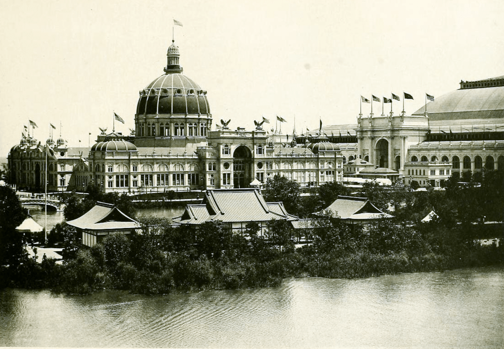

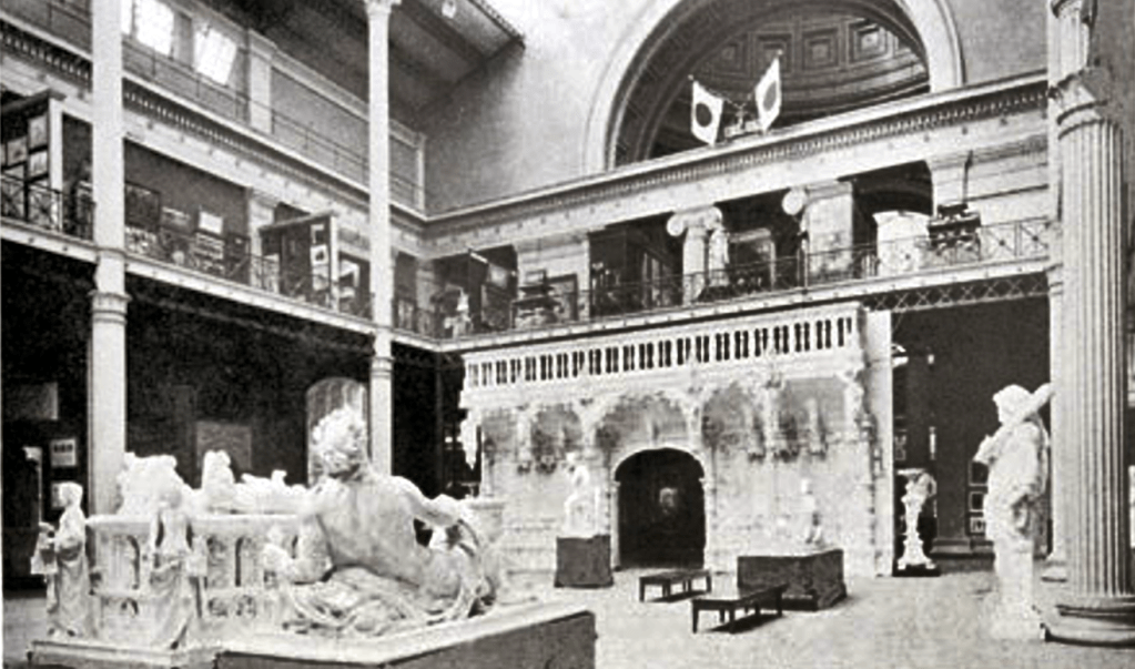
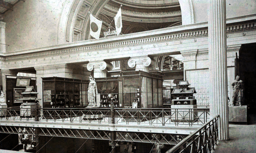
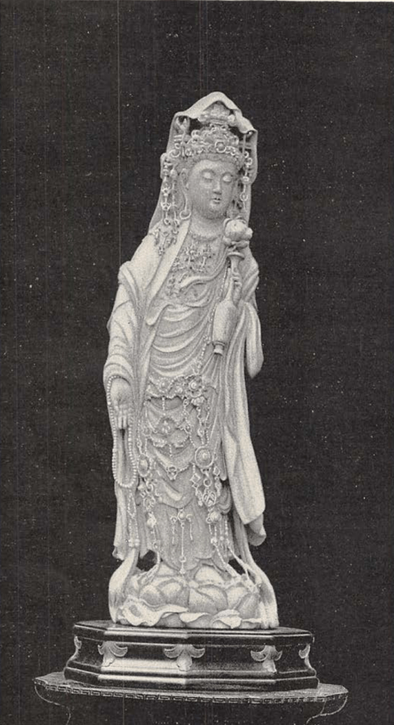


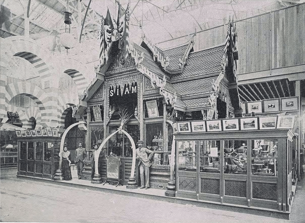


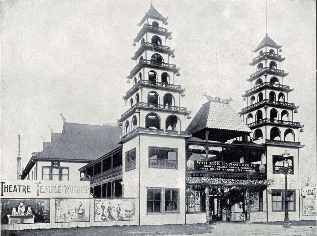
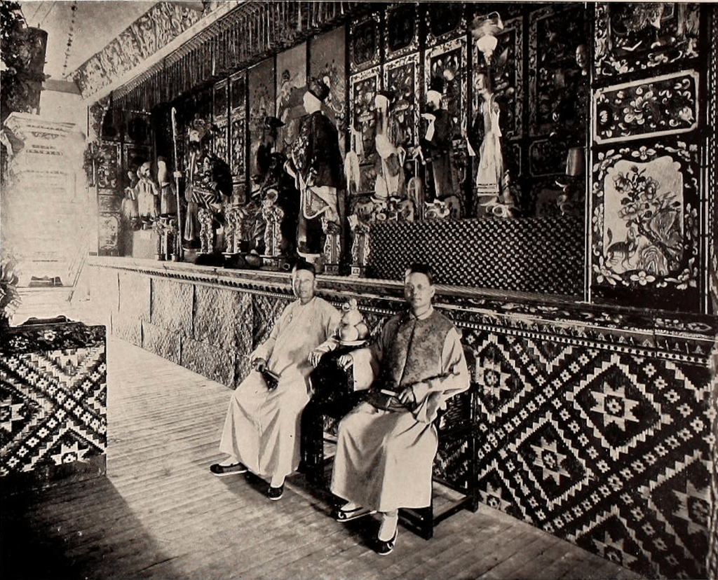

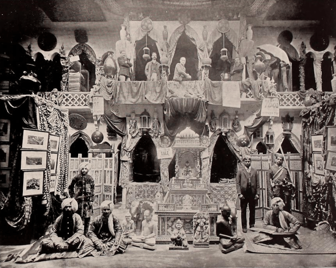


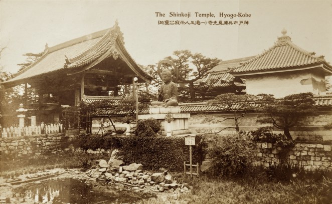
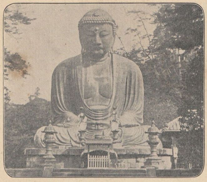
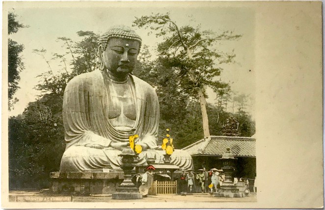
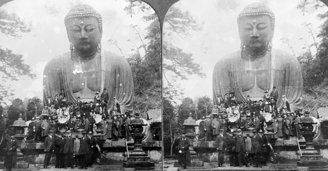
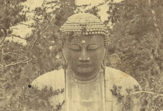


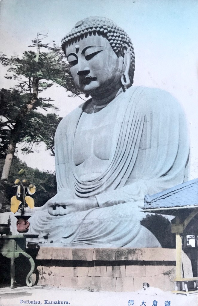
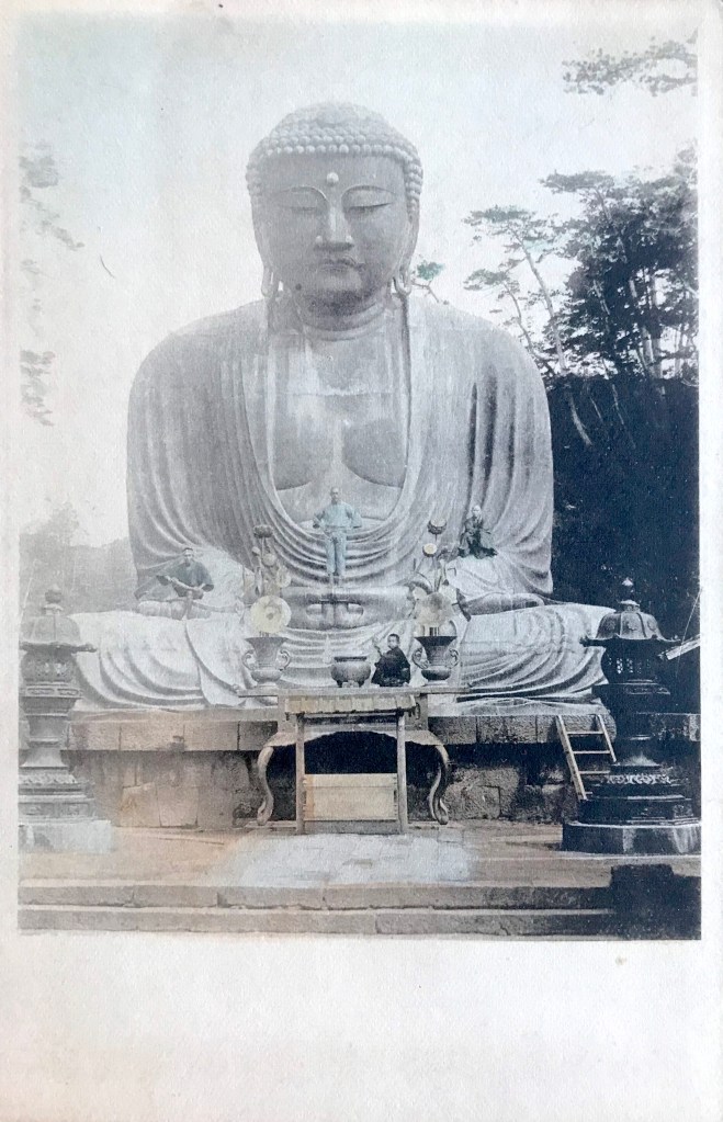


![District Associations
2. Yeong Wo Association II (Yanghe huiguan 陽和會館)
6. Ning Yung Assoc. II (Ningyang huiguan 寧陽會館)
12. Sam Yup Assoc. II [?] (Sanyi huiguan 三邑會館)
15. Sam Yup Association I (Sanyi huiguan 三邑會館)
24. Sam Yup Association III (Sanyi huiguan 三邑會館)
25. Yan Wo Association II (Renhe huiguan 人和會館)
35. Yeong Wo Assoc. III (Yanghe huiguan 陽和會館)
36. Six Companies I (Zhonghua huiguan 中華會館)
36. Hop Wo Association I (Hehe huiguan 合和會館)
37. Six Companies II (Zhonghua huiguan 中華會館)
38. Hop Wo Association II (Hehe huiguan 合和會館)
45. Ning Yung Assoc. I (Ningyang huiguan 寧陽會館)
X1. Yeong Wo Assoc. I (Yanghe huiguan 陽和會館)
X2. Sze Yup Association (Siba huiguan 四邑會館) Kong Chow Association (Gangzhou huiguan 岡州會館)
Clan Associations
1. Lung Kong Assoc. (Longgang gongsuo 龍岡公所)
3. Lord Tam Temple (Tamgong miao 譚公廟)
14. Yee Fung Toy Soc. (Yufengcai tang 余風采堂)
14. Gee Tuck Society (Zhide tang 至德堂)
17. Wong Kong Ha Shrine II (Huang jiangxia黃江夏)
40. Wong Kong Ha Shrine I (Huang jiangxia黃江夏)
Privately Owned Temples
2. Temple of Golden Flower (Jinhua miao 金花廟)
7. City God Temple I (Chenghua miao 城隍廟)
12. Tin How Temple (Tianhou miao 天后廟)
14. Eastern Glory Temple II (Donghua miao 東華廟)
18. Guanyin Temple (Guanyin miao 觀音廟)
22. Eastern Glory Temple I (Donghua miao 東華廟)
23. City God Temple II (Chenghua miao 城隍廟)
28. Jackson Street temple
30. Voorman’s building shrine
31. Sullivan’s building shrine
39. Chan Master Temple (Chanshi miao禪師廟)
39. City God Temple III (Chenghua miao 城隍廟)
X3. Ah Ching’s Tin How Temple (Tianhou miao 天后廟)
Secret Societies
8. Hong Sing Society
10. Dock Tin Society
11. Suey On Society (Ruiduan tang 瑞端堂)
12. Hip Yee Society (Xieyi tang協義堂)
13. Hip Sing Society (Xiesheng tang 協勝堂)
16. Chee Kong Society (Zhigong tang 致公堂)
19. Kai Sen Shea Society (Jishanshe tang 繼善社堂)
20. Bing Kong Society I (Binggong tang 秉公堂)
27. Bing Kong Society II (Binggong tang 秉公堂)
32. Hop Sing Tong (Hesheng tang 合勝堂)
33. On Yick Tong (Anyi tang安益堂)
39. Suey Ying Society (Ruiying tang 瑞英堂)
44. Suey Sing Tong (Cuisheng tang 萃勝堂)
Guild Shrines
4. Washermen’s shrine
34. Chinese Merchant’s Exchange shrine
40. Tailor’s shrine
Other
5. Hang Far Low Restaurant shrine
21. Grand Chinese Theatre shrine
26. St. George Temple
29. Yuen Fong Restaurant shrine
42. Chinese Telephone Exchange shrine
43. New Chinese Theatre shrine](https://peterromaskiewicz.com/wp-content/uploads/2020/06/san-francisco-chinatown-temple-map-legend-romaskiewicz-jan-2026.png)

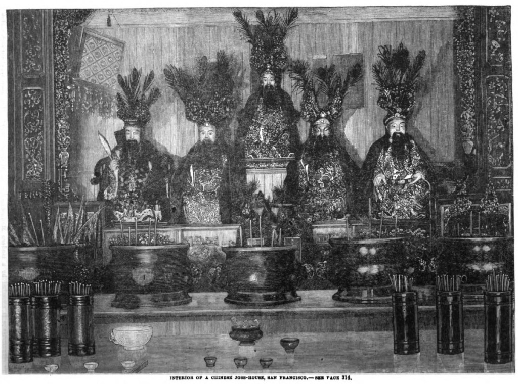


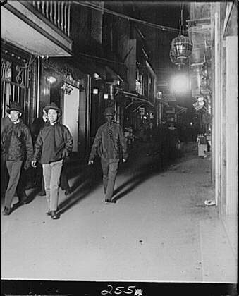
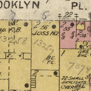


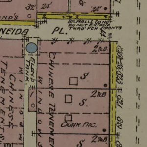
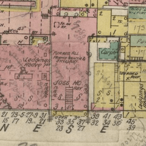


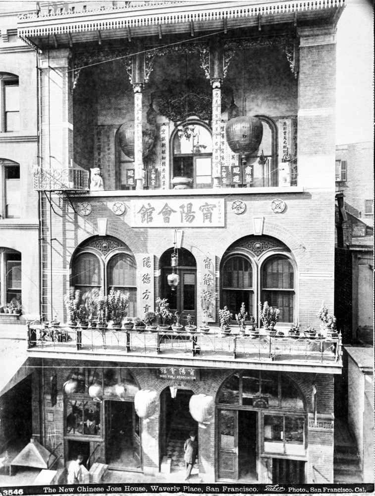


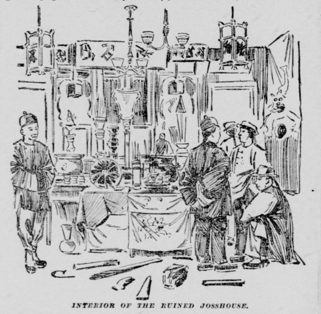


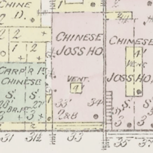

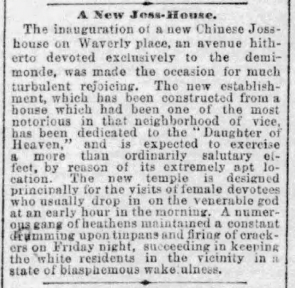


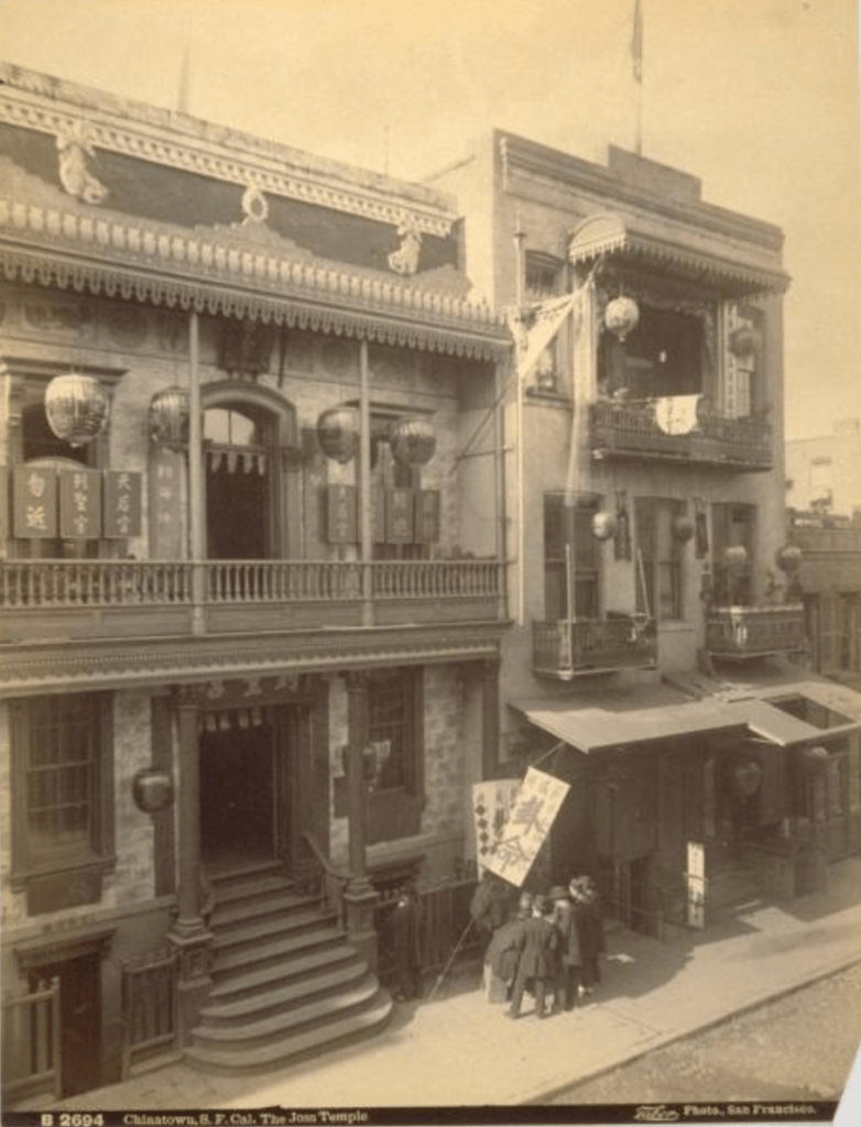
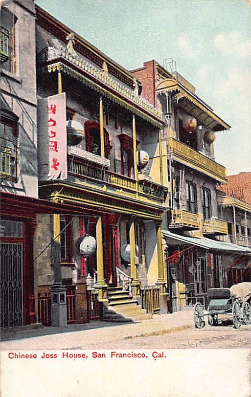


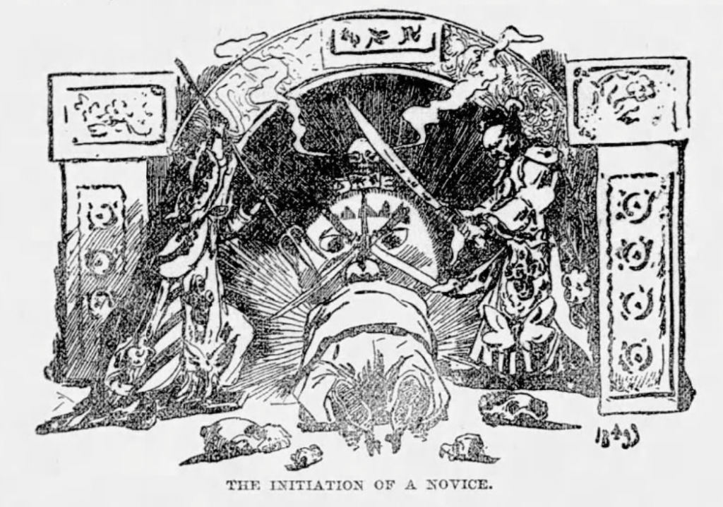
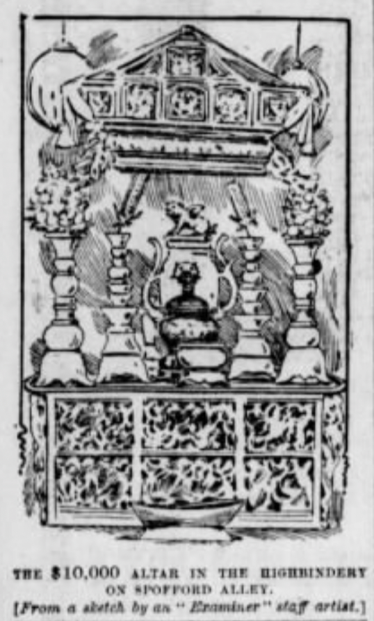
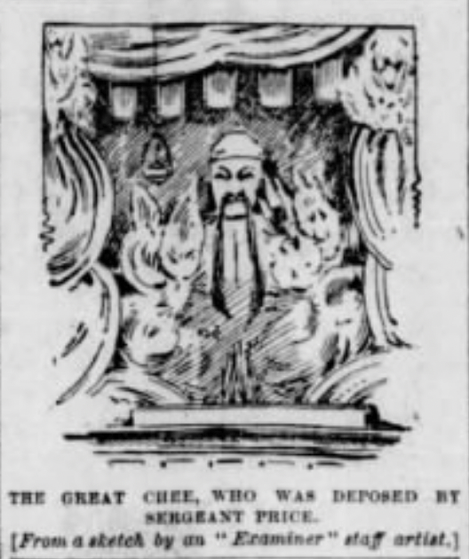


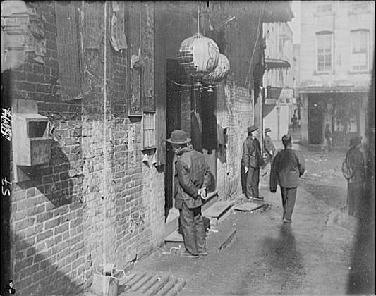


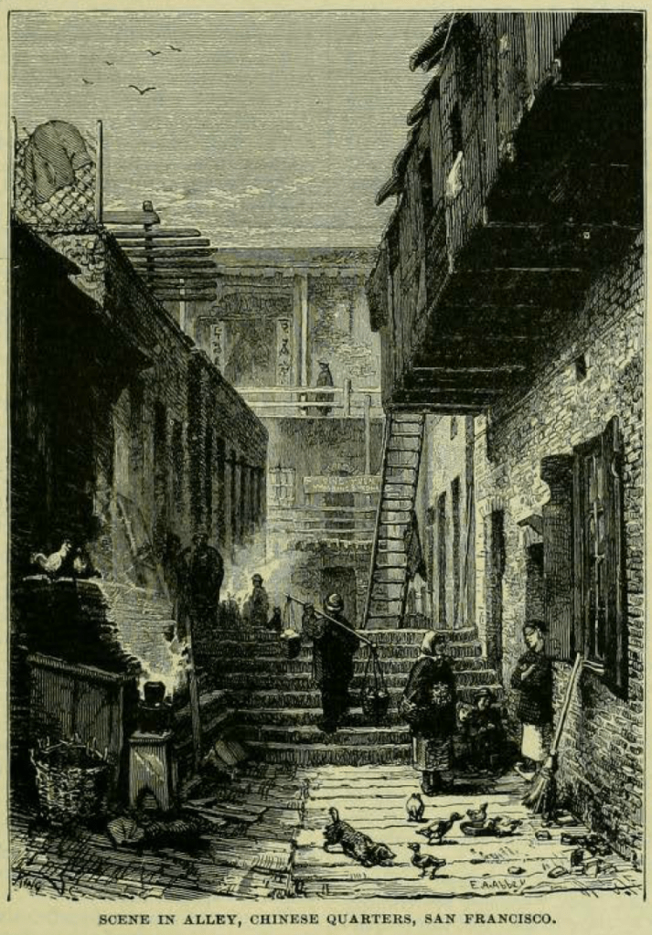

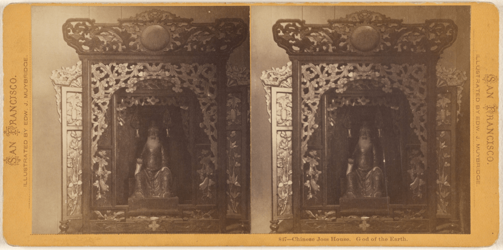
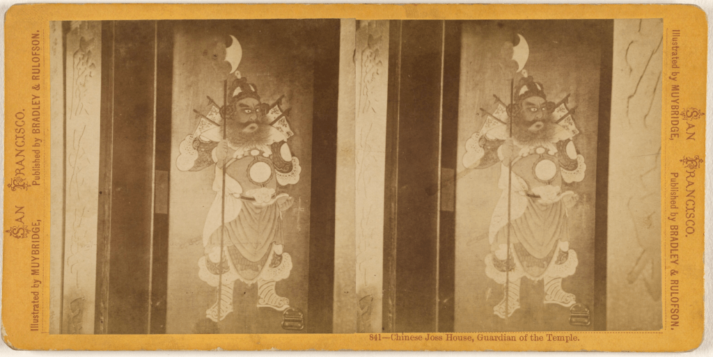
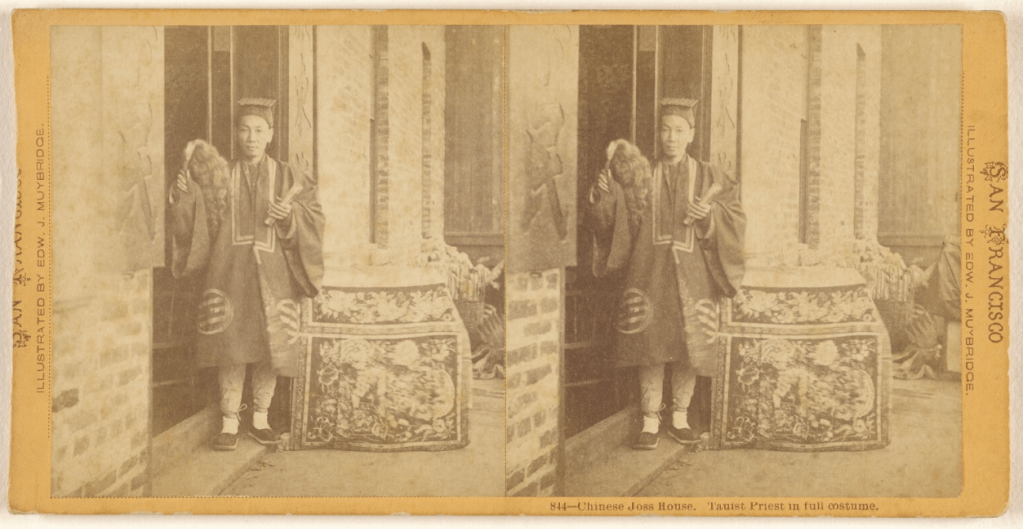
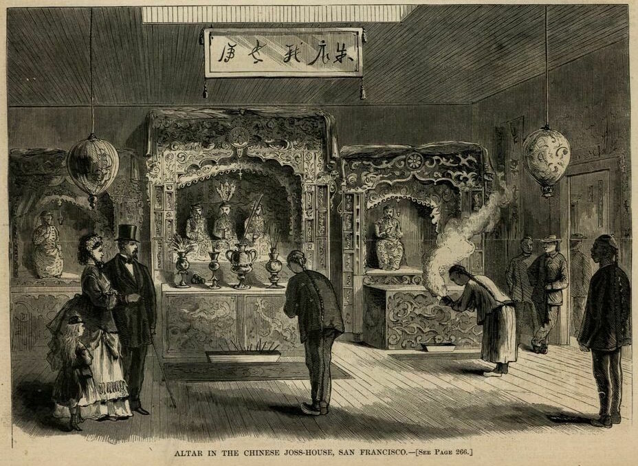


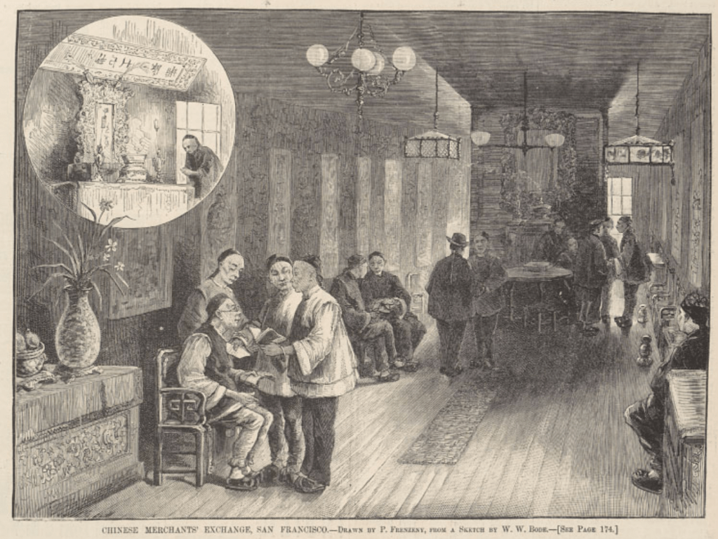
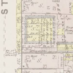
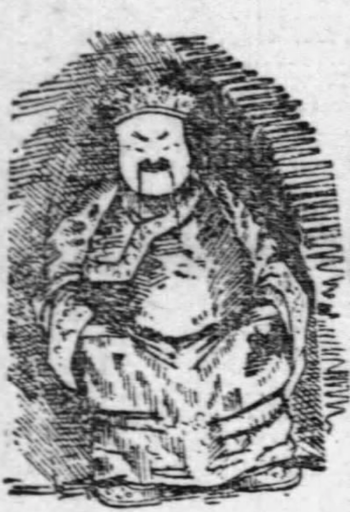

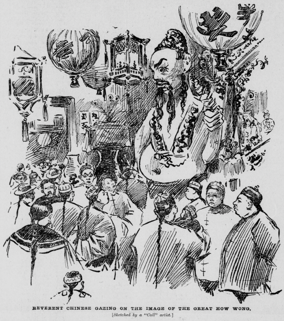

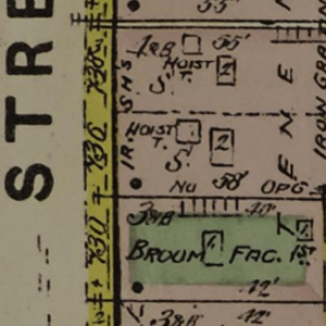
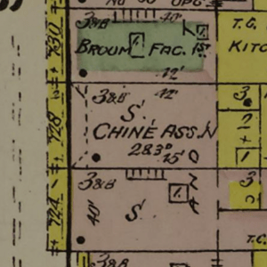


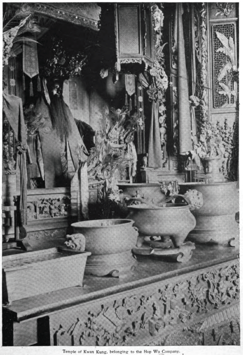
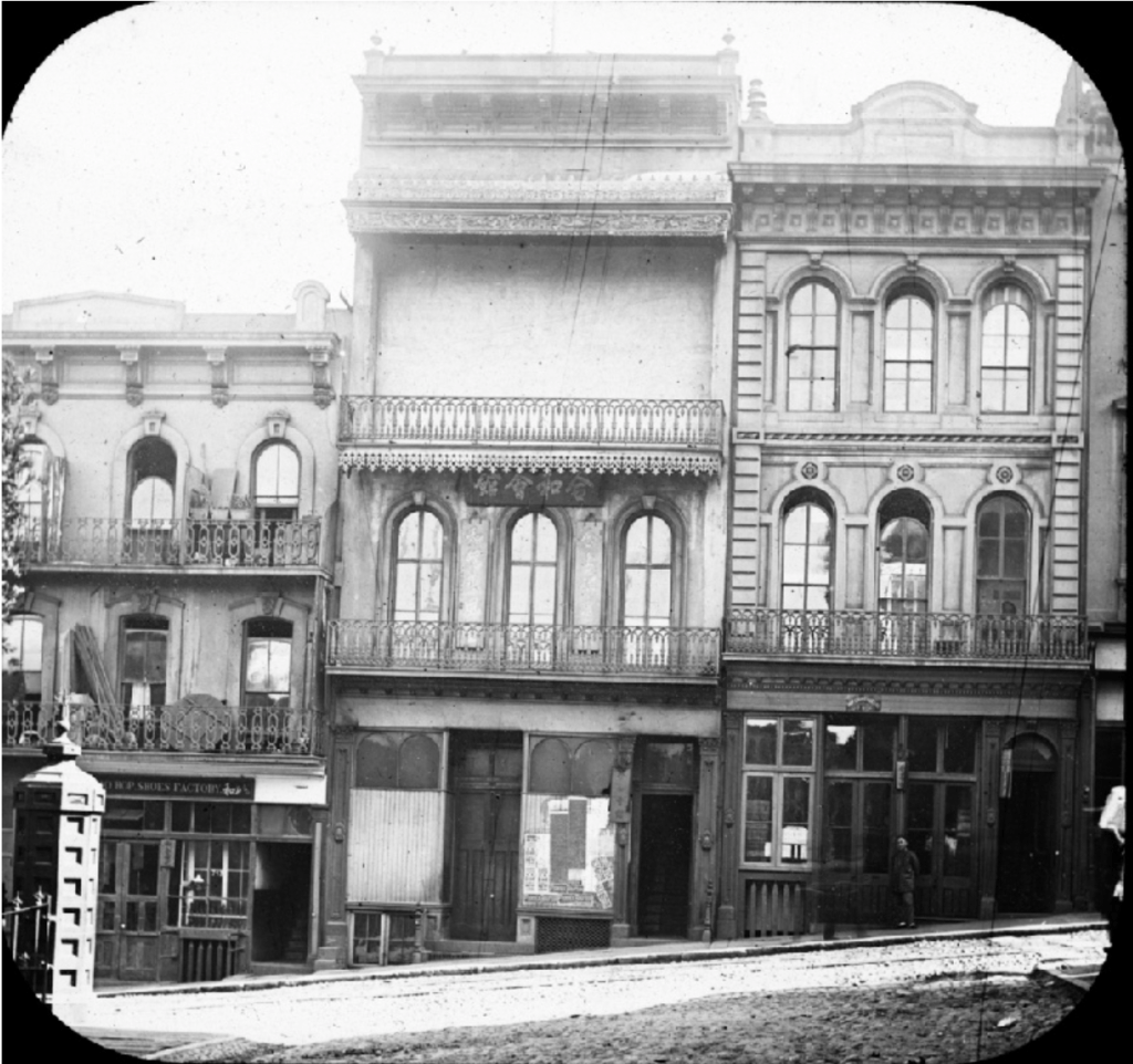
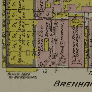

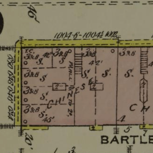
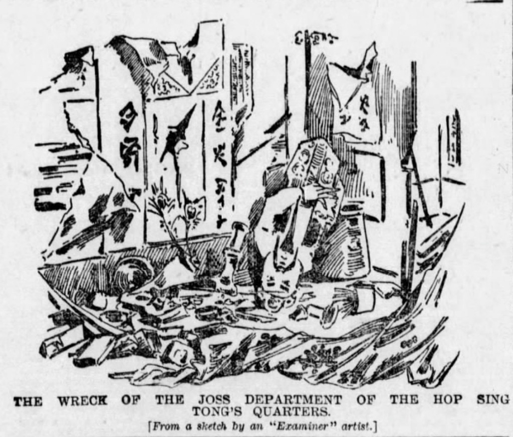
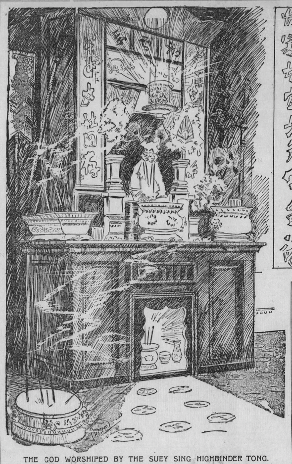


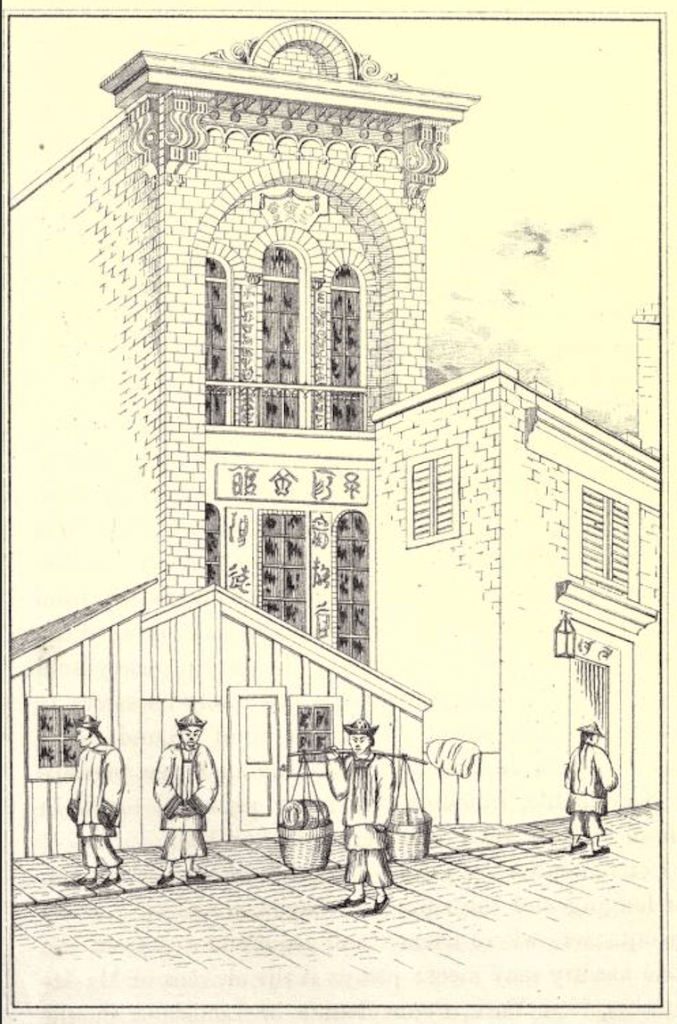

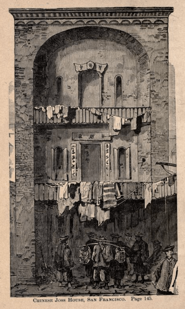


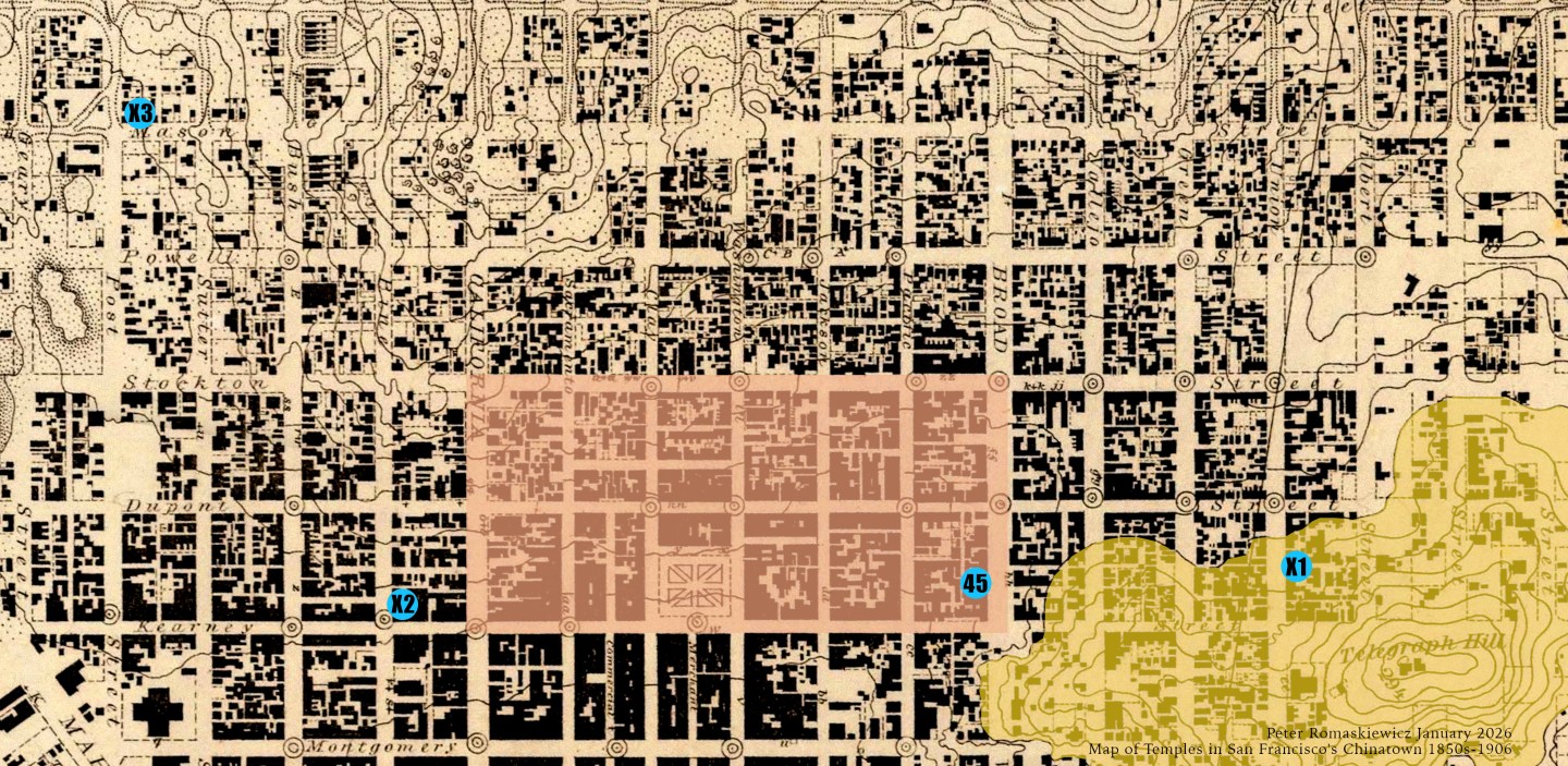
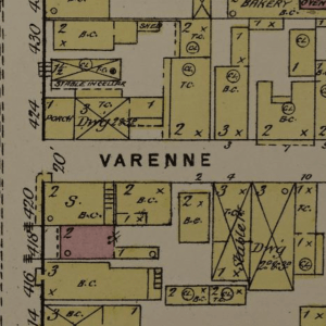
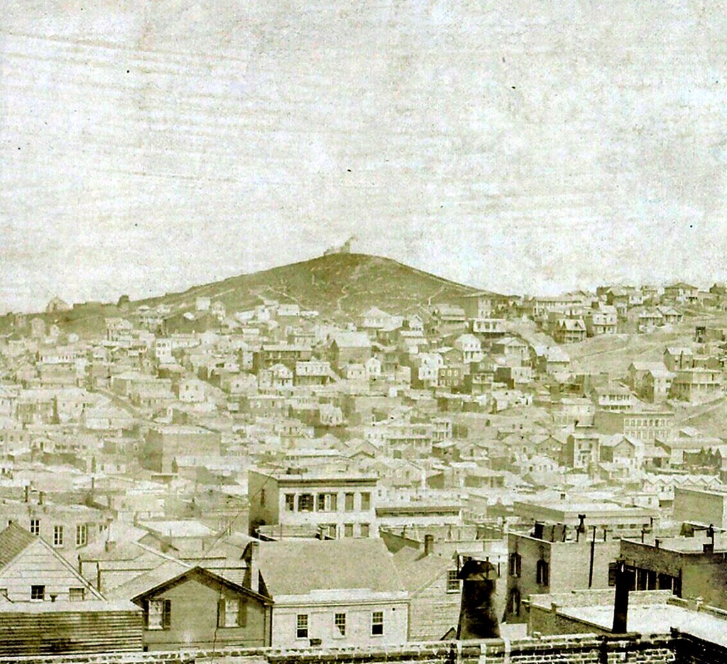

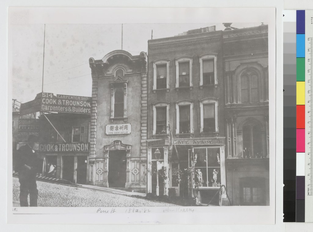

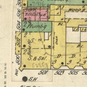


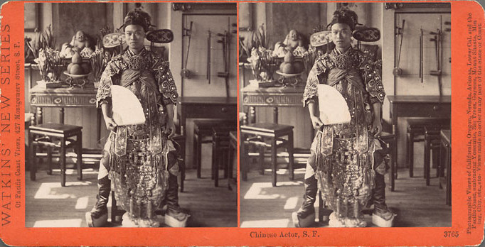


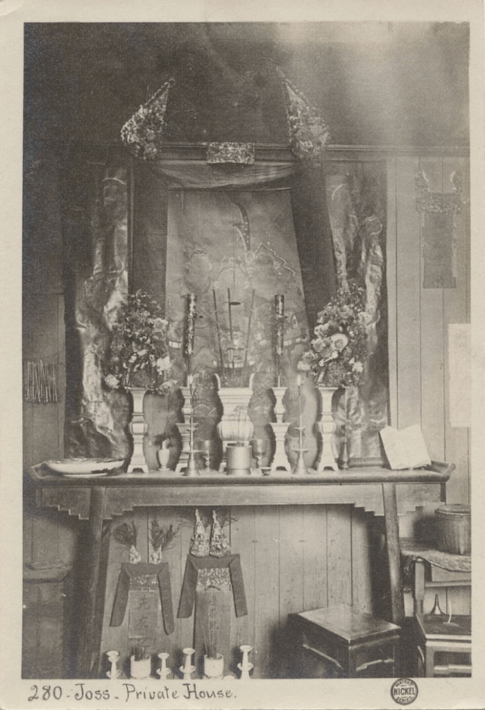


 Sometime in the 1920s sets of picture postcards were more frequently issued in a paper sleeve or cover. These sleeves were initially imprinted with text or simple designs, but due to the highly competitive commercial market these utilitarian items became subject to the same visual expectations as the postcards themselves. The examples before us bear a hand-colored photographic image, which is given the same artistic care as the cards they hold [Fig. 1 & Fig. 2]. In addition to the minor and idiosyncratic coloring differences, each set uses a slightly different letterpress design. Set 2 also appears to be influenced by an Art Deco font style.


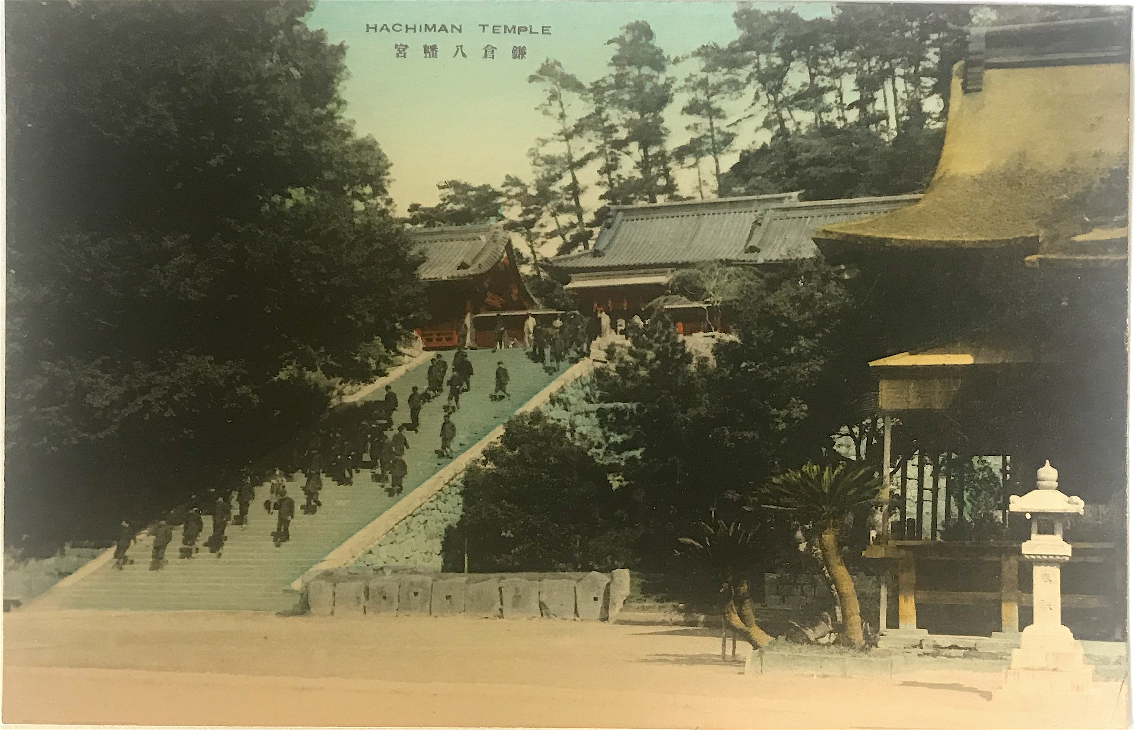


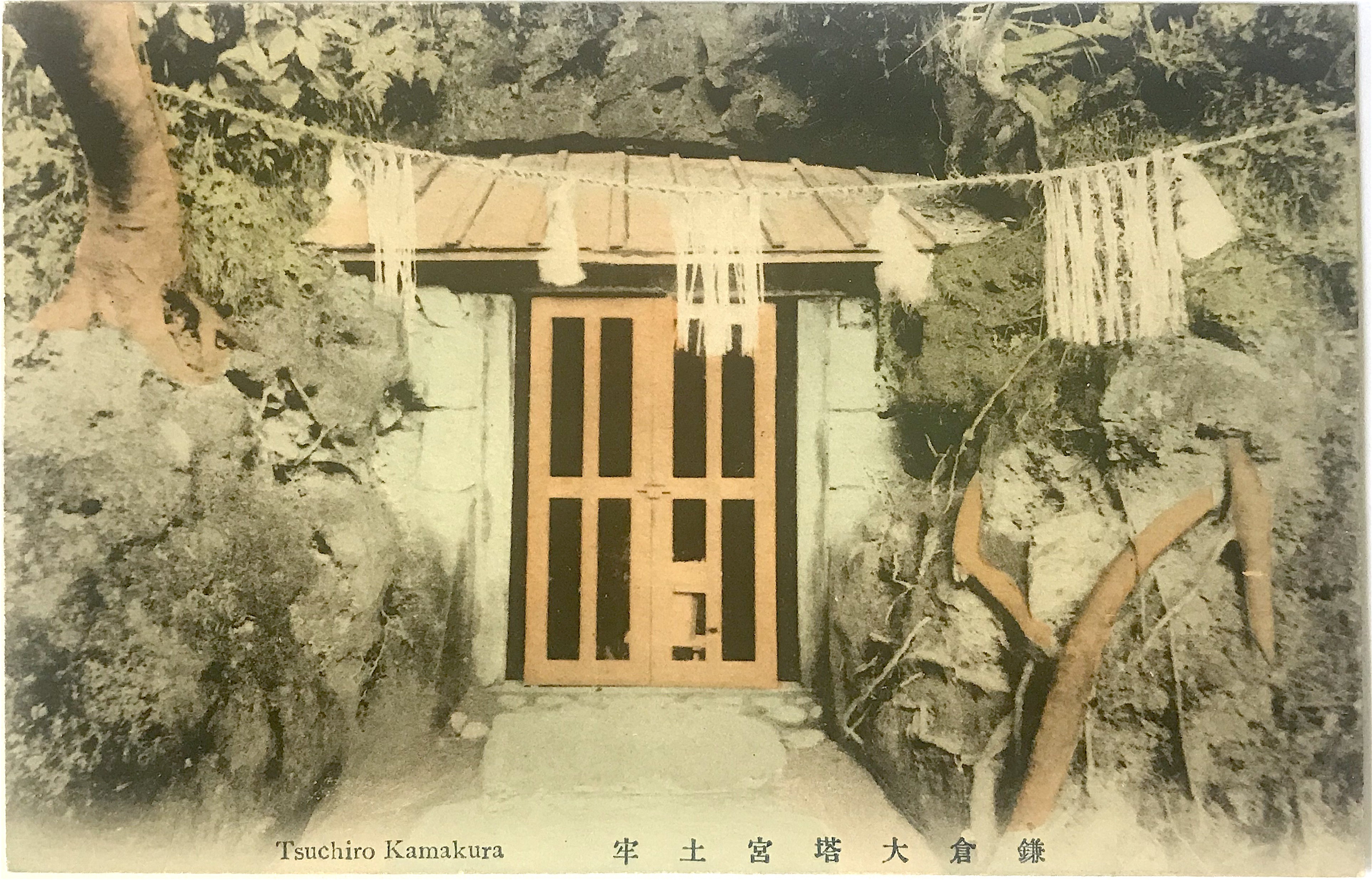


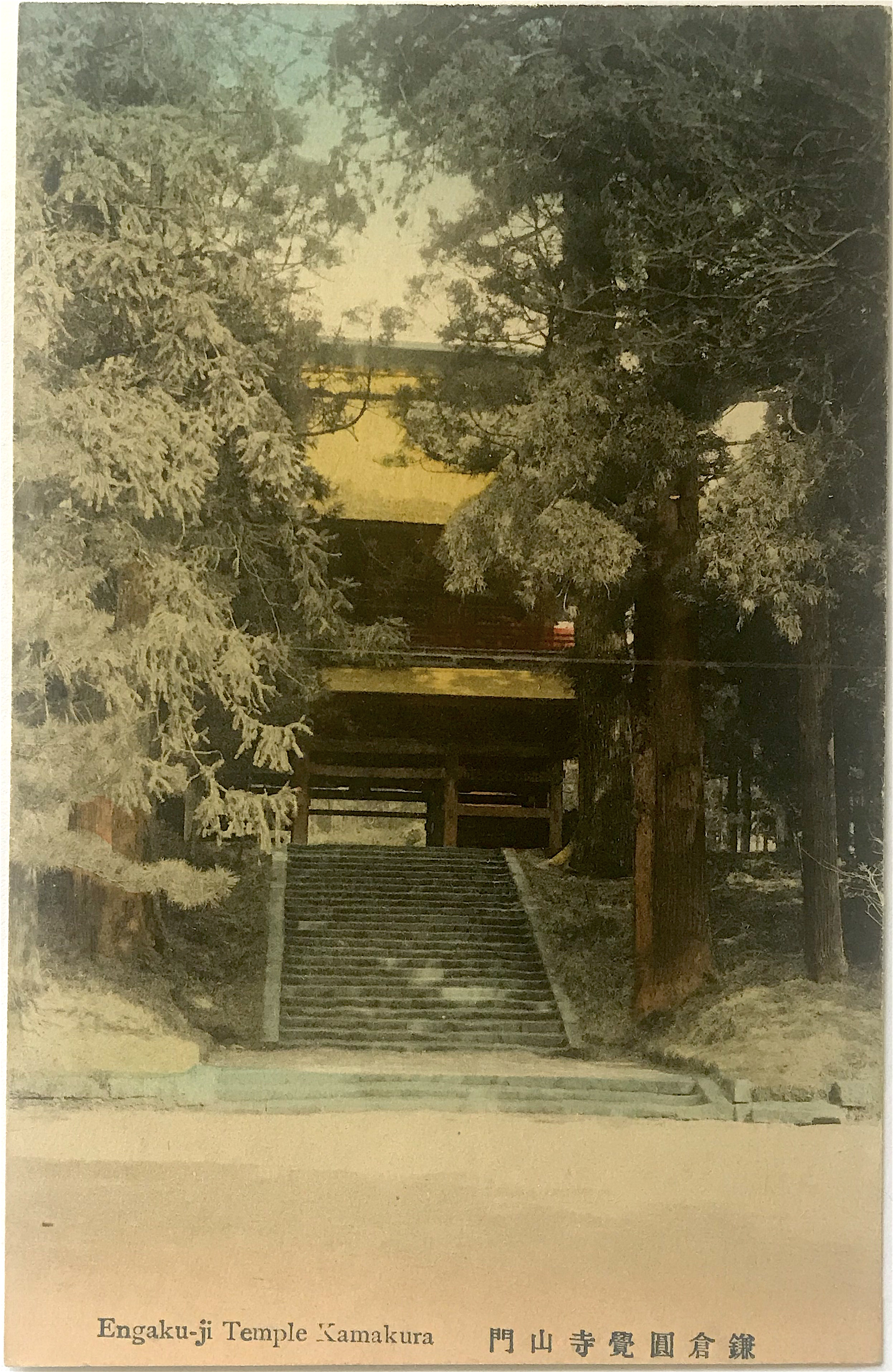


 The photograph of the Daibutsu by Esaki (or one of his studio assistants) depicts the bronze statue from the southwest corner, an uncommon, but


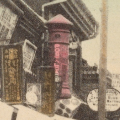


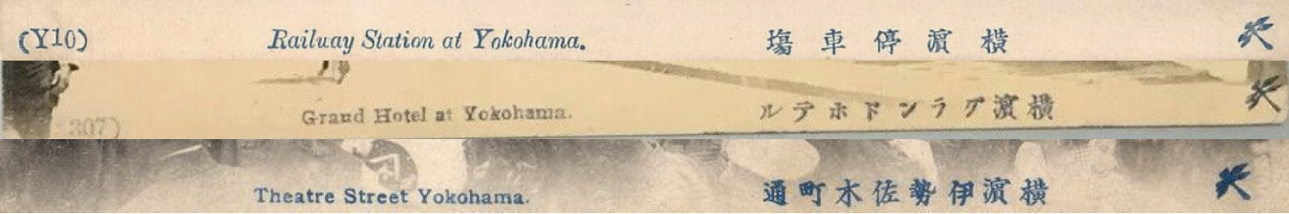


 A variant style for “Carte Postale” can also be found. Note the stamp box is vertical.


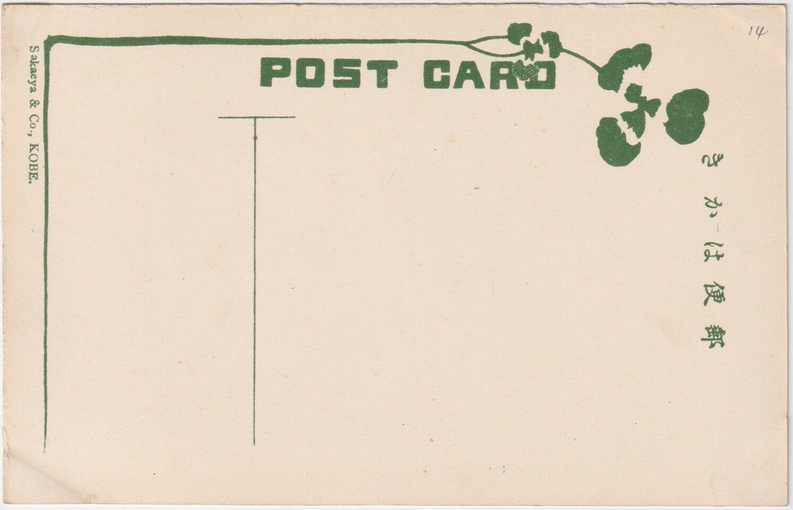
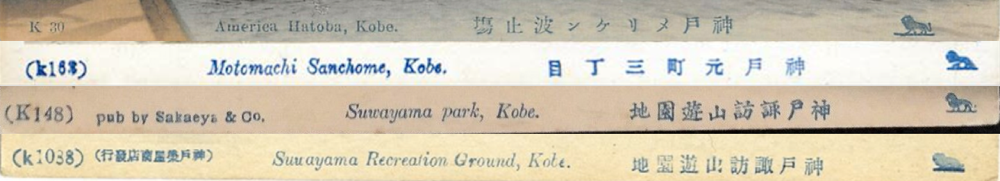


 Akanishi (Kobe 神戸)
 Asahidō (Kyoto 京都)
 Benrido 便利堂 (Kyoto 京都)[no trademark, but uses distinctive font –
  Hōeidō 保永堂 (Kamakura 鎌倉?)
 Naniwaya Co. 浪華屋 (Kanda, Tokyo
  Nisshinsha (Tokyo
  S.N. Banshiudo
  Taisho Hato Brand 大正鳩ブランド (Wakayama
  Tōdai-ji 東大寺 (Nara 奈良)
