Underwood and Underwood’s Cleveland Cruise Portrait Stereoview

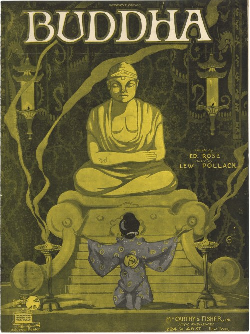
On October 16, 1909, the S.S. Cleveland left Hoboken, New Jersey on the first commercial around-the-world cruise. American tour operator, Frank C. Clark, chartered the Cleveland from the German operated Hamburg-American Line, leaving the east coast with a party of 650 passengers and traveling eastward through the Suez Canal before making landfall in San Francisco three months later on January 31, 1910. Because the Panama Canal was four years away from completion, the passengers completed the last leg of the around-the-world tour via train, returning to their origin point on the east coast. Thus, although Clark’s cruise was not a complete circumnavigation of the globe, the public and press treated it as such. Five days after landing in San Francisco, the Cleveland re-crossed the Pacific Ocean to start a second around-the-world tour, this time carrying more than 750 passengers. Clark’s pair of world tours generated significant amounts of publicity, with thousands appearing in San Francisco to send the ship off. The Cleveland made several subsequent trips between 1912 and 1914 until the advent of World War I interrupted access to the German-owned vessel.[1] The standard itinerary for trans-Pacific cruises of the period included a longer stopover in the port of Yokohama. Here, passengers could go ashore and enjoy the local sites, including a visit to the Kamakura Daibutsu.

One of the most popular publishers of stereocards, Underwood & Underwood, took advantage of these widely marketed luxury world tours and assigned a stereo-photographer to accompany the guests aboard the Cleveland to chronicle the trip. These new stereophotographs then became stock in Underwood & Underwood’s massive catalogue of Japan views and marketed to the general public.
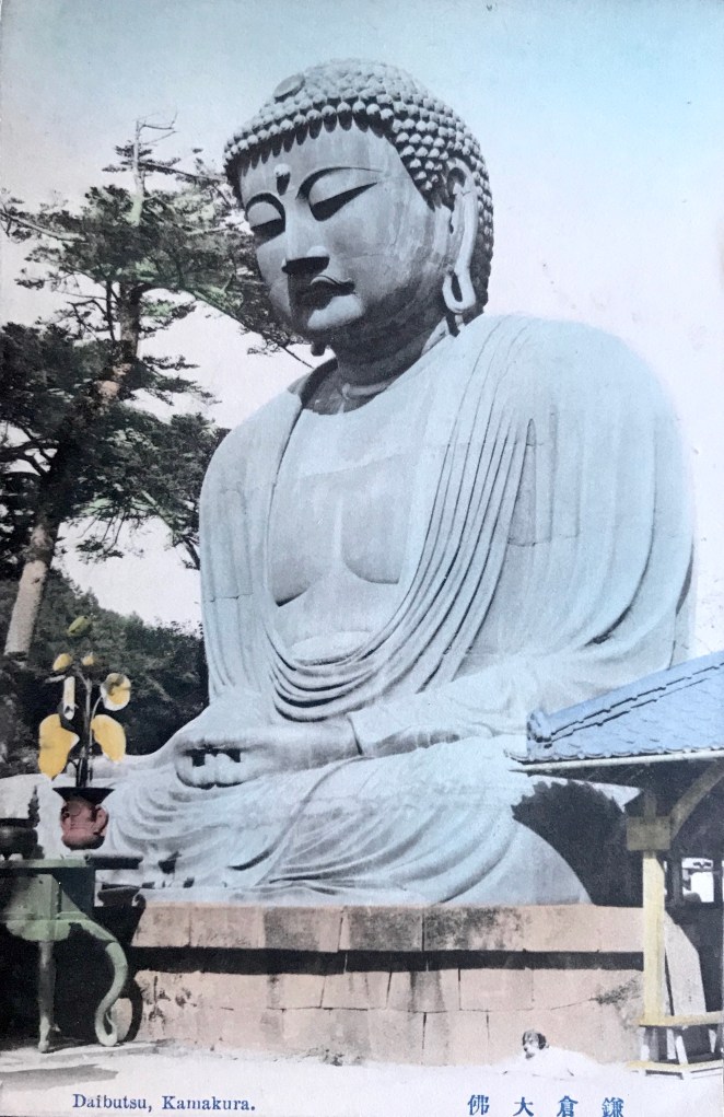
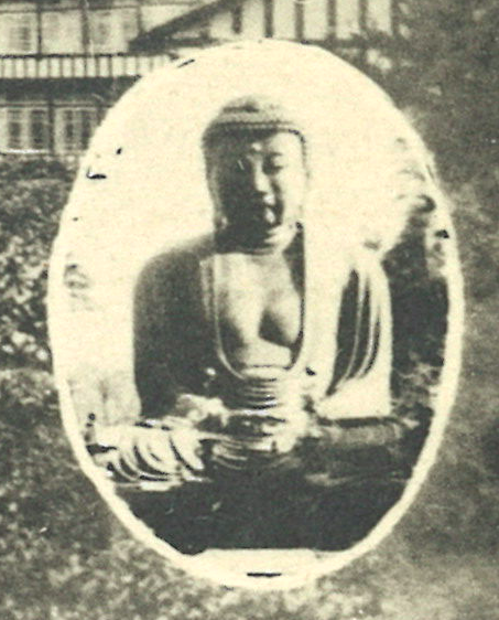
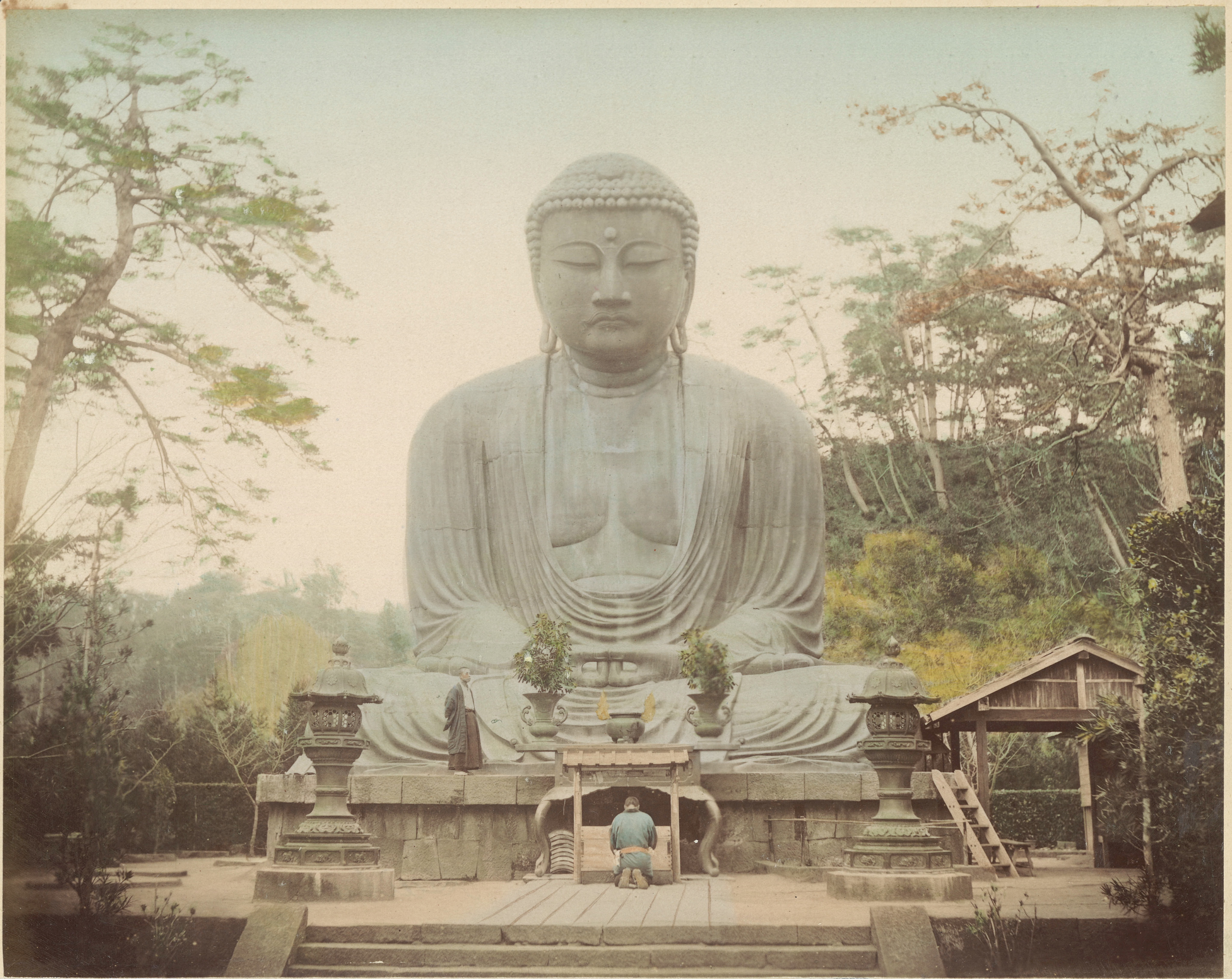
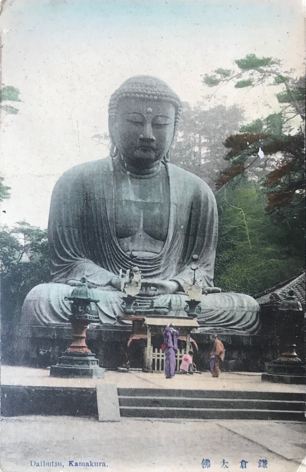
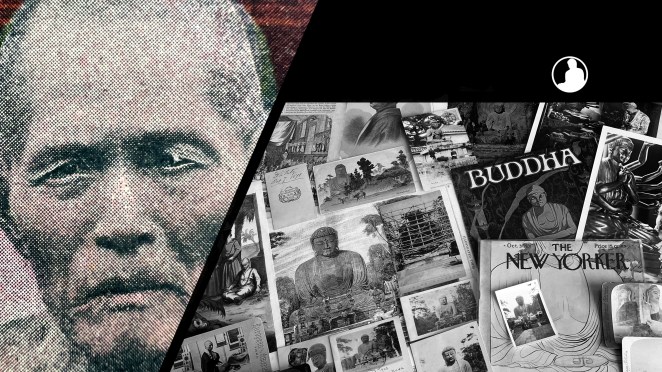
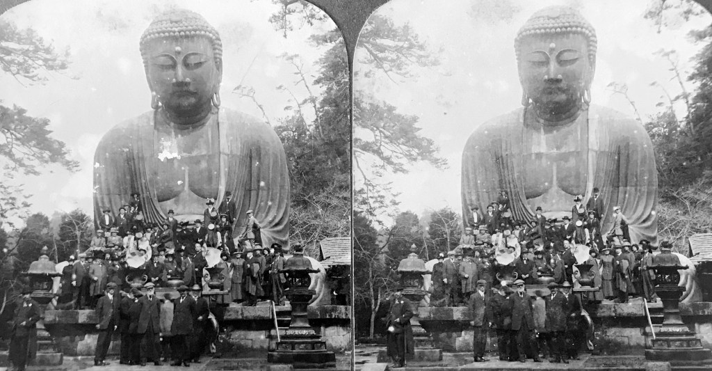
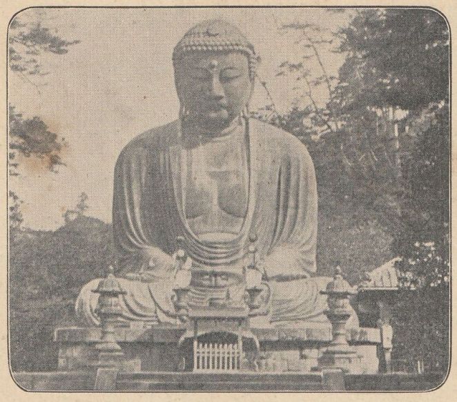
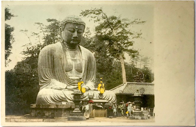
Figure 1

SVKD011uu.JPG
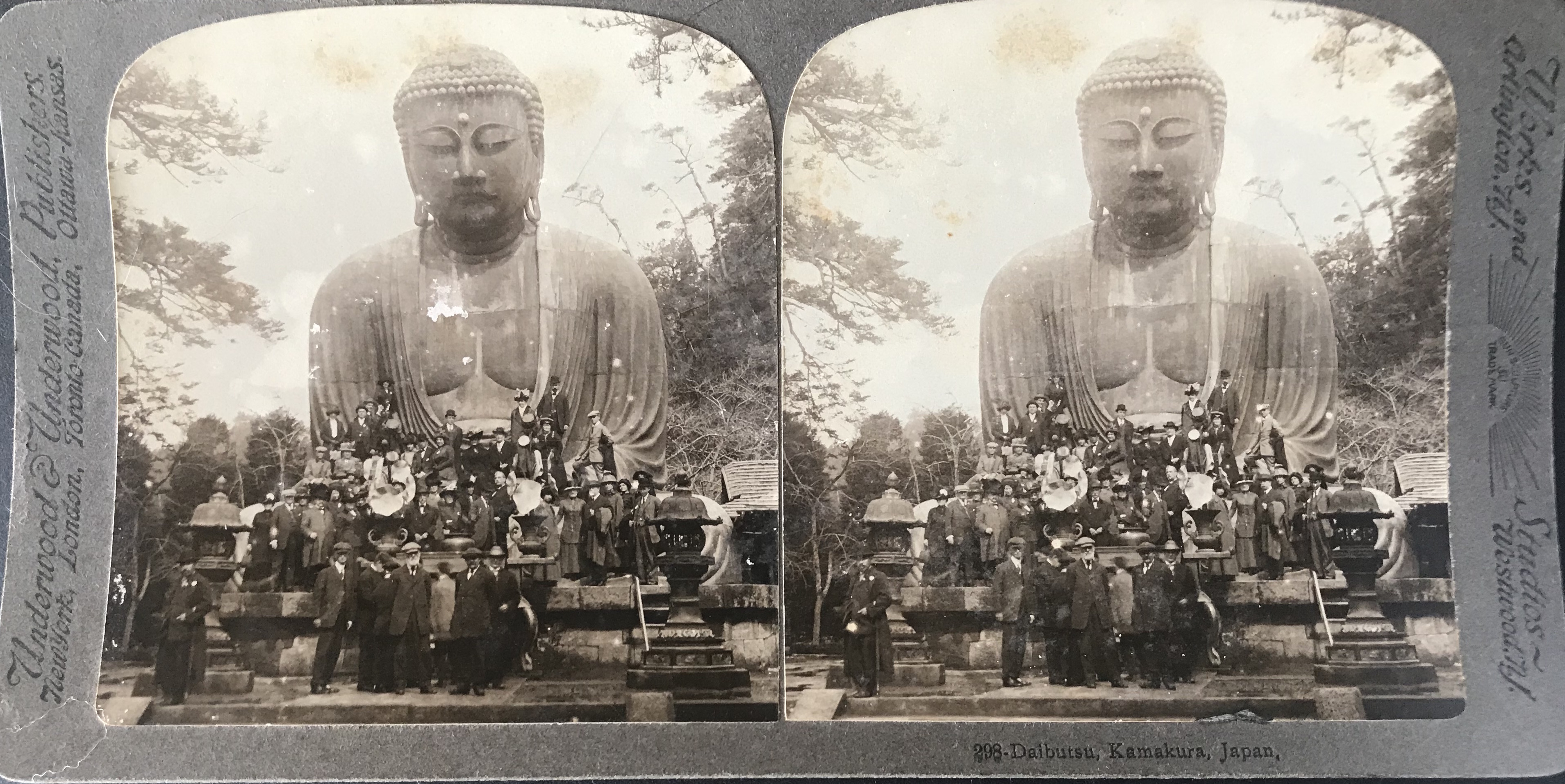
  • Title/Caption: 298-Daibutsu, Kamakura, Japan
  • Year: 1913-1914
  • Photographer: unknown
  • Publisher: Underwood & Underwood
  • Medium: sliver gelatin print; mounted on curved slate-colored card
  • Dimensions: 7 in X 3.5 in

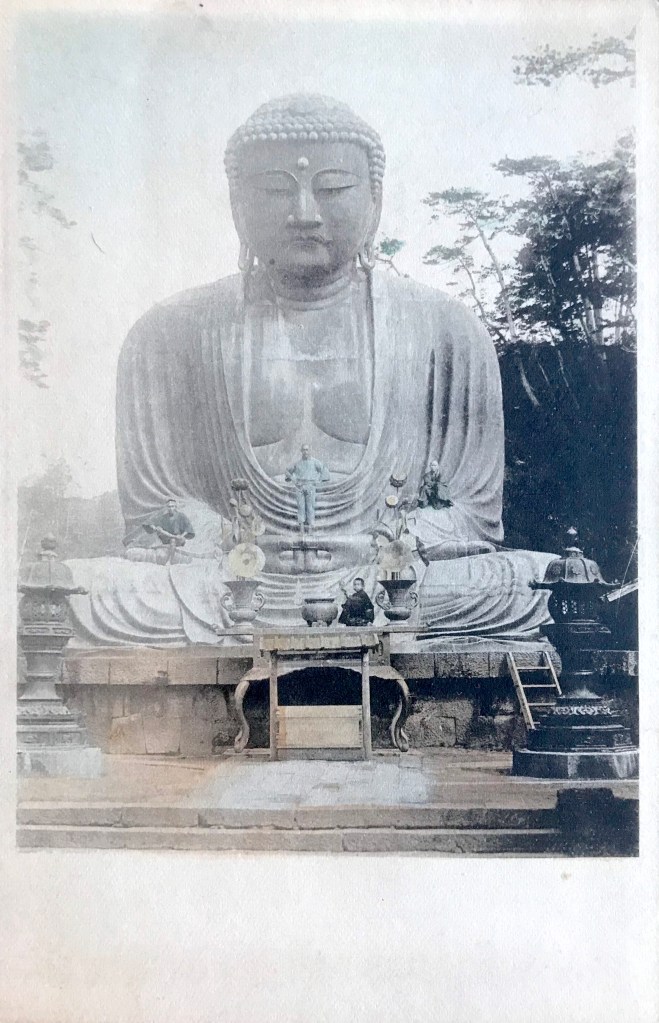
According to the account of R. H. Casey, a passenger aboard the Cleveland during its fourth trip across the globe which arrived in Japan on February 24, 1913, the tourist excursion trips were a sight to behold. Two hundred and forty passengers boarded a train to Kamakura and rode rickshaws from the train station to the temple of the Daibutsu, traveling en masse through the narrow roads of the rustic city’s back country.[2] This feeling of mass tourism is captured perfectly by our unknown photographer’s view, showing a cluster of nearly fifty people crowded in front of the Daibutsu [Fig. 1]. Almost all of the visitors are mounted atop the stone foundation or posing in the lap of the colossal statue. This posturing of gazing towards the viewer reflects a long-standing photographic tradition of collecting exotic “trophies” by being pictured in front of one’s cultural conquests.

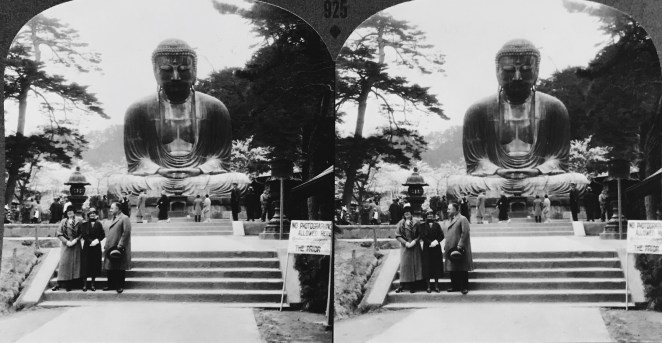
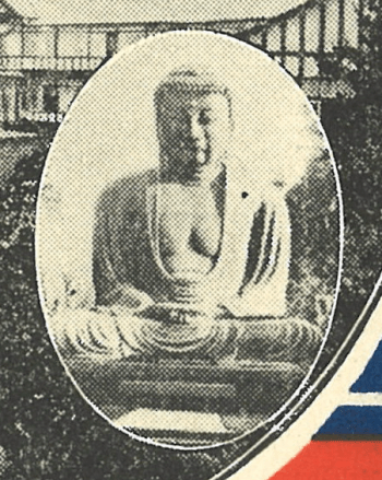
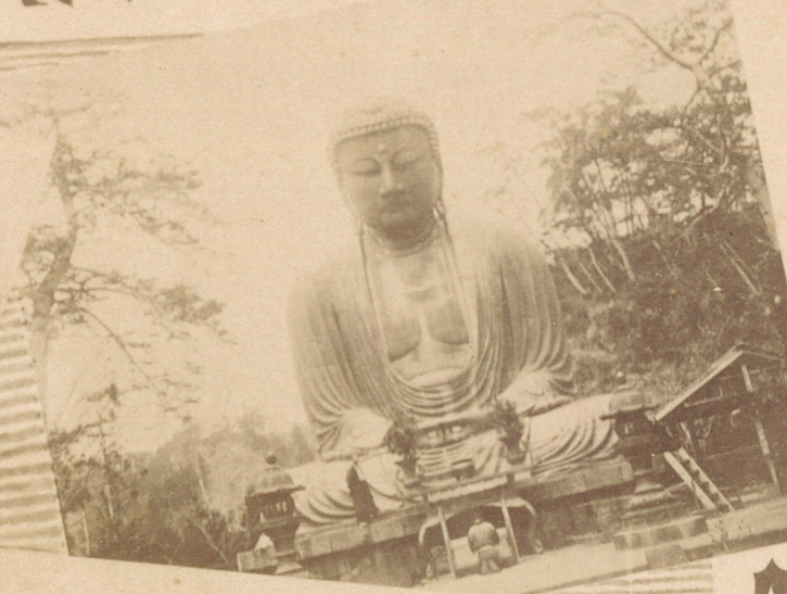
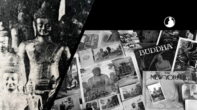
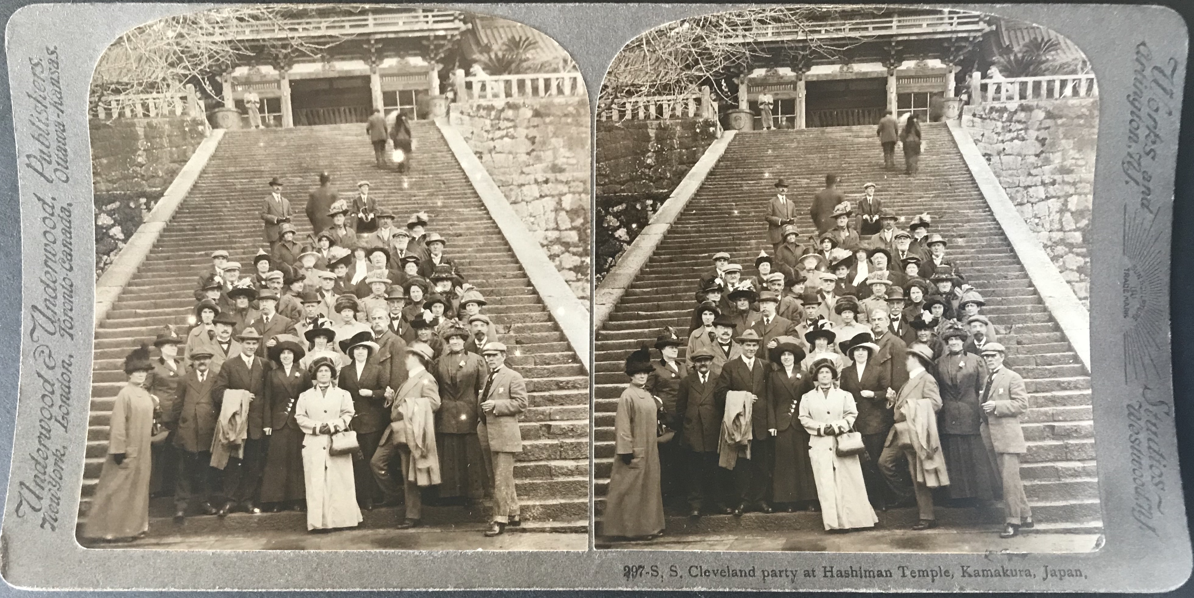
The card itself does not identify the party as originating from the Cleveland, but an adjacent card in the Underwood & Underwood catalogue (number 247, Fig. 2), does identify a large group of tourists perched along the tall stairway of Hachiman Shrine as traveling aboard the Cleveland. Moreover, a close inspection of these two photographs reveals the same individuals are depicted in both.[3] Thus, we can safely assume the visitors to the Daibutsu are among the globetrotters aboard the Cleveland.

Figure 2

SVHS001uu.JPG

It is difficult to determine which around-the-world cruise this group of people joined. Photographs from the initial pair of Clark’s trips, between 1909-1910, show the Daibutsu site displaying a picketed fence and gabled roof on the coin offering box (saisenbako 賽銭箱), elements that appear – to my eye – to be missing in this stereoview.[4] It is possible this image was taken on one of the second pair of cruises, landing in Yokohama in January and February 1913, having departed from Hoboken and San Francisco respectively.[5] A fifth, and likely final, cruise aboard the Cleveland was scheduled to depart the east coast in January 1914 on a 93-day voyage to San Francisco, with no scheduled “return” trip.[6] Thus, it appears this photograph of the Daibutsu could have been taken during one of these three trips during 1913 or 1914.

In contrast to the other Underwood & Underwood view of tourists atop the Daibutsu, this composition has the feeling of formal portraiture. The visitors are spread out symmetrically along the ground, statue, and stone base, with most looking sternly at the camera lens. As around-the-world cruises became more popular in the interwar period, these large group photos also became more common, sometimes being used in promotional material for the cruise company. The photographs of the 1860s and 1870s that depicted small groups of intrepid travelers (and mostly men), were now festooned with tourists who draw as much attention to themselves as the statue in the background.


Notes:

*This post is in honor of my father, may your curiosity in the odd live on through me.

*This is part of a series of posts devoted to exploring the development of a visual literacy for Buddhist imagery in America. All items (except otherwise noted) are part of my personal collection of Buddhist-themed ephemera.

[1] The Hamburg-American Line advertised heavily for the Cleveland’s first trip through the Panama Canal, scheduled to disembark from Hoboken in January 1915 and bring passengers to San Francisco to celebrate the Panama-Pacific Exposition. I have found no evidence that this trip took place, and given that Germany was in the midst of war by the end of 1914, the excursion was most likely to have been abandoned by the Hamburg-American Line. Accounts of the previous completed trips, where the above information was extracted, can be found in Frizell & Greenfield 1910, Junkin 1910, Bush 1911, Forbes 1912, and Casey 1914.

[2] Casey 1914: 29. According to Casey, they also visited the Kaihin Hotel.

[3] The easiest individual to spot is the sole hat-less man with coiffed white hair and mustache. A second man in a brimmed newsboy hat and white beard is also easily identified in both.

The distinctive plumes in women’s hats also leads to several relatively easy identifications (not pictured). Moreover, Underwood & Underwood Japan-series cards issued with numbers in the 290’s all appear to be issued from the Cleveland cruises.

[4] The photograph by amateur photographer F. H. Wellcome and published in the travelogue of Frizell and Greenwod clearly shows the gabled coin box. (see Frizell & Greenwood 1910: 49).

[5] These dates are noted in Forbes 1912: 27 & 29. Forbes took two trips around the world, starting in Hoboken and travelling eastward until ultimately landing in San Francisco, where he then joined the “return” voyage, heading westwards until back in Hoboken

[6] The Cleveland would have needed to be back in Hoboken for its widely publicized trip leaving in January 1915 (see note above). It is possible the Cleveland left San Francisco and headed for the Panama Canal, testing the crossing without passengers before returning in January. This tour was operated by the Hamburg-American Line directly and Clark would not make his fifth trip around the world until after the war in 1924, when he chartered the S.S. California.

References:

  • Bush, George Tome. 1911. 40,000 Miles Around the World. Howard, PA: N.P.
  • Casey, R. H. 1914. Notes Made During a Cruise Around the World in 1913. New York: N.P.
  • Forbes, Edgar Allen. 1912. Twice Around the World. New York: Fleming H Revell Company.
  • Frizell, William G. and Greenfield, George H. 1910. Around the World on the Cleveland. New York: N.P.
  • Junkin, Paul S. 1910. A Cruise Around the World. Creston, IA: N.P.

Additional Posts in Visual Literacy of Buddhism Series

Renjō’s Daibutsu Photograph: A Pioneer of the Path

Often called the “founding father of Japanese photography,” Shimooka Renjō 下岡蓮杖 (1823-1914) was a true artistic pioneer. One of the first Japanese to practice commercial photography, Renjō (a self-styled nickname) was also likely the first oil painter and lithographer in Japan.[1] His personal reminiscence, recorded in 1891, claims his fascination with photography began when he saw his first daguerreotype in 1844 in Edo (now Tokyō). He then spent the next ten years trying to find a photographer who could teach him the craft. According to his own account, which is held in suspicion by modern scholars, in 1856 Renjō had a secret meeting with Henry Huesken (1832-1861), the translator to the American general consul at Shimoda, to learn the basic principles of photography. Regardless of the veracity of this story, Renjō opened the first Japanese commercial photography studio in the port city of Yokohama in 1862.[2] His business soon prospered and he apprenticed several of the next generation of famed Japanese photographers, including Usui Shūzaburō 臼井秀三郎, Suzuki Shin’ichi (I) 鈴木真一, and Suzuki Shinichi (II) 鈴木真一. A considerable majority of Renjō’s surviving photographic oeuvre consists of small format cartes de visite, several of which depict the bronze Daibutsu located in Kamakura, not far from his studio in Yokohama.

According to several Western travelers and tour guides from the 1860’s, the original pathway leading to the Daibutsu was a long, stone-paved walkway, tightly flanked by tall evergreen trees and ornately pruned shrubs. For some, the most picturesque view of the Daibutsu was looking down through this long pathway of greenery towards the statue at the end. By the early 1870’s, however, the temple landscaping had undergone significant renovations and the pleasant framing effect of the towering trees was lost. Algernon Bertram Mitford (1837-1916), secretary to the British Legation, described his two contrasting visits to the Kamakura Daibutsu:

“The first time I saw [the Daibutsu], in the autumn of 1866, the approach to it lay along an avenue of grand old evergreen trees, and the effect of the colossus, when seen from the beginning of the avenue, was most striking. Now, unhappily, the trees have been cut down by the avarice of the priests, who grudged the little bit of soil which might bear a few more vegetables, and who took advantage of the revolution to pretend that the trees had been destroyed by the soldiery. The beautiful coup d’oeil is lost, but the figure must always rank among the most wonderful monuments of the world.”[3]

Regardless of the reason behind the removal of the trees, the change in environment certainly altered the viewing experience of the Daibutsu, which was now left in an open grove.

Figure 1

  • Title/Caption: NA (Diabutz [sic] on reverse)
  • Year: 1869-1871 (dated Oct. 7, 1871 on reverse)
  • Photographer: Shimooka Renjō 下岡蓮杖 (1823-1914)
  • Medium: albumen silver print, mounted on card
  • Dimensions: 3in X 2in (cartes de visite)

Interestingly, while the early written accounts of visiting the Daibutsu often included a vivid description of the “avenue of grand old evergreen trees,” the surviving photographic record rarely included this aesthetic aspect. Renjō was one of only a few commercial photographers who placed his camera rig far enough away from the bronze statue to incorporate the tree branches that converged on the walkway.[4] [Fig. 1] It remains uncertain if the rarity of this composition is due to a technical consideration of early photography (such as problematic lighting) or the resulting visual product which creates a cramped and partly obstructed view of the Daibutsu. If the latter case, the long row of trees and shrubs which undoubtedly added a sense of depth and scale to the in-person viewing experience is lost in the two dimensional space of the photograph. In the image above, a lone Japanese individual faces directly towards the camera, taking a wide, aggressive stance. This ultimately creates a sense of tension between the image and the viewer.[5]

Figure 2

APKD Renjō Reverse mark.jpg
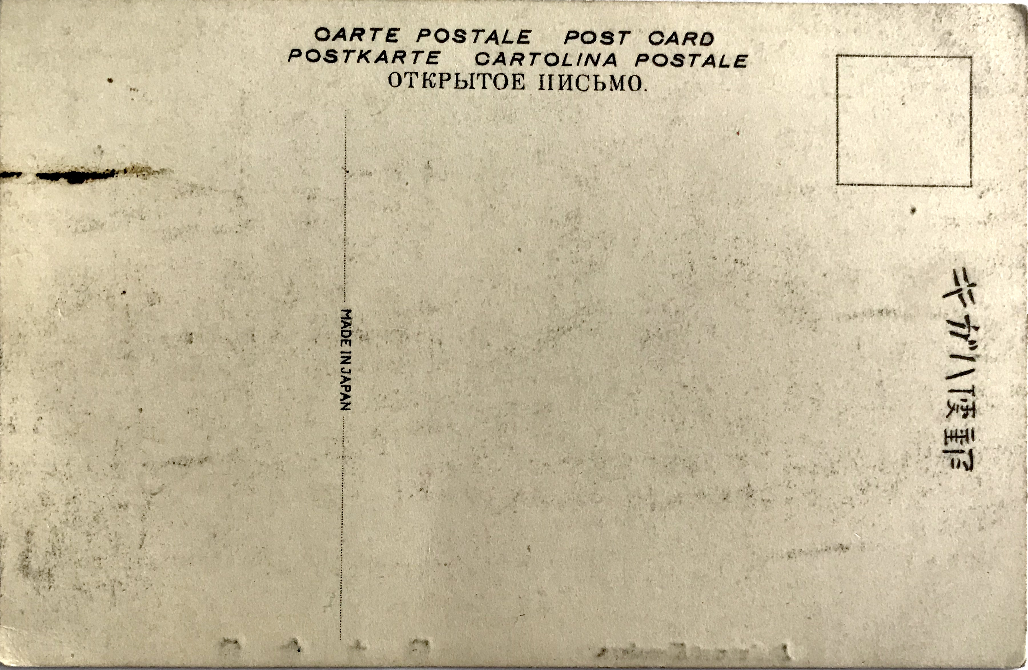
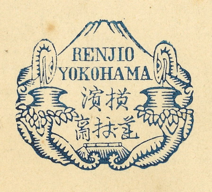
The back of the cartes de visite is stamped by Renjō’s studio mark in indigo blue [Fig. 2]. The hand stamp depicts two serpentine figures twisting around a pair of trees and peering into two pots. The peak of Mt. Fuji and the top of a thatched roof also appear the background. This specific imagery appeared to Renjō in a dream when his business first started to turn profitable, thus he decided to honor his vision by incorporating it into his studio mark. The Japanese characters, written in a variant script (itaiji 異體字), simply say, “Yokomaha, Renjō Studio” (横浜 / 蓮杖斎).[6] The handwritten inscription at the top of the card notes the date as October 7, 1871, thus providing a firm terminus ante quem for the photograph. This possibly represents the date an unknown tourist visited the site. The popular name for the Daibutsu in the foreign port city of Yokohama in the 1870’s, “Daibutz,” is also imprinted at the top of the card, with an accidental inversion of the a and i (not all too uncommon a mistake).

During his professional photographic career, Renjō moved his studio to several locations, but never seems to have accumulated great wealth. In the mid-1870’s Renjō ended his commercial photography exploits and moved to the new capital of Tokyō (behind Sensō-ji 浅草寺) where he returned to his previous profession as a Western-style oil painter.


*This is part of a series of posts devoted to exploring the development of a visual literacy for Buddhist imagery in America. All items (except otherwise noted) are part of my personal collection of Buddhist-themed ephemera.


Notes:

[1] Bennett 2006, esp. p. 71. A more detailed examination of Renjō’s life can be found in Tokyo Metropolitan Museum of Photography 2014. Some also credit Renjō with inventing the rickshaw (jinrikisha 人力車), but while this man-powered, two-wheel vehicle first appeared in Japan in the 1860’s, its attribution to Renjō is almost certainly misplaced. For many years, Renjō was considered the first Japanese professional photographer, but recent research suggests this mantle belongs to Ukai Gyokusen 鵜飼玉川 (1807–1887), who opened the first commercial photography studio in Edo in 1860 or 1861.

[2] For analysis of Renjō’s personal account, see Tokyo Metropolitan Museum of Photography 2014: esp. pp. 130-5.

[3] Mitford 1872: 208.

[4] A photograph held in the University of Massachusetts at Amherst, attributed to Felice Beato, contain perhaps the most foliage of any image I have encountered [here]. Another image is here.

[5] Another similar image attributed to Renjō and dated to 1873 can be found at the Freer Gallery of Art and the Arthur M. Sackler Gallery (FSA A1999.35 465)[source]. The position of the camera and framing is almost exact, but the figures by the altar are different. Older images by Renjō (still depicting the railing and balusters on the left) can be found at the Tokyo Photographic Art Museum (here & here) and among the Tom Burnett Collection (here). All three are also depicted in Tokyo Metropolitan Museum of Photography: 2014. The Austrian photographer Wilhelm Burger (1844-1920) traveled in Japan for a year spanning 1869 and 1870, and only some of his photographs of the Daibutsu include the railing to the left of the stairs leading to the second landing. Because of this, Renjō’s photograph here must post-date late 1869.

[6] The mark and its origins is described in Tokyo Metropolitan Museum of Photography 2014: 16-7.

References:

  • Bennett, Terry. 2006. Photography in Japan: 1853-1912. Rutland, VT: Tuttle Publishing.
  • Mitford, A[lgernon] B[ertram]. 1872. “Wanderings in Japan,” The Cornhill Magazine, Vol. 25, No. 146 (February), pp. 196-213.
  • Ozawa Takesi. 1981. “The History of Early Photography in Japan,” History of Photography, Vol. 5, No. 4, pp. 285-303.
  • Tokyo Metropolitan Museum of Photography. 2014. Shimooka Renjō: Nihon shashin no kaitakusha 下岡蓮杖: 日本写真の開拓者 [Shimooka Renjō: A Pioneer Of Japanese Photography]. Tōkyō: Kokusho Kankōkai.

Additional Posts in Visual Literacy of Buddhism Series

Panoramic Postcard of the Kamakura Kaihin Hotel

In the summer of 1887, Nagayo Sensai 長与専斎 (1838-1902), a physician and director of the recently incorporated Bureau of Health 衛生局, founded Japan’s first sanatorium, the Kaihin-in 海濱院, on the beaches of Kamakura. Since many Japanese physicians during the early Meiji (1868-1912) were trained under German doctors they soon adopted the contemporary belief in Western medicine that regular exposure to seawater would ameliorate people stricken with tuberculosis. German doctor Erwin Bälz (1849-1913) first recommended the mild climate of Kamakura as an optimal location for sea bathing therapy. This motivated Nagayo to work with wealthy Yokohama silk merchants to construct a vast Western-style resort on Yuigahama Beach 由比ヶ浜海岸 in Kamakura, replete with several acres of pine groves and spacious lawns. Called Kaihin-in (“Seaside Facility”), patients would participate in regular sea bathing sessions and enjoy the open-aired, scenic vistas. Within a year, however, mismanagement would cause the facility to be repurposed into a hotel and resort that catered to foreign visitors.[1]

 The hotel was renamed the Kamakura Kaihin Hotel 鎌倉海濱ホテル and quickly became a tourist destination in its own right. In 1891, an American sailor, M. B. Cook, described his pleasurable visit as such:

“From the streets of Kamakura we drove to the Kaihinin, a large hotel or marine sanitarium facing the sea, and surrounded by beautiful walks and drives. In the summer season it is full of guests, and being in one of the most healthy places in Japan, and the visitors are given so much attention, that it is becoming a center of attraction to all American tourists.[2]

The hotel was also featured in Murray’s A Handbook for Travellers in Japan, the premier English language guidebook for foreign tourists in Japan. It remained a wildly popular destination into the twentieth century, located a mile from the main Kamakura train station (the Yokosuka Line 横須賀線 opened in 1889) and was famed for its European-style cuisine, affordable rates, and English language guest services. It was also located less than a mile directly south from the most important foreign tourist attraction in the region, the Kamakura Daibutsu.

Figure 1

Kaihin obverse.jpg

Kaihin reverse.jpg

  • Title/Caption: Kamakura Kaihin Hotel Kamakura, Japan. // Telephone No. 4 & 331 The Best Bathing Beach in Japan // Telegram “Kaihin” Home of Daibutsu
  • Year: 1903-1907 [postally unused]
  • Publisher: unknown
  • Medium: collotype print on cardstock
  • Dimensions: 5.5 in X 3.5 in
  • Reverse Imprint: Post Card, 郵便はかき

The image on the postcard obverse [Fig. 1] shows the lawns and landscaping of the hotel grounds that led out towards the ocean (seen on the far left). The sprawling multi-storied complex is topped by a flag emblazoned with “KKH,” for the Kamakura Kaihin Hotel. The sweeping, panoramic photograph provides a potent combination of modern (Western) luxury and natural beauty, sure to lure even the most cagey tourist. The text under the photograph proclaims that the site offers “the best bathing beach in Japan,” a callback to its origins as a bathing sanatorium. Importantly, the photograph is overlaid with an oval image of the Kamakura Daibutsu, with the caption proclaiming that the hotel is the “home of Daibutsu.”[3] These elements show that the postcard was also used as an  advertisement, tying together the exotic Buddhist icon of the “Orient” with the scenic luxury of the resort grounds. Roaming, half-day long horseback rides to and from the port of Yokohama were no longer necessary to enjoy the Kamakura colossus. Daytime visitors could enjoy a short trek to the temple, expose or purchase a few photographs, and return to picnic by the beach.

Figure 2

Kaihin Daibutsu.png

This photograph of the Daibutsu [Fig. 2] likely dates from after 1903 (due to the outward facing metal lotus flowers atop the offering table). The reverse of the card shows that it is an “undivided back,” definitively dating it previous to 1907 (a “dividing line” was introduced the following year). This also proves the design on the front of the card was purposeful, with the bottom blank half of the card reserved for correspondence; only the address and name of the recipient was allowed on the back. The photographer(s) and publisher remain unknown.

Figure 3

TMKD Kaihin Obverse.jpg

  • Title/Caption: Kamakura Kaihin Hotel Kamakura // Telephone No. 4 & 331, Kamakura // Japan
  • Year: 1930s
  • Printer: unknown
  • Medium: halftone print and ink on paper
  • Dimensions: 5 in X 3.5

The same photograph of the hotel compound was later used on paper luggage tags [Fig. 3] for the Kamakura resort. Affixed to suitcases and steamer trunks, luggage tags were very popular in the interwar period. In addition to helping sort luggage in transit, these tags signaled the cosmopolitan sophistication of the tourist and thus were often designed with bold images and bright colors. The oval inset of the Daibutsu closely mirrors the postcard design, yet this photograph of the Kamakura colossus is of a much later vintage, quite possibly dating from the 1930’s [Fig. 4].

Figure 4

TMKD Kaihin CU.png

The Kamakura Kaihin Hotel suffered significant damage during the 1923 Great Kantō earthquake, but was rebuilt to its previous grandeur. The hotel would remain in operation up through World War II, until a series of fires resulted in its closing in the mid-1940s.


Notes:

*This is part of a series of posts devoted to exploring the development of a visual literacy for Buddhist imagery in America. All items (except otherwise noted) are part of my personal collection of Buddhist-themed ephemera.

[1] An overview of the cultural encounters between Germany and Japan in the field of medicine are discussed in Kim 2014. For more information on Nagayo, see Rogaski 2004, esp. pp. 136ff. The best available information on Nagayo’s role in the founding of the Kaihin-in appears to have been discussed in the Exhibition Reminiscing the Kamakura Kaihin Hotel 鎌倉海浜ホテル追憶展, organized by Hirata Emi 平田恵美 of the Kamakura Central Library, Modern Historical Materials Division 鎌倉市中央図書館近代史資料室 in 2011. I am indebted to the review of this event by Noriyuki Takagi 高木規矩郎 found here, here, and here. Other scattered information can be found here. Certainly, far more archival research needs to be done for a full account of this story. I have not been able to consult this work: Kamakura kaihin hoteru: Nipponhatsu no kaihin rizōtohoteru 鎌倉海濱ホテル 日本初の海浜リゾートホテル [The Kamakura Kaihin Hotel: Japan’s First Seaside Resort Hotel], by Shimamoto Chiya 島本千也 and Hirata Emi 平田恵美.

[2] Cook 1891: 29. A handful of other late nineteenth and early twentieth-century tourist remarks can be found here.

[3] There are versions of this postcard without the small overlay of the Daibutsu. The caption instead reads “The only resort in the Far East.” The best online collection of Kamakura Kaihin Hotel memorabilia remains here.

References:

  • Cook, M. B. 1891. A Sailor’s Visit to the Island Empire. New York: John R. Alden.
  • Kim, Hoi-eun. 2014. Doctors of Empire: Medical and Cultural Encounters between Imperial Germany and Meiji Japan. Toronto, University of Toronto Press.
  • Rogaski, Ruth. 2004. Hygienic Modernity: Meanings of Health and Disease in Treaty-Port China. Berkeley: University of California Press.

Additional Posts in Visual Literacy of Buddhism Series

Tonboya’s Failed Voyeurism of the Daibutsu

After the Meiji Restoration, the popularity of photography began to overshadow traditional Japanese woodblock printing. Increasingly, woodblock artisans came to find employment with photography studios, adapting their technical painting skills to add vivid color to monochromatic photographs. In the beginning of the twentieth century, due to the craze surrounding Japanese picture postcards (ehagaki 絵はがき), artisans continued to ply their trade by adding translucent water-soluble pigments to these small format calotypes. One of the most famous postcard distributers was Tonboya トンボヤ, or the “Dragonfly Studio,” first opened by Yoshimura Kiyoshi 吉村清 around 1905.[1] The Tonboya storefronts in Yokohama, first located in the Isezakichō 伊勢佐木町 district before moving to the more heavily trafficked Motomachi 元町 district, were easily identifiable because of large signboards made to look like red cylindrical postal boxes (yūbin posuto 郵便ポスト) widely adopted in Japan. One side of the signboard had the word “POSTALCARDS” painted on it, while the other said ehakaki エハカキ [sic](“picture postcards”), suggesting Yoshimura catered to both foreign and domestic travelers.[2] One image that would represent the photographic interests of both groups would be the Kamakura Daibutsu, located close to the port of Yokohama [Figure 1].

PCKD009t(o)

Figure 1

PCKD009t(r).JPG

  • Title/Caption: Daibutsu at Kamakura. 佛大倉鎌
  • Year: 1907-1918
  • Publisher: Tonboya トンボヤ
  • Medium: collotype print on cardstock, hand tinted
  • Dimensions: 5 in X 3.5 in
  • Reverse Imprint: Union Postale Universelle.[+], 郵便はかき

By setting the camera on the second landing of the paved walkway, this unknown photographer filled the frame with the image of the Daibutsu; positioning the statue frontally and symmetrically, this framing is similar to many of the images produced by Yokohama photography studios. The image depicts three figures, two women and a young child, facing the Buddhist icon in the center of the photograph. This setting might elicit other images of religious piety at this site, but the mise-en-scène is complicated by the presence of two more children, standing at each of the sides, who stare directly at the viewer. Their presence might have been obscured had it not been for the colorist who painted them in light hues of blue and pink. Notably, their casual posturing is stark contrast to staged “photo ops” of foreign travelers who try to visually suggest their domination of the Orient. Because of these elements, on the whole, we are made to feel as if the scene is staged and that we have been caught in an act of  voyeurism. The women and child, positioned center-stage, engage in a orchestrated religious performance while the children at the edges observe us watching them. A rather apt visual metaphor for the Orientalist gaze, where the artist attempts to create a certain controlled vision of the East, but with “unruly” actors foiling the illusion.[3]

This postcard is not imprinted with a trademark to identify the publisher. The black ink and serif font used for the reverse, however, in addition to the guide lines provided for writing the address, all suggest this card was made by Tonboya.[4] In addition, the position of the diving line for correspondence indicates this card was printed between 1907 and 1918. If the image on the obverse was not self-evident enough, bilingual cerulean letterpress (note the impression the reverse) identifies the scene clearly: “Daibutsu at Kamakura.”


Notes:

*This is part of a series of posts devoted to exploring the development of a visual literacy for Buddhist imagery in America. All items (except otherwise noted) are part of my personal collection of Buddhist-themed ephemera.

[1] Several online English sources claim Tokutaro Maeda was the founder of Tonboya, but I have found no Japanese sources that confirm this. I prefer here to follow the print Japanese sources (e.g. Saitō 1985: 1), but leave the question unsettled.

Red postal sign.png

[2] Several early-century postcards depicting the streets of Yokohama show this red cylindrical signboard, as seen here: The full postcard can be found here (not part of the Archive).

[3] By shooting one woman mid-stride ascending the small flight of steps, this photographer is (accidentally?) paying homage to Enami Nobukuni 江南信國 (1859—1929), but without the overal effects of sterling visual narrative.

[4] The best site for identifying Tonboya cards remains here: http://tamayochankankousya.seesaa.net/article/421306802.html. Another common reverse printing of Tonboya during this period is discussed here.

References:

  • Handy, Ellen. 1998. “Japonisme and American Postcard Visions of Japan,” in Delivering Views: Distant Cultures in Early Postcards,  Christraud M. Geary and Virginia-Lee Webb, eds. Washington: Smithsonian Institution Press.
  • Saitō Takio 斎藤多喜夫. 1985. “Yomigaeru shinsaizen no Yokohama fūkei よみがえる震災前の横浜風景,” Kaikō no hiroba 開港のひろば, No. 12, pp. 1, 4.
  • Satō, Kenji. 2002. “Postcards in Japan: A Historical Sociology of a Forgotten Culture,” International Journal of Japanese Sociology, No. 11, pp. 35-55.
  • Yokohama Open Port Museum 横浜開港資料館, ed. 1999. Nen mae no Yokohama Kanagawa ehagaki de miru fūkei 年前の横浜・神奈川―絵葉書でみる風景. Tokyō: Yurindo 有隣堂.

Additional Posts in Visual Literacy of Buddhism Series

Tonboya’s Onlooker of the Daibutsu

By the end of the nineteenth century the port city of Yokohama had developed into a thriving tourist destination. Consequently, numerous Japanese shops opened to cater to the needs of both domestic and foreign travelers. Perhaps surprising to a modern reader, among the prized goods offered for sale were picture postcards (ehagaki 絵はがき), the first truly commodified form of the photograph which unexpectedly became a collectors craze in the first decade of the twentieth century.[1] Around 1905, Yoshimura Kiyoshi 吉村清, the proprietor of the well-known Tokyō-based publisher Kamigataya 上方屋, started a new venture in Yokohama, called Tonboya トンボヤ, or the “Dragonfly Studio.”[2] The dragonfly was long seen as symbol of courage and strength in Japanese culture, and thus it was cherished by the samurai and bestowed the romantic name of the “Victorious Insect” (kachimushi 勝ち虫). This lore notwithstanding, Tonboya postcards – emblazoned with its distinctive dragonfly trademark – soon became some of the most famous and widely circulated postcards of the period.

Figure 1

PCKD008t(o).JPG

PCKD008t(r).JPG

  • Title/Caption: Daibutsu at Kamakura. 佛大倉鎌
  • Year: c. 1909
  • Publisher: Tonboya トンボヤ
  • Medium: collotype print on cardstock, hand tinted
  • Dimensions: 5 in X 3.5 in
  • Reverse Imprint: Carte Postale Post Card [+],  郵便ハガ[キ]

This image of the Kamakura Daibutsu [Figure 1] highlights the rustic setting of the colossal statue, framing the statue between sprawling tree branches and the silhouette of a sago palm. With the camera placed in the southwest corner, our unknown photographer creates a voyeuristic scene as a man in knee-high mud boots and western attire peers towards group of Japanese visitors from behind a tree. Seeing this observer from behind, we take his perspective and also gaze upon the group of Japanese visitors dwarfed by the overlooking bronze statue. The brightly colored garments of the women on the right stand in contrast to the uncolored gray shades of the men and boy on the left [Figure 2]. The boy wears a school uniform (gakuran 学ラン), a style adopted decades earlier based on French and Prussian military outfits.[3] Among this group, only a single man looks up towards the Buddhist statue. The others stand and stare at each other from several paces apart. The gives an unnatural effect to the scene, as the stationary bodies and odd spacing fails to build up a clear visual narrative. What is the relationship of these temple visitors to each other? What is their purpose for being there? As was typical of cards from this period, bilingual cerulean letterpress informs us as to the identity of the Buddhist figure, the “Daibutsu at Kamakura” (note the imression left on the reverse along the bottom edge).

Figure 2

PCKD008t(men).JPG
PCKD008t(women0.JPG


Often, Tonboya would impress its dragonfly logo at the lower right on the front of the card, but our variant lacks this identifying element.[4] Turning to the reverse of our card [Figure 1], we still fail to easily locate the characteristic mark of the dragonfly. So, just how can this card be distinguished? The designers at Tonboya devised a creative and playful way to identify their publishing studio; they replaced the ki (キ) in hagaki (ハガキ, “postcard”) with a highly stylized dragonfly illustration [Figure 3]. Only the most attentive observer would notice this subtle alteration, but once noticed it becomes an easily identifiable marker of this studio. This creative design can be dated back to around 1909 and remained throughout Tonboya’s existence into the late 1920’s.

Figure 3

PCKD008t(logo).JPG

Notes:

*This is part of a series of posts devoted to exploring the development of a visual literacy for Buddhist imagery in America. All items (except otherwise noted) are part of my personal collection of Buddhist-themed ephemera.

[1] Satō 2002: 41.

[2] Several online English sources claim Tokutaro Maeda was the founder of Tonboya, but I have found no Japanese sources that confirm this. I prefer here to follow the print Japanese sources (e.g. Saitō 1985: 1), but leave the question unsettled. Another unresolved question remains the relaitonship between Kamigataya and Tonboya. It appears that Tonboya may have been a distribution name of postcards printed by Kamigataya (which continued to also publish postcards under its own name). Some sources claim Tomboya opened as early as 1904, other as late as 1907.

[3] The development of Japanese school uniforms are detailed here: http://journal.media-culture.org.au/index.php/mcjournal/article/view/1041.

[4] Tonboya would also often include an identifying letter and stock number in the lower left, but this is also missing in our specimen. It is also possible to find cards with the letter and numbering system, but still lack the dragonfly icon, see here: https://www.maryevans.com [then search for the reference number 10989247]

References:

  • Handy, Ellen. 1998. “Japonisme and American Postcard Visions of Japan,” in Delivering Views: Distant Cultures in Early Postcards,  Christraud M. Geary and Virginia-Lee Webb, eds. Washington: Smithsonian Institution Press.
  • Saitō Takio 斎藤多喜夫. 1985. “Yomigaeru shinsaizen no Yokohama fūkei よみがえる震災前の横浜風景,” Kaikō no hiroba 開港のひろば, No. 12, pp. 1, 4.
  • Satō, Kenji. 2002. “Postcards in Japan: A Historical Sociology of a Forgotten Culture,” International Journal of Japanese Sociology, No. 11, pp. 35-55.
  • Yokohama Open Port Museum横浜開港資料館, ed. 1999. Nen mae no Yokohama Kanagawa ehagaki de miru fūkei 年前の横浜・神奈川―絵葉書でみる風景. Tokyō: Yurindo 有隣堂.

Additional Posts in Visual Literacy of Buddhism Series

To See a Buddha: A Visual Literacy of Buddhism in America (Digital Exhibit)

[This is a online version of my Archive exhibit at the UCSB Religious Studies Department. Many thanks to Will Chavez for his enthusiastic support and assistance.]

UCSB Exhibit

What do you think the Buddha looked like?

My research has been guided by this deceptively complex question. As Americans were first introduced to Buddhism on a mass level in the latter half of the nineteenth century, I became interested in how they also developed a “visual literacy” of Buddhist images. Before the happy Laughing Buddha was popular, the Great Buddha of Kamakura was the most prominent visual icon. This Great Buddha, or in Japanese, “Daibutsu,” was constructed in 1252. Here’s a look of how this statue made its way into the American imagination.

The Albumen Print and Yokohama Shashin

apkd002af

The popularity of the Kamakura Daibutsu in America was accidental. When Japan re-opened its borders to foreigners in 1859, the port of Yokohama – a short day’s ride from Kamakura – was selected as one of the treaty ports were foreigners could legally reside. The close proximity of Kamakura Daibutsu to this bustling port city was a significant factor in its blossoming popularity.

In addition, two other factors played a role in the recognizability of the Kamakura Daibutsu: the development of the international tourism industry and the invention of the camera. Globetrotting tourists who hoped to preserve their picturesque travels in souvenir photographs unwittingly helped promote a visual identity of an exotic Japan back home in America, with geisha, rickshaws, and Buddhist “idols,” such as the Kamakura Daibutsu.

Because of the sheer number of wealthy tourists in Yokohama, professional photography studios started to open their doors for business. These studios, operated at first by foreign residents, sold souvenir albums to fit the needs of their eager clientele. These souvenir photos were called Yokohama shashin, or “Yokohama photographs,” due to the high concentration of studios in this port city.

Adolfo Farsari (1841-1898), an Italian adventurer, eventually settled in Yokohama in the 1870s. Farsari entered a fiercely competitive photography industry when he bought out an established photography studio to open his own firm, A. Farsari & Co. Like his competitors, he sold photographs and pre-made albums to wealthy “globetrotters” who sought to return home with photographs of famous sites.

The first commercially viable photographic process produced what are known as albumen prints. They used albumen found in egg whites to bind the photosensitive chemicals to the paper.

After the monochromatic print was processed, artists would hand apply watercolor washes to provide vibrant color. Often these artists were Japanese, some who may have been trained in traditional Japanese woodblock printing.

Picture Postcards and the Collotype Process

pckd005u(o)

pckd007u(o)

Although photography had been in existence for over half a century, some claim that the first truly commodified form of the photograph was the picture postcard. Small and inexpensive, the postcard was a convenient souvenir that could easily be sent around the world for the appreciation and amusement of someone else.

The Japanese postal delivery service began in 1870, but it was not until 1900 that new postal regulations allowed for private companies to print their own postcards. In Japan, the postcard soon rivaled the traditional woodblock print as the favored medium to present contemporary Japanese images.

Early postcard images were commonly recycled photographs from old souvenir photography studios. In 1905, spurred by the international interest in photographing the Russo-Japanese War, a picture postcard boom hit Japan, breathing life into a new industry and collecting hobby.  Still catering to a thriving tourism industry, the private postcard publishers reshot the same generic imagery that sold well as albumen prints, including the Kamakura Daibutsu.

One of the most prolific postcard publishers of the period was the Ueda Photographic Prints Corporation, founded by Ueda Yoshizō上田義三 in the port of Yokohama around 1905. Because printing photos was exceptionally expensive and time consuming, new mechanical photographic reproduction processes were soon invented.  The development of a new printing technique, called the collotype, allowed for photomechanical printing – and the creation of inexpensive postcards – on a massive scale.

Stereophotography and Stereoviews

IMG_E5858

Perhaps one of the most curious forms of early photography involved a technique for making stereoscopic images.  By placing  a pair of slightly different images – taken by two cameras separated by about the distance between a person’s eyes – and viewing them through a stereoscope, they would merge and create an illusion of depth, thus mimicking three dimensional viewing.  An early form of virtual reality, stereocards, or stereoviews, became wildly popular by the end of the nineteenth century.

Although some stereoviews were sold in Japan, most stereoviews were sold directly to Americans in department stores, through mail-order catalogues, and by savvy door-to-door salesmen. A surviving manual for salesman instructs them in the “hard sell,” scripting a sales pitch to say: “You see, nearly everyone is getting a ‘scope and views, and really, so should you. One like this will last you all your days.”

Mass produced Japan-themed stereocard sets first started to appear in 1896, but dozens of Japan sets were available just a decade later. These images were no longer tourist souvenirs, but imaginary escapes for people who did not possess the wealth of a world-touring globetrotter. Many of the same images found in Yokohama photography studios and postcards publishers were used to paint an image of the exotic Orient.

In 1903, the novice professional photographer, Herbert George Ponting (1870-1935), was hired by the premier publishers of stereoviews, Underwood & Underwood to take new stereo-photographs of the scenery of Japan. As with many other publishers, he captured the “majestic calm” of the Kamakura Daibutsu.

Originally novelty items that could be paired with parlor games, stereoviews soon started to be marketed as educational tools. Eventually the reverse was filled with descriptive text, often taken directly from tourist books published a decade or more earlier.

From Idol to Icon

01cover

By the first decade of the twentieth century, the image of the Kamakura Daibutsu not only circulated through photographic prints, postcards, and stereoviews –  as we have seen already – but also through numerous travel books, magazine articles, and newspaper columns. The image was so often reproduced that it no longer signified a bronze statue, but an amorphous idea, a veritable icon of the exotic Orient.

It is not surprising that such an icon found favor among early modern advertising firms. The growing tourism and cruise ship industry was one of the early adopters of the Kamakura Daibutsu image. The Pacific Mail Steamship company, the first to offer a regular trans-Pacific route from San Francisco to Yokohama in 1867, used it in its magazine ads. Even the Japanese cruise company, Nippon Yūsen Kaisha (NYK) used the Daibutus in their English-language brochures.

The statue also took on more artistic renderings, gracing the cover for the sheet music to “Buddha,” composed by Lew Pollack in 1918 for a Vaudeville act. Lyrics were added the following year by Ed Rose, and it became a popular “foxtrot” dance record for home enjoyment. In addition, the Daibutsu image was also used to add an exotic quality to mundane home goods, such as incense.

The exotic image was also used as a symbol of foreign danger, and can be found in the background of movie sets, such as the Mask of Fu Manchu (1932), reflecting racist and xenophobic undercurrents of American culture. After WWII, the Daibutsu manifested again as popular souvenir trinkets marketed to overseas soldiers, such as cigar ash trays.

The Kamakura Daibtusu continued to be used widely in American advertising  throughout the 1950’s, before the allure of the Laughing Buddha started to take a firm hold in the American imagination.

Did You Know?

Both the Laughing Buddha and the Great Buddha of Kamakura are not actually images of the historical Buddha!! They are representations of different buddhas, Maitreya Buddha and Amitābha Buddha respectively – consider taking a Religious Studies class to learn about these figures!

Where’s Waldo?: Did you spot the happy, lounging temple dog that was photographed in both a stereoview and postcard in this exhibition?


[Thank you for your virtual visit!]


Farsari’s Dai Butsu

Adolfo Farsari (1841-1898), an Italian adventurer who ended up fighting for the North during the American Civil War, settled in the port city of Yokohama in the 1870’s and taught himself photography. By the early 1880’s the Western dominance of the Yokohama tourist photography industry had waned, but Farsari would still grow into a commercial success. In 1885 he acquired the negative and stocks of the famed Stillfried and Anderson firm and opened his own professional photography studio, named A. Farsari & Co., on the main street in the bustling port. Like his competitors, he sold photographs and pre-made albums to wealthy “globetrotters” who sought to return home with photographic souvenirs of famous sites. By this period, photography no longer relied upon the difficult technical skills it once required, in large part due to the adoption of the easier “dry-plate” process. Consequently, this change in technology also motivated a shift in social significance, as the photograph started a transition from a fine piece of art to a commodified object.[1] Farsari’s early successes in Yokohama were almost robbed of him completely, as a devastating fire ravaged the port just a year after he opened his business, subsequently destroying his studio and prized collection of negatives. Unfortunately, not only were all of Farsari’s negatives destroyed, but also those recently acquired of Stillfried and Anderson, as well those of the pioneering photographer Felice Beato, who was bought out by Stillfried and Anderson in 1877. A year after the Yokohama fire, in 1887, Farsari reopened his studio with a stock of around 1,000 new images.

Figure 1

apkd004af

  • Title/Caption: Japan, A. Farsari & Co., Yokohama [photographic frontispiece]
  • Year: c. 1887
  • Photographer: Adolfo Farsari (1841-1898)
  • Medium: albumen silver print, sepia tinted
  • Dimensions: 10.25in X 8.25in

The photographic frontispiece that adorned Farsari’s new studio albums  was an amalgamation of Orientalist visual motifs [Fig. 1]. Sharply-eaved pagodas, irenic bridges, beautiful geisha, antiquated rickshaws, and the famed Mt. Fuji all converge around the simple title of the album – Japan. In the center of the frontispiece we find the iconic Kamakura Daibutsu, a main attraction for tourists sojourning in Yokohama [Fig. 2]. One could travel to Kamakura and back on horseback within a day’s time. Unsurprisingly, Farsari also sold this photograph for individual purchase [Fig. 3].

Figure 2 (detail of Figure 1)

apkd004af(cu)

Figure 3

APKD002af.jpg

  • Title/Caption: NA
  • Year: c. 1887
  • Photographer: Adolfo Farsari (1841-1898)
  • Medium: albumen silver print, hand tinted
  • Dimensions: 10.25in X 8.25in

Farsari’s image of the Kamakura Daibutsu is bold. Balanced and symmetrically positioned within the frame, the colossal statue’s stoic countenance greets the viewer with warmth. One of the characteristic, and highly marketable, traits of Farsari’s prints were their superior coloring. He boasted that his teams of Japanese painters tinted his photos in a realistic manner, unlike the work of his rivals’ studios. He attributed the effects to the rigorous training of his artists, who would apprentice between two and four months before they were set to work. Reportedly, an individual artist under Farsari’s tutelage would only color two to three photographs per day, in contrast to the sixty prints issued by other studios’ artists. Furthermore, Farsari guaranteed the colors on his photographs would not fade, lasting “as long as ordinary oil paintings.” This he attributed to his stock of imported British paper. Farsari’s work earned the praise of the famed novelist and poet, Rudyard Kipling. He complimented the faithful coloring of Farsari’s prints once he saw the scenic vistas of Japan first hand on his trip through the countryside in 1889.[2] The gentle greenish-blue hue of the bronze statue here reflects the blue tinting of the sky above, as well as the garment of the kneeling supplicant, creating a cool, but not frigid, overall feeling in this image.

This photo is commonly assumed to be taken after Farsari’s studio fire in 1886, and was one of the centerpieces of his new collection of images given its prominent position in his photographic frontispiece. Farsari also sold a version of the Kamakura Daibutsu in vertical format, possibly taken on the same photography excursion [Fig. 4]. The kneeling man remains, but four more people are added in a row and all made to gaze upon the idol, causing the scene to look oddly staged. Our vertical image bears the catalogue number of Farsari’s stock in the lower left corner, a standard practice among Japanese photography studios (the horizontal image above is sometimes marked with “L19 Daibutsu (A)”). Curiously, the vertical image  appears – in contrast to Farsari’s bold advertising claims – to have faded.

Figure 4

APKD003af.jpg

  • Title/Caption: L20 DAI BUTSU (B)
  • Year: c. 1887
  • Photographer: Adolfo Farsari (1841-1898)
  • Medium: albumen silver print, hand tinted
  • Dimensions: 10.25in X 8.25in

Always eccentric, Farsari returned home to Italy in 1890, after a twenty-tree year absence, and never returned to Japan.


Notes:

*This is part of a series of posts devoted to exploring the development of a visual literacy for Buddhist imagery in America. All items (except otherwise noted) are part of my personal collection of Buddhist-themed ephemera.

[1] Bennett 2006: 219. Many details of Farsari’s exciting life – of which I am merely summarizing here – are discussed in Bennett 2006: 219-223.

[2] Bennett 2006: 221, 223.

References:

  • Bennett, Terry. 2006. Photography in Japan: 1853-1912. Rutland, VT: Tuttle Publishing.

Additional Posts in Visual Literacy of Buddhism Series

The “Buddha Foxtrot” by Pollack and Rose


Listen to the Victor Record’s 1920 recording of Pollack and Rose’s “Buddha” here: 


What is the sound of the “Orient”? As Edward Said has shown, the “Orient” is more of an imaginary idea than a physical location. Because of this, several musical tropes have emerged in American consciousness that create an “Oriental atmosphere,” perhaps none more famous than the nine-note “Oriental riff” (da-da-da-da dah-dah, dah-dah daah). This simple tune became widely popular in the 1910s and was utilized, for example, in numerous racially stereotyped cartoons of the 1930’s through the 1950’s[1].

It should be remembered, however, that before the widespread popularity of the phonograph, music still had to be played live to be heard. The publishing and selling of sheet music for home use was still widely practiced in the early twentieth century and because the American working class still clamored for the exotic Orient, musicians continued to compose “yellowvoice” Orientalist music.[2]

Early in his career, the composer and Vaudeville accompanist, Lew Pollack (1895-1946), started to experiment with Orientalist musical tropes, including a prototype of the Oriental riff. In 1918, he composed a piece entitled “Buddha” for an act performed by the singing and dancing “Mellette Sisters,” Helen and Rosalie (he would go on to marry Helen in 1921).[3] Lyrics were added to the musical composition by Ed Rose (1875-1935) and the work was published in 1919 by McCarthy & Fisher, Inc. [Figure 1].

Figure 1

01 cover.jpg

  • Title: Buddha [Operatic Edition]
  • Date: 1920 (date on reverse)[4]

  • Cover Artist: Unknown
  • Composer: Lew Pollack (1895-1946)
  • Lyricist: Ed Rose (1875-1935)
  • Publisher: McCarthy & Fisher Inc. (NY)

Given the title of the composition and the accompanying lyrics, it is not surprising to see that a Buddhist figure graced the cover of the sheet music. The cover depicts a scene of religious devotion, as a woman in traditional Japanese dress is positioned kneeling with her arms outstretched praying to the Buddhist image. A pair of incense burners beside the supplicant cast fragrant smoke trails into the air, while the background is festooned with decorative Asian motifs and ornamental lanterns. The overall golden hue of the scene is punctuated by the vibrant purple garment, focusing the viewer’s eye on the woman. The unknown artist employed these visual tropes to establish a setting of exoticism, femininity, and sensuousness – all established visual cues of the Orient.   

This illustration does not represent an authentic scene of Asian Buddhist worship, but the Western idea of Oriental religiosity. The Buddhist image only mimics traditional Asian art forms. The arms are folded atop one another, unlike the traditional joining of the hands in various meditative mudra positions, and the head appears to wear a crown or tiara, more like the vogue of early twentieth century American woman’s fashion than traditional Asian headwear. Even though the artist was not attempting to draw a particular Buddhist image, it is clear that the Kamakura Daibutsu was the iconic model. The overall style is definitively East Asian, but the open, draped robe exposing the chest and simple positioning of the arms in the lap closely mirror that of the Daibutsu. In addition, the frontward-facing, symmetrical composition would have echoed the numerous photographic images of the Kamakura colossus that had circulated for decades.  

What is likely the original cover for this piece was illustrated by André De Takacs (1880-1919), an artist known for his strong graphic style [Figure 2]. It is possible that De Takacs copied this image of the Kamakura Daibutsu from figural domestic bottles sold in department stores in the United States. The scene on the cover is spartan, but the whisps of smoke from the small fires suggest religious practice and the burning of incense. By examining the details of the image, it seems as if the unknown artist of the variant cover modified the origianal illustration of De Takacs, who died suddently in 1919. 

07cover28detackas29

Figure 2

  • Title: Buddha Fox Trot
  • Date: 1919 (date on reverse)
  • Cover Artist: André De Takacs (1880-1919)

  • Composer: Lew Pollack (1895-1946)
  • Lyricist: Ed Rose (1875-1935)
  • Publisher: McCarthy & Fisher Inc. (NY)

The small yellow phonograph icon on the lower left is inscribed with the words, “This Number is to be had on all Phonographic Records and Music Rolls. Ask your Dealer.” “Buddha” was recorded and published by several record companies, including the Lyraphone Company of America (as played by the Jazzarimba Orchestra; catalogue number 4204), Aeolian Company (Aeolian Dance Orchestra, 12166), Pathé Frères Phonograph Company (The Tuxedo Syncopaters, 22209; Peerless Quartet, 22334), Columbia Graphophone Company (Columbia Saxophone Sextette, A2876), and Victor Records (Sterling Trio and Peerless Quartet, 18653)[Figure 3].

Figure 3

MBVR.png

  • Title: Buddha
  • Date: 1920
  • Vocals: Peerless Quartet (Frank Croxton , John H. Meyer, Albert Campbell , Henry Burr)
  • Composer: Lew Pollack (1895-1946)
  • Lyricist: Ed Rose (1875-1935)
  • Publisher: Victor Talking Machine Company

  • Catalogue Number: 18653-A

The full musical score and lyrics of “Buddha” can be found here. The song opens with these lyrics: “In an oriental clime, seated on a mystic shrine, Buddha dwells, and dispels hate.” The lyrics of Ed Rose do not identity Japan or Kamakura as the setting for this song, but a more mystical “Oriental” location. The rest of the song sadly describes a woman who prays to the Buddha, pleading for her lover to return to her. This is not a novel melodic narrative. It clearly refelcts a story made famous by Giacomo Puccini’s opera Madame Buttefly, first performed in America in 1906. Even though neither of these musical pieces directly refers to the Kamakura Daibutsu, by the early twentieth century, the Kamakura colossus was the icon of the imaginary Orient for American audiences, thus the choice of cover illustration remains fitting.


Notes:

*This is part of a series of posts devoted to exploring the development of a visual literacy for Buddhist imagery in America. All items (except otherwise noted) are part of my personal collection of Buddhist-themed ephemera.

[1] This rhythmic device is discussed in Lancefield 2004: 730-35. The most popular recent use of this riff (in what might be its most iconic form) is found in Carl Douglas’ 1974 hit, Kung Fu Fighting.

[2] As coined by Robert Lancefield, “yellowvoice” refers to the ways in which Orientality was evoked through sound and music, see especially Lancefield 2004: 599-768. A rather exhaustive list of popular American songs with Chinese subjects or themes is found in Appendix A of Moon 2005.

[3] See the Vaudeville program information noted in Lancefield 2004: 604n.13. Pollack would compose another Asian themed piece, “Oh Sing-a-Loo, Whad’Ya Do with Your Que?” (1922).

[4] The song on the back cover is “Daddy, You’ve Been a Mother to Me” by Fred Fisher, with copyright date of 1920. Other prints have “While Others are Building Castles in the Air,” also by Fred Fisher, but copyrighted in 1919.

References:

  • Lancefield, Robert Charles. 2004. “Hearing Orientality in (White) America, 1900-1930.” Ph.D. dissertation, Wesleyan Universoty.  
  • Franceschina, John. 2017. Incidental and Dance Music in the American Theatre from 1786 to 1923 [Volume 3]. Albany: BearManor Media.
  • Moon, Krystyn. 2005. Yellowface: Creating the Chinese in American Popular Music and Performance, 1850’s – 1920’s. New Brunswick: Rutgers University Press.
  • Selth, Andrew. 2016. Burma, Kipling and Western Music: The Riff from Mandalay. London: Routledge.

Additional Posts in Visual Literacy of Buddhism Series

Ueda’s Unfussy Daibutsu Postcard

pckd006u(o)

Figure 1pckd006u(r)

  • Title/Caption: Daibutsu, Kamakura. 佛大倉鎌
  • Year: c. 1907 [postally unused]
  • Publisher: Ueda Photographic Prints Corp. 上田写真版合資会社
  • Medium: collotype print on cardstock, hand tinted
  • Dimensions: 5.5 in X 3.5 in
  • Reverse Imprint: Carte Postale [Type 2], Made in Japan, 郵便はかき

The unknown photographer of this image set the camera slightly off-center, positioning it just to the left of the shoulder of the three-step stairway leading to the first landing. From this position the Daibutsu does not peer directly at the viewer, but slightly off to the side, creating a more restful, nonconfrontational composition. The Japanese visitors add to this genial environment, casually positioning their bodies in front of the Buddhist statue [Figure 2]. It appears as if one woman is fixing her hair as she casually looks back towards the camera. Another, older woman, appears to look dotingly upon a child who is plafully placing a foot on the fence around the coin box. Unlike other staged photographs where Japanese supplicants are made to kneel in prostration in front of the Daibutsu, this presents a mundane scene. All of  these elements combine to create a spontaneous and unfussy mise en scène, a seeming “snap shot” of the daily affairs on temple grounds.

Figure 2

PCKD006u(o) visitors.jpg

The hand coloring is fairly typical of postcards of the period, with the Japanese garments painted in vibrant colors. We do not see pink cherry blossoms painted behind the Daibutsu, thus directing our attention to the brightly clothed visitors in the foreground. The reverse of the card does not indicate the publisher, but the design corresponds to the Type 2 back of Ueda publishing, dating this card between 1907-1918. The reverse is slightly unusual since the “Made in Japan” mark is on the lower edge of the card and not in the dividing line splitting the correspondence and address sections. Another small detail suggesting Ueda as the publishers is the coloring of the child clothing (pink with a red dot) as we find on other Ueda cards. In bold, cerulean letterpress (not the slight embossing on the back of the card from the lettering), the caption simply states the object and location, in English and Japanese – Daibutsu, Kamakura.


*This is part of a series of posts devoted to exploring the development of a visual literacy for Buddhist imagery in America. All items (except otherwise noted) are part of my personal collection of Buddhist-themed ephemera.

Additional Posts in Visual Literacy of Buddhism Series

Working Notes on Identifying Ueda Postcards, 1907-1918

Peter Romaskiewicz [Last Update: June 2024]

Introduction: Identifying publishers for early twentieth-century Japanese postcards can be daunting. Publishers oftentimes omit their name or trademark – or in the case of some postally used cards, the trademark is printed in the stamp box, under the stamp.

I have stumbled upon two methods for tentatively identifying publishers of unknown cards. One method is to trace the image on the obverse (tsūshin-men 通信面, “communication side”) of the unknown card to a different printed postcard with shared image where the publisher is clearly indicated. This process is not fool-proof, however. Some images seem to have become the common property of several publishing houses, especially when considering older photographic stock commonly seen on the “undivided period” of cards (early Japanese laws only provided five to ten years of copyright protection, see Bennett 2006a: 123, Bennett 2006b: 308). Moreover, it is possible that the rights to certain photographs were sold between publishing house – or outright pirated – thus making definitive identification difficult.

The second method is to identify the distinctive printing designs on the reverse (atena-men 宛名面, “address side”) of an unknown postcard and determining any plausible relationships between variant cards where the publisher is identified (e.g. matching general design, fonts, printing colors, etc.).

Using a combination of these two methods I propose the following identification for Ueda Photographic Prints Corporation 上田写真版合資会社 (historically Romanized as “Uyeda”) postcards printed between 1907 and 1918 (corresponding to Period II of Urakawa Kazuya’s 浦川和也 chronology). For a brief history of the company see here.

I identify five variant “types” that appear to follow a general chronological sequence, arranged into two “phases.” Much more work needs to be done to determine if an earlier type or phase ends with the introduction of a new type or phase, or if they were printed concurrently. The basic principle follows that the final type in the second phase (see below), Ueda incorporated its crest/trademark [a stylized “Ueda” 上田, see Figure 1] atop the dividing line on the reverse of the card. Thus, if any connection can be established to older variants without the publisher’s mark, they too would possibly (or even likely) be Ueda products.

Figure 1: The Ueda Photographic Prints Corp. trademark/crest.

Visual Literacy of Buddhism P.Romaskiewicz

Again, I have accomplished this by matching cards with the same obverse image but different reverse designs (as seen here) and complemented this procedure by looking for overarching similarities among different exemplars in the printing and design on the reverse. The design of the reverse is the most distinctive aspect of mass-produced postcards, and identifying the font, ink color, or overall design may help in determining publishers (see a Hoshinoya exemplar here). For Udea, the multilingual printing on the reverse in umber brown (or burgundy) ink appears as one of its most easily identifiable hallmarks. An outline of the progressive changes (Type 1 to Type 5) for Udea’s reverse printing is found below.

Relative Chronology of Ueda Cerulean-Umber Design from 1907–1918 (Urakawa Period II)

Visual Literacy of Buddhism P.Romaskiewicz

Urakawa Period II – Phase I (German or French header)

  • Type 1 (top card above): divided back; topped with German “Postkarte” header [TPQ 1907]
  • Type 2 (second card from top): divided back; topped with French “Carte Postale” header and imprinted with “Made in Japan” in dividing line (or sometimes in the bottom left corner)[TPQ 1907] (Update: I have found images that have also matched to later Tonboya backs, this identification needs more consideration.)
  • Notes: As of June 2024, I possess a Type 1 “German” header on an undivided back card (Urakawa Period I, pre-1907) with the old Udea company name printed along the side edge in Japanes. The header is printed in burgundy. I have yet to locate a Period II/Type 1 card with Ueda’s name, but believe there are grounds to make the association between the Period I and Period II/Type 1 cards. Type 2 cards switched from German to French headers. I have yet to find a Period II/Type 2 specimen on an undivided back, but the same sans-serif “Carte Postale” type (omitting the other languages) is found on undivided cards. Some sources claim that foreign language designations (i.e. non-Japanese) only appeared in 1905, but I have found that to be inaccurate. [There are two more types of Urakawa Period II cards not published here, I am still gathering more information.]

Urakawa Period II – Phase 2 (French-German-English header)

  • Type 3 (middle card): divided back; topped with French-German-English header and imprinted with “Made in Japan” in dividing ling, capped by single bar [appears c.1910]
  • Type 4 (second card from bottom): same as Type 3, but with a double bar capping the dividing line; possibly coincidental, this resembles the trademark for the Japanese Post Office (〒) [appears c.1910]
  • Type 5 (bottom card): same as Type 3, but with Udea crest capping the dividing line [appears c.1912]
  • Notes: These types all also contain the following ten languages in order: Italian, Estonian, Czech, Polish, Dutch, Austrian, Spanish, Sweedish, Norwegian, and Russian. Type 4 variants exist with “Made in Japan” imprinted on the short edge of the card.
    • As of June 2024, I now posses a Period II/Type 4 card with “Printed by Uyeda, Yokohama” on the side edge (Caption on the obverse: “Ogosho, Kyoto”). When considering the fact that I have not yet found Period II/Type 3 or Period II/Type 4 cards with a different publisher’s name strongly suggests there is firm grounding to assume Period II/Type 3 and Period II/Type 4 cards are the products of the Udea publishing house.

Color Variations on the Reverse of Ueda Postcards from 1907-1918 (Urakawa Period II)

The color of the ink on the Ueda reverse can vary between a burgundy red, light or dark orange, and cinnamon or umber brown (see below). It is difficult to determine if these distinctive hue variations were intended or are due to printing irregularities, light fading, or general aging. Regardless, these ink colors stand out in comparison to the blues and black used by several other contemporary publishers (Tonboya and Hishinoya specifically). Because a large portion of Ueda cards are brown or dark brown, I use the term “umber” as an umbrella term to include the variant warm color inks.

Visual Literacy of Buddhism P.Romaskiewicz

Color Variations on the Obverse of Ueda Postcards from 1907-1918 (Urakawa Period II)

Turning to the front of the card, captioning was a fairly common practice among many postcards publishers and is not a viable way, in isolation, to identify Ueda prints. In addition, not all Udea postcards are captioned, especially more generic images, such as those of geisha. Nevertheless, an immense amount of Ueda cards are captioned bilingually in English and Japanese in a cerulean or cobalt blue ink. Sometimes a caption is printed in another color, such as brown, but this is rare and most are printed in a light to dark cerulean blue (see below). After 1917, however, Ueda revamps its design and more captions are printed in scarlet red. This is just another factor to consider when assessing the origins of a postcard. Irregularly, some captions are printed with an index number on the lower left, but this was far more common among the Tonboya publishing house.

Visual Literacy of Buddhism P.Romaskiewicz

After 1918…

When shifting to Period III of Urakawa‘s chronology, the postal regulations move the dividing line to the middle of the postcard in 1918, and Ueda follow suit by shifting the crest-capped line to the center of the card. In this new period, I have seen this dividing line position with the Type 5 and Type 2 design, and have also seen a new design absent the multilingual translations.

Overall, I only offer this typology and chronology as a possible starting point for historical research, as more work remains to be done to develop a more robust history of Ueda postcard printing. Unsurprisingly, there is a lot more research on the Yokohama shashin 横浜写真 (“Yokohama photography”) industry which produced many of the oldest and most significant tourist photographs of Meiji Japan. Much more research will be necessary to identify the photographers of these inexpensive and mass-produced postcards.


Notes:

I have found at least two different Urakawa Period I Udea backs. One is Type 1 (as noted above). Another has a “Union Postale Universelle” header in serif font, with “Carte Postale” in serif font underneath.


Additional “Working Notes” Posts