Capturing light on a photosensitive medium to make a photograph was a monumental technological achievement. Arguably more influential, however, was the ability to mechanically reproduce those images in ink and expose them to wider audiences. In the latter half of the nineteenth century, chemically processing individual photographs was technically difficult, time-consuming, and expensive. Newspaper, magazine, and book publishers needed a less labor-intensive method to produce the thousands of images needed for mass commercial printing.
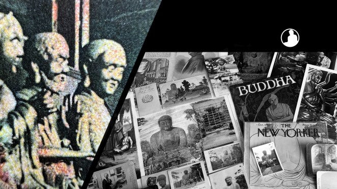
Consequently, translating the tonality of a photograph mechanically into black ink marks was developed not long after the discovery of photography. The collotype process, a planographic printing method using reticulated gelatin, produced a beautiful tonality with fine detail, but the process proved difficult and costly. On the other hand, the letterpress halftone process proved to a better investment for the inexpensive mass printing of images, especially for newspapers and magazines. This process is easily identified through its distinctive dot pattern creating the illusion of tonality [Fig. 1].
Figure 1


The tonality of the halftone print on the left, comprised of dots of differing size and spacing, is of lesser quality than the collotype print on the right. The wormy reticulation of a collotype print under high magnification can be seen here.
Ogawa Kazumasa 小川 一眞 (1860-1929) was a pioneer in the photomechanical reproduction of images in Meiji Japan. After a period of apprenticeship in the United States, Ogawa opened the first collotype (korotaipu コロタイプ) business for reproducing photographs in 1889, eventually introducing the halftone process to his Japanese customers. Having attended the Congress of Photographers at the Chicago World’s Fair in 1893, Ogawa learned about the halftone process and the following year procured the necessary equipment and had delivered to Tokyo.[1] As Kelly McCormick notes, under the guidance of Ogawa the Japanese newspaper, the Asahi Shimbun 朝日新聞, published its first photographs on June 16, 1894. Moreover, the halftone process allowed Japanese newspapers to fill their editions with multiple, full-page photographic images as well as incorporate text on the same plate. Additionally, to help expose his colleagues to the history of photography and modern photographic methods, Ogawa had Hermann Vogel’s The Chemistry of Light and Photography (1875, revised 1889) translated into Japanese (as Kōsen nami shashin kagaku 光線並写真化学); it remained in print for nearly 30 years.
The tonality of the halftone print was not as rich as the collotype (see above) and thus the collotype print remained preferential when image quality was more important.[2] This included the manufacturing of Japanese picture postcards (ehagaki 絵葉書), especially when changes in the postal code in 1900 allowed private publishers to issue their own cards. Collotype remained the main method of printing postcards through the first two decades of the twentieth century.
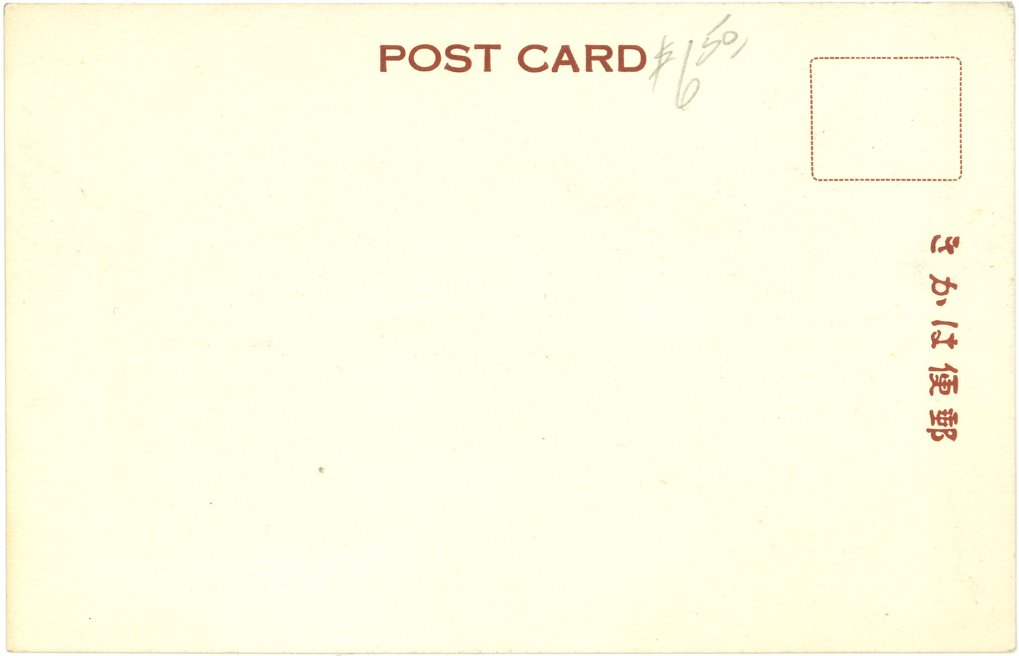
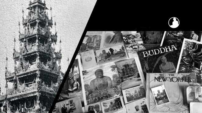
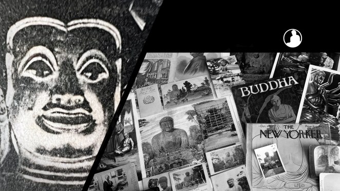
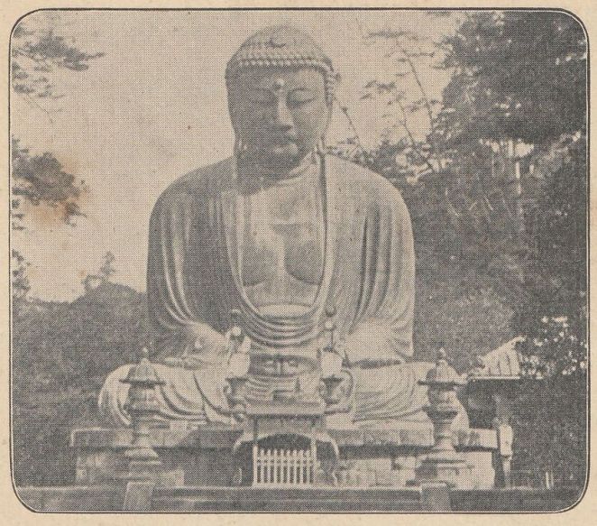
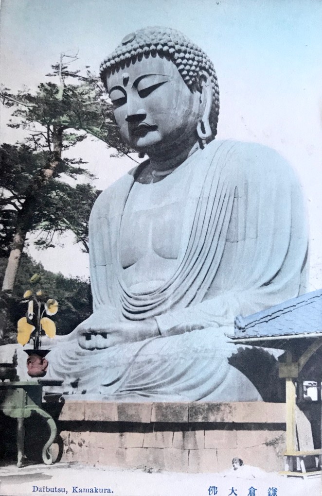
Figure 2
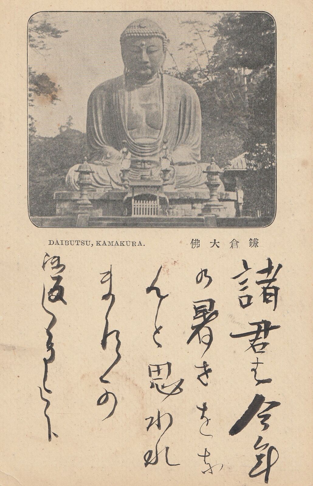
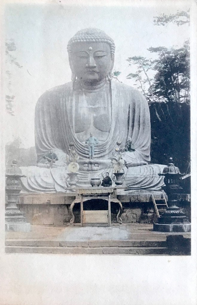
- Title/Caption: DAIBUTSU, KAMAKURA 鎌倉大仏
- Year: 1897 (postally used)
- Publisher: Printing Bureau, Ministry of Finance 大蔵省印刷局
- Medium: halftone print on paper
- Dimensions: 5.5 in X 3.5 in
- Reverse Imprint: 大日本郵便, JAPANESE POST, 郵便はがき+
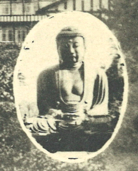
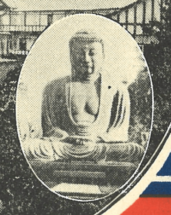
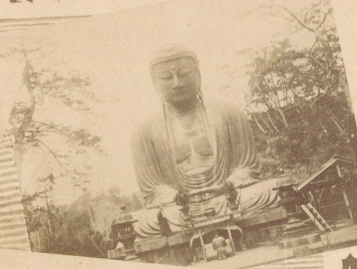
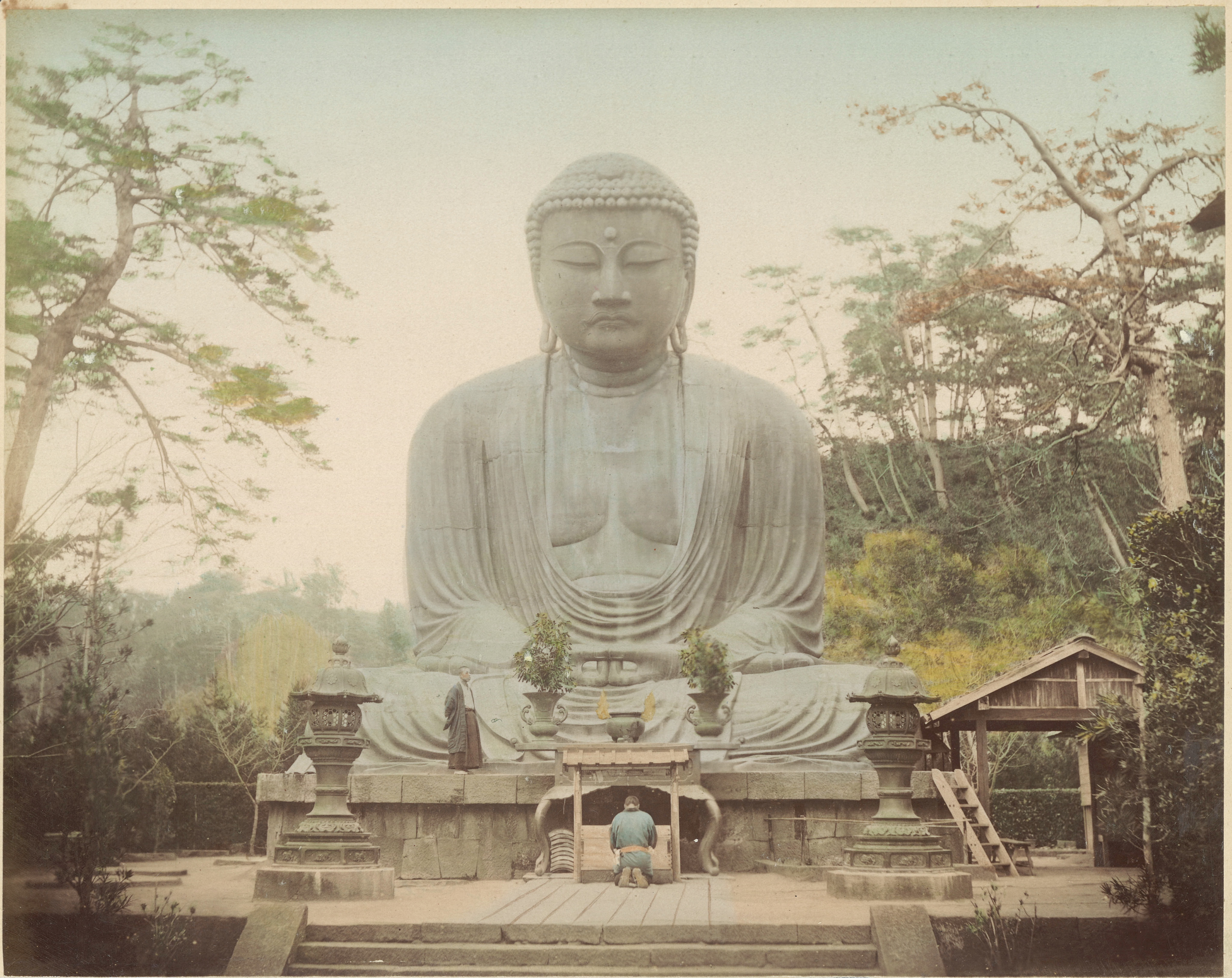
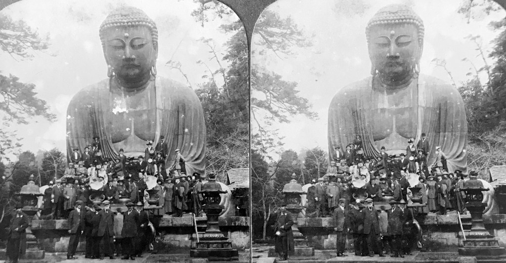
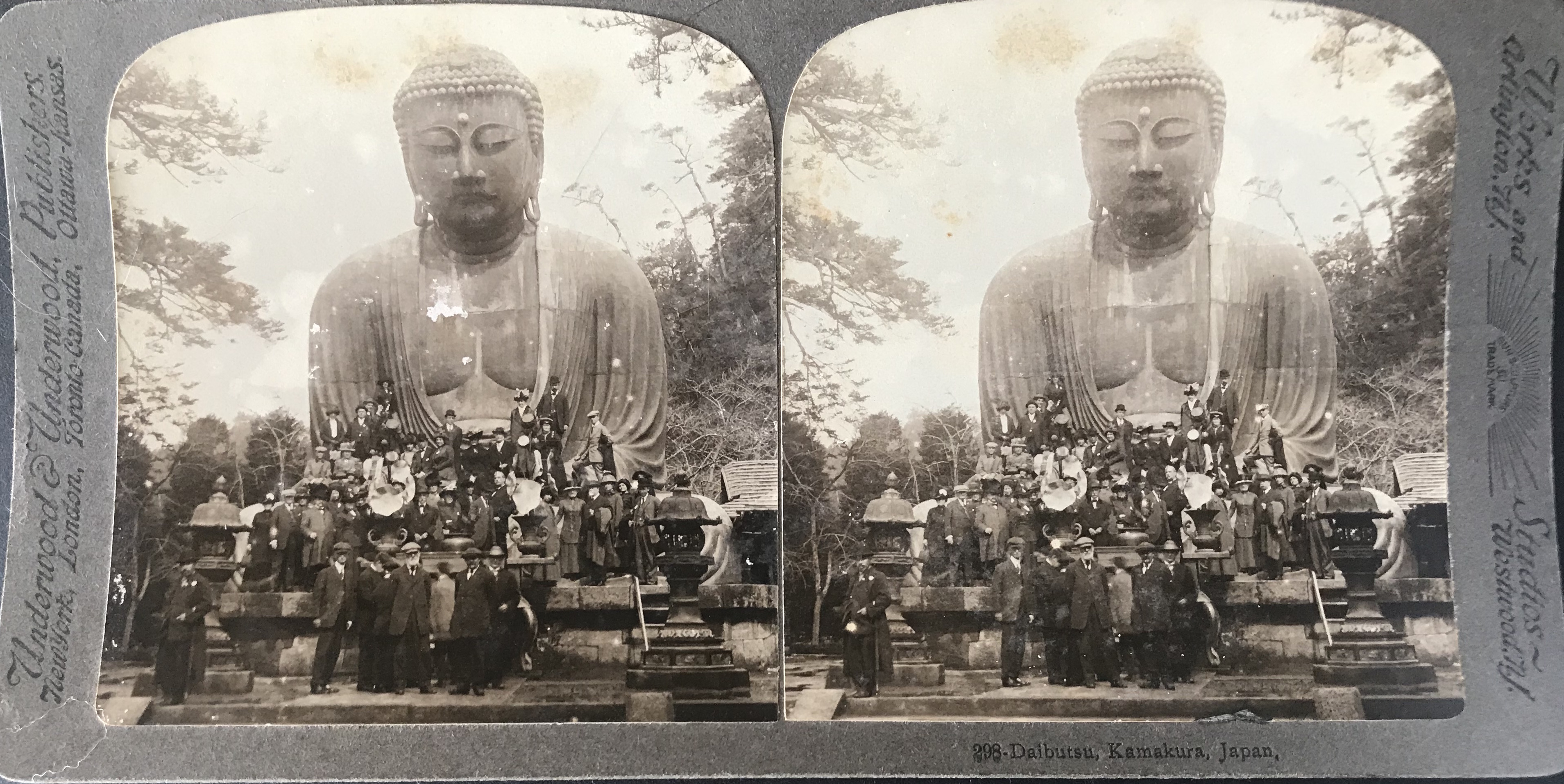
The government-issued postal card here, however, offers a rare glimpse at using the halftone process for mechanically reproducing a photograph previous to postal code changes [Fig. 2]. Sent in 1897 (Meiji 30[3]), this card reflects a rather early example of the halftone process, introduced by Ogawa only three years earlier. As noted by the caption, it depicts the Kamakura Daibutsu, a site that had developed into a popular international tourist destination by the 1890s. Interestingly, the image shows the site devoid of tourists, a rare depiction since people were often included to provide a sense of scale – the statue is over 40 feet in height. This photograph focuses the viewer’s attention to the craftsmanship of the work and the serenity of the image, thus creating a silent and contemplative portrait of the bronze colossus. The elements in the photograph suggest it was taken in the first half of the 1890s.
It is tantalizing to think that the Printing Bureau in the Ministry of Finance[4], the agency responsible for issuing postal cards, consulted Ogawa for this project.[5] It is also possible that the original photograph of the Daibutsu was taken by Ogawa or an associate of his studio.[6]
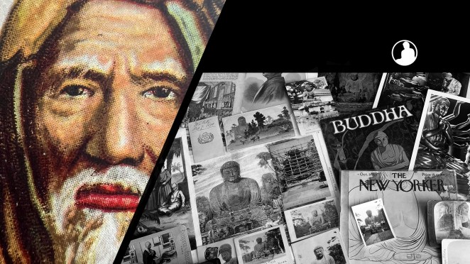
Figure 3
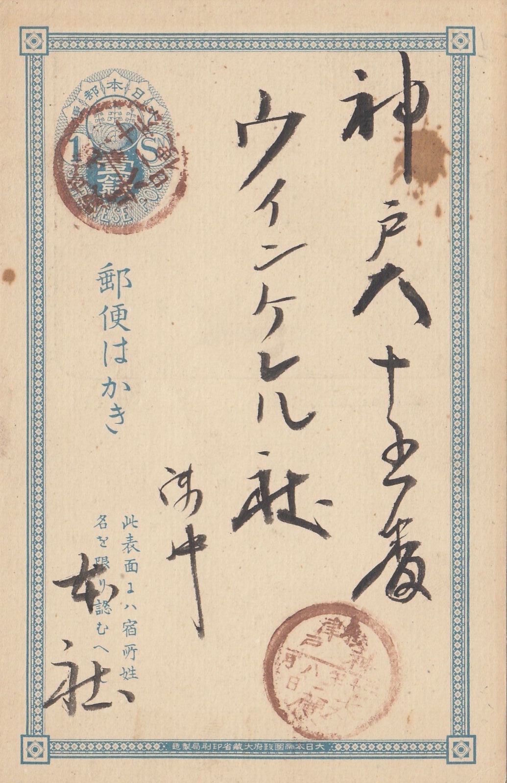
Figure 4

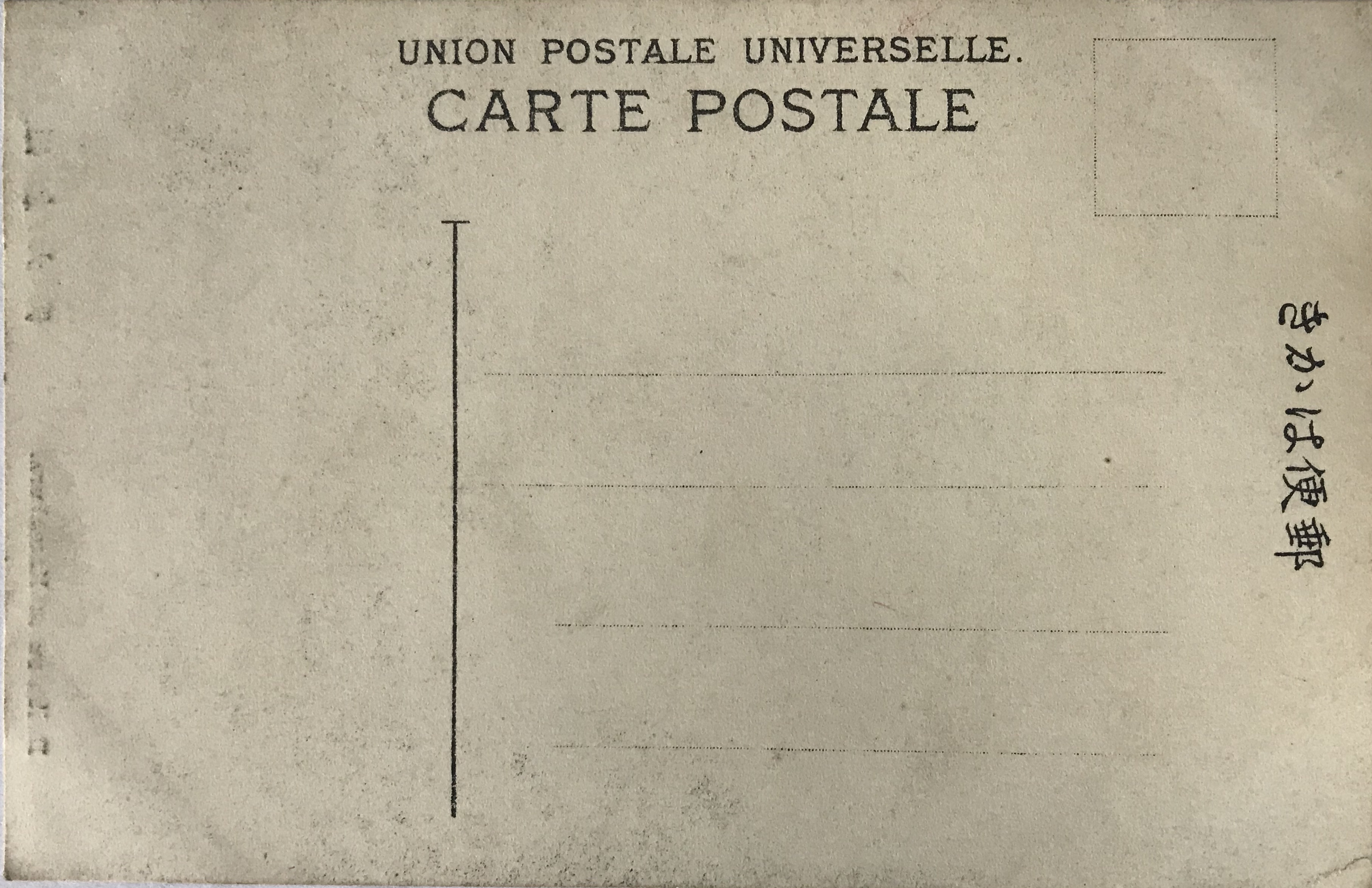
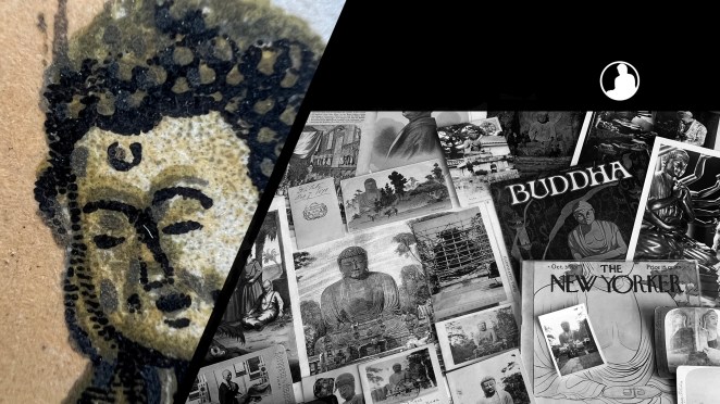
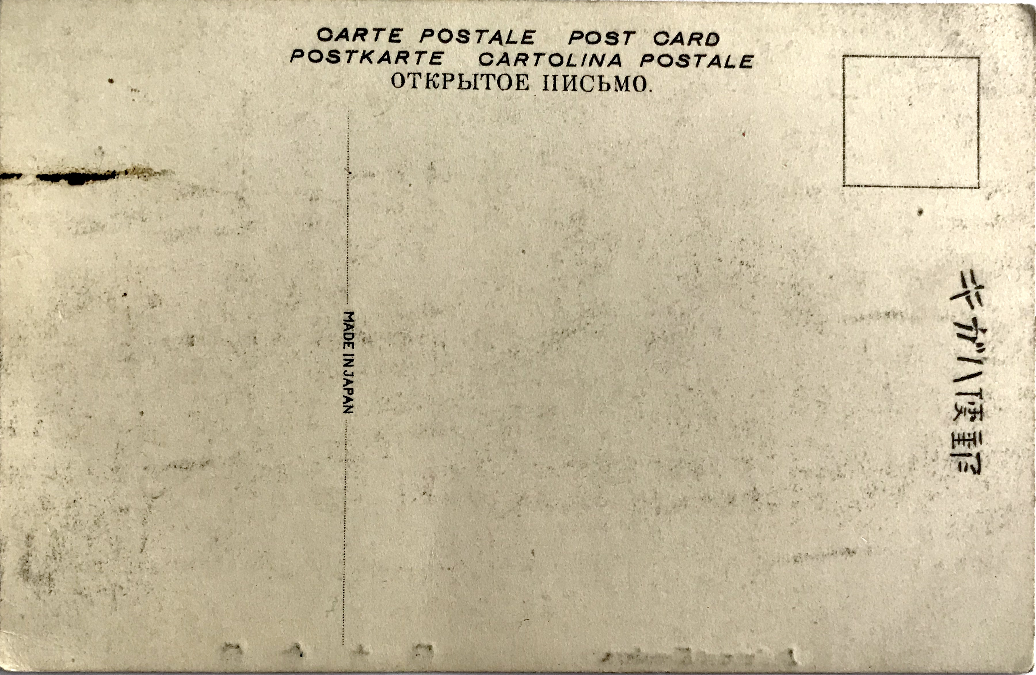
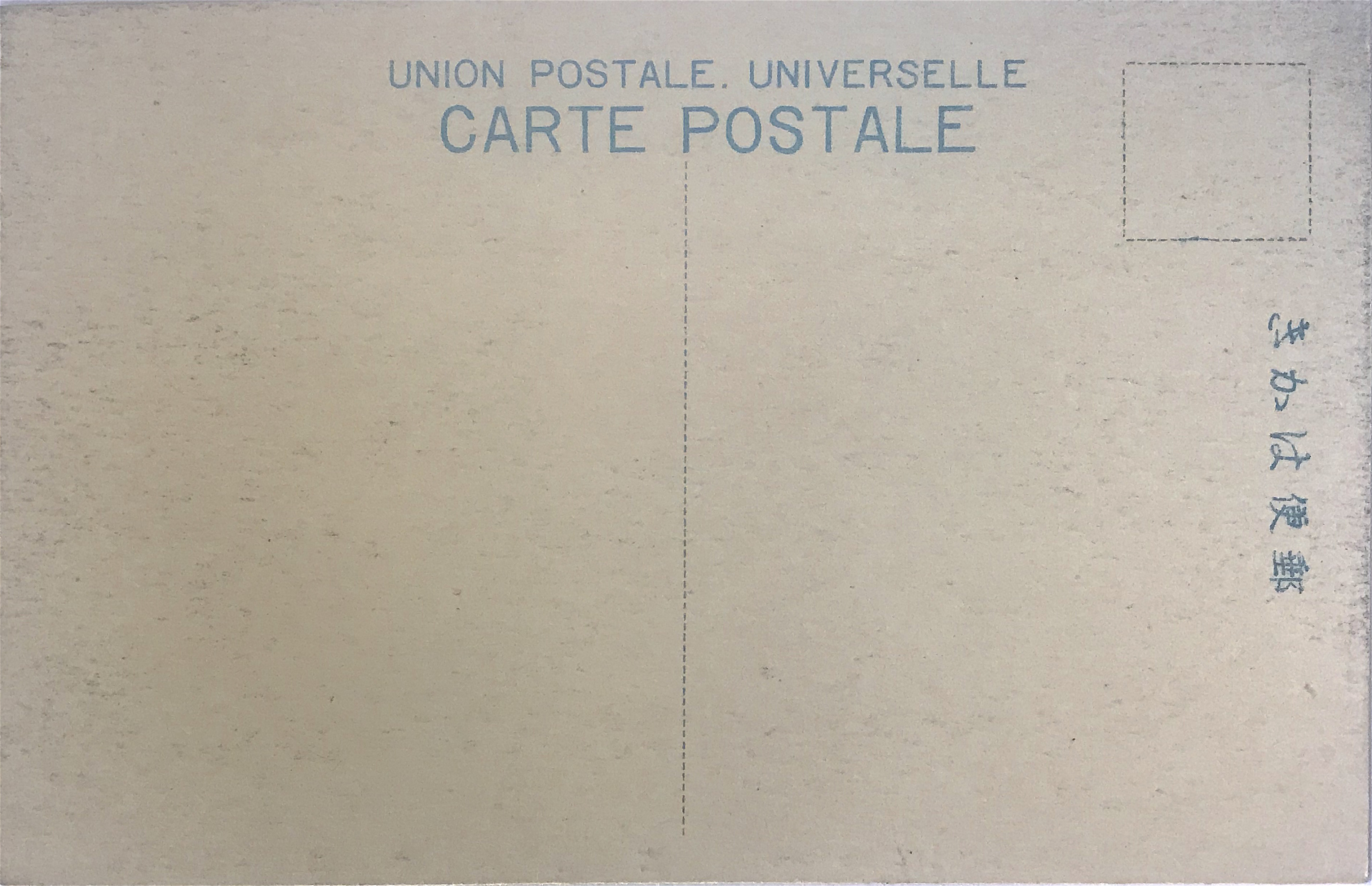
The reverse bears a simple filigree border and 1 sen oval-shaped frank printed in light blue [Fig. 3]. The pre-paid 1 sen rate covered domestic postage until 1899 when the rate was increased. The franking design incorporated the three-leafed paulownia seal (kirimon 桐紋), the official insignia of the Japanese government, in its center [Fig. 4]. Examining the border design (bottom) we can also find the government agency responsible for printing the card, namely the Printing Bureau in the Ministry of Finance. Instructions in Japanese (lower left) explain this side is reserved for the name and address of the recipient only. The paper is thinner than the card stock used by private publishers a few years later.
The cancellation stamp over the pre-paid postage reveals the card was sent on August 11, 1897 from the former Musashi Province 武蔵, an area that covered a location close to the Kamakura Daibutsu. The second cancellation stamp shows it was received the following day, August 12, at the post office in Kobe before it was sent out to the recipient.
*This post is dedicated to my mother, who introduced me to the beauty of printmaking.
**This is part of a series of posts devoted to exploring the development of a visual literacy for Buddhist imagery in America. All items (except otherwise noted) are part of my personal collection of Buddhist-themed ephemera.
Notes:
[1] For more information, see McCormick 2017. For a full biography of Ogawa in English, see Bennett 2006: 210-16. [For a quick chronology of his life, in Japanese, see here.]
[2] Perhaps most notably, the influential Japanese art magazine, Kokka 国華, employed collotypes and woodblock prints. Ogawa and his studio supervised the printing of the magazine until 1907. The magazine’s full title in English was Kokka, An Illustrated Monthly Journal of the Fine and Applied Arts of Japan and Other Eastern Countries. For more on this publication, see Hanley & Watanabe 2019. Ogawa also used collotypes in the Shashin Shinpō 写真新報 (Photography Journal), in which he was the editor, see Bennett 2006: 212. In the 1910s, Japanese postcard publishers switched to offset printing because this method produced images at a much faster rate.
[3] The cancellation stamp is not clear, but Meiji 30 seems appropriate. The bisected cancellation date stamp (maruichi-gata hiduke-in 丸一型日付印) was adopted in 1888 and the date reads year-month-day from right to left (this stamp was retired in 1909). Sanjū nen 三十年 (“year 30”) is barely legible and is equivalent to 1897. This dating also aligns with other evidence placing the cancellation between 1888 (signaling by the inclusion of the Printing Bureau 印刷局 instead of the Bureau of Paper Currency 紙幣寮 on the border inscription) and 1899, when the 1 sen oval frank was replaced by the 1½ sen chrysanthemum frank. These details are noted below.
[4] The full inscription reads, “issued by the Printing Bureau in the Ministry of Finance of the Empire of Japan” (Dainipponteikoku seifu Ōkurashō insatsu-kyoku seizō 大日本帝国政府大蔵省印刷局製造). The Ministry of Finance was also responsible for printing paper currency.
[5] Ogawa did have a close relationship with the Japanese government, and was appointed as the chief photography instructor for the Japanese army, see McCormick 2017. Furthermore, McCormick notes, “Ogawa skillfully aligned his name with the halftone process to the extent that if it was a halftone, it was likely that Ogawa was behind it.”
[6] In 1894, Ogawa published the Illustrated Companion to Murray’s Japan Guide-Book, the most popular tourist book for international travel in Japan. I have not seen a copy of this work, but the second image in the book is listed as the Kamakura Daibutsu.
References:
- Bennett, Terry. 2006. Photography in Japan: 1853-1912. Rutland, VT: Tuttle Publishing.
- Hanley, Keith & Watanabe, Aiko. 2019. “Kokka, Okakura Kakuzō, and the Aesthetic Construction of Late Meiji Cultural Nationalism.” Unpublished paper. [here]
- McCormick, Kelly M. 2017. “Ogawa Kazumasa and the Halftone Photograph: Japanese War Albums at the Turn of the Twentieth Century,” Technologies, Vol. 7, No. 2. [here]
Additional Posts in Visual Literacy of Buddhism Series


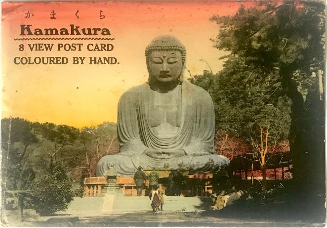


 Sometime in the 1920s sets of picture postcards were more frequently issued in a paper sleeve or cover. These sleeves were initially imprinted with text or simple designs, but due to the highly competitive commercial market these utilitarian items became subject to the same visual expectations as the postcards themselves. The examples before us bear a hand-colored photographic image, which is given the same artistic care as the cards they hold [Fig. 1 & Fig. 2]. In addition to the minor and idiosyncratic coloring differences, each set uses a slightly different letterpress design. Set 2 also appears to be influenced by an Art Deco font style.


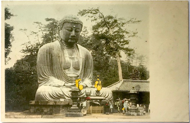
 The photograph of the Daibutsu by Esaki (or one of his studio assistants) depicts the bronze statue from the southwest corner, an uncommon, but


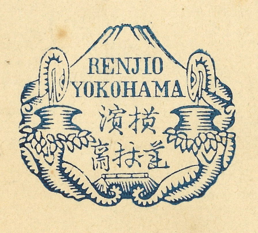 The back of the cartes de visite is stamped by Renjō’s studio mark in indigo blue [Fig. 2]. The hand stamp depicts two serpentine figures twisting around a pair of trees and peering into two pots. The peak of Mt. Fuji and the top of a thatched roof also appear the background. This specific imagery appeared to Renjō in a dream when his business first started to turn profitable, thus he decided to honor his vision by incorporating it into his studio mark. The Japanese characters, written in a variant script (itaiji