For all the new Buddhas in the West posts follow us on Bluesky & Instagram
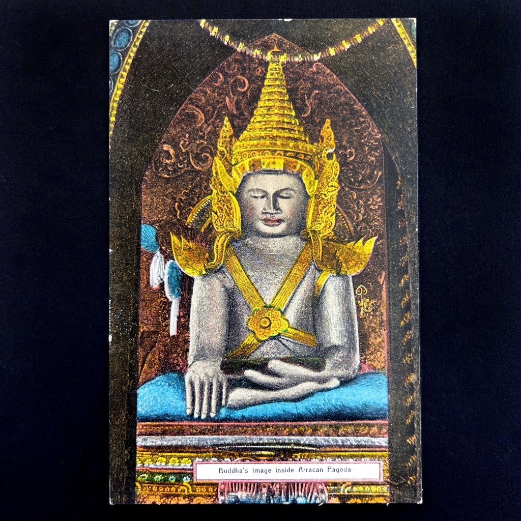
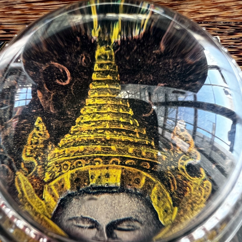
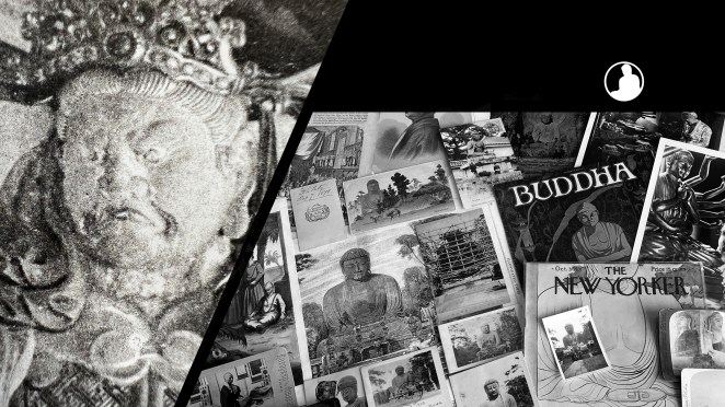
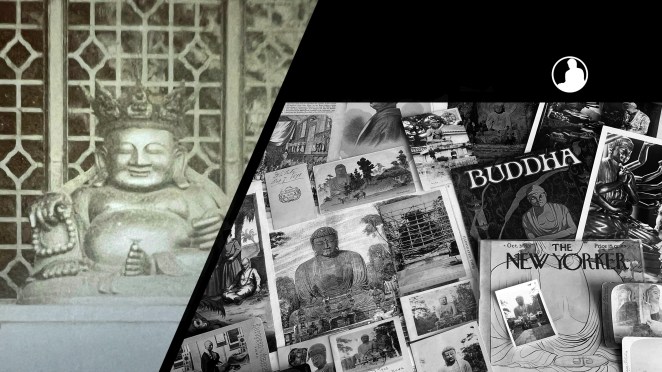
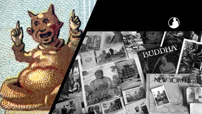
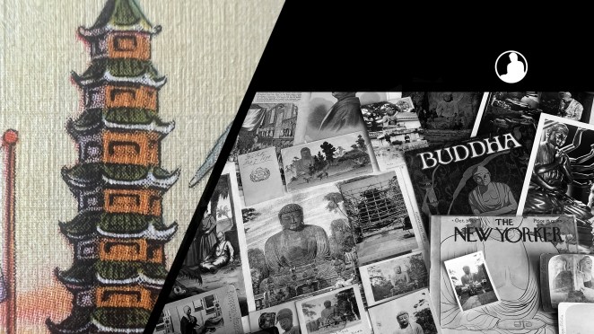
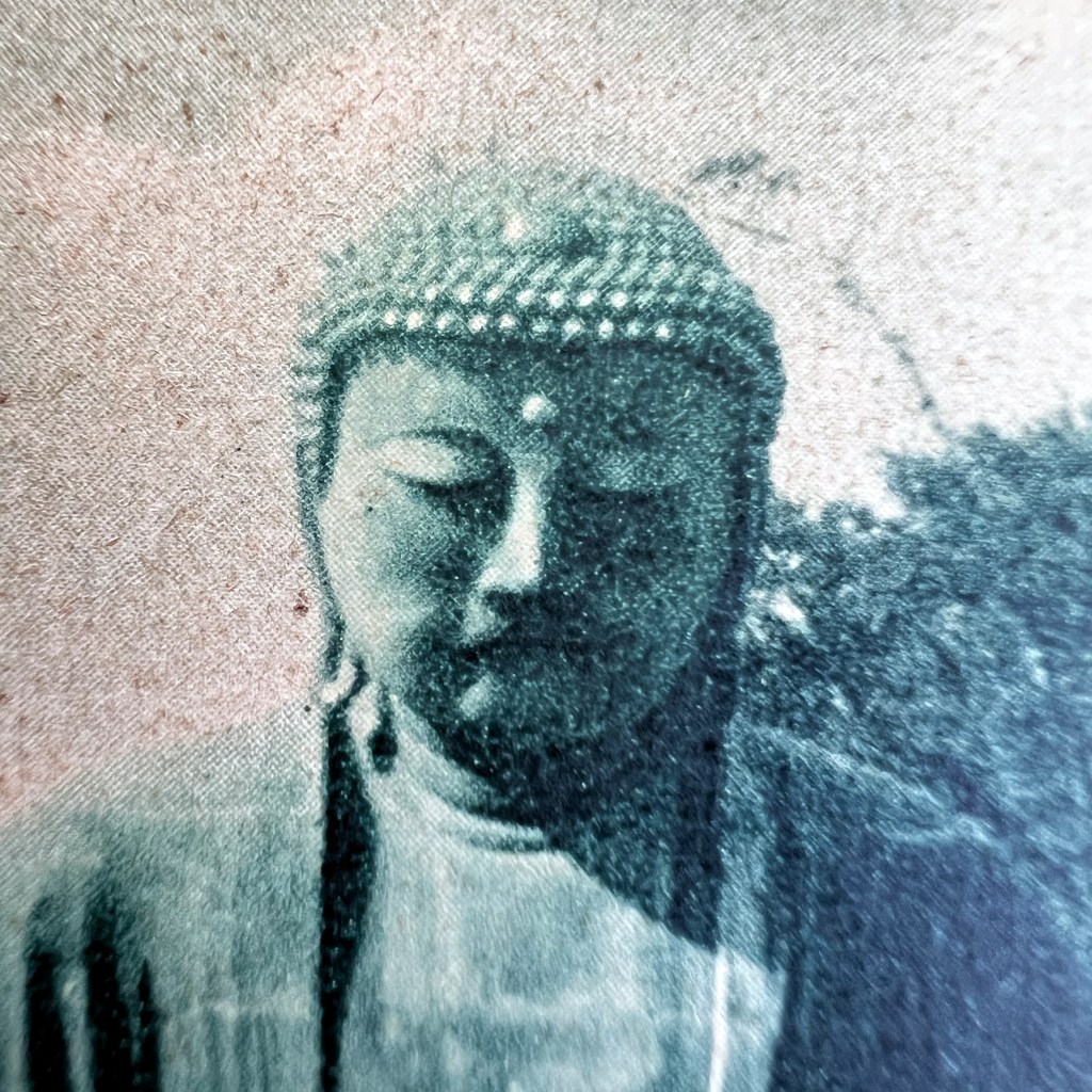
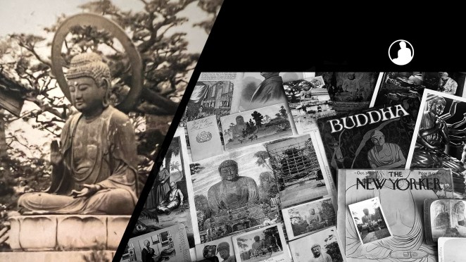
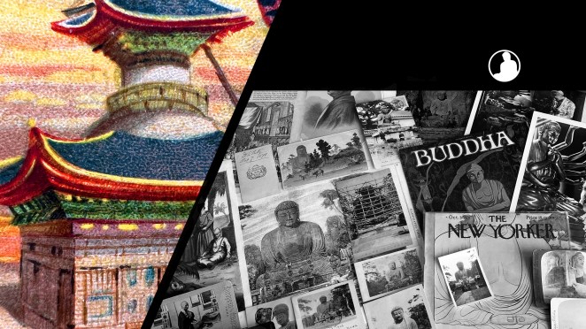
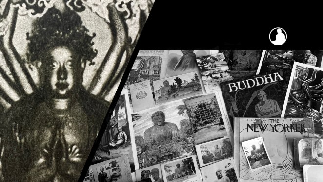
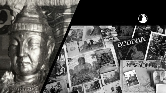
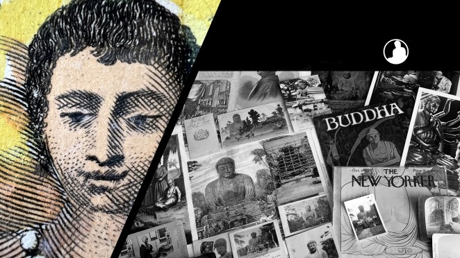
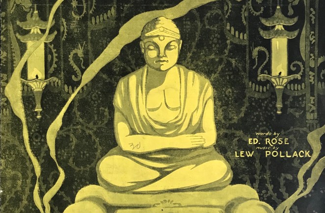
An image consecrated by the Buddha himself? The Mahāmuni image is among the most venerated in Burma. According to myth, the statue was cast during the lifetime of the Buddha and was “enlivened” to act as counsel to kings in the Buddha’s absence.
Originating in the coastal region of Arakan, the statue was moved to Upper Burma, into present-day Mandalay, at the turn of the 19th century.
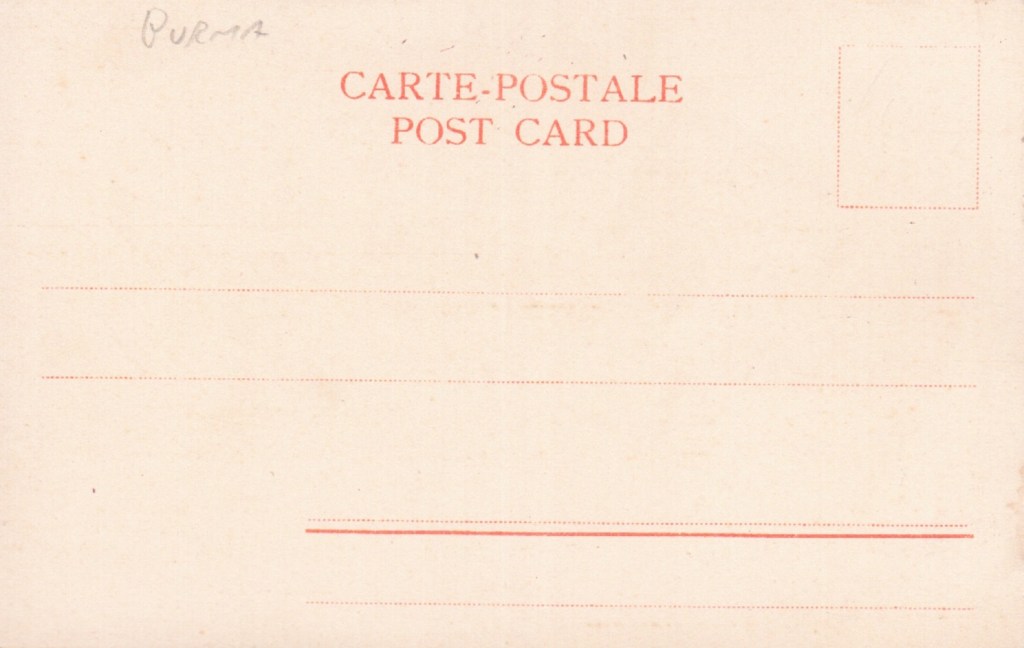
The colorful postcard is a German lithographic-halftone print published by D. A. Ahuja circa 1910. Postcards emerged as highly valued souvenirs during the period of British colonial rule and helped spread knowledge of Buddhist material culture into the West.
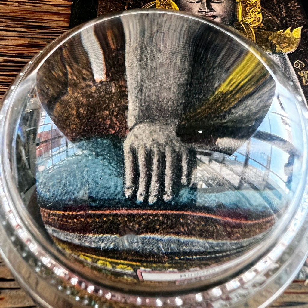
The brass statue depicts the moment when the Buddha calls upon the earth to testify to his generosity and to defeat Mara; this is symbolized by his right hand touching the ground.
Over 12 feet in height, the image is topped by a crown – typical of the Jambupati style – and is intended to display the grandeur of the Buddha and his message.
F
or more on a Burmese Buddhist statue in a similar style, see the Asian Art Museum website here: https://tinyurl.com/mpvxn8j9.
The Buddhas in the West Material Archive is a digital scholarship project that catalogues artifacts depicting Buddhist material culture for Western audiences. It’s comprised of prints, photos, and an assortment of ephemera and other objects. For a brief introduction to this archive, visit the main Buddhas in the West project page.
For Related Buddhas in the West Posts Featuring the Historical Buddha / Gautama:
For all the new Buddhas in the West posts follow us on Bluesky & Instagram
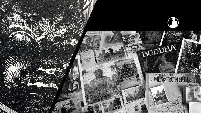
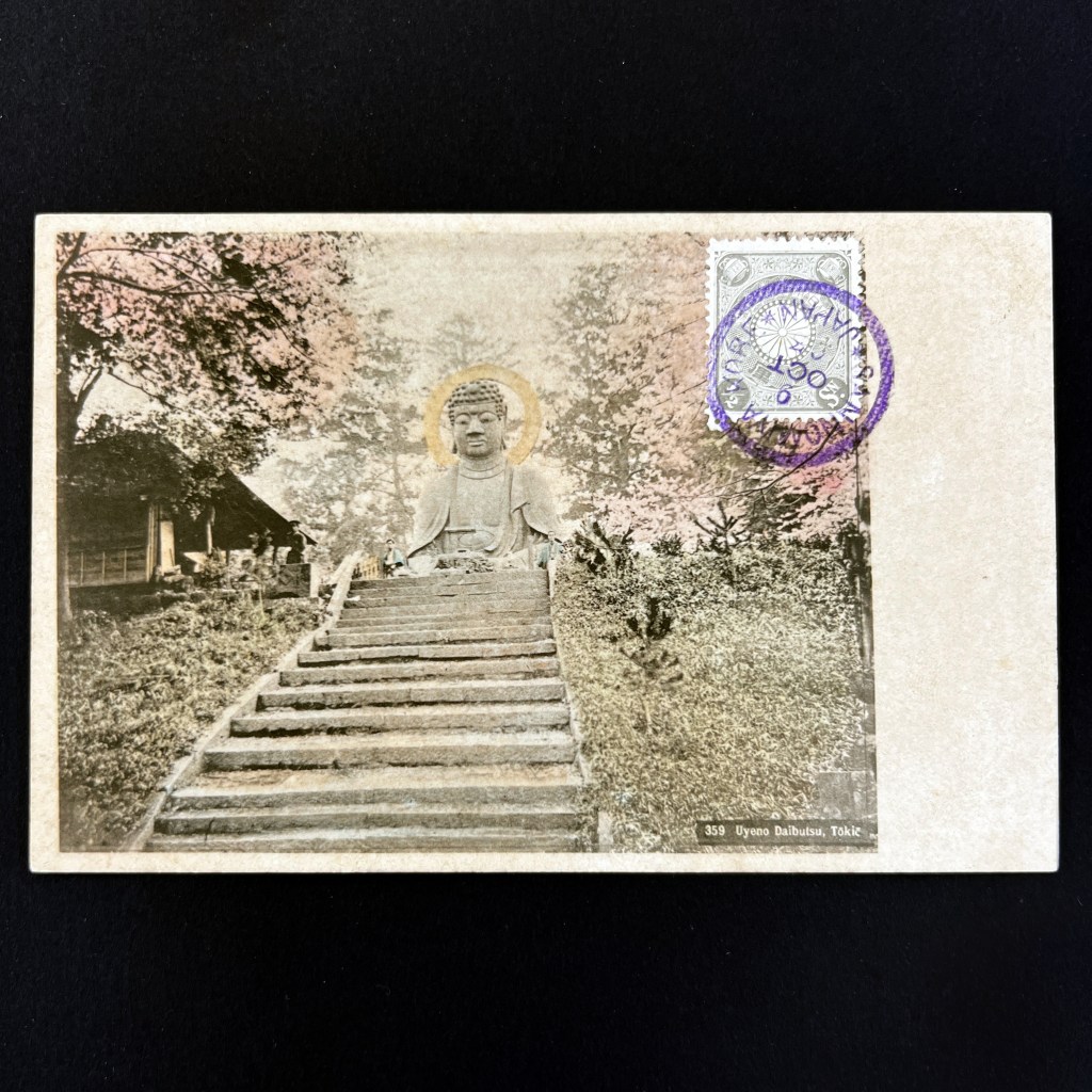
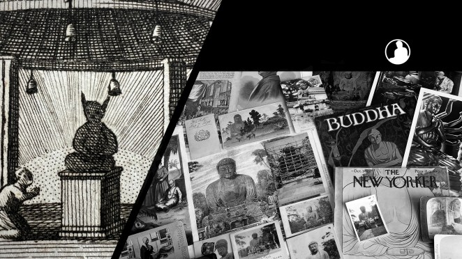
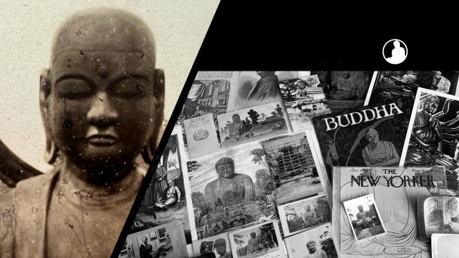
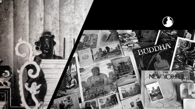
Only the face of the Ueno Daibutsu remains in Tokyo’s Ueno Park. Toppled during the 1923 Kantō earthquake, the salvaged body was eventually melted down during the Pacific War.
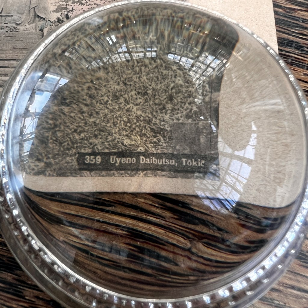
Picture postcards are some of the only remaining images of the intact statue. This plain design on the reverse reveals the print was made prior to 1907.
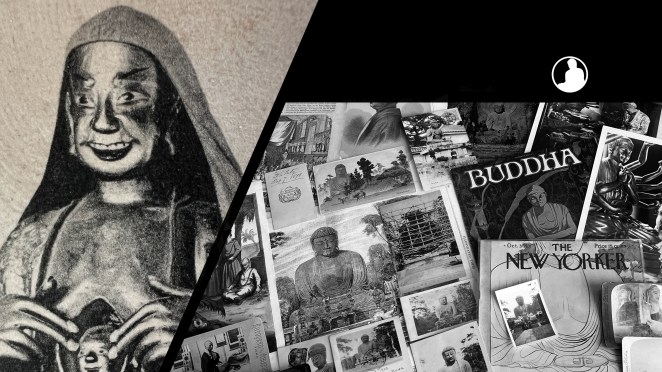
Q&A) Note, there is no address on the reverse…so why is there a cancelled stamp on the obverse?
The caption style is strongly reminiscent of the professional Japanese tourist photography trade that grew steadily thorough the 1890s. Contemporary databases do not currently link this stock number and location with a known photographer.
Ueno Park is celebrated for its spring cherry blossoms, highlighted here by the hand-colorist who painted the trees pink. Q&A) The stamp and cancellation on the front suggest this card was intended for display in a postcard album.
After many years in storage in the nearby temple, the Daibutsu face was displayed in 1972 on the site of the original statue.
The Buddhas in the West Material Archive is a digital scholarship project that catalogues artifacts depicting Buddhist material culture for Western audiences. It’s comprised of prints, photos, and an assortment of ephemera and other objects. For a brief introduction to this archive, visit the main Buddhas in the West project page.
For Related Buddhas in the West Posts Featuring Japan:
For all the new Buddhas in the West posts follow us on Bluesky & Instagram
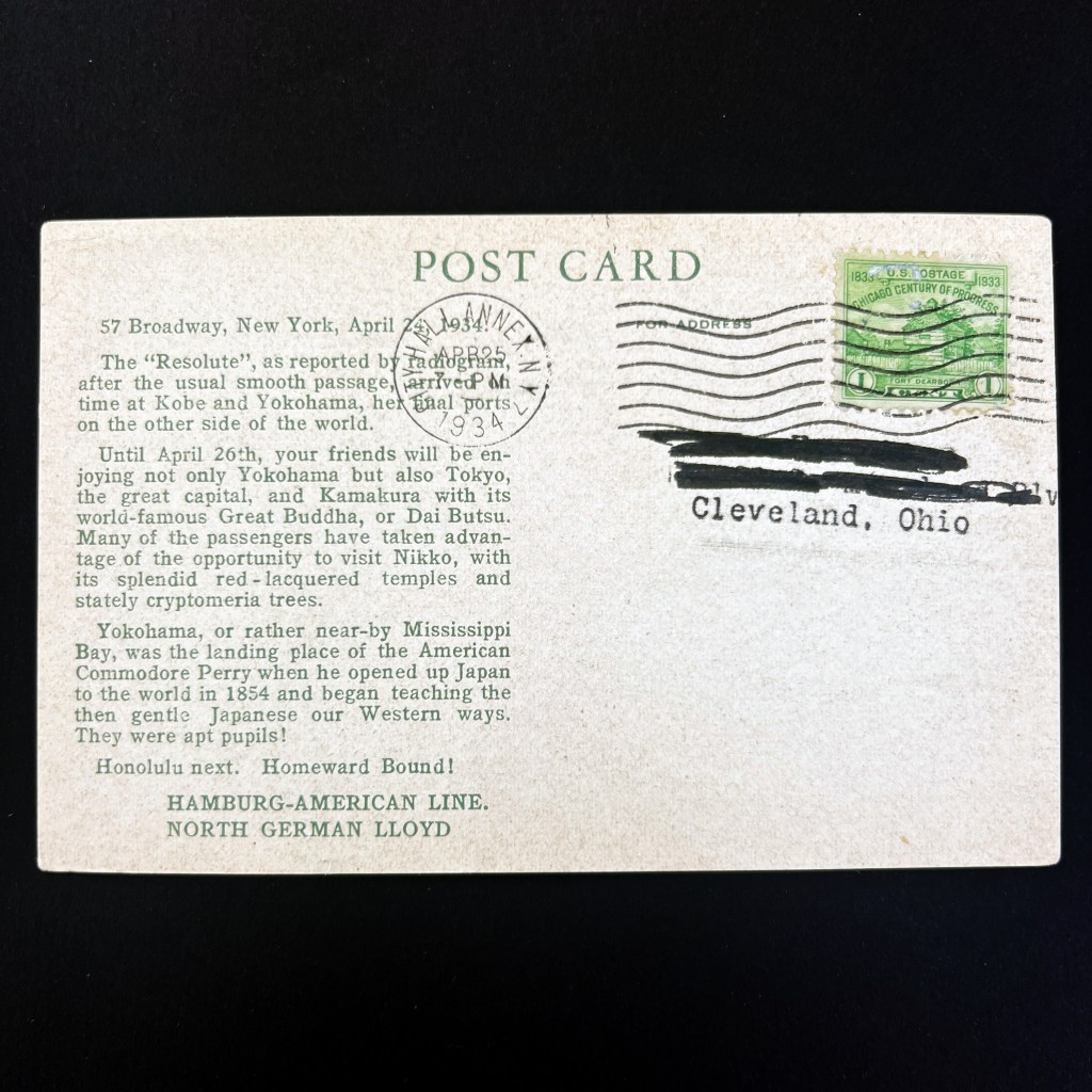
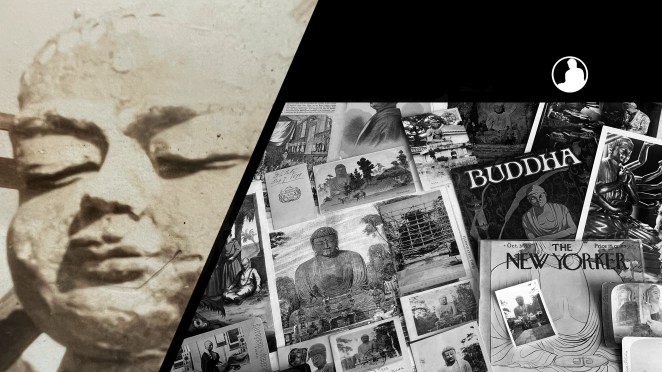
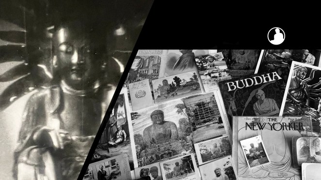
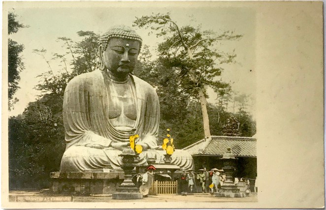
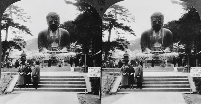
The first regular around-the-world commercial cruises began in the early 1920s. The Great Buddha of Kamakura was an iconic stop on the long sea passage; its international stature as a tourist destination was equivalent to the Taj Mahal and the Sphinx.
Within a decade, circumnavigation of the globe by passenger liner transformed into a stalwart luxury industry. The Hamburg–American Line was one of the main companies in the inter-war period.
Passengers kept family or friends abreast of their travels by having postcards automatically sent from ocean liner offices around the world. Here we see notification of the Resolute arriving in the ports of Japan on April 24, 1934. Tours through Nikko and Kamakura are noted.
The photograph printed here depicts a seemingly orchestrated scene that highlights the foreignness and apparent piousness of the Japanese.
The travel and souvenir journal of Eleanor Phelps, who embarked on the inaugural American Express Co. cruise around the world in 1922, is held by the University of South Carolina, viewable here: https://tinyurl.com/avt4xt2p.
Additional Archived Posts for the Buddhas in the West Project
The Buddhas in the West Material Archive is a digital scholarship project that catalogues artifacts depicting Buddhist material culture for Western audiences. It’s comprised of prints, photos, and an assortment of ephemera and other objects. For a brief introduction to this archive, visit the main Buddhas in the West project page.
For Related Buddhas in the West Posts Featuring the Kamakura Daibutsu:
For all the new Buddhas in the West posts follow us on Bluesky & Instagram
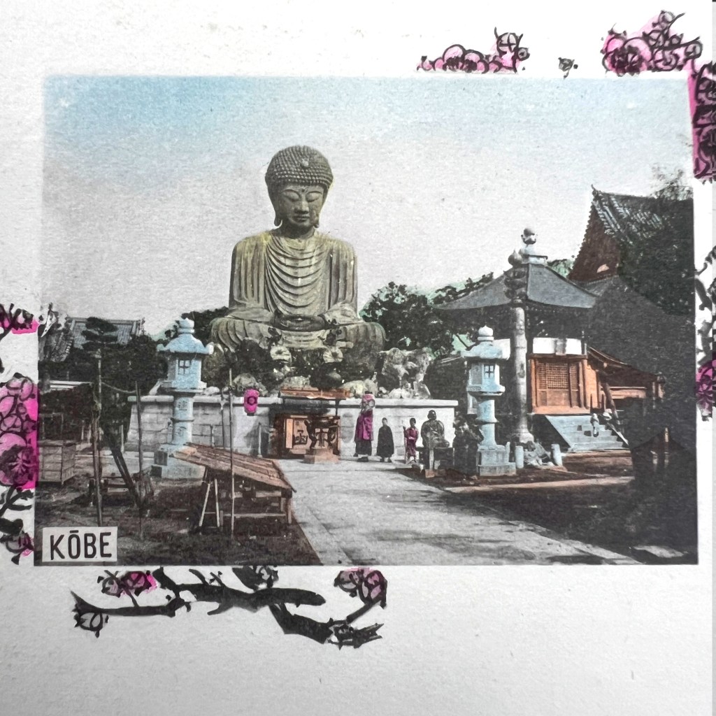
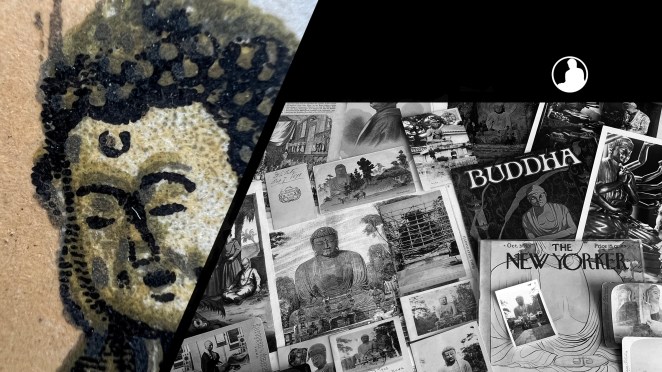
The original Hyōgo Daibutsu 兵庫大仏 was dismantled as part of Japanese war efforts during WWII. It was motivated by the Ordinance on the Collection of Metals issued in 1941. At the time, it was the third largest Buddhist statue in Japan.
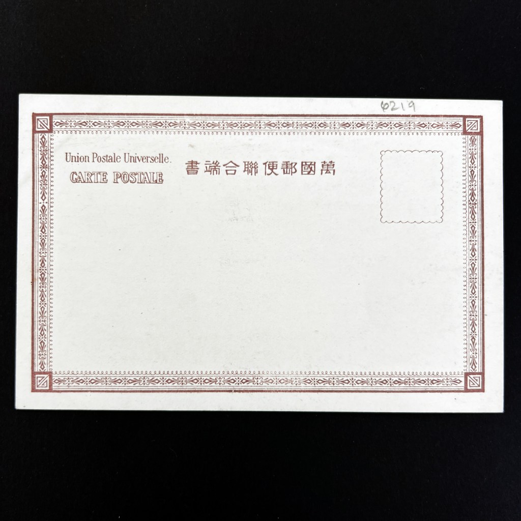
Constructed in 1891, photographs of the Hyōgo Daibutsu were often printed on Japanese postcards of the era. Based on the design on the back of this card we know it was published before 1907.
The blank space on the front of this card was intended for the written message. The reverse was saved for the address only.
This card is uncommon because it combines a collotype print with an added pink cherry blossom frame. The angular band of discoloration on the corner reveals it was stored in a postcard album.
Most photographic Japanese post cards of this period were individually hand-painted. This continued into the 1910s until multi-color printing became more commonplace.
The Buddhas in the West Material Archive is a digital scholarship project that catalogues artifacts depicting Buddhist material culture for Western audiences. It’s comprised of prints, photos, and an assortment of ephemera and other objects. For a brief introduction to this archive, visit the main Buddhas in the West project page.
For Related Buddhas in the West Posts Featuring Historical Postcards:
For all the new Buddhas in the West posts follow us on Bluesky & Instagram
It’s said the postcard was the first truly democratic photograph, providing people with images of places and things for the cost of a few pennies. In 1913, Japanese postal carriers delivered 1.5 billion cards, second only to Germany with 1.8 billion cards delivered.
In Japan, postcards of Buddhist temples, priests, and other elements of religious practice were popular as both domestic and foreign souvenirs as well as collector’s items (postcard collecting is known as deltiology).
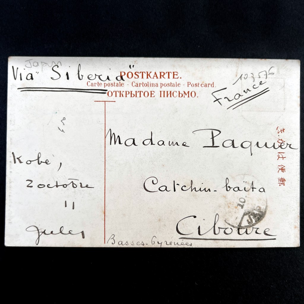
Collecting picture postcards (ehagaki 絵葉書) for display in albums was commonplace. In the case of the postcard here, the stamp is affixed to the image side of the card – this allows the stamp and postal mark to be displayed when the card is attached to an album page.
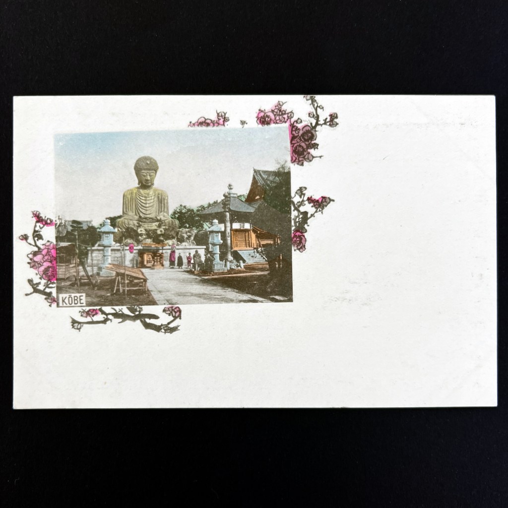
According to the postal mark, the stamp was cancelled on October 1, 1925 (Taisho 14) in Kobe, the same location as the statue in the image. The cost of international postage for postcards at this time was four sen. The final destination of this card was France.
The composition of the photograph includes people thus helping us gauge the size of the Buddhist state. As far as I can tell, this state was destroyed in World War II by allied firebomb attacks on Kobe in March 1945.
Joanne Bernardi has curated a wonderful collection of Japanese postcards at the University of Rochester, available to be viewed here: https://tinyurl.com/57fae58f.
The Buddhas in the West Material Archive is a digital scholarship project that catalogues artifacts depicting Buddhist material culture for Western audiences. It’s comprised of prints, photos, and an assortment of ephemera and other objects. For a brief introduction to this archive, visit the main Buddhas in the West project page.
For Related Buddhas in the West Posts Featuring Japan:
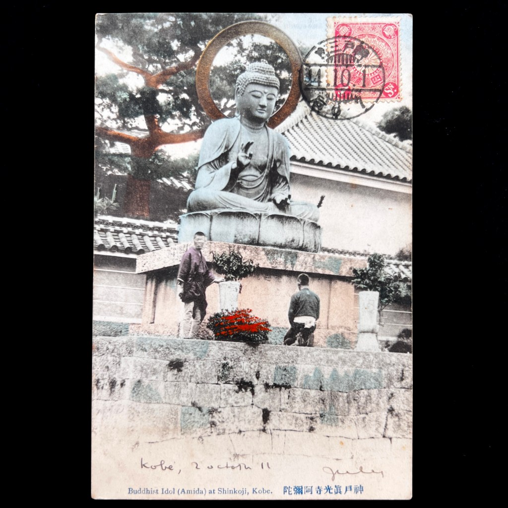
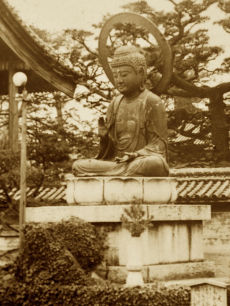
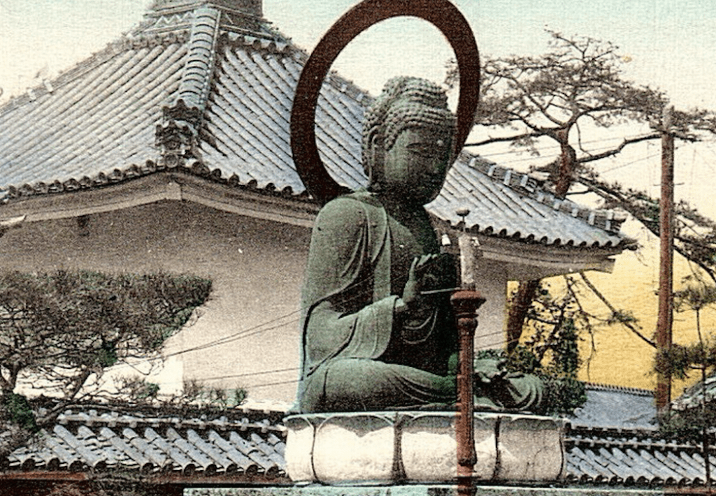
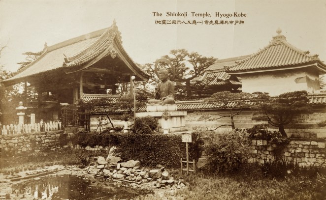
The Kamakura period (1185-1333) was a time of intense religious activity in Japan. In particular, Buddhist priests who promoted faith in Amitābha Buddha, a figure who resided in the Western Pure Land and taught those fortunate to be reborn there, were influential in shaping the future of Japanese Buddhism. The founder of the Ji School (Jishū 時宗) of Pure Land Buddhism, Ippen 一遍 (1239-1289), was among the more obscure of these figures, but traditionally he is given the honorific title, Shōnin 上人, a name reserved for the most eminent of Buddhist priests. He is perhaps most celebrated for his sixteen year period of homeless wandering as a holy mendicant during which he distributed small talismans bearing the name of Amitābha Buddha. A central practice of the Pure Land schools was reciting this buddha’s name, thus the practice was called nembutsu 念仏, “recalling [Amitābha] Buddha.” Ippen sought to encourage this salvific practice among as many people as he could reach. In 1289, he passed away in a hall dedicated to the Buddhist bodhisattva of compassion, Avalokiteśvara, in a small temple that would soon come to be known as Shinkōji 真光寺. Located in Hyōgo, far from the Japanese capital, Shinkōji never became a powerful center of Japanese Buddhism, but it’s connection to Ippen – as it would come to house his remains – would garner it a small bit of local fame.
When foreign tourists first started traveling in large numbers to Japan in the last decades of the nineteenth century, Yokohama was the main port of entry for people traveling across the Pacific Ocean. The port of Hyōgo, which came to be subsumed by its neighbor Kōbe in 1892, was the next harbor that ships used when taking passengers further south along the Japanese coast. The ships would then eventually continue on to China, if not further west or even around the globe. This influx of travelers gave sites around the port of Kōbe more attention, of which Shinko-ji received a small share. For example, the temple was noted as being “worth a visit” by the widely circulated third edition of Murray’s Handbook for Travellers in Japan, published in 1891.[1] It was also noted in Keeling’s Guide to Japan, a popular illustrated guidebook sold in Yokohama at Adolfo Farsari’s shop. The centerpiece for most foreign tourists was a large bronze statue of a buddha, situated outside the main temple gate. At a height of just under sixteen feet, the statue was not as colossal as the Great Buddha in Kamakura, but its placement in the middle of a lush lotus pond made it a picturesque and desirable location for visitors to enjoy. While some sources claim the Shinkōji statue depicts Amitābha Buddha, the iconography suggests Vairocana Buddha, an identification substantiated by Shinkōji today.
Figure 1
Title/Caption: The Shinkoji Temple, Hyogo-Kobe
Year: 1920’s
Publisher: Sakaeya & Co.
Medium: silver gelatin print on cardstock
Dimensions: 5.5 in X 3.3 in
Reverse Imprint: Postcard/郵便はかき
The postcard here depicts the Shinkōji statue atop its pedestal in the middle of the lotus pond [Fig. 1]. To the left of the statue is a large gable roof structure which acted as the main gate giving access to the inner monastic compound. Behind the plastered wall we see the tiled roofs of the bell tower and main hall. The small pond in front was used to rescue and release turtles.
The English caption clearly denotes the location of the image, but the Japanese caption provides more commentary on the religious relevance of the site. It notes that this temple as sacred location where Ippen passed away, a story that would resonate more with Japanese pilgrims than Western tourists. This also tacitly acknowledges the diverse reasons for visiting temples, as more foreign visitors were interested in seeing – and capturing – the picturesque sites of Japan. Like curio collectors they could return home with their souvenir spoils.
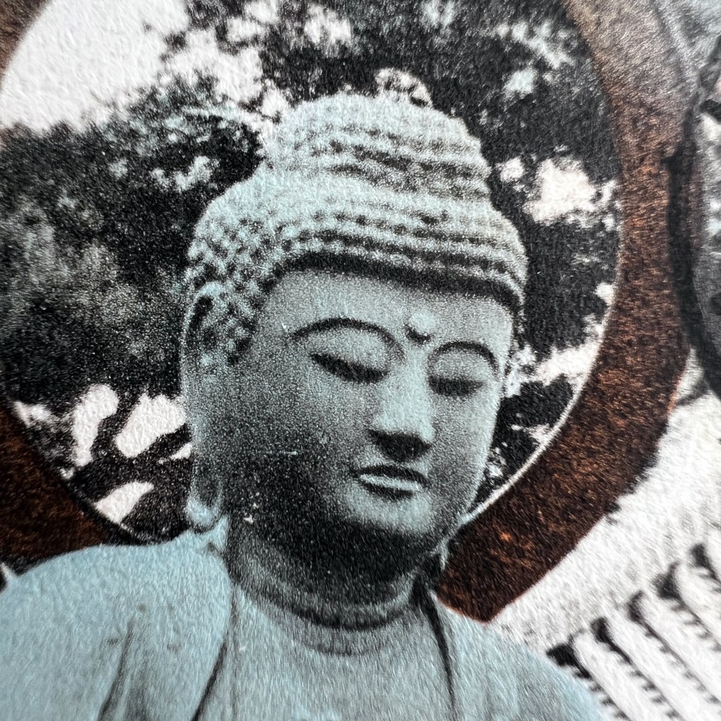
Figure 2 (detail of Figure 1)
The large halo fixed to the statue’s upper back, suggesting a radiant glow emanating from the icon, helps draw attention to the calm features of the buddha’s face [Fig. 2]. Without a person in the picture for scale it is difficult to assess that the statue is much larger than life-size; a person standing atop the ivy covered base would barely surpass the height of the square white stone pedestal.[2] The pole to the left of the pedestal appears to support a small round light that is level with the statue’s head. Viewed from the harbor, the city of Kobe and surrounding hillsides were known to cast a delightful glow at night, suggesting electric lights were installed throughout the region. When turned on, this light likely would have cast a gentle glow on the buddha’s face at night.[3]
Figure 3
Figure 4
Unlike many Japanese produced postcards of the time, this is not a photomechanical print made with ink, but a silver gelatin photograph. Thus, this “real photo” postcard was chemically processed as a photograph on cardstock bearing a postcard design. By the early 1920’s several Japanese publishers were issuing real photo postcards as part of their commercial catalogues. Sakaeya & Co., the publisher of this postcard, was based in Kobe and many of its cards depict the environs of the bustling port city. The lion insignia in the stamp box was the trademark of Sakaeya, which was one of the largest distributors of postcards in Japan [Figs. 3 & 4]. Based on similar cards issued by other publishers, this card likely dates to the early 1920’s.
During World War II, the entire Hyōgo ward of Kōbe was destroyed by the allied firebomb attacks in March 1945. Most of “Old” Shinkōji was destroyed and the statue at the front gate appears to have been lost.[4]Temple records reveal the statue was installed on temple grounds in 1760. Nineteenth century Japanese photography studio prints and twentieth century picture postcards remain some of the best artifacts cataloguing this wonderful piece of Japanese Buddhist art.
[2] The height of the Shinkō-ji statue is noted as being 4.8 meters tall. This height is equivalent to the traditional measurement of “one jō and six shaku” (一丈六尺 ichijō rokushaku, often shortened to jōroku 丈六), which was considered to be the true height of the historical Buddha while standing. Many “Great Buddha” images in Japan were made to match this height. Since the Shinkōji image was made sitting, it would be close to twice the traditional height of the Buddha.
[3] The pole does not appear in studio photographs from the nineteenth century, nor in postcards issued before 1918. Another postcard in the Archive clearly shows wires leading from the pole to behind the statue towards the wall (it is missing a light bulb, however). It also shows towering wooden power lines in the background, proving the temple had electricity by at least the early 1920’s. See a cropped image of this postcards here:
Power lines run from the temple to the pole in front of the pedestal; also note the power lines supported by the wood tower in the background (on the right).
[4] The temple website does not currently count the statue as among its current holdings. It is worth noting that a statue of the Buddhist figure Jizō was enshrined in 1936 and still remains on the temple grounds, thus some objects did survive the bombing. I have not found any resource to confirm the statue was destroyed, but it does not appear to be on display at this point. As for now, I must leave the question regarding the statue’s current existence as unknown.
Kaufman, Laura. 1992. “Nature, Courtly Imagery, and Sacred Meaning in the Ippen Hijiri-e,” in Flowing Traces: Buddhism in the Literary and Visual Arts of Japan, eds. James H. Sanford, William R. LaFleur and Masatoshi Nagatomi, Princeton: Princeton University Press, pp. 47-75.
Yanagi Sōetsu, and Waddell, Norman. 1973. “Ippen Shōnin,” The Eastern Buddhist, Vol. 6, No. 2, pp. 33-57.
Additional Posts in Visual Literacy of Buddhism Series
During the long period of British rule in Burma (modern Myanmar), the Imperial Post Office of India oversaw all mail delivery across British India, which included a circuit in eastern-most Burma. Postcards were introduced through the British postal department in 1879 and were first marketed at the inexpensive rate of a quarter-anna. That same year, a popular Indian newspaper proclaimed, “Postal cards are now a rage all over India.” [1]
The immediate popularity of the mail system, and postcards in particular, was not the case in Burma, however. Few Burmese elected to use the colonial mail system (unlike in India, Burma had no native mail system previous to British occupation) and postal employees conversant in Burmese were difficult to recruit. By the 1890s, postcards were still a rarity in both Lower and Upper Burma. And while more than fourteen million letters and postcards were sent across the Burmese province in 1900, more than three quarters were written by non-Burmese.[2] Nevertheless, a viable commercial postcard market grew in the first decade of the twentieth century, centered in the provincial capital of Rangoon (modern Yangon). Many of the early Burmese postcard publishers operated professional photography studios and thus many postcard images can also be found in commercial tourist albums now in personal and private collections around the world. This included the work of Felice Beato, Philip Klier, D.A. Ahuja, and Frederick Albert Edward Skeen and Harry Walker Watts. A sizable collection of Burmese postcards can be found in the Pitt Rivers Museum archive at the University of Oxford, donated in 1986 by the Burma-born artist Noel F. Singer, and the wonderfully digitized collection of Sharman Minus.
D. A. Ahuja
Reverse of Ahuja studio carte-de-viste mounting card. Ahuja was at this address from approx. 1906-1920.
The firm D.A. Ahuja & Co. was the largest publisher of postcards in colonial Burma and continued operation through the late 1950s. Very little is known about the personal life of the proprietor, D.A. Ahuja (c.1865–c.1939), but he claims to have established his business in Rangoon in 1885. It is likely he immigrated from India, along with thousands of other Indians during the colonial period, but his family’s precise origins remain debated, with both Punjab and Shikarpur (in modern Pakistan) as suggestions. The earliest firm documentation comes in 1900, when he announced the change of his company name from Kundandass & Co. to his own personal name, located at 87 Dalhousie Street in Rangoon. The following year Ahuja published a photography manual in Burmese and in English translation, with the latter entitled Photography in Burmese for Amateurs. In a 1917 advertisement pictorial postcards remained “a specialty” for Ahuja, but his business had expanded beyond photography and involved exporting a wide variety of Burmese goods.[3]
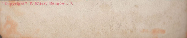
Ahuja produced some of the most distinctive and vibrant color postcards in South Asia. As is noted on the reverse of his cards, they were printed in Germany, then the commercial center of postcard printing. German printers used a lithographic-halftone hybrid process, first applying layers of color using a lithographic substrate and then applying a black halftone screen. Only the final key plate (i.e. black ink plate) carried the fine detail of the photograph. Several of Ahuja’s images were taken from his competitors, including Philip Klier and Watts & Skeen. While Ahuja apparently bought out the photographic stock of Watts & Skeen, Klier filed a lawsuit against Ahuja for copyright infringement in 1907. Klier won the claim, but it appears Ahuja paid for the rights to reproduce Klier’s photographs since he continued to print them years after the lawsuit.
I still remain uncertain when the colonial British post office allowed divided back postcards. This began in England in 1902, but thus far I have not confirmed if this was the case for the Post Office of India. Postcards were first introduced nine years later in British India, thus I assume there might be a lag in changes in Indian postal code.
Undivided Back
Type 1: This is the only undivided back design I have seen from Ahuja, printed in a distinctive evergreen color. It cannot predate his business name change in 1900. I have not seen any examples with a printed stamp box. Note that the design is similar to the undivide Klier card. The obverse always leaves a small portion of the card on the bottom (for both vertical and horizontally oriented photographs) blank for correspondence. The photograph is otherwise bled to the edges of the card. The caption uses red ink with an italicized front.
Divided Back
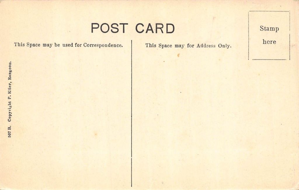
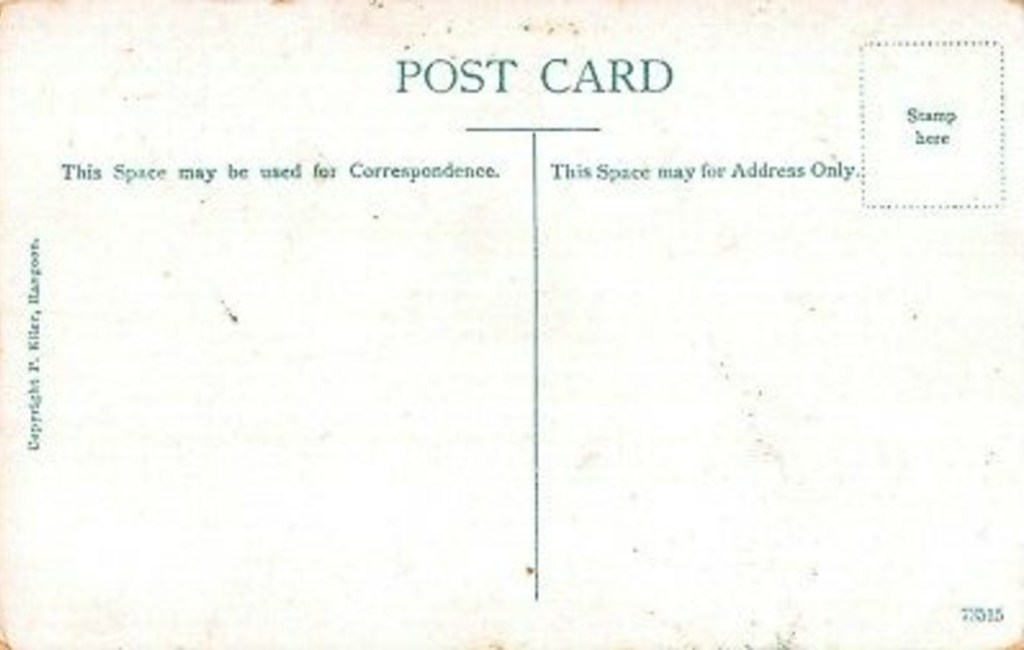
Type 2: I presume this to be the earliest divided back design of Ahuja cards since it follows the undivided back design so closely. Again, I have not seen any examples with a printed stamp box. Significantly, there also appears to be a renumbering of the photographic stock numbers when compared to the same images on the undivided back cards. In many cases a blank space with caption is retained on the obverse, just as we saw with the undivided back specimens. In a handful of cases, the photograph is bled to all edges of the card and the caption is printed directly atop the image. Type 3: The black ink design signals an overhaul of the entire card design by Ahuja. The stock number is brought to the front of the publisher line. Ahuja’s use of the word “copyright” is very inconsistent. I have noticed, however, that he uses the term when his is copying a photograph of Klier, a rather unintuitive practice given a lawsuit was brought against him by Klier in 1907. The upper limit of stock numbers for the black-back design I have seen thus far is 155. The earliest cancellation date I have seen for this design is November 1907. We now encounter Ahuja’s distinctive captioning style, a white label placed at the bottom of the image. There are slight variations in font, but I have not been able to trance out any rationale for the changes. Type 4: A green ink is now used for the reverse design. “Printed in Germany” is marked in the stamp box. All notices of “copyright” are removed, even if the photograph was originally taken by Klier (I presume Ahuja obtained the rights after the lawsuit). The upper limit of stock numbers for the green-back design I have seen thus far is 614. The earliest date I have seen for this design is August 1912.Type 5: This card design remains curious to me. It retains the older method of placing the stock number at the end of the publisher line, but still has the stamp box marking printing in Germany. The obverse design also has a white border around the photograph with the stock number as part of the caption.
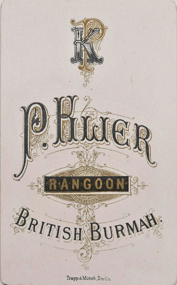
Philip Klier
Reverse of Klier studio carte-de-viste mounting card.
Philip Adolphe Klier (1845–1911) first arrived in Moulmein, Lower Burma, in 1870 and established business that offered a range of services, one of them being a photography studio. By the late 1870s he created a large portfolio of photographs and moved to a new location in Rangoon, the bustling capital of British Burma. Klier’s business continued after his death for about another decade.
Klier produced large format albumen prints of various locations around Burma, focusing on the major cities of Moulmein, Rangoon, and Mandalay. His studio photographs would be inscribed with the name of the location and a stock number while later photos from the late 1880s or early 1890s would also include his name. A large digitized collection of Klier’s work is housed at the National Gallery of Australia. It is difficult to ascertain when Klier started publishing postcards from his photography stock, but it was certainly sometime during the 1890s. Noel Singer has suggested the well known German printer, Verlag v. Albert Aust, in Hamburg partnered with Klier to produce a series, Birma Series Asien.[4] The earliest issues (at least, imprinted with Klier’s name) were collages, typically of two or three monochromatic photographs with significant blank incorporated around the images for correspondence. Eventually, this style gave way to single photo cards and then tinted cards.
The analysis below is preliminary – there appear to be a wide variety of variants in both the obverse and reverse design.
Undivided Back
Type 1: The reverse for the Birma Series Asien cards issued by Verlag v. Albert Aust. In addition to the caption providing the location of the photograph, a series stock number was included.Type 2: The reverse deign for the early monochromatic collage cards (see above). Except for the inclusion of the stamp box, this design is similar to the back of the undivided Ahuja cards. The collage cards backs are typically in red ink. The obverse of the collage cards, in addition to the caption, would incorporate Klier’s name and address, and the word “copyright” – presumably in accordance with new trademark laws enacted in 1894 (see Berchiolly 2018: 98n.16). Type 3: The reverse design for an unknown publisher that used Klier’s photographs, only identified by Klier’s inscription on the original photograph, not imprinted on the card. Not all cards with this reverse design have a photograph with Klier’s inscription in view, thus more research needs to be done on these issues. Type 4: Similar to the reverse design above, the obverse bears a single image bled to three edges (the bottom or right side is left blank for correspondence). The image could be monochromatic or polychromatic. Some monochromatic images are printed in dark blue ink for both the obverse caption and reverse design. Colored images typically have black ink reverse designs, like above. I presume these to be later than the collage cards with red ink reverse designs. The obverse bears Klier’s name and a stock number.
Divided Back
Type 5: A reverse design for monochromatic images bled to all four edges.Type 6: A reverse design for monochromatic images bled to all four edges. I am unsure of the number in the bottom right.Type 7: A reverse design for colored images. I am unsure of the number in the bottom right.
Notes
[1] Clarke 1921: 8.
[2] Frost 2016: 1059.
[3] Berchiolly 2018: 113. I am indebted to Berchiolly’s work for the life of Ahuja and Klier.
[4] Noted in Berchiolly 2018: 98.
References
Berchiolly, Carmin. 2018. “Capturing Burma: Reactivating Colonial Photographic Images through the British Raj’s Gaze,” MA Thesis, Northern Illinois University.
Birk, Lukas and Berchiolly, Carmín. Reproduced: Rethinking P.A. Klier and D.A. Ahuja. Vienna: Fraglich Publishing.
Clarke, Geoffrey. 1921. The Post Office of India and its Story. London.
Davis, G., and Martin, D. 1971. Burma Postal History. London.
Falconer, John. 2014. “Cameras at the Golden Foot: Nineteenth-century Photography in Burma,” in 7 Days in Myanmar: A Portrait of Burma by 30 Great Photographers, by John Falconer, Denis Gray, Thaw Kaung, Patrick Winn, Nicholas Grossman, and Myint-U Thant. Singapore: Didier Millet, pp. 27-29.
Frost, Mark. R. 2016. “Pandora’s Post Box: Empire and Information in India, 1854–1914,” English Historical Review, Vol. 131, No. 552, pp 1043-73.
Imamura, Jackie. “Early Burma Photographs at the American Baptist Historical Society,” Archives, Vol. 4, No. 1. [here]
Khan, Omar. 2018. Paper Jewels: Postcards form the Raj. Mapin Publishing Pvt. Limited. [also see website below]
Sadan, Mandy . 2014. “The Historical Visual Economy of Photography in Burma,” Bijdragen Tot De Taal-, Land- En Volkenkunde / Journal of the Humanities and Social Sciences of Southeast Asia, Vol. 170, pp. 281-312.
Singer, Noel F. 1993. Burmah: A Photographic Journey, 1855-1925. Gartmore, Stirling: Paul Strachan Kiscadale.
Singer, Noel F. 1999. “Philipp Klier: A German Photographer in Burma,” Arts of Asia, Vol. 29, No. 1, pp. 106-13.
Capturing light on a photosensitive medium to make a photograph was a monumental technological achievement. Arguably more influential, however, was the ability to mechanically reproduce those images in ink and expose them to wider audiences. In the latter half of the nineteenth century, chemically processing individual photographs was technically difficult, time-consuming, and expensive. Newspaper, magazine, and book publishers needed a less labor-intensive method to produce the thousands of images needed for mass commercial printing.
Consequently, translating the tonality of a photograph mechanically into black ink marks was developed not long after the discovery of photography. The collotype process, a planographic printing method using reticulated gelatin, produced a beautiful tonality with fine detail, but the process proved difficult and costly. On the other hand, the letterpress halftone process proved to a better investment for the inexpensive mass printing of images, especially for newspapers and magazines. This process is easily identified through its distinctive dot pattern creating the illusion of tonality [Fig. 1].
Figure 1
The tonality of the halftone print on the left, comprised of dots of differing size and spacing, is of lesser quality than the collotype print on the right. The wormy reticulation of a collotype print under high magnification can be seen here.
Ogawa Kazumasa小川 一眞 (1860-1929) was a pioneer in the photomechanical reproduction of images in Meiji Japan. After a period of apprenticeship in the United States, Ogawa opened the first collotype (korotaipu コロタイプ) business for reproducing photographs in 1889, eventually introducing the halftone process to his Japanese customers. Having attended the Congress of Photographers at the Chicago World’s Fair in 1893, Ogawa learned about the halftone process and the following year procured the necessary equipment and had delivered to Tokyo.[1] As Kelly McCormick notes, under the guidance of Ogawa the Japanese newspaper, the Asahi Shimbun朝日新聞, published its first photographs on June 16, 1894. Moreover, the halftone process allowed Japanese newspapers to fill their editions with multiple, full-page photographic images as well as incorporate text on the same plate. Additionally, to help expose his colleagues to the history of photography and modern photographic methods, Ogawa had Hermann Vogel’sThe Chemistry of Light and Photography (1875, revised 1889) translated into Japanese (as Kōsen nami shashin kagaku 光線並写真化学); it remained in print for nearly 30 years.
The tonality of the halftone print was not as rich as the collotype (see above) and thus the collotype print remained preferential when image quality was more important.[2] This included the manufacturing of Japanese picture postcards (ehagaki 絵葉書), especially when changes in the postal code in 1900 allowed private publishers to issue their own cards. Collotype remained the main method of printing postcards through the first two decades of the twentieth century.
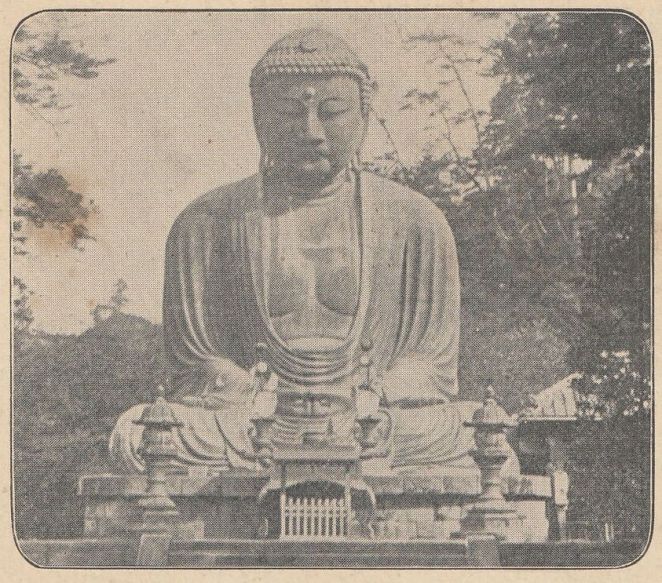
Figure 2
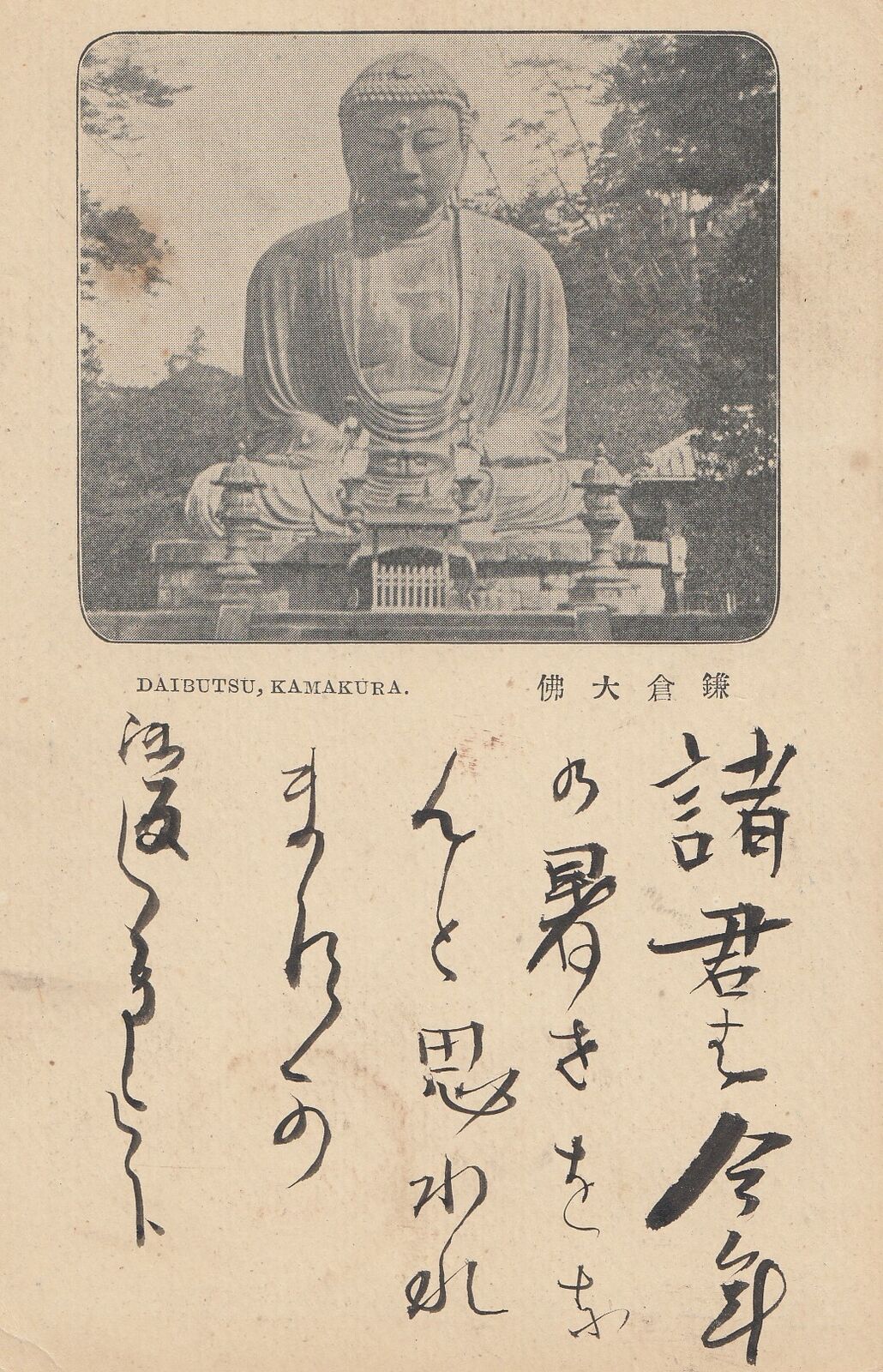
Title/Caption: DAIBUTSU, KAMAKURA 鎌倉大仏
Year: 1897 (postally used)
Publisher: Printing Bureau, Ministry of Finance 大蔵省印刷局
Medium: halftone print on paper
Dimensions: 5.5 in X 3.5 in
Reverse Imprint: 大日本郵便, JAPANESE POST, 郵便はがき+
The government-issued postal card here, however, offers a rare glimpse at using the halftone process for mechanically reproducing a photograph previous to postal code changes [Fig. 2]. Sent in 1897 (Meiji 30[3]), this card reflects a rather early example of the halftone process, introduced by Ogawa only three years earlier. As noted by the caption, it depicts the Kamakura Daibutsu, a site that had developed into a popular international tourist destination by the 1890s. Interestingly, the image shows the site devoid of tourists, a rare depiction since people were often included to provide a sense of scale – the statue is over 40 feet in height. This photograph focuses the viewer’s attention to the craftsmanship of the work and the serenity of the image, thus creating a silent and contemplative portrait of the bronze colossus. The elements in the photograph suggest it was taken in the first half of the 1890s.
It is tantalizing to think that the Printing Bureau in the Ministry of Finance[4], the agency responsible for issuing postal cards, consulted Ogawa for this project.[5] It is also possible that the original photograph of the Daibutsu was taken by Ogawa or an associate of his studio.[6]
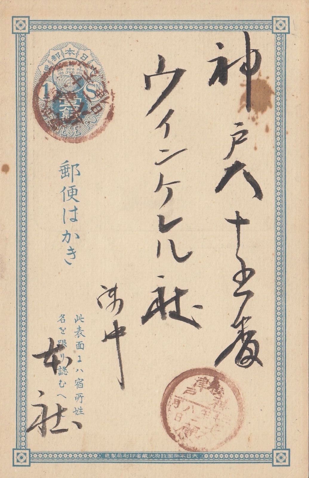
Figure 3
Figure 4
The reverse bears a simple filigree border and 1 sen oval-shaped frank printed in light blue [Fig. 3]. The pre-paid 1 sen rate covered domestic postage until 1899 when the rate was increased. The franking design incorporated the three-leafed paulownia seal (kirimon 桐紋), the official insignia of the Japanese government, in its center [Fig. 4]. Examining the border design (bottom) we can also find the government agency responsible for printing the card, namely the Printing Bureau in the Ministry of Finance. Instructions in Japanese (lower left) explain this side is reserved for the name and address of the recipient only. The paper is thinner than the card stock used by private publishers a few years later.
The cancellation stamp over the pre-paid postage reveals the card was sent on August 11, 1897 from the former Musashi Province 武蔵, an area that covered a location close to the Kamakura Daibutsu. The second cancellation stamp shows it was received the following day, August 12, at the post office in Kobe before it was sent out to the recipient.
*This post is dedicated to my mother, who introduced me to the beauty of printmaking.
**This is part of a series of posts devoted to exploring the development of a visual literacy for Buddhist imagery in America. All items (except otherwise noted) are part of my personal collection of Buddhist-themed ephemera.
Notes:
[1] For more information, see McCormick 2017. For a full biography of Ogawa in English, see Bennett 2006: 210-16. [For a quick chronology of his life, in Japanese, see here.]
[2] Perhaps most notably, the influential Japanese art magazine, Kokka 国華, employed collotypes and woodblock prints. Ogawa and his studio supervised the printing of the magazine until 1907. The magazine’s full title in English was Kokka, An Illustrated Monthly Journal of the Fine and Applied Arts of Japan and Other Eastern Countries. For more on this publication, see Hanley & Watanabe 2019. Ogawa also used collotypes in the Shashin Shinpō写真新報 (Photography Journal), in which he was the editor, see Bennett 2006: 212. In the 1910s, Japanese postcard publishers switched to offset printing because this method produced images at a much faster rate.
[3] The cancellation stamp is not clear, but Meiji 30 seems appropriate. The bisected cancellation date stamp (maruichi-gata hiduke-in 丸一型日付印) was adopted in 1888 and the date reads year-month-day from right to left (this stamp was retired in 1909). Sanjū nen 三十年 (“year 30”) is barely legible and is equivalent to 1897. This dating also aligns with other evidence placing the cancellation between 1888 (signaling by the inclusion of the Printing Bureau 印刷局 instead of the Bureau of Paper Currency 紙幣寮 on the border inscription) and 1899, when the 1 sen oval frank was replaced by the 1½ sen chrysanthemum frank. These details are noted below.
[4] The full inscription reads, “issued by the Printing Bureau in the Ministry of Finance of the Empire of Japan” (Dainipponteikoku seifu Ōkurashō insatsu-kyoku seizō 大日本帝国政府大蔵省印刷局製造). The Ministry of Finance was also responsible for printing paper currency.
[5] Ogawa did have a close relationship with the Japanese government, and was appointed as the chief photography instructor for the Japanese army, see McCormick 2017. Furthermore, McCormick notes, “Ogawa skillfully aligned his name with the halftone process to the extent that if it was a halftone, it was likely that Ogawa was behind it.”
[6] In 1894, Ogawa published the Illustrated Companion to Murray’s Japan Guide-Book, the most popular tourist book for international travel in Japan. I have not seen a copy of this work, but the second image in the book is listed as the Kamakura Daibutsu.
Hanley, Keith & Watanabe, Aiko. 2019. “Kokka, Okakura Kakuzō, and the Aesthetic Construction of Late Meiji Cultural Nationalism.” Unpublished paper. [here]
McCormick, Kelly M. 2017. “Ogawa Kazumasa and the Halftone Photograph: Japanese War Albums at the Turn of the Twentieth Century,” Technologies, Vol. 7, No. 2. [here]
Additional Posts in Visual Literacy of Buddhism Series
The modern Japanese word for postcard, hagaki はがき, is derived from hashigaki はしがき (or 端書き), a reference to writing placed at the beginning or end of a document. During the early Meiji period (1868–1912), hagaki came to denote a brief letter or a note that was sent through the mail as a postcard.[1] The first postal card in Japan was issued in December 1873, just four years after this novel postal stationary was introduced in Austro-Hungarian Empire. Until the beginning of the twentieth century all Japanese postal cards were government issued (kansei 官製). Moreover, the vast majority were printed without images on the obverse since the non-address side was reserved for the written message. These plain cards are further identifiable through pre-paid franking printed on the address side (reverse) of the card. Changes in Japanese postal codes on October 1, 1900 afforded private companies the opportunity to publish picture postcards (ehagaki 絵葉書) where an illustration or design could be printed on the obverse. These changes altered the landscape of the postcard market and soon started a new cultural phenomenon known as the Japanese “postcard boom.”[2]
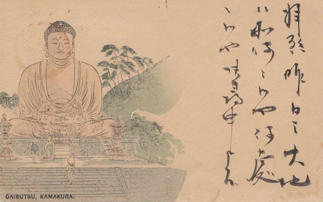
Figure 1
The state issued postal card shown here, postally canceled in 1897 (Meiji 30),[3] unconventionally bears a multi-color woodblock print on the obverse. It depicts the Kamakura Daibutsu colored with washes of ink [Fig. 1]. Notably, the image is offset to allow space for the written message; it would not be until 1907 that a message could be written on the reverse. Domestic illustrated postal cards from this period – that is, before the ban on privately printed cards was lifted in 1900 – are relatively uncommon and their origins are poorly understood.[4] Exemplars such as this suggest the state Printing Bureau (insatsu-kyoku 印刷局), the agency responsible for printing banknotes, stamps, and postal cards, may have been playing with designs before the postal code changes in 1900 or, alternatively, were ambivalent towards private companies who added illustrations to government cards and resold them to the public.[5]
For example, in addition to the circulation of illustrated New Year’s cards (nengajō 年賀状) in the 1890s, some government issued cards (as identified through the imprinted franking on the reverse) depict photographs of landscapes and a variety of scenes from daily Japanese life.[6] It is clear that some of these images draw heavily upon photographic genres, compositions, and conventions that developed under the Japanese foreign tourism and souvenir industry of the 1870s and 1880s.[7] More specifically, some state-issued postal card images can be traced to known Japanese photography studios that catered to both domestic and foreign clientele through the last decade of the nineteenth century.[8]
It remains unknown whether early picture postal cards were printed under the formal auspices of the Printing Bureau (to my knowledge, there is no documentation supporting such a view), or if Japanese photography studios privately issued or commissioned photomechanically printed cards on the “base” of state-issued cards, or if printing houses purchased copyrights of photographs and issued cards themselves (again, on a state-issued card “base”).[9] Current evidence gives most weight to the latter possibility. We know, for example, Ueda Yoshizō 上田義三 (1865–?), opened a collotype printing house in Yokohama in 1897 and is reported to have printed landscapes and images of people on state-issued cards.[10] The role of the Printing Bureau and other state agencies remains undetermined in such a business, but we may surmise these entrepreneurial activities helped encourage the postal regulation changes in 1900. Ueda would directly benefit from this change and became the one of the largest private postcard publishers in Yokohama through the early 1910s.
The postal card under consideration here is reminiscent of similar period photographs taken of the Daibutsu statue head-on. The unknown artist depicted a realistic scene with two Japanese travelers gazing upwards at the colossal image. It casts a gentle sign of reverence towards the Buddhist image without culturally reductionistic signs of deep religious piety as was sometimes choreographed by Western photographers. The overall scene is calm and peaceful, reflecting the beneficent gaze of the Daibutsu.
With the exception of the steeply banking hillside and tall flight of steps leading to the top landing, the illustration depicts the location faithfully as it was known in the 1880s, inclusive of the step ladder to help visitors climb atop the statue. Similar photographs were sold by the studios of Kusakabe Kimbei 日下部金兵衛 (1841–1934) and Tamamura Kōzaburō 玉村康三郎 (1856–1923?), both highly accomplished commercial photographers whose stock may have been the models upon which the unknown artist based this design.[11] The Daibutsu grounds were modified by the winter of 1890, thus while this postcard was probably printed in the latter half of the 1890s, it is likely based on a photograph taken a decade earlier.
The only curious element in the depiction of the statue is the inclusion of earrings, a detail often reserved for other Buddhist deities, but not for buddhas. In contrast, the original bronze work has long, pierced ear-lobes which one might easily confuse for earrings, especially from frontal photographs.[12]
Figures 2 & 3
In further examining the card we can infer it is a woodblock print. First, this is discernible through the telltale signs of “ink squash” along the margins of the color washes. This occurs when the pressure of printing forces ink to spill over the cut edge of the woodblock, creating a darker ink line [Fig. 2]. Moreover, we can observe partial embossing of the obverse image on the reverse of the print. The pressure of the print, most noticeable here with the trees on hillside, causes the paper to deform around the woodblock cuts [Fig. 3]. (Both figures show an unused version of the same postcard where these details are easier to see.)
Figure 4
The reverse bears a rectangular filigree border and 1 sen oval-shaped frank printed in light blue [Fig. 4]. We may presume this card was intended for domestic use since international mail required higher 2 sen or 3 sen rates.[13] Additional postage could be affixed, however, to make up for the difference. There are other indications this card was produced with an international or cosmopolitan audience in mind. If we look back at the caption under the obverse illustration we see “Daibutsu, Kamakura.” While this uses Japanese terminology (Daibutsu means “Great Buddha”), it nevertheless employs the foreign Roman alphabet, not native kanji characters or the kana syllabary, such as we see on the reverse.
The franking design here incorporates the three-leafed paulownia seal (kirimon 桐紋), the official insignia of the Japanese government, in its center. Examining the border design we can also find the government agency responsible for printing the card, namely the Printing Bureau in the Ministry of Finance.[14] Instructions in Japanese explain this side is reserved for the name and address of the recipient only. The paper is thinner than the sturdier stock customarily used by private publishers a few years later. Not only was the paper more durable, it was also a better surface for the increasingly fashionable fountain pen, a Western implement that started to replace the traditional writing brush, especially for composing postcard messages.[15]
*This is part of a series of posts devoted to exploring the development of a visual literacy for Buddhist imagery in America. All items (except otherwise noted) are part of my personal collection of Buddhist-themed ephemera.
Notes:
[1] Scholars of postal history often distinguish between “postal cards” which are imprinted with prepaid franking (an imprinted stamp) and “postcards” which are privately issued and require the addition of an adhesive stamp. The Japanese term hagaki came to signify both state issued postal cards and privately issued postcards.
[2] For an English language introduction to the early history of Japanese picture postcards, see Satō 2002 and Morse 2004.
[3] The cancellation stamp is heavily degraded, but Meiji 30 seems appropriate. The bisected cancellation date stamp (maruichi gata hitsukein 丸一型日付印) was nationally adopted in 1888 and the date reads year-month-day from right to left below the dividing line. Sanjū nen 卅十年 (Year 30) is barely legible and is equivalent to 1897. This dating also aligns with other evidence placing the cancellation between 1878 (signaled by the inclusion of the Printing Bureau instead of the Bureau of Banknotes on the reverse border inscription) and April 1899, when the postage rate for postal cards increased from 1 sen to 1½ sen (additional postage would have been affixed to the card if mailed after the rate increase). In addition, the Printing Bureau changed the design of the oval frank postal card to a chrysanthemum frank in December 1898, thus the printing of this postal card – not necessarily its mailing – must predate this period.
[4] Traditional Japanese deltiological lore holds that the first privately issued picture postcard was designed by Ishii Kendō 石井研堂 and appended to the October 5th issue of the boy’s magazine Kinsei Shonen 今世少年, just four days after the new postal regulations. This story was first reported in Ishii’s own 1908 work, Origin ofMeiji Things明治事物起源, where he proclaims himself to be the inaugural producer of private picture postcards. Most postal historians will point out that Ishii’s claims do not preclude the earlier existence of state issued cards bearing pictures, see for example Saitō 1999: 336. Nevertheless, Ishii’s own claims deserve further scrutiny. For example, in 2020, a privately issued picture postcard cancelled on October 1, 1900 came into the hands of collector Takao Hitoshi 高尾均, hinting the printing history of picture postcards is not as straightforward as traditional lore suggests.
[5] Postal cards had long been adorned with hand drawn illustrations prepared by the sender, now typically categorized as etegami 絵手紙, “hand drawn missives.” These were clear predecessors to the mass scale printing of picture postcards. In addition, many Japanese were previously familiar with picture postcards through European or American cards collected overseas or sent through international mail, see comments in Mōri 2013: 32.
[6] As noted in Kim 2011: 173. Such postal cards are can be categorized as landscapes (fūkei 風景) and customs (fūzoku 風俗). These are continuations of the two most important genres of Meiji-era export tourist photography, see Tucker 2003: 7–8.
[7] For discussion of early commercial photography in Japan, see Dobson 2004 and Wakita 2013.
[8] This personal observation is based on seeing several illustrated state-issue cards for sale on the secondary market. For example, I have seen postal cards depicting a photograph of geisha playing the shamisen and koto as well as a lakefront vista of the old Grand Hotel in Yokohama (destroyed during the 1923 earthquake). Both of these images were reproductions of photographs found in albums sold by Yokohama photographer Kusakabe Kimbei, catalogued as “371. Girls Playing on Samisen and Koto,” and “505. Grand Hotel, Yokohama”; for these catalogue number attributions, see Bennett 2006: 137. I saw the former photograph, with identifying caption, in a private collection while the latter, also with identifying caption, is held by the Syracuse University Art Museum (Object number 1986.510). Notably, the postal cards were printed with 4 sen franking, revealing they were intended for international mail.
[9] It should be noted that Meiji-era Japan had weak copyright regulations for photographs and pirating was fairly common, see Bennett 1996: 85–87.
[10] Saitō 1999: 336. Mid-to-late Meiji business documents from the many postcard sellers of the time have yet to be uncovered. As noted by Saitō Takio, a very large Yokohama postcard exhibit was held in 1985 in the hopes that descendants of these sellers would come forward with old business documentation or family anecdotes, but nothing of the sort occurred, see Saitō 1986.
[11] Relevant photographs would be Kusakabe Kimbei’s print sometimes labeled as “1020,” with an exemplar held by the Nagasaki University Library (Catalogue No. 4673), and Tamamura Kōzaburō’s print captioned “No. 535 Daibutsu at Kamakura,” with an exemplar held by Museé Guimet (AP15903).
[12] According to Buddhist lore, as a sign of his renunciation of princely life, the Buddha removed his earrings, thus leaving his pierced earlobes empty.
[13] International postal cards, issued between June 1879 and December 1898, were printed with 2 sen or 3 sen franking depending on destination, see EGASHIRA 2018: 2. The 1 sen rate covered domestic postage until April 1899 when the rate was increased.
[14] The full inscription reads, “issued by the Printing Bureau in the Ministry of Finance of the Empire of Japan” (Dainippon teikoku seifu Ōkurashō insatsu-kyoku seizō 大日本帝国政府大蔵省印刷局製造). The Printing Bureau in the Ministry of Finance was also responsible for printing paper currency.
[15] For comments on the relationship between postcards and fountain pens, see Satō 2002: 49.
Sources:
Bennett, Terry. 2006. Old Japanese Photographs Collectors’ Data Guide. London: Bernard Quaritch Ltd.
Dobson, Sebastian. 2004. “Yokohama Shashin.” In Art & Artifice: Japanese Photographs of the Meiji Era, by Sebastian Dobson, Anne Nishimura Morse, and Frederic A. Sharf, 15–40. Boston: MFA Publications.
KIM Kyounghwa 金暻和. 2011. “‘Bungaku to shite no hagaki’: Nichirosensō-ki no “hagaki bungaku” o jirei ni shita media-ron no kokoromi”「文学としての葉書」: 日露戦争期の『ハガキ文學』を事例にした メディア論の試み. Masu komyunikēshon kenkyū マス・コミュニケーション研究 78: 169–88.
The September 1, 1923 Great Kantō Earthquake changed Japan. Striking at just before noon, the 7.9 magnitude earthquake razed the capital of Tokyo and the port of Yokohama and caused severe destruction around the entire Kantō region. The resulting fire and tsunami triggered by the earthquake claimed many more casualties. The resulting reconstruction efforts, involving the rebuilding of homes, government buildings, factories, shops, roads, canals, and bridges was a monumental effort. After seven years of toil, the rebirth of the capital and the symbolic renewal of Japan was marked by a week-long series of celebratory events held in March 1930.
Among the many structures decimated by the disaster also included historic temples and shrines, several of which were in Kamakura, part of what is now considered the Greater Tokyo Area. The ancient capital of Kamakura, after which the Kamakura Period (1185-1333) is named, was the home to the shogunate (bakufu 幕府, “tent government”), a hereditary military dictatorship that ruled over Japan and which granted only nominal authority to the imperial court. While the institution of the shogunate persisted until 1867, the capital was moved at the end of the Kamakura period back to the cultural center of Kyoto. After centuries of gradual decline, significant domestic and international interest was thrust back on to Kamakura in the Meiji period (1868-1912), when its proximity to the newly created international port of Yokohama increased its exposure to travelers and businesses.
When the 1923 earthquake hit the region, one of the early storylines that spread through American newspapers concerned the survival of the Kamakura Daibutsu, a destination known worldwide among globetrotting tourists. While the 93 metric tonne bronze statue had shifted 30 centimeters forward, warping its back and neck, it survived relatively unharmed. Because of the shift in weight, a portion of the stone pedestal was pushed into the ground. The pedestal itself, however, received extensive structural damage requiring significant repair, which occurred early in 1925.
Sometime after the 1923 earthquake, an unknown publisher issued a set of eight postcards memorializing the scenic views of Kamakura. Thematic sets of postcards had long been manufactured by Japanese publishers, both by private printers and the government. When the government first printed its own picture postcards (ehagaki 絵葉書) in 1902 (private companies were allowed two years earlier), it issued a set of six cards commemorating the Japanese–Korea Treaty of Amity (Nitchō-shūkōjōki 日朝修好条規). Regardless of this precedent for publishing a set of six cards, issuing a set of eight cards soon became standard for postcard publishers.
Why issue a set of eight cards? On theory traces the origin to the artistic preferences of Song Dynasty China. A set of eight scenic vistas has its historical origins in the brush paintings of Chinese artist and government bureaucrat Song Di 宋迪 (c. 1067 – c. 1080) who is attributed with created the visual genre of the Eight Views of the Xiao and Xiang Rivers (Xiāoxiāng Bājǐng瀟湘八景)[Song Di’s paintings are now lost]. The notion that a set of “eight scenic vistas” or “eight views” (hakkei 八景) constituted a complete and integrated set made its way into Japan by the fourteenth-century. This motivated Japanese artisans and poets to find their own groupings of “famous sites” (meisho 名所) and by the Edo period (1615-1868) each province claimed to have its own set of eight special vistas.[1] For example, Kanazawa 金沢 in Sagami Province, in which Kamakura also resides, became among the most famous sets of eight views in Japan, which was visually represented by woodblock artists such as Utagawa Hiroshige 歌川広重 (1797-1858). Perhaps surprisingly, given Kamakura’s historical importance as a national capital, a specific set of eight views was never expressed among pre-Meiji poets, artists, and woodblock printers.[2]
Given the precedence of the literary and artistic value of the eight scenic vistas genre, one could conclude postcard publishers were naturally filling in the gaps of history when they issued sets of eight postcards depicting famous locations around Kamakura. Kanji Satō suggests this would be premature, as it overlooks the particular means of postcard manufacturing. The photomechanical process of printing late Meiji postcards was dominated by the collotype press, which used relatively large sheets of paper that were later cut into individual cards. Each of these sheets accommodated eight individual postcards, thus sets were most efficiently designed in groupings of eight cards, totaling 8, 16, 24, or 32 cards per set. Thus the relationship to the historical groupings of eight scenic vistas portrayed as a “complete” set is most likely coincidental, although it dovetails nicely into traditional Japanese arts.
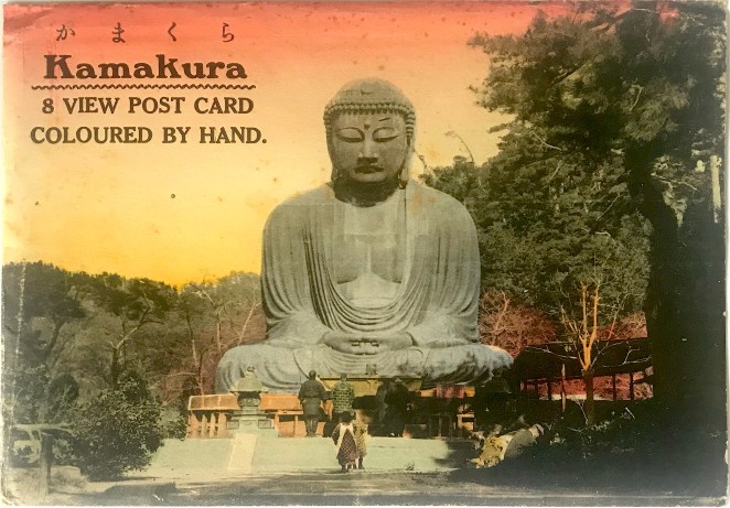
Figure 1 [Set 1] & Figure 2 [Set 2]
Sometime in the 1920s sets of picture postcards were more frequently issued in a paper sleeve or cover. These sleeves were initially imprinted with text or simple designs, but due to the highly competitive commercial market these utilitarian items became subject to the same visual expectations as the postcards themselves. The examples before us bear a hand-colored photographic image, which is given the same artistic care as the cards they hold [Fig. 1 & Fig. 2]. In addition to the minor and idiosyncratic coloring differences, each set uses a slightly different letterpress design. Set 2 also appears to be influenced by an Art Deco font style.
Figure 3 & Figure 4
The sleeve image of the Daibutsu matches the photograph of the Daibutsu on the interior postcard, save for the bokashi-style color wash of the sky. Both sleeves show a pink-hued twilight coloring of the sky while the cards are tinted with a daylight blue [Fig. 3 & Fig. 4]. The fact that these selves and cards are hand-colored is partly surprising. In the early part of the twentieth century many monochromatic photographic postcards were hand-tinted. In the early part of the Taishō period (1912-1926), however, a multi-color collotype printing process was developed, presenting a new option for publishers to speed up their production process. Some publishers took advantage of this technology and multi-color printed cards existed side-by-side with hand-tinted cards into the early 1920s. After the 1923 earthquake, however, almost all publishers adopted this new printing technology when they re-opened their businesses. Since these two sets of cards were issued post-1923 (see below), the fact that our unknown publisher was employing hand-coloring was an added selling point – justifiably noted on the sleeve.
Figure 5
Figure 6 [sleeve] & Figure 7 [postcard]
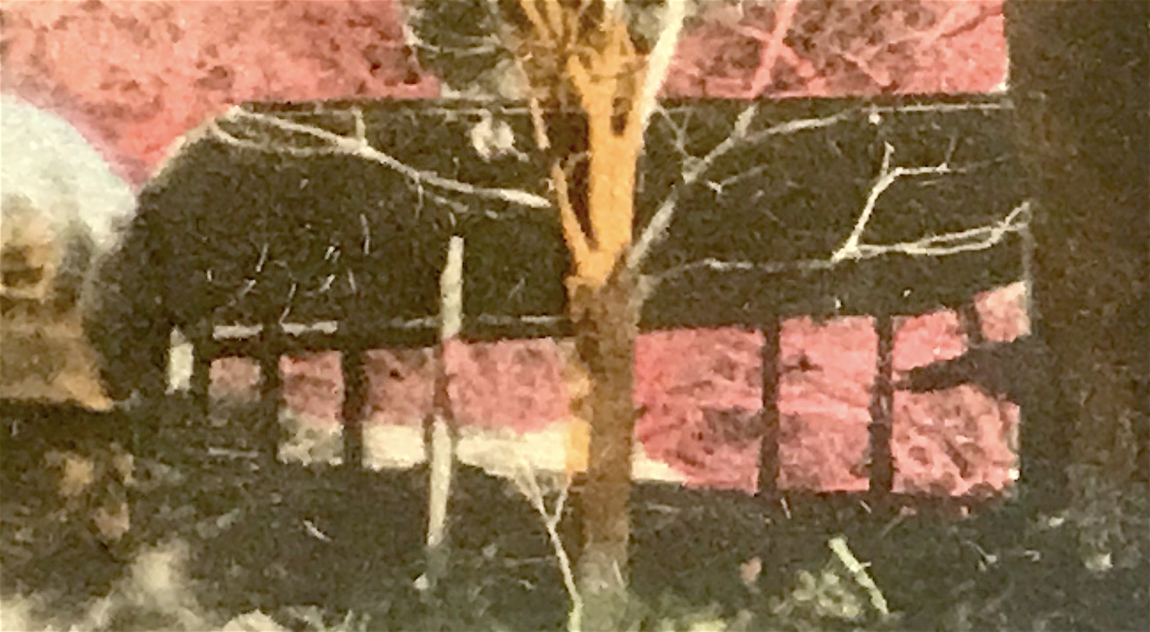
The photograph of the Daibutsu appears staged, as all of the onlookers face squarely towards the colossal statue with legs drawn together and arms at their sides. Upon close inspection, we also see very subtle signs of the 1923 earthquake that ravaged the Kantō region. The lanterns, for example, are shortened from their usual height, signs they needed to be pieced back together and re-erected. Additionally, the items normally arranged atop the offering table are now missing [Figs. 3 &4]. More significantly, the structure to the right of the Daibutsu appears slipshod, a significant difference from the ornate hipped roof building that stood in that same location for three decades [Fig. 5]. Moreover, in a detail that is only visible on the cover sleeves, wooden supports hold up the base of the pedestal, a clear indication of the damages rendered in 1923 [Fig. 6]. An artist carefully painted over the wooden supports for the postcard image, creating a new brick façade to complete the deception [Fig. 7]. The most evident sign of damage is the toppled tree that breaks into the foreground view from the left side [Figs. 3 &4].
Most likely, this photograph represents a period after the terrible destruction caused by the earthquake and after the initial clean-up of the temple grounds. Indeed, enough time has passed so the structure on the right could have been constructed. Yet, the ample work reported in refinishing the pedestal appears to have not yet been executed. Furthermore, in other photographs from April 1925 after the repairs, not only are the wooden supports removed, but the lanterns have been reconstructed fully and moved to the second landing. These details all suggest this photograph of the Daibutsu was taken after the Great Kantō earthquake on September 1, 1923, but before the repairs were finished in early 1925.
Figure 8 [Set 1] & Figure 9 [Set 2]
I suspect that Set 1 was printed in the mid-to-late 1920s. Regrettably, I have not yet been able to match the trademark of a drum (in the stamp box, see Fig. 8) to any known publisher. While Set 2 contains photographs of the same locations, only four of the eight photographs have been copied directly from Set 1. The other four cards offer different vantage points of those locations. Most importantly, the caption (in Japanese only) of the image of the bell tower at Kenchō-ji Temple in Set 2 distinguishes the bell as a National Treasure (kokuhō 國寶)[Fig. 23], a designation it received only on November 14, 1933, thus establishing a firm terminus post quem for this set. I would estimate that Set 2, also issued under an unknown publisher (although I’ve suspected Hoshinoya in the past), was printed in the mid-1930s. I remain uncertain if the same publisher issued both sets.
Below I offer brief historical commentary on the remaining seven views from both sets. The older set, i.e. Set 1, bears simpler captions that are set in blank spaces around the card. The newer set, i.e. Set 2, places the captions along the bottom edge of the cards, as is more traditional. The English in the bilingual caption is sometimes a loose translation of the Japanese, thus I provide a more literal rendering in square brackets.
Figure 10 & Figure 11
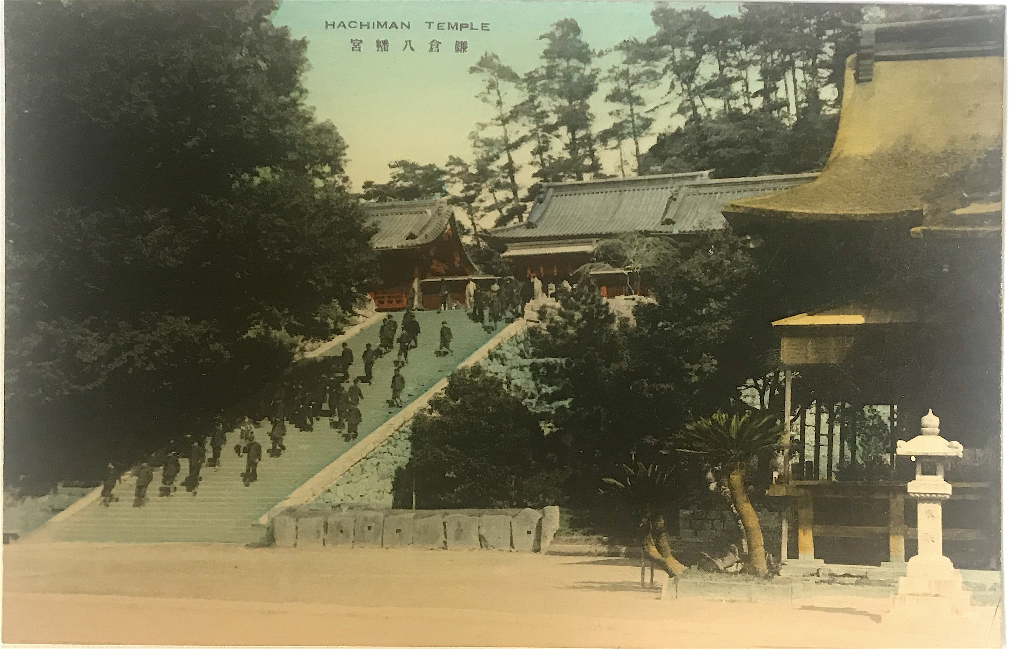
Set 1 caption: Hachiman Temple 鎌倉八幡宮 [Hachiman Shrine, Kamakura]
Set 2 caption: Hachiman Shrine Kamakura 鎌倉八幡宮 [Hachiman Shrine, Kamakura]
Residing at the geographical center of the city, the unusually long, nearly 2-kilometer long road leading to the Hachiman Shrine entrance traditionally doubled as the main thoroughfare of the city. Originally constructed in 1063, the founder of the Kamakura shogunate, Minamoto no Yoritomo 源頼朝 (1147-99), invited the tutelary kami of warriors, Hachiman 八幡, to reside in a new reconstruction of the shine in order to protect his fledgling government. Due to its relationship with the shogun and important political role, the Hachiman Shrine remains the most historically and culturally important site in Kamakura. Previous to 1868, this site was a shrine-temple complex (jingū-ji 神宮寺), meaning it was used as a place for Buddhist practice and the worship of kami.
Figure 12 & Figure 13
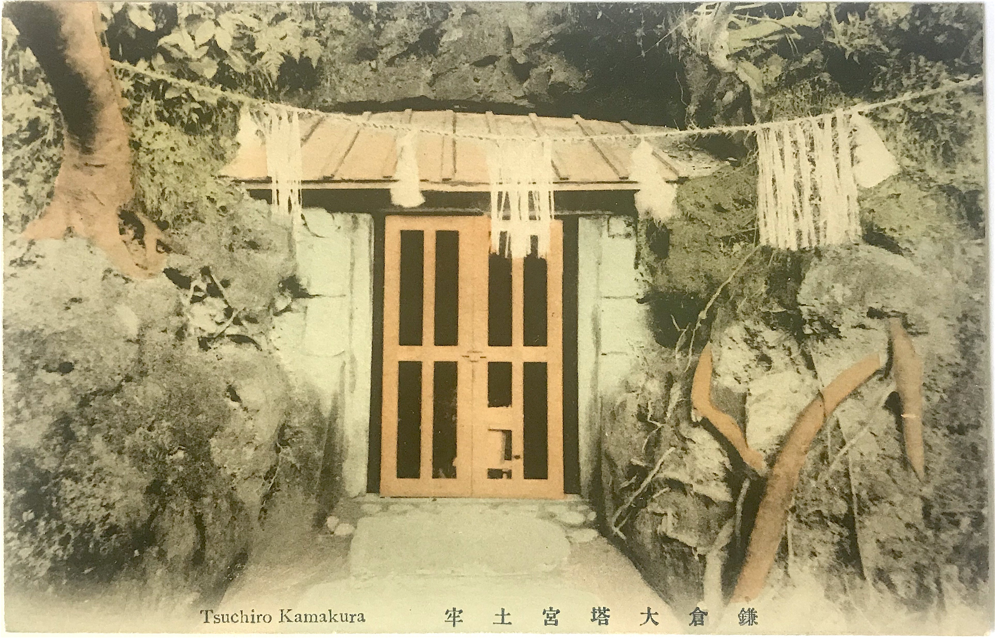
Set 1 caption: Tsuchiro Kamakura 鎌倉大塔宮土牢 [“The prison at Ōtōnomiya Shrine, Kamakura”]
Set 2 caption: Tsuchiro Kamakura 鎌倉大塔宮土牢 [“The prison at Ōtōnomiya Shrine, Kamakura”]
The Kamakura Shrine was erected by Emperor Meiji in 1869 to honor Prince Moriyoshi 護良親王 (also read Morinaga) (1308-1335) who was imprisoned and killed as an act of political retribution in 1335. Before he actively helped his father lead forces against the shogun, Moriyoshi was a Buddhist monk and previously held the position of head abbot of Enryaku-ji Temple 延暦寺, the prestigious seat of the Tendai school.[3] Moriyoshi’s life and unfortunate death captured the imagination of the Japanese and he was well known even before the creation of the shrine memorializing him. The postcard photograph depicts the cave behind the main shrine hall (haiden 拝殿), which according to tradition is where the prince was held captive for nine months. The alternate name of this site is Ōtōnomiya Shrine 大塔宮, for a pseudonym used by Moriyoshi.
Figure 14 & Figure 15
Set 1 caption: View of Yenoshima 七里ヶ濱ヨリ江ノ島ヲ望 [Distant View of Enoshima from Shichirigahama]
Set 2 caption: View of Enoshima (Island) near Kamakura 七里ヶ濱ヨリ江ノ島ヲ望ム [Distant View of Enoshima from Shichirigahama]
Figure 16 & Figure 17
Set 1: View of Yenoshima 江ノ島入口 [The Entrance to Enoshina]
Set 2: Entrance of Enoshima (Island) near Kamakura 江ノ島入口棧橋 [The Entrance Bridge to Enoshina]
The famed island of Enoshima is a center of worship to the goddess Benzaiten 弁財天, a figure with origins in India and who entered Japan in the 6th through 8th centuries. As one of her roles, Benzaiten was considered the protector of the nation and thus was favored by military leaders. The founder of the Kamakura shogunate, Minamoto no Yoritomo 源頼朝 (1147-99), took advantage of the proximity of Enoshima to his new capital and mandated the construction of a torii on the island to memorialize his devotion to the goddess. Taking advantage of visitors to the islands, entrepreneurs soon set up a variety of shops, consequently making the excursion even more attractive to travelers. For early Western tourists, the sandy beaches made the island a favorite resort area. Older woodblock prints show that the island was connected to the Shichirigahama beach by a shallow sandbar before the bridge was constructed.
Figure 18 & Figure 19
Set 1 caption: Hase Temple 鎌倉長谷寺 [Hasa-dera Temple, Kamakura]
Set 2 caption: Hase Temple Kamakura 鎌倉長谷寺 [Hasa-dera Temple, Kamakura]
With origins in the 8th century, this temple is best known for housing one of the largest wooden statues in Japan. It is a 9 meter (approx. 30 foot) tall statue of the Buddhist goddess Kannon 觀音. Its purported origins are rather interesting. It is believed an artist named Tokudo 徳道 made two large Kannon statues from a single fragrant camphor tree in 721. One was enshrined in Hase-dera Temple in Nara, while the second was set adrift into the sea. Fifteen years later the wooden statue washed ashore near Kamakura and a temple, also named Hase-dera, was constructed to honor it. Like many religious sites in Kamakura during the Kamakura period, this temple was restored and expanded. Several later postcard sets of Kamakura include a view of the Kannon statue.
Figure 20 & Figure 21
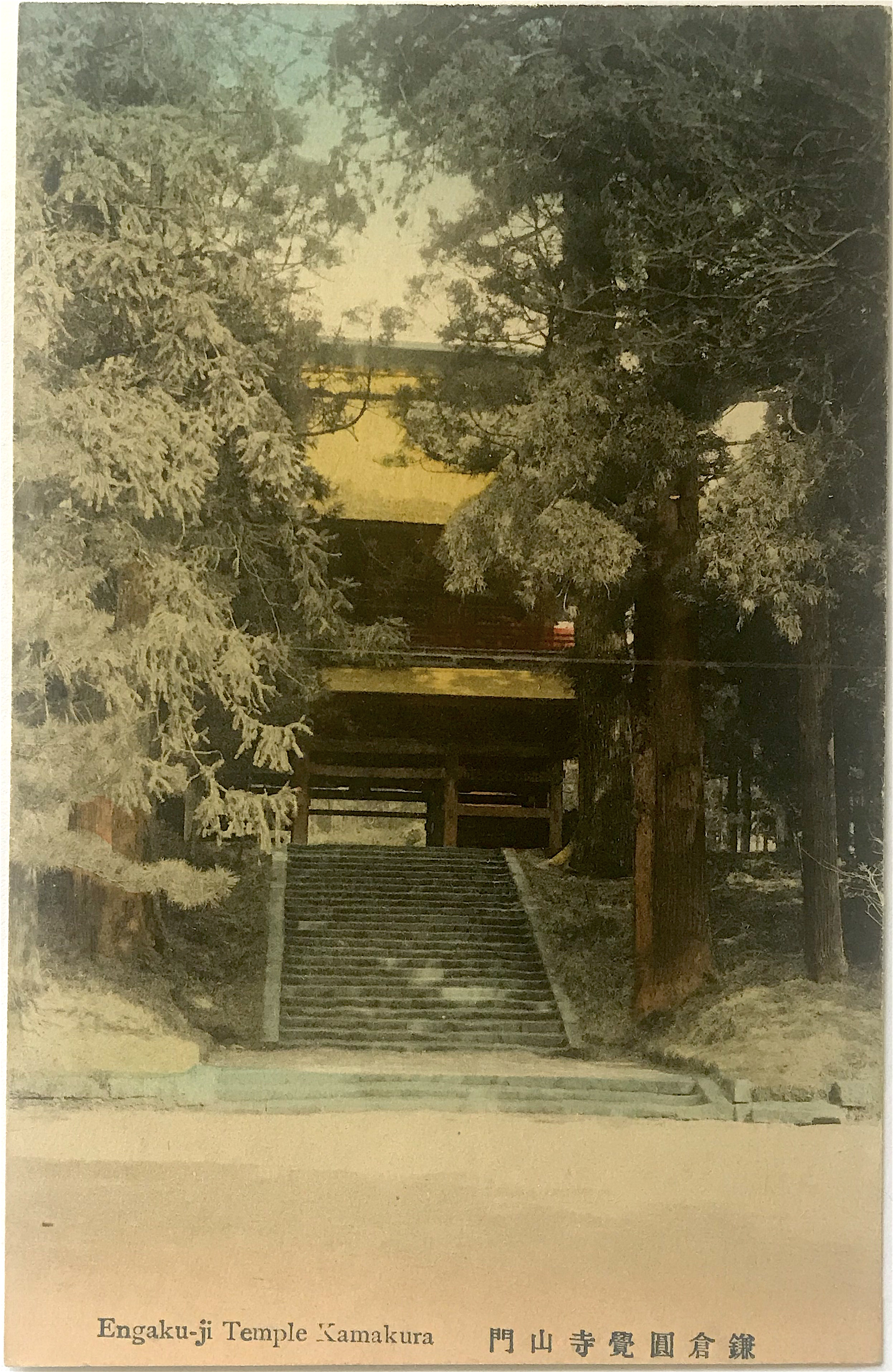
Set 1: Yengakuji Temple Kamakura 鎌倉円覚寺舍利殿 [Reliquary Hall of Engaku-ji Temple, Kamakura]
Set 2: Engaku-ji Temple Kamakura 鎌倉圓覺寺山門 [Front Entrance of Engaku-ji Temple, Kamakura]
Founded in 1282 during the Kamakura period, Engaku-ji Temple was included as one of the Kamakura’s “Five Mountains” (gozan 五山), a network of Zen Buddhist temples supervised by a state bureaucracy but that also received the state’s protection. In the Meiji period (1868-1912) it became the center for Zen study in the eastern part of Japan. Not coincidentally, the famed popularizer of Zen in America, D.T. Suzuki (1870-1966), trained there (though he remained a layperson until his death). Set 1 depicts the temple Reliquary Hall (noted in the Japanese caption) which houses a tooth of the Buddha. This building is registered as a National Treasure. Set 2 depicts the temple front gate (sanmon 山門, “mountain gate”), itself a prominent piece of architecture on the temple grounds.
Figure 22 & Figure 23
Set 1 caption: Kenchoji Temple Kamakura 鎌倉建長寺山門 [Front Entrance of Kenchō-ji Temple, Kamakura]
Set 2 caption: Tsurigane (Bell-Tower) Kencho-ji Temple Kamakura 鎌倉建長寺鐘樓(國寶) [Bell Tower at Kenchō-ji Temple, Kamakura (National Treasure)]
Founded in 1253 during the Kamakura period, Kenchō-ji is the oldest Zen training temple in Japan. Like Engaku-ji, it was also included among the “Five Mountains” network. Set 1 depicts the temple front gate. And while Set 2 depicts the bell tower, the significant historical entity is the temple bell (bonshō 梵鐘), itself designated as a National Treasure (kokuhō 國寶), the most precious of Japan’s historic and cultural properties. Cast in 1255 by Mononobe Shigemitsu 物部重光 it is the second largest in the Kantō region, only to one housed in Engaku-ji. It is believed that the goddess Benzaiten, who was thought to reside on the nearby island of Enoshima (see above), offered her divine protection to have it made. Some modern scholars have suggested Mononobe as the caster of the Kamakura Daibutsu since this bell was made around the same period, although this remains unlikely.
Notes:
*This is part of a series of posts devoted to exploring the development of a visual literacy for Buddhist imagery in America. All items (except otherwise noted) are part of my personal collection of Buddhist-themed ephemera.
[2] Nenzi (2004) outlines the development of Kamakura and Sagami generally into a destination spot through the identification of “tourist packages.”
[3] Moriyoshi (his Buddhist name was Son’un 尊雲) had a complex relationship to his monastic vocation, since his vital role as abbot was to enlist the help of important temples and warrior monks to help his father, Emperor Go-Daigo 後醍醐天皇 (1288-1339), in his fight against the Kamakura shogunate.
Additional Posts in Visual Literacy of Buddhism Series


 Sometime in the 1920s sets of picture postcards were more frequently issued in a paper sleeve or cover. These sleeves were initially imprinted with text or simple designs, but due to the highly competitive commercial market these utilitarian items became subject to the same visual expectations as the postcards themselves. The examples before us bear a hand-colored photographic image, which is given the same artistic care as the cards they hold [Fig. 1 & Fig. 2]. In addition to the minor and idiosyncratic coloring differences, each set uses a slightly different letterpress design. Set 2 also appears to be influenced by an Art Deco font style.