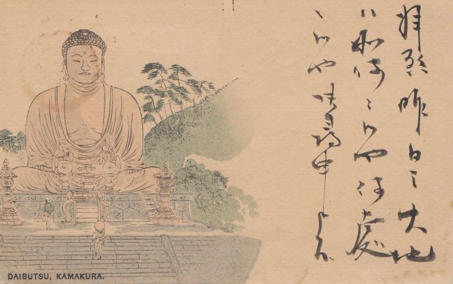
For nearly three decades after the first Japanese postal cards were issued in 1873, printing and distribution were strictly controlled by the government. Only with changes in postal codes in 1900 could private publishers start printing and selling their own postcards. Importantly, and for the first time, these privately issued cards could bear images on the obverse, thus being termed “picture postcards” (ehagaki絵葉書). Previous government-issued specimens were printed blank to accommodate a sender’s written message. Moreover, the growing use among Japanese print shops of inexpensive collotype printing equipment meant photographs could be easily reproduced for this new medium. Many early photographic postcards are reproductions of images originally created and sold in Japanese photography studios, as is the case with the examples here.
Figure 1
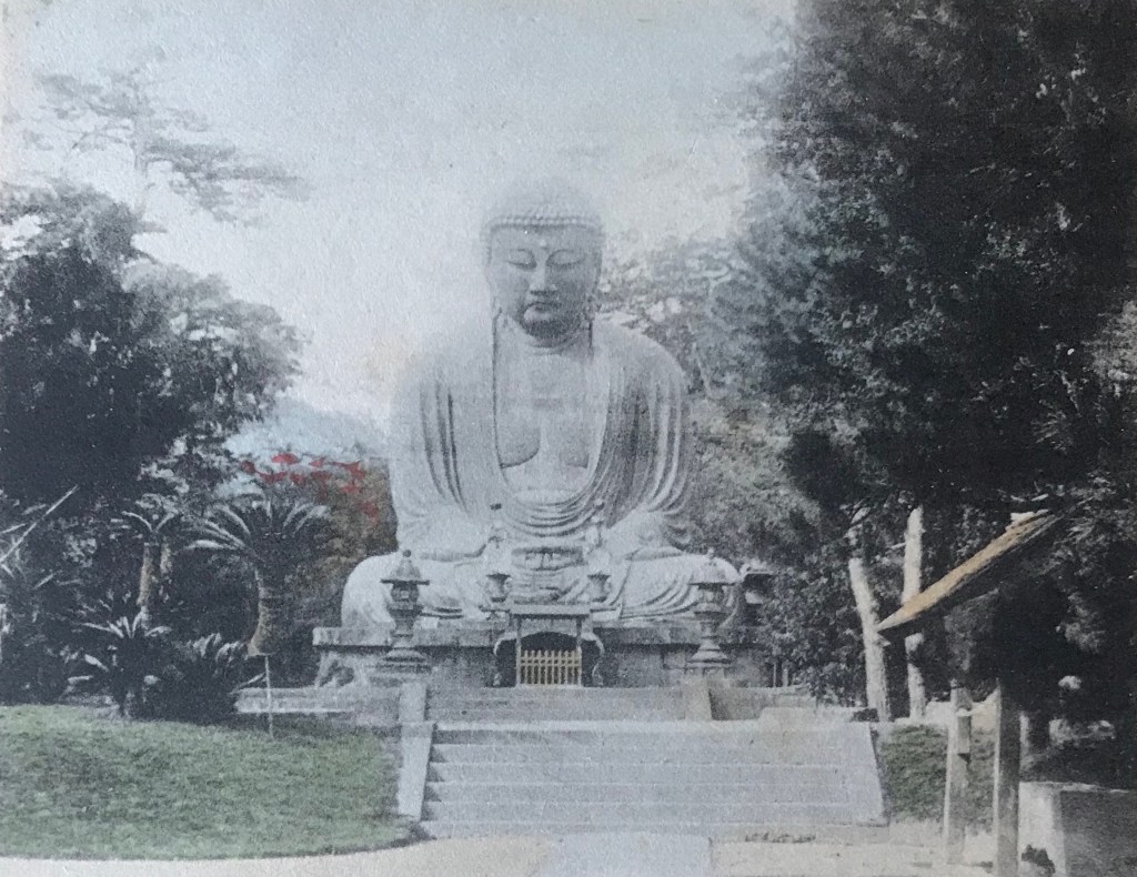
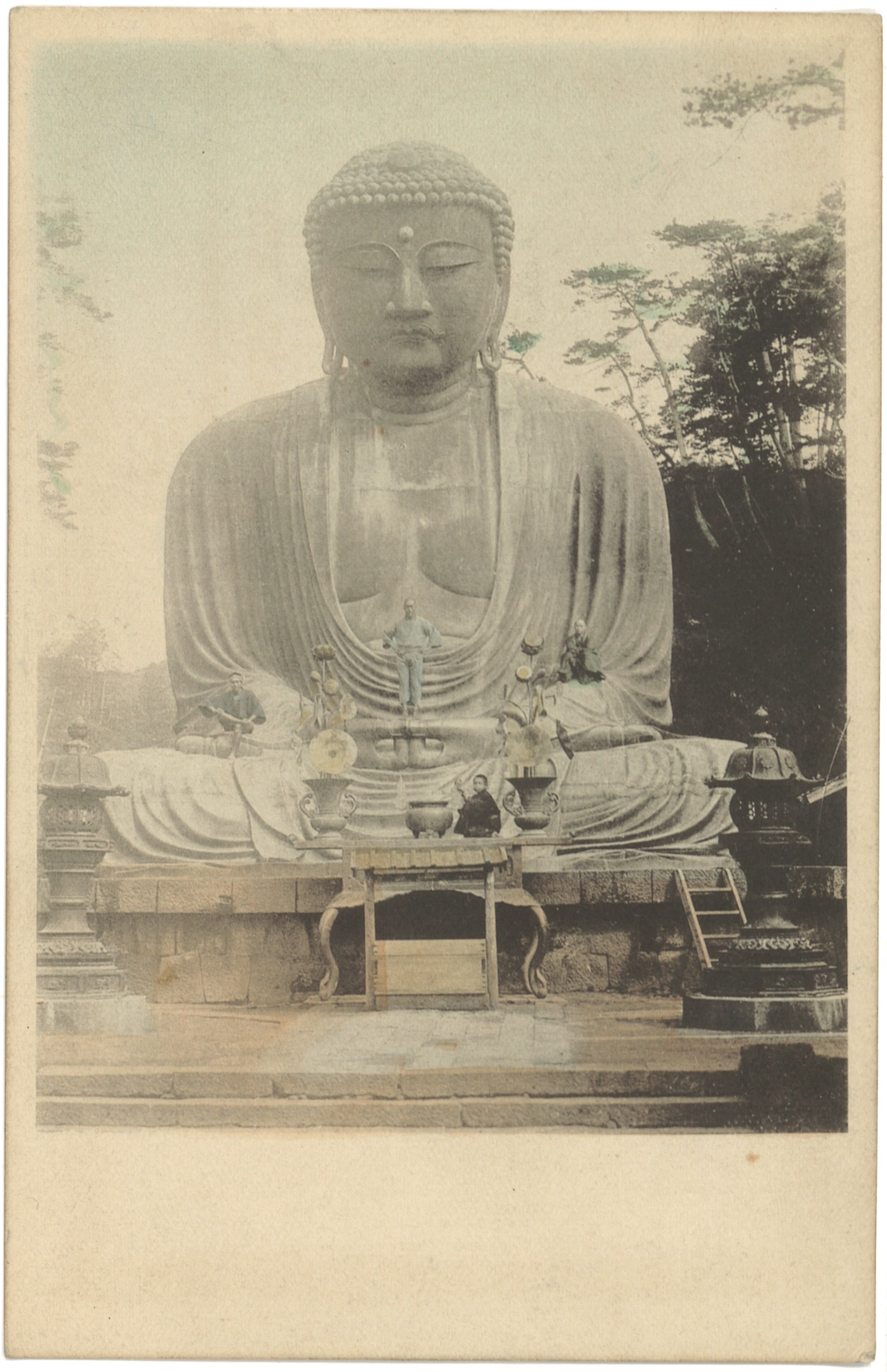
Title/Caption: DAIBUTSU AT KAMAKURA
Year: 1900-1907 (postally unused)
Photographer: Esaki Reiji 江崎礼二 (1845-1910)[?]
Medium: collotype print on cardstock, hand-tinted
Dimensions: 5.5 in X 3.5 in
Reverse Imprint: Union Postale Universelle. CARTE POSTALE, 萬國郵便聯合端書
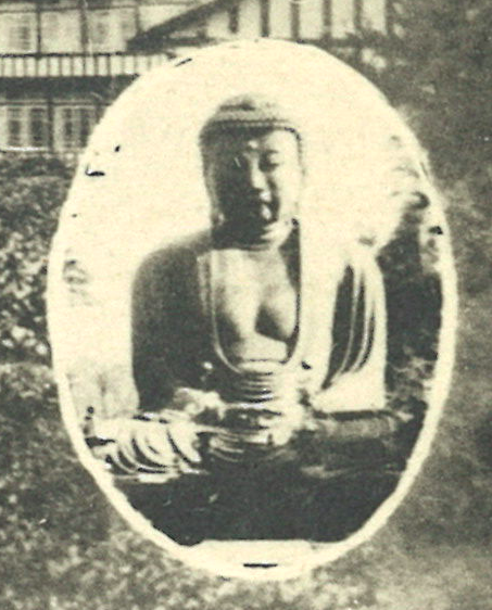
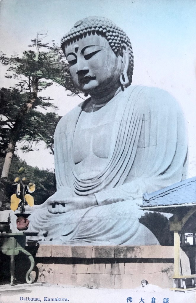
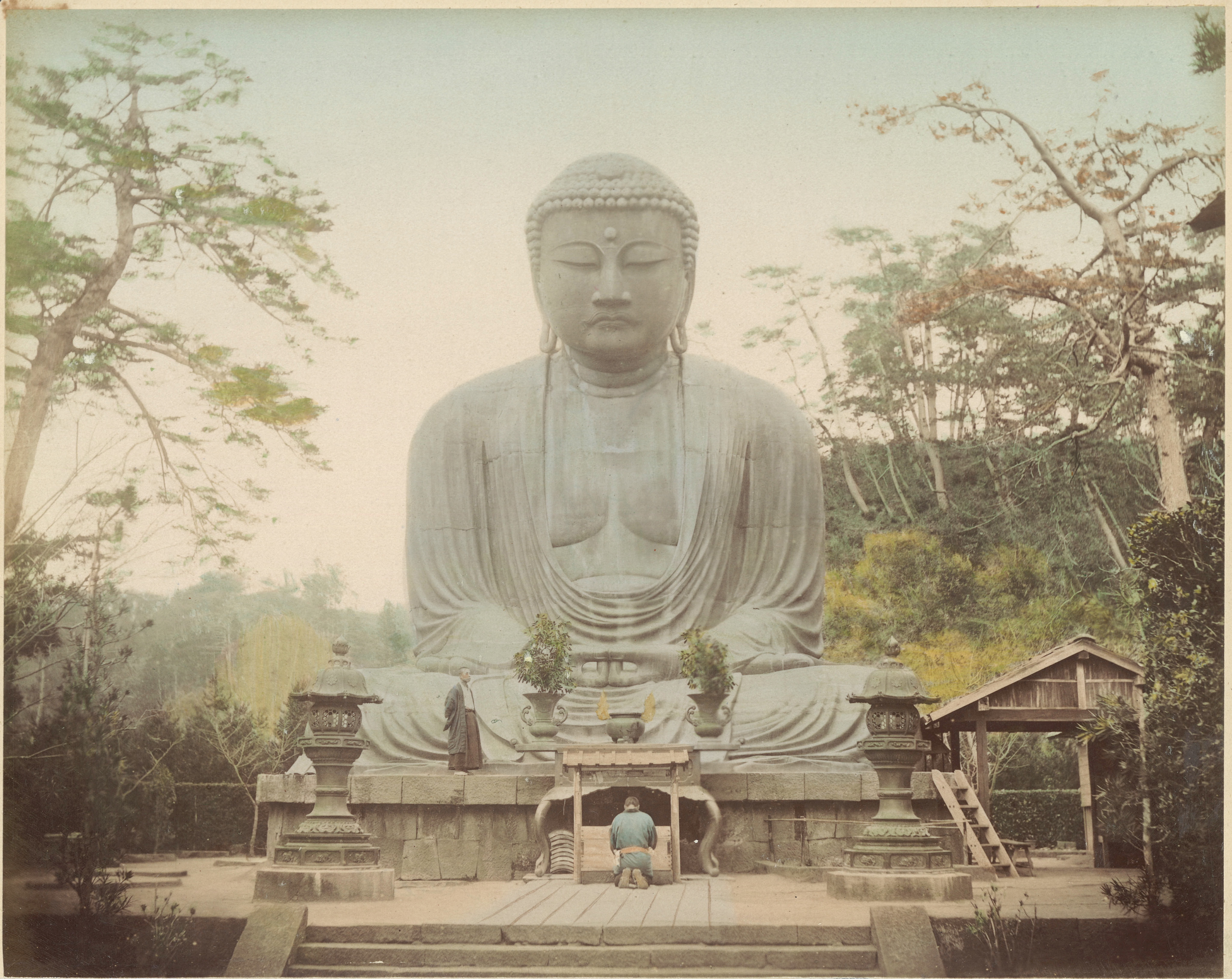
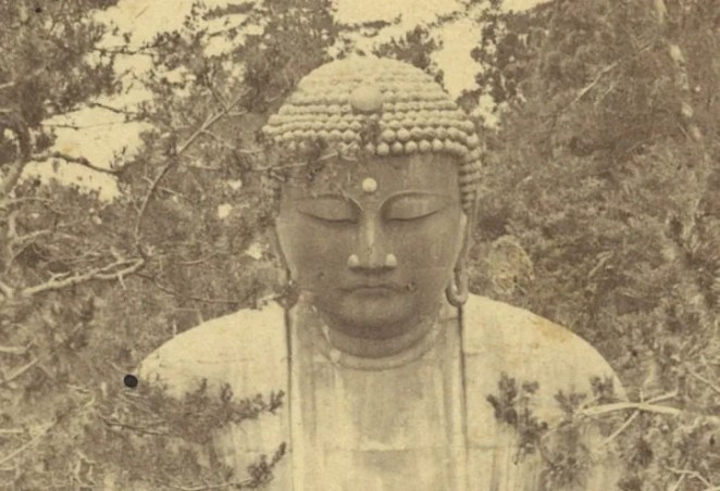
This postcard depicts the Kamakura Daibutsu, scaled to fit in the upper-left corner of the card [Fig. 1]. The blank space on the right side was reserved for a written message; Japanese postal code required the reverse side to be reserved solely for the name and address of the recipient. Once messages could be included on the reverse in 1907, postcard images were regularly scaled to fit the entirety of the obverse side.
For artistic flourish, the publisher of our card employed a subtle trompe-l’œil, making it appear as if the corner of the photographic image is curling off the paper. Visual illusions such as this would make the postcard stand out among a sea of similar imagery. Printed in large block lettering, the caption clearly denotes the subject of the photograph, the “Daibutsu at Kamakura.”
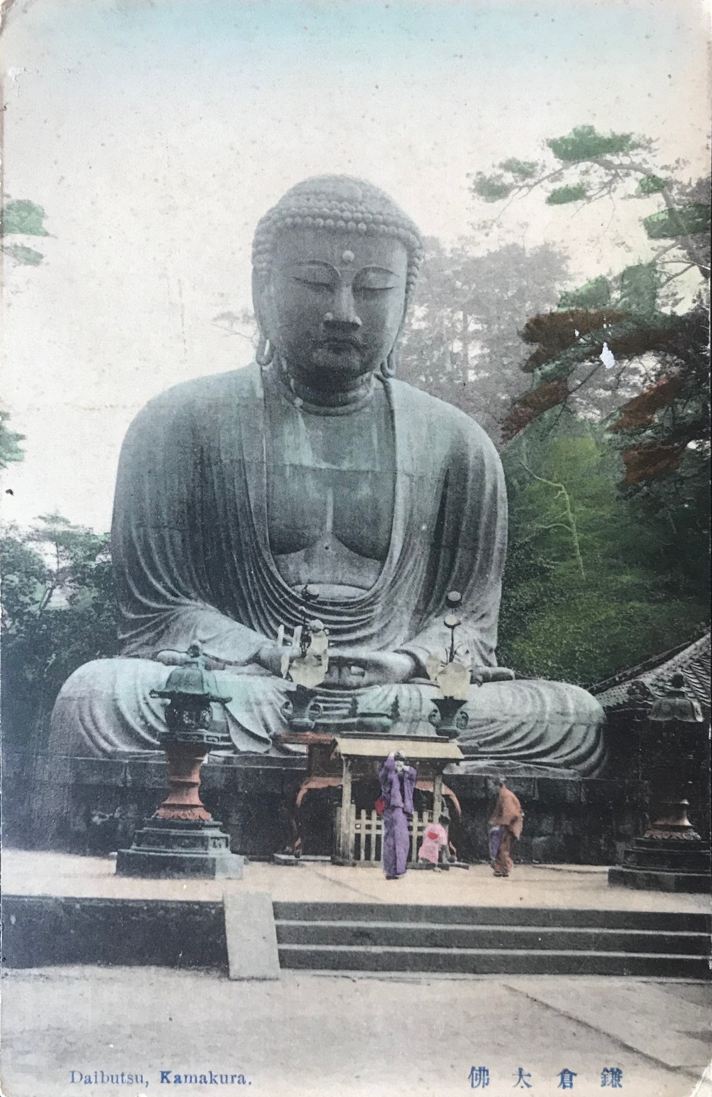
Figure 2
Title/Caption: 451 [or 461] DAIBUTSU AT KAMAKURA
Year: 1900-1907 (postally unused)
Photographer: Esaki Reiji 江崎礼二 (1845-1910)[?]
Medium: collotype print on cardstock, hand-tinted
Dimensions: 5.5 in X 3.5 in
Reverse Imprint: Union Postale Universelle. CARTE POSTALE, 萬國郵便聯合端書
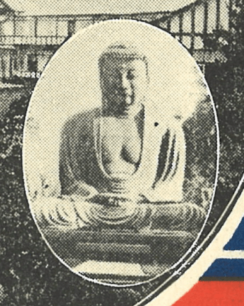
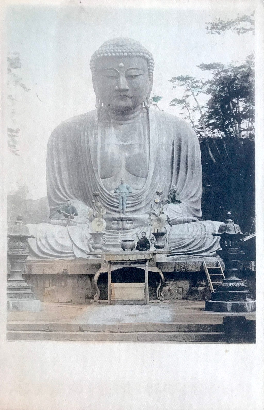
Another postcard employs the same photograph. Here, the image covers a larger portion of the card, but lacks the trompe-l’œil effect [Fig. 2]. Additionally, the caption is much smaller and incorporates an identifying stock number, 451 (or possibly 461). It is of note that a caption which incorporates a stock number with a title is characteristic of prints made by Japanese photography studios of the 1880’s and 1890’s. By comparing this stock number to known lists gleaned from published Japanese studio albums, it appears likely the original photograph was taken by Esaki Reiji 江崎礼二 (1845-1910), a famed Tokyo-based photographer.[1]
Esaki apprenticed under the pioneering photographer Shimooka Renjō 下岡蓮杖 (1823-1914) in 1870 before opening his own studio in 1871 in Asakusa Park.[2] He soon established himself as a technical master, among the first of Japanese photographers to adopt the new gelatin dry-plate (zerachin kanpan ゼラチン乾板) technique in 1883 and executing technically difficult pictures of a naval mine detonating in the Sumida River (1883) and night-time exposures of a lunar eclipse (1884) and exploding fireworks (1885). The shorter exposure times of the dry-plate process also allowed Esaki to more easily photograph fidgeting children, an expertise he proudly displayed in a famous collage of more than 1700 young children and infants (1893).[3]
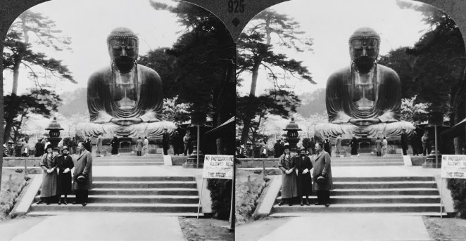
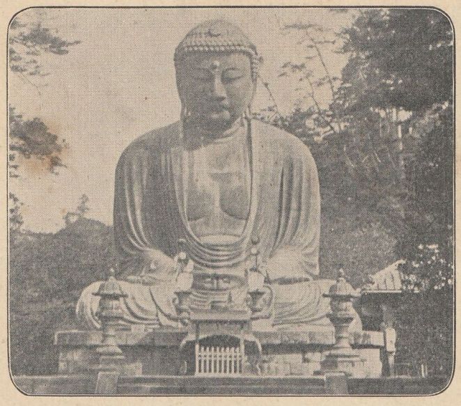
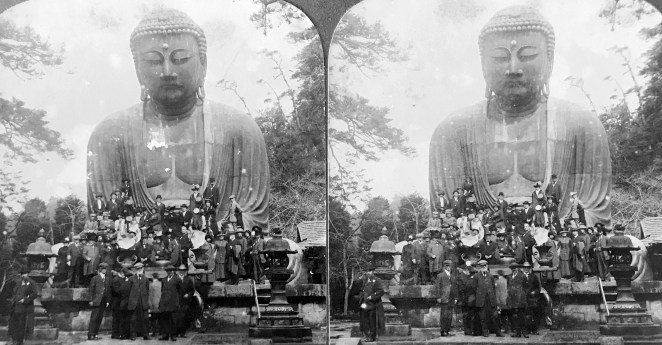
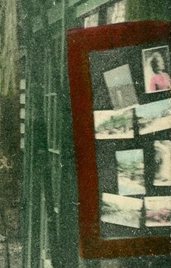
Figure 3
The photograph of the Daibutsu by Esaki (or one of his studio assistants) depicts the bronze statue from the southwest corner, an uncommon, but notunprecedented angle. More relevant to the site’s religious heritage, the photograph shows a line of Japanese pilgrims (jinreisha 巡礼者) in front of the Daibutsu, easily identified by their broad circular sedge hats and walking staffs carried over their shoulders [Fig. 3]. The mise-en-scène is more relaxed than reverent. The lead pilgrim, who holds his hat in his hand, appears to read the small rectangular sign perched on the pedestal (which, coincidentally, forbids climbing on the statue), while his fellow travelers casually stand conversing with one another. Only the temple priest by the offering table glances directly towards the camera.[4] This mundane expression of religious piety stands in contrast to the highly orchestrated images of devotion sometimes staged by Western photographers. Significantly, the distinction between Japanese pilgrim and tourist is often blurred, as both can engage in similar activities at a pilgrimage site, including visits to the temple souvenir shop.
Although faded, the hand-tinting is still visible in both cards, with the slate blue colossus overlooking his faithful visitors. The elements in the scene suggest this photograph was taken in the late 1890’s.[5]
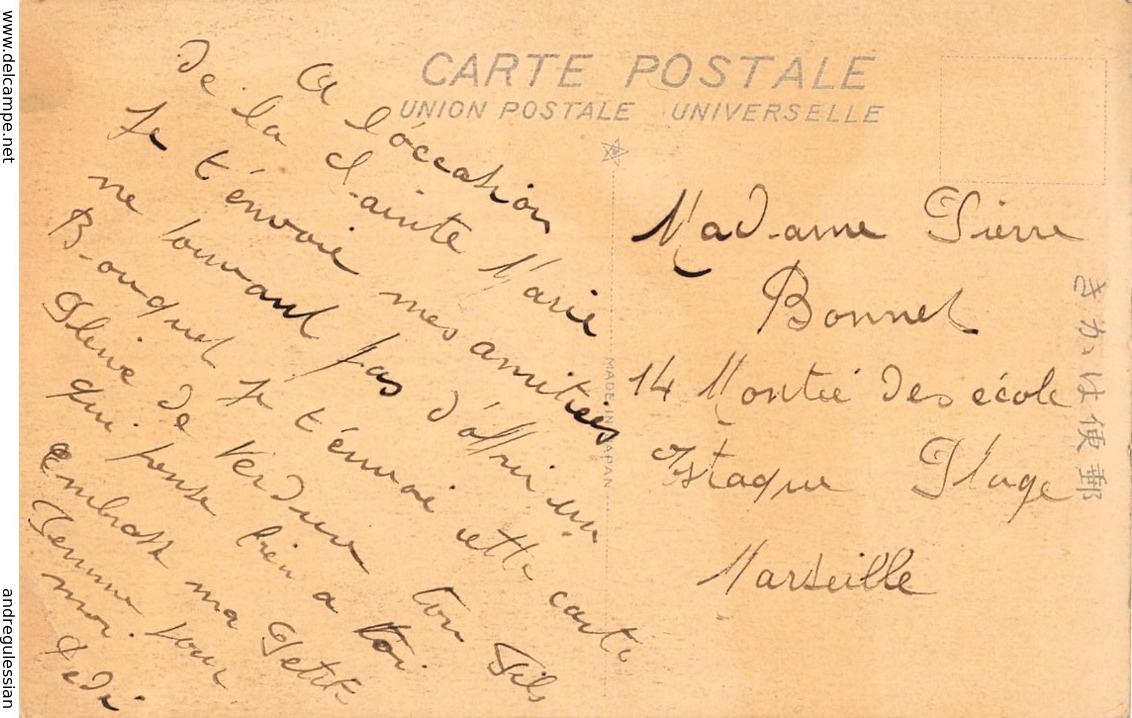
Figure 4
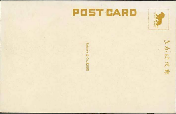
The reverse of both cards is bordered by an ornamental filigree-like design in burgundy ink [Fig. 4]. These are examples of “undivided back” cards, since no line yet separates the areas on the back where the correspondence and address would later come to be written. This functions now as an easy identifier for dating old postcards, with these dating between 1900 and 1907. Since it was not yet common for publishers to imprint their names or trademarks on the back, it is difficult to tell who printed these beautifully rendered cards.
[1] Stock lists for Esaki’s studio do not include numbers 451 or 461, but numbers 452 to 460 are all images of Kamakura, specifically Hachiman Temple, the Daibutsu, and the lotus ponds in Kōtokuin (the temple that houses the Daibutsu). See Bennett 2006a: 129. Unfortunately, almost all attributions to Esaki and his studio remain tentative and more work desperately needs to be done on his photographic oeuvre.
[2] For Esaki’s biographical information, see Bennett 2006b: 165 and here and here. Several Japanese resources note his name as “Ezaki,” but I follow the standard English “Esaki,” which is also how he promoted his studio on photographic mounts and in other published materials (the older “Yesaki” can also be found).
[3] This image was also sold in the United States through Sears & Roebuck catalogues.
[4] Closer inspection reveals a young boy towards the far right of the photograph, holding his hat in his hand, also possibly peering towards the camera
.
[5] I have seen postcards of this image cancelled in January 1902, setting a firm terminus ante quem for the photograph. I have also seen a third postcard, oriented vertically, bearing this same photograph.
Additional Posts in Visual Literacy of Buddhism Series
In the ongoing effort to identify Japanese picture postcards (ehagaki 絵葉書) in my collection, I have decided to publish my working notes on early twentieth-century Japanese postcard publishers.
Using Urakawa Kazuya’s four-period chronology as a foundation, I attempt to catalog variant designs printed on the reverse (atena-men 宛名面, “address side”) by each publisher, as well as differing letterpress caption styles on the obverse (egara [or shashin]-men 絵柄[写真]面, “design [or photograph] side,” also called tsūshin-men 通信面, “communication side”)[1].
The aim is to assist in identifying cards that lack a publisher’s name or trademark (shōhyō 商標; rogumāku ロゴマーク)—an inherently fallible undertaking.
The information presented here is drawn primarily from Japanese-language sources, both print and digital, supplemented by my own observations. These notes remain provisional and will be updated as time permits.
Japan was among the world’s largest producers of postcards in the early twentieth century; accordingly, the research below is far from exhaustive and reflects my particular interests. I focus mainly on hand-tinted, photomechanically reproduced cards from the late Meiji and early Taishō periods. I do not address, for example, the substantial collectors’ market for artist-designed picture postcards, bijutsu ehagaki 美術絵葉書.
Topically, my interest centers on landscape views (fūkei 風景), especially those depicting Japanese religious sites, and the scope of this research is shaped accordingly. A list of useful references appears at the end of this post.
Please contact me if you can provide any other information or resources about Japanese postcard publishers, or any other oversights and errors: peter.romaskiewicz[at]gmail[dot]com.
A Brief History of Publishing Postcards in Meiji and Early Taishō Japan
The commercial market for photography in Japan expanded significantly in the 1860s and 1870s with the arrival of globetrotting tourists in search of souvenirs from their “exotic” travels in Asia. During the Meiji period, the principal port of entry for foreign visitors was Yokohama, which quickly emerged as the center of a competitive commercial photography industry. Yokohama shashin 横浜写真 (“Yokohama photography”) came to denote a distinctive fusion of Western technology and Japanese craftsmanship: monochromatic albumen prints were meticulously hand-colored by artists to produce vivid, eye-catching scenes.
Throughout the 1880s and 1890s, Japanese-owned studios grew steadily in number and prominence, gradually displacing their Western counterparts, who had dominated the market in earlier decades. As travel restrictions on foreigners were eased and domestic interest in photography increased, Japanese studios expanded into a wider range of urban centers across the country. The aesthetic cultivated by these early studios would exert a significant influence on Japan’s first domestic postcard publishers.
Japan’s modern postal service began operations in March 1871 and joined the Union Postale Universelle (bankoku yūbin rengō 萬国郵便聯合) in June 1877, enabling the regular exchange of international mail (although several foreign powers had previously maintained post offices in select treaty ports). The first postal card (hagaki 端書) was issued in December 1873; until the end of the nineteenth century, however, all cards were government-issued (kansei 官製). These are identifiable by prepaid franking printed on the address side (i.e., the reverse). The obverse was left blank to accommodate a written message.
Revisions to postal regulations on October 1, 1900 permitted private companies to produce picture postcards (ehagaki 絵葉書), allowing illustrations or photographs to appear on the obverse. (Until the adoption of the “divided back” format in April 1907, the sender’s message still had to be written on the image side.) Two years later, the government began issuing its own commemorative picture postcards. Together, these changes transformed the landscape of the postcard market and sparked a new cultural phenomenon.
For privately issued (shisei 私製) cards, photographic imagery quickly became the preferred visual medium, and many images originally produced by commercial Japanesephotography studios were repurposed for postcard publication. These were typically reproduced using the inexpensive planographic process known as collotype (korotaipu コロタイプ), introduced commercially in Japan by Ogawa Kazumasa 小川 一眞 (1860–1929) in 1889. Because multi-color collotype printing was technically challenging, many early twentieth-century publishers employed artists to apply watercolor washes by hand (certain hues, such as red, often used more heavily pigmented paints). In this way, the aesthetic of Yokohama shashin developed in the early Meiji period persisted into the early Taishō era through the new medium of the postcard.
The Russo-Japanese War (1904–1905) triggered what is now termed the “picture postcard boom” (ehagaki būmu 絵葉書ブーム or ehagaki ryōkō 絵葉書流行). Postcards were sold nationwide, particularly in major urban centers. Specialty postcard shops operated in cities such as Tokyo, Kyoto, Kobe, and Yokohama. Numerous other enterprises entered the lucrative trade, including photography studios, printing houses, booksellers, souvenir shops, and even Buddhist temples. Large publishers distributed stock wholesale to retailers across the country, saturating the market with inexpensive photographic images—landscapes, city views, geisha and actors, members of the imperial family, scenes of daily life, war reportage, natural disasters, and more. At least one firm, Ueda Photographic Prints Corp., marketed its products directly to retailers in New York City.
Publishers did not always identify themselves clearly on their cards. In some cases, their name and address were printed discreetly on the card; more commonly—though still not uniformly—larger firms adopted a trademark or logo, often placed within the stamp box (kitte ichi 切手位置) on the reverse. While this location visually framed the mark, the affixing of a postage stamp could easily obscure it, effectively rendering the publisher anonymous. At times, a name or insignia appears elsewhere: incorporated into the dividing line, embedded in a letterpress caption, or concealed within the image itself. Some publishers, such as Ueda or Tonboya, even disguised their marks intentionally.
In many instances, however, surviving cards offer little reliable evidence for firm attribution. In an industry defined by mass production, identifying the original photographer—or the individual colorist—is, regrettably, impossible. Elsewhere I have outlined a method for approaching otherwise anonymous publishers; the present entry continues that ongoing, if necessarily provisional, investigation. The attributions proposed here should therefore be understood not as definitive conclusions, but as informed and carefully considered hypotheses.
Ueda Photographic Prints Corp. 上田写真版合資会社
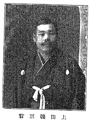
Ueda Yoshizō
Born in Tokyo, Ueda Yoshizō 上田義三 (1865–?) found employment after college in the oldest German export trading company in the capital, Aherns & Co. (Ārensu shōkai アーレンス商会), founded by Heinrich Aherns in 1869. In the mid-1890’s, after Ueda toured Europe and America, he returned to Japan to open his first business venture in 1897 (Meiji 30), the Yokohama Photographic Printing Co. 横浜写真版印刷所 first located on Yatozaka Slope 谷戶坂. In 1905 (Meiji 38) the business moved to Okina-chō3-chōme (No. 131) 翁町3丁目(131番) and around 1913 (Taishō 2) the business was renamed Ueda Photographic Prints Corp. 上田写真版合資会社 (the name “Uyeda” can be found printed on some postcards).
Ueda was highly successful in selling photographs and producing government-issued postcards on his own collotype printing equipment. Importantly, Ueda’s success in printing early landscape and figural picture postcards presaged the Japanese postcard boom after the Russo-Japanese War, thus he became recognized as the “Japanese Pioneer of Picture Postcard Manufacturing” 日本元祖絵葉書製造元. Īkura Tōmei 飯倉東明 (1884-?) worked as Udea’s director of photography in the first decade of the twentieth century. My analysis of Ueda postcards from 1907–1918 can be found below.
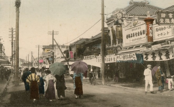
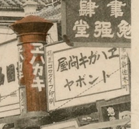
Around 1905 (Meiji 38), Yoshimura Kiyoshi 吉村清, the proprietor of the well-known Tokyo-based publisher Kamigataya 上方屋 (in Ginza), started a new venture in Yokohama, called Tonboya トンボヤ, or “Dragonfly Studio.” [2] Along with Ueda, Tonboya was the most prolific hand-painted postcard publisher in late Meiji/early Taishō Japan, also opening offices in Tokyo, Kawasaki, and Yokosuka. The original shop was located on Isezaki-chō 2-chōme (No. 16) 伊勢佐木町2丁目(16番), a famous area known among foreigners as Theatre Street (see post frontispiece above). The storefront can easily be located in period photographs due to its distinctive Japanese-style red cylindrical postal box (yūbinposuto 郵便ポスト) sign painted with ehakaki エハカキ [sic], or “Picture Postcards.” The left-hand column of words on the white storefront sign says “photographic collotype printing.”
Kamigataya stamp box trademark
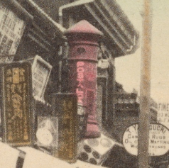
The postal box was also the trademark printed in the stamp box for Kamigataya issued cards. The precise business relationship between Kamigataya and Tonboya remains obscure.
Postal box signboard in Motomachi
Kamigataya appears to have had an officein the Motomachi district (Motomachi-dori 2-chōme [No. 85]) which also appears in period photographs, here saying “postal cards” (in some photographs, Kamigataya is visible on the front of the sign). In the early Showa Period after the Great Kantō earthquake, Tonboya moved to Izezaki-chō 1-chōme (No. 36) 1丁目(36番). Cards were initially hand-colored, but Tonboya used a multicolored collotype process starting in the early Taisho. Tonboya remained in operation after the Great Kantō Earthquake of 1923.
Tonboya Reverse Designs and Obverse Captions
Type 1: Dragonfly in the stamp box. Type 2: A variant dragonfly trademark is placed in the upper left-hand corner.Type 3: Even without the dragonfly seal, the characteristic serif font in dark/black ink can help identify the publisher. The same serif font, however, was also used by Kamigataya which is easily identified by the Japanese postal box trademark in the stamp box. With no identifying emblem it remains difficult to confidently identify the publisher as Tonboya or Kamigataya. Tonboya, however, seems to have regularly used black ink for the reverse while Kamkigataya seems to have preferred dark green or maroon. Moreover, Kamigataya cards are sometimes printed with the “UNION POSTALE UNIVERSELLE” header as narrower than “CARTE POSTALE” below.For Tonboya Types 1-3, the obverse captioning is typically in capital letters and finished with a period. Some captions include a stock number in parentheses. It should be noted that Kamigataya also used capital lettering in this period.
Type 4: Dragonfly trademark with divided back and address lines. Variants exist with the rule lines for the name and address omitted.Type 5: No dragonfly trademark with divided back, here with rule lines for the name and address.Type 5 (variant): No dragonfly trademark with divided back, here without rule lines.Type 5 (variant): No dragonfly trademark with barred dividing line (top of line) and without rule lines.For Types 4-5, the obverse captions often incorporate a dragonfly facing downwards and to the left. A stock number in parentheses with a letter code indicating the location of the image is also sometimes included (e.g. Y=Yokohama). Note, however, this system is not universal, these designs can have the older captioning system of capital letters.Type 6 [Yokohama Jubilee](Japanese): This reverse design was printed for the 1909 fiftieth anniversary jubilee for the opening of Yokohama port. The symbol in the stamp box is the emblem of Yokohama. Notably, the reverse design bears the dragonfly as the ki キ.Type 6 [Yokohama Jubilee](English): Same design as above with English name and street address. The design also incorporates “MADE IN JAPAN” in the dividing line, suggesting this card was printed with US customs laws in mind. The Yokohama city insignia is also missing in the stamp box.For Type 6, the obverse captions have a dragonfly facing upwards to the left. Sometimes a stock number in parentheses is incorporated.Type 7 (blue): Around September 1909, “UNION POSTALE UNIVERSELLE” is removed and a new bilingual header is introduced. The dotted dividing line may or may not contain “MADE IN JAPAN.” Notably, the reverse design bears the dragonfly as the ki キ.Type 7 (umber): The reverse design is printed in blue, umber, or black.Type 7 (black): A barred line variant is also common.Type 7 (blue): Here with address linesFor Type 7, the obverse captions most typically have a dragonfly facing upwards with a stock number and letter identification in parentheses. There are, however, exceptions. The letterpress is commonly in italic print, but not always. At some point, the letter identification is printed in lower case. Confusingly, the Sakaeya publishing house 栄屋商店 lion is sometimes incorporated in the caption, even when the reverse design bears the dragonfly as the ki キ (!). I presume, but have no firm evidence, that Sakaeya purchased the card stock from Tonboya already imprinted with the reverse design (maybe even the front image?) and incorporated their lion insignia in the letterpress caption.
Type 8: A bilingual header with a centered dividing line.Type 8: A minor variant of above with rounded, full-line stamp box.
Hoshinoya 星野屋
Yoshioka Chōjirō
Yoshioka Chōjirō 吉岡長次郎 arrived in Yokohama in 1904 (Meiji 37) with postcards purchased in Tokyo, hoping to turn a profit by reselling them to foreigners. After receiving numerous orders and making several trips back to Tokyo to restock, Yoshioka opened a shop in Yokohama at Onoe-chō 4-chōme, No. 61 尾上町4丁目(61番).
Possible display of cards at Hoshinoya
By the end of the Russo-Japanese War in the fall of 1905, he had collected many collotype plates of native landscapes and was very successful marketing to both foreigners and Japanese. Hoshinoya emerged as one of the most well-known postcard shops in the port of Yokohama.
Hoshinoya Reverse Designs and Obverse Captions
I have not yet confidently identified undivided back Hoshinoya cards.
The Art Nouveau style “Carte Postale” is an easily identifying characteristic of Hoshinoya cards. I have also seen Nassen & Co. cards with this same font and scalloped stamp box, however, but cards with the Nassen & Co. imprint are far less common in the secondary market. In any regard, any reverse design with the publisher’s mark could be Hoshinoya or Nassen & Co. A variant style for “Carte Postale” can also be found. Note the stamp box is vertical.This reverse design, with French header and multilingual translation, is frustrating. Here, it is clearly identified by the Hoshinoya stamp box trademark. Without the stamp box insignia, however, this design is fairly common among cards in the secondary market. I had previously believed cards without a printer’s insignia were an Ueda product (Type 2), but I also have found evidence suggesting this design was used by Tonboya as well. In any regard, only Hoshinoya’s trademark can be found on cards I have seen (thus far) of this design. Yet, not only is the sans-serif font uncharacteristic of Hoshinoya cards of this period, this publisher often used “Union Postale Universelle” as a header; this phrase is absent on the card here. It suffices to say that it was surprising to find a Hoshinoya insignia on this reverse design. It remains possible that this reverse design (without the Hoshinoya trademark) was shared among several printers (see, e.g., Sakaeya below). Unfortunately, I am not sure this will ever be resolved with certainty.Reverse printed in umber, see my comments directly above.
Period III using the Art Nouveau style “Carte Postale.”Hoshinoya is also clearly indicated on the obverse of this card, thus connecting the sans-serif font to the card design noted above. I am unsure of this identification, but I take the star at the top of the dividing bar to indicate the Hoshinoya trademark.I am also unsure of this identification, It seems that Hoshinoya started to use a light blue more regularly for the reverse designs, so I include this one here.Hoshinoya relocated to Nikko and started to produce sets of this locale. Backs are also printed in Japanese.
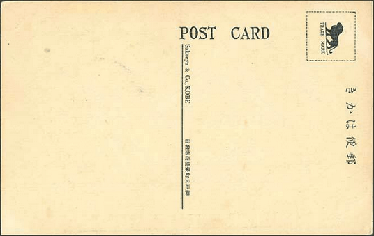
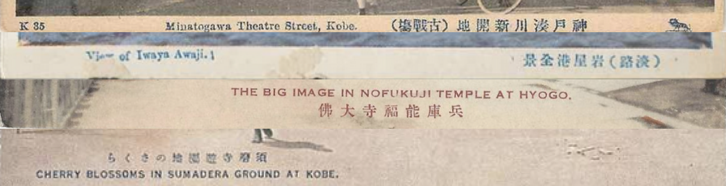
Sakaeya & Co. 栄屋商店
Sakaeye storefront in Motomachi, Kobe
A Kobe based company with a shop in Motomachi, Kobe. A majority of this publisher’s cards are of Kobe and its environs, but there are other images among its portfolio. Curiously, I have seen Sakaeya’s lion insignia in the caption of images that were printed on cards bearing both Ueda’s and Tonboya’s seals on the reverse. I’d speculate that Sakaeya purchased Ueda and Tonboya cardstock and used it to print their own cards. It seems likely they mainly sold them in Kobe with the lion insignia imprinted on the front. Period III cards also bare the insignia of Taisho Hato (see below), a dove with is wings spread open.
Sakaeya Reverse Designs and Obverse Captions
I have not yet confidently identified undivided back Sakaeya cards.
Ueda publisher back with Sakeya insignia in obverse caption.Tonboya publisher back with Sakeya insignia in obverse caption.Sakaeya captions typically use stock numbers with letter identification (most are K for Kobe), sometimes inside parentheses. The letterpress is sometimes italicized. While the lion insignia is printed in the bottom right corner, sometimes the Sakeya name is also included by the stock identification number. It is uncommon for landscape postcards to have the Sakaeya name or insignia printed on the reverse.
Sakaeya continued to use Udea cards stock for their postcards into Period IIIEventually, Sakaeya incorporated the lion insignia into the stamp box.Later period captions sometimes still incorporate the Sakaeya lion insignia, but it gets removed when the name and insignia are incorporated on the reverse. Sakaeya also started to use two lines of letterpress.
Naniwaya Co. 浪華屋 (Kanda, Tokyo 東京神田) – [later became Tokyo Design Printing Co. 東京図按(vl. 案)印刷社; Kuroda Hisayoshi 黒田久吉]
Nassen & Co. (Yoshioka-chō, Yokohama) – interlaced N and S atop floral design
Nisshinsha (Tokyo 東京)
S.N. Banshiudo 長島萬集堂 [Nagashima banshūdō](Shiba, Tokyo 東京芝)
Taisho Hato Brand 大正鳩ブランド (Wakayama 和歌山)
Tōdai-ji 東大寺 (Nara 奈良)
Notes
[1] The nomenclature for the sides of the postcard derived from their original design where one side was reserved solely for the address, while the other was reserved for the written message, and eventually, a printed image. These are also known as the reverse (rimen 裏面) and obverse (hyōmen 表面).
Kamigataya storefront displaying postcards for sale.
[2] Some sources name the proprietor as Maeda Tokutarō 前田徳太郎, but I have not seen this name in printed Japanese sources. Some sources note 1907 (Meiji 40) as the date for the founding of Tonboya. A Kamigataya sign and display of postcards can also be found in the Motomachi district of Yokohama.
Resources
Print Resources [selected]
Barclay, Paul D. 2010. “Peddling Postcards and Selling Empire: Image-Making in Taiwan under Japanese Colonial Rule.” Japanese Studies, Vol. 30, No. 1, pp. 81-110.
Geary, Christraud & Webb, Virginia-Lee, eds. 1998. Delivering Views: Distant Cultures in Early Postcards. Washington DC: Smithsonian Institution.
Handy, Ellen. 1998. “Japonisme and American Postcard Visions of Japan: Beauties and Workers, Cherry Blossoms and SIlkworms.” In Delivering Views: Distant Cultures in Early Postcards, edited by Christraud Geary and Virginia-Lee Webb, 91–114. Washington D.C.: Smithsonian Institution Press.
Hibata Sekko 樋畑雪湖. 1936. Nihon ehagaki shichō 日本絵葉書史潮 [The History of Japanese Picture Postcards]. Tokyo: Nihon Yûken Kurabu.
Itō Izumi 伊藤泉美. 2001. “Tsuioku No Yokohama: Ehagaki Ni Miru 100-Nen Mae No Hitobito to Fūkei 追憶の横浜: 絵葉書にみる100年前の人びとと風景 [Memories of Yokohama: Postcards of People and Scenery from 100 Years Ago].” Kaikō No Hiroba 開港のひろば / Yokohama Kaikō Shiryōkan 横浜開港資料館 [Yokohama Archives of History], Vol. 71. [http://www.kaikou.city.yokohama.jp/journal/images/kaikouno-hiroba_71.pdf]
Kamakura Board of Education 鎌倉市教育委員会. 2011. Ehagaki de miru Kamakura hyakkei 絵葉書で見る鎌倉百景 [One Hundred Views of Kamakura through Postcards].[photos]
Maclachlan, Patricia L. 2011. The People’s Post Office: The History and Politics of the Japanese Postal System, 1871-2010. Harvard University Asia Center.
Matsumoto Hiroyuki 松本洋幸. 2012. “Yokohama No Shashin-Kan No Ayumi – 1860’s~1960’s 横浜の写真館の歩み -1860’s~1960’s [History of Photo Studios in Yokohama – 1860’s – 1960’s].” Kaikō No Hiroba 開港のひろば / Yokohama Kaikō Shiryōkan 横浜開港資料館 [Yokohama Archives of History], Vol. 115.
Morse, Anne Nishimura; Rimer, J. Thoma & Brown, Kendall H. 2004. Art of the Japanese Postcard. Boston: MFA Publications a Division of the Museum of Fine Arts.
O’Connor, Peter & Cohen, Aaron M. 2001. “Thoughts on the Precipice: Japanese Postcards, c.1903–39,” Japan Forum, Vol. 13, No. 1, pp. 55-62.
Pai, Hyung Il. 2013. “Staging ‘Koreana’ for the Tourist Gaze: Imperialist Nostalgia and the Circulation of Picture Postcards,” History of Photography, Vol. 37, No. 3, pp. 301-311.
Saitō Takio 斎藤多喜夫. 1985. “Yomigaeru Shinsaizen No Yokohama Fūkei よみがえる震災前の横浜風景 [Reviving the Scenery of Yokohama Before the Earthquake].” Kaikō No Hiroba 開港のひろば / Yokohama Kaikō Shiryōkan 横浜開港資料館 [Yokohama Archives of History], Vol. 12. [http://www.kaikou.city.yokohama.jp/journal/images/kaikouno-hiroba_12.pdf]
Saitō Takio 斎藤多喜夫. 1986. “‘Pedorā Korekushon Ehagaki Ni Miru Shinsaizen No Yokohama Fūkei’-Ten Yow『ペドラー・コレクション絵葉書にみる震災前の横浜風景』展余話 [A Side Note from the Exhibition ‘Scenery of Yokohama before the Earthquake as Seen on Postcards from the Peddler Collection’].” Kaikō No Hiroba 開港のひろば / Yokohama Kaikō Shiryōkan 横浜開港資料館 [Yokohama Archives of History], Vol. 13.
Satō Kenji. 2002. “Postcards in Japan: A Historical Sociology of a Forgotten Culture.” International Journal of Japanese Sociology, Vol. 11, No. 1, pp. 35-55.
Schor, Naomi. 1992. “Cartes Postales”: Representing Paris 1900,” Critical Inquiry, Vol. 18, No. 2, pp. 188-244
Urakawa Kazuya 浦川和也. 2006. “Ehagaki de Chōsen sōtokufu o miru: ‘Chōsen hantō ehagaki’ no shiryōteki kachi to naihōsareta ‘mezashi.'” Shuka 朱夏, Vol. 21., pp. 39-52.
Yokohama Open Port Museum 横浜開港資料館, ed. 1999. Hyaku-nen mae no Yokohama Kanagawa: Ehagaki de miru fūkei 100 年前の横浜・神奈川: 絵葉書でみる風景. Kyoto: 有隣堂.
Digitzed Collections:
Museum of Fine Arts Boston: Art of the Japanese Postcard
In the summer of 1887, Nagayo Sensai 長与専斎 (1838-1902), a physician and director of the recently incorporated Bureau of Health 衛生局, founded Japan’s first sanatorium, the Kaihin-in 海濱院, on the beaches of Kamakura. Since many Japanese physicians during the early Meiji (1868-1912) were trained under German doctors they soon adopted the contemporary belief in Western medicine that regular exposure to seawater would ameliorate people stricken with tuberculosis. German doctor Erwin Bälz (1849-1913) first recommended the mild climate of Kamakura as an optimal location for sea bathing therapy. This motivated Nagayo to work with wealthy Yokohama silk merchants to construct a vast Western-style resort on Yuigahama Beach 由比ヶ浜海岸 in Kamakura, replete with several acres of pine groves and spacious lawns. Called Kaihin-in (“Seaside Facility”), patients would participate in regular sea bathing sessions and enjoy the open-aired, scenic vistas. Within a year, however, mismanagement would cause the facility to be repurposed into a hotel and resort that catered to foreign visitors.[1]
The hotel was renamed the Kamakura Kaihin Hotel 鎌倉海濱ホテル and quickly became a tourist destination in its own right. In 1891, an American sailor, M. B. Cook, described his pleasurable visit as such:
“From the streets of Kamakura we drove to the Kaihinin, a large hotel or marine sanitarium facing the sea, and surrounded by beautiful walks and drives. In the summer season it is full of guests, and being in one of the most healthy places in Japan, and the visitors are given so much attention, that it is becoming a center of attraction to all American tourists.[2]
The hotel was also featured in Murray’s A Handbook for Travellers in Japan, the premier English language guidebook for foreign tourists in Japan. It remained a wildly popular destination into the twentieth century, located a mile from the main Kamakura train station (the Yokosuka Line 横須賀線 opened in 1889) and was famed for its European-style cuisine, affordable rates, and English language guest services. It was also located less than a mile directly south from the most important foreign tourist attraction in the region, the Kamakura Daibutsu.
Figure 1
Title/Caption: Kamakura Kaihin Hotel Kamakura, Japan. // Telephone No. 4 & 331 The Best Bathing Beach in Japan // Telegram “Kaihin” Home of Daibutsu
Year: 1903-1907 [postally unused]
Publisher: unknown
Medium: collotype print on cardstock
Dimensions: 5.5 in X 3.5 in
Reverse Imprint: Post Card, 郵便はかき
The image on the postcard obverse [Fig. 1] shows the lawns and landscaping of the hotel grounds that led out towards the ocean (seen on the far left). The sprawling multi-storied complex is topped by a flag emblazoned with “KKH,” for the Kamakura Kaihin Hotel. The sweeping, panoramic photograph provides a potent combination of modern (Western) luxury and natural beauty, sure to lure even the most cagey tourist. The text under the photograph proclaims that the site offers “the best bathing beach in Japan,” a callback to its origins as a bathing sanatorium. Importantly, the photograph is overlaid with an oval image of the Kamakura Daibutsu, with the caption proclaiming that the hotel is the “home of Daibutsu.”[3] These elements show that the postcard was also used as an advertisement, tying together the exotic Buddhist icon of the “Orient” with the scenic luxury of the resort grounds. Roaming, half-day long horseback rides to and from the port of Yokohama were no longer necessary to enjoy the Kamakura colossus. Daytime visitors could enjoy a short trek to the temple, expose or purchase a few photographs, and return to picnic by the beach.
Figure 2
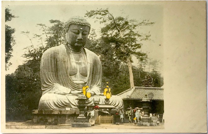
This photograph of the Daibutsu [Fig. 2] likely dates from after 1903 (due to the outward facing metal lotus flowers atop the offering table). The reverse of the card shows that it is an “undivided back,” definitively dating it previous to 1907 (a “dividing line” was introduced the following year). This also proves the design on the front of the card was purposeful, with the bottom blank half of the card reserved for correspondence; only the address and name of the recipient was allowed on the back. The photographer(s) and publisher remain unknown.
Figure 3
Title/Caption: Kamakura Kaihin Hotel Kamakura // Telephone No. 4 & 331, Kamakura // Japan
Year: 1930s
Printer: unknown
Medium: halftone print and ink on paper
Dimensions: 5 in X 3.5
The same photograph of the hotel compound was later used on paper luggage tags [Fig. 3] for the Kamakura resort. Affixed to suitcases and steamer trunks, luggage tags were very popular in the interwar period. In addition to helping sort luggage in transit, these tags signaled the cosmopolitan sophistication of the tourist and thus were often designed with bold images and bright colors. The oval inset of the Daibutsu closely mirrors the postcard design, yet this photograph of the Kamakura colossus is of a much later vintage, quite possibly dating from the 1930’s [Fig. 4].
Figure 4
The Kamakura Kaihin Hotel suffered significantdamage during the 1923 Great Kantō earthquake, but was rebuilt to its previous grandeur. The hotel would remain in operation up through World War II, until a series of fires resulted in its closing in the mid-1940s.
Notes:
*This is part of a series of posts devoted to exploring the development of a visual literacy for Buddhist imagery in America. All items (except otherwise noted) are part of my personal collection of Buddhist-themed ephemera.
[1] An overview of the cultural encounters between Germany and Japan in the field of medicine are discussed in Kim 2014. For more information on Nagayo, see Rogaski 2004, esp. pp. 136ff. The best available information on Nagayo’s role in the founding of the Kaihin-in appears to have been discussed in the Exhibition Reminiscing the Kamakura Kaihin Hotel 鎌倉海浜ホテル追憶展, organized by Hirata Emi 平田恵美 of the Kamakura Central Library, Modern Historical Materials Division 鎌倉市中央図書館近代史資料室 in 2011. I am indebted to the review of this event by Noriyuki Takagi 高木規矩郎 found here, here, and here. Other scattered information can be found here. Certainly, far more archival research needs to be done for a full account of this story. I have not been able to consult this work: Kamakura kaihin hoteru: Nipponhatsu no kaihinrizōtohoteru 鎌倉海濱ホテル 日本初の海浜リゾートホテル [The Kamakura Kaihin Hotel: Japan’s First Seaside Resort Hotel], by Shimamoto Chiya 島本千也 and Hirata Emi 平田恵美.
[2] Cook 1891: 29. A handful of other late nineteenth and early twentieth-century tourist remarks can be found here.
[3] There are versions of this postcard without the small overlay of the Daibutsu. The caption instead reads “The only resort in the Far East.” The best online collection of Kamakura Kaihin Hotel memorabilia remains here.
References:
Cook, M. B. 1891. A Sailor’s Visit to the Island Empire. New York: John R. Alden.
Kim, Hoi-eun. 2014. Doctors of Empire: Medical and Cultural Encounters between Imperial Germany and Meiji Japan. Toronto, University of Toronto Press.
Rogaski, Ruth. 2004. Hygienic Modernity: Meanings of Health and Disease in Treaty-Port China. Berkeley: University of California Press.
Additional Posts in Visual Literacy of Buddhism Series
After the Meiji Restoration, the popularity of photography began to overshadow traditional Japanese woodblock printing. Increasingly, woodblock artisans came to find employment with photography studios, adapting their technical painting skills to add vivid color to monochromatic photographs. In the beginning of the twentieth century, due to the craze surrounding Japanese picture postcards (ehagaki 絵はがき), artisans continued to ply their trade by adding translucent water-soluble pigments to these small format calotypes. One of the most famous postcard distributers was Tonboya トンボヤ, or the “Dragonfly Studio,” first opened by Yoshimura Kiyoshi 吉村清 around 1905.[1] The Tonboya storefronts in Yokohama, first located in the Isezakichō 伊勢佐木町 district before moving to the more heavily trafficked Motomachi 元町 district, were easily identifiable because of large signboards made to look like red cylindrical postal boxes (yūbinposuto 郵便ポスト) widely adopted in Japan. One side of the signboard had the word “POSTALCARDS” painted on it, while the other said ehakaki エハカキ [sic](“picture postcards”), suggesting Yoshimura catered to both foreign and domestic travelers.[2] One image that would represent the photographic interests of both groups would be the Kamakura Daibutsu, located close to the port of Yokohama [Figure 1].
Figure 1
Title/Caption: Daibutsu at Kamakura. 佛大倉鎌
Year: 1907-1918
Publisher: Tonboya トンボヤ
Medium: collotype print on cardstock, hand tinted
Dimensions: 5 in X 3.5 in
Reverse Imprint: Union Postale Universelle.[+], 郵便はかき
By setting the camera on the second landing of the paved walkway, this unknown photographer filled the frame with the image of the Daibutsu; positioning the statue frontally and symmetrically, this framing is similar to many of the images produced by Yokohama photography studios. The image depicts three figures, two women and a young child, facing the Buddhist icon in the center of the photograph. This setting might elicit other images of religious piety at this site, but the mise-en-scène is complicated by the presence of two more children, standing at each of the sides, who stare directly at the viewer. Their presence might have been obscured had it not been for the colorist who painted them in light hues of blue and pink. Notably, their casual posturing is stark contrast to staged “photo ops” of foreign travelers who try to visually suggest their domination of the Orient. Because of these elements, on the whole, we are made to feel as if the scene is staged and that we have been caught in an act of voyeurism. The women and child, positioned center-stage, engage in a orchestrated religious performance while the children at the edges observe us watching them. A rather apt visual metaphor for the Orientalist gaze, where the artist attempts to create a certain controlled vision of the East, but with “unruly” actors foiling the illusion.[3]
This postcard is not imprinted with a trademark to identify the publisher. The black ink and serif font used for the reverse, however, in addition to the guide lines provided for writing the address, all suggest this card was made by Tonboya.[4] In addition, the position of the diving line for correspondence indicates this card was printed between 1907 and 1918. If the image on the obverse was not self-evident enough, bilingual cerulean letterpress (note the impression the reverse) identifies the scene clearly: “Daibutsu at Kamakura.”
Notes:
*This is part of a series of posts devoted to exploring the development of a visual literacy for Buddhist imagery in America. All items (except otherwise noted) are part of my personal collection of Buddhist-themed ephemera.
[1] Several online Englishsources claim Tokutaro Maeda was the founder of Tonboya, but I have found no Japanese sources that confirm this. I prefer here to follow the print Japanese sources (e.g. Saitō 1985: 1), but leave the question unsettled.
[2] Several early-century postcards depicting the streets of Yokohama show this red cylindrical signboard, as seen here: The full postcard can be found here (not part of the Archive).
[3] By shooting one woman mid-stride ascending the small flight of steps, this photographer is (accidentally?) paying homage to Enami Nobukuni 江南信國 (1859—1929), but without the overal effects of sterling visual narrative.
Handy, Ellen. 1998. “Japonisme and American Postcard Visions of Japan,” in Delivering Views: Distant Cultures in Early Postcards, Christraud M. Geary and Virginia-Lee Webb, eds. Washington: Smithsonian Institution Press.
Saitō Takio 斎藤多喜夫. 1985. “Yomigaeru shinsaizen no Yokohama fūkei よみがえる震災前の横浜風景,” Kaikō no hiroba 開港のひろば, No. 12, pp. 1, 4.
Satō, Kenji. 2002. “Postcards in Japan: A Historical Sociology of a Forgotten Culture,” International Journal of Japanese Sociology, No. 11, pp. 35-55.
Yokohama Open Port Museum 横浜開港資料館, ed. 1999. Nen mae no Yokohama Kanagawa ― ehagaki de miru fūkei 年前の横浜・神奈川―絵葉書でみる風景. Tokyō: Yurindo 有隣堂.
Additional Posts in Visual Literacy of Buddhism Series
By the end of the nineteenth century the port city of Yokohama had developed into a thriving tourist destination. Consequently, numerous Japanese shops opened to cater to the needs of both domestic and foreign travelers. Perhaps surprising to a modern reader, among the prized goods offered for sale were picture postcards (ehagaki 絵はがき), the first truly commodified form of the photograph which unexpectedly became a collectors craze in the first decade of the twentieth century.[1] Around 1905, Yoshimura Kiyoshi 吉村清, the proprietor of the well-known Tokyō-based publisher Kamigataya 上方屋, started a new venture in Yokohama, called Tonboya トンボヤ, or the “Dragonfly Studio.”[2] The dragonfly was long seen as symbol of courage and strength in Japanese culture, and thus it was cherished by the samurai and bestowed the romantic name of the “Victorious Insect” (kachimushi 勝ち虫). This lore notwithstanding, Tonboya postcards – emblazoned with its distinctive dragonfly trademark – soon became some of the most famous and widely circulated postcards of the period.
Figure 1
Title/Caption: Daibutsu at Kamakura. 佛大倉鎌
Year: c. 1909
Publisher: Tonboya トンボヤ
Medium: collotype print on cardstock, hand tinted
Dimensions: 5 in X 3.5 in
Reverse Imprint: Carte Postale Post Card [+], 郵便ハガ[キ]
This image of the Kamakura Daibutsu [Figure 1] highlights the rustic setting of the colossal statue, framing the statue between sprawling tree branches and the silhouette of a sago palm. With the camera placed in the southwest corner, our unknown photographer creates a voyeuristic scene as a man in knee-high mud boots and western attire peers towards group of Japanese visitors from behind a tree. Seeing this observer from behind, we take his perspective and also gaze upon the group of Japanese visitors dwarfed by the overlooking bronze statue. The brightly colored garments of the women on the right stand in contrast to the uncolored gray shades of the men and boy on the left [Figure 2]. The boy wears a school uniform (gakuran 学ラン), a style adopted decades earlier based on French and Prussian military outfits.[3] Among this group, only a single man looks up towards the Buddhist statue. The others stand and stare at each other from several paces apart. The gives an unnatural effect to the scene, as the stationary bodies and odd spacing fails to build up a clear visual narrative. What is the relationship of these temple visitors to each other? What is their purpose for being there? As was typical of cards from this period, bilingual cerulean letterpress informs us as to the identity of the Buddhist figure, the “Daibutsu at Kamakura” (note the imression left on the reverse along the bottom edge).
Figure 2
Often, Tonboya would impress its dragonfly logo at the lower right on the front of the card, but our variant lacks this identifying element.[4] Turning to the reverse of our card [Figure 1], we still fail to easily locate the characteristic mark of the dragonfly. So, just how can this card be distinguished? The designers at Tonboya devised a creative and playful way to identify their publishing studio; they replaced the ki (キ) in hagaki (ハガキ, “postcard”) with a highly stylized dragonfly illustration [Figure 3]. Only the most attentive observer would notice this subtle alteration, but once noticed it becomes an easily identifiable marker of this studio. This creative design can be dated back to around 1909 and remained throughout Tonboya’s existence into the late 1920’s.
Figure 3
Notes:
*This is part of a series of posts devoted to exploring the development of a visual literacy for Buddhist imagery in America. All items (except otherwise noted) are part of my personal collection of Buddhist-themed ephemera.
[2] Several online Englishsources claim Tokutaro Maeda was the founder of Tonboya, but I have found no Japanese sources that confirm this. I prefer here to follow the print Japanese sources (e.g. Saitō 1985: 1), but leave the question unsettled. Another unresolved question remains the relaitonship between Kamigataya and Tonboya. It appears that Tonboya may have been a distribution name of postcards printed by Kamigataya (which continued to also publish postcards under its own name). Some sources claim Tomboya opened as early as 1904, other as late as 1907.
[4] Tonboya would also often include an identifying letter and stock number in the lower left, but this is also missing in our specimen. It is also possible to find cards with the letter and numbering system, but still lack the dragonfly icon, see here: https://www.maryevans.com [then search for the reference number 10989247]
References:
Handy, Ellen. 1998. “Japonisme and American Postcard Visions of Japan,” in Delivering Views: Distant Cultures in Early Postcards, Christraud M. Geary and Virginia-Lee Webb, eds. Washington: Smithsonian Institution Press.
Saitō Takio 斎藤多喜夫. 1985. “Yomigaeru shinsaizen no Yokohama fūkei よみがえる震災前の横浜風景,” Kaikō no hiroba 開港のひろば, No. 12, pp. 1, 4.
Satō, Kenji. 2002. “Postcards in Japan: A Historical Sociology of a Forgotten Culture,” International Journal of Japanese Sociology, No. 11, pp. 35-55.
Yokohama Open Port Museum横浜開港資料館, ed. 1999. Nen mae no Yokohama Kanagawa ― ehagaki de miru fūkei 年前の横浜・神奈川―絵葉書でみる風景. Tokyō: Yurindo 有隣堂.
Additional Posts in Visual Literacy of Buddhism Series
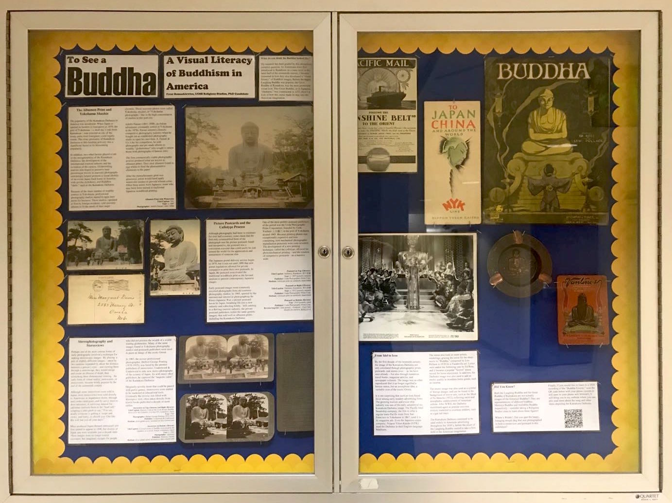
[This is a online version of my Archive exhibit at the UCSB Religious Studies Department. Many thanks to Will Chavez for his enthusiastic support and assistance.]
What do you think the Buddha looked like?
My research has been guided by this deceptively complex question. As Americans were first introduced to Buddhism on a mass level in the latter half of the nineteenth century, I became interested in how they also developed a “visual literacy” of Buddhist images. Before the happy Laughing Buddha was popular, the Great Buddha of Kamakura was the most prominent visual icon. This Great Buddha, or in Japanese, “Daibutsu,” was constructed in 1252. Here’s a look of how this statue made its way into the American imagination.
The Albumen Print and Yokohama Shashin
The popularity of the Kamakura Daibutsu in America was accidental. When Japan re-opened its borders to foreigners in 1859, the port of Yokohama – a short day’s ride from Kamakura – was selected as one of the treaty ports were foreigners could legally reside. The close proximity of Kamakura Daibutsu to this bustling port city was a significant factor in its blossoming popularity.
In addition, two other factors played a role in the recognizability of the Kamakura Daibutsu: the development of the international tourism industry and the invention of the camera. Globetrotting tourists who hoped to preserve their picturesque travels in souvenir photographs unwittingly helped promote a visual identity of an exotic Japan back home in America, with geisha, rickshaws, and Buddhist “idols,” such as the Kamakura Daibutsu.
Because of the sheer number of wealthy tourists in Yokohama, professional photography studios started to open their doors for business. These studios, operated at first by foreign residents, sold souvenir albums to fit the needs of their eager clientele. These souvenir photos were called Yokohama shashin, or “Yokohama photographs,” due to the high concentration of studios in this port city.
Adolfo Farsari (1841-1898), an Italian adventurer, eventually settled in Yokohama in the 1870s. Farsari entered a fiercely competitive photography industry when he bought out an established photography studio to open his own firm, A. Farsari & Co. Like his competitors, he sold photographs and pre-made albums to wealthy “globetrotters” who sought to return home with photographs of famous sites.
The first commercially viable photographic process produced what are known as albumen prints. They used albumen found in egg whites to bind the photosensitive chemicals to the paper.
After the monochromatic print was processed, artists would hand apply watercolor washes to provide vibrant color. Often these artists were Japanese, some who may have been trained in traditional Japanese woodblock printing.
Picture Postcards and the Collotype Process
Although photography had been in existence for over half a century, some claim that the first truly commodified form of the photograph was the picture postcard. Small and inexpensive, the postcard was a convenient souvenir that could easily be sent around the world for the appreciation and amusement of someone else.
The Japanese postal delivery service began in 1870, but it was not until 1900 that new postal regulations allowed for private companies to print their own postcards. In Japan, the postcard soon rivaled the traditional woodblock print as the favored medium to present contemporary Japanese images.
Early postcard images were commonly recycled photographs from old souvenir photography studios. In 1905, spurred by the international interest in photographing the Russo-Japanese War, a picture postcard boom hit Japan, breathing life into a new industry and collecting hobby. Still catering to a thriving tourism industry, the private postcard publishers reshot the same generic imagery that sold well as albumen prints, including the Kamakura Daibutsu.
One of the most prolific postcard publishers of the period was the Ueda Photographic Prints Corporation, founded by Ueda Yoshizō上田義三 in the port of Yokohama around 1905. Because printing photos was exceptionally expensive and time consuming, new mechanical photographic reproduction processes were soon invented. The development of a new printing technique, called the collotype, allowed for photomechanical printing – and the creation of inexpensive postcards – on a massive scale.
Stereophotography and Stereoviews
Perhaps one of the most curious forms of early photography involved a technique for making stereoscopic images. By placing a pair of slightly different images – taken by two cameras separated by about the distance between a person’s eyes – and viewing them through a stereoscope, they would merge and create an illusion of depth, thus mimicking three dimensional viewing. An early form of virtual reality, stereocards, or stereoviews, became wildly popular by the end of the nineteenth century.
Although some stereoviews were sold in Japan, most stereoviews were sold directly to Americans in department stores, through mail-order catalogues, and by savvy door-to-door salesmen. A surviving manual for salesman instructs them in the “hard sell,” scripting a sales pitch to say: “You see, nearly everyone is getting a ‘scope and views, and really, so should you. One like this will last you all your days.”
Mass produced Japan-themed stereocard sets first started to appear in 1896, but dozens of Japan sets were available just a decade later. These images were no longer tourist souvenirs, but imaginary escapes for people who did not possess the wealth of a world-touring globetrotter. Many of the same images found in Yokohama photography studios and postcards publishers were used to paint an image of the exotic Orient.
In 1903, the novice professional photographer, Herbert George Ponting (1870-1935), was hired by the premier publishers of stereoviews, Underwood & Underwood to take new stereo-photographs of the scenery of Japan. As with many other publishers, he captured the “majestic calm” of the Kamakura Daibutsu.
Originally novelty items that could be paired with parlor games, stereoviews soon started to be marketed as educational tools. Eventually the reverse was filled with descriptive text, often taken directly from tourist books published a decade or more earlier.
From Idol to Icon
By the first decade of the twentieth century, the image of the Kamakura Daibutsu not only circulated through photographic prints, postcards, and stereoviews – as we have seen already – but also through numerous travel books, magazine articles, and newspaper columns. The image was so often reproduced that it no longer signified a bronze statue, but an amorphous idea, a veritable icon of the exotic Orient.
It is not surprising that such an icon found favor among early modern advertising firms. The growing tourism and cruise ship industry was one of the early adopters of the Kamakura Daibutsu image. The Pacific Mail Steamship company, the first to offer a regular trans-Pacific route from San Francisco to Yokohama in 1867, used it in its magazine ads. Even the Japanese cruise company, Nippon Yūsen Kaisha (NYK) used the Daibutus in their English-language brochures.
The statue also took on more artistic renderings, gracing the cover for the sheet music to “Buddha,” composed by Lew Pollack in 1918 for a Vaudeville act. Lyrics were added the following year by Ed Rose, and it became a popular “foxtrot” dance record for home enjoyment. In addition, the Daibutsu image was also used to add an exotic quality to mundane home goods, such as incense.
The exotic image was also used as a symbol of foreign danger, and can be found in the background of movie sets, such as the Mask of Fu Manchu (1932), reflecting racist and xenophobic undercurrents of American culture. After WWII, the Daibutsu manifested again as popular souvenir trinkets marketed to overseas soldiers, such as cigar ash trays.
The Kamakura Daibtusu continued to be used widely in American advertising throughout the 1950’s, before the allure of the Laughing Buddha started to take a firm hold in the American imagination.
Did You Know?
Both the Laughing Buddha and the Great Buddha of Kamakura are not actually images of the historical Buddha!! They are representations of different buddhas, Maitreya Buddha and Amitābha Buddha respectively – consider taking a Religious Studies class to learn about these figures!
Where’s Waldo?: Did you spot the happy, lounging temple dog that was photographed in both a stereoview and postcard in this exhibition?
Publisher: Ueda Photographic Prints Corp. 上田写真版合資会社
Medium: collotype print on cardstock, hand tinted
Dimensions: 5.5 in X 3.5 in
Reverse Imprint: Carte Postale [Type 2], Made in Japan, 郵便はかき
The unknown photographer of this image set the camera slightly off-center, positioning it just to the left of the shoulder of the three-step stairway leading to the first landing. From this position the Daibutsu does not peer directly at the viewer, but slightly off to the side, creating a more restful, nonconfrontational composition. The Japanese visitors add to this genial environment, casually positioning their bodies in front of the Buddhist statue [Figure 2]. It appears as if one woman is fixing her hair as she casually looks back towards the camera. Another, older woman, appears to look dotingly upon a child who is plafully placing a foot on the fence around the coin box. Unlike other staged photographs where Japanese supplicants are made to kneel in prostration in front of the Daibutsu, this presents a mundane scene. All of these elements combine to create a spontaneous and unfussy mise en scène, a seeming “snap shot” of the daily affairs on temple grounds.
Figure 2
The hand coloring is fairly typical of postcards of the period, with the Japanese garments painted in vibrant colors. We do not see pink cherry blossoms painted behind the Daibutsu, thus directing our attention to the brightly clothed visitors in the foreground. The reverse of the card does not indicate the publisher, but the design corresponds to the Type 2 back of Ueda publishing, dating this card between 1907-1918. The reverse is slightly unusual since the “Made in Japan” mark is on the lower edge of the card and not in the dividing line splitting the correspondence and address sections. Another small detail suggesting Ueda as the publishers is the coloring of the child clothing (pink with a red dot) as we find on other Ueda cards. In bold, cerulean letterpress (not the slight embossing on the back of the card from the lettering), the caption simply states the object and location, in English and Japanese – Daibutsu, Kamakura.
*This is part of a series of posts devoted to exploring the development of a visual literacy for Buddhist imagery in America. All items (except otherwise noted) are part of my personal collection of Buddhist-themed ephemera.
Additional Posts in Visual Literacy of Buddhism Series
Many early Japanese turn-of-the century postcards were colorful illustrations, cartoons, or woodblock prints, some of which were made by famed Japanese artists, but these traditional arts forms would soon lose favor to the photograph. One of the shifts that ushered in the visual dominance of photographic postcards was the introduction of private company postcards 私製はがき, which had been illegal to print until new postal regulations were introduced in 1900. In addition, the adoption of a new photomechanical printing technique, called the collotype, allowed for the wide availability of inexpensive photographic images of Japan.
Many early photographic postcards first circulated as albumen or silver gelatin prints sold by commercial photography studios. Early postcard publishers experimented with the orientation of the old images on the new format. By placing the image on the top half of a vertically oriented card, the bottom half could be reserved for the message [Figure 1]. Strategically designed areas or blank spots were necessary on the front of the card, because the reverse of the card was reserved solely for the name and address of the recipient until 1907. The regulations were determined by the Union postale universelle, the body which oversaw the postal system worldwide. These postcards, known today as “undivided back” cards, were replaced by “divided back” cards in 1907 in Japan, where the message could be included on the reverse of the card.
Inscription: Union Postale Universelle. CARTE POSTALE, 萬國郵便聯合端書
The image depicts a wide angle view of the Daibutsu taken from the third landing. The positioning of the camera shows the rustic, yet landscaped grounds surrounding the Daibutsu statue. Lacking the presence of people, this bucolic setting exhibits a more quiet moment of the famous tourist destination. On the right, the supports and roof of the ablution pavilion stick out from under an evergreen tree. The water basin (chōzubachi 手水鉢) for washing hands is found underneath (dating from 1749).
The photographer of this image is debated. Older studio albumen prints of this image are imprinted with “661 Daibuthu [sic] at Kamakura.” This numbering is consistent with the studio catalogue of Tamamura Kōzaburō 玉村康三郎 (1856-1923?)(See Bennett 2006: 152), but other sources attribute this image to Ogawa Kazumasa 小川 一眞 (1860-1929). (A similar, but not exact, photo has been identified in an Ogawa studio album). This exemplifies the difficulty in determining the correct attribution and age of old Daibutsu photographs, and more research still needs to be done.
Moreover, because the publishers of the postcard did not imprint their name on the back, it is difficult to tell who printed this tourist souvenir. The reverse of this card is bordered by an ornamental filigree-like design in umber brown ink. This card is an example of an “undivided back,” since no line appears separating the sections on the back where the correspondence and address would later come to be written. This functions now as an easy identifier for dating old postcards, with this exemplar dating between 1900 and 1907. (The photograph was probably taken in the mid-to-late 1890s). In addition, a small scalloped square appears in the top right corner, indicating the location to affix the necessary postage.
*This is part of a series of posts devoted to exploring the development of a visual literacy for Buddhist imagery in America. All items (except otherwise noted) are part of my personal collection of Buddhist-themed ephemera.
Additional Posts in Visual Literacy of Buddhism Series
Collecting postcards became a national craze in Japan in the first decade of the twentieth century – and caused at least one riot. Yokohama, home to many of the oldest and most important Japanese tourist photography studios, became a major center of postcard production and the Ueda Photographic Prints Corporation 上田写真版合資会社, founded by Ueda Yoshizō上田義三 in the famed city port, was one of a handful of premier Japanese picture postcard publishers. Ueda’s early sets of cards included photographs of the Kamakura Daibutsu, but they and their business rivals continued to produce new views of this ancient colossus.
Professional and amateur photographs had long shot the Daibutsu frontally from long and medium distances. A few took photographs from the southwest corner, or even from behind, but images of the Daibutsu from the southeast were uncommon (although not unknown) likely because the temple landscaping did not easily allow for a person to position himself. The grounds of Kōtoku-in 高徳院, the temple where the Daibutsu resides, had continuously undergone renovations since Western tourists discovered it in the 1860’s, slowly opening up the areas around the statue and providing better “picturesque” viewing. One unknown photographer from Ueda was able to take a position in the southeast corner and take a photograph [Figure 1] – one of the very few from this angle.
Figure 1
Title/Caption: Daibutsu, Kamakura. 佛大倉鎌
Year: c. 1912 [postally unused]
Publisher: Ueda Photographic Prints Corp. 上田写真版合資会社
Medium: collotype print on cardstock
Dimensions: 5.5 in X 3.5 in
Reverse Imprint: Carte postale – Postkarte – Post Card [Type 5], Made in Japan, 郵便はかき
This postcard image is also one of the few photographs that does not incorporate any people in its composition, a technique which typically assisted the viewer in gauging and appreciating the sheer size of the statue. Only the most astute observer would note that the photograph is not devoid of all beings – there is a dog resting at the stone base of the statue [Figure 2]. The dog’s distinctive head patterning and white body suggests this may be the same dog photographed in two olderstereoview cards, who is seen mingling with temple visitors and tourists. Serene and relaxed, both the Daibutsu and dog appear to be enjoying the relative quiet of the scene.
Figure 2
The Ueda crest on the reverse along with the distinctive multilingual printing clearly reveals this card to be part of the Ueda Corp. stock published after 1907, possibly around 1912. It is difficult to determine when the photograph was taken, but the presence of the dog suggests it was taken sometime after the first few years of the turn of the century, when the stereoviews were taken. While this is one among a dozen or more Japanese picture postcards produced of the Daibutsu before 1923 (when the Kantō earthquake destabilized the Japanese postcard industry), it remains one of the most unique.
*This is part of a series of posts devoted to exploring the development of a visual literacy for Buddhist imagery in America. All items (except otherwise noted) are part of my personal collection of Buddhist-themed ephemera.
Additional Posts in Visual Literacy of Buddhism Series
The Japanese postal delivery service was initiated in 1871 and soon joined the Universal Postal Union (soon to be known formally as Union Postale Universelle) in 1877, thus permitting the sending and receiving of international mail. Until the start of the twentieth century, however, all postcards were issued by the Japanese government as private companies were prohibited from publishing their own cards. After legal permission was granted in 1900, private companies soon embarked on mass-scale printings of picture postcards (ehagaki 絵はがき). The postcard soon rivaled the traditional woodblock print as the favored medium to present contemporary Japanese images.[1] Furthermore, while many early postcards were illustrated with drawings, photographic images soon dominated the medium and are considered the earliest commodified forms of the photograph.[2] This was spurred by the development of a new printing process, known as the collotype, which allowed for photomechanical printing on a massive scale. Several themes emerged as popular favorites, including ones that may sound odd to modern purchasers of postcards, such as “natural disasters” and “current events.” Not surprisingly, with the advent of the thriving tourism industry, “scenic views” (fukei 風景) emerged as a favorite visual genre for many domestic Japanese tourists and foreign travelers.
Since a driving force behind the early interest in postcards was the acquisition of inexpensive photographs, it seems only natural that several picture postcards would be reprints of old photographic stock. The premier Japanese photographer of his time, Tamamura Kōzaburō 玉村康三郎 (b. 1856), was commissioned in the 1890’s to produce a then-reported one-million hand-colored albumen prints (though more recent estimates place the number of prints at approximately 350,000) for the multi-volume work Japan: Described and Illustrated by the Japanese. He enlisted the help of his competitor, Kusakabe Kimbei 日下部金兵衛 (1841-1934), to finish the massive order. Scholars have only recently begun to identify Kimbei’s photographs found within the publication. The postcard image of the Great Buddha of Kamakura [Figure 1] is now considered a Kimbei photograph. The original image was scaled down and slightly cropped to fit on a standard size postcard.
Figure 1
Title/Caption: NA
Year: 1900-1907
Photographer: Kusakabe Kimbei 日下部金兵衛 (1841-1934)
Medium: collotype print on cardstock, hand tinted
Dimensions: 5.5 in X 3.5 in
Inscription: Union Postale Universelle. CARTE POSTALE, 萬國郵便聯合端書
There is no caption identifying the statue or location on the postcard, but the Kamakura Daibutsu was certainly well known in the early twentieth century. In the coming years, however, it would become standard practice to include letterpress captions, often both in English and Japanese, to describe the scene. The fine reticulation pattern and matte cardstock identifies this image as a photomechanical reproduction, known as a collotype (korotaipu コロタイプ). As with standard albumen and silver gelatin photography, early postcards were hand-tinted with water-color washes.
The small margin at the bottom of the card was left for correspondence. Before 1907, the Union Postale Universelle required the entire reverse of the postcard be used for the address and name of the recipient, thus early publishers would leave blank space for a brief messages on the front of the card. Because of this limitation, the correspondence was typically very short, with foreign travelers often briefly commenting on their sightseeing excursions.
The reverse of this card is bordered by an ornamental filigree-like design in umber brown ink. This card is an example of an “undivided back,” since no line appears separating the spaces on the back where the correspondence and address would later come to be written. This functions now as an easy identifier for dating old postcards, with this exemplar dating between 1900 and 1907. In addition, a small scalloped square appears in the top right corner, indicating the location to affix the necessary postage.
Notes:
*This is part of a series of posts devoted to exploring the development of a visual literacy for Buddhist imagery in America. All items (except otherwise noted) are part of my personal collection of Buddhist-themed ephemera.
Saitō Takio 斎藤多喜夫. 1985. “Yomigaeru shinsaizen no Yokohama fūkeiよみがえる震災前の横浜風景,” Kaikō no hiroba 開港のひろば, No. 12, pp. 1, 4.
Satō, Kenji. 2002. “Postcards in Japan: A Historical Sociology of a Forgotten Culture,” International Journal of Japanese Sociology, No. 11, pp. 35-55.
Yokohama Open Port Museum 横浜開港資料館, ed. 1999. Nen mae no Yokohama Kanagawa ― ehagaki de miru fūkei 年前の横浜・神奈川―絵葉書でみる風景. Tokyō: Yurindo 有隣堂.
Additional Posts in Visual Literacy of Buddhism Series


 The photograph of the Daibutsu by Esaki (or one of his studio assistants) depicts the bronze statue from the southwest corner, an uncommon, but not unprecedented angle. More relevant to the site’s religious heritage, the photograph shows a line of Japanese pilgrims (jinreisha 巡礼者) in front of the Daibutsu, easily identified by their broad circular sedge hats and walking staffs carried over their shoulders [Fig. 3]. The mise-en-scène is more relaxed than reverent. The lead pilgrim, who holds his hat in his hand, appears to read the small rectangular sign perched on the pedestal (which, coincidentally, forbids climbing on the statue), while his fellow travelers casually stand conversing with one another. Only the temple priest by the offering table glances directly towards the camera.[4] This mundane expression of religious piety stands in contrast to the highly orchestrated images of devotion sometimes staged by Western photographers. Significantly, the distinction between Japanese pilgrim and tourist is often blurred, as both can engage in similar activities at a pilgrimage site, including visits to the temple souvenir shop.


 A variant style for “Carte Postale” can also be found. Note the stamp box is vertical.


 Akanishi (Kobe 神戸)
 Asahidō (Kyoto 京都)
 Benrido 便利堂 (Kyoto 京都)[no trademark, but uses distinctive font –
  Hōeidō 保永堂 (Kamakura 鎌倉?)
 Naniwaya Co. 浪華屋 (Kanda, Tokyo
  Nisshinsha (Tokyo
  S.N. Banshiudo
  Taisho Hato Brand 大正鳩ブランド (Wakayama
  Tōdai-ji 東大寺 (Nara 奈良)