Listen to the Victor Record’s 1920 recording of Pollack and Rose’s “Buddha” here:
What is the sound of the “Orient”? As Edward Said has shown, the “Orient” is more of an imaginary idea than a physical location. Because of this, several musical tropes have emerged in American consciousness that create an “Oriental atmosphere,” perhaps none more famous than the nine-note “Oriental riff” (da-da-da-da dah-dah, dah-dah daah). This simple tune became widely popular in the 1910s and was utilized, for example, in numerous racially stereotyped cartoons of the 1930’s through the 1950’s[1].
It should be remembered, however, that before the widespread popularity of the phonograph, music still had to be played live to be heard. The publishing and selling of sheet music for home use was still widely practiced in the early twentieth century and because the American working class still clamored for the exotic Orient, musicians continued to compose “yellowvoice” Orientalist music.[2]
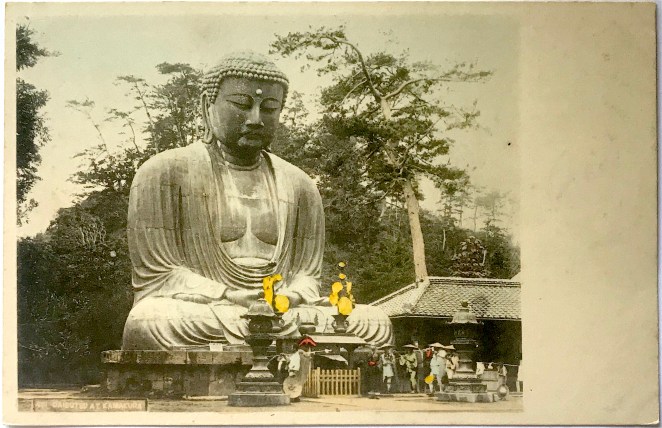
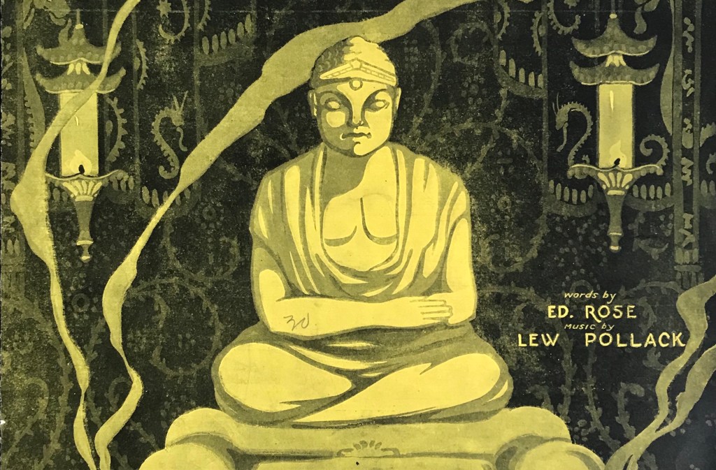
Early in his career, the composer and Vaudeville accompanist, Lew Pollack (1895-1946), started to experiment with Orientalist musical tropes, including a prototype of the Oriental riff. In 1918, he composed a piece entitled “Buddha” for an act performed by the singing and dancing “Mellette Sisters,” Helen and Rosalie (he would go on to marry Helen in 1921).[3] Lyrics were added to the musical composition by Ed Rose (1875-1935) and the work was published in 1919 by McCarthy & Fisher, Inc. [Figure 1].
Figure 1
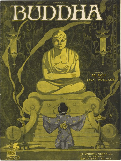
- Title: Buddha [Operatic Edition]
- Date: 1920 (date on reverse)[4]
- Cover Artist: Unknown
- Composer: Lew Pollack (1895-1946)
- Lyricist: Ed Rose (1875-1935)
- Publisher: McCarthy & Fisher Inc. (NY)
Given the title of the composition and the accompanying lyrics, it is not surprising to see that a Buddhist figure graced the cover of the sheet music. The cover depicts a scene of religious devotion, as a woman in traditional Japanese dress is positioned kneeling with her arms outstretched praying to the Buddhist image. A pair of incense burners beside the supplicant cast fragrant smoke trails into the air, while the background is festooned with decorative Asian motifs and ornamental lanterns. The overall golden hue of the scene is punctuated by the vibrant purple garment, focusing the viewer’s eye on the woman. The unknown artist employed these visual tropes to establish a setting of exoticism, femininity, and sensuousness – all established visual cues of the Orient.
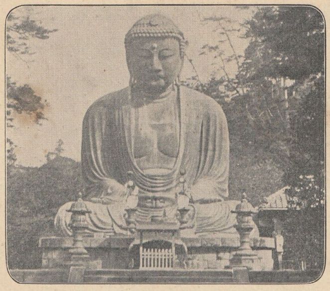
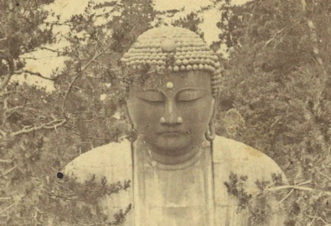
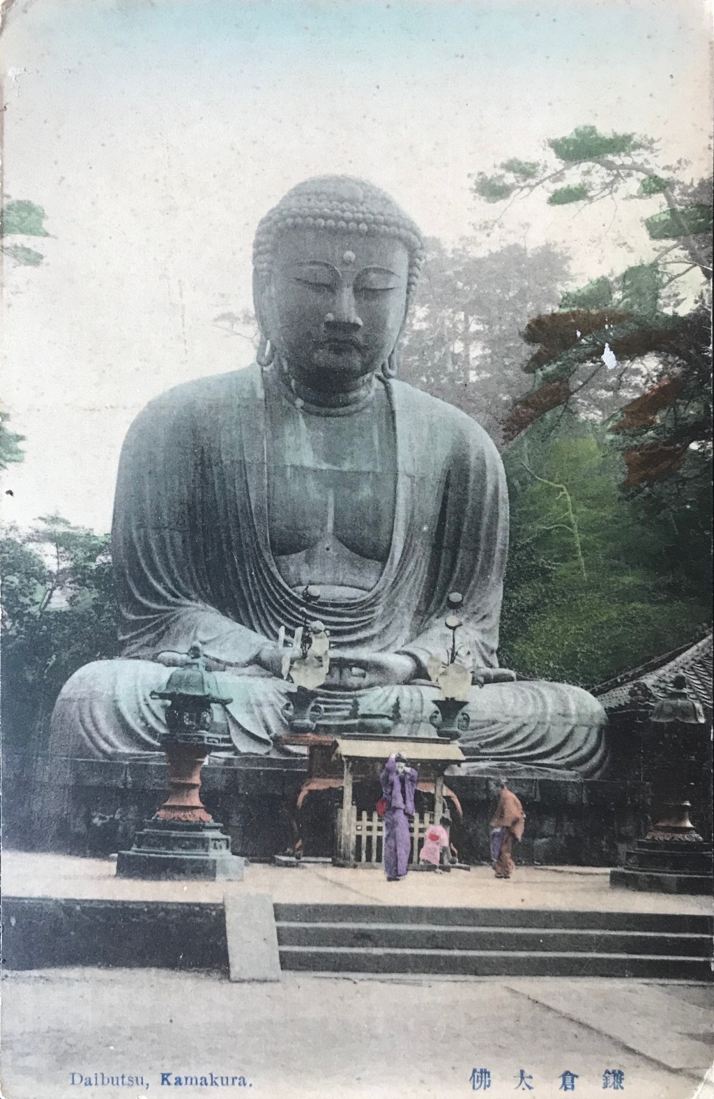
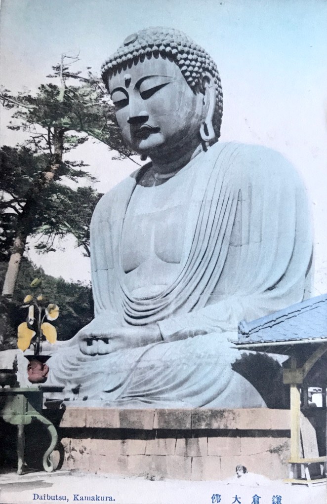
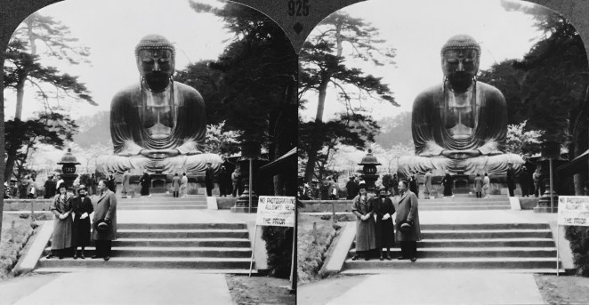
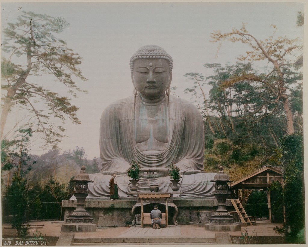
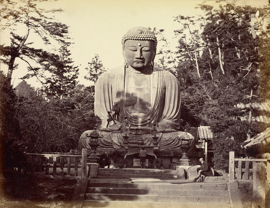
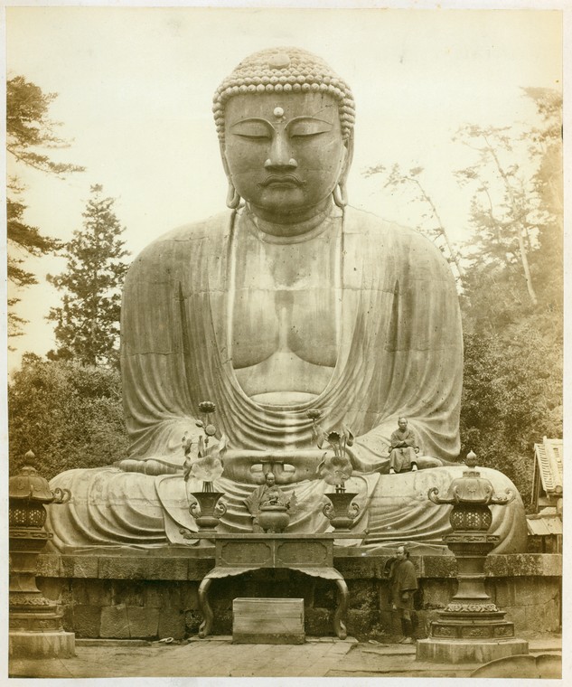
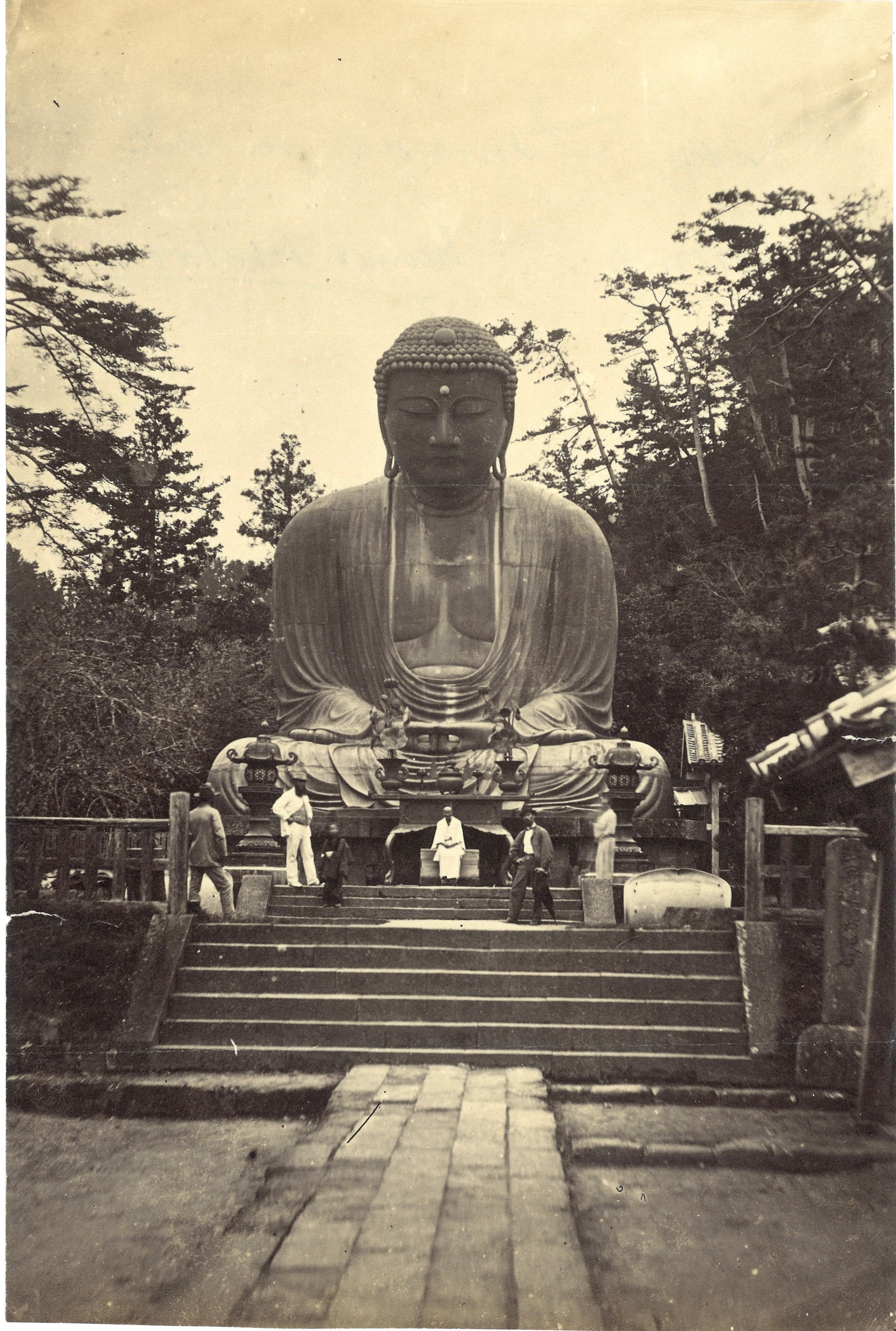
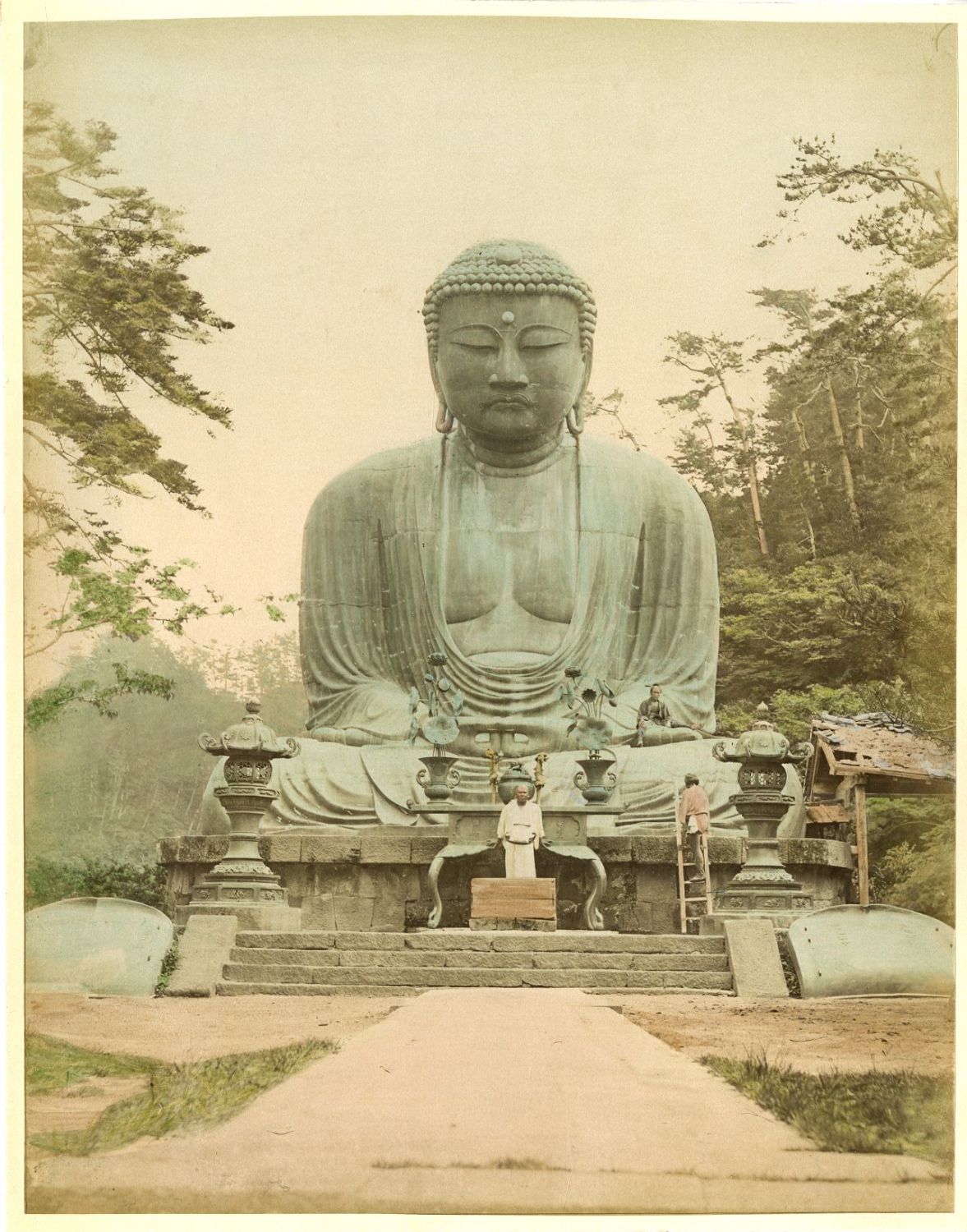
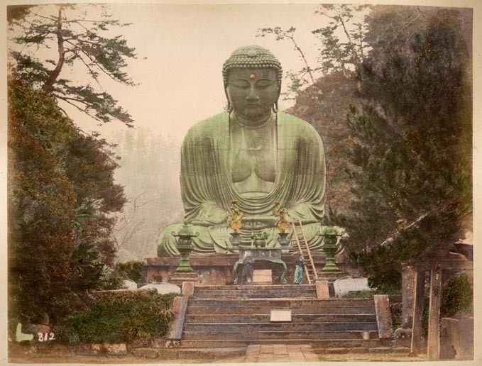
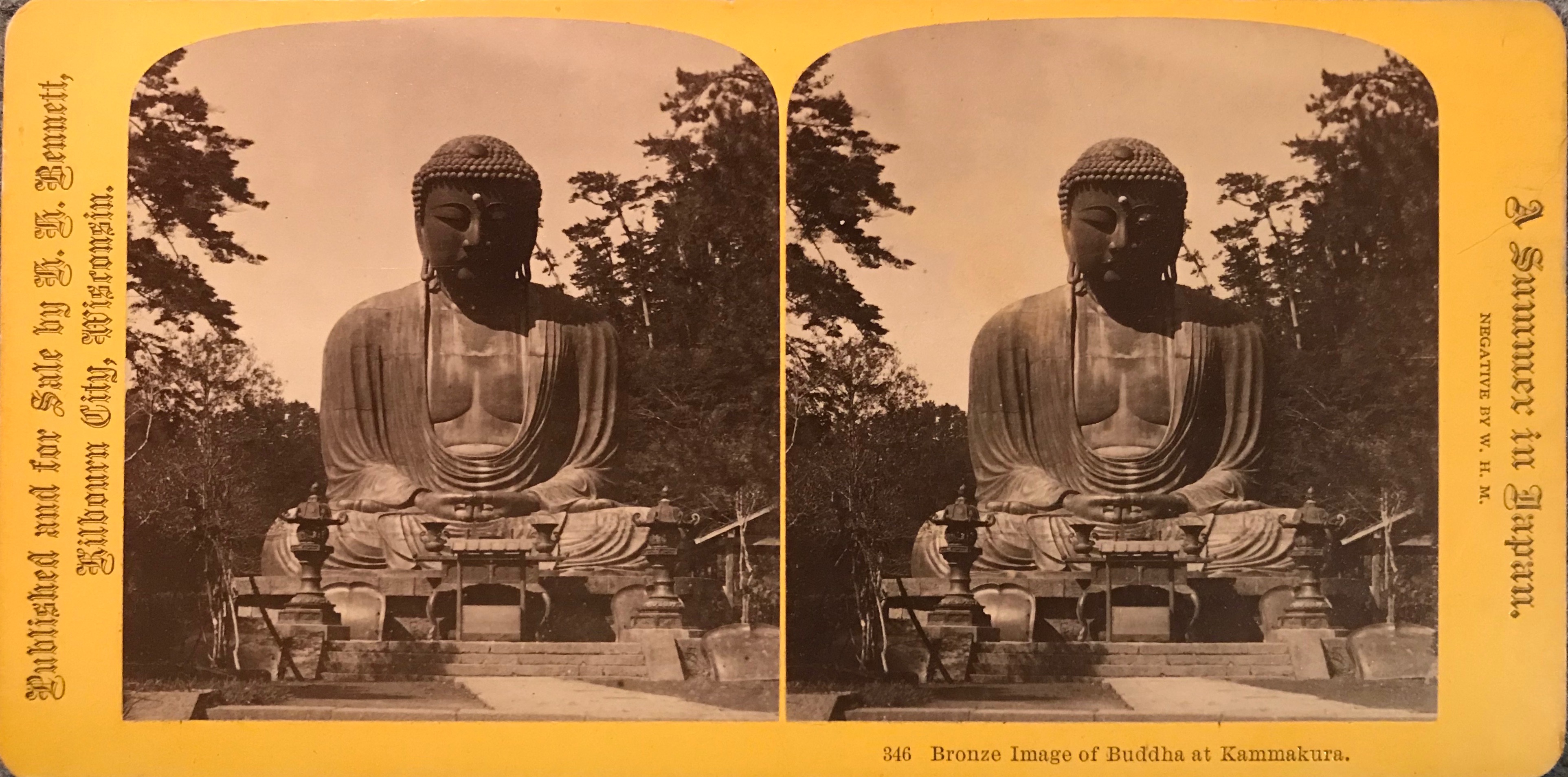
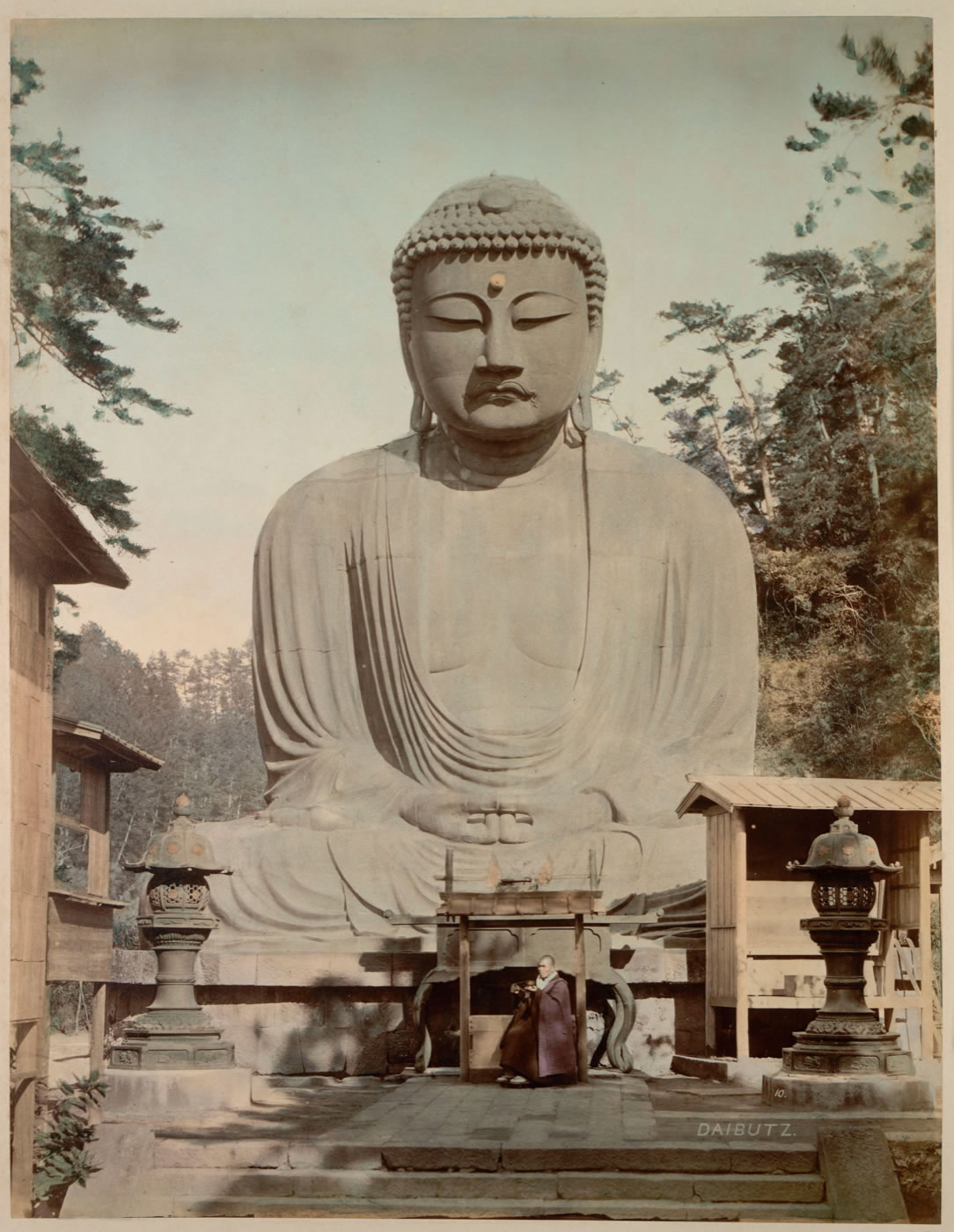
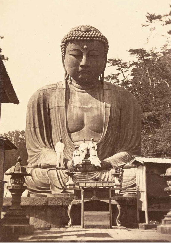
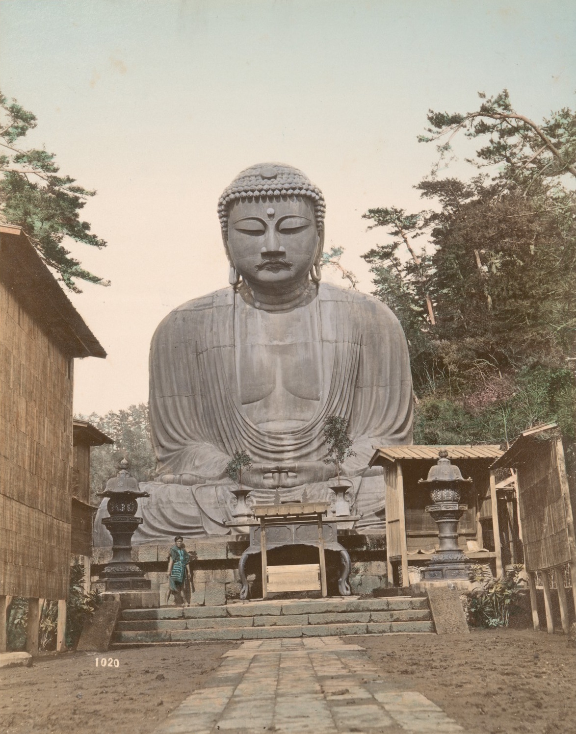
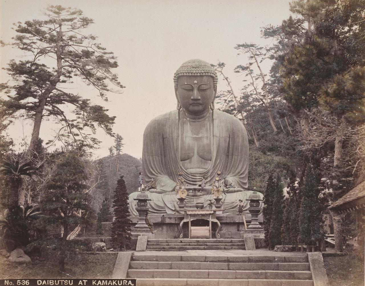
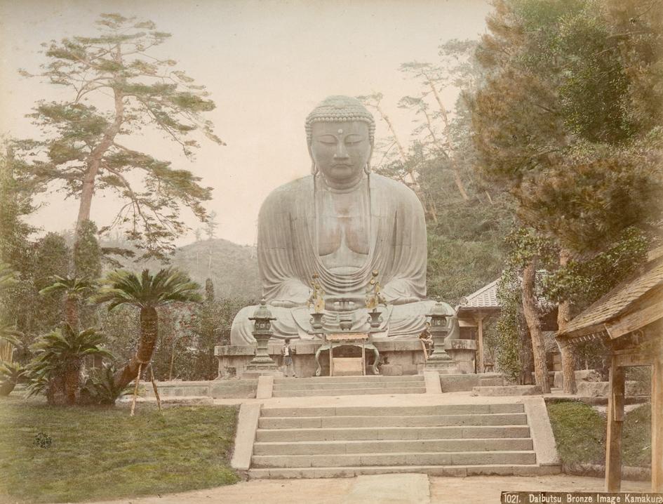
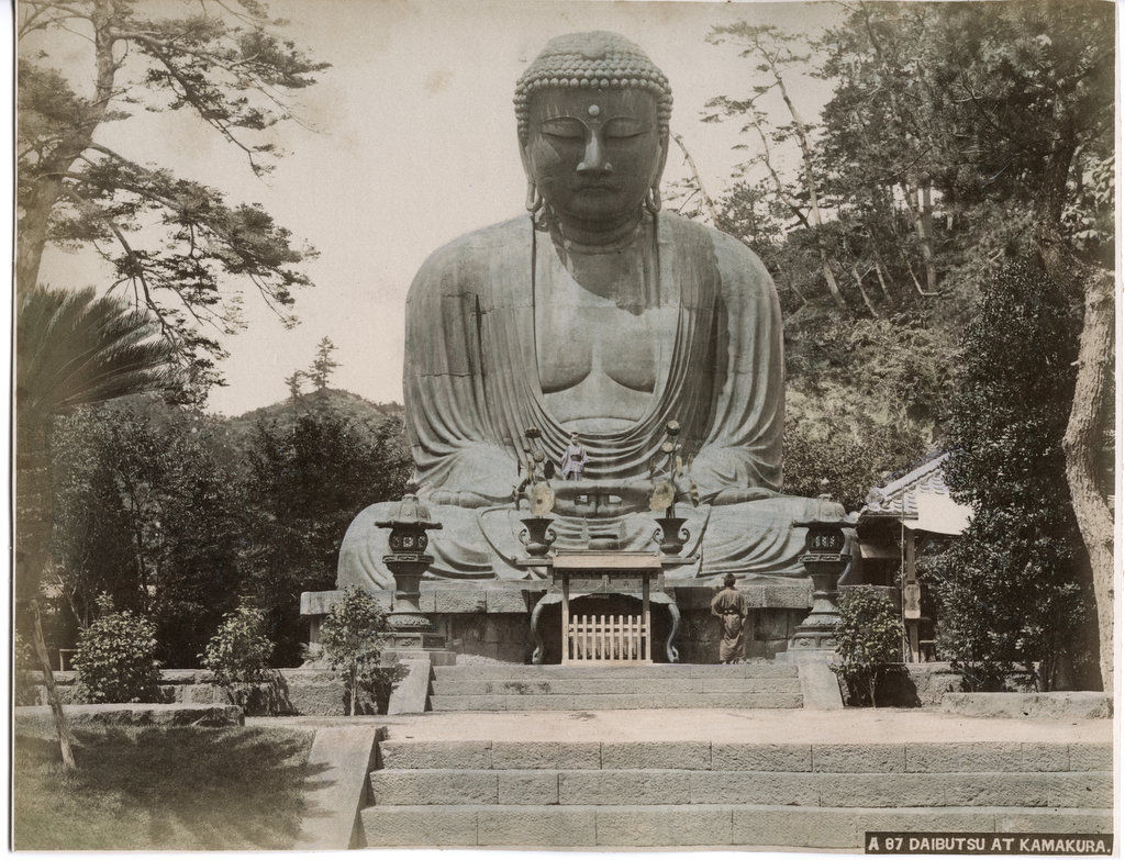
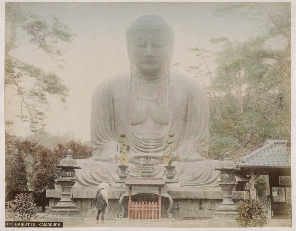
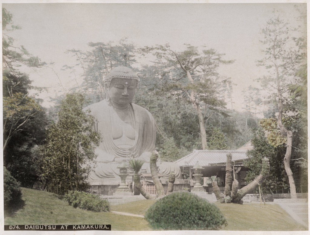
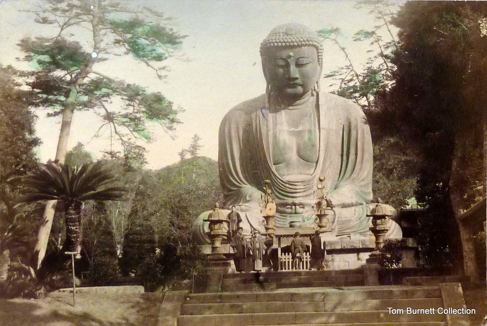
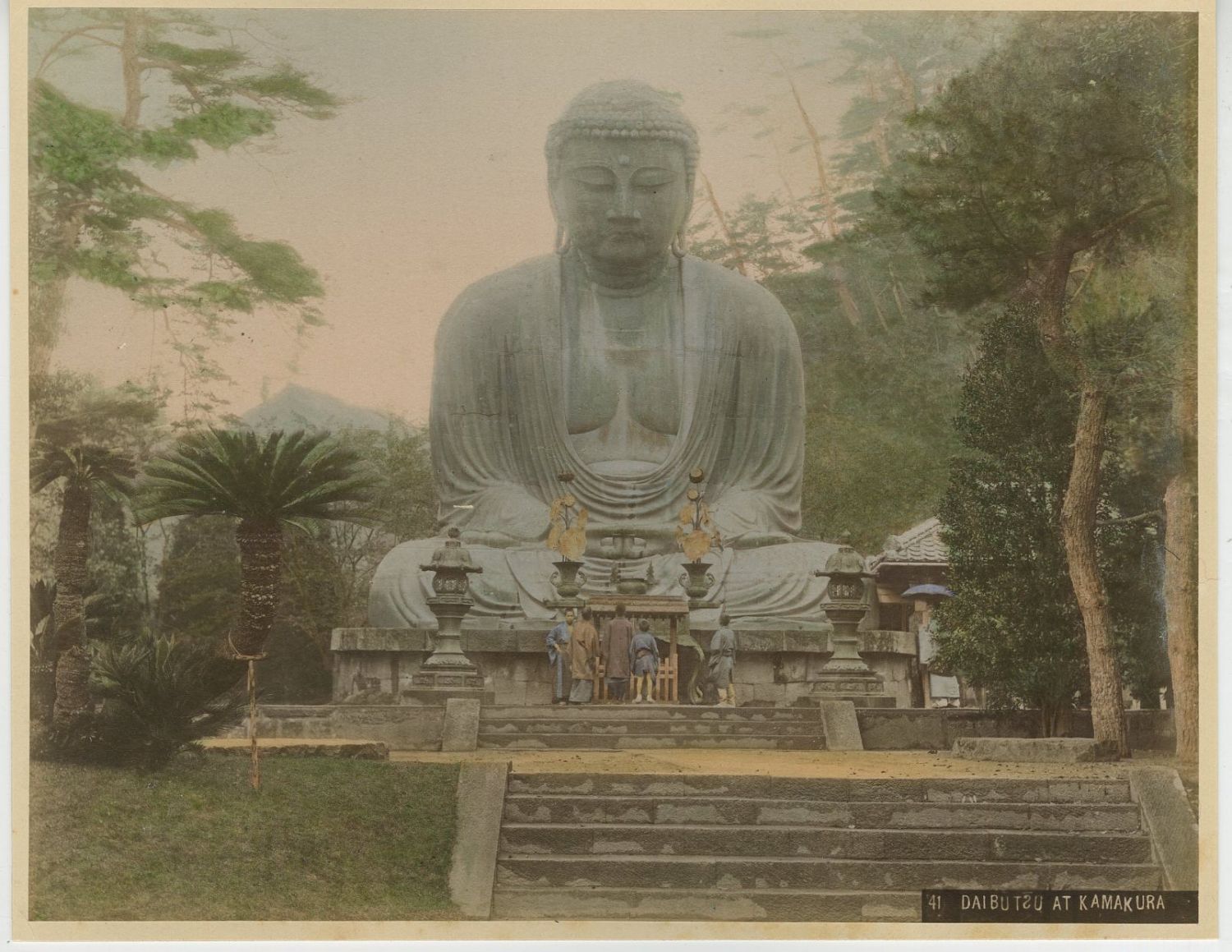
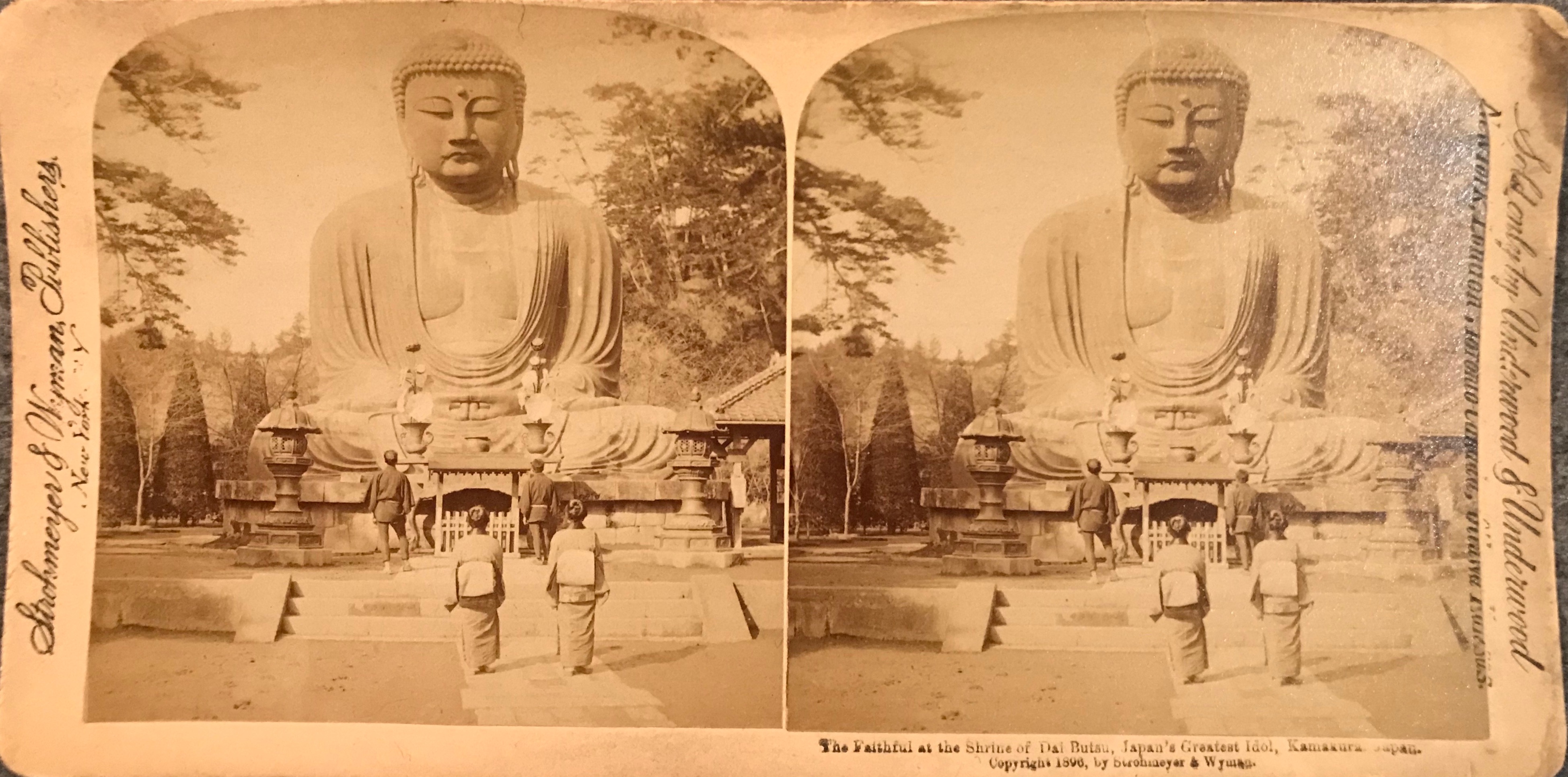
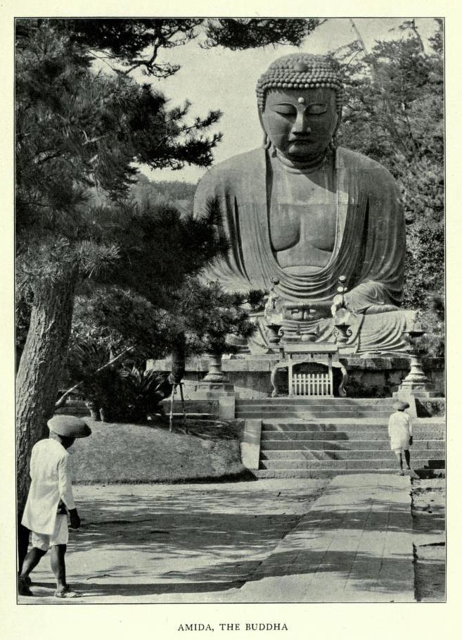
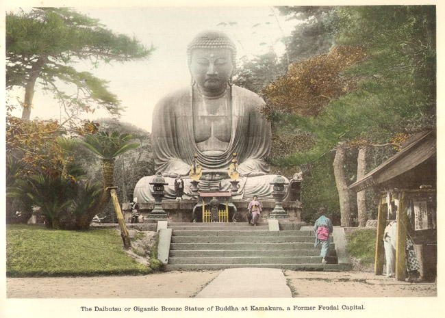
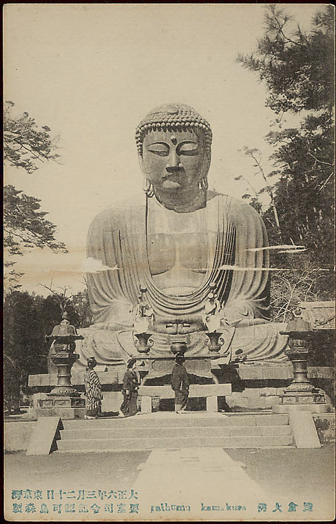
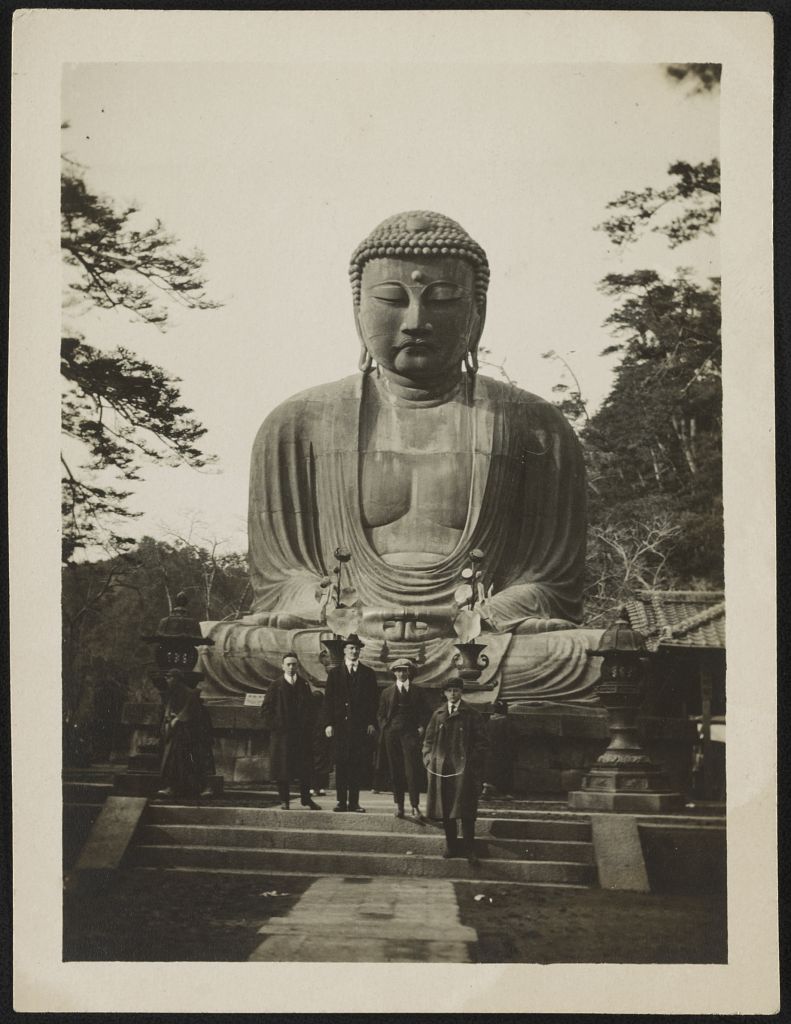
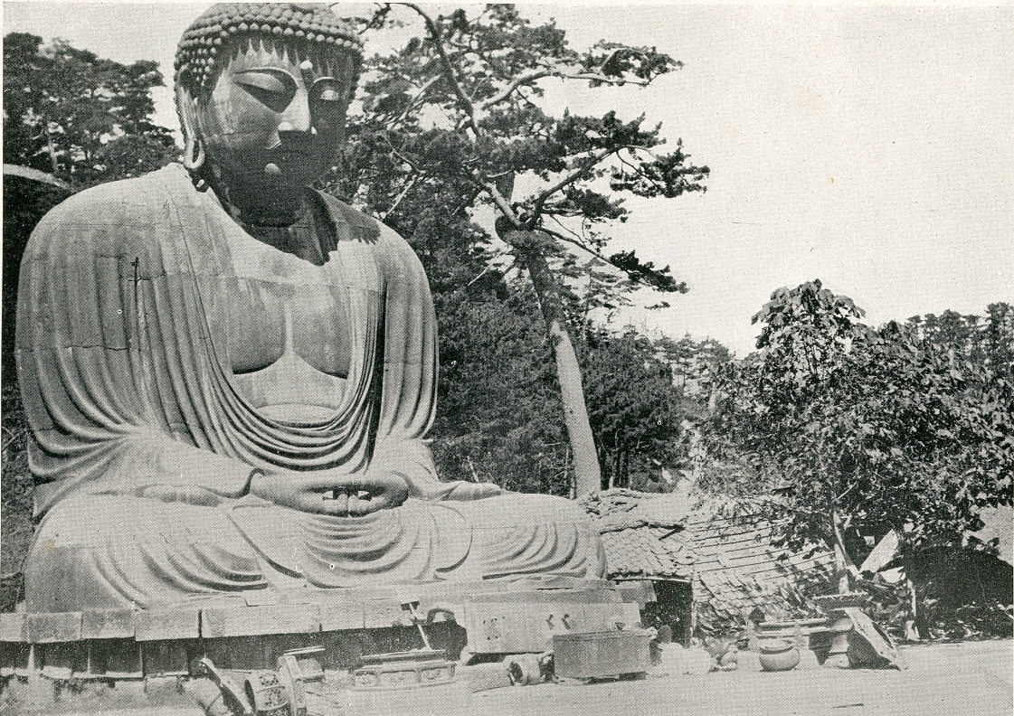
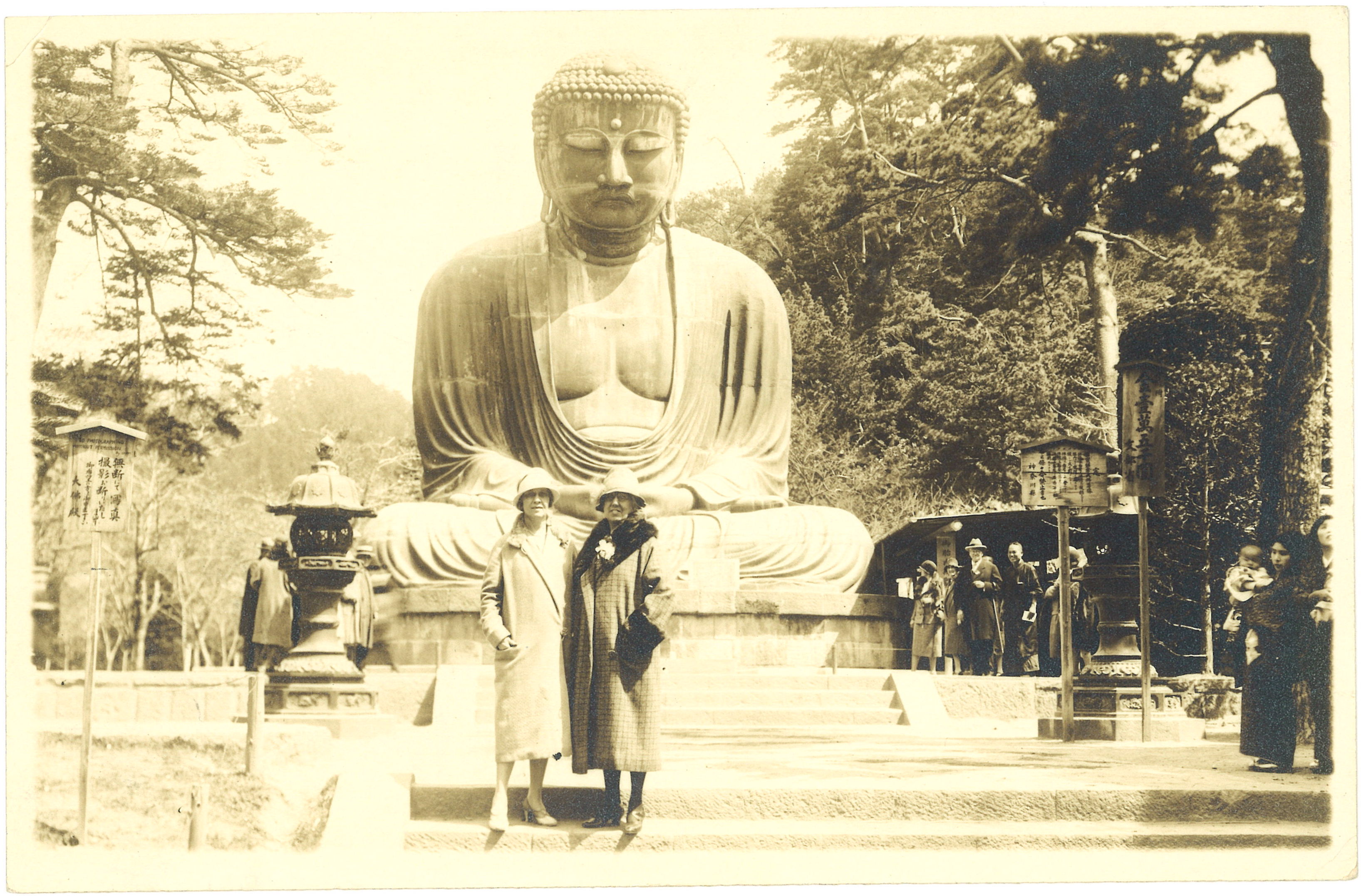
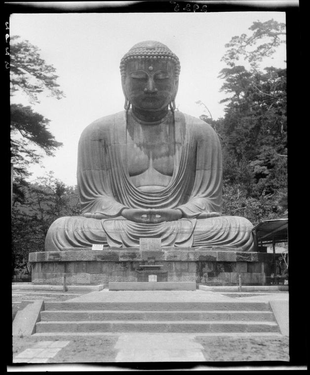
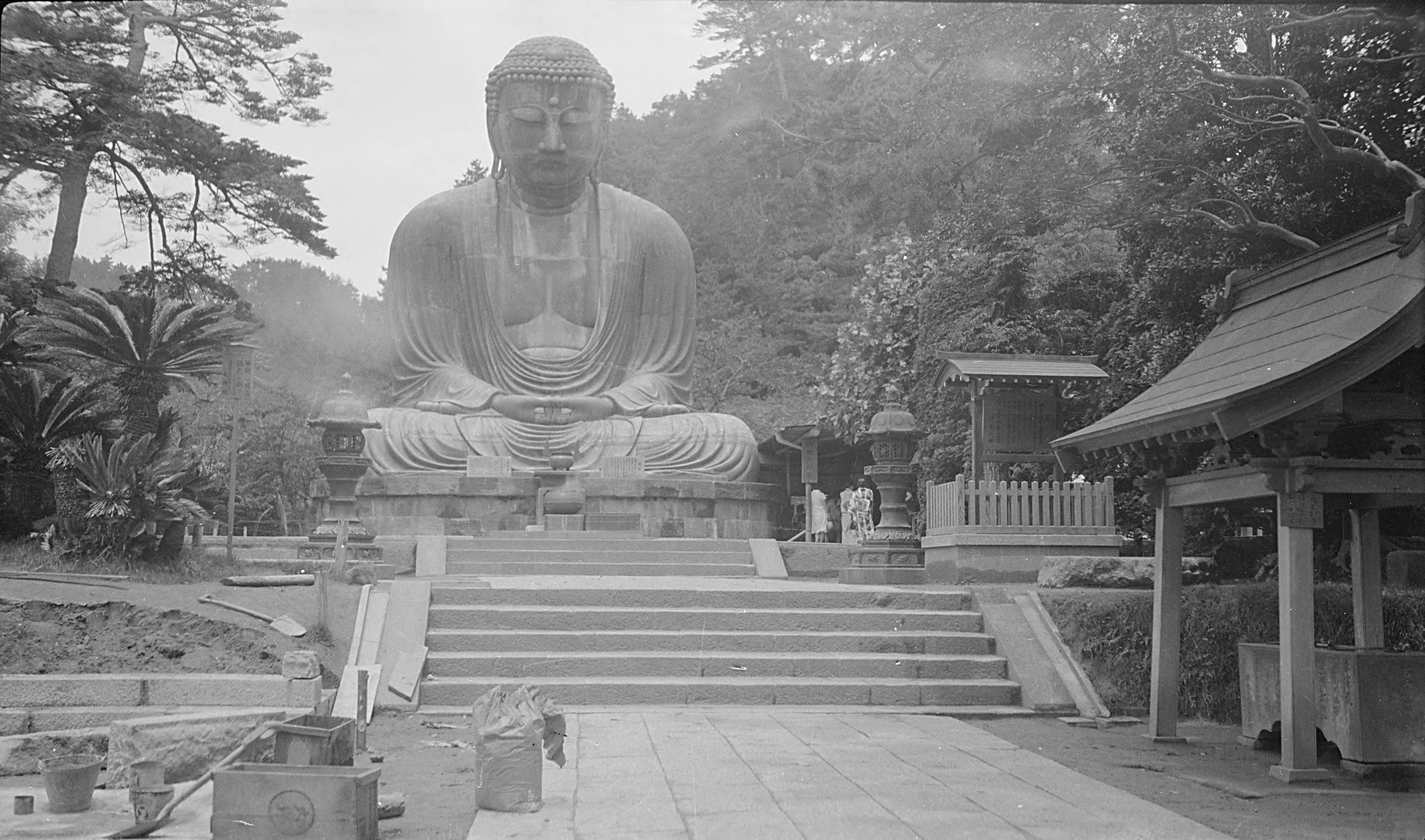
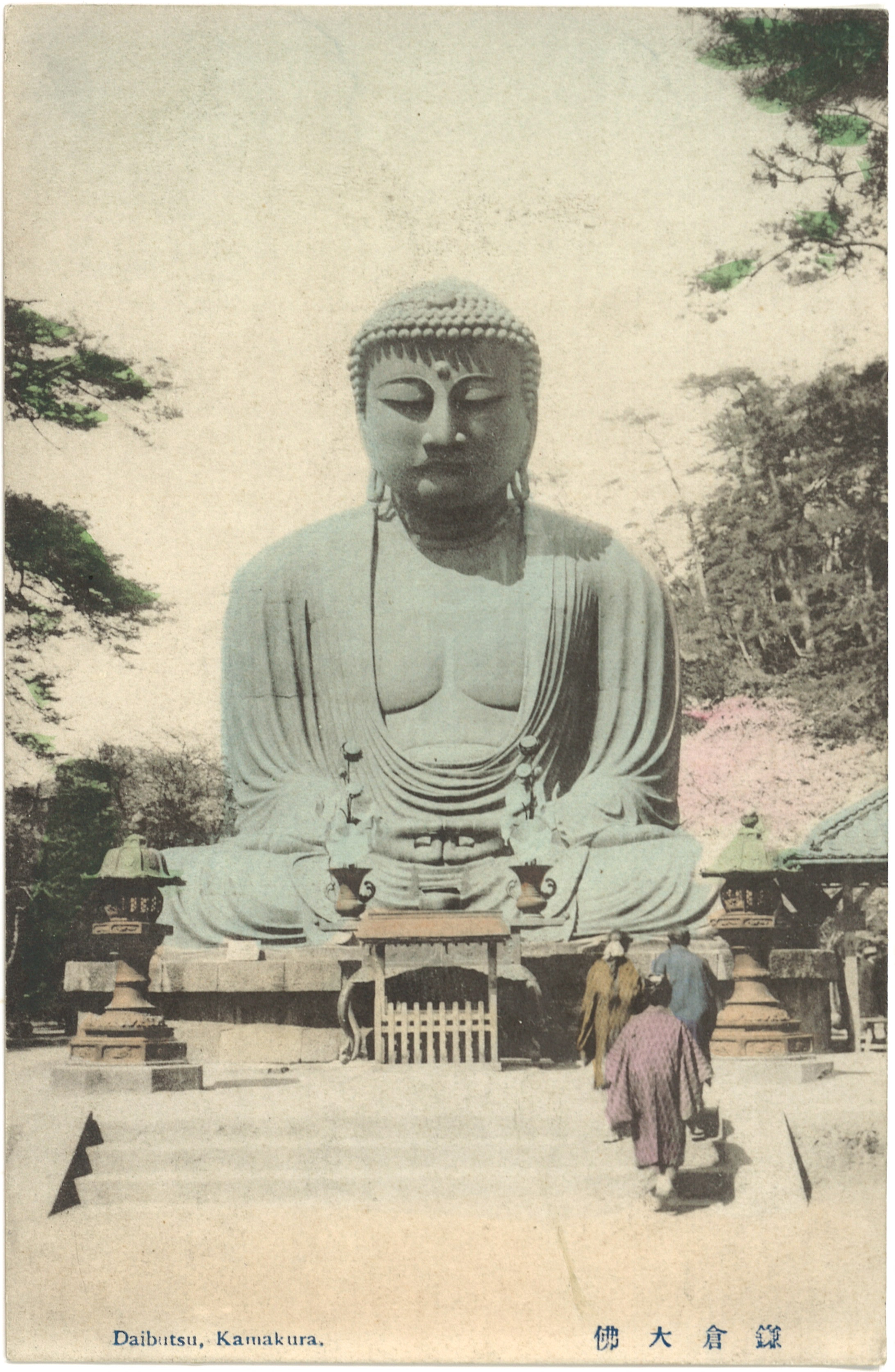
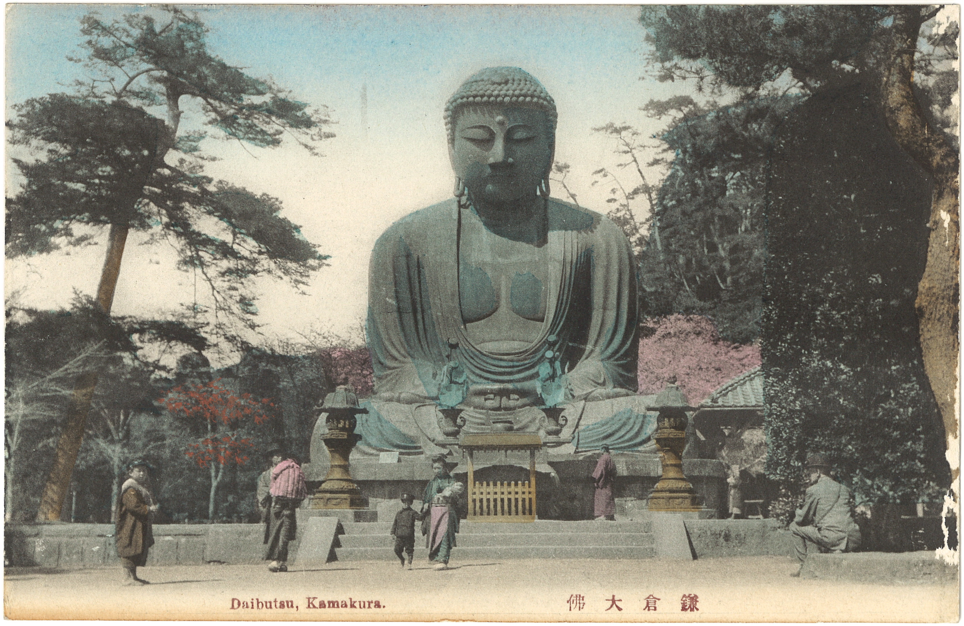
This illustration does not represent an authentic scene of Asian Buddhist worship, but the Western idea of Oriental religiosity. The Buddhist image only mimics traditional Asian art forms. The arms are folded atop one another, unlike the traditional joining of the hands in various meditative mudra positions, and the head appears to wear a crown or tiara, more like the vogue of early twentieth century American woman’s fashion than traditional Asian headwear. Even though the artist was not attempting to draw a particular Buddhist image, it is clear that the Kamakura Daibutsu was the iconic model. The overall style is definitively East Asian, but the open, draped robe exposing the chest and simple positioning of the arms in the lap closely mirror that of the Daibutsu. In addition, the frontward-facing, symmetrical composition would have echoed the numerous photographic images of the Kamakura colossus that had circulated for decades.
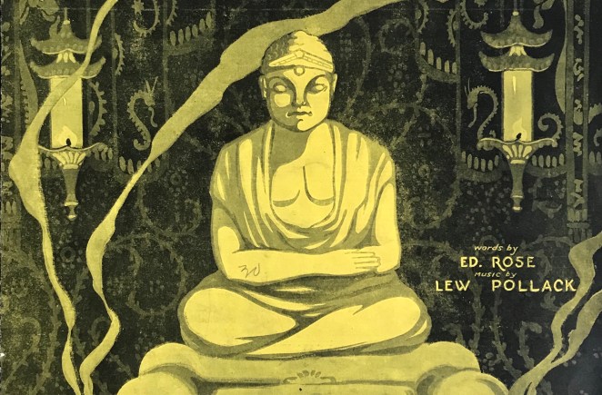
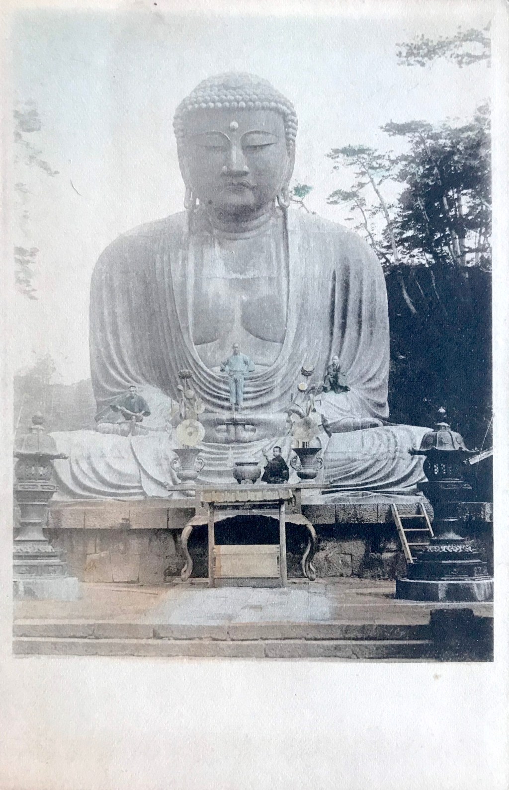
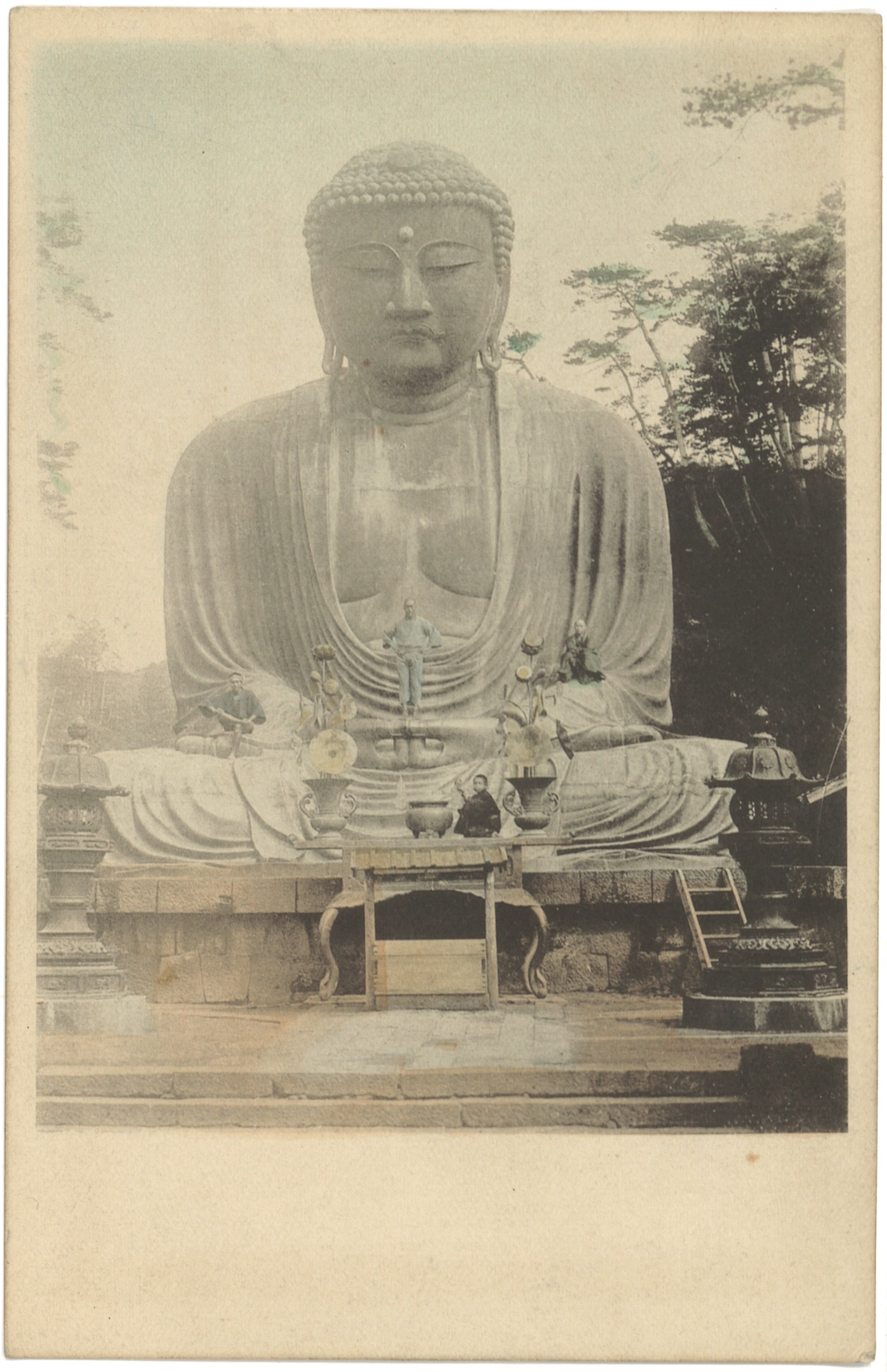
What is likely the original cover for this piece was illustrated by André De Takacs (1880-1919), an artist known for his strong graphic style [Figure 2]. It is possible that De Takacs copied this image of the Kamakura Daibutsu from figural domestic bottles sold in department stores in the United States. The scene on the cover is spartan, but the whisps of smoke from the small fires suggest religious practice and the burning of incense. By examining the details of the image, it seems as if the unknown artist of the variant cover modified the origianal illustration of De Takacs, who died suddently in 1919.

Figure 2
- Title: Buddha Fox Trot
- Date: 1919 (date on reverse)
- Cover Artist: André De Takacs (1880-1919)
- Composer: Lew Pollack (1895-1946)
- Lyricist: Ed Rose (1875-1935)
- Publisher: McCarthy & Fisher Inc. (NY)
The small yellow phonograph icon on the lower left is inscribed with the words, “This Number is to be had on all Phonographic Records and Music Rolls. Ask your Dealer.” “Buddha” was recorded and published by several record companies, including the Lyraphone Company of America (as played by the Jazzarimba Orchestra; catalogue number 4204), Aeolian Company (Aeolian Dance Orchestra, 12166), Pathé Frères Phonograph Company (The Tuxedo Syncopaters, 22209; Peerless Quartet, 22334), Columbia Graphophone Company (Columbia Saxophone Sextette, A2876), and Victor Records (Sterling Trio and Peerless Quartet, 18653)[Figure 3].
Figure 3
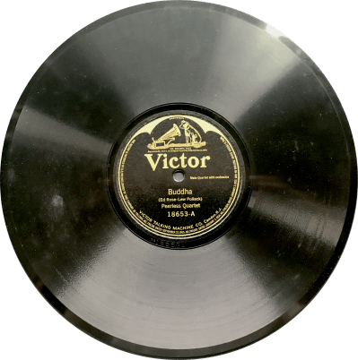
- Title: Buddha
- Date: 1920
- Vocals: Peerless Quartet (Frank Croxton , John H. Meyer, Albert Campbell , Henry Burr)
- Composer: Lew Pollack (1895-1946)
- Lyricist: Ed Rose (1875-1935)
- Publisher: Victor Talking Machine Company
- Catalogue Number: 18653-A
The full musical score and lyrics of “Buddha” can be found here. The song opens with these lyrics: “In an oriental clime, seated on a mystic shrine, Buddha dwells, and dispels hate.” The lyrics of Ed Rose do not identity Japan or Kamakura as the setting for this song, but a more mystical “Oriental” location. The rest of the song sadly describes a woman who prays to the Buddha, pleading for her lover to return to her. This is not a novel melodic narrative. It clearly refelcts a story made famous by Giacomo Puccini’s opera Madame Buttefly, first performed in America in 1906. Even though neither of these musical pieces directly refers to the Kamakura Daibutsu, by the early twentieth century, the Kamakura colossus was the icon of the imaginary Orient for American audiences, thus the choice of cover illustration remains fitting.
Notes:
*This is part of a series of posts devoted to exploring the development of a visual literacy for Buddhist imagery in America. All items (except otherwise noted) are part of my personal collection of Buddhist-themed ephemera.
[1] This rhythmic device is discussed in Lancefield 2004: 730-35. The most popular recent use of this riff (in what might be its most iconic form) is found in Carl Douglas’ 1974 hit, Kung Fu Fighting.
[2] As coined by Robert Lancefield, “yellowvoice” refers to the ways in which Orientality was evoked through sound and music, see especially Lancefield 2004: 599-768. A rather exhaustive list of popular American songs with Chinese subjects or themes is found in Appendix A of Moon 2005.
[3] See the Vaudeville program information noted in Lancefield 2004: 604n.13. Pollack would compose another Asian themed piece, “Oh Sing-a-Loo, Whad’Ya Do with Your Que?” (1922).
[4] The song on the back cover is “Daddy, You’ve Been a Mother to Me” by Fred Fisher, with copyright date of 1920. Other prints have “While Others are Building Castles in the Air,” also by Fred Fisher, but copyrighted in 1919.
References:
- Lancefield, Robert Charles. 2004. “Hearing Orientality in (White) America, 1900-1930.” Ph.D. dissertation, Wesleyan Universoty.
- Franceschina, John. 2017. Incidental and Dance Music in the American Theatre from 1786 to 1923 [Volume 3]. Albany: BearManor Media.
- Moon, Krystyn. 2005. Yellowface: Creating the Chinese in American Popular Music and Performance, 1850’s – 1920’s. New Brunswick: Rutgers University Press.
- Selth, Andrew. 2016. Burma, Kipling and Western Music: The Riff from Mandalay. London: Routledge.
Additional Posts in Visual Literacy of Buddhism Series