Tonboya’s Failed Voyeurism of the Daibutsu

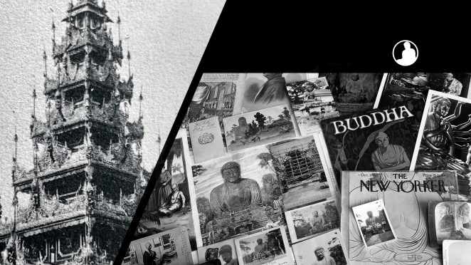
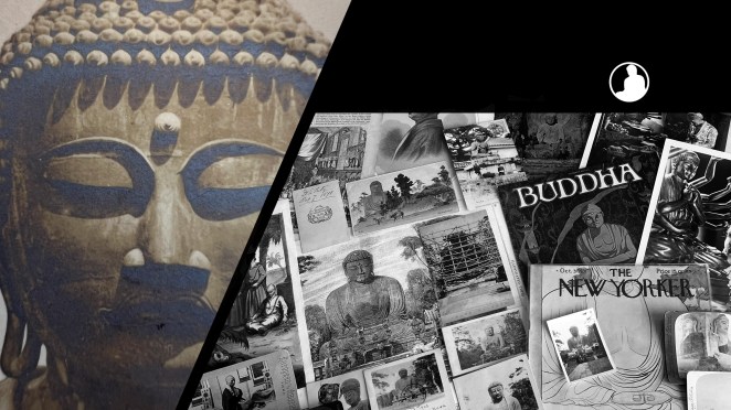
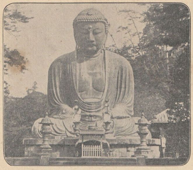
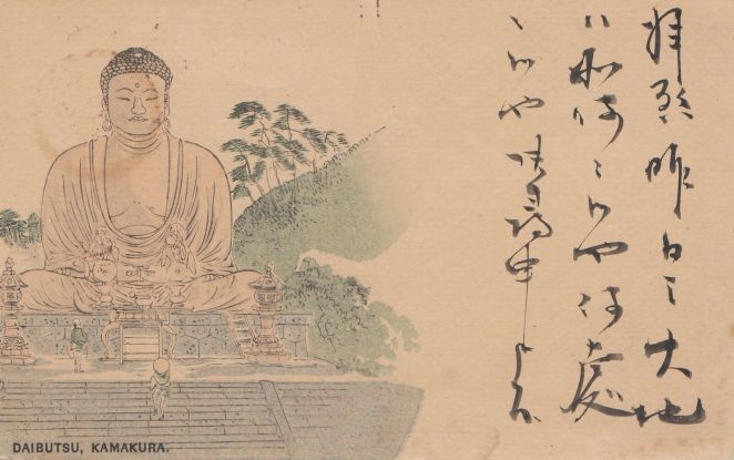
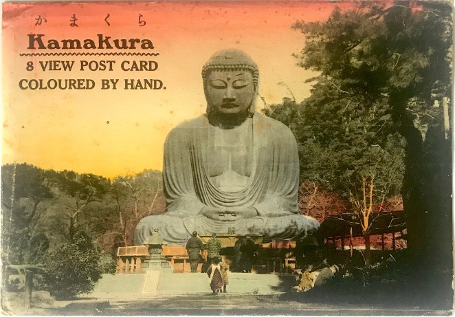
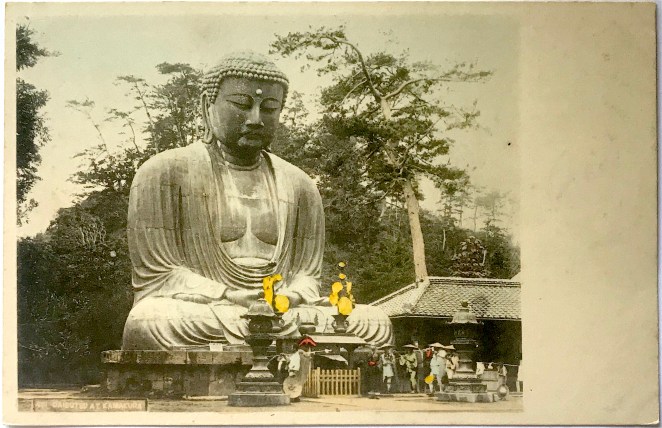
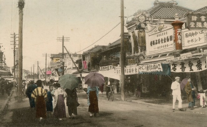
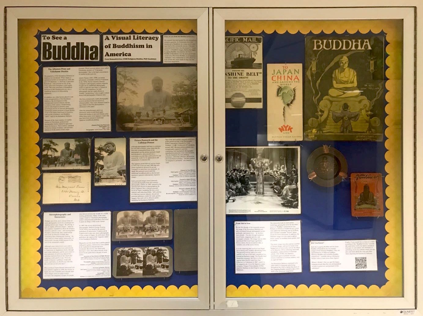
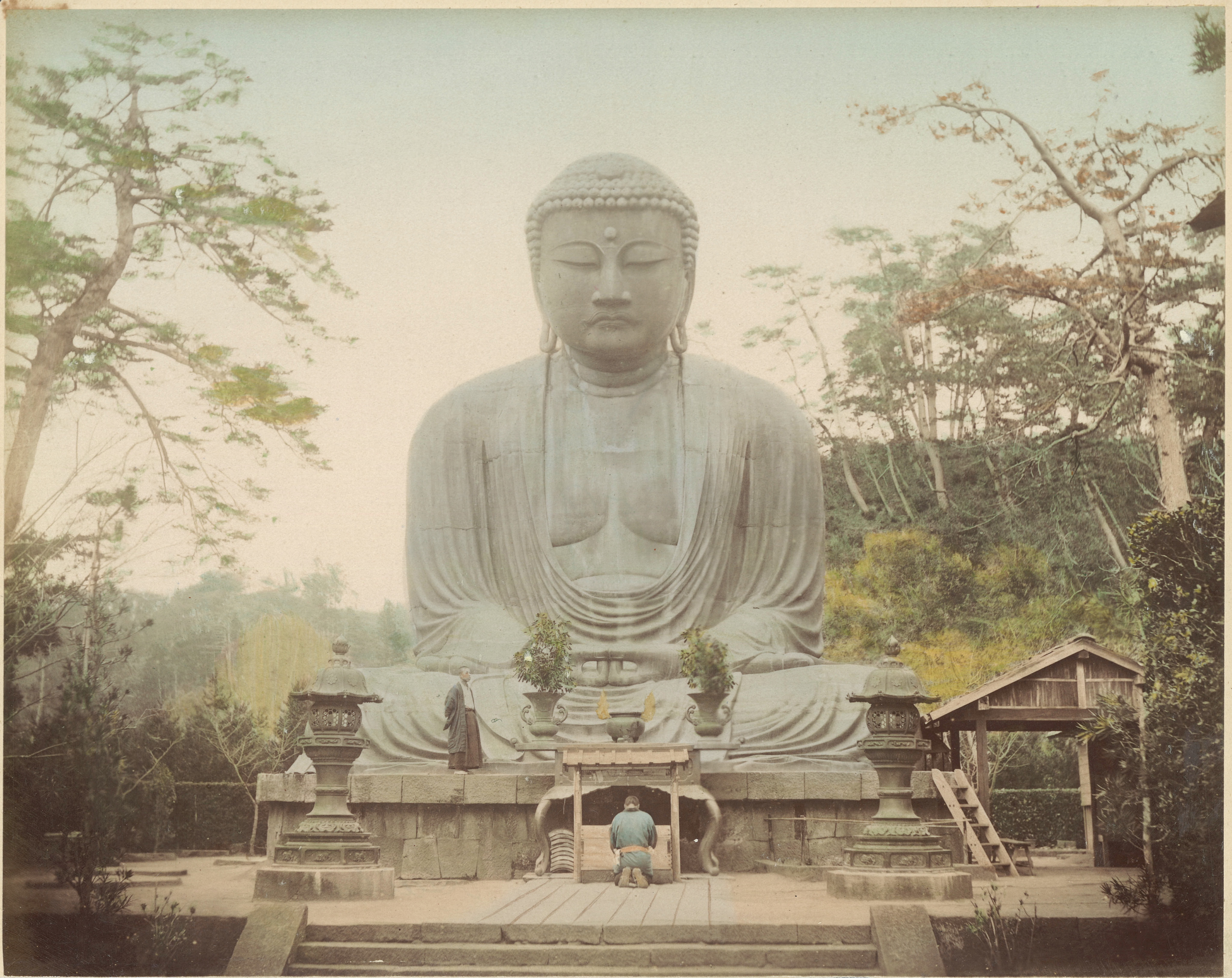
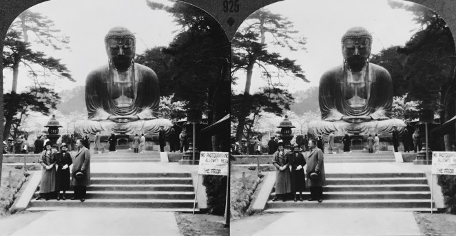
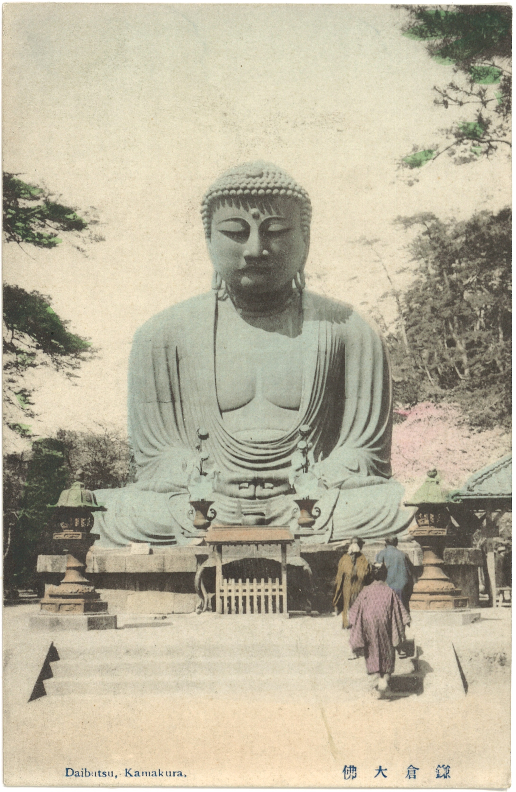
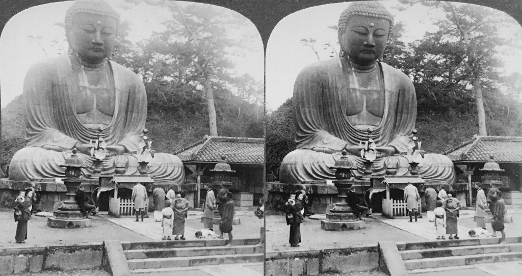
After the Meiji Restoration, the popularity of photography began to overshadow traditional Japanese woodblock printing. Increasingly, woodblock artisans came to find employment with photography studios, adapting their technical painting skills to add vivid color to monochromatic photographs. In the beginning of the twentieth century, due to the craze surrounding Japanese picture postcards (ehagaki 絵はがき), artisans continued to ply their trade by adding translucent water-soluble pigments to these small format calotypes. One of the most famous postcard distributers was Tonboya トンボヤ, or the “Dragonfly Studio,” first opened by Yoshimura Kiyoshi 吉村清 around 1905.[1] The Tonboya storefronts in Yokohama, first located in the Isezakichō 伊勢佐木町 district before moving to the more heavily trafficked Motomachi 元町 district, were easily identifiable because of large signboards made to look like red cylindrical postal boxes (yūbin posuto 郵便ポスト) widely adopted in Japan. One side of the signboard had the word “POSTALCARDS” painted on it, while the other said ehakaki エハカキ [sic](“picture postcards”), suggesting Yoshimura catered to both foreign and domestic travelers.[2] One image that would represent the photographic interests of both groups would be the Kamakura Daibutsu, located close to the port of Yokohama [Figure 1].
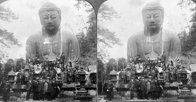
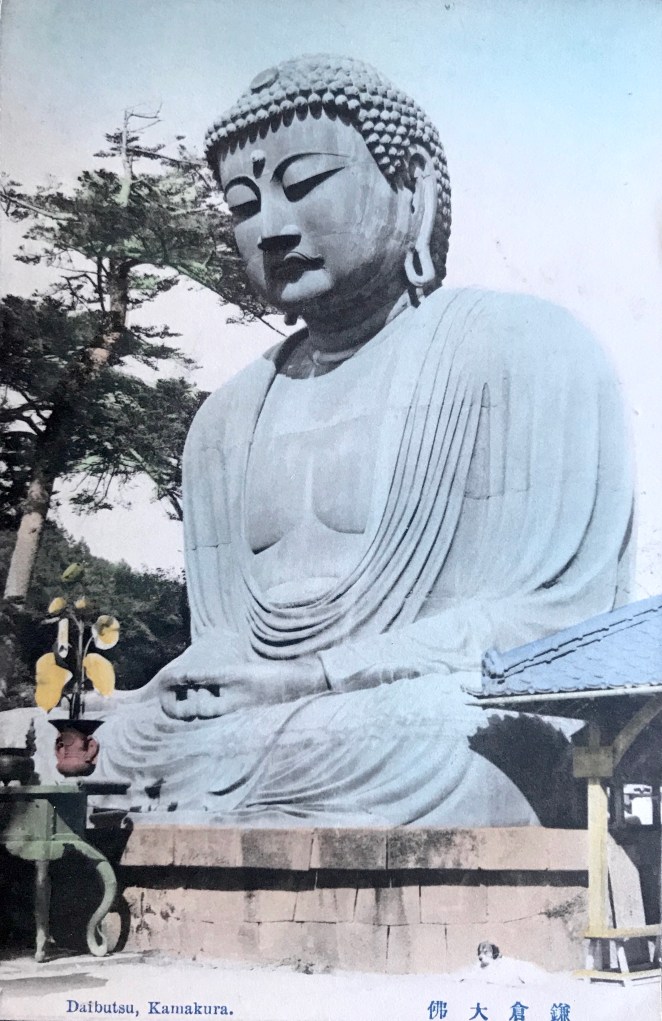
PCKD009t(o)

Figure 1

PCKD009t(r).JPG

  • Title/Caption: Daibutsu at Kamakura. 佛大倉鎌
  • Year: 1907-1918
  • Publisher: Tonboya トンボヤ
  • Medium: collotype print on cardstock, hand tinted
  • Dimensions: 5 in X 3.5 in
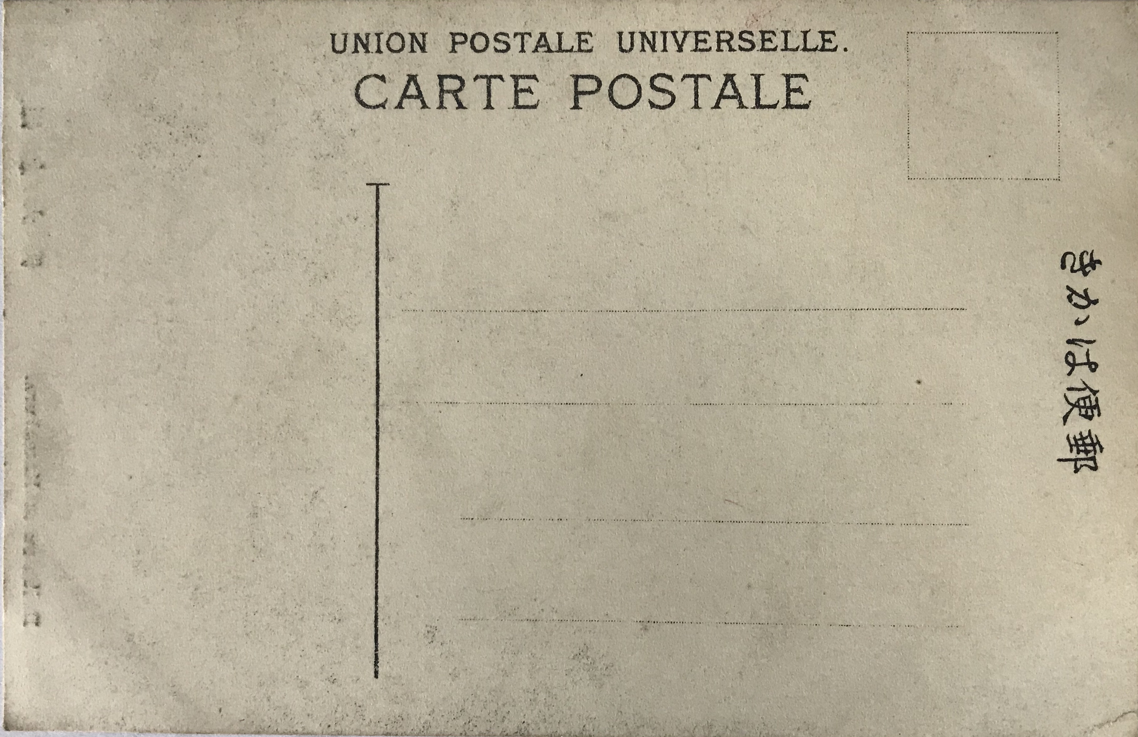
  • Reverse Imprint: Union Postale Universelle.[+], 郵便はかき

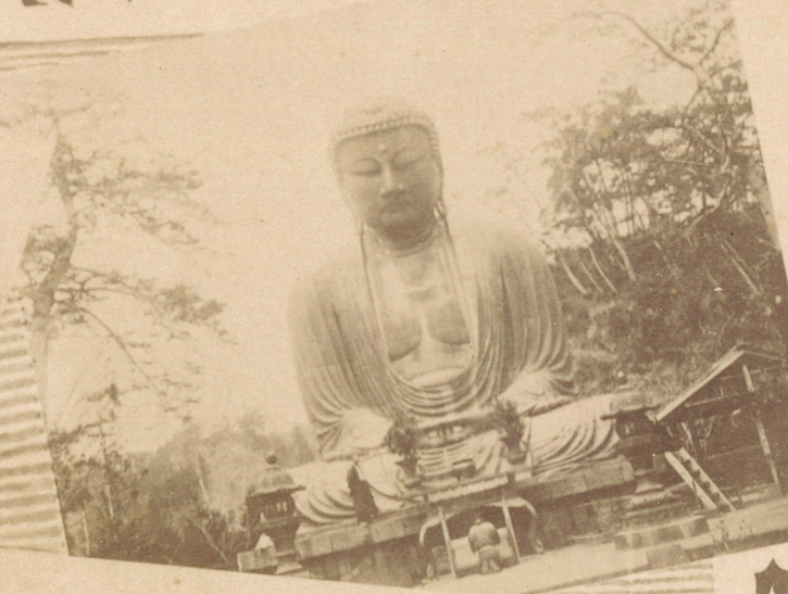
By setting the camera on the second landing of the paved walkway, this unknown photographer filled the frame with the image of the Daibutsu; positioning the statue frontally and symmetrically, this framing is similar to many of the images produced by Yokohama photography studios. The image depicts three figures, two women and a young child, facing the Buddhist icon in the center of the photograph. This setting might elicit other images of religious piety at this site, but the mise-en-scène is complicated by the presence of two more children, standing at each of the sides, who stare directly at the viewer. Their presence might have been obscured had it not been for the colorist who painted them in light hues of blue and pink. Notably, their casual posturing is stark contrast to staged “photo ops” of foreign travelers who try to visually suggest their domination of the Orient. Because of these elements, on the whole, we are made to feel as if the scene is staged and that we have been caught in an act of  voyeurism. The women and child, positioned center-stage, engage in a orchestrated religious performance while the children at the edges observe us watching them. A rather apt visual metaphor for the Orientalist gaze, where the artist attempts to create a certain controlled vision of the East, but with “unruly” actors foiling the illusion.[3]

This postcard is not imprinted with a trademark to identify the publisher. The black ink and serif font used for the reverse, however, in addition to the guide lines provided for writing the address, all suggest this card was made by Tonboya.[4] In addition, the position of the diving line for correspondence indicates this card was printed between 1907 and 1918. If the image on the obverse was not self-evident enough, bilingual cerulean letterpress (note the impression the reverse) identifies the scene clearly: “Daibutsu at Kamakura.”


Notes:

*This is part of a series of posts devoted to exploring the development of a visual literacy for Buddhist imagery in America. All items (except otherwise noted) are part of my personal collection of Buddhist-themed ephemera.

[1] Several online English sources claim Tokutaro Maeda was the founder of Tonboya, but I have found no Japanese sources that confirm this. I prefer here to follow the print Japanese sources (e.g. Saitō 1985: 1), but leave the question unsettled.

Red postal sign.png

[2] Several early-century postcards depicting the streets of Yokohama show this red cylindrical signboard, as seen here: The full postcard can be found here (not part of the Archive).

[3] By shooting one woman mid-stride ascending the small flight of steps, this photographer is (accidentally?) paying homage to Enami Nobukuni 江南信國 (1859—1929), but without the overal effects of sterling visual narrative.

[4] The best site for identifying Tonboya cards remains here: http://tamayochankankousya.seesaa.net/article/421306802.html. Another common reverse printing of Tonboya during this period is discussed here.

References:

  • Handy, Ellen. 1998. “Japonisme and American Postcard Visions of Japan,” in Delivering Views: Distant Cultures in Early Postcards,  Christraud M. Geary and Virginia-Lee Webb, eds. Washington: Smithsonian Institution Press.
  • Saitō Takio 斎藤多喜夫. 1985. “Yomigaeru shinsaizen no Yokohama fūkei よみがえる震災前の横浜風景,” Kaikō no hiroba 開港のひろば, No. 12, pp. 1, 4.
  • Satō, Kenji. 2002. “Postcards in Japan: A Historical Sociology of a Forgotten Culture,” International Journal of Japanese Sociology, No. 11, pp. 35-55.
  • Yokohama Open Port Museum 横浜開港資料館, ed. 1999. Nen mae no Yokohama Kanagawa ehagaki de miru fūkei 年前の横浜・神奈川―絵葉書でみる風景. Tokyō: Yurindo 有隣堂.

Additional Posts in Visual Literacy of Buddhism Series

Tonboya’s Onlooker of the Daibutsu

By the end of the nineteenth century the port city of Yokohama had developed into a thriving tourist destination. Consequently, numerous Japanese shops opened to cater to the needs of both domestic and foreign travelers. Perhaps surprising to a modern reader, among the prized goods offered for sale were picture postcards (ehagaki 絵はがき), the first truly commodified form of the photograph which unexpectedly became a collectors craze in the first decade of the twentieth century.[1] Around 1905, Yoshimura Kiyoshi 吉村清, the proprietor of the well-known Tokyō-based publisher Kamigataya 上方屋, started a new venture in Yokohama, called Tonboya トンボヤ, or the “Dragonfly Studio.”[2] The dragonfly was long seen as symbol of courage and strength in Japanese culture, and thus it was cherished by the samurai and bestowed the romantic name of the “Victorious Insect” (kachimushi 勝ち虫). This lore notwithstanding, Tonboya postcards – emblazoned with its distinctive dragonfly trademark – soon became some of the most famous and widely circulated postcards of the period.

Figure 1

PCKD008t(o).JPG

PCKD008t(r).JPG

  • Title/Caption: Daibutsu at Kamakura. 佛大倉鎌
  • Year: c. 1909
  • Publisher: Tonboya トンボヤ
  • Medium: collotype print on cardstock, hand tinted
  • Dimensions: 5 in X 3.5 in
  • Reverse Imprint: Carte Postale Post Card [+],  郵便ハガ[キ]

This image of the Kamakura Daibutsu [Figure 1] highlights the rustic setting of the colossal statue, framing the statue between sprawling tree branches and the silhouette of a sago palm. With the camera placed in the southwest corner, our unknown photographer creates a voyeuristic scene as a man in knee-high mud boots and western attire peers towards group of Japanese visitors from behind a tree. Seeing this observer from behind, we take his perspective and also gaze upon the group of Japanese visitors dwarfed by the overlooking bronze statue. The brightly colored garments of the women on the right stand in contrast to the uncolored gray shades of the men and boy on the left [Figure 2]. The boy wears a school uniform (gakuran 学ラン), a style adopted decades earlier based on French and Prussian military outfits.[3] Among this group, only a single man looks up towards the Buddhist statue. The others stand and stare at each other from several paces apart. The gives an unnatural effect to the scene, as the stationary bodies and odd spacing fails to build up a clear visual narrative. What is the relationship of these temple visitors to each other? What is their purpose for being there? As was typical of cards from this period, bilingual cerulean letterpress informs us as to the identity of the Buddhist figure, the “Daibutsu at Kamakura” (note the imression left on the reverse along the bottom edge).

Figure 2

PCKD008t(men).JPG
PCKD008t(women0.JPG


Often, Tonboya would impress its dragonfly logo at the lower right on the front of the card, but our variant lacks this identifying element.[4] Turning to the reverse of our card [Figure 1], we still fail to easily locate the characteristic mark of the dragonfly. So, just how can this card be distinguished? The designers at Tonboya devised a creative and playful way to identify their publishing studio; they replaced the ki (キ) in hagaki (ハガキ, “postcard”) with a highly stylized dragonfly illustration [Figure 3]. Only the most attentive observer would notice this subtle alteration, but once noticed it becomes an easily identifiable marker of this studio. This creative design can be dated back to around 1909 and remained throughout Tonboya’s existence into the late 1920’s.

Figure 3

PCKD008t(logo).JPG

Notes:

*This is part of a series of posts devoted to exploring the development of a visual literacy for Buddhist imagery in America. All items (except otherwise noted) are part of my personal collection of Buddhist-themed ephemera.

[1] Satō 2002: 41.

[2] Several online English sources claim Tokutaro Maeda was the founder of Tonboya, but I have found no Japanese sources that confirm this. I prefer here to follow the print Japanese sources (e.g. Saitō 1985: 1), but leave the question unsettled. Another unresolved question remains the relaitonship between Kamigataya and Tonboya. It appears that Tonboya may have been a distribution name of postcards printed by Kamigataya (which continued to also publish postcards under its own name). Some sources claim Tomboya opened as early as 1904, other as late as 1907.

[3] The development of Japanese school uniforms are detailed here: http://journal.media-culture.org.au/index.php/mcjournal/article/view/1041.

[4] Tonboya would also often include an identifying letter and stock number in the lower left, but this is also missing in our specimen. It is also possible to find cards with the letter and numbering system, but still lack the dragonfly icon, see here: https://www.maryevans.com [then search for the reference number 10989247]

References:

  • Handy, Ellen. 1998. “Japonisme and American Postcard Visions of Japan,” in Delivering Views: Distant Cultures in Early Postcards,  Christraud M. Geary and Virginia-Lee Webb, eds. Washington: Smithsonian Institution Press.
  • Saitō Takio 斎藤多喜夫. 1985. “Yomigaeru shinsaizen no Yokohama fūkei よみがえる震災前の横浜風景,” Kaikō no hiroba 開港のひろば, No. 12, pp. 1, 4.
  • Satō, Kenji. 2002. “Postcards in Japan: A Historical Sociology of a Forgotten Culture,” International Journal of Japanese Sociology, No. 11, pp. 35-55.
  • Yokohama Open Port Museum横浜開港資料館, ed. 1999. Nen mae no Yokohama Kanagawa ehagaki de miru fūkei 年前の横浜・神奈川―絵葉書でみる風景. Tokyō: Yurindo 有隣堂.

Additional Posts in Visual Literacy of Buddhism Series

To See a Buddha: A Visual Literacy of Buddhism in America (Digital Exhibit)

[This is a online version of my Archive exhibit at the UCSB Religious Studies Department. Many thanks to Will Chavez for his enthusiastic support and assistance.]

UCSB Exhibit

What do you think the Buddha looked like?

My research has been guided by this deceptively complex question. As Americans were first introduced to Buddhism on a mass level in the latter half of the nineteenth century, I became interested in how they also developed a “visual literacy” of Buddhist images. Before the happy Laughing Buddha was popular, the Great Buddha of Kamakura was the most prominent visual icon. This Great Buddha, or in Japanese, “Daibutsu,” was constructed in 1252. Here’s a look of how this statue made its way into the American imagination.

The Albumen Print and Yokohama Shashin

apkd002af

The popularity of the Kamakura Daibutsu in America was accidental. When Japan re-opened its borders to foreigners in 1859, the port of Yokohama – a short day’s ride from Kamakura – was selected as one of the treaty ports were foreigners could legally reside. The close proximity of Kamakura Daibutsu to this bustling port city was a significant factor in its blossoming popularity.

In addition, two other factors played a role in the recognizability of the Kamakura Daibutsu: the development of the international tourism industry and the invention of the camera. Globetrotting tourists who hoped to preserve their picturesque travels in souvenir photographs unwittingly helped promote a visual identity of an exotic Japan back home in America, with geisha, rickshaws, and Buddhist “idols,” such as the Kamakura Daibutsu.

Because of the sheer number of wealthy tourists in Yokohama, professional photography studios started to open their doors for business. These studios, operated at first by foreign residents, sold souvenir albums to fit the needs of their eager clientele. These souvenir photos were called Yokohama shashin, or “Yokohama photographs,” due to the high concentration of studios in this port city.

Adolfo Farsari (1841-1898), an Italian adventurer, eventually settled in Yokohama in the 1870s. Farsari entered a fiercely competitive photography industry when he bought out an established photography studio to open his own firm, A. Farsari & Co. Like his competitors, he sold photographs and pre-made albums to wealthy “globetrotters” who sought to return home with photographs of famous sites.

The first commercially viable photographic process produced what are known as albumen prints. They used albumen found in egg whites to bind the photosensitive chemicals to the paper.

After the monochromatic print was processed, artists would hand apply watercolor washes to provide vibrant color. Often these artists were Japanese, some who may have been trained in traditional Japanese woodblock printing.

Picture Postcards and the Collotype Process

pckd005u(o)

pckd007u(o)

Although photography had been in existence for over half a century, some claim that the first truly commodified form of the photograph was the picture postcard. Small and inexpensive, the postcard was a convenient souvenir that could easily be sent around the world for the appreciation and amusement of someone else.

The Japanese postal delivery service began in 1870, but it was not until 1900 that new postal regulations allowed for private companies to print their own postcards. In Japan, the postcard soon rivaled the traditional woodblock print as the favored medium to present contemporary Japanese images.

Early postcard images were commonly recycled photographs from old souvenir photography studios. In 1905, spurred by the international interest in photographing the Russo-Japanese War, a picture postcard boom hit Japan, breathing life into a new industry and collecting hobby.  Still catering to a thriving tourism industry, the private postcard publishers reshot the same generic imagery that sold well as albumen prints, including the Kamakura Daibutsu.

One of the most prolific postcard publishers of the period was the Ueda Photographic Prints Corporation, founded by Ueda Yoshizō上田義三 in the port of Yokohama around 1905. Because printing photos was exceptionally expensive and time consuming, new mechanical photographic reproduction processes were soon invented.  The development of a new printing technique, called the collotype, allowed for photomechanical printing – and the creation of inexpensive postcards – on a massive scale.

Stereophotography and Stereoviews

IMG_E5858

Perhaps one of the most curious forms of early photography involved a technique for making stereoscopic images.  By placing  a pair of slightly different images – taken by two cameras separated by about the distance between a person’s eyes – and viewing them through a stereoscope, they would merge and create an illusion of depth, thus mimicking three dimensional viewing.  An early form of virtual reality, stereocards, or stereoviews, became wildly popular by the end of the nineteenth century.

Although some stereoviews were sold in Japan, most stereoviews were sold directly to Americans in department stores, through mail-order catalogues, and by savvy door-to-door salesmen. A surviving manual for salesman instructs them in the “hard sell,” scripting a sales pitch to say: “You see, nearly everyone is getting a ‘scope and views, and really, so should you. One like this will last you all your days.”

Mass produced Japan-themed stereocard sets first started to appear in 1896, but dozens of Japan sets were available just a decade later. These images were no longer tourist souvenirs, but imaginary escapes for people who did not possess the wealth of a world-touring globetrotter. Many of the same images found in Yokohama photography studios and postcards publishers were used to paint an image of the exotic Orient.

In 1903, the novice professional photographer, Herbert George Ponting (1870-1935), was hired by the premier publishers of stereoviews, Underwood & Underwood to take new stereo-photographs of the scenery of Japan. As with many other publishers, he captured the “majestic calm” of the Kamakura Daibutsu.

Originally novelty items that could be paired with parlor games, stereoviews soon started to be marketed as educational tools. Eventually the reverse was filled with descriptive text, often taken directly from tourist books published a decade or more earlier.

From Idol to Icon

01cover

By the first decade of the twentieth century, the image of the Kamakura Daibutsu not only circulated through photographic prints, postcards, and stereoviews –  as we have seen already – but also through numerous travel books, magazine articles, and newspaper columns. The image was so often reproduced that it no longer signified a bronze statue, but an amorphous idea, a veritable icon of the exotic Orient.

It is not surprising that such an icon found favor among early modern advertising firms. The growing tourism and cruise ship industry was one of the early adopters of the Kamakura Daibutsu image. The Pacific Mail Steamship company, the first to offer a regular trans-Pacific route from San Francisco to Yokohama in 1867, used it in its magazine ads. Even the Japanese cruise company, Nippon Yūsen Kaisha (NYK) used the Daibutus in their English-language brochures.

The statue also took on more artistic renderings, gracing the cover for the sheet music to “Buddha,” composed by Lew Pollack in 1918 for a Vaudeville act. Lyrics were added the following year by Ed Rose, and it became a popular “foxtrot” dance record for home enjoyment. In addition, the Daibutsu image was also used to add an exotic quality to mundane home goods, such as incense.

The exotic image was also used as a symbol of foreign danger, and can be found in the background of movie sets, such as the Mask of Fu Manchu (1932), reflecting racist and xenophobic undercurrents of American culture. After WWII, the Daibutsu manifested again as popular souvenir trinkets marketed to overseas soldiers, such as cigar ash trays.

The Kamakura Daibtusu continued to be used widely in American advertising  throughout the 1950’s, before the allure of the Laughing Buddha started to take a firm hold in the American imagination.

Did You Know?

Both the Laughing Buddha and the Great Buddha of Kamakura are not actually images of the historical Buddha!! They are representations of different buddhas, Maitreya Buddha and Amitābha Buddha respectively – consider taking a Religious Studies class to learn about these figures!

Where’s Waldo?: Did you spot the happy, lounging temple dog that was photographed in both a stereoview and postcard in this exhibition?


[Thank you for your virtual visit!]


Farsari’s Dai Butsu

Adolfo Farsari (1841-1898), an Italian adventurer who ended up fighting for the North during the American Civil War, settled in the port city of Yokohama in the 1870’s and taught himself photography. By the early 1880’s the Western dominance of the Yokohama tourist photography industry had waned, but Farsari would still grow into a commercial success. In 1885 he acquired the negative and stocks of the famed Stillfried and Anderson firm and opened his own professional photography studio, named A. Farsari & Co., on the main street in the bustling port. Like his competitors, he sold photographs and pre-made albums to wealthy “globetrotters” who sought to return home with photographic souvenirs of famous sites. By this period, photography no longer relied upon the difficult technical skills it once required, in large part due to the adoption of the easier “dry-plate” process. Consequently, this change in technology also motivated a shift in social significance, as the photograph started a transition from a fine piece of art to a commodified object.[1] Farsari’s early successes in Yokohama were almost robbed of him completely, as a devastating fire ravaged the port just a year after he opened his business, subsequently destroying his studio and prized collection of negatives. Unfortunately, not only were all of Farsari’s negatives destroyed, but also those recently acquired of Stillfried and Anderson, as well those of the pioneering photographer Felice Beato, who was bought out by Stillfried and Anderson in 1877. A year after the Yokohama fire, in 1887, Farsari reopened his studio with a stock of around 1,000 new images.

Figure 1

apkd004af

  • Title/Caption: Japan, A. Farsari & Co., Yokohama [photographic frontispiece]
  • Year: c. 1887
  • Photographer: Adolfo Farsari (1841-1898)
  • Medium: albumen silver print, sepia tinted
  • Dimensions: 10.25in X 8.25in

The photographic frontispiece that adorned Farsari’s new studio albums  was an amalgamation of Orientalist visual motifs [Fig. 1]. Sharply-eaved pagodas, irenic bridges, beautiful geisha, antiquated rickshaws, and the famed Mt. Fuji all converge around the simple title of the album – Japan. In the center of the frontispiece we find the iconic Kamakura Daibutsu, a main attraction for tourists sojourning in Yokohama [Fig. 2]. One could travel to Kamakura and back on horseback within a day’s time. Unsurprisingly, Farsari also sold this photograph for individual purchase [Fig. 3].

Figure 2 (detail of Figure 1)

apkd004af(cu)

Figure 3

APKD002af.jpg

  • Title/Caption: NA
  • Year: c. 1887
  • Photographer: Adolfo Farsari (1841-1898)
  • Medium: albumen silver print, hand tinted
  • Dimensions: 10.25in X 8.25in

Farsari’s image of the Kamakura Daibutsu is bold. Balanced and symmetrically positioned within the frame, the colossal statue’s stoic countenance greets the viewer with warmth. One of the characteristic, and highly marketable, traits of Farsari’s prints were their superior coloring. He boasted that his teams of Japanese painters tinted his photos in a realistic manner, unlike the work of his rivals’ studios. He attributed the effects to the rigorous training of his artists, who would apprentice between two and four months before they were set to work. Reportedly, an individual artist under Farsari’s tutelage would only color two to three photographs per day, in contrast to the sixty prints issued by other studios’ artists. Furthermore, Farsari guaranteed the colors on his photographs would not fade, lasting “as long as ordinary oil paintings.” This he attributed to his stock of imported British paper. Farsari’s work earned the praise of the famed novelist and poet, Rudyard Kipling. He complimented the faithful coloring of Farsari’s prints once he saw the scenic vistas of Japan first hand on his trip through the countryside in 1889.[2] The gentle greenish-blue hue of the bronze statue here reflects the blue tinting of the sky above, as well as the garment of the kneeling supplicant, creating a cool, but not frigid, overall feeling in this image.

This photo is commonly assumed to be taken after Farsari’s studio fire in 1886, and was one of the centerpieces of his new collection of images given its prominent position in his photographic frontispiece. Farsari also sold a version of the Kamakura Daibutsu in vertical format, possibly taken on the same photography excursion [Fig. 4]. The kneeling man remains, but four more people are added in a row and all made to gaze upon the idol, causing the scene to look oddly staged. Our vertical image bears the catalogue number of Farsari’s stock in the lower left corner, a standard practice among Japanese photography studios (the horizontal image above is sometimes marked with “L19 Daibutsu (A)”). Curiously, the vertical image  appears – in contrast to Farsari’s bold advertising claims – to have faded.

Figure 4

APKD003af.jpg

  • Title/Caption: L20 DAI BUTSU (B)
  • Year: c. 1887
  • Photographer: Adolfo Farsari (1841-1898)
  • Medium: albumen silver print, hand tinted
  • Dimensions: 10.25in X 8.25in

Always eccentric, Farsari returned home to Italy in 1890, after a twenty-tree year absence, and never returned to Japan.


Notes:

*This is part of a series of posts devoted to exploring the development of a visual literacy for Buddhist imagery in America. All items (except otherwise noted) are part of my personal collection of Buddhist-themed ephemera.

[1] Bennett 2006: 219. Many details of Farsari’s exciting life – of which I am merely summarizing here – are discussed in Bennett 2006: 219-223.

[2] Bennett 2006: 221, 223.

References:

  • Bennett, Terry. 2006. Photography in Japan: 1853-1912. Rutland, VT: Tuttle Publishing.

Additional Posts in Visual Literacy of Buddhism Series

Kōzaburō’s Undivided Back Postcard

Many early Japanese turn-of-the century postcards were colorful illustrations, cartoons, or woodblock prints, some of which were made by famed Japanese artists, but these traditional arts forms would soon lose favor to the photograph. One of the shifts that ushered in the visual dominance of photographic postcards was the introduction of private company postcards 私製はがき, which had been illegal to print until new postal regulations were introduced in 1900. In addition, the adoption of a new photomechanical printing technique, called the collotype, allowed for the wide availability of inexpensive photographic images of Japan.

Many early photographic postcards first circulated as albumen or silver gelatin prints sold by commercial photography studios. Early postcard publishers experimented with the orientation of the old images on the new format. By placing the image on the top half of a vertically oriented card, the bottom half could be reserved for the message [Figure 1]. Strategically designed areas or blank spots were necessary on the front of the card, because the reverse of the card was reserved solely for the name and address of the recipient until 1907. The regulations were determined by the Union postale universelle, the body which oversaw the postal system worldwide. These postcards, known today as “undivided back” cards, were replaced by “divided back” cards in 1907 in Japan, where the message could be included on the reverse of the card.

Figure 1

pckd002tk(o)
pckd002tk(r)

  • Title/Caption: NA
  • Year: 1900-1907
  • Photographer: Tamamura Kōzaburō 玉村康三郎 (1856-1923?)[?]
  • Medium: collotype print on cardstock, hand tinted
  • Dimensions: 5.5 in X 3.5 in
  • Inscription: Union Postale Universelle. CARTE POSTALE, 萬國郵便聯合端書

The image depicts a wide angle view of the Daibutsu taken from the third landing. The positioning of the camera shows the rustic, yet landscaped grounds surrounding the Daibutsu statue. Lacking the presence of people, this bucolic setting exhibits a more quiet moment of the famous tourist destination.  On the right, the supports and roof of the ablution pavilion stick out from under an evergreen tree. The water basin (chōzubachi 手水鉢) for washing hands is found underneath (dating from 1749).

The photographer of this image is debated. Older studio albumen prints of this image are imprinted with “661 Daibuthu [sic] at Kamakura.” This numbering is consistent with the studio catalogue of Tamamura Kōzaburō 玉村康三郎 (1856-1923?)(See Bennett 2006: 152), but other sources attribute this image to Ogawa Kazumasa 小川 一眞 (1860-1929). (A similar, but not exact, photo has been identified in an Ogawa studio album). This exemplifies the difficulty in determining the correct attribution and age of old Daibutsu photographs, and more research still needs to be done.

Moreover, because the publishers of the postcard did not imprint their name on the back, it is difficult to tell who printed this tourist souvenir. The reverse of this card is bordered by an ornamental filigree-like design in umber brown ink. This card is an example of an “undivided back,” since no line appears separating the sections on the back where the correspondence and address would later come to be written. This functions now as an easy identifier for dating old postcards, with this exemplar dating between 1900 and 1907. (The photograph was probably taken in the mid-to-late 1890s). In addition, a small scalloped square appears in the top right corner, indicating the location to affix the necessary postage.


*This is part of a series of posts devoted to exploring the development of a visual literacy for Buddhist imagery in America. All items (except otherwise noted) are part of my personal collection of Buddhist-themed ephemera.


Additional Posts in Visual Literacy of Buddhism Series

Ueda’s Daibutsu and Dog Postcard

Collecting postcards became a national craze in Japan in the first decade of the twentieth century – and caused at least one riot. Yokohama, home to many of the oldest and most important Japanese tourist photography studios, became a major center of postcard production and the Ueda Photographic Prints Corporation 上田写真版合資会社, founded by Ueda Yoshizō上田義三 in the famed city port, was one of a handful of premier Japanese picture postcard publishers. Ueda’s early sets of cards included photographs of the Kamakura Daibutsu, but they and their business rivals continued to produce new views of this ancient colossus.

Professional and amateur photographs had long shot the Daibutsu frontally from long and medium distances. A few took photographs from the southwest corner, or even from behind, but images of the Daibutsu from the southeast were uncommon (although not unknown) likely because the temple landscaping did not easily allow for a person to position himself. The grounds of Kōtoku-in 高徳院, the temple where the Daibutsu resides, had continuously undergone  renovations since Western tourists discovered it in the 1860’s, slowly opening up the areas around the statue and providing better “picturesque” viewing. One unknown photographer from Ueda was able to take a position in the southeast corner and take a photograph [Figure 1] – one of the very few from this angle.

Figure 1

pckd007u(o)
pckd007u(r)

  • Title/Caption: Daibutsu, Kamakura. 佛大倉鎌
  • Year: c. 1912 [postally unused]
  • Publisher: Ueda Photographic Prints Corp. 上田写真版合資会社
  • Medium: collotype print on cardstock
  • Dimensions: 5.5 in X 3.5 in
  • Reverse Imprint: Carte postale – Postkarte – Post Card [Type 5], Made in Japan, 郵便はかき

This postcard image is also one of the few photographs that does not incorporate any people in its composition, a technique which typically assisted the viewer in gauging and appreciating the sheer size of the statue. Only the most astute observer would note that the photograph is not devoid of all beings – there is a dog resting at the stone base of the statue [Figure 2]. The dog’s distinctive head patterning and white body suggests this may be the same dog photographed in two older stereoview cards, who is seen mingling with temple visitors and tourists. Serene and relaxed, both the Daibutsu and dog appear to be enjoying the relative quiet of the scene.

Figure 2

PCKD007u(o) dog.jpg

The Ueda crest on the reverse along with the distinctive multilingual printing clearly reveals this card to be part of the Ueda Corp. stock published after 1907, possibly around 1912. It is difficult to determine when the photograph was taken, but the presence of the dog suggests it was taken sometime after the first few years of the turn of the century, when the stereoviews were taken. While this is one among a dozen or more Japanese picture postcards produced of the Daibutsu before 1923 (when the Kantō earthquake destabilized the Japanese postcard industry), it remains one of the most unique.


*This is part of a series of posts devoted to exploring the development of a visual literacy for Buddhist imagery in America. All items (except otherwise noted) are part of my personal collection of Buddhist-themed ephemera.


Additional Posts in Visual Literacy of Buddhism Series


Kimbei’s Undivided Back Postcard

The Japanese postal delivery service was initiated in 1871 and soon joined the Universal Postal Union (soon to be known formally as Union Postale Universelle) in 1877, thus permitting the sending and receiving of international mail. Until the start of the twentieth century, however, all postcards were issued by the Japanese government as private companies were prohibited from publishing their own cards. After legal permission was granted in 1900, private companies soon embarked on mass-scale printings of picture postcards (ehagaki 絵はがき). The postcard soon rivaled the traditional woodblock print as the favored medium to present contemporary Japanese images.[1] Furthermore, while many early postcards were illustrated with drawings, photographic images soon dominated the medium and are considered the earliest commodified forms of the photograph.[2] This was spurred by the development of a new printing process, known as the collotype, which allowed for photomechanical printing on a massive scale.  Several themes emerged as popular favorites, including ones that may sound odd to modern purchasers of postcards, such as “natural disasters” and “current events.” Not surprisingly, with the advent of the thriving tourism industry, “scenic views” (fukei 風景) emerged as a favorite visual genre for many domestic Japanese tourists and foreign travelers.

Since a driving force behind the early interest in postcards was the acquisition of inexpensive photographs, it seems only natural that several picture postcards would be reprints of old photographic stock. The premier Japanese photographer of his time, Tamamura Kōzaburō 玉村康三郎 (b. 1856), was commissioned in the 1890’s to produce a then-reported one-million hand-colored albumen prints (though more recent estimates place the number of prints at approximately 350,000) for the multi-volume work Japan: Described and Illustrated by the Japanese. He enlisted the help of his competitor, Kusakabe Kimbei 日下部金兵衛 (1841-1934), to finish the massive order.  Scholars have only recently begun to identify Kimbei’s photographs found within the publication. The postcard image of the Great Buddha of Kamakura [Figure 1] is now considered a Kimbei photograph. The original image was scaled down and slightly cropped to fit on a standard size postcard.

Figure 1

PCKD001kk(o).jpg
PCKD001kk(r).jpg

  • Title/Caption: NA
  • Year: 1900-1907
  • Photographer: Kusakabe Kimbei 日下部金兵衛 (1841-1934)
  • Medium: collotype print on cardstock, hand tinted
  • Dimensions: 5.5 in X 3.5 in
  • Inscription: Union Postale Universelle. CARTE POSTALE, 萬國郵便聯合端書

There is no caption identifying the statue or location on the postcard, but the Kamakura Daibutsu was certainly well known in the early twentieth century. In the coming years, however, it would become standard practice to include letterpress captions, often both in English and Japanese, to describe the scene. The fine reticulation pattern and matte cardstock identifies this image as a photomechanical reproduction, known as a collotype (korotaipu コロタイプ). As with standard albumen and silver gelatin photography, early postcards were hand-tinted with water-color washes.

The small margin at the bottom of the card was left for correspondence. Before 1907, the Union Postale Universelle required the entire reverse of the postcard be used for the address and name of the recipient, thus early publishers would leave blank space for a brief messages on the front of the card. Because of this limitation, the correspondence was typically very short, with foreign travelers often briefly commenting on their sightseeing excursions.

The reverse of this card is bordered by an ornamental filigree-like design in umber brown ink. This card is an example of an “undivided back,” since no line appears separating the spaces on the back where the correspondence and address would later come to be written. This functions now as an easy identifier for dating old postcards, with this exemplar dating between 1900 and 1907.  In addition, a small scalloped square appears in the top right corner, indicating the location to affix the necessary postage.


Notes:

*This is part of a series of posts devoted to exploring the development of a visual literacy for Buddhist imagery in America. All items (except otherwise noted) are part of my personal collection of Buddhist-themed ephemera.

[1] https://www.mfa.org/collections/asia/art-japanese-postcard

[2] Satō 2002: 41.

References:

  • Saitō Takio 斎藤多喜夫. 1985. “Yomigaeru shinsaizen no Yokohama fūkeiよみがえる震災前の横浜風景,” Kaikō no hiroba 開港のひろば, No. 12, pp. 1, 4.
  • Satō, Kenji. 2002. “Postcards in Japan: A Historical Sociology of a Forgotten Culture,” International Journal of Japanese Sociology, No. 11, pp. 35-55.
  • Yokohama Open Port Museum 横浜開港資料館, ed. 1999. Nen mae no Yokohama Kanagawa ― ehagaki de miru fūkei 年前の横浜・神奈川―絵葉書でみる風景. Tokyō: Yurindo 有隣堂.

Additional Posts in Visual Literacy of Buddhism Series

Ueda’s Hand-Colored Cerulean Letterpress Postcards

In early 1904, Japan formally declared war on Russia after nearly a decade of rising tensions. Military attachés and journalists from around the world traveled to the front with photographers to chronicle the gruesome affair. This use of wartime photography propelled a surge in popularity of Japanese picture postcards (ehagaki 絵はかき), resulting in a spike of mass-produced, inexpensive postcards depicting Japan’s military might. The swell in Japanese nationalism and interest in seeing images of a modernized state helped create a Japanese postcard boom in the middle of the first decade of the twentieth century.[1] New private postcard publishing houses, such as Ueda Photographic Prints Corporation 上田写真版合資会社, Hoshinoya 星野屋, and Tonboya トンボヤ, grew in number as did their inventory of photographic postcards. Consequently, during this period numerous new images of the Kamakura Daibutsu were taken and sold to a ready market of Japanese and foreign travelers [Figure 1].

 Figure 1

pckd004u(o)

PCKD004u(r).jpg

  • Title/Caption: Daibutsu, Kamakura. 佛大倉鎌
  • Year: c. 1907 [postally used 1910]
  • Publisher: Ueda Photographic Prints Corp. 上田写真版合資会社
  • Medium: collotype print on cardstock, hand tinted
  • Dimensions: 5.5 in X 3.5 in
  • Reverse Imprint: Postkarte [Type 1], 郵便はかき

The unknown photographer of this postcard image set the camera on the second landing of the paved walkway and framed the Daibutsu frontally and symmetrically, similar to  numerous Yokohama port studios and foreign stereo-photographers of earlier years. The standard size ratio of the postcard allowed for a slightly larger panoramic sweep than that of older albumen prints, thus more of the foliage surrounding the site is visible. The mise-en-scène is natural and casual, unlike the highly choreographed images of piety taken by Herbert Ponting around the same period. The viewers eyes are eventually drawn to the group of people on the lower left, perhaps a family, that walks away from the Daibutsu. Except for the adolescent boy on the far left dressed in an oversized coat, no one makes eye contact with the photographer. This leaves the viewer with a sense of casual observation, as if seeing the normal daily activities of the temple grounds. The outfits of the family suggest a bricolage of cultures, as traditional flowing (and brightly colored) Japanese garments are mixed with Western attire, including a narrow brimmed hat worn by the older man and military school outfits (gakuran 学ラン) worn by the young boys (officially adopted in Japan in the 1880’s[2]). Another man sits on the far right, also wearing a brimmed hat, trousers, and vented jacket. To a Japanese viewer, these sartorial elements would be clear indications of a modern, militaristic, and “Westernized” Japan. Reading deeper, the lone kimono-wearing figure in the rear, closest to the Daibutsu, might symbolize the traditional and religious past being left behind by the more progressive present.

This collotype print on card stock was hand tinted with water color, but unlike the more conservative hues of older albumen prints sold at established port photography studios, postcards more frequently have a splash of bright color, especially the warm vibrant hues of orange, scarlet, and pink. The early colorists of Daibutsu postcards often included a patch of pink behind the statue, suggesting spring cherry blossoms, even though this was not the tradition of older Yokohama studios and – as far as I can discern – not botanically accurate [although this image may suggest otherwise].

In addition to this card, a vertical format of a similarly dated Daibutsu picture postcard [Figure 2] shows the same patch of tree foliage to the right of the Daibutsu also painted in cherry blossom pink.[3] Images such as these may function as the origins of the painting tradition for Daibutsu postcards which continued for several decades, effectively ending when color photography was introduced. More curiously, in the horizontal image above, the colorist also included a red-leaved maple tree (just above the man in the short-brimmed hat), inaccurately suggesting that spring cherry blossoms and red autumn foliage appear in the same season! Of course, these decisions were not motivated by a fidelity to reality, but by a consumer market with idealized visions of a bright and polychromatic Japanese landscape.

Figure 2

pckd005u1(o)
pckd005u1(r)

  • Title/Caption: Daibutsu, Kamakura. 佛大倉鎌
  • Year: c. 1907 [postally unused]
  • Publisher: Ueda Photographic Prints Corp. 上田写真版合資会社
  • Medium: collotype print on cardstock, hand tinted
  • Dimensions: 5.5 in X 3.5 in
  • Reverse Imprint: Postkarte [Type 1], 郵便はかき

These two postcards were not only sold by the same publisher (the printing on the reverse is identical on both), but clues in these photographs suggest they were taken at the same time. Most tellingly, the shadows are sharp, indicating a clear afternoon, and fall across the face and shoulders of the Daibutsu in precisely the same way, indicating they was taken on the same exact time of day.[4]

For both the horizontally and vertically formatted postcards, the photographic image bleeds to the edges, except on the bottom where an unprinted border leaves space for a caption, here both in English and Japanese. Identifying the location of the site, the cerulean colored letterpress is simple and succinct: “Daibutsu, Kamakura,” (or “Kamakura Daibutsu” 鎌倉大佛 in Japanese).[5] Unlike older postcards, no blank space needed to be reserved on the front of the card because new postal regulations allowed correspondence to be written on the back in addition to the recipient’s name and address. The evidence for this change is the narrow umber (or orange-cinnamon) colored dividing line separating the message from the address space on the reverse.[6] The new regulations for “divided back” postcards were passed in March 1907, but took effect in October of the same year, thus providing a terminus post quem of 1907 for both cards above.

The reverse of these cards also clearly indicates the intended international audience for this expanding postal medium. “Postkarte” (postcard) is written in German along the long edge, followed by French, Italian, and Russian translations, as well as Japanese (yūbin hakaki 郵便はかき [sic]) along the short edge. Unfortunately, as is common for older cards, the reverse sides do not provide information pertaining to the publisher. I feel there is solid evidence, however, to believe these were published by the Ueda Photographic Prints Corporation, founded by Ueda Yoshizō上田義三 in the bustling port of Yokohama. This company was known for its prolific production of early Japanese postcards.[7] If we examine other similar hand colored collotype postcards with cerulean captions and umber printing on the reverse – hereafter I refer to this scheme as the Ueda “cerulean-umber” design – we find a clear relationship between our cards and later cards imprinted with the Udea Corp. trademark. If we examine another horizontal postcard [Figure 3] with the same image (even with the same coloring, down to the red spot on the child’s pink jacket), we can observe the printing on the reverse is different, suggesting it comes from a different print run.

Figure 3

PCKD005u(o).jpg
pckd005u(r)

  • Title/Caption: Daibutsu, Kamakura. 佛大倉鎌
  • Year: c. 1910 [postally unused]
  • Publisher: Ueda Photographic Prints Corp. 上田写真版合資会社
  • Medium: collotype print on cardstock, hand tinted
  • Dimensions: 5.5 in X 3.5 in
  • Reverse Imprint: Carte postale – Postkarte – Post Card [Type 3], MADE IN JAPAN, 郵便はかき

Within a short period between 1907 and 1912, the design on the reverse of Ueda postcards changes several times [Figure 4], following a discernable progression, until the dividing line was capped by a heavily stylized Ueda crest in the last phase [Figure 5].[8] Please consult my working notes for an outline of these chronological changes.

Figure 4:

pckd004u5(o)
pckd004u5(r)

  • Title/Caption: Daibutsu, Kamakura. 佛大倉鎌
  • Year: c. 1912 [postally unused]
  • Publisher: Ueda Photographic Prints Corp. 上田写真版合資会社
  • Medium: collotype print on cardstock, hand tinted
  • Dimensions: 5.5 in X 3.5 in
  • Reverse Imprint: Carte postale – Postkarte – Post Card [Type 5], MADE IN JAPAN, 郵便はかき

Figure 5: The Ueda Photographic Prints Corp. trademark/crest.

PCKD004u5(r) crest.jpg

These Ueda Corp. postcards were domestically produced (later editions cearly say “Made in Japan”), but had a worldwide circulation. The cards were not only purchased as inexpensive souvenirs or mailed to lucky recipients around the world, the premier commercial importer of Asian goods into America, A.A. Vantine & Co., also sold Ueda postcards at its flagship store in New York City and through it’s widely distributed mail order catalogue. Coincidentally, Vantine’s heavily illustrated 1914 catalogue [Figure 5] highlights the horizontal Daibutsu postcard along with pictures of geisha and pagoda, all well-worn visual motifs of the exotic Orient. Affordably priced, Vantine’s sold a dozen of these Ueda published postcards for 25 cents.  The copy of Vantine’s catalogue three years later [Figure 6] informs its prospective buyers about the value of these inexpensive items: “To one interested in ‘things Japanese,” or as a gift to a friend making a collection, nothing is more appropriate than a set of Japanese souvenir postcards.” [10]

Figures 5 (left) & Figure 6 (right) [not part of Archive]


Figure 7

IMG_9312


In addition, Vantine’s used Ueda postcards to confirm orders placed by customers [Figure 7], thus diffusing the idealized imagery of Japan, and notably that of the Kamakura colossus, to people who never left the confines of their living rooms. From this vantage point, a postcard of the Daibutsu was no longer a momento of a trip, but one verification among many of the cultural difference and strange Otherness of the Orient.


Notes:

*This is part of a series of posts devoted to exploring the development of a visual literacy for Buddhist imagery in America. All items (except otherwise noted) are part of my personal collection of Buddhist-themed ephemera.**This post is in honor of Josh Harris, thanks for all the postcards!

[1] See for example:  https://visualizingcultures.mit.edu/asia_rising/ar_essay01.html and https://visualizingcultures.mit.edu/yellow_promise_yellow_peril/yp_essay01.html

[2] The development of Japanese school uniforms are detailed here: http://journal.media-culture.org.au/index.php/mcjournal/article/view/1041

[3] Uncolored versions of this vertical format postcard also exist [in Archive].

[4] This is in addition to the era clues supplied by the fenced and gable-roofed coin donation box and small placard by the right leg of the statue. These environmental elements can be confidently dated, minimally, to between 1896 and 1905, but may extend a few years beyond this range. While the printed postcard must postdate October 1907 (see below) the photograph may have been taken several years earlier, although I would assign it to a time between 1904 and 1907.

[5] It is difficult to tell if a caption is printed or letterpress, but on some samples there is slight embossing of the letters on the back – a telltale sign of letterpress printing. Visually, some postcards will have slight soiling where the caption pushes through on the reverse.

[6] It should be noted that an older undivided back version of this postcard exists which is not in the Archive, it is rather astutely analyzed here: http://celio-barreto.strikingly.com/blog/about-a-photo-postcard-version-2-0.

[7] Preliminary information of Yokohama postcard publishers can be found here: http://www.kaikou.city.yokohama.jp/journal/images/kaikouno-hiroba_12.pdf. And here: http://tamayochankankousya.seesaa.net/article/420534147.html. For more scattered informaiton on Japanese publishers, see here: http://www.ikjeld.com/japannews/00000551.php. Of the three most important publishers in Yokohama, Ueda started his business in 1897, Hoshinoya was started in 1904 (Meiji 37), and Tonboya in 1905/7 (Meiji 38, some sources claim Meiji 40).

[8] The Ueda Co. crest/trademark is comprised of the two characters of the Ueda family name: ue 上 repeated rotationally four times around da 田. Is should be remembered that earlier printed cards could remain unsold for several years before being purchased or mailed. It is worth noting that both the horizontal and vertical format card [in the Archive] depicted above were also produced in black and white.

[9] The U.S. Stamp Act of 1894 required the country of origin to be printed on all foreign imports to the US, but this stipulation was not fastidiously practiced. In addition, this act was amended in 1919 so the words, “Made in,” be included on all imports, but clearly this practices was already established before 1919.

[10] Scanned versions of several of the Vantine’s catalogues can be found here: https://archive.org/search.php?query=creator%3A%22A.A.+Vantine+and+Company+%28New+York%2C+N.Y.%29%22

Bibliography:

  • Morita Tadayoshi 森田忠吉, ed. 1910. Yokohama seikō meiyo kan: Kaikō go jū-nen kinen 横浜成功名誉鑑: 開港五十年紀念. Yokohama: Yokohama shō kyōshin byōsha 横浜商况新報社. [Digital version here: https://www.lib.city.yokohama.lg.jp/Archive/DTRP0320?SHIRYO_ID=2235%5D
  • Itō Izumi 伊藤泉美. 2001. “Tsuioku no Yokohama e hagaki ni miru 100-nen mae hitobito to fūkei 追憶の横浜繪葉書にみる100年前人びとと風景,” Kaikō no hiroba 開港のひろば, No. 71, p. 1.
  • Saitō Takio 斎藤多喜夫. 1985. “Yomigaeru shinsaizen no Yokohama fūkei よみがえる震災前の横浜風景,” Kaikō no hiroba 開港のひろば, No. 12, pp. 1, 4.
  • Yokohama Archives of History 横浜開港資料館, ed. 1999. Nen mae no Yokohama Kanagawa ehagaki de miru fūkei 年前の横浜・神奈川―絵葉書でみる風景. Tokyo: Yurindo 有隣堂.

Additional Posts in Visual Literacy of Buddhism Series


Ponting and the Underwoods’ “Majestic Calm” of the Kamakura Daibutsu Stereoview

After completing his series of photographs commissioned by C.H. Graves and the Universal Photo Art Company, Herbert George Ponting (1870-1935) was hired by the premier publishers of stereoviews, Underwood & Underwood, in 1903 to take new stereo-photographs of the scenery of Japan.[1] These new images would replace the older series by Henry Strohmeyer, which was already almost a decade into its profitable run. For this set, Underwood & Underwood would expand the total number of views from 72 to 100, bringing them up to pace with their competitors who were enlarging their Japanese portfolios. Ponting was in Japan (or its neighboring regions) from spring to late fall 1903, and his images were published on the now-standard slate-colored mounts in 1904. By the end of his stereo-photography career, Ponting would have produced more images of Japan than any other Western stereo-photographer, having shot eight separate volumes of 100-view sets for an array of publishers in the first decade of the twentieth century. His reminiscences of his stays in Japan were published in 1910 as In Lotus-Land Japan, not surprisingly illustrated by copious amounts of his own photography.

IMG_E5835.jpg

  • Title/Caption: Majestic Calm of the Great Bronze Buddha, Revered for Six Centuries, (Facing S.W.) Kamakura, Japan
  • Year: 1904
  • Photographer: Herbert George Ponting (1870-1935)
  • Publisher: Underwood & Underwood; part of “Tour of Japan” (#11 out of 100)
  • Medium: sliver gelatin print; mounted on curved slate-colored card
  • Dimensions: 7 in x 3.5 in

Ponting’s approach to photographing the Daibutsu stands in contrast to that of Strohmeyer. Avoiding the all-too-common frontal symmetry employed by decades of professional and amateur photographers, Ponting takes his image from a few paces off-center, almost at three-quarters view (and abandons having his subjects kneel in reverence). It is possible he was imitating the composition made famous by his contemporary Enami Nobukuni 江南信國 (1859-1929), who fastidiously avoided the frontal view of the Daibutsu, albeit with far more panache than Ponting. In Ponting’s image, the scene is crowded by Japanese onlookers, comprised of men, women, and children, all paying homage to the Buddhist image, with those closest lowering their heads in reverence. With the worshiper’s feet firmly planted and their gaze seemingly synchronized, the scene appears a touch too orchestrated. There is one exception, however. In the lower left, a young woman and baby gaze off to the side and back, with the eyes of the child seemingly looking directly at the viewer. Due to this eye contact, the viewer is made uncomfortable; attention is brought to the ethnographic voyeurism at play in such images. Acting as a real tourist, the viewer is “sight-seeing” as well as being seen by the actors in this imaginary drama. [2]

The casualness of the worshipers, dressed in a variety of loose-fitting garments, and the presence of the resting dog reassert some of the mundaneness of the scene. Looking more closely, we can spot a young man reclining on the base of the left lantern, adding to the sense that the viewer is actually peering into the daily temple environs. The caption brings attention to the “majestic calm” of the Daibutsu, asking the viewer to recognize the serenity of the setting, despite the small crowd of worshipers looking frozen in their spots. The photograph and its accompanying caption strike a balance between highlighting the wonder of the statue and the religious activities of Japanese commoners.

In addition to the multi-lingual captioning on the reverse side of the card saved from its 72-view predecessor, this set also included a lengthy description and history of the scene depicted on the obverse (some variant editions lack this description, however). By opening with a second-person form of address (“You are about an hour’s ride by rail…”), the readers are immediately transported into the role of a globetrotting tourist making their way through the foreign terrain of Japan. The three-dimensional effect of stereoviews combined the stylized point-of-view of the description all act to make the beholder of the card a truly virtual tourist. The descriptive account employs ample amounts of pathos, drawing upon nostalgia for the “old times of mediæval splendor” and nuanced detail of the craftsmanship of the statue, highlighting the value of the “solid gold” eyes and “pure silver” ūrṇā. In form, this does not differ greatly from the genre of guidebooks and travel account narratives, of which many readers would likely be familiar. The description ends with comments on Japanese religious practice, and directs readers to Lafcadio Hearn’s (1850-1904) Glimpses of Unfamiliar Japan, first published in 1894 and which had become a popular seller.[3]

Underwood & Underwood also produced a half-stereo “positive” image (the inverse of the original negative image) as a magic lantern slide. Lantern slides were marketed for use during public “lecture-sermons” – often called stereopticon shows – where an individual could present on a topic to a crowd gathered at a theater, church, fraternal lodge, or private home. Underwood & Underwood sold (and rented) pre-made lecture-sermons which contained a script of about twenty-five to forty minutes and forty to sixty slides. While our specimen below is black and white, the set would contain sepia colored slides as well as full color slides to give “variety pleasing to the eye.”

LS001uu(o).jpg

  • Title/Caption: Great Bronz [sic] Buddha, Kamakura Japan.
  • Year: 1904
  • Photographer: Herbert George Ponting (1870-1935)
  • Publisher: Underwood & Underwood; (#3850)
  • Medium: glass and photographic emulsion, paper

Notes

*This is part of a series of posts devoted to exploring the development of a visual literacy for Buddhist imagery in America. All items (except otherwise noted) are part of my personal collection of Buddhist-themed ephemera.

[1] For more detailed information on Ponting and the publishers Underwood & Underwood, see Bennett 2006.

[2] It was not uncommon for stereoview publishers to sell the rights of their images for use in other printed media. Half of Ponting’s stereoview, for example, was used in Clive Holland’s Things Seen in Japan, published in 1907, (pg. 215). This stereocard can also be viewed here.

[3] As described by Thomas Tweed, Hearn was a romanticist, focusing on the exotic, aesthetic, and literary dimensions of Buddhism, see Tweed 2000. This would be a natural fit for the middle-to-upper class consumers of stereoviews, who would have shared many similar sentiments.

References

  • Bennett, Terry. 2006. Old Japanese Photographs Collector’s Data Guide. London: Bernard Quaritch Ltd.
  • Tweed, Thomas A. 2000. The American Encounter with Buddhism, 1844-1912: Victorian Culture and the Limits of Dissent, Revised Edition. Chapel Hill: University of North Carolina Press.

Additional Posts in Visual Literacy of Buddhism Series

Strohmeyer’s “Faithful at the Shrine of the Daibutsu” Stereoview

In early 1896, photographer and publisher Henry A. Strohmeyer (1858-1943) set off for an around the world photographic tour. His mission was to capture stereoscopic images from Japan, China, and India and various locations around the Middle East and Europe. After arriving in Japan in the Spring of 1896, Strohmeyer took around 200-300 photographic negatives that were curated into a final set of 72 images. This established the first mass-produced, dedicated box set of Japan stereoviews. This 72-view set was distributed exclusively by Underwood & Underwood, the largest producers of stereographic cards globally, making – and presumably selling – nearly 30,000 stereocards and 900 stereoviewers per day by 1900.[1] The Underwood & Underwood empire had perfected door-to-door canvassing, employing enterprising college students to directly market their stock to the public. The catalogue and publishing operation of Strohmeyer and business partner Nehemiah Dwight Wyman (1861-1934) was acquired by Underwood & Underwood in 1901 and the 72-view Japan set continued to be published under the Underwood & Underwood imprint until 1904 when it was replaced by the new “Ponting Set.” For eight years between 1896 and 1904, Strohmeyer’s photographs of Japan remained the premier set of Japanese imagery for the American mass public.[2]

Figure 1

IMG_E5822.jpg

  • Title/Caption: The Faithful at the Shrine of Dai Butsu, Japan’s Greatest Idol, Kamakura, Japan
  • Year: 1896
  • Photographer: Henry A. Strohmeyer (1858-1943)
  • Publisher: Strohmeyer & Wyman, distributed by Underwood & Underwood (out of a set of 72 views)
  • Medium: sliver gelatin print; mounted on curved buff/tan-colored card
  • Dimensions: 7 in X 3.5 in

Strohmeyer’s image of the Daibutsu produces a rather stilted mise-en-scène [Fig. 1]. Two pairs of Japanese onlookers, with the formally dressed women placed several paces behind the men, stand stoically facing the grand Buddhist image. The viewer enters the scene through the two well-groomed women in the lower right foreground, a visual pathway enhanced through the three-dimensional effect produced by stereoscopic viewing. The visual weight given to these two Japanese women immediately calls to mind the motif of the hypersexualized Orient, often signaled through the appearance of alluring geisha. Cultural difference is highlighted not only through the clothing of the worshippers, but also through the magnitude of the object of reverence. In contrast to William Henry Metcalf’s stereoview which elided a human presence, Strohmeyer’s incorporation of people allows for a better sense of scale of the towering bronze statue. In addition, by placing the women on the landing before the stairs, there is an apparent greater vertical distance between them and the head of the Daibutsu, which crowns the very top of the image. This creates an illusion of the statue being taller than it really is.[3] Yet, the wooden posturing of the onlookers makes the size of the Daibutsu appear more menacing than contemplative. Due to the artificial parallel placement and awkward stances, more attention is drawn to the awe-struck worshippers, casting the entire scene under an unnatural and ominous shadow. The caption to the photograph also focuses the viewer’s attention on the pious “faithful,” making this image less about the artistic virtue of the Daibutsu, and more about the foreign and unfamiliar religiosity that inspires such creations.

Figure 2

IMG_E5817.jpg

  • Title: The Faithful at the Shrine of Dai Butsu, Japan’s Greatest Idol, Kamakura, Japan
  • Year: 1901
  • Photographer: Henry A. Strohmeyer (1858-1943)
  • Publisher: Underwood & Underwood (#54 of 72)
  • Medium: sliver gelatin print; mounted on curved buff/tan-colored card
  • Dimensions: 7 in X 3.5 in

In 1901, after the acquisition of Strohmeyer and Wyman’s catalogue, Underwood & Underwood re-issued the 72-card set, now listed as both publisher and distributor on the mount [Fig 2.]. The cards were numbered sequentially and the reverse reprinted the caption in English along with five foreign language translations (French, German, Spanish, Swedish, and Russian) suggesting the international popularity of the series. The series would be re-issued one more time around 1902/3 on slate-colored mounts.

Figure 3

Strohmeyer UU print

  • Title: None (dated on reverse September 11, 1923)
  • Photographer: Henry A. Strohmeyer (1858-1943)
  • Publisher: Underwood & Underwood (#54 of 72)
  • Medium: sliver gelatin print
  • Dimensions: 7 in X 3.5 in

Around the end of the first decade of the twentieth century, Underwood & Underwood expanded into news photography, slowing their production of stereoviews through World War I until fully selling off their stock and rights to Keystone Viewing Company in 1921. They apparently continued to hold the non-stereographic rights to numerous photographs, however, including Strohmeyer’s 1896 image of the Great Buddha of Kamakura [Fig. 3]. This above photograph, dated September 11, 1923 on the reverse, was originally owned by the Baltimore Sun and was likely procured in response to the Great Kantō earthquake of September 1, 1923. The Kamakura Daibutsu was easily recognized as one of the most famous monuments of Japan by international audiences and numerous papers reported on the damage of the statue. I have been unable to locate this image among the published papers of the Baltimore Sun, however. It is the left side of Strohmeyer’s original stereoscopic image, photographed more than two decades earlier.


Notes

*This is part of a series of posts devoted to exploring the development of a visual literacy for Buddhist imagery in America.

[1] For estimates on card production at the turn of the century, see Darrah 1977: 47. Brey also discusses production and the scripted sales pitch that made the Underwoods’ enterprise highly successful, see Brey 1990.

[2] For more information on Strohmeyer and the publishers Underwood & Underwood, see Bennett 2006. Bennett notes that the first Japan views on Strohmeyer mounts appeared in 1890-91, when they reprinted Anthony’s “Views of Japan.”

[3] Most photographers would position their camera on this second landing, an optimal distance to fill a majority of the frame with the Daibutsu. Only a hand of photographers would position themselves further back, on the first landing, which minimizes the visual significance of the Daibutsu, but also opens the possibility for more visually compelling compositions. A different view from Strohmeyer & Wyman’s set is paced further back. Moreover, a third view of the Kamakura Daibutsu is without people. It is worth noting that a handful of other views contain Buddhist imagery.

References

  • Bennett, Terry. 2006. Old Japanese Photographs Collector’s Data Guide. London: Bernard Quaritch Ltd.
  • Brey, William. 1990. “Ten Million Stereo Views a Year,” Stereo World, Vol. 16, No. 6, pp. 6-12. [Digitized by the National Stereoscopic Association, www.stereoworld.org.]
  • Darrah, William C. 1977. The World of Stereographs. Gettysburg, Pennsylvania: W.C. Darrah.
  • [For a comparison between Strohmeyer and Herbert Ponting’s photography styles, see here]
  • [The Library of Congress has a good selection of Strohmeyer & Wyman’s 72-view Japan set, see here]

Additional Posts in Visual Literacy of Buddhism Series